10,000 search results
(0.378 seconds)
- Hologram by Kazer Studio,
$4.00 Hologram is a font inspired by a combination of the future and the past. The intention was to design a font that was most effective when applied to Largely Displayed text like Headings, rather than for smaller extended bodies of text. There are 3 distinctive styles offered in the Hologram font family. Each style contains over 350+ Glyphs per style with support for up to 26 Languages as well as specialised kerning & spacing. Display Sans: This style is the cleanest of the 3 fonts. There are no serifs attached to the ends of the strokes, although the stroke weight is varied from thick to thin depending on the letters. Display Serif: This style contains modern serifs at the ends of most character strokes that give more structure to the shapes. A majority of the serifs are horizontal in direction with few characters containing vertical serif details. Display Wedge: The most Bold of all is the Wedge Serif style offered. Featuring thick and thin triangular serifs at the ends of character strokes. This style is most effective in Large Displays & Titling uses. Designed by KAZER STUDIO
 - VLNL Tp Martini by VetteLetters,
$35.00 Our chef Martin Lorenz likes to mix cool and fresh cocktails - shaken, not stirred! You have to taste his awesome Martini or mix it yourself! To make matters more easy, cocktail master Martin reveals his special recipe: “The TpMartini refers esthetically to typefaces drawn with a pointed nib as the Bodoni or Didot, but with the clear distinction that it is obviously constructed by modules. The visual system for the TpMartin is based on a square 5x9-unit grid and three different basic forms with which the font and other elements are designed. The basic forms consist of a straight line and circles of two different sizes. The line can be extended, but the circles retain their related proportions.” One piece of advice: Don’t drink and type!
 - Arquitecta by Latinotype,
$26.00 Arquitecta. The humanist typography as a rational project. Since the experimentation from the Bauhaus through modern sans history we looked for a new mix to construct a rational geometric typeface with humanist proportions suitable for text layout and continuous reading. Inspired by American & European hand lettering from the first half of the past century, Arquitecta finds his own space as a great alternative for paragraphs in front of classics like Futura, Kabel or Avant Garde. The family contains 8 upright romans and 8 italics with the following features: - European accents, Old Style Numbers, Numerators & Fractions. - Ink traps to avoid press impressing spots & hinting optimized. - Small X-height with accentuated ascenders y descenders. Upgrade Mar 2023: Contours were corrected and the set was extended to the current Latinotype.
 - Arquitecta Standard by Latinotype,
$16.00 Arquitecta Standard. The humanist typography as a rational project. Since the experimentation from the Bauhaus through modern sans history we looked for a new mix to construct a rational geometric typeface with humanist proportions suitable for text layout and continuous reading. Inspired by American & European hand lettering from the first half of the past century, Arquitecta finds his own space as a great alternative for paragraphs in front of classics like Futura, Kabel or Avant Garde. The family contains 8 upright romans and 8 italics with the following features: - European accents. - Ink traps to avoid press impressing spots & hinting optimized. - Small X-height with accentuated ascenders and descenders. Arquitecta Standar update: Improvements of proportions and drawing. The set was extended to the current one of Latinotype.
 - TessieMoreBirds by Ingrimayne Type,
$13.95 A tessellation is a shape that can be used to completely fill the plane. Simple examples are isosceles triangles, squares, and hexagons. Tessellation patterns are eye-catching and visually appealing, which is the reason that they have long been popular in a variety of decorative situations. These Tessie fonts have two family members, a solid style that must have different colors when used and an outline style. They can be used separately or they can be used in layers with the outline style on top of the solid style. For rows to align properly, leading must be the same as point size. To see how patterns can be constructed, see the “Samples” file here. Shapes that tessellate and also resemble real-world objects are often called Escher-like tessellations. This typeface contains Escher-like tessellations of birds. Quite a few of them resemble swimming birds, but there are also some that resemble flying birds or birds in other positions. Most or all of these shapes were discovered/created by the font designer during the past twenty years in the process of designing maze books, coloring books, and a book about tessellations. (Earlier tessellation fonts from IngrimayneType, the TessieDingies fonts, lack a black or filled version so cannot do colored patterns. The addition of a solid style that must be colored makes these new fonts a bit more difficult to use but offers far greater possibilities in getting visually interesting results.)
 - Freaky Vibes by Blankids,
$20.00 Elevate your design with the distinctive charm of “Freaky Vibes Font”, a unique font that seamlessly blends rugged textures with contemporary style. This versatile font is meticulously crafted to add character and personality to your projects, making it an ideal choice for various creative applications. Key Features: Unique Texture: The font boasts a captivating rough texture that exudes authenticity and individuality, setting it apart from conventional typefaces. Versatility: “Freaky Vibes Font” is designed to meet diverse design needs. Whether you’re working on branding, logotypes, displays, posters, or even food-related projects, this font is your go-to choice for a touch of rustic elegance. Bold Presence: Make a statement with the bold and impactful presence of “Freaky Vibes Font.” Its strong and confident strokes command attention, ensuring your message is conveyed with style. Perfect for: Branding: Establish a memorable and distinctive brand identity with the unique flair of “Freaky Vibes Font.” Logotypes: Craft logos that stand out and leave a lasting impression with this font’s rugged yet refined aesthetic. Display and Poster Design: Infuse your designs with a bold and eye-catching appeal, perfect for grabbing attention in displays and posters. Food-related Projects: Capture the essence of artisanal and rustic culinary experiences with a font that complements the visual language of the food industry. Embrace the rustic charm and modern appeal of “Freaky Vibes Font” – a font that goes beyond letters and becomes a visual signature for your creative endeavors.
 - Tuba by Canada Type,
$24.95 Initially commissioned in the summer of 2009 for a popular North American ice cream parlor chain we cannot name, Tuba started with a reconceptualization of a somewhat flawed '72 alphabet idea by Swiss graphic designer Erwin Poell. During the back-and-forth of the custom project, other ideas seeped into the design, mostly from other Canada Type fonts, like Fab, Jonah, Jojo and Teaspoon. The end result was what the client called a "sugar circuit trigger alphabet". This now is the retail version of that project. Tuba's main style is a straight-forward mix of 60s/70s art nouveau ideas and late-70s/early-80s tube aesthetic. The Highlight and Outline styles are almost necessary spinoffs for this kind of typeface. And the all-caps Black style is a nod to the fat font fad of the past couple of years. All styles contain many alternates – so many that each style is almost two fonts in one. Make sure to check out the character sets for a few nice and useful surprises. Life's too short. Seek sweetness. Get gooey.
 - Paris Angel by Pen Culture,
$19.00 Introducing Paris Angel, a graceful and elegant calligraphy font that exudes timeless beauty and sophistication. Designed with meticulous attention to detail, Paris Angel captures the essence of romantic handwriting, making it the perfect choice for adding a touch of charm to your projects. With its exquisite ligatures, Paris Angel seamlessly connects letters to create fluid and natural-looking handwritten text. The ligatures beautifully merge characters, enhancing the overall aesthetic and giving your designs a polished and professional appearance. Enhancing its allure further, Paris Angel offers an enchanting array of beginning and ending swashes. These delicate and intricate flourishes gracefully adorn the start and end of each word, adding a captivating touch of elegance. Let your words come to life with these delightful swashes, making a statement and leaving a lasting impression. Whether you're crafting wedding invitations, branding materials, logos, or any project that demands a touch of refined beauty, Paris Angel shines with its versatility. Its legibility ensures readability across different mediums, while its timeless appeal lends a sense of sophistication to any design.
 - Trakya Rounded by Bülent Yüksel,
$19.00 Thrace (/θreɪs/; Greek: Θράκη, Thráki; Bulgarian: Тракия, Trakiya; Turkish: Trakya) is a geographical and historical region in Southeast Europe, now split among Bulgaria, Greece, and Turkey, which is bounded by the Balkan Mountains to the north, the Aegean Sea to the south, and the Black Sea to the east. It comprises southeastern Bulgaria (Northern Thrace), northeastern Greece (Western Thrace), and the European part of Turkey (East Thrace). Trakya Rounded is a modern sans serif with a geometric touch. It has a modern streak which is the result of a harmonization of width and height especially in the lowercase letters to support legibility. Trakya Rounded is softer and rounder than it's sibling Trakya Sans. They're both ideally suited for advertising and packaging, editorial and publishing, logos, branding and creative industries, posters and billboards, small text, way-finding and signage as well as web and screen design. Trakya Rounded provides advanced typographical support for Latin-based languages. An extended character set, supporting Central, Western and Eastern European languages, rounds up the family. The designation “Trakya Rounded 500 Regular” forms the central point. The first figure of the number describes the stroke thickness: 100 Thin to 900 Bold. "Trakya Rounded" comes in 5 weights and italics and has the company of "Trakya Rounded Alt" that also comes in 5 weights and italics for a total of 20 styles. The family contains a set of 630+ characters. Case-Sensitive Forms, Classes and Features, Small Caps from Letter Cases, Fractions, Superior, Inferior, Denominator, Numerator, Old Style Figures are easily accessible in all graphic programs. Trakya Rounded is the perfect font for web use. Enjoy using it.
 - Worthless by Gassstype,
$23.00 Here comes a New font, Introducing WORTHLESS It's Weird Display Font is a Natural Style and Authentic classy style, this font is great for your creative projects such as watermark on photography, and perfect for logos & branding, invitation,advertisements,product designs, stationery, wedding designs,label ,product packaging, special events or anything that need handwritting taste. WORTHLESS a natural Hand Drawn feel. This handmade font will make your design has a beautiful natural touch for each details.
 - Inhabits by Gassstype,
$23.00 Hello Everyone, introduce our new product Font Inhabits it is Handwritten Brush Font,This is a Textured Natural Style and classy style with a clear style and dramatic movement. This font Inhabits is great for your next creative project such as logos, printed quotes, invitations, cards, product packaging, headers, invitation,advertisements,product designs, stationery, wedding designs,label ,product packaging, special events or anything that need handwritting taste. You can activate 16 Ligatures glyphs and 13 Alternates glyphs OpenType panel.
 - Santos by Gassstype,
$23.00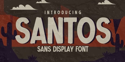 Here comes a New font, Introducing SANTOS It's Sans Display Font is a Textured Natural Style and Authentic Classy Style, this font is great for your creative projects such as watermark on photography, and perfect for logos & branding, invitation,advertisements,product designs, stationery, wedding designs,label ,product packaging, special events or anything that need handwritting taste. SANTOS is a vintage natural Hand Drawn feel. This handmade font will make your design has a beautiful natural touch for each details.
 - Capires by Craft Supply Co,
$20.00 Capires - Art Deco Font is a captivating fusion of two iconic art movements, Art Deco and Art Nouveau, blended into a contemporary typeface that pays homage to the rich artistic heritage of both styles. This font beautifully combines the geometric precision of Art Deco with the intricate, organic motifs of Art Nouveau, resulting in a harmonious masterpiece of design. Capires is the perfect choice for projects that demand a unique and mesmerizing synthesis of these two influential art movements. Whether you're working on branding, packaging, or editorial design, Capires brings a sense of timeless elegance and artistic richness to your work. With Capires, your designs seamlessly bridge the gap between past and present, making it an exceptional choice for projects that seek to capture the essence of both Art Deco's geometric refinement and Art Nouveau's flowing, ornamental beauty. This font transforms your creations into an elegant and visually captivating experience, where tradition meets modernity in a harmonious embrace.
 - Schizotype Grotesk by Eclectotype,
$25.00 A neo-grotesk with a bit more bite, this is Schizotype Grotesk. It's not your usual grot; this is purely display typography. Notches cut deep into the letterforms and the thick/thin contrast isn't always where you might expect. It's intended to be a challenging typeface - not beautiful or particularly 'useful' in any conventional sense, but it is at the very least interesting. In a world where everyone and their dog has their own grotesk offering, perhaps being interesting and that little bit different is in itself enough to give the face its utility. Besides, beauty is in the eye of the beholder. What really matters is what you think! Schizotype Grotesk isn't bogged down with a million and one OpenType features you'll never use, but it does include proportional and tabular lining figures; automatic fractions; numerators and denominators; superscript and subscript numerals; case sensitive forms; and five stylistic sets that change [a], [g], [y], [IJ], and [@] respectively.
 - Extra Old by Mans Greback,
$59.00 Extra Old is a vintage serif typeface. With heavy strokes and miniscule serifs, this classic font family is the perfect lettering for a headline to emit genuine quality. Why not use Extra Old for a traditional logo or balanced product label. Created with pride and care, this type has the optimal appearance of a classic vintage logo but for a modern setting. The font family consists of Regular and Italic, as well as Bold and Bold Italic. Also included are the font styles Coaster and Floria Corner, two typefaces for beautiful decorative elements, combining with the lettering. The font is built with advanced OpenType functionality and has a guaranteed top-notch quality, containing stylistic and contextual alternates, ligatures and more features; all to give you full control and customizability. It has extensive lingual support, covering all Latin-based languages, from Northern Europe to South Africa, from America to South-East Asia. It contains all characters and symbols you'll ever need, including all punctuation and numbers.
 - Seribu Bulan by IKIIKOWRK,
$21.00 Introducing Seribu Bulan - Arabic Type, created by ikiiko. Seribu Bulan is inspired by term in the Islamic world about the night of Lailatul Qadr in the month of Ramadan. Seribu Bulan is a display type adapted from the form of a slab serif style. This typeface has a wide selection of alternative styles to choose from. From hooked letters, to the typical symbols of arabic letters, you can play around by using various stylistic sets to form the character you want. This typeface is perfect for an logo, magazine layout, header & headline design, food & beverages product, packaging, poster, quotes, or simply as a stylish text overlay to any background image that need an a middle east vibes. What's included? Uppercase & Lowercase Number & Punctuation Complete Stylistic Set Complete Alternates Multilingual Support Get also a good offer & FREEBIE at our site : www.ikiiko.com Enjoy our font and if you have any questions, you can contact us by email : ikiikowrk@gmail.com
 - Babetta by Viktor Nübel Type Design,
$- Babetta is a display typeface that comes with some decorative typographical features. Alongside a set of arrows and flower icons, it also includes an alternative ›E‹, some special diacritic marks, a wavy ›S‹ and a series of ligatures. It features 5 weights, a special ›Neon‹ version and supports a wide range of Latin languages. This typographical tool box provides a large and playful variety of options for headlines and logotypes. Babetta supports Latin and Cyrillic languages. The initial inspiration for Babetta was an illuminated vintage shop sign—that of a famous bookstore in Berlin called Karl-Marx-Buchhandlung that dates back to the days of East Germany. During the course of the design process, this slightly shabby historical original was kissed by an Italian Art Deco beauty and has blossomed into a new typeface with its own special charm. The aim was not to preserve the original lettering, but to use it as a starting point for typographical exploration.
 - Lyra by Canada Type,
$39.95 Lyra is an Italian Renaissance script that might have developed if metal type had not broken the evolution of broad pen calligraphy. It lies in the area between the humanist bookhand and the chancery cursive, combining the fullness and articulation of the Roman letters with a moderate italic slant and condensation. A steep pen-angle allows use of a broader pen relative to the x-height, giving the letters more contrast with light verticals and heavy curves. Lyra embodies the Renaissance spirit of refining technical advances of the late middle ages with reintroduction of ancient classical principles. Based on the moving penstroke with constantly changing pen-angle, it brings the vitality of handwriting to the ordered legibility of type. Lyra is a formal italic, too slow for copying books. By eliminating the element of speed, digital technology opens up a new level of calligraphy, bringing it into the sphere of typography as would naturally have happened if metalworkers had not controlled the process. If classical Western traditions are respected, digital calligraphy has the potential to recapture the work of the past and restart its stalled evolution. There is of course no substitute for the charm of actual writing, with each letter made for its space; but the tradeoff is for the formal harmony of classical calligraphy as every curve resonates in tune with every other. This three-weight font family marks Philip Bouwsma's much-requested return from a three year hiatus. It also reminds us of his solid vision in regards to how calligraphy, typography and technology can interact to produce digital beauty and vesatility. Each of the three Lyra fonts contains almost three character sets in a single file. Aside from the usual wealth of alternates normally built into Bouwsma's work, Lyra offers two unique features for the user who appreciates the availability of handy solutions to subtle design space issues: At least three (and as many as six) length variations on ascending and descending forms, and 65 snap-on swashes which can be attached to either end of the majuscules or minuscules. The series also offers 24 dividers and ornaments built into each weight, and a stand-alone font containing 90 stars/snowflakes/flowers, symmetric contstructs for building frames or separators, masking, watermarking, or just good old psychedelia.
 - Carrot and Strawberry by HIRO.std,
$17.00 Carrot and Strawberry is a Playful Serif Font. This font describes about fun, cute, easy going, and easy to use. FEATURES - Support Opentype Features - Support Ligatures - Numbering and Punctuations - PUA Encoded Characters - Multilingual Support - Works on PC or Mac USE Carrot and Strawberry works great in craft, any product packaging, book, logotype, magazine, editorial, quotes and any projects that need all about cute and fun taste. Enjoy using! Thanks. HIRO.std
 - Qidung Swara by Creative17studio,
$20.00 Qidung Swara is a heritage typeface. Inspired by Aksara Jawa, character that has its own uniqueness and privilege. Qidung Swara was created to support use in all designs, such as branding, magazines, advertising brochures, music album covers and other uses. Qidung Swara also support multilingual language. Available in 2 styles: Regular and Italic. Grab this exclusive and awesome font fast. Don't miss it. Any question? Jusk Ask. Free update Thank You
 - Look Like Coffee by HIRO.std,
$17.00Look Like Coffee is a Display font. This font describes about fun, semi casual, stylish, headline, easy going, dynamic, and easy to use. FEATURES - Support Opentype Features - Support Ligatures - Numbering and Punctuations - PUA Encoded Characters - Multilingual Support - Works on PC or Mac USE Look Like Coffee works great in any product packaging, logotype, magazine, editorial, quotes and any projects that need all about fun and dynamic taste. Enjoy using! Thanks. HIRO.std - Quickly Brown by HIRO.std,
$14.00 Quickly Brown Bold Script Font This font describes about fun, bold, chubby, wide and easy to use. Quickly Brown inspired from Doodle and Junk Food. FEATURES - All Capital Bold - Numbering and Punctuations - PUA Encoded Characters - Multilingual Support - Works on PC or Mac USE Quickly Brown works great in any craft, logotype, magazine, quotes, social media and any projects that need all about Bold taste. Enjoy using! Thanks. HIRO.std
 - Botaky by Alit Design,
$9.00 Introducing BOTAKY Romellast fontduo Unique and fantastic duo fonts combined or they stand alone. BOTAKY font family which consists of 10 families, from Thin to Black style. The funky, swaying font creates a unique design and is sure to take the eye off the design target audience. Apart from being unique, the BOTAKY font also has a luxury simple character that makes the design charming. The Romellast font is a signature script that has cool strokes. The line shape from Romellast is inspired by the brushes on Instagram when creating stories. This brush is very cool and is often used by netizens who are not designers or designers. In addition, Romellast has an altenate ligature that looks natural and not stiff. There are 2 styles of the Romellast font, namely the Thin style which is thinner and the regular style which is thicker, so you have several options to suit your taste. Combining the two BOTAKY and Romellast fonts will create a design that is charming, unique, elegant and cool. you can see from the design preview. These two fonts are perfect for designs with the concept of elegant, luxury, romance, fashion and so on.
 - JulesLove - Unknown license

- Aeroxys by Kulokale,
$17.00 Aeroxys is an condensed sans serif display font, and with a style that is very different from the others. This font comes in four styles, Regular, Oblique, Outline, and Oblique Outline Version. Aeroxys is well-suited for posters, social media, headlines, magazine titles, clothing, large print formats - and wherever you want to be seen. Inspired by the style of design that is currently popular, and this is the answer to all the needs of every idea that you will pour in this modern era. We highly recommend using a program that supports OpenType features and Glyphs panels such as Adobe Illustrator, Adobe Photoshop CC, Adobe InDesign, or CorelDraw, so you can see and access all Glyph variations. This font is encoded with Unicode PUA, which allows full access to all additional characters without having special design software. Mac users can use Font Book, and Windows users can use Character Map to view and copy one of the extra characters to paste into your favorite text editor / application. We hope you enjoy the font. Thank you.
 - Geakosa by Kulokale,
$25.00 Geakosa is an condensed sans serif display font, and with a style that is very different from the others. This font comes in two styles, Regular and Outline Version. Geakosa is well-suited for posters, social media, headlines, magazine titles, clothing, large print formats - and wherever you want to be seen. Inspired by the style of design that is currently popular, and this is the answer to all the needs of every idea that you will pour in this modern era. We highly recommend using a program that supports OpenType features and Glyphs panels such as Adobe Illustrator, Adobe Photoshop CC, Adobe InDesign, or CorelDraw, so you can see and access all Glyph variations. This font is encoded with Unicode PUA, which allows full access to all additional characters without having special design software. Mac users can use Font Book, and Windows users can use Character Map to view and copy one of the extra characters to paste into your favorite text editor / application. We hope you enjoy the font. Thanks for purchasing and have fun!
 - Minuet by Canada Type,
$24.95 Minuet, an informal script with crossover deco elements giving it an unmistakable 1940s flavor, is a revival and expansion of the Rondo family, the last typeface drawn by Stefan Schlesinger before his death. This family was initially supposed to be a typeface based on the strong, flowing script Schlesinger liked to use in the ads he designed, particularly the ones he did for Van Houten’s cocoa products. But for technical reasons the Lettergieterij Amsterdam mandated the face to be made from unattached letters, rather than the original connected script. Schlesinger and Dooijes finished the lowercase and the first drawings of the uppercase just before Schlesinger was sent to a prison camp in 1942. Dooijes completed the design on his own, and drew the bold according to Schlesigner’s instructions. The typeface family was finished in February of 1944, and Schlesinger was killed in October of that same year. Though he did see and approve the final proofs, he never actually saw his letters in use. It took almost four more years for the Lettergieterij Amsterdam to produce the fonts. The typeface was officially announced in November of 1948, and immediately became a bestseller. By 1966, according to a memo from the foundry, the typeface had become “almost too popular”. This digital version of Schlesigner’s and Dooijes’s work greatly expands on the metal fonts. Both weights include a complete set of lowercase alternates — based on Schlesinger’s own drawings, as well as alternative variations for some of the capitals, a few ligatures, and extended language support covering Western, Eastern and Central European languages, plus Baltic, Celtic/Welsh, Esperanto, Maltese and Turkish. Minuet is available in all popular formats. The OpenType version, Minuet Pro, takes advantage of internal font programming to combine the main and alternate fonts into a single file per weight, making all alternates and ligatures automatically available at the push of a button in OpenType supporting programs.
 - Avenir by Linotype,
$42.99 In drawing the Avenir® typeface, Adrian Frutiger looked to both the past and the future for inspiration. His goal was to reinterpret the geometric sans serif designs of the early part of the 20th century in a typeface that would portend aesthetics of the 21st century. He succeeded handsomely. In doing so, Frutiger added a bit of organic humanism to the design, freeing Avenir from the rigid geometric overtones of the earlier designs. Avenir is employed on signage at Dallas Fort Worth and Hong Kong international airports. The city of Amsterdam adopted Avenir as its corporate typeface in 2003. The original Avenir family is made up of designs with gradual weight changes in order to satisfy the needs of specific text applications. While the book and light weights have similar stroke widths, the book weight is well suited for body text, whereas the light was designed for captions and subhead text. Featured in: Best Fonts for Resumes
 - Neo Sans Cyrillic by Monotype,
$103.99The branding agency's client wanted an ultra modern"" typeface that was ""futuristic without being gimmicky or ephemeral,"" according to the design brief. Designer Sebastian Lester took on this intriguing custom font assignment, but soon, a bureaucratic decision cancelled the project. ""I was left with a sketchbook full of ideas and thought it would be a shame not to see what came of them,"" says Lester. He decided to finish the design on his own. Lester's research confirmed that the principal ingredient of an ""ultra modern"" typeface was simplicity of character structure: a carefully drawn, monoline form, open letter shapes and smooth, strong curves. To conceive a typeface that crossed the line from modern to futuristic, Lester decided to amplify these qualities. About a year after Lester's initial conceptual work, two highly functional and versatile typefaces emerged. These are Neo Sans and Neo Tech, designs Lester describes as ""legible without being neutral, nuanced without being fussy, and expressive without being distracting."" Both the Neo Sans and the more-minimalist Neo Tech families are available in six weights, ranging from Light to Ultra. Each has a companion italic, and Neo Tech offers a suite of alternate characters. While engineered to look modern as tomorrow, Neo Sans and Neo Tech display the functional and aesthetic excellence that earns them a place in the list of classic designs from the Monotype typeface library. - Neo Sans Paneuropean by Monotype,
$114.99The branding agency's client wanted an ultra modern"" typeface that was ""futuristic without being gimmicky or ephemeral,"" according to the design brief. Designer Sebastian Lester took on this intriguing custom font assignment, but soon, a bureaucratic decision cancelled the project. ""I was left with a sketchbook full of ideas and thought it would be a shame not to see what came of them,"" says Lester. He decided to finish the design on his own. Lester's research confirmed that the principal ingredient of an ""ultra modern"" typeface was simplicity of character structure: a carefully drawn, monoline form, open letter shapes and smooth, strong curves. To conceive a typeface that crossed the line from modern to futuristic, Lester decided to amplify these qualities. About a year after Lester's initial conceptual work, two highly functional and versatile typefaces emerged. These are Neo Sans and Neo Tech, designs Lester describes as ""legible without being neutral, nuanced without being fussy, and expressive without being distracting."" Both the Neo Sans and the more-minimalist Neo Tech families are available in six weights, ranging from Light to Ultra. Each has a companion italic, and Neo Tech offers a suite of alternate characters. While engineered to look modern as tomorrow, Neo Sans and Neo Tech display the functional and aesthetic excellence that earns them a place in the list of classic designs from the Monotype typeface library. - GrindelGrove by Laura Worthington,
$19.00 GrindelGrove is a spooky display face that suggests deep dark woods, long-lost treasure maps, and cautionary fables. Its bark-like texture and v-shaped letterforms lends an air of eerie mystery, a perfect complement for scary novels, haunted houses, and strange happenings. See what’s included! http://bit.ly/2bIDfOf
 - Single Fighter by Subectype,
$15.00 Single Fighter is a supercharged, street-wise brush font bursting with energy. With extra attention to quick strokes and sharp details, Single Fighter is guaranteed to deliver an unapologetically loud & fast-paced message; ideal for logos, apparel, quotes, product packaging, or anything which needs a typographic turbo-boost.
 - Hupfildac by Midvel,
$22.00 Hupfildac is coming. Vintage font have unique ornament in every charactes. Make your lettering design more attractive with stylistic set. Make design according to your taste. You can use to design tshirt, logo, poster, ect. Feature : · Uppercase · Lowercase · Numbers · Puctuations · Multilingua Support · Ligature · PUA Included · SS 01-03
 - Bakelony by Multype Studio,
$18.00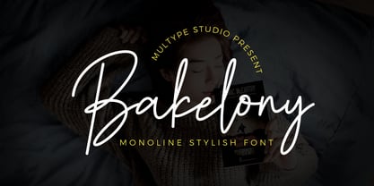 Bakelony is a monoline stylish script font that contain uppercase, lowercase, symbol, number, ligature, and also support multi language. Bakelony is perfect for photography, watermark, social media posts, advertisements, logos & branding, invitation, product designs, label, stationery, wedding designs, product packaging, special events or anything that need handwriting taste.
 - Press Gothic by Canada Type,
$24.95 Press Gothic is a revival of Aldo Novarese's Metropol typeface, released by Nebiolo in 1967 as a competitor to Stephenson Blake's Impact (designed by Goeffrey Lee). Though Metropol enjoyed a few short months of popularity and use in Italy, Germany and France, Impact won the technological outlasting battle by moving on to film type then to computer outlines bundled with mainstream software, while Metropol never made it past the metal state until now. Too bad really, since this is one of the few faces that could have played well with all the horrendous stretch'n'squeezing of the 1970s. Just like its inspiration, Press Gothic aims to be a fresh alternative to big economical poster fonts with clear sans serif forms and an urgent, strong, yet elegant design appeal. In the summer of 2008, Press Gothic underwent a major linguistic and aesthetic reworking for an international publishing company. The result of this on the retail side are new small capitals and biform/unicase additions to the main font, as well as expanded language support that includes Cyrillic, Greek, Turkish, Baltic, Central and Eastern European, Maltese, and Esperanto. Press Gothic Pro, the OpenType version, combines all three fonts into one, taking advantage of the small caps feature, and the stylistic alternate feature for the biform shapes.
 - Slivowitz by Hanoded,
$15.00 First off, Slivowitz is written with a v (SlivoVitz), rather than a w, but I liked it better with a w. Slivowitz is a plum brandy from Eastern Europe. My father used to be an international truck driver and he often had to go to Eastern Europe. He took all kinds of ‘western’ goods with him to give away (plastic bags, beer, cigarettes - remember, Eastern Europe at the time was still communist!). He always came back with bottles of Slivowitz. I never tasted it, as I was too young, but I liked the name and I decided to name this font after a fond memory! Slivowitz is an easy-going handwritten script font - it looks good on fashion items, book covers and fancy magazines, but greeting cards will look just as great. Comes with a bunch of ligatures, alternates and a whole lotta diacritics!
 - Noir Jolie by SilverStag,
$19.00 After a couple of weeks of teasing, sneak previews & insta shots, my new typeface is finally here. Noir Jolie is a modern ligature serif font that comes with curvy & straight combo of uppercase letters and chic lowercase alphabet that together look just perfect. Noir Jolie is also my last font for 2022 so I really hope you guys like it. The font also includes full language support, punctuation, numerals and detailed instructions how to use alternates & ligatures in most of the apps on your computer, as well as in Canva. I invite you to check out the preview images, and I hope you will be immersed in my vision for this creative typeface that, I am sure, will work for all kinds of interesting projects you might be working on this year. If you end up publishing your designs on Instagram, tag me - @silverstagco and I will make sure to showcase your design and work to my audience as well! Noir Jolie - Modern Ligature Serif Includes: 25+ Ligatures Numerals & Punctuation Language Support Web Font Kit is included as well Detailed instructions on how to use alternates in most of the apps on your computer as well for Canva Happy creating everyone!
 - Amantea Script by Create Big Supply,
$25.00 Experience the enchanting allure of Amantea Script, a stunning and delicate font that embodies elegance and grace in every stroke. With its thin and flowing style, this script font captures the essence of sophistication, making it the perfect choice for a wide range of design projects. Amantea Script is a true gem for those seeking to create captivating wedding invitations that leave a lasting impression. Its intricate and graceful curves evoke a sense of romance and beauty, adding a touch of magic to any special occasion. The versatility of this font extends beyond weddings, as it effortlessly enhances stationary art, creating stunning pieces that exude refinement and style. In the realm of digital design, Amantea Script shines on social media platforms, effortlessly captivating audiences with its captivating charm. Whether it's engaging posts, inspiring quotes, or eye-catching advertisements, this font adds an element of sophistication and allure that commands attention. With its extensive language support, Amantea Script opens up a world of possibilities. From English to Spanish, French to German, and beyond, you can seamlessly incorporate this font into your projects, ensuring that your message reaches a global audience. Amantea Script comes complete with a wide range of features, including alternate characters and ligatures, allowing you to create unique and personalized designs. The font is PUA encoded, providing easy access to a plethora of stunning glyphs that add depth and flair to your creations.
 - Mixa by Fontfabric,
$29.00 Neo-grotesque Sans Serif mixed with the classical handwritten Script in slanted geometric shapes - that’s the way Mixa was born. Those two faces of the new font family makes it as much as unique and recognizable. When you’re using the Capitals only nobody will suspect that there is script hidden in the lowercase. That’s why all eight weights can be combined perfectly with wide list of classical Sans Serif, Slab Serif and Serif typefaces. The font offers wide range of ligatures to ensure smooth readability and beautiful letter combinations. The decorative swashes in some of the Capitals presented as a stylistic sets give unique touch in any design. Mixa has it’s own style and personality, but without lacking of legibility.
 - Truesdell by Monotype,
$29.99 Frederic Goudy drew Truesdell in 1930 and first used it for an article in a quarterly journal for book collectors. Since it was a small family and not promoted, Goudy received few orders for fonts. The original drawings and matrices for the face were lost in the fire that destroyed Goudy's studio in 1939.The only known examples of Truesdell fonts reside in the extensive collection of typographic material at the Rochester Institute of Technology School of Printing. It was proofs from these fonts that served as the basis for Monotype's digital revival of the family. Monotype Truesdell was released in March of 1994, just slightly over fifty-five years after fire destroyed Goudy's original work. Truesdell font field guide including best practices, font pairings and alternatives.
