10,000 search results
(0.027 seconds)
- Magical Tours by IKIIKOWRK,
$17.00 Proudly Present Magical Tours - Psychedelic Type, created by ikiiko. Magical Tours is a stunning typeface with the retro appeal and allure of a psychedelic design. This distinctive bottom thickness typeface takes you on a fantastic journey through time while still maintaining a timeless aesthetic. Magical Tours, inspired by the writing styles of the 60s, where the psychedelic trend perfectly encapsulated the restless essence of youth at the time. This font has a distinct personality due to its inventive mix of vintage components and psychedelic influences, making it ideal for evoking the romance of the past. This typeface is perfect for an vintage stuff, retro poster layout, fashion ads, book cover, packaging, food & beverages and also good for quotes, or simply as a stylish text overlay to any background image. What's included? Uppercase & Lowercase Number & Punctuation Multilingual Support Works on PC & Mac Enjoy our font and if you have any questions.
 - Bunaero by Buntype,
$24.50 Buntypes Bunaero™ combines classical and contemporary characteristics to a unique and distinctive font family with extravagant but also harmonious appearance. The characters are clear, open and sometimes bellied. Especially the caps have a very high waistline. The font was manually hinted and contains extensive handcrafted kerning tables to ensure flawless appearance in all media. It supports at least 99 languages incl. Vietnamese and provides ligatures, alternative glyphs, special localized forms and even more enjoyable OpenType® features. Feature Summary*: - 9 weights, 18 styles: Hair, Light, Thin, SemiLight, Regular, SemiBold, Bold, ExtraBold and Heavy and corresponding italics - Supports at least 99 Languages incl. eastern european and vietnamese languages - Overall width: Narrow or Space-Saving - Advanced f- ligature set including fb - Discretionary s- and c- ligatures - Alternative Characters: a, e, f, g, i, k, l, t, v, w, y, J, K, Q, R, and more - Capital German Eszett - Extra characters with Polish Kreska - Catalan Punt Volat - Extra characters with alternate minimalistic Cedille * Some features may only be available in OpenType®-savvy applications
 - Fashion Experiment by PeachCreme,
$21.00 "Fashion Experiment" is an all-caps handwritten display font featuring a funky and expressive gel pen-style that is perfect for creating impactful header text, poster designs, album covers, product designs, and merchandise. The font's unique and playful appearance is crafted to maintain an authentic look, with alternative letters and ligatures adding to its creative potential. The font includes alternative letters and ligatures coded for uppercase letters. The font also features more than 100k kerning pairs, ensuring optimal precision and readability. To maintain the authentic appearance of ligatures, this font was crafted from the handwritten text. However, as ligatures that complement one combination of letters may not work for another, it is essential to have the option of switching to alternate letters or avoiding the use of ligatures altogether. The frequency of use for certain letters varies, resulting in some letters having more alternates than others. For example, letters such as A, E, L, M, S, and T are more commonly used than letters like X, Z, and Q, which explains the difference in alternate options. We recommend using programs that support OpenType features to fully access the font's features. This will allow you to access glyphs directly on the same panel without copying/pasting each glyph. Additionally, the OpenType panel allows you to turn on standard ligatures, which can automatically change letters for available ligatures. Even if you are using a program that does not support OpenType, you can still access the alternates and ligatures of this font through Fontbook or Character Map, as the glyphs are PUA-encoded. However, please note that you will have to copy and paste each ligature or alternate individually, which can be time-consuming and require extra effort. Happy designing, Gulya
 - Henderson Slab by Sudtipos,
$39.00 A few bold caps drawn by Albert Du Bois for the 1906 Henderson Sign Painter book started me in the direction of looking at how sign painters approached slabs after the industrial revolution. The usual happened from there. My exercise in the early lettering roots of what eventually became the definition of geometric typography ended up having a life of its own. The majuscules led to minuscules, one idiosyncratic bold weight led to six more, and uprights led to italics. What was kind-of-interesting in the early twentieth century persuaded me to make it interesting enough a century later. This of course meant alternates, swashes, the standard baggage that keeps calling my name. Henderson Slab is a family of seven weights plus italics, all full of open features and extended Latin language support. Part of this family’s appeal is its coverage of nearly the entire of the slab serif through the last 100 years — the basis is the manual, humanist origins, the swashed forms come right out of the phototypesetting era, and the alternates and mostly modern constructs of contemporary ideas. The result is a set with the ability to function in modern spaces, from corporate to editorial, in text or display, while both winking and nodding at the roots of what is now considered a geometric endeavor. (Basic version do not include alternates, swashes, etc).
 - Ecatherina by BlessedPrint,
$23.00 Hi! It took me almost a year to design Ecatherina script. Finally it is available to purchase! Ecatherina script is an opentype font-family (15 fonts: 5 styles for 3 line thickness) with a bonus (editable wedding invitations, menu, quotes, letters, and more) HOW TO GET ACCESS TO ALTERNATES? Absolutely easy, just type a number after any letter: a1, a2, a3 etc Capital letters have 3-4 options and more. So just type E1, E2, E3 etc and find your favourite one! I found this method the most useful when you need to experiment with design very fast. All characters are available through Glyph panel as well, even more each of the alternate letter has it’s own unicode (PUA) so you can copy/paste from Apple Font Book or Windows Character Map. Total amount of glyphs 1436. Compatible with SILHOUETTE & CRICUT DESIGN SPACE WHAT IS INCLUDED BP-Ecatherina OTF & TTF It goes with 5 weights: Thin, Medium, Regular, Bold, UltraBold BP-Ecatherina-Ex1 The only difference between previous font is that thin line is a bit thicker. BP-Ecatherina-Ex2 Even more thicker line. Help.pdf Help file with most common questions. Bonus - Ecatherina.fig with editable wedding invitations (10+ designs 5x7 inches), menu, quotes, letters. Important! You need to install Figma application (it is free) to access files. With Figma application you can import bonus files and edit the text, export as png, pdf, svg and print it. Bonus - help.pdf file with general information how to work with Figma if you are new. It is very easy application and I recommend it to you! It works with MS Word, I included example.docx file so you can understand how to work.
 - Eurotypo BKL by Eurotypo,
$28.00 Eurotypo BKL is a family of fonts inspired in on one of the most beautiful British Typography ever done. This version of Baskerville tries to reflect the taste of his fine style, compatible with the bluntness of the digital present. As many other designers and foundries, our intention has been to represent the atmosphere of Baskerville's style, than simply relive the shapes of its letters. Actually, capitals fits almost to a square proportions, lowercases are more open, ascenders and descenders are shorter, offering more space for enlarge the "x" high. The beauty of his letterforms can enrich headlines; this font can also be used as body text for its good legibility and accurate kerning. John Baskerville (1706-1775) was born 1706 in Wolverley, England. He was a great typographer and printer who published a remarkable edition of Virgil in 1757. His typefaces were greatly admired by Benjamin Franklin; He also has improved and developed many innovations in printing, paper and ink production. Baskerville’s typefaces are regarded as transitional types that represents the link between Old Roman Style and Modern Roman typography.
 - Pristine Pro Slab by AZCRTV Studio,
$23.00 Meet Pristine Pro, the epitome of elegance and precision in typography. This Slab Serif font, meticulously developed with a humanistic touch, promises unparalleled sophistication for your projects. Its 18 versatile font families, ranging from Thin to Black, offer a tailored solution for every design need. Explore the seamless blend of clean lines and firm structure that defines Pristine Pro. This font isn't just a typeface; it's a statement of modernity and style. With support for 89 international languages, including English, French, Spanish, and German, Pristine Pro caters to a global audience, ensuring your designs communicate effectively worldwide. Desire perfection in your designs? Pristine Pro delivers. Craft compelling branding, striking posters, or editorial layouts with confidence. Its immaculate precision and extensive language support empower your creativity. Your desire for flawlessness finds its match in Pristine Pro, promising visuals that captivate, leaving a lasting impression on any audience. Ready to elevate your designs? Take action now. Download Pristine Pro and witness your creativity flourish. Unleash the power of clean Slab Serif typography with international appeal. Dominate the digital space, ensuring your projects rank high and capture attention. Seize this opportunity and transform your designs into timeless masterpieces.
 - Sacred Letter by 38-lineart,
$14.00 Sacred letter is a font that follows the rules of calligraphy writing, but the difference is there is a natural emphasis on handwriting. The Thick and thin are not smooth to describe the flow of natural ink. The pure calligraphy tends to the classic style with nuances of the grandeur of the past. This font is more open and appears as-is. The flexibility of the style makes it can survive in the classic style and modern style. Sacred Letter is a flowing and classic handwritten font, described by an elegant touch, perfect for your dearest projects. Fall in love with its incredibly distinct and timeless style and use it to create spectacular designs! This font is PUA encoded which means you can access all of the glyphs and swashes with ease! It features a varying baseline, smooth lines, gorgeous glyphs and stunning alternates.
 - Parma by Monotype,
$29.99Giambattista Bodoni (1740-1813) was called the King of Printers; he was a prolific type designer, a masterful engraver of punches and the most widely admired printer of his time. His books and typefaces were created during the 45 years he was the director of the fine press and publishing house of the Duke of Parma in Italy. He produced the best of what are known as modern" style types, basing them on the finest writing of his time. Modern types represented the ultimate typographic development of the late eighteenth and early nineteenth centuries. They have characteristics quite different from the types that preceded them; such as extreme vertical stress, fine hairlines contrasted by bold main strokes, and very subtle, almost non-existent bracketing of sharply defined hairline serifs. Bodoni saw this style as beautiful and harmonious-the natural result of writing done with a well-cut pen, and the look was fashionable and admired. Other punchcutters, such as the Didot family (1689-1853) in France, and J. E. Walbaum (1768-1839) in Germany made their own versions of the modern faces. Even though some nineteenth century critics turned up their noses and called such types shattering and chilly, today the Bodoni moderns are seen in much the same light as they were in his own time. When used with care, the Bodoni types are both romantic and elegant, with a presence that adds tasteful sparkle to headlines and advertising. Parma was designed by the monotype Design Team after studying Bodoni's steel punches at the Museo Bodoniana in Parma, Italy. They also referred to specimens from the "Manuale Tipografico," a monumental collection of Bodoni's work published by his widow in 1818. - NS Yorkest Poster by Novi Souldado,
$25.00 Experience the around-the-world traveling vibes from the past with Yorkest Poster. It was inspired by the vintage retro national travel arts and printings from the 60s and 70s eras back in the day. Comes along with 2 styles (Serif and Script) that would never go wrong to be paired. A pack of Stylistic Alternates features to give a personal touch to your design, and also Swashes to cover your visual needs to be stronger in every appearance. Perfectly fit for logo design, headliner, signage, poster, postcard, title, postage stamp, and a lot of other printing works and stuff.
 - Hadnich by Arterfak Project,
$28.00 Inspired by the vintage brush typography, we proudly present Hadnich. the versatile script font. Carefully designed with the taste of old school sign painting which has the neat letterforms, attractive move and combined in modern form. Complete your font library with this cool brush font. Works perfectly for logo, signage, apparel, labels, poster, and many more! Make sure you get more variants of typographic design with a ton of alternates characters that you can access easily! There are stylistic sets 01-14, ligatures, swashes also accented characters, packed in a total of 350++ glyphs! Worth every penny. Uppercase Lowercase Numbers & symbols Stylistic sets 01-14 Ligatures Multilingual characters Thank you for watching. Keep it real!
 - Xylo by ITC,
$29.99Xylo is a rugged, no-nonsense typeface that was originally designed in 1924 by the Benjamin Krebs type foundry in Frankfurt am Main, Germany. Even back then, Xylo must have been very popular; the design made it at least as far as England. In 1995, after finding its design in an old London printer's reference book, the Letraset Type Studio faithfully converted Xylo into digital format. A time-proven display face, Xylo will convey a feeling of power and strength in any application. Best used big in headlines or logos; Xylo exudes an expressionistic and art deco spirit that just as much at home today as it was during the roaring 20s! - HS Gold by Hiba Studio,
$69.00 HS Gold is based on some modern lines of Naskh calligraphy which supports Arabic, Persian and Latin with a Sans Serif with subtle round on stems and corners. The typeface has been optimized for corporate identity work, editorial design and modern projects when a contemporary and simple look with a similarity between Arabic and Latin is requested. It features swash, ligatures and swash ligatures. Its proportions allow high impact on the tightly set lines of big and small text alike. This font consists of two weights (regular and bold) which can constitute a striking addition to the library of Arabic and Latin contemporary fonts models that meet the purposes of various designs for all tastes and projects.
 - Retrio by Luxfont,
$18.00 Introducing Retrio. Original glyphs with echoed behind. As if the letters were moved, but the kinetic trail remained. Colored, gradient, with transparency or solid - many options in one family for any task and for every taste. The font will emphasize the style of the 20th century in illustration. Discos, electro music, records, nostalgia - these are the associations that this font family evokes, which is very important in design. At the same time, the Retrio font is not outdated, it was created taking into account modern trends in retro themes. A unique family in which there are both color and classic monochrome versions. Great versatility in use is provided by the many fonts in the set. Great for ad designs, posters, headlines and covers. Check the quality before purchasing and try the FREE DEMO version of the font to make sure your software supports color fonts. P.s. Have suggestions for color combinations? Write me an email with the subject "Retrio Color" on: ld.luxfont@gmail.com Features: - Free Demo font to check it works. - Uppercase and lowercase the same size. - With transparency and without. - Mega high-quality gradients in letters. - Kerning. IMPORTANT: - Multicolor version of this font will show up only in apps that are compatible with color fonts, like Adobe Photoshop CC 2017.0.1 and above, Illustrator CC 2018. Learn more about color fonts & their support in third-party apps on www.colorfonts.wtf -Don't worry about what you can't see the preview of the font in the tab "Individual Styles" - all fonts are working and have passed technical inspection, but not displayed, they just because the website MyFonts is not yet able to show a preview of colored fonts. Then if you have software with support colored fonts - you can be sure that after installing fonts into the system you will be able to use them like every other classic font. Question/answer: How to install a font? The procedure for installing the font in the system has not changed. Install the font as you would install the classic fonts. How can I change the font color to my color? · Adobe Illustrator: Convert text to outline and easily change color to your taste as if you were repainting a simple vector shape. · Adobe Photoshop: You can easily repaint text layer with Layer effects and color overlay. ld.luxfont@gmail.com
 - Kedira Signature by Zeenesia Studio,
$15.00 edira Signature is a monoline script font with handwritten signature Style. Kedira Signature font was created with original handwritting pen. This collection of scripts is perfect for personal branding. this works well for many applications. Kedira Signature would perfect for photography, watermark, social media posts, advertisements, logos & branding, invitation, product designs, label, stationery, wedding designs, product packaging, special events, fashion, website or anything that need handwriting taste.
 - Mandan by Sabrcreative,
$25.00 Elevate your designs with Mandan, a bold sans serif display font that exudes power and impact. With its strong and commanding presence, Mandan is perfect for headlines, logos, posters, and any design that requires a bold statement. Featuring both uppercase and lowercase letters, Mandan offers versatility in crafting captivating compositions. The inclusion of numbers and punctuations ensures seamless integration into your design projects, whether it's for digital or print media. Additionally, the font's multilingual support allows you to reach a diverse global audience and communicate your message effectively. Mandan is designed with precision and attention to detail, providing a clean and modern aesthetic. Its PUA encoding enables easy access to special characters and symbols, expanding your creative possibilities. The font's bold strokes and distinct letterforms make it stand out in any design, capturing attention and leaving a lasting impression.
 - Shikatta by Grezline Studio,
$12.00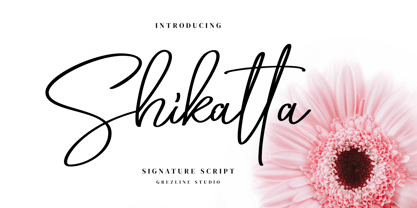 Shikatta is a beauty signature script font crafted very carefully. Shikatta is perfect use for a logo for branding, typography design, product packaging, invitation, quotes, t-shirt design, label poster, special events and anything that need handwriting taste.
 - Bellinda by Krafted,
$10.00 Introducing Bellinda - A Stylish Signature Font. Modern and tasteful, Bellinda is fantastic if you’re aiming for elegance. You can use this font for web pages, ads, promotions, banners, printed cards, clothing, merchandise, and anything else your business needs. What you’ll get: Multilingual & Ligature Support Full sets of Punctuation and Numerals Compatible with: Adobe Suite Microsoft Office KeyNote Pages Software Requirements: The fonts that you’ll receive in the pack are widely supported by most software. In order to get the full functionality of the selection of standard ligatures (custom-created letters) in the script font, any software that can read OpenType fonts will work. We hope you enjoy this font and that it makes your branding sparkle! Feel free to reach out to us if you’d like more information or if you have any concerns.
 - Technica by Monotype,
$25.00 Do you remember a typeface called Meccanica? I didn’t think so. Well, it was pretty unique – too unique for most people’s tastes it seems. Anyway, this is Technica, Meccanica’s more conservative little brother. Essentially, this typeface is a geometric sans that retains the structure of Meccanica, but tones down most of the hexagonal elements. The chamfered terminals are retained, but sharpened, and a more technical approach is instilled with each glyph being fine-tuned for optimal performance and aesthetics. The result is a refined sans serif that has enough personality to differentiate itself from the myriad of others available – undoubtedly, Technica will deliver a distinctive tone to your own typographic designs. Key features: • 9 weights in Roman and Italic • Western European character set (Adobe Latin 1) • 250+ glyphs per font.
 - HWT Arabesque by Hamilton Wood Type Collection,
$24.95 A long lost Art Nouveau wood type from the Hamilton Museum Collection evokes the excesses of Victorian design and the equally quirky 1960s Psychedelic era revival of the Victorian type styles. Free flowing organic designs that flourished with Art Nouveau in the late 1800s were directly referenced and further distorted with with phototype in the late 1960s. This design, known as Arabesque, was produced by the Morgans & Wilcox Co. and the Wm. Page Co. as almost identical designs. Both manufacturers were acquired by Hamilton and offered briefly by Hamilton as design #618. This curious wood type defies most of the basic tenets of type design and what comes to mind when one thinks "wood type". Many characters have a lively eccentricity that were all left true to the original design. Additional characters were designed to fill out the standard range of characters found in digital fonts. This font includes over 280 characters for full unicode support of Western and Central European Latin characters.
 - Bandoengsche by Gumpita Rahayu,
$14.00 Bandung is home to numerous examples of Dutch colonial architecture, most notably the tropical Art Deco architectural style. This typeface was adapted from the finest Art Deco landmarks and signage in Bandung, Indonesia and strongly added native elements of traditional Art Deco typefaces style. The main character is an example of a harmonious mixture between West and East architectural styles, repackaged into the Art Deco type design. With two different styles, it comes as regular and Deco styles, the regular style is constructed with all caps setting, with some different characters between uppercase and lowercase. The Deco style uses more stripes in the right shapes, it was naturally inspired with the most common art deco typefaces. The additional Opentype Features loaded in this typeface; some stylistic alternates, accessible catchwords in the discretionary ligatures, and the art deco ornaments, This typeface is highly usable with large scaling size and will fit with posters, movie titles, and signage designs.
 - 57-nao by ILOTT-TYPE,
$49.00 Designed in 1950s Japan by Okanao & Kushiro, the perfect partnership until artistic temperaments drove them apart. The duo spent years crafting the font with the working title “Messenjā”, Okanao bringing technical expertise to craft letterforms, while Kushiro made it his life, obsessively working late into the night to check pages for errors. For him the project was never about making money, it was an artistic endeavor to reprint the great Western works of literature. When he found out Okanao had secretly sold the rights to the font for use as a logo for a major Japanese manufacturer, Kushiro burned all evidence of the designs in a fit of passionate fury. The two reportedly never spoke again. “Messenjā” was thought lost forever until a type specimen was discovered in a vintage typewriter box bought on eBay. Now redrawn and available as 57-nao, a faithful and beautifully crafted monospace characterized by what is considered Okanao’s defining moment, the angular loop on the lowercase ‘a’.
 - Meposa by Typodermic,
$11.95 Meposa is more than just a typeface; it is a bold statement of individuality and creativity. It’s a unique, tough, and quirky design that defies convention. Meposa’s mixed-case letters with open apertures deviate from the traditional roots of wood-block typography, bringing a fresh and modern twist to an old-school classic. This hybrid typeface is an amalgamation of various design elements from different eras and cultures. The result is a unique and mesmerizing typeface that defies categorization. Meposa also draws inspiration from the 1970s custom van culture, where artists and designers would showcase their creativity by customizing their vehicles with bold and colorful graphics. This typeface channels that same spirit of creativity and individuality, inviting you to break the mold and think outside the box. With historical wood type influences, Meposa pays homage to the timeless and authentic craft of typography. Yet, it also features retro-tech and modern design elements, resulting in a truly one-of-a-kind typeface that bridges the past and the present. In summary, Meposa is a unique and tough display typeface that is both historical and modern, quirky and bold. Its mix of design influences makes it an ideal choice for anyone looking to break the mold and stand out from the crowd. Whether you’re a graphic designer or a creative professional, Meposa is sure to leave a lasting impression. Most Latin-based European writing systems are supported, including the following languages. Afaan Oromo, Afar, Afrikaans, Albanian, Alsatian, Aromanian, Aymara, Bashkir (Latin), Basque, Belarusian (Latin), Bemba, Bikol, Bosnian, Breton, Cape Verdean, Creole, Catalan, Cebuano, Chamorro, Chavacano, Chichewa, Crimean Tatar (Latin), Croatian, Czech, Danish, Dawan, Dholuo, Dutch, English, Estonian, Faroese, Fijian, Filipino, Finnish, French, Frisian, Friulian, Gagauz (Latin), Galician, Ganda, Genoese, German, Greenlandic, Guadeloupean Creole, Haitian Creole, Hawaiian, Hiligaynon, Hungarian, Icelandic, Ilocano, Indonesian, Irish, Italian, Jamaican, Kaqchikel, Karakalpak (Latin), Kashubian, Kikongo, Kinyarwanda, Kirundi, Kurdish (Latin), Latvian, Lithuanian, Lombard, Low Saxon, Luxembourgish, Maasai, Makhuwa, Malay, Maltese, Māori, Moldovan, Montenegrin, Ndebele, Neapolitan, Norwegian, Novial, Occitan, Ossetian (Latin), Papiamento, Piedmontese, Polish, Portuguese, Quechua, Rarotongan, Romanian, Romansh, Sami, Sango, Saramaccan, Sardinian, Scottish Gaelic, Serbian (Latin), Shona, Sicilian, Silesian, Slovak, Slovenian, Somali, Sorbian, Sotho, Spanish, Swahili, Swazi, Swedish, Tagalog, Tahitian, Tetum, Tongan, Tshiluba, Tsonga, Tswana, Tumbuka, Turkish, Turkmen (Latin), Tuvaluan, Uzbek (Latin), Venetian, Vepsian, Võro, Walloon, Waray-Waray, Wayuu, Welsh, Wolof, Xhosa, Yapese, Zapotec Zulu and Zuni.
 - Gundrada ML by HiH,
$12.00 Gundrada ML was inspired by the lettering on the tomb of Gundrada de Warenne. She was buried at Southover Church at Lewes, Sussex, in the south of England in 1085. The Latin inscription on her tomb, STIRPS GUNDRADA DUCUM, meaning “Gundrada, descendant of the Duke” may have led to the speculation that she was the daughter of William, Duke of Normandy and bastard son of Robert the Devil of Normandy and Arletta, daughter of a tanner in Falaise. In 1066 William defeated Harold at the Battle of Hastings and was crowned William I of England. More commonly known as William the Conquerer, he commissioned a string of forts around the kingdom and charged trusted Norman Barons to control the contentious Anglo-Saxon population. William de Warenne, husband of Gundrada, was one of these Barons. There has also been the suggestion that Gundrada may have been the daughter of William’s wife, Matilda of Flanders, by a previous marriage. According to the Dictionary of National Biography (Oxford University Press, Oxford, England 1921-22), both of these contentions are in dispute. Searching the past of a thousand years ago is like wandering in a heavy fog: facts are only dimly in view. Regardless, I know that I found these letterforms immediately engaging in their simplicity. Unadorned and unsophisticated, they have a direct honesty that rests well in the company of humanistic sans serifs like Franklin Gothic or Gill Sans, appealing to a contemporary sensibility. The lettering on the tomb is in upper case only. Although Gundrada does not sound Norman French to me, her husband certainly and her father probably were Norman French. Nonetheless, the man that carved her tombstone was probably Anglo-Saxon, like most of the people. For that reason, we are quite comfortable with a fairly generic lower case from an Anglo-Saxon document of the time. The time was a time of transition, of contending language influences. This font reflects some of that tension. Features 1. Multi-Lingual Font with 389 glyphs and 698 Kerning Pairs. 2. OpenType GSUB layout features: onum, dlig, liga, salt & hist. 3. Tabular Figures and Alternate Old-Style Figures. 4. Alternate Ruled Caps (line above and below, matching to brackets). 5. Central Europe, Western Europe, Turkish and Baltic Code Pages. 6. Additional accents for Cornish and Old Gaelic. 7. Stylistic alternates A, E, y and #. 8. Ligatures ST, Th, fi and fl. 9. Historic alternate longs. The zip package includes two versions of the font at no extra charge. There is an OTF version which is in Open PS (Post Script Type 1) format and a TTF version which is in Open TT (True Type)format. Use whichever works best for your applications.
 - Automatic AOE by Astigmatic,
$19.95A retro seventies idea of the Futuristic typeface, Automatic is a reflection on the simple and innocent ideas of the future from our past. To reach to moon, to colonize other planets, feed and clothe the earth, and spread peace throughout the universe and our own planet. Those ideals of the future are now changed forever by genetics, and the progression towards automation, amongst others. Will the future still be an innocent place for our children, or something out of a Terminator or Matrix like film...? Put the retro techno edge into your designs, and bring the dreams of yesteryears future back into our future! - Technopen JNL by Jeff Levine,
$29.00 At first glance, the lettering style of Technopen JNL seems to emulate the computer-age fonts of the 1980s. In actuality, this font is derived from an alphabet sample found in an instructional booklet for the Esterbrook Drawlet Pens. The Drawlet line was Esterbrook's answer to the iconic Speedball pen points sold through their chief competitor, the Hunt Pen Manufacturing Company. So, what seems to be late 20th Century typography is actually from vintage source material. In fact, the entire contents of the instructional booklet were copyright 1929! A few minor changes were made to the original A-Z alphabet and additional characters were added. The name Technopen is a shortening of the term 'technical pen', which is both a nod to the techno age of the 80s and the technical instruments of the past utilized for drawing and lettering.
 - Eckhardt Poster Text JNL by Jeff Levine,
$29.00 Eckhardt Poster Text JNL continues Jeff Levine's series of sign painter-oriented fonts, named in honor of his good friend Albert Eckhardt, Jr. (who ran Allied signs in Miami, Florida from 1959 until his passing). Sign painters are the true heroes of lettering, for they make the alphabet and style fit the job. Printers and layout artists were constricted by metal and wood type; that is until photo lettering, then digital type opened up unexplored territories in design possibilities. There is a unique charm (and nowadays pretty much a lost art) to hand-lettering word copy in a way that draws the eye like an arrow to a target. Even a simple sanserif such as Eckhardt Poster Text JNL can have the effect of that hand lettering when applied to posters and pages with plenty of white space and matching type designs of the period.
 - Rockyeah by Majestype,
$19.00 Rockyeah is 3 style fonts: brush, serif and sans serif who have strong personalities and work very well in many design projects. - Rockyeah Brush made with fine brush pen with the fastest stroke movement. Comes with over 300 glyphs that will give you a vast possibility to play with each character. - Rockyeah Serif is an interpretation of Rockyeah brush. A serif font that focuses on legible, elegant and unique. With light and bold stroke combination this serif will give a modern-classic vibes on your design project. - Rockyeah Sans a geometric sans serif that focuses on legible, clean and useful for any project. This sans is an interpretation of Rockyeah Serif with the same caps height and bold stroke. This font is suitable for poster, tattoo, tees graphic, headline and etc :) Just play and rock it!
 - Zt Sigata by Khaiuns,
$15.00 Zt. Sigata is an experiment where combining the two font styles into one, namely sans serif and serif, maybe this sounds very strange, don't worry this has been designed with very deep consideration with the serif style superti water droplets in the foliage that present coolness in every word and simple style sans serif with softness on each side, So when combined the two will be an extraordinarily beautiful design invention. Zt. Sigata comes with 6 styles (Regular/ italic, Kozi / italic, Rame / italic) that from each style have their own uniqueness, so it further expands your design experiment, and is great for poster design, packaging, logos, films and thanks to the uniqueness of each style may look good either in magazines or kompanye branding effectively. I hope you have a blast using zt.Sigata Thanks for use this font ~ Khaiuns X zelowtype
 - Nsai by AukimVisuel,
$15.00 Nsai is a modern sans serif font family with a geometric twist, created in 2021 by a Congolese type designer, Audry Kitoko Makelele. It is available in two versions (normal and extended) making a total of 36 fonts. There are 9 weights with their true italics. Over 600 glyphs per font provide a wide range of language support, from Latin to Cyrillic, as well as powerful Opentype features such as professional kerning, stylistic variations, very special ligatures, old-fashioned tabular figures, Fractions, denominators, exponents, unlimited indices, arrows and more to satisfy the most demanding professionals. On the one hand, it features rounded curves with very open terminals that make this font family elegant, user-friendly and contemporary and on the other hand very useful for writing titles on any medium. Perfectly suited for graphic design and any display use. It could easily work for web, signage, corporate as well as editorial design. It’s a wonderful, bold and elegant font. This font is guaranteed to make your design stand out from the crowd and leave a lasting impression, as it has the potential to enhance any creation.
 - Khakoy by Twinletter,
$13.00 Introducing “Khakoy Font” – Unleash Playful Creativity! Dive into a world of limitless imagination with Khakoy Font, your ultimate tool for injecting a playful spirit into your designs. Khakoy Font is the embodiment of joy and whimsy in typography. Crafted to spark delight, it’s your go-to choice for projects that demand a dash of fun and a pinch of mischief. With its lively and distinct characters, Khakoy Font invites you to explore the playful side of design. It’s a font that ensures your message is conveyed with a contagious sense of playfulness, captivating your audience instantly. Designed to ignite creativity, Khakoy Font adds a touch of amusement to your projects. From cheerful posters to charming children’s books, this font is your partner in crafting designs that leave a lasting, joyful impression. Let your designs break free from the ordinary and embrace the vibrant spirit of Khakoy Font. Elevate your creative game, infuse humor and light-heartedness into your work, and watch your designs come alive with this delightful typeface. Discover the magic of Khakoy Font today! – PUA Encoded Characters – Fully accessible without additional design software.
 - CoffeeBreak by Andinistas,
$36.00 The coffee made typography. CoffeeBreak is a typefamily designed by Carlos Fabian Camargo G. Its purpose is to communicate similar feelings to the ones you get when you first try the best roasted Colombian coffee early in the morning. That is the reason of the waiting, accompanied, or when you only want to be, nuances your design with its fonts full of flavor, texture and passion. For each time, every time, it gives you hints of flavor to design your day. It unleashes your artistic streak mixing possibilities as you wish, to your taste or the taste of your friends or that special someone. From handwriting to every warm drop of your first mug of the morning, we've always got something for you. Eye catching, modern, beautiful, cool and adventurous styles in the CoffeeBrwak shop ready for you to purchase. - CoffeeBreak A & B: 2 typographic tools with countless swashes and ligatures ideal for use at the beginning, in the middle or end of words that need italics, flavored dancers and rhythm masterfully expressed in gestural strokes for his calligraphic experimental logic. - Coffee Break Script 1 & 2: write them you can easily with decorative letters advocating a return to the artisan product ingenuity of the primacy of man over machine so your upper and lower case letters travel in a single line. - CoffeeBreak Words & WordsBold: It contains words specially designed to attract attention. - CoffeeBreak Dingbats: They are figurative silhouettes with textures that add warmth and a highly communicative environment. All are easily activated glyphs using the Glyphs panel in Illustrator, InDesign and Photoshop. Special thanks: Ilustrations: Eduardo Gomes. Photos: Karen Salvatierra. Texts: Javier Lineares- Description: Ernesto Googolplex. French translation: Marta Cano
 - Wellsbrook Initials SG by Spiece Graphics,
$39.00 These four sets are based on the elegant and beautiful work of the German graphic designer Emil Rudolf Weiss. The initials were made to complement Weiss’ text fonts and were cast in the 1920s by the Bauer Type Foundry of Frankfurt. Also known as Weiss Initials Series I, II, II Bold, and III, the lettering has a distinct antique quality. These extremely hard-to-find digital versions look superb in large sizes and remain huge favorites among book designers. Wellsbrook Initials are now available in the OpenType Std format. Some new characters have been added to this OpenType version as Stylistic Alternates. This advanced feature works in current versions of Adobe Creative Suite InDesign, Creative Suite Illustrator, and Quark XPress. Check for OpenType advanced feature support in other applications as it gradually becomes available with upgrades.
 - Largo EF by Elsner+Flake,
$35.00The typefaces Largo Mager (Light) and Largo Halbfett (Medium) were cast for the first time in 1937 by Ludwig & Mayer based on the designs by Hans Wagner. One weight Largo Licht (Outline) was added in 1956. All fonts were only configured with capitals. The digital version of Largo has pointed serifs and not the slightly rounded ones seen in the hot metal versions which gives the typeface a more elegant note. Largo is often used for fine printing jobs as business cards or formal invitations, or in the fashion and cosmetics fields. Hans Wagner was born in Munich in 1894 and died in 1977 in Altenburg where he had worked as a painter, graphic designer and book designer. In addition to the Largo typeface, he developed, among others, the Altenburger Gotisch (1928), the Welt-Antiqua (1931-1934) and the Wolfram (1930). - Spoonbread by Hanoded,
$15.00 I originally wanted to call this font Instant Pudding. When I was a kid, we sometimes had instant pudding (the ‘add cold milk and rest in the fridge’ kind) for dessert. My brother and I loved the stuff, especially when some of the pudding powder had not dissolved and had turned into brightly coloured speckles! But this font, alas, did not ‘feel’ like instant pudding, so I hunted the internet for other, more obscure, puddings. I found Spoonbread. Apparently it is a pudding-like Southern American dish, made from cornmeal. I have never tasted it, nor do I particularly like corn (most of it is GMO anyway), but the font and the name became friends. And who am I to tear this beautiful relationship asunder? Spoonbread - use it for your packaging, your books, your posters and your games. And when you make Spoonbread, use organic cornmeal!
 - Papillon Script by Fenotype,
$30.00 Papillon Script is an eloquent pen script with large display capitals and small but legible lowercase letters. It’s ideal for logo, headline, brochure, model for a neon sign or any display use like that. Papillon Script is completely monolinear and it gives a clear but vivid impression of a hand writing style. Papillon Script is equipped with following OpenType features: • Standard Ligatures is automatically on and it adds variation and smoothness to typing. If a same letter repeats in the same word the latter will automatically change to an alternative version. • Contextual Alternates is an optional feature that cuts the connection between letters every once in awhile. • Titling Alternates changes the last character in every word into an ending Swash alternative. • From Stylistic Set 1 you’ll find a set of 34 ornaments, strokes and arrows. • Small Caps turns lowercase into a set of legible capital letters.
 - Hot Mess by Set Sail Studios,
$18.99 It’s bold, brazen, and irresistibly fun – it’s Hot Mess! A super realistic hand brushed font just raring to get the party started. It’s guaranteed to leave a vibrant, long lasting impression on social media posts, advertisements, posters, products packaging & more. Ligatures • Hot Mess includes 17 ligatures built in to the font. These letter pairs help to create authentic, naturally flowing hand-lettering. Ligatures are supported by most desktop graphics & text software (not just the fancy ones!), including Photoshop, Illustrator, InDesign, Word, Pages & Keynote. Ligatures will automatically be switched on when using supported software. Language Support • English, French, Italian, Spanish, Portuguese, German, Swedish, Norwegian, Danish, Dutch, Finnish, Indonesian, Malay, Hungarian, Polish, Croatian, Turkish, Romanian, Czech, Latvian, Lithuanian, Slovak, Slovenian. Swashes • Hot Mess includes 4 swashes; use these to underline your script text and add a stylish finishing touch. Simply type any of the square brackets to generate a swash [ ] { }
 - Silian Rail by Mans Greback,
$39.00 Silian Rail is a high quality serif typeface. A professional uppercase font, this intellectual font has a distinct personality while being strict and controlled. Drawn and created by Mans Greback in 2022, the Silian Rail family consists in 16 high-quality styles, complimenting each other. Among them, Light, Regular, Bold, Black, Italic, Sharp and several combinations. The font is built with advanced OpenType functionality and has a guaranteed top-notch quality, containing stylistic and contextual alternates, ligatures and more features; all to give you full control and customizability. It has extensive lingual support, covering all Latin-based languages, from Northern Europe to South Africa, from American to South-East Asian. It contains all characters and symbols you'll ever need, including all punctuation and numbers.
 - Hellschreiber by Jörg Schmitt,
$35.00 The birth of the monospaced types dates back to the past. There was a need for the creation of typesets for typewriters. The difficulty was to align the different glyphs in the same width. This led to particular problems with letters like “M” and “l”; the former seemed to be squeezed into the same width of all letters and the second one appeared way too streched. Despite – or perhaps because of – the impression of the typewriter is still popular with Graphic Designers. Nowadays there are even monospaced versions of primarily proportional types; for example the the Sans Mono designed by Lucas de Groot or the DIN Mono. Then again, why not the other way round?! In the first half of the Nineties, Erik Spiekermann developed a proportional type named ITC Officina based on the Letter Gothic. According to a survey on the 100 best fonts of all time conducted by FontShop, ITC Officina is in an eighth place, far ahead of its forerunner. This was the reason for me to create a wider design with a Serif and a Sans Serif based on the queen of all monospaced types – the Courier.
 - Pipeline by URW Type Foundry,
$39.99 Pipeline is a futuristic and technical looking typeface. But as the name suggest it’s also earthly, (literally). Deep down underneath villages, city’s everywhere and even oceans there’s a network of pipelines. Providing us all sorts of supplies, like water and oil. Sewers wash fluid waste away. They are never to be looked upon as pretty or beautiful but purely functional. The soil peeled off and looked upon from above, a greater industrial infrastructure is revealed, cluttered like spaghetti, complex as the maze of corridors of termite colonies. I present two pipelines to you; one naked and one dressed. This typeface is very suitable for graphic, logo and poster design. It is quadratic shaped with round curves. It is modern and classic at the same time. It could be appealing for young, technical, digital, inventive and urban (sub) culture (at any age).