10,000 search results
(0.046 seconds)
- Futurum Parqez by Parquillian Design,
$19.00 Futurum Parqez is the first collaborative font for Parquillian Design. The idea for this font first came to the creator, Jose V Lopez, almost 40 years ago. A couple years ago he shared his concepts and we were gradually able to collaborate on editing the designs and turn them into a working font. The philosophy behind the font is to use a standardized frame format and the fewest strokes possible, while maintaining legibility, to create an original minimalist and modern style.
 - Goldbarre by Greater Albion Typefounders,
$19.95 Goldbarre is a finely engraved slab serif face in the spirit of ‘between the wars’ commercial confidence. It’s a solid and dependable face of distinction for use on certificates and posters which need to convey an emphatic yet refined message. The letterforms of Goldbarre combine finely hatched shading with and embossed, three-dimensional, quality. The utility of the family is further enhanced with Goldbarre No 2 - a solid shaded face, Goldebarre No 3 - an open embossed face, and Goldbarre No 4 - a basic black slab-serif face.
 - Felipe by Sudtipos,
$49.00 As a follow-up to his popular Chocolate font, Angel Koziupa softens his brush again to produce Felipe, a font made in the memory of his brother. As packaging-friendly and versatile as any Koziupa font, Felipe contains fresh perspectives on old characters. Some of the majuscules and figures show characteristics normally reserved for minuscules. The overall color of the font is somewhat bittersweet, which adds to its ability to capture the attention in display settings. Felipe is ideal for packaging, signs, culinary-related designs, and posters.
 - Warrior of World by Wildan Type,
$10.00 Introducing new typeface!!! Warrior of World is a display modern serif. it has unic construction. The simplicity and smoothness of its forms is combined with the sharpness and suddenness of the details. There are two style hollow and regular. The font is intended for short inscriptions and texts and is adapted for use on the screen. Warrior of World perfectly used for movie poster, product presentation, elegant logo design, packaging or invitation cards or heading text. Features Two style/ Numbers & Punctuation / Extensive Language Support
 - NoExit by muccaTypo,
$39.00 NoExit is an industrial vernacular type system with multiple widths. Originally designed for the Chicago Athletic Association Hotel, its inspiration was an old sign that said “STAIRWAY” found the hotel’s old building. A pointed uppercase letter A stood up against the mechanic aspect of the rest of the letters, and that discrepancy was love at first sight. From that, we developed a type system in multiple widths and weights that looks best at large sizes. It’s an ideal typeface for signage systems, magazine headlines, posters and packaging.
 - Bong God by Loaded Fonts,
$7.50Following rules, perhaps too closely. The first full font created by Ray Mullin who strongly believes a font need not be pretty to be valid. Each capital shares similar angles, as does each lowercase, making for a typeface only a mother could love. The rounded style was the true inspiration for the original, but logically it had to come second. Based entirely around Bong God but losing the harsh edges to become a usable futuristic type. Legible, but not readable, recommended in small doses. - Tacky Shoes by PizzaDude.dk,
$18.00 May I present to you: Tacky Shoes. Actually there's nothing tacky here - just liked the sound of that :) Just like the letters may look quite straight-forward, but here and there the lines are a bit off, which enhances the handmade look - which makes it great for work like posters, invitations, flyers, stickers or something that has to do with creativity. Each letter has 6 variants (in all 6 versions!) which makes the text look more natural and random - because these variants cycle as you type!
 - paintbrushdd by Matthias Luh,
$49.00 paintbrushdd was created using a real paintbrush. It is available in 4 styles including almost 3000 characters (Latin, Greek, Cyrillic, Coptic, symbols, shapes, mathematical expressions and so on). The main focus is on authenticity: The font literally looks like someone just painted it onto your artwork with a paintbrush! Just to name some examples, it is recommended for headlines, posters, t-shirts, computer graphics, and for any other purpose that need less than about 1000 words (due to the complexity of the font and the brush details).
 - Rossika by ParaType,
$25.00 Rossika is a four-style typeface designed by Oleg Karpinsky in 2002-2004 for the ParaType company. The general design and some letterforms were borrowed from antique Russian typefaces of XV-XVIII centuries. For example, the upper Cyrillic N has a diagonal stem, a tail of Ц character is attached in the center unlike major contemporary designs. Some characters have alternatives. There are several Latin and Cyrillic ligatures. Rossika is intended for logos, headlines and short text blocks: posters, calendars, post cards, diplomas, certificates and the like.
 - Emoticons - Personal use only

- Fitfully by Ali Hamidi,
$12.00 Fitfully is a marker simple cursive script font which is perfect for crafty projects, quotes, social media. Use this font for invitations, branding, flyers, posters, and more.
 - Gastino by Ronin Design,
$15.00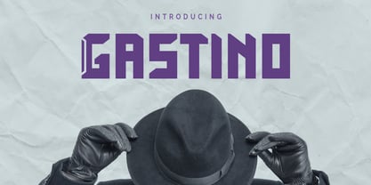 Gastino is an casual and unique display font. Gastino is designed for any project, this font is perfect for poster design, logotype design, advertising and many more.
 - Amonus by Ronin Design,
$15.00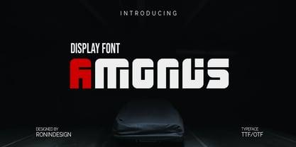 Amonus is a modern and simple display font. This font is ideal for logo design, labels, posters, or pretty much anything else that requires a unique touch.
 - AZ Harpers July by Artist of Design,
$25.00 AZ Harper's July font is inspired from original early 1900's Edward Penfield's poster art. This font is designed for use as a worn and antiqued headline.
 - Ticketbook by Suomi,
$20.00 Univers and Helvetica Compressed are most often used for movie posters, but they lack variants. Therefore I made a compressed family with seven weights for more versatility.
 - RTCO Fransworth by Roams Type Co,
$12.00 RTCO Fransworth Inspired by Vintage Horror Novel & Movies Poster Typograhphy This font is suitable for graphic designs such as logotypes, merchandise, printed stickers, and other branding needs.
 - Salvador by Homelessfonts,
$49.00 Homelessfonts is an initiative by the Arrels foundation to support, raise awareness and bring some dignity to the life of homeless people in Barcelona Spain. Each of the fonts was carefully digitized from the handwriting of different homeless people who agreed to participate in this initiative. A biography/story of each homeless person captures their story, to help raise awareness and bring some dignity to the life of homeless people. Monotype is pleased to donate all revenue from the sales of Homelessfonts to the Arrels foundation in support of their mission to provide the homeless people in Barcelona with a path to independence with accommodations, food, social and health care. Salvador was born in a small village in the province of Seville, Spain where he lived until 2002. During many years he worked in restaurants, construction, and in the fields, until he decided to go try his luck in Palma de Mallorca. There he worked in hotels and in construction, until the economic crisis erupted and he was left without work or benefits of any kind and he began to live in the street: “The street has few good things, but it teaches you to be more selfless, to share with others what you have, even if it isn’t much.” In 2006, a friend encouraged him to come along to Barcelona and bought his plane ticket. Once there, things did not go much better and he had to continue living in the street. A year ago he left behind that life and now he explains his experience in guided tours to school groups: “I like it because I see that many of them are interested and they ask questions. It is good that they learn.”
 - Hispania Script by HiH,
$10.00 Hispania Script is a distinctive and distinctly nineteenth century script. It was released by Schelter & Giesecke of Leipzig, Germany around 1890. Particularly noteworthy are the sharply-pointed legs of the upper case ‘K’ & ‘R’ that seem to be characteristic of the period. Similar strokes, often with a slight curve, may be seen in typefaces like Alt-Romanish and Tinteretto by Schelter & Giesecke, Artistic and Lateinsch by Bauer and Berthold and the poster lettering of Edward Penfield. The angle of this script (approximately 24 degrees) and the sharp delicate points must have made the manufacture of this face in metal type a challenge. The resulting type was probably quite fragile and subject to accidental damage. Additionally, the sharp points would be subject to wear. With digital type, these concerns are eliminated. As far as I know, no one has ever dropped a digital letter on the floor. Nonetheless, creating a digital outline for a typeface like Hispania Script, with many crossing strokes, can be quite time-consuming. Even with an accurate scan of a good quality original, it is usually necessary to construct each crossing stroke separately and then remove the overlap in order to obtain a sharp and convincing intersection. Steep internal angles are often defined with two points, rather than one, to minimize ink or toner fill that can muddy the rendering in smaller sizes. Like all formal scripts, Hispania Script is always useful for announcements and invitations. However, the distinctiveness of of this design strongly suggests that there are other applications that may benefit from its use. Step outside the box and try it in some unexpected places. It is the unexpected that often draws a person’s eye.
 - Bright Flicks by Nathatype,
$29.00 Bright Flicks is a delightful script font that embodies a playful and whimsical spirit. With its rounded letterforms and charming swings at the ends of some letters, this typeface adds a joyful and lively touch to your designs. The defining feature of this script lies in its rounded shape, which gives the font a friendly and approachable appearance. The letterforms flow smoothly, creating a sense of fluidity and movement. Each letter flows into the next, creating a harmonious and lively composition. The uppercase letterforms are crafted with precision and creativity, maintaining legibility while embracing the playful nature of the font. Adding to its character are the swings at the ends of select letters, adding a touch of playfulness and spontaneity. Bright Flicks captures the essence of creativity and imagination. The rounded shapes evoke a sense of warmth and friendliness, while the swings at the ends of certain letters add a touch of whimsy and fun. This font brings a sense of joy and positive energy to your designs. You can also enjoy the various features available in this font. Features: Stylistic Sets Ligatures Multilingual Supports PUA Encoded Numerals and Punctuations Bright Flicks fits in logos, branding materials, packaging, and any design project that aims to evoke a sense of cheerfulness and creativity. Whether you're working on invitations, greeting cards, posters, or any project that needs a touch of playfulness, this font will bring a vibrant and lively vibe. Find out more ways to use this font by taking a look at the font preview. Thanks for purchasing our fonts. Hopefully, you have a great time using our font. Feel free to contact us anytime for further information or when you have trouble with the font. Thanks a lot and happy designing.
 - Protipo by TypeTogether,
$35.00 Protipo helps information designers work smarter. Veronika Burian and José Scaglione’s Protipo type family is an information designer’s toolbox: a low-contrast sans of three text widths with a separate headline family, accompanied by an impressive two-weight icon set, and working with the advanced variable (VAR) font format. From annual reports and wayfinding to front page infographics and poster use, designers consistently turn to the simplicity and starkness of grotesque sans fonts to get their point across. Protipo is made for such environments. When designing information you may start with the headline, which in the case of this family is called Protipo Compact and comes in eight weights. From Hairline to Black, set it large, overlap it, or let it run off the page. Protipo Compact was made to hit hard and attract attention with a different character set and different proportions than the three text fonts. It sets the stage for what’s to come. Great information designers are aces at melding form and function, so we’ve stacked the Protipo family with Narrow, Regular, and Wide versions as a way of organising your information and directing the reader. Each width has seven distinct weights (light to bold) and italics, while maintaining the round-rect shapes of its DNA. Subtle details amplify its place in the typographic universe, like an ‘a’ and ‘e’ that go from solid to supple when italicising, an ‘f’ that gains an italic descender, two versions of the lowercase ‘r’ and ‘l’, and clipped corners on diagonals to keep the tight fit inherent to this kind of design work. Protipo is not meant to be loudmouthed, but stakes its claim through refinement, breadth, and impact. Some changes at first don’t seem substantial, but the Protipo family doesn’t handle text like most in its category. Protipo helps readers find and process data in a clear and unequivocal way and accounts for the complexity involved in rendering large amounts of information while still appealing to aesthetics. Protipo is ideal in all informative situations: apps, infographics, UI, wayfinding, transport, posters, display, and even internet memes. Add to all this the icon sets and upcoming variable font capability, and you’re assured a level of creativity, productivity, and impact on a much greater scale.
 - Motopica by Anomali Creative,
$19.99 Motopica was born when I watched a show, namely "the pickers". At that time I realized that there were still many communities or people who really loved Western culture (Cowboy), Vintage Style in the 40s - 60s era and Classic Motorbike style (Caferacer). So I intend to combine these three concepts into a single font, and Motopica was born, which brings the spirit of the three styles, namely Western Cowboy, Vintage, Beer and motorbike. Motopica can be used as a Vintage Poster, Vintage Signage, Vintage badge What's Included Motopica Reguler Motopica Italic Motopica College Motopica Bold How to install your new font This font can be used with all software that can read standard fonts. Check out my instagram for update: https://www.instagram.com/anomalikreatif/ Thanks so much for checking out my shop! All the best, Krisna
 - Wagon by Dirtyline Studio,
$25.00 Wagon a new fresh & modern serif with a strong style, a dancing baseline! So beautiful on invitations like greeting cards, branding materials, business cards, quotes, posters, and more! Wagon Display Typeface is part of a strong and modern display family. This typeface is both impressive at display sizes and easily readable in text size, while the sharp shapes of the triangular serifs and the distinctive letter shapes show their strength in logo design and impressive editorial use. Wagon comes with elegant style, strength and contrasts, with features an extended latin character set of 415 glyphs covering over 87 languages. Wagon is ready to be like a top model on the design catwalk, making your projects look classic but contemporary, finely tuned but assertive, and elegant as the best luxury fashion.
 - Coigum by Keristyper Studio,
$14.00 Coigum is a modern display font that is perfect for creating attention-grabbing headlines, titles, and logos. Its bold and fat lettering style is sure to make a statement and capture the viewer's attention. This font is ideal for projects that require a bold, strong, and impactful appearance, such as posters, advertisements, packaging, and branding materials. With its unique and modern design, Coigum is a great choice for designers who want to add a touch of boldness and energy to their projects. Featured: Standard, Uppercase & Lowercase Numeral & Punctuation Multilingual : ä ö ü Ä Ö Ü ß ¿ ¡ Alternate & Ligature PUA encoded We recommend programs that support the OpenType feature and the Glyphs panel such as Adobe applications or Corel Draw, so you can use all the variations of the glyphs. Hope you enjoy our fonts!
 - Refinest by Nathatype,
$29.00 Whether for personal or professional purposes is absolutely needed to light up your result. Ignite the potential within you and elevate all your design performance with the Refinest. Refinest is an amazing serif font. While it certainly gets the job done in terms of readability, the unique characters give this particular font a more artistic vibe but still elegant than other serifs. Features: Alternates Ligatures Swashes Numerals and Punctuations PUA Encoded It can be used for many design projects, such as poster, logo, book cover, branding, heading, printed product, merchandise, quotes, social media campaign, etc. Learn more about how to use it by seeing the font preview. Thank you for purchasing our fonts. Please don’t hesitate to contact us, if you have any further question or issues. We’re happy to help. Happy Designing.
 - Polygraph by PintassilgoPrints,
$29.00 Inspired on posters by the extraordinary polish artist Leszek Żebrowski, Polygraph is a highly unusual face. Packed with eccentric alternates, it is an all-caps font with four exchangeable variations for each letter. These alternates are programmed to cycle when the font is used in OpenType-savvy programs, creating a random effect on glyphs distribution. The resulting pieces are truly outstanding, with an audacious handmade twist. To achieve this, just turn on the contextual alternates feature and play – you can easily try different glyphs sequences by adding spaces before words. When you need a more well-behaved look, but still with a subtle hand-drawn flair, turn off the contextual alternates and set text in uppercase. Polygraph comes in two weights, for added flexibility. But be warned: it’s quite addictive!
 - Soka by Alit Design,
$12.00 Introducing Soka Typeface Soka font is inspired by a sans serif font that is retro style but still modern and unique. With a preview with a Japanese concept, the Soka font looks unique among other retro fonts. Sans Serif typefaces such as “Soka typeface” are very easy to apply to any design, especially those with an elegant and smooth concept, besides that this font is very easy to use both in design and non-design programs because everything changes and glyphs are supported by Unicode (PUA). The Soka typeface contains 522 glyphs with many unique and interesting alternative options. Plus, there's a cool sans serif font family for header and description text from thin to heavy and thin condensed to heavy condensed. In the poster preview all the letters are in the Soka typeface.
 - Ruthen Back by Java Pep,
$13.00 Ruthen Back - a Stylish Font, offering a different feel than my other fonts. A script font with a taste like signature fonts because all characters are based on the stylish signature, always catchy and elegant if you use it for personal name branding or logotype in your business. This font also looks outstanding in other projects such as greeting cards, tittle book/magazine, poster, neon light logo and etc. What's featured? - Uppercase and lowercase - numeral and punctuations - Multilingual support - PUA encoded Thanks for using this font. For other questions about this font please contact me at java.indonesian@yahoo.com. Have a nice day!
 - Grindmore by LetterStock,
$25.00 **Grindmore Font** This pair was inspired by the vintage poster design that i saw on some coffee shop, It was crafted by hand specially to add natural handmade feeling in its brand identity than i make it clean with pentool. **Opentype features** Grindmore font has 222 character set included Cricket Font is very good looking in logo, labels, t-shirt prints, product packaging, invitations, advertising and others. * Multilingual support (Western European characters). This fonts works with folowing languages: English, Danish, Dutch, Estonian, Faroese, Filipino, Finnish, French, German, Hungarian, Icelandic, Irish, Italian, Norwegian, Polish, Portuguese, Spanish, Swedish. Thank you for using this font. LS
 - Badge Robo 3d Display Graffiti by Sipanji21,
$15.00 "Badge Robo" is a 3D display graffiti font with very bold and impactful characters. Fonts like this are often used in designs where you want to create a bold, attention-grabbing, and three-dimensional text effect. This style can be seen in various design applications, including street art, posters, or any project where you want your text to stand out prominently. With "Badge Robo," you can create designs that feature powerful and visually striking typography. The bold and 3D nature of this font can make your text appear dynamic and attention-grabbing, helping your design make a strong impact.
 - Japan Gate by Senekaligrafika,
$12.00 "Japan Gate" is a Japanese-style display font inspired by traditional Japanese gate (Torii Gate) .This font is a sans serif font with a authentic japanese look and feel designed as unique as possible to create a beautiful and easy-to-read combination of sentences. This font is also very flexible for you to use in your various projects, ensuring that your project has a fantastic and appealing appearance that will be remembered by all audiences. Logotypes, food banners, branding, brochure, posters, movie titles, book titles, quotes, and more – may all benefit from this font. The owner of endless possibilities!
 - Soigka Display by Gatype,
$14.00 Soigka Display is a modern font with a unique font. This customizable font will look great on a variety of design ideas such as, inding styles, high contrast and light weight fonts perfect for feminine logo signs, fashion & editorial design heads, branding projects, Clothing Branding, packaging, magazine titles, advertisements, T -shirts, postcards, valentines, posters, invitations, weddings, branding projects, social media posts, magazines, book covers and more! This will add a fun and friendly touch to any of your projects! This font is PUA encoded which means you can access all the glyphs and sweeps easily and more.
 - Bekinder by Gatype,
$2.00 Bekinder is a modern serif font with a unique font. This customizable font will look great on a variety of design ideas such as, inding styles, high contrast and light weight fonts perfect for feminine logo signs, fashion & editorial design heads, branding projects, Clothing Branding, packaging, magazine titles, advertisements, t -shirts, postcards, valentines, posters, invitations, weddings, branding projects, social media posts, magazines, book covers and more. This will add a fun and friendly touch to any of your projects! This font is PUA encoded which means you can access all the glyphs and sweeps easily and more.
 - Brockies by Ronny Studio,
$19.00 Brockies is a sporty, strong, and elegant typeface, with a college style. Inspired by design styles that are currently popular, this is the answer to every need for ideas that you will pour in this modern era, with a thick and sturdy style in each letter as if this font has a soul in it. It excels on posters, social media, headlines, headlines, large format print - and anywhere else you want attention. Features : - Lowercase & Uppercase ( All Caps ) - numbers and punctuation - multilingual - Ligature - alternates - PUA encoded Please contact us if you have any questions. Enjoy Crafting and thanks for supporting us! :) Thank you
 - Lacoste Foliage by Gatype,
$14.00 LACOSTE Foliage is a modern serif font with a unique font. This customizable font will look great on a variety of design ideas such as, inding styles, high contrast and light weight fonts perfect for feminine logo signs, fashion & editorial design heads, branding projects, Clothing Branding, packaging, magazine titles, advertisements, T -shirts, postcards, valentines, posters, invitations, weddings, branding projects, social media posts, magazines, book covers and more ! This will add a fun and friendly touch to any of your projects! This font is PUA encoded which means you can access all the glyphs and sweeps easily and more.
 - Raphia by Twinletter,
$15.00 Raphia is a one-of-a-kind display font designed with caution in mind in order to create a font with a powerful, bold, and noticeable character for your varied creative endeavors, maximizing the impression of beauty. Not only that, but this font works well as text in sentences as well. So, what are you waiting for? Start making your creative ideas more beautiful and extraordinary right now, and don’t forget to employ this font. This font is perfect for games, sporting events, branding, banners, posters, movie titles, book titles, quotes, logotypes, and more. Start using our fonts for your amazing projects.
 - Ideal Gothic by Storm Type Foundry,
$44.00At the turn of the 20th century monolinear alphabets were often despised for their dullness. Typographers, therefore, took great pains to breathe some kind of individuality into the monotonous sans-serif scheme. They started with subtle differentiation in the thickness of vertical and horizontal strokes and finished by improving details. By this they arrived at a more decorative appearance of the type face which thus became more regardful of the eye of the bourgeoisie. Ideal Gothic is no exception. It is characterized by a correct stiffness which will improve the morals of every idea printed by this type face. The awkward curves of the italics are a little suggestive of openwork iron products or the bent iron of the decorative little railings in a Prague park. The so-called "hidden" and, furthermore, curved serifs complete the inconspicuous "charm" of this type face. All its above-mentioned features, however, suddenly turn into advantages when we need to design a magazine, a brochure or an annual report, in short whenever illustrations dominate. It is not by accident that the basic design of "Ideal Gothic" has such a light tonal value - it competes neither with fine pencil sketches, nor with sentimental landscapes. It is very suitable for business cards and corporate identity graphics. - Crox by NumidiaType,
$25.00 Crox™ is a sans-serif professional typeface inspired by crude geometry, creativity, and art. In the font family, there are 19 styles, including upright and italic, It is constructed of big lowercase letters with a maximum x-height for excellent optical reading. English letters are supported as a numerator and denominator set, this feature may aid in the creation of fractions using letters and numbers, as well as for sophisticated scripting and various scientific fractions forms. All weights support over 25 professional OpenType features within each style, with extensive coverage of western languages. These features were originally planned for personal and professional use, including multi-alternative characters in Styles: 1, 2, 4, 10, 11. Operational styles 6, 7 are enhanced with some scientific forms, to write the fit derived (SI units' expressions). Otherwise, it supports a wide range of professional factory pricing styles for business and marketing, as well as retail pricing styles in Sets 5, 8, and 9, with ligatures, old-style numerals, ordinals, swashes... Crox™ is enhanced with a poster weight like the fantastical type to fulfill your creative needs in three styles: poster, poster oblique, and poster italic for ADS and web design, branding, or product design. Glyphs: More than 970 glyphs, including those accessible with OpenType features. Powerful OpenType features: Standard Ligature, Alternate access, Automatic ordinals (English, French...), Case sensitive, localized forms, Numerator set, Denominator set, Subscript, Superscript, Swash, Stylistic alternate, Styles 1,2,3,4,5(Pricing style 1), 6(Derived Units),7(Advanced Fractions for Scientific units, Derived Units Vulgar Form), Set 8 (Pricing Style 2), Set (Pricing Style 3), Proportional Old-style, Tabular Old-style, Proportional Lining, Tabular Lining, Zero with slash, Fractions (Default, Automatic). Suitable for: logo and modern branding, web design, packaging, Product packaging, Articles, scientific document, Product user guides, multiple works in the Media, Design, ADS... Specimen Crox™ is a trademark of Yassine Abdi.
 - Divina Proportione by Intellecta Design,
$29.00 Divina Proportione is based from the original studies from Luca Pacioli. Luca Pacioli was born in 1446 or 1447 in Sansepolcro (Tuscany) where he received an abbaco education. Luca Pacioli was born in 1446 or 1447 in Sansepolcro (Tuscany) where he received an abbaco education. [This was education in the vernacular (i.e. the local tongue) rather than Latin and focused on the knowledge required of merchants.] He moved to Venice around 1464 where he continued his own education while working as a tutor to the three sons of a merchant. It was during this period that he wrote his first book -- a treatise on arithmetic for the three boys he was tutoring. Between 1472 and 1475, he became a Franciscan friar. In 1475, he started teaching in Perugia and wrote a comprehensive abbaco textbook in the vernacular for his students during 1477 and 1478. It is thought that he then started teaching university mathematics (rather than abbaco) and he did so in a number of Italian universities, including Perugia, holding the first chair in mathematics in two of them. He also continued to work as a private abbaco tutor of mathematics and was, in fact, instructed to stop teaching at this level in Sansepolcro in 1491. In 1494, his first book to be printed, Summa de arithmetica, geometria, proportioni et proportionalita, was published in Venice. In 1497, he accepted an invitation from Lodovico Sforza ("Il Moro") to work in Milan. There he met, collaborated with, lived with, and taught mathematics to Leonardo da Vinci. In 1499, Pacioli and Leonardo were forced to flee Milan when Louis XII of France seized the city and drove their patron out. Their paths appear to have finally separated around 1506. Pacioli died aged 70 in 1517, most likely in Sansepolcro where it is thought he had spent much of his final years. De divina proportione (written in Milan in 1496–98, published in Venice in 1509). Two versions of the original manuscript are extant, one in the Biblioteca Ambrosiana in Milan, the other in the Bibliothèque Publique et Universitaire in Geneva. The subject was mathematical and artistic proportion, especially the mathematics of the golden ratio and its application in architecture. Leonardo da Vinci drew the illustrations of the regular solids in De divina proportione while he lived with and took mathematics lessons from Pacioli. Leonardo's drawings are probably the first illustrations of skeletonic solids, an easy distinction between front and back. The work also discusses the use of perspective by painters such as Piero della Francesca, Melozzo da Forlì, and Marco Palmezzano. As a side note, the "M" logo used by the Metropolitan Museum of Art in New York City is taken from De divina proportione. “ The Ancients, having taken into consideration the rigorous construction of the human body, elaborated all their works, as especially their holy temples, according to these proportions; for they found here the two principal figures without which no project is possible: the perfection of the circle, the principle of all regular bodies, and the equilateral square. ” —De divina proportione
 - Hebrew Sevilha Tanach by Samtype,
$149.00 This is Classic Hebrew Sefardi Font. This is a beautiful typeface to invitations, posters, cover books and small texts. All diacritic marks for vocalization are present (Nikud), including shevana, kamats katan, cholam chaser and dagesh hazak.
 - Hebrew Sevilha Std by Samtype,
$49.00 This is Classic Hebrew Sefardi Font. This is a beautiful typeface to invitations, posters, cover books and small texts. All diacritic marks for vocalization are present (Nikud), including shevana, kamats katan, cholam chaser and dagesh hazak.
