10,000 search results
(0.056 seconds)
- Grand Wilson by Letterhend,
$17.00 Introducing, Grand Wilson, a pair of font that brings the modern and casual feel in the same time. The Bold sans combined with the natural hand writing script are the perfect match for you who needs a typeface for headline, logotype, apparel, invitation, branding, packaging, advertising etc. Features : 2 fonts (bold sans and script font) uppercase & lowercase numbers and punctuation multilingual alternates & ligatures PUA encoded We highly recommend using a program that supports OpenType features and Glyphs panels like many of Adobe apps and Corel Draw, so you can see and access all Glyph variations.
 - Selectric Melt by Indian Summer Studio,
$45.00 A classical 20-th century's (1900s to 1980s) typewriter font for both text and large display usage, titles, signage... A new thicker version of Selectric (2016), as if typed using not a thin carbon ribbon but a coarse fabric one. Both are available on a different models of Selectrics. Made after rare enough samples of the same style used during 1980s in the USSR. Based on the actual letter proportions of the original typewriter Selectric (2016) (Cyrillic ball). This time not monospaced as before, but proportional. The single known so far previous typewriter vector typeface with this 'ink blotting' effect (similarly expanded serifs) as in Dodo (2008) is ITC American Typewriter (1974; by Joel Kaden and Tony Stan) and all its hand drawn analogs from 1980s (and perhaps before). Which, in turn, is resembling ATF Bulletin Typewriter's (1925, 1933; by Morris Fuller Benton) overall proportions, geometry, and even had some natural ink expands in its paper sample (but not by design, as I see it).
 - Magnite by Tom Chalky,
$12.00 Introducing Magnite - an expressive, handwritten brush font jam-packed with character and authentic charm. Designed to be versatile, Magnite is perfect for branding projects, editorial work, invitation design, product packaging, and everything in between. The original handcrafted font family containing uppercase and lowercase glyphs alongside a large range of punctuation, symbols, numerals, and multilingual support. Also included in this font are discretionary ligature swashes (activated by typing in 1--, 2--, etc, as illustrated in the above presentation). 'Magnite Alt' contains a whole new range of lowercase and uppercase letters. By using this font in combination with the original you can improve the overall authenticity.
 - Art Lesson JNL by Jeff Levine,
$29.00The hand-lettered title of a vintage Walter Foster "how to draw" book inspired the Deco-influenced alphabet of Art Lesson JNL. Bold and retro in nature, this typeface gets the message across in a straightforward way, yet still has a bit of a casual feel to it. - Milionaria by 3Wprotype,
$10.00 Introducing the Milionaria font, which is used for the needs of designers who are looking for characters such as signature writing which is used for logo designs, branding, invitation cards, business cards and so on. This font is inspired by the natural but elegant handwriting style of characters.
 - Formal Dance JNL by Jeff Levine,
$29.00 A vintage Canadian-published music book circa the 1940s had the title "Strauss Waltzes" hand lettered in a bold Art Deco sans serif that featured block style letters with rounded corners. This was the working model for Formal Dance JNL, which is available in both regular and oblique versions.
 - Croz by Cititype,
$17.00 Croz Script is a raw and organic script typeface. Its cool appereance is carefully handcrafted to straight away grab the attention of the viewers. the shapes give this font a modern, chic, fun, funky vibe. Suitable if use for logos, posters, craft project, portfolio, headlines, brandings, apparel, etc.
 - Eckhardt Embellishments JNL by Jeff Levine,
$29.00Eckhardt Embellishments JNL collects a number of vintage pointing hands, ribbons, panels and embellishments from an early 1900s sign painter's manual and misc. type sources. This font is a continuation of the series named in honor of the late Albert Eckhardt, Jr. - a Miami area sign painter and close friend of type designer Jeff Levine. - Caligor by Letterhend,
$14.00 Caligor is a Display Typeface Family which is suitable for you who needs a typeface for headline, logotype, apparel, invitation, branding, packaging, advertising etc. This typeface is comes in uppercase, lowercase, punctuations, symbols & numerals, stylistic set alternate, ligatures, etc also support multilingual and already PUA encoded. this font come in 3 versions, regular, edge, and stamp. the regular with clean and neat look of the font, edge version is look like a little bit of the normal version with rough edge, and stamp version that gives an aged feel on it.
 - Delighted Atmosphere by Java Pep,
$15.00 Proudly present a pretty bouncy font called Delighted. As the name suggests, this font will make your project more enjoyable because it will make your project more beautiful and stand out. Delighted font comes with several alternates, so you can switch on for the alternate, stylistic alternate, and terminal form. This font is perfect for logo font, branding, greeting cards, cut files for quotes, silhouette font design, monogram font, etc. The packages and features Delighted font PUA encoded Multilingual support in more than 30 languages Thanks, and have a nice day
 - Neue Plak Variable by Monotype,
$344.99A little-known design by Futura designer Paul Renner gets a long overdue update by Linda Hintz and Toshi Omagari, in this reliable and impactful industrial sans serif. Neue Plak offers more weights and widths than the original 1928 design, extending its use for branding, editorial, logos and UIs. The pair based their updated and extended version on the original Plak wood type, uncovering lost details and incorporating them as alternates – including the choice between open or strikethrough counters. Neue Plak's outwardly stubborn personality is counteracted by unexpected details, which make for an unusual juxtaposition of severe and playful. “It felt like we should pay Paul Renner more tribute,” says Hintz, who spent time researching the typeface in Hamburg's Museum der Arbeit. “The forms themselves are partly quirky, partly really fun, but with a German stiffness that makes for a strange mix.” Neue Plak offers 60 weights, including a new text version that pairs well with the display weights, and allows the design to function in print and digital environments, and for a wide range of uses. Neue Plak Text Variables are font files which are featuring one axis and have a preset instance from Thin to Black. - Trippy Hippie JNL by Jeff Levine,
$29.00 Don’t let the name “Trippy Hippie JNL” fool you. Although the type design fits well with the 1960s-70s hippie movement and the “love generation”, the design is actually straight out of a page from a vintage German lettering textbook entitled “50 Alphabete fur Technikur und Fachschulen” (loosely translated to “50 Alphabets for Technicians and Specialized Schools”). The novelty, free form shapes and stroke weights of this hand lettered alphabet fits well in creating 1920s period pieces or for designing a retro-inspired rock and roll concert poster. Trippy Hippie JNL is available in both regular and oblique versions.
 - ArchiType by Archiness,
$10.00 With the famous and much used Eurostile and Bank Gothic in my mind I wanted to design a mono-line font as simple and legible as possible. A square with rounded corners, i.e., the letter ‘o’ as its basis. From there on back to basics, so straights remained simple straights with 90° endings, whatever the angle. Numbers are monospaced. The result seems to be a pleasantly balanced and neutral font. Excellent for display purposes and surprisingly legible in even small sizes. This perhaps typical approach by an architect led to the name of the font: ArchiType.
 - Hawkes by Kimmy Design,
$15.00 Hawkes is an extensive handmade typeface family that comes with a bundle of weights, widths and styles, all designed to work cohesively. Here is a breakdown of the Hawkes family. Hawkes Sans: The primary subfamily is a sans-serif typeface that includes nine fonts: three weights (light, medium and bold) and three widths (narrow, regular and wide). Within this set are an array of stylistic features; including small capitals, character style alternatives, discretionary ligatures and contextual alternatives. See details below for more information on OpenType Features. Hawkes Variable Width Sans: The secondary subfamily is the same base sans-serif fonts but combined in variating widths. Essentially, it takes all three widths of each weight and randomly mixes them together. This creates a funky and creative alternative to the more traditional sans-serif set. The variations are for the uppercase, lowercase, small capitals, ligatures and numbers. Hawkes Script: The last subfamily is the script typeface. It’s a quirky script with variations of its own, including ligatures, swashes and contextual alternatives (again, see below for further details.) The script font works great as a complimentary style to the sans-serif, or on it’s own. FEATURES Alright, let’s get into all the extra goodies this typeface has to offer. Small Capitals: Small caps are short capital letters designed to blend with lowercase text. These aren’t just capital letters just scaled down but designed to fit with the weight of both the lowercase and capitals. With Hawkes, small caps can either sit on the baseline (in line with the base of the capital and lowercase) or to be lifted to match the height of the capital letters by applying the discretionary ligature setting in the OpenType panel. These small capitals have a dot underlining them that sit along the baseline. The feature offers a unique display affect that is great for logos, titles and other headline needs. Discretionary Ligatures: A discretionary ligature is more decorative and unique combination than a standard ligature and can be applied at the users discretion (as the name indicates.) The specific styling for these ligatures varies for different fonts. With Hawkes, they are used as an all capital styling feature, or to lift the small capitals to align with the height of the capitals. In the former setting, both lowercase and uppercase letters are first changed to all capitals, then a specialized set of letter combinations are transitioned so small characters are positioned within a main capital letter. These combinations only happen with main characters that include an applicable stem, such as C F K L R T Y. Some of these combinations include two or three characters. When Small Caps is turned ‘on’, this feature will lift the small caps to the height of the capital letter. For more information, please check out the user guide! Stylistic Alternatives: Stylistic alternates are a secondary form of a character, often used to enhance the look or style of a font. For Hawkes, these alternatives provide a slightly more handmade feel. A - the capital and small capital A will lose its pointed apex and become rounded. Think of it more as an upside-down U than an up-side-down V ;-) Oo, G, Ss, Cc- these characters’ topmost terminal becomes a loop. The O is applied automatically, the G S and C need to be turn on individually. Titling Alternatives: This feature does sort of the opposite of what it intends. Instead of being used for titling purposes, this feature makes the text look better in paragraph text settings. Kk Rr h n m - curved terminals on the are straightened e - the counter stroke also gets straightened from a more looping motion y - the shape of y is changed from a rounded character to a sharper apex (think more like a ‘v’ than ‘u’) Contextual Alternatives: Contextual alternates are glyphs designed to work within context of other adjacent glyphs. With Hawkes Sans, there are three slightly different variations per character. The feature rotates the application of each variation. This helps with organic authenticity, so if you have two e’s next to each other, they won’t look identical (reflecting the natural variations in handwriting and lettering.) With Hawkes Variable width fonts, I have created a contextual pattern that randomizes the widths of each character. So, when the feature is turned ‘on’ in the OpenType panel, the widths would alternate in a pattern such as: Narrow, Wide, Regular, Narrow, Regular Wide, Narrow, etc. It happens automatically so the user doesn’t have to think or worry about getting a random seed. With Hawkes Script, contextual alternates allow strokes to connect properly from one character to the next while maintaining a believable, natural flow. Connecting strokes are present for two letters next to each other but are replaced by a shorter stroke when located at the end of a word or sentence. Some characters have in-strokes when located at the start of a word. When a character is preceded by a capital letter that doesn’t connect, it too needs an in-stroke or altered spacing. This feature is complicated and messy, but luckily you don’t really have to think about it! I’ve done all the coding so all you have to do is turn ‘on’ the feature in the OpenType panel and you are off to the races! I’m just letting you know what’s happening behind the scenes. Swashes: These are just for Hawkes Script and provide tail swashes to the start and ends of letters. There are three different options. You can pick the basic option by turning ‘on’ the swash feature in the OpenType panel, or you can pick using the Glyph panel. Stylistic Sets: This feature work in new versions of Illustrator CC and InDesign CC. You can pick specific styling sets instead of turning on an entire feature. For example, let’s say you want to have a loopy S, but not a loopy C or O, you can just turn on the S in the Style Set. It also helps create the little drop box that pops up when you hover over a character, showing you the alternates associated with that character. This makes it easy to pick and choose specific styles you want in a word or headline. ---------- And there it is folks! That’s all the basic info on Hawkes, I know it’s been a lot and I appreciate you hanging on. If you are like me and need more of a visual reference to accessing all these goodies, I’ve made a user guide to help navigate Hawkes and everything it has to offer. Altogether this extensive family boasts 14 total fonts in a wide array of styles, weights and widths, making it a great addition to any handmade type collection. Enjoy!
 - Yumo by Thinkdust,
$10.00 Yumo is a new, textured remix of the original 2010 Yume typeface, and has plenty to offer of its own. Angular and blocky, this typeface creates impactful text with a hint of playfulness, expanded upon by its rough finish. There are no extraneous edges to this font because most of them have been subsumed into the characters themselves, so any sharpness it may have from the squared corners is removed by the lack of thin strokes or serifs. Perfect for headlines and large text that wants to stand out, Yumo’s big, bold text will help your message make an impact. Playing with colours on the textured surface only helps to strengthen this effect, so that Yumo will blow people away, whatever you want to say.
 - Posh Soiree NF by Nick's Fonts,
$10.00The American Type Founders 1923 Specimen Book and Catalogue called the inspiration for this typeface Engravers Text; it could easily be called elegant, enchanting and erudite, as well. The inline version of this font includes the complete 1252 Latin and 1250 Central European character sets; the Solid version includes the Turkish 1254 set in addition. - Kidszania by Nirmalagraphics,
$14.00 I'm Andrea, creator at Nirmalagraphics and I want to present my latest font called "Kidszania". I took the name from a children's playground filled with writings posted on the wall. I found a child's writing style that is funny, looks clean and natural. I tried a rough sketch of a font that resembled the writing of the child, then I modified it to become the "Kidszania" font. This font can be used for any needs, especially children-themed designs.
 - Maribor by Dima Pole,
$30.00 Maribor is a slab serif font with nice shapes, they are both soft and angular. It is perceived calmly and with a twist. Maribor means "Mara`s pinery". The energy of the Universe, reflecting the modification, renewal and change for the better is called Mara; Ancient wise ancestors called it so. Today it is known as the goddess Mara in the Vedic worldview of the Slavic-Aryan peoples. Maribor is a multilingual font, it contains characters for 104 Latin languages and all Slavic, including all capitals for them. There are all major currency signs, including the ruble and the Euro. Many OpenType features allow you to make a variety of compositions; as well as to see the font from the new side thanks to the stylistic sets for the Slavic alphabets.
 - Linotype Paint It by Linotype,
$29.99Jochen Schuss designed Linotype Paint It in 1997 with exclusively capital letters and in two weights. The best way to describe the weight Paint It might be to compare it with a labyrinth in which the figures only become clear to the reader dedicated to finding them. The second weight, Paint It black, is almost the solution to this puzzle. The characters are black and stand out strikingly from the background. Linotype Paint It is particularly good for headlines in large point sizes or wherever a text should display a playful character. - Aylea by Lafitte 58,
$16.00 Aylea a modern and relaxed display font. It embodies playfulness and authenticity and is the perfect choice for any children activity, school project, Christmas, New Year, Birthday and many more. Add this playful font to your designs and notice how it makes them come alive!
 - Monotype Goudy by Monotype,
$40.99Over the course of 50 years, the charismatic and enterprising Frederic W. Goudy designed more than 100 typefaces; he was the American master of type design in the first half of the twentieth century. Goudy Old Style, designed for American Type Founders in 1915-1916, is the best known of his designs, and forms the basis for a large family of variants. Goudy said he was initially inspired by the cap lettering on a Renaissance painting, but most of the flavor of this design reflects Goudy's own individualistic style. Recognizable Goudy-isms include the upward pointing ear of the g, the diamond-shaped dots over the i and j, and the roundish upward swelling of the horizontal strokes at the base of the E and L. The italic was completed by Goudy in 1918, and is notable for its minimal slope. Goudy Bold (1916-1919) and Goudy Extra Bold (1927) were drawn not by Goudy, but by Morris Fuller Benton, who was ATF's skillful in-house designer. Goudy Catalogue was drawn by Benton in 1919-1921 and was meant to be a medium weight of Goudy Old Style. Goudy Heavyface was designed by Goudy for Monotype in 1925, and was intended to be a rival to the successful Cooper Black. Goudy Modern was designed by Goudy in 1918; its small x-height, tall ascenders and shorter caps impart a spacious and elegant feeling. Benton designed Goudy Handtooled, the shaded version that has just a hairline of white through its bold strokes. The Goudy faces, especially the bolder weights, have long been popular for display and advertising design. They continue to pop up all over the world, and still look reassuring to our modern eyes." - Goudy Ornate MT by Monotype,
$29.99Over the course of 50 years, the charismatic and enterprising Frederic W. Goudy designed more than 100 typefaces; he was the American master of type design in the first half of the twentieth century. Goudy Old Style, designed for American Type Founders in 1915-1916, is the best known of his designs, and forms the basis for a large family of variants. Goudy said he was initially inspired by the cap lettering on a Renaissance painting, but most of the flavor of this design reflects Goudy's own individualistic style. Recognizable Goudy-isms include the upward pointing ear of the g, the diamond-shaped dots over the i and j, and the roundish upward swelling of the horizontal strokes at the base of the E and L. The italic was completed by Goudy in 1918, and is notable for its minimal slope. Goudy Bold (1916-1919) and Goudy Extra Bold (1927) were drawn not by Goudy, but by Morris Fuller Benton, who was ATF's skillful in-house designer. Goudy Catalogue was drawn by Benton in 1919-1921 and was meant to be a medium weight of Goudy Old Style. Goudy Heavyface was designed by Goudy for Monotype in 1925, and was intended to be a rival to the successful Cooper Black. Goudy Modern was designed by Goudy in 1918; its small x-height, tall ascenders and shorter caps impart a spacious and elegant feeling. Benton designed Goudy Handtooled, the shaded version that has just a hairline of white through its bold strokes. The Goudy faces, especially the bolder weights, have long been popular for display and advertising design. They continue to pop up all over the world, and still look reassuring to our modern eyes." - Goudy Handtooled by Monotype,
$40.99Over the course of 50 years, the charismatic and enterprising Frederic W. Goudy designed more than 100 typefaces; he was the American master of type design in the first half of the twentieth century. Goudy Old Style, designed for American Type Founders in 1915-1916, is the best known of his designs, and forms the basis for a large family of variants. Goudy said he was initially inspired by the cap lettering on a Renaissance painting, but most of the flavor of this design reflects Goudy's own individualistic style. Recognizable Goudy-isms include the upward pointing ear of the g, the diamond-shaped dots over the i and j, and the roundish upward swelling of the horizontal strokes at the base of the E and L. The italic was completed by Goudy in 1918, and is notable for its minimal slope. Goudy Bold (1916-1919) and Goudy Extra Bold (1927) were drawn not by Goudy, but by Morris Fuller Benton, who was ATF's skillful in-house designer. Goudy Catalogue was drawn by Benton in 1919-1921 and was meant to be a medium weight of Goudy Old Style. Goudy Heavyface was designed by Goudy for Monotype in 1925, and was intended to be a rival to the successful Cooper Black. Goudy Modern was designed by Goudy in 1918; its small x-height, tall ascenders and shorter caps impart a spacious and elegant feeling. Benton designed Goudy Handtooled, the shaded version that has just a hairline of white through its bold strokes. The Goudy faces, especially the bolder weights, have long been popular for display and advertising design. They continue to pop up all over the world, and still look reassuring to our modern eyes." - Goudy by Linotype,
$39.00Over the course of 50 years, the charismatic and enterprising Frederic W. Goudy designed more than 100 typefaces; he was the American master of type design in the first half of the twentieth century. Goudy Old Style, designed for American Type Founders in 1915-1916, is the best known of his designs, and forms the basis for a large family of variants. Goudy said he was initially inspired by the cap lettering on a Renaissance painting, but most of the flavor of this design reflects Goudy's own individualistic style. Recognizable Goudy-isms include the upward pointing ear of the g, the diamond-shaped dots over the i and j, and the roundish upward swelling of the horizontal strokes at the base of the E and L. The italic was completed by Goudy in 1918, and is notable for its minimal slope. Goudy Bold (1916-1919) and Goudy Extra Bold (1927) were drawn not by Goudy, but by Morris Fuller Benton, who was ATF's skillful in-house designer. Goudy Catalogue was drawn by Benton in 1919-1921 and was meant to be a medium weight of Goudy Old Style. Goudy Heavyface was designed by Goudy for Monotype in 1925, and was intended to be a rival to the successful Cooper Black. Goudy Modern was designed by Goudy in 1918; its small x-height, tall ascenders and shorter caps impart a spacious and elegant feeling. Benton designed Goudy Handtooled, the shaded version that has just a hairline of white through its bold strokes. The Goudy faces, especially the bolder weights, have long been popular for display and advertising design. They continue to pop up all over the world, and still look reassuring to our modern eyes." - Kidy Smile by Illushvara,
$12.00 Kidy Smile is a cute handwritten font. It embodies playfulness and authenticity and is the perfect choice for any children activity or school project. Add this chunky lettered font to your designs and notice how it makes them come alive!
 - Sigmatone by Keristyper Studio,
$12.00 Introduce Sigmatone Inspired by old skool graffiti tagging, and street art, we created this Typeface, drawn in Procreate app, then vectorized and crafted carefully. This font is good for logo design, Social media, Movie Titles, Books Titles, short text even long text letters, and good for your secondary text font with sans or serif. Featured: Standard Uppercase & Lowercase Numeral & Punctuation Multilingual : ä ö ü Ä Ö Ü ß ¿ ¡ Alternate & Ligature PUA encoded We recommend programs that support the OpenType feature and the Glyphs panel such as Adobe applications or Corel Draw. so you can use all the variations of the glyphs. Hope you enjoy our fonts!
 - Notes from Paris by PeachCreme,
$18.00 "Notes from Paris" will make your letters look très chic while still maintaining its functionality with easy-to-read letterforms. Furthermore, the comforting vibe of this font brings a touch of relaxation to your typography. The words flow with ease and grace, like a gentle breeze on a summer day in the city of love. So, whether you're crafting a logo design or wedding invite, "Notes from Paris" is a font that you must have for a chic and legible typographic journey. With 59 Opentype ligatures, this font blurs the line between script and handwriting, allowing for a seamless transition between letters and creating a truly genuine sensation.
 - Duesenberg NF by Nick's Fonts,
$10.00The 1930s produced many distinctive and stylish autos. One was the Auburn, and this typeface was suggested by a period poster for the make. Another fine car of the time gives the font its name, because “it’s a Duesie!” Both versions of this font contain the Unicode 1252 Latin and Unicode 1250 Central European character sets, with localization for Romanian and Moldovan. - Ark Monogram SG by Spiece Graphics,
$39.00 Ark is a combination monogram set based on the ATF Virkotype design. By combining variously shaped characters, you can produce initials within an oval frame. Just select a left-hand letter, a center letter, and a right-hand letter. Then place all three on an oval frame of your choice. Great for stationery and company logos. The Ark Monogram Set comes with easy-to-read instructions and a useful character map. Additional alternate characters have been provided for better identification and letter fitting within each font. Ark Monogram is now available in the OpenType Std format. Some new stylistic alternates have been added to this OpenType version. Advanced features work in current versions of Adobe Creative Suite InDesign, Creative Suite Illustrator, and Quark XPress. Check for OpenType advanced feature support in other applications as it gradually becomes available with upgrades.
 - Love Birds Pattern by PintassilgoPrints,
$24.90 Love Birds Pattern is a picture font consisting of pattern tiles and illustrations. It is the sister font of Love Birds , which contains a handful of charming birds silhouettes. With 37 unique tiles (corresponding to lowercase & numbers) and 26 single illustrations (corresponding to uppercase), this font makes it easy to create awesome patterns – even in the simplest text editors. Just be sure to set the line spacing value the same as the font size, with no spaces between paragraphs. And keep singing!
 - Slantblaze Pro by Campotype,
$25.00 We Redesigned this Slantblaze-Pro. Slantblaze Pro is an exteme slanted display script with characteristics: Simple, Thick, Contrast, and Dynamic. First launched in 2011, and now we present it again in a new version to provide the best user experience. As italics (default), Slantblaze Pro has aloof challenge as a display font. It was designed as an alternative for headline, title in any purpose such as header, brands, packaging, identity, automotive logo, etc. What’s new and changed: This version 2.02 comes in a True Type OT-flavor version. The outline were designed to be smoother than before. Redesign of ‘C’, ‘E’, ‘F’, ‘G’, ‘T’, and some changes to all other smallcases Removed: question.sc, questiondown.sc, exclam.sc and exclamdown.sc assuming they will never be used Rewrite the features structure and adding some new related to all changes New swashed glyphs: A-Z The writing system of numbers is completed with the old-style version and each tabular and proportional method New contextual (calt) to an alternative look of “A" when combined with all lowercase. Also in this feature we have another way to access Ornaments is more interactive by combining dlig and calt features. Another new glyph may be access only in feature (salt)
 - Carina Elegant by suhadidesign,
$19.00 Carina elegant classy font Hi ladies and gentlemen! Due to the popularity of the market for modern fonts, I created a serif font that suits your needs. The Carina elegant font is a modern classy elegant serif font. is here to become a market favorite. We made this font look elegant, classy, modern, new style, easy to read, stylish, attractive and easy to use. Carina elegant Font is the right choice for magazine designs, newspapers, fashion, classy designs, beauty, feminine, brand names, branding and other projects. The Carina elegant font is here to enhance the quality of your designs. Follow us for the next classy font creation :) Feature: • Uppercase • Lowercase • Multilingual Support • Numbers and punctuation • Alternatives • Stylistic sets • Ligatures What's included: Carina elegant (OpenType)
 - Polyspring by PintassilgoPrints,
$29.00 Polyspring is a handcrafted serif display font, with a cool flowery flair. It was hand-drawn based on Italia Condensed typeface from Keystone Foundry from circa 1906. Loaded with stylish ornaments and flourishing alternates for all its letters and numbers, this font is a terrific toolbox for display purposes. Yet, it has the superpower of changing the first and last letters in words to its germinated alternates at the click of a button, thanks to the smart OpenType programming. Please note that this feature will only work in OpenType savvy applications. Check it performing live on the sample text below: just click on the Advanced Typography option, located next to the sample colors options (look for an icon showing “ff”), and check the option “swash”. Very cool, isn't it? Happy blooming!
 - Nauka by Slide Shoot,
$12.00 Nauka Serif is a an elegant and smooth combine typeface regular and italic serif font. He has a beautiful character. It fits perfectly with invitation card designs, company logos, movie titles, movie names, business cards, book titles, brand names and various other designs. Nauka Serif is a subtle serif font that exudes sophistication and elegance. Its stylish alternations and ligatures make this font the perfect partner for any project.
 - Filora by Slide Shoot,
$12.00 Filora Serif is a an elegant and smooth combine typeface regular and italic serif font. He has a beautiful character. It fits perfectly with invitation card designs, company logos, movie titles, movie names, business cards, book titles, brand names and various other designs. Filora Serif is a subtle serif font that exudes sophistication and elegance. Its stylish alternations and ligatures make this font the perfect partner for any project.
 - Jack History by Ditatype,
$29.00 Jack History is a unique, amazing font inspired by creative, experimental handwritings of which letters are always connected to each other to create surprising, dynamic flows, and adopt unconventional proportions and variations. Some of the letters may actually seem bigger or smaller than the others in free moving and curvy lines to express bravery and freedom nuances of the font. Differences in proportions and letter style changes of the font have become the design’s integral parts. Despite the absence of strict rules, creativity and courage to combine the connected letters in a unique way is all that matters because this script font offers extraordinary attractiveness and uniqueness in all designs. Furthermore, the connected letter flows in various proportions reflect some explorations and innovations in the handwritings. You may then apply this font for big text sizes for a legibility reason and enjoy the available features here. Features: Alternates Ligatures Multilingual Supports PUA Encoded Numerals and Punctuations Jack History fits best for any design projects requiring artistic, elegant displays such as wedding invitations, greeting cards, merchandise designs, and more. For such artistic and elegant displays, this script font is also applicable for logo designs, posters, and packaging. Find out more ways to use this font by taking a look at the font preview. Thanks for purchasing our fonts. Hopefully, you have a great time using our font. Feel free to contact us anytime for further information or when you have trouble with the font. Thanks a lot and happy designing.
 - Torges by Fitrah Type,
$14.00 Torges is the newest typeface with a marker style. The entire typography has been designed to work on large sizes. This font ideal for designing merchandise, social media, marketing posts, product packaging & branding projects. Torges supports uppercase, lowercase, numerals and punctuation.
 - Love seed by Aestherica Studio,
$12.00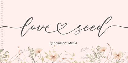 Love Seed is perfect for product packaging, branding project, magazines, social media, weddings, or just used to express words above the background. This font is PUA encoded, which means you can access all of the glyphs and swashes with ease!
 - French Film JNL by Jeff Levine,
$29.00 Hand lettering found in the September, 1936 issue of the French film publication “La Cinématographie Française” is rendered in a lovely Art Nouveau serif type style. This is now available digitally as French Film JNL, in both regular and oblique versions.
 - Churchward Brush by BluHead Studio,
$20.00 BluHead Studio LLC is pleased to announce the release of Churchward Brush by New Zealand typeface designer Joseph Churchward. This showcard brush hand-lettered design looks great for flashy headlines and signage! The Italic is especially fun to work with!