10,000 search results
(0.826 seconds)
- Sol Pro by Canada Type,
$29.95 Based on the classic Sol design by Marty Goldstein and C.B. Smith, published by VGC in 1973, Sol Pro goes above and beyond the call of revival/retooling to include plenty of optical improvements to the original design, more weights, italics, small caps, biform shapes, alternates, and extended language support. This particular design is one of the more prominent forefathers and strong influencers of the soft, streamlined aesthetic that has been going strong in branding and geometric design for more than 40 years now. It cuts all links to melancholy and classic empire shapes, and introduces smooth contrast modulation that communicates sleek, adaptable youth, confidence, knowledge, and modern hi-tech presence. This is not your grandfather's Eurostile. This is your offspring's global hope, optimism, and total awareness. Sol Pro's extended character set and range of weights and widths makes it quite suitable for applications of all sizes, from small collateral to product branding and massive marketing campaigns. The Sol Pro complete family comes in 20 fonts, each containing over 520 characters. Available in single fonts or value-maximizing packages.
 - Ringo by typoland,
$9.00 Whassup y’all! Me and my bros got this li’l gang together: we is Ringo, and we got da bling, yo! We is da typeface family for ya all! We got some real sweet stuff for ya, some nice characters. We got all ’em OpenType features like fractions and proportional figgers, we even got da cubic root, man! And check out da question mark, man, is real sweet. And the ampersand, yeah! I luv ’em ampersands. Now my brothers over here got some light action for ya, and they got some real bold action for ya. We got some nice foxy curves goin’ on, some nice tension, and some nice relaxation. My bro Light over here is kind of like the subtle guy, ya know. He’s in for the female fans, ya know. Heh! Hell, yeah! And man, we speak like 84 languages: we speak the German, and the French, and the Spanish, and we speak the Polish, and the Czech, and the Hungarian, and we even speak Shambala and Swahili and Rundi, and we got some Esperanto thing as well for ya. And check out my bro Black right over here, he’s like the action superhero, man! He’s got impact, man! Yeah yeah, but you know, my bros Regular and Bold are the real deal. Them is like da word of da street, man! Like da word of you, and you. And we got a message for y’all: life is hard, life is real, but you should work your mojo, be smooth, be nice, chill. We got all them kerning pairs, and all them weights, and we got ’em alternate letters. So check us out, yo!
 - Busther by Putracetol,
$12.00 Introducing Busther - A Hand Brush Typeface. This font was made from my original handwriting, using a brush pen then making it digital. You can create stunning and natural hand lettering quickly and easily. You can use this font for making an awesome lettering, apparel projects, signature, album cover, logo, branding, magazine, social media, & advertisements, but Busther also works great for other projects.
 - Levato by Linotype,
$29.99 Levato, the first font designed by Felix Bonge, is an Antiqua that is full of character and is refined but by no means sterile. This typeface provides for a wide range of options for creating individual designs. It was not really Felix Bonge's intention to create a whole font family when, as a second year student, he began several exercises in contrast and proportion as part of the typeface design course of Professor Veljovi? at Hamburg University of Applied Sciences. However, these initial studies developed into a project that Bonge persisted with over the following years while working towards his degree. He continually had new insights and ideas that he was able to exploit for his font. Of particular importance, he claims, was a calligraphy seminar, which prompted him to completely rework his concept. It took him several years before his extensive font Levato™ was ready. Although the forms of Levato are ultimately derived from Renaissance Antiqua, Bonge has slightly increased the relative contrast in his version. This gives the font a graceful appearance that is further emphasized by the reduced x-height and the associated prominence of the ascenders. And, in addition, the relatively fine serifs, which are almost linear at their ends, infuse Levato with a hint of classical Antiqua á la Bodoni. At the same time, Bonge cleverly compensates for the sterilising tendency of this font form. Soft and rounded serif attachments and rounded line apexes offset the severe nature of the font and provide it with an aura of vivacity. This effect is promoted by the calligraphic-like foot of the lowercase h, n and m and the not quite horizontal bars of the uppercase E and F. Overall, Bonge has succeeded in creating a refined and yet very dynamic typeface. Levato is available in five weights; Light, Regular, Medium, Bold and Black, in each case with the corresponding italic versions. Bonge treats Levato Italic as a genuine cursive typeface. Its letters are thus slightly narrower than the analogous upright letters and their forms are considerably more curvilinear. All the versions of Levato boast an enormous range of characters to meet all possible requirements. In addition to four sets of minuscule and majuscule numerals for tabular and proportional typesetting, there are also small caps, numerous ligatures, ornamental characters and even swash variants of letters. With their generous, sweeping curves, the swash variants (available as OpenType versions) can be used for striking titling effects or as initials.
 - Sharland by Heinzel Std,
$13.00 Sharland is a beautiful and refined script font. It has a classy, elegant, and modern look that can be used for logos, branding, invitations, stationery, wedding designs, social media posts, and much more! This font is PUA encoded which means you can access all of the amazing glyphs and ligatures with ease! Fall in love with this font and bring your projects to the highest levels!
 - Monthstage by ahweproject,
$10.00 Monthstage is a Vintage retro font inspired by retro typography and lettering in the 70s and 80s combined with a bold typography style. This font is perfect for vintage and retro designs, badges, logos, t-shirts, posters, branding, packaging, signage, book covers, and so much more! This font is PUA encoded, which means you can access all of the glyphs and swashes with ease!
 - Lanoline Script by Letterhend,
$16.00 Please meet Lanoline, a playful script typeface. As you can see, this typeface has a casual look yet still looks bold and stands out from the crowd. The swashes make the font looks even more unique. You can play around and mix and match the swashes, combining into a great logotype! Lanoline works perfect for you who needs a typeface for headline, logotype, apparel, invitation, branding, packaging, advertising and more. This typeface comes in uppercase, lowercase, with punctuation, symbols, numerals, stylistic set alternate, ligatures, and also support multilingual.
 - Sola by Khaito Gengo,
$25.00 Sola is a simplistic, stylish, and modern san serif type font with the unique addition of rounded corners. When creating this font, Bank Gothic originally influenced me, however when I made the square shapes lower case the font didn't retain its sophistication, so it was designed narrower. The result is this warm and soft looking font that works for all types of design, from posters and fliers to logos and business cards. Sola also features standard ligature, stylistic alternates, titling characters with extended width, and a set of standard pictograms.
 - FebDrei by Ingrimayne Type,
$9.95 FebDei is neat, meticulous hand printing in two weights, plain and bold, each with italics. It has little contrast and appears as if it was written with a pencil or ball-point pen. Unlike many other hand-printing fonts, it has tiny serifs. FebDrei was created in the process of making the fonts AllSmiles and BringInTheFrowns and can be used with them.
 - Light Bearer by Letterara,
$12.00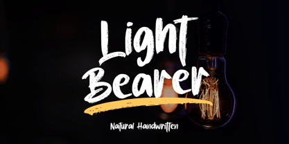 Light Bearer is a cool handwritten font. It's ideal for branding and decorate your projects. The Light Bearer font has a classy and modern look that can be used for logos, branding, posters, advertisements, stationery, movies, social media posts, youtube channels, and much more! This is a PUA code which means you can access all the glyphs and sweeps easily!
 - Woodford Bourne by Monotype,
$20.99 Woodford Bourne is a brand new 19th century grotesque typeface. The design is a tribute to the historic stone cast type in the building façades of the former Woodford, Bourne & Co. in Cork City, Ireland. For many years I had admired the type’s simplicity and strength, so I decided to faithfully reproduce those letters and expand them to a fully working font with 500 glyphs per case. A key feature of Woodford Bourne is the ability to change the feel of your typography with just one click. Switch from contemporary to vintage style by selecting “Stylistic Set 1” – this gives Woodford Bourne a unique versatility which I am sure you will enjoy playing with in your designs. It is a solid, reliable “workhorse” font family that reproduces well at all sizes… it’s also great for branding and identities. These font files (v2) were redrawn and updated in April 2021 (v1 created 2015).
 - Arabetics Aladdin by Arabetics,
$34.00 Arabetics Aladdin is a monoshape font family with a fixed single shape per each Arabic Unicode character. Glyphs are designed to incorporate the traditional Arabetic visual characteristics found in all four varying shapes, isolated, initial, medial, and final, for each letter. The overall design also emphasizes the line-like (khat) horizontal look and feel of the Arabetic scripts without sacrificing legibility. This font family supports all Arabetic scripts covered by Unicode 6.1, and the latest Arabic Supplement and Extended-A Unicode blocks, including support for Quranic texts. It includes two weights: regular and bold, each of which has normal and left-slanted (Italic) versions. The design of this font family follows the Arabetics Mutamathil style design principles utilizing varying x-heights and no glyph substitutions. The Mutamathil type style was introduced by the designer more than 18 years ago. The Arabetics Aladdin font family includes all required Lam-Alif ligatures in addition to all soft vowel diacritics (harakat), which are selectively positioned with most of them appearing on similar high and low levels—top left corner—to clearly distinguish them from the letters. The Tatweel or Kashida lengthening character is a zero-width glyph.
 - Lloyd Serif by Ivan Kostynyk,
$- Initially, I participated in the contest to design the logo for Bill Lloyd. In the end, the design was rejected, but letters remained. I then decided to continue with the idea and complete the entire typeface. After a couple of months, I realized that the typeface was imperfect, and now that I’m working on an updated Lloyd type, this one is free. The main characteristic of the typeface is its bold and curvy shapes. It is also tall and original in design. It was a great experience because it taught me how failure inspires people to move on, and create something better.
 - FS Clerkenwell by Fontsmith,
$80.00 A creative context 2003. Fontsmith was sharing a small, cold, whitewashed studio space in Northburgh Street, Clerkenwell. But things were on the up following prestigious custom type commissions for The Post Office and E4. “Slab serifs were on the brink of another revival, we could feel it,” says Jason Smith. “All we wanted to do was have a play with these slabs, go as far as we could within what was acceptable and readable.” “It wasn’t initially clear what was happening,” recalls Phil Garnham. “We were becoming very influenced by our surroundings, outside the studio space. We absorbed the essence and the designer grime of where we were.” Process Jason began by drawing stems on-screen. “The key aspect of the font is the upward bend of the leading shoulder serif, the way it kind of ramps up and then plummets back down the stem. “The regular and light characters are quite narrow – great for text but the bold is quite wide and chunky – better for headlines. I think ‘y’ is quite different for a slab design. We call it the Fontsmith ‘y’.” Promotion Fontsmith were determined to get FS Clerkenwell noticed. To launch the font, Ian Whalley, a designer friend of Fontsmith, captured words heard on the streets of Clerkenwell, set them in the new font and crafted a small book of typographic conversations. It was a first for Fontsmith. “I think that’s part of why this font has been so successful,” says Phil. “It really does embody the spirit of the area, as a special place for design, arts and crafts. And designers love that.” Contemporary twist FS Clerkenwell, based on influences in and around this part of London with a rich tradition of printing and design, mixes tradition with creation. Old-fashioned values meet new-school trends. Its quirky, contemporary character lends an edge to headlines, logotypes and any large-size text.
 - StudioSans by BrightHead Studio,
$20.00 StudioSans — is a modern representative of the class of sans-serif fonts inspired by the traditional Swiss design and typography of the mid 20th century. This is a minimal, clean and open font family with friendly forms. Focuses on functionality, has a high x-height and short ascender and descender elements. This is combined with soft circles and high legibility of characters contributing to comfortable reading. The family contains six weights from ExtraLight to ExtraBold. Each of them has in its arsenal more than 450 glyphs and knows more than 50 languages. Support for OpenType Features focused on the Oldstyle Figures (including signs of currencies and interest), Case-Sensitive Forms, Standarts and Discretionary Ligatures, Slashed Zero and Etc.
 - TT Supermolot by TypeType,
$29.00 You are on the page of the old display version of the TT Supermolot font. In 2019, we released an entirely new, completely redesigned and significantly expanded version of the typeface called TT Supermolot Neue. In addition to 54 styles, TT Supermolot Neue has stylistic alternates, ligatures, old-style figures and many other useful OpenType features. Before you buy the old display version of the font, we suggest that you pay attention to the new superfamily TT Supermolot Neue and study it in more detail. - TT Supermolot Condensed is the narrow version of the TT Supermolot font family. Thanks to its open forms, TT Supermolot Condensed fits perfectly into any contemporary technological design and navigation systems. We've already seen this font family in the sports theme (as the main font for hockey teams branding), we've seen TT Supermolot as the main font inside the gameplay of a popular 3D-shooter. Information transfer in the high-tech areas is the ideal environment for this font family, also TT Supermolot Condensed fits well into army, space, and innovation themes. We've tried to create a maximum number of convenient weights (Thin, Light, Regular, Bold, Black) for you to be able to use this family anywhere, from mobile apps and web pages to big state fairs branding.
 - TT Supermolot Condensed by TypeType,
$29.00 You are on the page of the old display version of the TT Supermolot Condensed font. In 2019, we released an entirely new, completely redesigned, and significantly expanded version of the typeface called TT Supermolot Neue. In addition to 54 styles, TT Supermolot Neue has stylistic alternates, ligatures, old-style figures and many other useful OpenType features. Before you buy the old display version of the font, we suggest that you pay attention to the new superfamily TT Supermolot Neue and study it in more detail. - TT Supermolot Condensed is the narrow version of the TT Supermolot font family. Thanks to its open forms, TT Supermolot Condensed fits perfectly into any contemporary technological design and navigation systems. We've already seen this font family in the sports theme (as the main font for hockey teams branding), we've seen TT Supermolot as the main font inside the gameplay of a popular 3D-shooter. Information transfer in the high-tech areas is the ideal environment for this font family, also TT Supermolot Condensed fits well into army, space, and innovation themes. We've tried to create a maximum number of convenient weights (Thin, Light, Regular, Bold, Black) for you to be able to use this family anywhere, from mobile apps and web pages to big state fairs branding.
 - Linotype Zensur by Linotype,
$29.99Linotype Zensur is part of the Take Type Library, chosen from the entries of the Linotype-sponsored International Digital Type Design Contests of 1994 and 1997. This fun font was created by French designer Gérarld Alexandre and contains one weight. The characters look as though parts of each of them were censored or removed, leaving just enough left over to know what was meant. The basic forms of this font are sans serif and the rounded corners give it an almost soft character. Linotype Zensur is a distinctive typeface which is especially good for headlines in larger point sizes. - Sommerwerk Ink by Sommerwerk,
$29.00 This font is inspired by typography found on old German shop windows. It is a script font, but instead of imitating human handwriting and the gestures connected to it, the goal was to come up with a new writing flow and stroke order. As opposed to handwriting Latin script letters, which normally means drawing each character and then connecting it to the next one, the strokes of this font run across multiple glyphs. Intentionally, the design aims to achieve a flowing transition between each glyph without making use of contextual alternates, taking the limitations of classic machine lettering as a challenge.
 - Fundstueck by Ingo,
$12.00 Inspired by a find a coarse but decorative font was created. "Fundstueck" ist the German term for it. Fonts can be so simple. That is what I was thinking as my attention was turned to this rusty piece of metal. Only a few centimeters in size, I couldn’t imagine which purpose it might truly serve. But my eyes also saw an E, even a well-proportioned E: a width to height ratio of approximately 2/3, black and fine strokes with a 1/2 proportion — could I create more characters on this basis? Thought it, did it. The form is based on a 5mm unit. The strikingly thick middle stroke of E suggests that the emphasis is not necessarily placed on the typical stroke, and likewise with the other characters. But if the font is going to be somewhat legible, then you cannot leave out slanted strokes completely. Eventually I found enough varying solutions for all letters of the alphabet and figures. A font designed in this way doesn’t really have to be extremely legible, which is why I forwent creating lower case letters. Nevertheless, Fundstueck still contains some diverse forms in the layout of upper and lower case letters. Thus, the typeface is a bit richer in variety. By the way — the “lower” letters with accents and umlauts stay between the baseline and cap height. And with that, you get wonderful ribbon-type lines.
 - Kayino by Twinletter,
$15.00 Let’s not be frightened of the asymmetrical Kayino font. The character of this Groovy Retro font is intriguing and enjoyable. If your project calls for enjoyment, proceed with care. The foundation of Kayino was classical but modern music. A psychedelic-inspired look called Kayino was created using vintage objects and brash pop art typography from the 1960s. The fun and captivating character of the Groovy Retro font makes it the ideal option for designs like posters, banners, music, branding, logos, and more.
 - Almondy Amor by Storictype,
$19.00 Almondy Amor Script, A new carefully crafted fun script Typeface. The Ideas of this fonts are from wide range of reference, Dessert & Beverages are our main focus for this fonts. So the looks of this fonts must be in the wide range of the reference above. It’s Versatile, Fun, Cute and Beauty feel that you get in Almondy Amor Typefaces. Thjis typeface on the display to give you a reference what it looks like on your project. such as Branding, Header, Logotype, Poster, Magazine, Packaging, Food Menus, restaurant and etc.
 - Adhesive Serif Letters JNL by Jeff Levine,
$29.00 A few scant examples of die cut gummed letters (R, C, Y and &) provided the design inspiration for Adhesive Serif Letters JNL. Influenced by the Caslon style, this typeface offers clean, legible titling. The sample letters were once manufactured by the Tablet and Ticket Company of Chicago and sold under their brand name of Willson's [named for the founder of the company]. Gummed letter sets were available in a variety of styles and sizes for various sign, merchandising and marking needs.
 - Point Made JNL by Jeff Levine,
$29.00 Point Made JNL is a varied assortment of pointing hands and arrows used for embellishing word copy, drawing attention to key points or simply adding some retro flair to your print or web project. Twenty six designs in varying styles offer a wide range of visual diversity. The images point to the right on the capital keys and to the left on the lower case keys. This font is a companion to Point Taken JNL, which offers twenty-six more pointing hands and arrows.
 - Jazz Gothic by Canada Type,
$24.95Jazz Gothic is a digitization and expansion of an early 1970s film type from Franklin Photolettering called Pinto Flare. This type became an instant titling classic with jazz and soul album designers; then it caught on wildly with film and television designers. Blue Note and Motown would not have been the same without this face. Jazz Gothic is a simple geometric idea, quite likely originally inspired by the heavier display weights of Futura. The resulting product is a versatile message-driver that stands quite strong and cherishes the limelight, yet shows a playful and artistic side within its curvy thick swashes and rebellious unicase forms. In the hands of a good designer, Jazz Gothic eliminates any doubt about the delivery of the message or the attractive purposeful way it is delivered. It is the kind of typeface that loves a design program's bells and whistles. Knock it out of dark or light backgrounds, shade it, mask-alize it, roughen it, stretch it, squeeze it, and the message will still stand larger than life. Jazz Gothic comes in two fonts, a main one with a full character set to accommodate the majority of Latin-based languages, and a second one that contains about 50 alternates and swashed forms. The OpenType version is a single font that has all the alternates and swashes at the disposal of the buttons of OT-savvy program palettes. - FS Untitled Variable by Fontsmith,
$319.99Developer-friendly The studio has developed a wide array of weights for FS Untitled – 12 in all, in roman and italic – with the intention of meeting every on-screen need. All recognisably part of a family, each weight brings a different edge or personality to headline or body copy. There’s more. Type on screen has a tendency to fill in or blow so for each weight, there’s the choice of two marginally different versions, allowing designers and developers to go up or down a touch in weight. They’re free to use the font at any size on any background colour without fear of causing optical obstacles. And to make life even easier for developers, the 12 weight pairs have each been designated with a number from 100 (Thin) to 750 (Bold), corresponding to the system used to denote font weight in CSS code. Selecting a weight is always light work. Easy on the pixels ‘It’s a digital-first world,’ says Jason Smith, ‘and I wanted to make something that was really functional for digital brands’. FS Untitled was made for modern screens. Its shapes and proportions, x-height and cap height were modelled around the pixel grids of even low-resolution displays. So there are no angles in the A, V and W, just gently curving strokes that fit, not fight, with the pixels, and reduce the dependency on font hinting. Forms are simplified and modular – there are no spurs on the r or d, for example – and the space between the dot of the i and its stem is larger than usual. The result is a clearer, more legible typeface – functional but with bags of character. Screen beginnings FS Untitled got its start on the box. Its roots lie in Fontsmith’s creation of the typeface for Channel 4’s rebrand in 2005: the classic, quirky, edgy C4 headline font, with its rounded square shapes (inspired by the classic cartoon TV shape of a squidgy rectangle), and a toned-down version for use in text, captions and content graphics. The studio has built on the characteristics that made the original face so pixel-friendly: its blend of almost-flat horizontals and verticals with just enough openness and curve at the corners to keep the font looking friendly. The curves of the o, c and e are classic Fontsmith – typical of the dedication its designers puts into sculpting letterforms. Look out for… FS Untitled wouldn’t be a Fontsmith typeface if it didn’t have its quirks, some warranted, some wanton. There’s the rounded junction at the base of the E, for example, and the strong, solid contours of the punctuation marks and numerals. Notice, too, the distinctive, open shape of the A, V, W, X and Y, created by strokes that start off straight before curving into their diagonal path. Some would call the look bow-legged; we’d call it big-hearted. - FS Untitled by Fontsmith,
$80.00 Developer-friendly The studio has developed a wide array of weights for FS Untitled – 12 in all, in roman and italic – with the intention of meeting every on-screen need. All recognisably part of a family, each weight brings a different edge or personality to headline or body copy. There’s more. Type on screen has a tendency to fill in or blow so for each weight, there’s the choice of two marginally different versions, allowing designers and developers to go up or down a touch in weight. They’re free to use the font at any size on any background colour without fear of causing optical obstacles. And to make life even easier for developers, the 12 weight pairs have each been designated with a number from 100 (Thin) to 750 (Bold), corresponding to the system used to denote font weight in CSS code. Selecting a weight is always light work. Easy on the pixels ‘It’s a digital-first world,’ says Jason Smith, ‘and I wanted to make something that was really functional for digital brands’. FS Untitled was made for modern screens. Its shapes and proportions, x-height and cap height were modelled around the pixel grids of even low-resolution displays. So there are no angles in the A, V and W, just gently curving strokes that fit, not fight, with the pixels, and reduce the dependency on font hinting. Forms are simplified and modular – there are no spurs on the r or d, for example – and the space between the dot of the i and its stem is larger than usual. The result is a clearer, more legible typeface – functional but with bags of character. Screen beginnings FS Untitled got its start on the box. Its roots lie in Fontsmith’s creation of the typeface for Channel 4’s rebrand in 2005: the classic, quirky, edgy C4 headline font, with its rounded square shapes (inspired by the classic cartoon TV shape of a squidgy rectangle), and a toned-down version for use in text, captions and content graphics. The studio has built on the characteristics that made the original face so pixel-friendly: its blend of almost-flat horizontals and verticals with just enough openness and curve at the corners to keep the font looking friendly. The curves of the o, c and e are classic Fontsmith – typical of the dedication its designers puts into sculpting letterforms. Look out for… FS Untitled wouldn’t be a Fontsmith typeface if it didn’t have its quirks, some warranted, some wanton. There’s the rounded junction at the base of the E, for example, and the strong, solid contours of the punctuation marks and numerals. Notice, too, the distinctive, open shape of the A, V, W, X and Y, created by strokes that start off straight before curving into their diagonal path. Some would call the look bow-legged; we’d call it big-hearted.
 - SteamCourt by insigne,
$22.00 Think smart. Think regal. Think SteamCourt, a new font designed specifically for the card game SteamCourt. A bit of background if you will: In early 2014, some friends from my college days banded together to form their own game company. Their first launch? A current Kickstarter they named SteamCourt. I love Kickstarter. It’s a fantastic platform, a great way for individuals to introduce the public to their visions. I've started a couple of them myself--both including fonts designed specifically for the projects. The first is Chatype, a font created exclusively for the city of Chattanooga. The second: Cabrito, a font developed as part of the children’s typeface book, The Clothes Letters Wear. It’s wonderful to work with so many others who come alongside to help you vision become reality. Naturally, hearing of my friends' project, I contacted them about adding a new face to their venture as well. I gave them carte blanche. They wanted steampunk. It was a great challenge, the result of which is now SteamCourt, an unforgettable display typeface that draws from the mix of Victorian regals, metallic and brass engineering, cogs, clocks and blackletter typography. It evokes a time of skillfully forged metalwork and an era of intrigue and excitement, filled with audacious feats of engineering and innovation and the perilous journeys of the airship. While influenced by the era of blackletter, SteamCourt is an unmistakable departure from the style of two centuries past, yet it still shines in its given display roles with a distinct regal twist. The serifs are asymmetrical, yet the characters are all specially and delicately balanced. It’s an eye-catching alternative to blackletter with modern steampunk touches. The game’s signature typeface has sizeable language support on top of 90 alternate characters as well. In addition to a generous number contextual alternates, SteamCourt features stylistic alternates that allow for buyers to customize its visual appearance for their preferences, helping to make it a superior option for packaging, branding and enormous typesetting logotypes as well as shorter textual content. Check out the game, but grab the font, too, to be a part of that crib created as a companion for the new game in court. It'll be the ace up your sleeve for many rounds of design ahead.
 - Storyville by Canada Type,
$29.95 This is the redrawn and expanded version of an alphabet Rebecca Alaccari made back in 2009 as a bespoke font for a tourism agency looking to recapture the appeal of New Orleans after the hurricane Katrina disaster robbed it of its core industries. The brief back then was to "revive the unique spirit of what always made Nola great for new adults, which is the excellent combination of history, romance, food and music." No word of a lie, the brief actually contained "new adults." Storyville contains two interchangeable sets of forms drawn in the doodly, loose and organic way now conspicuously popular with today's young designers, almost every one of whom thinks they will get to design something for a boutique coffee bar somewhere. Well, this whole thing perhaps means freedom, youth, fun, happiness, good stuff like that. But just in case, a little caution doesn't hurt: Use this font only if you know what you're doing. We don't want to go back to the 1990s. Please. We were nearly done for by that exposure the first time around. The ligatures feature in this font does some pseudo-randomization, so the forms in doubled letters don't repeat. Serious fun can be had by also applying the stylistic alternates feature, or picking a letter in the middle of a setting and disabling the ligatures feature. Or various sequences of all that. If you don't like any of that stuff, just forget about it. Uh, wutever.
 - Beautica by Krafted,
$10.00 Introducing Beautica - A Modern Calligraphy Font This is a handcrafted and most natural, elegant, simple yet angelic font. This beautiful font can be used for various projects and promotions. Go ahead and use it on your website, your social media branding, Pinterest banners, printed invitations, and more! Inspire your audience, clients, or guests with richness of elegance with this modern handwritten font. What you’ll get: Multilingual & Ligature Support Full sets of Punctuation and Numerals Compatible with: Adobe Suite Microsoft Office KeyNote Pages Software Requirements: The fonts that you’ll receive in the pack are widely supported by most software. In order to get the full functionality of the selection of standard ligatures (custom created letters) in the script font, any software that can read OpenType fonts will work. We hope you enjoy this font and that it makes your branding sparkle! Feel free to reach out to us if you’d like more information or if you have any concerns.
 - Desirable Brust Texture by Alcode,
$20.00 Desirable Brush Texture is a brush version of desirable solid released in 2019. With a classic style and an elegant touch, inspired by Italian women's handwriting and ancient manuscripts. These two fonts are carefully designed to work together in harmony making them perfect for wedding media, book covers, greeting cards, logos, branding, business cards and certificates, even for any design work that requires classic, formal or extravagant. Try Desirable Brush Texture, enjoy the richness of the features and let her fun and elegant excitement make you happy and enhance your creativity! You can use this font very easily. Multilingual Support And Special Ligatures If you are interested in the solid version, visit the link - https://www.myfonts.com/fonts/alcode/desirable-calligraphy/
 - Pitos by Ahmet Altun,
$19.00 Pitos Font Family includes 3 fonts that have different styles from each other but very eye-pleasing when they're used together. There exists the extras in the family which are very easy to be reached on the keyboard with simple codes. This font collection is completely hand-writing. Pitos Font Family was designed carefully to create elegant typographic works. It is great to use in designs of lettering works and the extras are very useful to make them elegant. It would be a perfect choice to design posters, affiches, logos such as wine bottle labels, t-shirt and magazine prints, eye-pleasing typographic designs and more.
 - Ropan by Larin Type Co,
$16.00 Ropan this is a modern geometric sans-serif font that includes nine weights from thin to black. This multi-purpose font captures a huge range for the design and creation of your project. Ropan will perfectly cope with a variety of tasks and he will always look stylish and modern. With it, you can create logos, labels, use in advertising, packaging, branding, book covers and magazines, cosmetics, banners, posters, headings, descriptions and much more. This font is easy to use has OpenType features.
 - Animus by Artisticandunique,
$25.00 Animus - Serif font family - Multilingual - 6 Styles Animus is a uniquely elegant serif font family.This font provides flexibility in all your projects with its aesthetic structure, multilingual options, 6 styles and 3 weight options. You will have the opportunity to enrich the content of your projects with its elegant structure. Depending on the purpose of use in the typographic composition you will create with 6 styles; you can enrich your titles in books or magazines and your logos for branding. You can benefit form the elegant structure of standard characters in your plain text. This font comes with uppercase, lowercase, punctuation, symbols and numbers, ligatures and multilingual supports. Ideal for books and magazines, editorials, headlines, websites, packaging, logos, branding, advertising, movie titles and more. This font family can meet your needs in all creative projects, modern and classic. With this font you can create your unique designs. Have a good time.
 - Geek Speak by Comicraft,
$29.00 Scissors cuts paper, paper covers rock, rock crushes lizard, lizard poisons Spock, Spock smashes scissors, scissors decapitates lizard, lizard eats paper, paper disproves Spock, Spock vaporizes rock, and as it always has, rock crushes scissors. If you're familiar with this theory, you already Speak Geek, and now you can download a font that has 250 friends in the Comicraft Font Library but has never met one of them. Take it to Comic-con this weekend and take photos of Wonder Woman cosplayers together then post them to your tumblr account... Or head down to the basement for D&D and debate the merits of George Lucas fiddling with his trilogies. Yep, GEEKSPEAK shoots first -- put that on a t-shirt! And gimme some Spock. GeekSpeak features Western & Central European, Vietnamese & Cyrillic support, worldwide currency symbols and Crossbar I Technology™ * Comicraft fonts are created by actual comic book letterers for actual comic book lettering
 - Linotype Astrolo by Linotype,
$29.99Born in Fulda, Germany, Martina Theisen studied communications design in Mainz. She spent many years working for the television company, SWR Mainz. Now she works as a designer and illustrator. She creates fonts, as well as illustrates children's books and school textbooks. For Linotype Typentypo (2002, part of TakeType 4), she designed the display faces Linotype Creatures, Linotype Improfil Outline and Black (profiles of funny faces), Linotype Smileface, Linotype Maenneken and Linotype Astrolo (hand-drawn astrological symbols). - FS Renaissance by Monotype,
$52.99 FS Renaissance is a display stencil typeface by the Monotype Studio. A collaboration between lettering artist and designer Craig Back and Creative Type Director Pedro Arilla, the single style font explores the intersection between art and design. With artist and designer working hand in hand, each letter was crafted as a standalone piece of art, while working harmoniously together as a functioning typeface. The typeface is inspired by the Renaissance period symbolised by flourishing progress in the arts, sciences, learning, and philosophy. The typeface is not a traditional stencil design: the cuts are not rigid but interactions that are hand crafted between each element, emphasising the idea of a typeface as a piece of art or sculpture. Pedro Arilla’s aim was to take the core DNA of Craig's lettering and apply it to a typographic base with a solid internal consistency, balanced with an external elegance. Pedro and Craig worked closely together to make sure the original concept was not compromised and this is reflected in the finished design which strikes the perfect balance between functionality and art.
 - Strawberry Swirl by Krafted,
$10.00 Imagine a world filled with swirls of strawberry, pops of pink, and pure joy to go around for everyone... Are you trying to make an elegant, sweet, and stylish statement with your invitations, social media, website, or printed materials? Then grab some cotton candy, crack a smile, and get ready for a swirly day of wonders! Introducing Strawberry Swirl - A Modern Script Font. This gorgeous & stylish font can be used for a host of different content needs and projects. Use it for your headings, logos, business cards, printed quotes, invitations (wedding, birthday, engagement, etc.), packaging, resumes, and even your website or social media branding. Enchant & delight your audience, clients, or guests with this versatile, stylish, and elegant font. What you’ll get: - Multilingual & Ligature Support - Full sets of Punctuation and Numerals Compatible with: - Adobe Suite - Microsoft Office - KeyNote - Pages Software Requirements: The fonts that you’ll receive in the pack are widely supported by most software. In order to get the full functionality of the selection of standard ligatures (custom created letters) in the script font, any software that can read OpenType fonts will work. We hope you enjoy this font and that it makes your branding sparkle! Feel free to reach out to us if you’d like more information or if you have any concerns.
 - CA Superpilot by Cape Arcona Type Foundry,
$29.00 Introducing the CA Superpilot Sans & Script family pairing - the ultimate package designed specifically for creatives and designers. The CA Superpilot Sans font family, with its contemporary take on Futura, is the perfect choice for those seeking a sleek and modern typeface. With five weights and italics, this font is flexible enough to be used in any project. In addition, it includes an extensive Central European character set and alternate characters, ensuring that your designs will stand out in any language. On the other hand, the CA Superpilot Script font family is a monoline script font that takes inspiration from vintage camera equipment logos and type designations from the 1950s. The result is a unique and retro-inspired typeface that adds personality and charm to any project. With regular and italic styles, you have plenty of options to work with. Despite being a script typeface, its bold strokes and clean lines make it ideal for captivating and impactful headlines in uppercase. Using these two fonts together gives you unmatched flexibility for any project, whether it's branding, website design, or print design. Don't miss out on this essential font pairing - get it today!
 - Rainbow Symphony by Violatype,
$14.00 Introducing "Rainbow Symphony" is a cute and unique type of handwritten font, made with hand strokes to produce a unique and cute font shape, this font style is thick and thin so it adds a natural and aesthetic impression. This font is very suitable for design needs such as Branding, Logotype, Magazine, Quotes, Wedding Invitations, and many others, please try it yourself and perfect your design with the Rainbow Symphony font. If you have any questions, don't hesitate to contact us.