10,000 search results
(0.527 seconds)
- Tim Sale by Comicraft,
$39.00 If you're familiar with the work of Eisner Award winning artist Tim Sale, you'll also be familiar with the soft curves and hard edges of the characters he brings so vividly to life in the pages of GRENDEL, BATMAN and SUPERMAN. Now you can get to know a selection of the characters Tim has been working on his whole life, and Comicraft has been kind enough to arrange them in alphabetical order for you! Based on Tim's own hand lettering work in the lost Dark Horse classic, BILLI 99, the Tim Sale font brings together the class and finesse of Hunter Rose, the elegance and charm of Bruce Wayne and the honesty and trustworthiness of Clark Kent. Don't go into the big city alone at night without it. See the families related to Tim Sale: Tim Sale Lower & Tim Sale Brush.
 - Bomber Dreams by Din Studio,
$29.00 Looking for a fun and bold font to captivate your audience, clients or guests? Then we’ve got the font for you! Introducing Bomber Dreams- A Grafiti Font Use this cool and modern graffiti font to breathe a street life vibe into your projects. This font is perfect for logos, printed quotes, cards, packaging, website or social media branding, and many more! Our font always includes Multilingual Support to make your branding reach a global audience. Features: Standart Ligatures Stylistic Set Multilingual Support PUA Encoded Numerals and Punctuation
 - Corleone by FontMesa,
$- Corleone was originally designed as a two font family in 2001 and offered for free. This year we've expanded the font family to twelve fonts including small caps and italics. While the new Corleone has been greatly refined and is a much more professional quality font we've decided to still offer the original two fonts for free. Corleone is the perfect font for t-shirts and other merch, the new small caps make this font stand out and bring attention to whatever you use it on. Corleone is the font you can't refuse. Tech notes: Corleone was designed after a famous movie logo in the 1970's with a title name that sounds a lot like The Grandfather if you know what I mean. The movies had three installments, my original font was patterned after the logo for the third movie, the new Corleone Primo and Secondo versions are patterned after the logos of the first two movies. The differences are noticed mostly in the lowercase letters. One thing you will not find in this font family is the puppeteer or puppet master hand because it's been registered as a separate trademark of Paramount Pictures. If you're using an application that works in layers then you'll be interested in the four extra over score glyphs included in some of the versions of this font. Sorry, MS Word does not work in layers so this feature will not work in MS Word. When you open up the glyph map in Adobe Creative Suite you should see the over score glyphs when you scroll down to the bottom. These extra over score glyphs allow you to extend the top line of a single capital letter, with four different lengths you should be able to mix and match to achieve the length that you desire. When using the over score glyphs it's best to divide your word or headline into separate text objects, the cap being one object and the remaining letters being the second. If you try using the over score glyphs on a single text object then with each over score that you add the text after it will get pushed down the line.
 - Sedid World by Fontuma,
$28.00 Sedid, “solidity; It is an Arabic term meaning “righteousness”. In particular, the correctness and soundness of a word is indicated by this word. The fact that I gave this name to the writing family is to point out its accuracy and robustness. This typeface, which is sans serif, consists of three families: ▪ Sedid: Font family containing Latin letters ▪ Sedid Pro: Font family including Latin, Arabic and Hebrew alphabets ▪ Sedid World: A family of typefaces including Latin, Cyrillic, Greek, Arabic and Hebrew alphabets Do you want a difference in your work? Then meet the Sedid World font family. This font will meet all your expectations in terms of the languages it supports and the variety of glyphs it contains. You can easily use the Sedid World font family in every project. Because this font has beautiful and soft lines. The font family includes open type features, as well as a large number of ligatures, small caps, modifiers, and currency symbols of many countries.
 - Bacterio by Wiescher Design,
$39.50 Bacterio is a typeface I designed for this hulk of a friend of mine who is a kitchen designer. He is huge but has a very delicate feeling for form. One day he said he was trying out something new and if I couldn't make a font for him. Then he showed me the surface design, a hard-plastic covered multilayered wood. The surface design was called "Bacteria" and it looked just like that, only in multicolors. Well here is "Bacterio" the font that looks just like that surface of my hulky friend. Yours very design infected Gert Wiescher
 - Geographica by Three Islands Press,
$29.00 Thomas Jefferys (ca. 1710–1771) was the best-known map maker in 18th-century England, chiefly because he won (and hyped) the title “Geographer to King George III.” Jefferys was really more an engraver/publisher than a geographer, since he mostly relied on the cartographic materials of others. Still, his maps of the North American colonies were well known. Geographica is a legible, four-style serif family modeled after the neat hand-lettered place names and peripheral text on Jefferys’s maps. With its long serifs, tall x-height, and robust curves, Geographica somehow combines classic elegance with a whiff of coastline and sea. The italic styles have the slant and warmth of the hand-drawn source materials. And the typeface comes with a slew of distinctive map-based ornaments—including compass wheels and sailing ships. This evocative serif works well in both display situations and long blocks of text, whether on paper or screen. OpenType features include small capitals, numerous ligatures, and two stylistic sets of titling caps. Geographica offers full support for Central and Eastern European languages—more than 1,200 glyphs in all.
 - Yaa Type by artill,
$20.00 Yaa! Type is a hand-sketched headline font. The family contains a light and bold weight; both complement each other perfectly. Created solely by me from sketch by hand and then digitized, yaa! Type makes a perfect font to create the hand-made character look, or to supplement illustrations with typography.
 - Gabby by Bellafonts,
$25.00 Gabby is an authentic handwriting of a First Grader. I took all the papers from her backpack during her first grade year and scanned in various letters, cleaned them up, and turned them into a font. This font is how I captured memories of my daughter's handwriting. This font is perfect for projects requiring the handwriting of a child, such as kid-friendly t-shirts and school projects. Comic Sans can move over because Gabby is readable and authentic. Unlike many decorative fonts, Gabby works well in All Caps or Caps and Lower case. The license allows creative and commercial use, meaning you can use this font on t-shirts, marketing gear, and just about any project you want to do, whether you make money or not. The only stipulation I have is try not to be a jerk with the font. This is my daughter's handwriting, and we would both cringe if we discovered it was used to bully or threaten people. The license attempts to protect religious icons and the US Military, but overall, just don't be mean with the font. If you want to be mean, try Comic Sans.
 - Modern Neon by Ditatype,
$29.00 Modern Neon is an audacious display font that combines the allure of neon lights with an array of captivating lines. With its uppercase letterforms, this typeface commands attention, creating a visually stunning experience that leaves a lasting impression. The defining feature of Modern Neon lies in its bold and adventurous lines that adorn each letter. These radiant lines flow dynamically throughout the characters, adding an element of complexity and intrigue. The interplay of these luminous lines creates a visual spectacle, captivating the viewer's gaze and drawing them into a world of electrifying typography. Inspired by the vibrant glow of neon signs, Modern Neon exudes a futuristic energy. The font's luminosity casts a vivid hue, evoking a sense of innovation and modernity. Each letter pulsates with an otherworldly glow, creating a striking visual impact that cannot be ignored. Each letter of this font has been meticulously crafted to strike a balance between legibility and decorative intricacy. The interconnected lines add depth and movement to the characters, enhancing the overall composition without compromising readability. The result is a font that exudes creativity and boldness while ensuring your message remains clear and impactful. You can also enjoy the various features available in this font. Enjoy the various features available in this font. Features: Alternates Ligatures Multilingual Supports PUA Encoded Numerals and Punctuations The strong and bold strokes demand attention, making this font perfect for headlines, titles, and impactful statements. Whether you're creating posters, branding materials, digital artwork, or anything in between, this font will add a daring and captivating element. It particularly shines in applications related to technology, gaming, fashion, and futuristic themes. Find out more ways to use this font by taking a look at the font preview. Thanks for purchasing our fonts. Hopefully, you have a great time using our font. Feel free to contact us anytime for further information or when you have trouble with the font. Thanks a lot and happy designing.
 - Rostrum by Canada Type,
$24.95The Rostrum fonts are a revival and expansion of a type called Oleander, designed in 1938 by Julius Kirn for the Genzsch & Heyse foundry in Hamburg. Many of the original uppercase letters had some blackletter remnants tacked onto them, so in this digital version they were relegated to the Rostrum Two font, while more contemporary forms were designed for the Rostrum One font. Characters from both fonts are interchangeable via software programs' font menus and glyph palettes in the Postscript and True Type versions, while the OpenType version takes advantage of the Ligatures, Contextual Alternates and Stylistic Alternates features to perform character substitutions. Rostrum finds the middle ground between italic and brush script, which makes it quite usable in all-caps settings. Its majuscules have a very distinct curl that makes the typeface effect-ready and very appealing in packaging design. Plenty of alternates and ligatures are sprinkled throughout the character set. - Faux Pas JNL by Jeff Levine,
$29.00 The lettering found on an 1878 Salt Lake City advertisement for the Forepaugh’s Circus inspired Faux Pas JNL, which is a bit of a pun on the circus’ name and also a commentary on how this unusual lettering style seems to break all of the rules on stroke width and balance. According to Wikipedia: “Adam John Forepaugh (February 28, 1831 - January 22, 1890) was an American entrepreneur, businessman, and circus owner. Forepaugh owned and operated a circus from 1865 through 1890 under various names including Forepaugh's Circus, The Great Forepaugh Show, The Adam Forepaugh Circus, and Forepaugh & The Wild West. In 1889, Forepaugh sold his circus acts to James Anthony Bailey and James E. Cooper and he sold his railroad cars to the Ringling Brothers. The Ringlings used the equipment to transform their circus from a small animal-powered production to a huge rail-powered behemoth, which later purchased the Barnum & Bailey Circus. Thus, in liquidating his circus assets, he indirectly contributed to the demise of his arch-rival.” Faux Pas JNL is available in both regular and oblique versions.
 - Excelsior by Linotype,
$29.99Before designing this font, C.H. Griffith consulted the results of a survey of optometrists regarding optimal legibility. Excelsior font was then presented by Mergenthaler Linotype in 1931 and remains one of the most legible and popular fonts worldwide. - D-block A by AType,
$19.95The history of this font is those. Once I assorted the old children's books which have stayed from times of my childhood. On one of them I have seen a trade mark of a printing house consisting of two Russian letters "L" and "B". From they were begun also with my font. And though finally from these letters a little that remained, elements of these letters can be seen in font D-block B. - Obvia Wide by Typefolio,
$29.00 'Obvia' appeared as a result of direct observation on typefaces classified as geometric and the plan to explore for the first time width axes Condensed, Narrow (soon), Normal and new Wide and Expanded. The idea behind 'Obvia's design was to create a distancing from geometrically pure shapes, in this case, square shapes. Then some details were added, such as subtle inktraps, concave endings of the stems and carefully drawn alternate characters, giving a 'geohumanist' tone to the font. This first family of 'Obvia' has 9 weights ranging from Thin to Black, delivering a strong typographic identity, from the paper to the pixel.
 - Obvia Expanded by Typefolio,
$29.00 'Obvia' appeared as a result of direct observation on typefaces classified as geometric and the plan to explore for the first time width axes Condensed, Narrow (soon), Normal and new Wide and Expanded. The idea behind 'Obvia's design was to create a distancing from geometrically pure shapes, in this case, square shapes. Then some details were added, such as subtle inktraps, concave endings of the stems and carefully drawn alternate characters, giving a 'geohumanist' tone to the font. This first family of 'Obvia' has 9 weights ranging from Thin to Black, delivering a strong typographic identity, from the paper to the pixel.
 - Newsmaker JNL by Jeff Levine,
$29.00 A WPA (Works Progress Administration) poster from the 1940s saying "Behind the Headlines" presented the title hand-lettered in a bold, condensed slab serif. This became the model for Newsmaker JNL, available in both regular and oblique versions.
 - Lovanaru by Attype Studio,
$24.00 Lovanaru is a Sans Serif font with all caps, that provides a modern and minimalistic design. It comes with smart OpenType features, ligatures, clean letterforms and monoline strokes. Lovanaru is an excellent choice if you are looking for an easy to read and enjoyable font. Lovanaru is perfect for minimalistic themed product, branding, logo, invitation, stationery, product packaging, merchandise, monogram, blog design, game titles, cute style design, Book/Cover Title and more. Features : - Lovanaru Font - Ligatures - Multilingual, US Roman, Latin 1 Support Thank you for purchasing premium fonts from Attype Studio. Follow and explore our work on Pinterest & Instagram. If you have any question, don’t hesitate to contact us. We hope you enjoy with our font! Attype Studio
 - Banquet by Solotype,
$19.95In our early days of type hunting, we considered this to be the prize of our collection. Fonts of this late Victorian period seem to have less ruffles and flourishes than the earlier ones, which makes them easier to read. - Swirl Sensations by Redy Studio,
$17.00 From Lovely Label comes Swirl Sensations inspired by the feeling of the pen stroke. Swirl Sensations fonts will be a treat for your eyes. Combined with the natural flow of handwritten typefaces, this series is a lot of fun and can help bring your design to life. This font is perfect for creating stunning designs in various styles, including vintage, cute, colorful, hand-made, or customized logos. Made manually by the author and it is the best match to put your texts perfectly on the design. In addition, this font is great for numerous types of projects: logos, branding projects, t-shirts, advertising, labels, and other items. Also ideal for invitations for its unique style of writing. Feel free to give me a message if you have a problem or question. Thank you so much for taking the time to look at one of our products.
 - ITC Cyberkugel by ITC,
$29.99ITC Cyberkugel is the work of British designer Timothy Donaldson, who occasionally likes to write with an extra-fine ballpoint pen. I like the spindly scrawny forms that it gives me when I follow all the usual 'italic' writing conventions", he says. And there lie the origins of ITC Cyberkugel, although the creative process was moved from pen and paper to software and a Wacom tablet. "I like the fact that people will be buying it to give them a 'human', 'organic', 'non-digital' look, and yet no ink has soiled paper. Although the movements of the hand are still the essence, the whole thing was created in cyberspace." The name comes from combining cyberspace and Kugelschreiber, the German word for ballpoint pen. ITC Cyberkugel is a fresh interpretation of traditional calligraphy." - Etero by Larin Type Co,
$15.00 Etero is a modern and elegant serif font that includes four typefaces: regular, outline, italic, and outline italic. This font has a light weight and looks amazing in logos, branding, arranging wedding invitations, business cards, packaging, titles and much more and also works perfectly with text, it is very readable and recognizable. This font includes alternates for Uppercase and Lowercase, with them you can make your project more elegant and unique and the slanted style will add dynamics to your design. This font is easy to use has OpenType features.
 - Sassoon Handwriting Starter by Sassoon-Williams,
$45.99 Sassoon fonts package for handwriting starters The three upright "infant" fonts developed to meet the demand for letters to produce pupil material for handwriting as well as for reading. Letters have extended ascenders and descenders ideal on screen and print. They facilitate word recognition. The exit strokes link words together visually, also crucially, they space the letters for improved legibility. The "joined" font puts the skills gained into practice producing joined-up handwriting. Together these typefaces provide a valuable resource for Teachers to create consistent material across the curriculum. Sassoon Infant Tracker B font: This font with its direction arrows helps pupils to start in the correct place. Motor movements can be refined by keeping inside the line. When starting and direction is no problem, the arrow font can be dropped and the Dotted font used. Sassoon Infant Dotted B font: Writing over the dots of this font refines motor skills. The aim here is to give confidence by reinforcing starting points, exits and to now encourage fluidity. Sassoon Infant font: With some words in this font and a baseline beneath to copy onto, pupils can use their learned starting points and exit strokes to write freely along the baseline - still unjoined. Once learned, this leads to spontaneous joins along the baseline leading logically to a joined-up hand. Sassoon Joined font: Having learned to write letters with correct starts and exits, this is when the joined font for teaching handwriting can be used. With some words in this font and a baseline beneath to copy onto, pupils can use their learned starting points and simply extend their exit strokes to make joined-up writing. The default joins the font provides are recommended, however there are alternative letterforms that are so important for some Teachers which can be accessed. Create ‘pen lifts’ anytime too! NOTE: Fonts display unjoined by default on this website and are delivered that way - joining is controlled by your text editing application such as Word or TextEdit, read more for instructions… Free to download PDF resources: Stylistic Sets and how to access the alternative letters feature in these OpenType fonts. Using the separate letter fonts Using the joined font Teachers copybooks using these fonts: How to teach pre-cursive Copybook How to teach cursive handwriting Copybook
 - Carnero Variable by Monotype,
$209.99Carnero™ is a feisty hybrid of precise geometry and calligraphic flair; a design that walks that fine line between being sensible and a standout. In an increasingly monotone typographic landscape – Carnero has a unique pulse that moves the reader along with a new energy. Carnero gives life to simple utility with kinetic letter shapes, open apertures, and generous counters Drawn by Steve Matteson for the Monotype Studio, Carnero’s versatility is its strength. From digital ads and applications to packaging and branding, Carnero is comfortable and contemporary. The lightest and boldest weights create inviting headlines, while the middle weights read well for body copy. Used together, they build a lively brand and a clear hierarchy. Matteson infused Carnero with a modernist exterior resting on a 10th century calligraphic foundation. Delightful flourishes on the capital R and K, and lowercase a, k and l, give the design a distinctive demeanor; while the alternate italic swash caps are a saucy nod to the scribes. The result is a design that is warm, approachable – and a bit lighthearted. Matteson describes Carnero as, “transcending the static posture of the geometric sans genre.” The Carnero family is a compact collection of six distinct weights, ranging from an engaging light to an authoritative black, each with an italic counterpart. Its extended Latin character set ensures worry-free localization for eastern/western European languages. This is a design that will prove its value many times over. Matteson has drawn over 80 distinctive typeface families for major corporations, branding firms and retail sales. His passions for the outdoors and performing music balances an intense focus on work – and subtly finds its way into typefaces like Carnero. Matteson has designed custom fonts for three generations of the Microsoft Xbox® game console, the original core fonts for the Android® mobile-phone platform, in addition to branding typefaces for Toyota®, Rocket Mortgage®, and Google®. He also drew the Kootenay™ family, Monotype’s proprietary branding typeface. Matteson’s retail designs range from the elegant and utilitarian Open Serif™ (a companion to Google’s Open Sans), to a growing series of Frederic Goudy revivals. Carnero Variables are font files which are featuring one axis and have a preset instance from Light to Black. - Carnero by Monotype,
$50.99 Carnero™ is a feisty hybrid of precise geometry and calligraphic flair; a design that walks that fine line between being sensible and a standout. In an increasingly monotone typographic landscape – Carnero has a unique pulse that moves the reader along with a new energy. Carnero gives life to simple utility with kinetic letter shapes, open apertures, and generous counters. Drawn by Steve Matteson for the Monotype Studio, Carnero’s versatility is its strength. From digital ads and applications to packaging and branding, Carnero is comfortable and contemporary. The lightest and boldest weights create inviting headlines, while the middle weights read well for body copy. Used together, they build a lively brand and a clear hierarchy. Matteson infused Carnero with a modernist exterior resting on a 10th century calligraphic foundation. Delightful flourishes on the capital R and K, and lowercase a, k and l, give the design a distinctive demeanor; while the alternate italic swash caps are a saucy nod to the scribes. The result is a design that is warm, approachable – and a bit lighthearted. Matteson describes Carnero as, “transcending the static posture of the geometric sans genre.” The Carnero family is a compact collection of six distinct weights, ranging from an engaging light to an authoritative black, each with an italic counterpart. Its extended Latin character set ensures worry-free localization for eastern/western European languages. This is a design that will prove its value many times over. Matteson has drawn over 80 distinctive typeface families for major corporations, branding firms and retail sales. His passions for the outdoors and performing music balances an intense focus on work – and subtly finds its way into typefaces like Carnero. Matteson has designed custom fonts for three generations of the Microsoft Xbox® game console, the original core fonts for the Android® mobile-phone platform, in addition to branding typefaces for Toyota®, Rocket Mortgage®, and Google®. He also drew the Kootenay™ family, Monotype’s proprietary branding typeface. Matteson’s retail designs range from the elegant and utilitarian Open Serif™ (a companion to Google’s Open Sans), to a growing series of Frederic Goudy revivals. Carnero Variables are font files which are featuring one axis and have a preset instance from Light to Black.
 - Overthink by WTFont,
$20.00 Often it is hard to express ourselves and our emotions. Thus, the idea of emotional typography and fonts was born. This is a detailed font with many lines and shapes. It has been designed to reflect the feeling of overthinking. Overthinking, by nature, is done by logically thinking through all the different scenarios and outcomes for one particular thought or situation. Therefore the appearance of this font is one that is structured and technical. This font is great for architecture, buildings, construction, geometry or even for situations that are heavily detailed! It definitely works great as an overlay on images or photographs. Pair this overthink font with a simple sans serif font to contrast against the details in the former. We hope you enjoy this font as much as we do!
 - 2 Prong Tree - Unknown license

- Peace by Burghal Design,
$29.00Don't you HATE it when this happens? You're protesting the war in Iraq, and the other protesters keep pointing at you and giggling. You can't figure out what they could possibly be laughing at...You look up and then it hits you: you're holding a sign that looks like it was made by your 5-year old kid brother. It's sloppy, the words are crooked, hell, it's BARELY READABLE. How is anyone ever going to take you seriously with THAT SIGN???? There's only one solution...To further your cause, you need Burghal Design's Peace font. Peace contains upper and lower letters, numbers, punctuation, even foreign accented characters! Clean, concise, and oh, SO legible, you'll have no problem getting your message across with this typeface. Who knows, you might even make the evening news. - Plain Talk JNL by Jeff Levine,
$29.00 Plain Talk JNL is similar to Eckhardt Centerline JNL, but lacks the thin inline lettering and has a different A and G. The hand-lettered look of this font makes it perfect for titling applications.
 - Social Club JNL by Jeff Levine,
$29.00 The movie poster for the 1934 comedy/crime drama “Jimmy the Gent” (starring James Cagney) featured the title hand lettered in an ultra-bold Art Deco sans serif style. This type design has been turned into Social Club JNL, and is available in both regular and oblique versions.
 - Chiq by Ingo,
$36.00 The name suggests it: the Chiq is based on a well-known system font from Apple's classic Mac OS operating system. By revamping and expanding good old “Chicago“, I want to make that 90s tech charm available for the future. The model consisted of just a single style and inspired me to create “Chiq Bold,” which later became the starting point for the entire font family. The shapes of the Chiq are constructed according to a very simple principle. The contrast of stems and hairlines becomes more pronounced towards the bolder cuts. A few basic shapes form the framework for all characters. The shapes are very regular and sometimes form somewhat unusual figures, which has a negative effect on readability and makes the font rather unsuitable for long passages of text, but results in a very even typeface. This is particularly true for the extra-wide “UltraExpanded,” which is so wide that you can no longer recognize word images but literally have to spell them out. In this way, words are turned into letter bands with a great decorative effect. With variants from “Light” to “Black”, from “Normal” to “Ultra Expanded” and the italics, Chiq reaches beyond its archetype. This opens up a wide range of uses. It is even clearer, even more sober, and to a certain extent speaks an even more modern formal language. Chiq is also a variable font!
 - Headline Nouveau JNL by Jeff Levine,
$29.00 The hand lettered title for the 1890s book called “The Octopus” featured extra bold Art Nouveau lettering with rounded serifs. This is now available as Headline Nouveau JNL in both regular and oblique versions.
 - Phone Pro Hebrew by Tamar Fonts,
$30.00 Note: the 'Phone Pro Hebrew' typeface, includes just the Hebrew characters of the comprehensive "Phone Pro" family font, sold separately [on this MyFonts site], so they are economical for those interested just in the Hebrew Characters. And regarding the “Phone Pro” project in general, this is what I wrote: 'PRISTINE'; this font is—neither beautiful nor ugly, neither vigorous nor weak, neither traditional nor modern, neither serif nor sans serif, neither script nor printable, neither a text font nor a display font—it is rather all of the above, which makes it a more versatile typographic tool—[handwritten] characters that are well-suited for a wide variety of applications—from editorial design, [friendly] greeting cards... to branding, advertising, publicity and digital. Each glyph design combines its unique shapes and stylish ink-traps with parabolic curves. Each glyph design has been treated as an 'individual character'—the way I would treat a breathing, living, vulnerable and courteous human being; looking after each and every character as if it was my only child — bringing to light the authenticity and uniqueness of each individual, as well as my objective to bring about peace and harmony between them all as a whole. Designed with the intention of harmonizing between four scripts — Latin, Cyrillic, Greek and Hebrew; the whole family has a comprehensive set of characters—in addition to the Latin letters, the Phone typeface also has a full set of characters for Vietnamese, partially extended Cyrillic, Greek and Hebrew (sold separately). The t_t ligature is something unique to Phone, as well as the t_z ligature, among others and extras. A distinctive trait of the Phone typeface, is a high x-height combined with relatively short ascenders. The Phone typeface is in a way evoking the feeling of some Gaelic font and of the [Egyptian] Papyrus font (by Chris Costello, though, not being based on neither of those), having an exotic and an exquisite look, under the category of "Soft Fonts & Friendly Faces".
 - Andilay by Rezastudio,
$9.00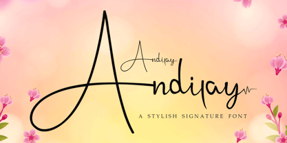 Andilay is a lovely and timeless handwritten font. It is the best choice for creating eye catching logos, branding and quotes. This font is PUA encoded which means you can access all of the glyphs and swashes with ease!
 - Semrawut by Andrey Font Design,
$9.00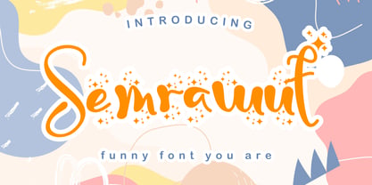 Semrawut is a lovely and timeless handwritten font. It is the best choice for creating eye catching logos, branding and quotes. This font is PUA encoded which means you can access all of the glyphs and swashes with ease!
 - Zyklop NF by Nick's Fonts,
$10.00A random scan from a late nineteenth-century German type specimen book, encountered on the internet, provided the pattern for this surprisingly contemporary face. Although all of the characters are parallel to the baseline, the unusual dimensional treatment tends to give the impression that they slant upward to the right. Both versions of this font include the complete Unicode 1252 Latin and Unicode 1250 Central European character sets. - Tchig Mono by Eclectotype,
$30.00 This is Tchig Mono, a monospaced type family that doesn't take itself too seriously. Why make a monospaced font? For coding, sure, but display? It’s my humble opinion that it’s the aesthetic choices driven by the constraints of the monospaced environment that makes them attractive. It’s a challenge for the type designer to squash and expand glyphs into a rigid bounding box, and the more unorthodox shapes that spring from this have a feel about them which lends them to postmodernist layouts and hipsterish anti-design. And the payoff for the type designer - no kerning! Yay. So what’s different about Tchig? Like I said before, it doesn't take itself too seriously. Even the name Tchig is just a stupid, fun sound (although it does show off that nice g!). There are a selection of playful alternates that give text a slightly alien feel. Stylistic set 1 chops off ascenders and descenders of lowercase letters, giving it a kind of small caps meets unicase feel (it is also accessible using the small caps feature). The other sets (or stylistic alternates if you don't have access to stylistic sets) make certain letters more twirly, more square, more “experimental”. Automatic fractions use a half-width numerator and denominator so fractions like one half and five eighths have the same width as figures (and every other glyph). There you go then - a monospaced type family not initially intended for use in the usual ways monospaced families are intended to be used. Give it a try. You could even do some coding with it if you like.
 - Davison Spencerian by House Industries,
$33.00 As one of the most distinguished lettering artists of the 20th century, Meyer “Dave” Davison’s greatest contribution to the American visual landscape is arguably Davison Spencerian. The alphabet made its first appearance in Photo-Lettering’s 1946 catalog and remains a benchmark of the ornamental script genre. Thanks to the skillful hands of Mitja Miklavčič and the tireless eyes of House Industries designers Ben Barber and Ken Kiel, we have preserved the poise and precision of Davison’s masterwork in this faithfully-rendered digital incarnation. From automotive exhaust accessories and pirate-themed wedding invites to New Orleans sissy bounce hip-hop CD covers and upmarket bivalve ambrosia packaging, Davison Spencerian offers sober sophistication and unparalleled flexibility. DAVISON SPENCERIAN CREDITS: Typeface Design: Meyer “Dave” Davison Typeface Digitization: Mitja Miklavčič Typeface Direction: Ben Kiel and Ken Barber Like all good subversives, House Industries hides in plain sight while amplifying the look, feel and style of the world’s most interesting brands, products and people. Based in Delaware, visually influencing the world.
 - Flefixx by Sun Young Oh,
$54.00 Flefixx is a typeface designed to support a project "Flefixx", an idiosyncratic visual language and typeface system that unfolds narratives based on common combinations of letters. In this visual language, just as individual letters come together like puzzle pieces to form different meanings or words based on combinations, the typeface is also constructed from fragmentary elements, each playing a distinct role as if they are individual pieces. The intentional exposure of the intersections of these fragments emphasizes the typeface's creation through interconnected elements. Furthermore, diacritics and dots are strategically positioned as ornaments, enhancing their presence within the gaps between letters. This concept aligns with the theme of composition and connectivity among fragments, allowing strong rhythmic patterns to emerge as letters and symbols blend in a paragraph. Additionally, the prominent and bold punctuation marks serve to provide pauses and clarity within sentences that incorporate both letters and the visual language. They contribute to articulating sentence structure amidst the dynamic flow of sentences with combined characters and visuals.
 - Florati by Proportional Lime,
$19.99 Can you imagine the delight that the printers of the Incunabula era would have had if they had such a tool as this font with a hundred and fifty glyphs of decorative capitals. The printers of that era were lucky to have more than a handful such delights. These Decorated initials and drop caps are all based on early period exemplars, dating to prior to 1525, from a wide range of printers such as Thomas de Blavis to Günther Zainer. Every Proportional Lime Font comes equipped with a complete character map.
 - Exelancer by Popskraft,
$19.00 We are proud to present the futuristic Excelancer font. This font was inspired by passion for space stories. The uniqueness of this font lies in the rare combination of a wibrant style of decorative capital letters and perfectly balanced lowercase charachters that read well in any massive text. Thus, you get a universal font kit with which all the tasks of futuristic design are solved. However, this font will become a decoration not only for fantastic stories, but also for everything related to technology, development, progress and even sports. In short, this is the pure energy of the future!
