10,000 search results
(0.038 seconds)
- Sheree by Typadelic,
$14.95 Inspired by mid-century greeting card hand-lettering, Sheree is a unique serif font with some really fun qualities. While some characters are distinctly calligraphic and conformist in nature, Sheree bounces all over the baseline, displaying an unconventional attitude all her own.
 - Grassroots Typewriter by BeckMcCormick,
$16.00This font was inspired by a 1950’s Royal Quiet De Luxe Typewriter, and features textured letters & symbols, creating a realistic look & feel without needing to source your own antique machine! Each keystroke on an old typewriter shows variations based on the ink ribbon & how hard or soft the typebars strike the ribbon & paper. This font was designed to provide multiple options for each letter so that you can further customize the look & feel of your text. - 1475 Bastarde Manual by GLC,
$38.00 This script font was inspired by the type called “Bastarde Flamande”, a much appreciated one in the Duke of Burgundy’s court at the end of 1400s for handwritten books. A book titled Histoire Romaine (Roman history), from Roman author Tite Live, translated in French by Pierre Bersuire, circa 1475, was our main source for drawing the lower case characters and many of the upper case. Each character was written by hand with a quill pen on rough paper so as to look like the originals as much as possible. This font includes “long s”, naturally, as typically medieval , also a few ligatures, final and initial characters but there aren't any abbreviations because the text was written in French rather than Latin. Instructions for use are enclosed in the file and identify how to keyboard these special characters. This font can be used for web-site titles, posters, fliers, ancient looking texts, greeting cards, indeed for many types of presentations as it is a very decorative, elegant and luxurious font. Large type size shows this font at its best.
 - 1805 Austerlitz Script by GLC,
$42.00 In 1805, December second, the Napoleonic French army won the famous battle of Austerlitz, against Autrichian and Russian armies. Napoleon was a great general, but his hand-writing was not legible at all, so he employed a few secretaries who wrote the official mail. This font was created, inspired from letters written by one of these professional secretaries and scribes in the months before the battle. We propose it as a typical example of the French Hand from this period. The font contains numerous ligatures and alternative characters so as to look as close as possible to real handwriting. The standard full set is complete with accented or specific characters for West (Including Celtic) and Central European, Baltic, Romanian, Hungarian and Turkish languages.
 - Shameless by Positype,
$79.00 I will spare you the long-winded description this time and all of the motivations and witty innuendoes. Quite frankly, I forgot about creating this typeface and it sat on my hard drive for almost a year. Luckily, my daughter Isobel saw the initial drawings one day and ask me about those pretty letters and I remembered… yep, that happened. That said, time made this a better typeface… with fresh eyes and time, much was redrawn, retooled and expanded to something I truly enjoy playing with. Shameless makes extensive use of Contextual alternates to create a proper ebb and flow from letter to letter. Interestingly, there are only a handful of ligatures… instead many special combinations are accounted for solely by relying on Contextual Alts. Mix in Stylistic Alts, Swashes, responsive Titling Alts, numerous Style Sets, etc and you can have a lot of fun. I created 2 versions. A ‘Standard’ version that has 2200+ characters and a ‘Deluxe’ version that has 2400+ characters and an interesting caveat… I plan on expanding the Deluxe version any time I have an idea to add to the typeface… and as such, buyers will receive all of those updates at no charge (with updates going directly to the distributors). You get what you pay for… no insane discounts. Oh, and if you are wondering… Shameless is based on my handwriting using Kuretake Zig CocoIro pens. I love these pens.
 - Better Kamp by Ingrimayne Type,
$6.00 BetterKamp was originally constructed in 1995-6. It was not constructed to meet any specific purpose but out of curiosity, to see what the result would be if two quite different faces were blended. KampIngriana is the offspring of BetterTypeRight, which has characteristics of a typewriter face without the monospacing, and KampFriendship, which mimics a serifed face drawn by hand. The original blending had many oddities that I did not clean up until 2020 when I also added the semi-bold weights. BetterKamp lacks polish and elegance, but it is very readable at small point sizes.
 - ITC Tremor by ITC,
$29.99ITC Tremor is the work of British designer Alan Dempsey. You might think that it looks like the letters are in a seismically lively geological zone, but Dempsey had other kinds of motion in mind. Most of the faces I design come from trace 'work-outs' for advertising products. In the case of Tremor, it was to reflect a lively teenager," says Dempsey. The result is ITC Tremor, a cartoony slab serif typeface with irregular angles, straight-edged curves, and lines surrounding each character, making them look like they are jittery. - Senorita Cyrillic Script by Ira Dvilyuk,
$16.00 The hand-drawn script Señorita was handwritten with a dry brush and will look great on branding design, posters, apparel, logotype, website header, fashion design, wedding card design, and more. Hand-drawn script font Señorita contains a full set of uppercase letters and 2 full sets of lowercase letters and 43 ligatures - which can be used to create a handwritten calligraphy look. Use alternate lowercase and double-letter ligatures to create a perfect hand-painted look in your creations. The Cyrillic part of the font contains the uppercase letters and lowercase letters and 17 ligatures, giving a realistic hand-lettered style. Multilingual Support for 32 languages: Latin glyphs for Afrikaans, Albanian, Basque, Bosnian, Catalan, Danish, Dutch, English, Estonian, Faroese, Filipino, Finnish, French, Galician, Indonesian, Irish, Italian, Malay, Norwegian Bokmål, Portuguese, Slovenian, Spanish, Swahili, Swedish, Turkish, Welsh, Zulu. And Cyrillic glyphs support for Russian, Belorussian, Bulgarian, Ukrainian, and Kazakh languages. (Does font support more Cyrillic languages just type a message in the text box below and see if all characters you’ll need are there.)
 - Chu Ching San JNL by Jeff Levine,
$29.00 Novelty songs and their often crazy or extra-long titles were all the rage at the beginning of the 20th century. A piece of sheet music for the 1920 song "When Chu-Ching-San weds Paddy McCann" had the title hand lettered in an unusually bold form of Asian-inspired lettering. This has been recreated digitally as the type font named for the song - Chu Ching San JNL.
 - Potus Uncial by Jonahfonts,
$40.00 The Uncial alphabet is a majuscule script with unjoined letters which is found in European manuscripts of the 4th to 8th centuries and from which modern capital letters are derived. Potus Uncial is designed with lowercase letters reflecting the Uncial style while keeping them as close to the original majuscule script Uncials and making it a useful modern day font. I have found it to be appropriate for historic, medical and spatial topics and may be used in packaging designs, medical journals, declarations, greeting cards and prehistoric articles.
 - 2009 Handymade by GLC,
$38.00 This font is not a historical one. Although to make it was quite time-consuming (each glyph was hand-drawn separately, except for the ligatures), this cartoon or comics style font is just made for fun.
 - H-AND-S by AND,
$89.00 A common creation: (to pass from one hand to the other): For the first time, various hand-signs from diverse sources are unified into one single visual style. This compendium is the result of 15 years of incubation and 7 years of creation. In his travels throughout the world, graphic designer Jean-Benoit Levy, principal of the visual studio AND, has collected pictures of multiple hand signage. Uncertain what to do with those signs, he kept them year after year until the idea came to unify almost 200 handsigns into one single family. In accordance with this entire collection, the name of the typeface is a mix: "h-and-s". A global collection: (To put in good hands): We all have one thing in common: Hand-signs are an international language, they are meant to be understood by all of us. Each of us regularly comes in contact with modern hieroglyphs such as the hand-sign-codes that are so prevalent in our daily life. This way of communication belongs to no one in particular and to all of us in general. Even if the sense of certain signs varies from one culture to the other, there is a common hand-sign language. We are surrounded by this language of handsigns each time we step in a store, we eat, open a container of milk, we clean up, use package of wash-powder, by shaving, when we work, use tools, at home, by tearing the envelope of a condom, by traveling, etc. When we encounter these signs, we all understand them easily. A visual connection: (To go hand in hand): This typeface is a global visual statement. Collecting, ordering, redrawing, unifying. Reconstructed and assembled into one original alphabet, H-AND-S is a unique and complex signs program. Our choice is based on daily gestures and global hand-codes. Logically this typeface starts with the "American Sign Language" and expands on two type-variations, each on two levels of keyboard. The international team of H-AND-S would like to send his special thanks to all of the anonymous graphic designers throughout the world who designed different hand-signage and who influenced and inspired to create such a sign collection into one unified family. We, the global nomad team of AND, hope that you will enjoy our H-AND-S. Additional Credits Production: Studio AND. www.and.ch. Concept, Idea & Creative Direction: Jean-Benoît Lévy, Switzerland / USA. Research & Sketches: Eva Schubert, Germany. Illustration, Graphic Design & Visual Fusion: Diana Stoen, USA. Transfer, Adaptation & Refining: Moonkyung Choi, Korea. Finalization & Checking: Sylvestre Lucia, Switzerland. Coaching & Technical Advice: Mike Kohnke, USA. Creative Energy & Implementation: Joachim Müller-Lancé, Germany / USA.
 - English Script by Linotype,
$40.99English Script Regular is a typeface made in the manner of English Copperplate, a kind of writing that was very popular in England during the 18th Century. Also referred to as English Round Hand, the style was promulgated by various writing masters, who published copybooks of their handwriting for students to use as guides. The style has remained popular to this day, and almost no sort of font is more readily identifiable with the ideas of formal," "old fashioned," "traditional," or "high society." English Script Regular is the perfect choice for use on wedding invitations and other announcements." - Mimogie by Youngtype,
$14.00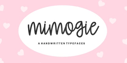 Mimogie - Handwritten Typefaces Contains a complete set of lowercase, uppercase, alternative, ligatures, punctuation marks, numbers and multilingual support. This font is ideal for use in watercolor designs or hand bold styles, such as blog headers, posters, wedding elements, t-shirts, clothing, book covers, business cards, greeting cards, branding, merchandise, invitations and handmade quotes and more. again. again. Thank you :)
 - Spectacular Americanos by Youngtype,
$17.00 Spectacular Americanos & Spectacular Americanos Outline is a hand brush font made with brushes and ink. This typeface is ideal for use in thick watercolor designs or handwriting styles, such as blog titles, posters, wedding elements, t-shirts, clothing, book covers, business cards, greeting cards, branding, merchandise etc. Contains full set : Uppercase Lowercase Ligatures Punctuation number multilingual support. Thank you!
 - Bellastory by HafisHidayat,
$20.00 Bellastory is a font that is intentionally made with hand strokes using a brush pen, so that it gets a natural texture, and produces beautiful fonts for your various designs, this font is suitable for cover books, magazines, logos, invitations, business cards, screen printing, product packaging, posters, invitations, greeting cards, news, blogs, everything including personal charm.
 - Colorful Candy by Putracetol,
$22.00 Colorful Candy is funny hand letering font make from hand lettering ideas in typeface. Each one works perfectly in conjunction with the others so you can mix and match them until your hearts content! The possibilities really are endless and all styles are useful for so many different designs - have fun using it! Colorful Candy a super fun and playful hand-lettered bold typeface. It is perfect for story books, illustrations, comic books, t-shirts, posters, greeting cards, logos, branding, stickers, svg, crafting and all for display purposes. The alternative characters were divided into several Open Type features such as Swash, Stylistic Sets, Stylistic Alternates, Contextual Alternates, and Ligature. The Open Type features can be accessed by using Open Type savvy programs such as Adobe Illustrator, Adobe InDesign, Adobe Photoshop Corel Draw X version, And Microsoft Word. This font is also support multi language.
 - P22 Royalist by IHOF,
$39.95 Royalist Pro is an expanded OpenType font based on "Secretary Hand" from the time of the English Civil War, circa 1632. This Pro version includes over 500 glyphs with alternate characters, ligatures and full Western and Central European Characters sets.
 - FWD Zooks by Fontwright Design,
$29.00 FWD Zooks is a very casual pen style OpenType LatPro font containing 411 characters. This font contains a full complement of characters including many extra ligatures and OpenType alternates. FWD Zooks was designed directly from hand lettered notes with a few uniquely creative features added yielding a truly individual and recognizable typeface. FWD Zooks is perfect for your personalized casual text across numerous document types. FWD Zooks was designed with a natural bounce to provide a more personalized, hand lettered appearance. For instance, while FWD Zooks is great for Cartoons and Comics, it is also an excellent choice for Invitations, Cards, Posters, Book Covers, Personalized Letters and much, much more!
 - Kiranna by Ably Creative,
$10.00 Kiranna is a classic handwritten font nd combination with Hand Lettering style. we make with personality touch every single curve. I hope this can make inspire you from your work. and a very bouncy. Ideal for logos, handwritten quotes, product packaging, header, poster, merchandise, social media & greeting cards.. This font is suitable for wedding invitation, branding, invitation, t-shirt, mailing and other suitable design you can think of. To enable the OpenType Stylistic alternates, you need a program that supports OpenType features such as Adobe Illustrator CS, Adobe Indesign & CorelDraw X6-X8. There are additional ways to access alternates, using Character Map (Windows), Nexus Font (Windows), Font Book (Mac) or a software program such as PopChar (for Windows and Mac).
 - Birama by Haksen,
$13.00 a Hand-lettered with beauty style, Birama is a must have for all your design needs. Perfect for greeting cards, branding, stationery design, social media, packaging, magazine layouts, prints and more! Utilize lowercase for a completely alternate style and also ligatures, for creative designs. This font works best in a program that supports OpenType features such as Adobe Indesign, Adobe Illustrator CS, or Adobe Photoshop CC. You can access the alternates from the 'Glyphs Panel' in these programs. Birama has a variety of unique, coded features to create compelling, handmade outcomes: stylistic alternates and standard ligatures. Multilingual support is included for Western European languages. PUA Encoded. Have a great day! :) Haksen
 - Tiamaria by Galapagos,
$39.00In the 70's I went out with a girl whose father was a card-carrying member of 3 of the biggest unions in the printing arts. He gave me 2 things, a pre-war Linotype specimen book and an ancient 'how to' lettering book that contained 30 or 40 script specimens from lettering artists of the time. Tiamaria is the developed glyphs of one of these specimens. Tiamaria is the name of one of the islands in the Galapagos chain. - Sandbrush by Typia Nesia,
$20.00 Sandbrush is a natural hand brushed font. Work great for any design needs : logo, branding, modern advertising design, logos, poster quote, book / cover Title, editorial design, website / blog, card, custom mug, pillow, t-shirts, and any hand-lettered needs.
 - Allograph JNL by Jeff Levine,
$29.00According to the dictionary, the way a letter is formed or shaped within a writing system is an allograph... and Allograph JNL from Jeff Levine takes on unusual shapes. Using characters from Jeff's Printing Set JNL font, they were printed out white-on-black, and the paper was torn into abstract pieces and then scanned in order to create this edgy looking font. - Bandung Pro by Majestype,
$34.00 Bandung Pro from Majestype was made to capture the natural movement of a brush script infused with the elegance of copperplate hand. With 6 months in the making, we want to make sure that the character set connects each other as natural and seamless as handwriting would be. We give you vast amounts of glyph options(700+) added with lots of swashes and flourishes to give you an authentic look of hand-made brush letters. Aceserif Pro is an all-caps serif font inspired by traditional serif and art deco design. Equipped with 220 Glyphs and has the current OpenType features. We made the uppercase letters slightly larger than the lowercase letters to give a good impression when used in designs that don’t require a lot of words, such as headlines or headers. You can try it like this, “HeadlineS” - Capital letters are at the beginning and end of a word. Bandung Pro & Aceserif Pro is suitable for a wine label, photography, invitation, ID card, tattoo, poster, logo, title, tees, branding, etc.
 - Gemstone JNL by Jeff Levine,
$29.00 A late-19th Century song book entitled "Gems of Scotland - A Beautiful Collection of Scottish Songs" had the words "Gems of Scotland" hand lettered in an ornate, condensed type style now reproduced digitally as Gemstone JNL.
 - Mercato VF by Borutta Group,
$79.00 MERCATO is a headline family of typefaces inspired by hand-painted price tags. The idea for this family was born a few years ago in South America. I wanted to create a typeface that is written, expressive and organic on the one hand, and thrown into a geometric frame on the other. Co-designers: Karol Mularczyk & Małgorzata Bartosik.
 - Hush Hush by Comicraft,
$49.00 If you thought you heard someone callin' your name just now, you might have caught the firm but soft spoken tones of Comicraft's classy balloon lettering font, HushHush. Created in the style of the newspaper strips of the 30s and 40s, HushHush captures the slick movements of the skilled hand letterers of that era. Gracing the pages of Jeph Loeb and Jim Lee's chart-topping BATMAN storyline -- which by a staggering coincidence was also called "Hush" -- these characters have brought to life the words of Two Face, The Joker, Scarecrow, Catwoman, Batman and Robin -- from every whisper to every scream.
 - heavyLOUDedge - Personal use only

- JulesLove - Unknown license

- Winter Garden JNL by Jeff Levine,
$29.00 Winter Garden JNL was modeled from the eccentric sans serif hand lettering with varying line widths found on the sheet music of 1917's "When the Girl You'd Give the World to Win Gives Her Heart to You". (It seems that sheet music from the early 1900s often had song titles that were more than just a few choice words. This particular ditty's title took up fourteen words to make its point.) The font is available in regular and oblique versions and gets its name from both the famed theater in New York and the city located 14 miles West of downtown Orlando, Florida.
 - Areplos by Storm Type Foundry,
$53.00To design a text typeface "at the top with, at the bottom without" serifs was an idea which crossed my mind at the end of the sixties. I started from the fact that what one reads in the Latin alphabet is mainly the upper half of the letters, where good distinguishableness of the individual signs, and therefore, also good legibility, is aided by serifs. The first tests of the design, by which I checked up whether the basic principle could be used also for the then current technology of setting - for double-sign matrices -, were carried out in 1970. During the first half of the seventies I created first the basic design, then also the slanted Roman and the medium types. These drawings were not very successful. My greatest concern during this initial phase was the upper case A. I had to design it in such a way that the basic principle should be adhered to and the new alphabet, at the same time, should not look too complicated. The necessary prerequisite for a design of a new alphabet for double-sign matrices, i.e. to draw each letter of all the three fonts to the same width, did not agree with this typeface. What came to the greatest harm were the two styles used for emphasis: the italics even more than the medium type. That is why I fundamentally remodelled the basic design in 1980. In the course of this work I tried to forget about the previous technological limitations and to respect only the requirements then placed on typefaces intended for photosetting. As a matter of fact, this was not very difficult; this typeface was from the very beginning conceived in such a way as to have a large x-height of lower-case letters and upper serifs that could be joined without any problems in condensed setting. I gave much more thought to the proportional relations of the individual letters, the continuity of their outer and inner silhouettes, than to the requirements of their production. The greatest number of problems arose in the colour balancing of the individual signs, as it was necessary to achieve that the upper half of each letter should have a visual counterbalance in its lower, simpler half. Specifically, this meant to find the correct shape and degree of thickening of the lower parts of the letters. These had to counterbalance the upper parts of the letters emphasized by serifs, yet they should not look too romantic or decorative, for otherwise the typeface might lose its sober character. Also the shape, length and thickness of the upper serifs had to be resolved differently than in the previous design. In the seventies and at the beginning of the eighties a typeface conceived in this way, let alone one intended for setting of common texts in magazines and books, was to all intents and purposes an experiment with an uncertain end. At this time, before typographic postmodernism, it was not the custom to abandon in such typefaces the clear-cut formal categories, let alone to attempt to combine the serif and sans serif principles in a single design. I had already designed the basic, starting, alphabets of lower case and upper case letters with the intention to derive further styles from them, differing in colour and proportions. These fonts were not to serve merely for emphasis in the context of the basic design, but were to function, especially the bold versions, also as independent display alphabets. At this stage of my work it was, for a change, the upper case L that presented the greatest problem. Its lower left part had to counterbalance the symmetrical two-sided serif in the upper half of the letter. The ITC Company submitted this design to text tests, which, in their view, were successful. The director of this company Aaron Burns then invited me to add further styles, in order to create an entire, extensive typeface family. At that time, without the possibility to use a computer and given my other considerable workload, this was a task I could not manage. I tried to come back to this, by then already very large project, several times, but every time some other, at the moment very urgent, work diverted me from it. At the beginning of the nineties several alphabets appeared which were based on the same principle. It seemed to me that to continue working on my semi-finished designs was pointless. They were, therefore, abandoned until the spring of 2005, when František Štorm digitalized the basic design. František gave the typeface the working title Areplos and this name stuck. Then he made me add small capitals and the entire bold type, inducing me at the same time to consider what to do with the italics in order that they might be at least a little italic in character, and not merely slanted Roman alphabets, as was my original intention. In the course of the subsequent summer holidays, when the weather was bad, we met in his little cottage in South Bohemia, between two ponds, and resuscitated this more than twenty-five-years-old typeface. It was like this: We were drinking good tea, František worked on the computer, added accents and some remaining signs, inclined and interpolated, while I was looking over his shoulder. There is hardly any typeface that originated in a more harmonious setting. Solpera, summer 2005 I first encountered this typeface at the exhibition of Contemporary Czech Type Design in 1982. It was there, in the Portheim Summer Palace in Prague, that I, at the age of sixteen, decided to become a typographer. Having no knowledge about the technologies, the rules of construction of an alphabet or about cultural connections, I perceived Jan Solpera's typeface as the acme of excellence. Now, many years after, replete with experience of revitalization of typefaces of both living and deceased Czech type designers, I am able to compare their differing approaches. Jan Solpera put up a fight against the digital technology and exerted creative pressure to counteract my rather loose approach. Jan prepared dozens of fresh pencil drawings on thin sketching paper in which he elaborated in detail all the style-creating elements of the alphabet. I can say with full responsibility that I have never worked on anything as meticulous as the design of the Areplos typeface. I did not invent this name; it is the name of Jan Solpera's miniature publishing house, in which he issued for example an enchanting series of memoirs of a certain shopkeeper of Jindrichuv Hradec. The idea that the publishing house and the typeface might have the same name crossed my mind instinctively as a symbol of the original designation of Areplos - to serve for text setting. What you can see here originated in Trebon and in a cottage outside the village of Domanín - I even wanted to rename my firm to The Trebon Type Foundry. When mists enfold the pond and gloom pervades one's soul, the so-called typographic weather sets in - the time to sit, peer at the monitor and click the mouse, as also our students who were present would attest. Areplos is reminiscent of the essential inspirational period of a whole generation of Czech type designers - of the seventies and eighties, which were, however, at the same time the incubation period of my generation. I believe that this typeface will be received favourably, for it represents the better aspect of the eighties. Today, at the time when the infection by ITC typefaces has not been quite cured yet, it does absolutely no harm to remind ourselves of the high quality and timeless typefaces designed then in this country.In technical terms, this family consists of two times four OpenType designs, with five types of figures, ligatures and small capitals as well as an extensive assortment of both eastern and western diacritics. I can see as a basic text typeface of smaller periodicals and informative job-prints, a typeface usable for posters and programmes of various events, but also for corporate identity. Štorm, summer 2005 - Bibliophile Script by Sudtipos,
$79.00 A friend once jokingly told me that what I really do is mine extinct arts for parts to use in modern things, like going to the scrapyard to pick up bumpers, quarter-panels and dashboards off of Datsuns and Ponies to build a shiny new Ferrari. I still kind of grin at that, but I certainly do spend a lot of time looking at old things and imagining ways they would work today. This shiny new Ferrari here is called Bibliophile, and it contains scrap heap parts from various pages by Louis Prang, the Prussian-American printer and publisher who inspired my Prangs fonts. This is my second engagement with the late 19th century man, and it’s quite a bit more intricate than just an italic Didone with a connected lowercase. Bibliophile marries Round Hand calligraphy with Italian capitals, two styles not often relayed in the same alphabet, but work together beautifully when combined well. When you combine them well with a few long-practised tricks of the trade, then mix in a few trusted features from my previous work over the years, you get my usual crazy exuberance, like 17 different shapes for the d, 21 different forms for the y, endings, beginnings, swashes, ornaments, and so on. It’s no secret that I can get carried away when I’m so consumed by an idea. — Bibliophile comes in 2 weights, each of them with over 900 glyphs covering all the latin languages. Bibliophile also comes with a bold weight, something I’m always reluctant to do with something as adventurous and complex as the structure of this historical mashup. But I couldn’t chase away the idea of increasing the contrast while maintaining the hairlines in a lowercase this narrow. Part of it was the curiosity about the outcome, and part was the sheer challenge of it. I think it turned out OK. Words set in either weight will show delicateness and elegance, and the more time you spend inside the font and micro-manage the setting, the more ways you will find to magnify either. Bibliophile can be as muted or luxurious as you want it to be. This is the kind of alphabet that fits well in fashion marketing and high-end packaging, from the very subdued to the super-exquisite. Enjoy the gleaming new vehicle made with freshly polished old parts.
 - Chicago Brush by Colllab Studio,
$19.00 "Hi there, thank you for passing by. Colllab Studio is here. We crafted best collection of typefaces in a variety of styles to keep you covered for any project that comes your way! If you're looking for a hand-drawn font to help craft a unique statement piece, you've probably been spending hours looking for the perfect brush font. The problem with most brush fonts is that they're not actually made from real brushes - they look like they've been artificially drawn by a machine. There's now a high-quality alternative available. We are proud to introduce our new, very high resolution Chicago Brush font - the result of our meticulous process of digitizing hand-drawn typefaces and then optimizing them through our exclusive, innovative technology. That’s why we created Chicago Brush, a font made from a real brush. Use it to create logos, names and signage. It will look hand lettered, like you really worked on those letters manually. A Million Thanks Colllab Studio www.colllabstudio.com
 - Osovec by Dima Pole,
$27.00 This font is dedicated to the glory of the human spirit and honor. Osovec is a fortress of World War I. On the 6 August 1915, the defenders of the fortress, the Russian soldiers, against whom the enemy had used poison gas; though half-dead, were able to rise to the counter. Thus it was that 60 Russian soldiers routed the 2 thousand strong enemy army. This heroic episode has gone down in history as"Attack of the dead". The font contains more than 700 glyphs, support for all 104 European languages, all Slavic languages, a variety of OT features, including ligatures, old numerals, alternatives, ordinals, and many others.
 - ITC Ironwork by ITC,
$29.99ITC Ironwork is the work of Serge Pichii, who was inspired by a piece of decorative lettering done by Jan Tschichold in the early 1920s. Tschichold had interlocked a series of rough sans serif letters and embellished them with scattered decorative elements. The original was of only capital letters, touching and overlapping like an ironwork gate made of letters. Pichii completed the typeface with lowercase forms and smoothed the edges. The scrolls of the capitals were extended to the lowercase and Pichii based them on iron scrollwork he found in Vienna and Prague. A lot of attention was paid to the elements of the typeface in order to 'smooth out' and balance proportional relations between the elements," says Pichii. ITC Ironwork is great for signage and display but also works well in short texts." - Beverly Catherine by Attract Studio,
$16.00 Beverly Catherine is a bold hand-drawn all-caps marker font that has really original brush edges and is rough in every stroke. Great for logos, merchandise, product packaging, quotes, comic book text, and hard-hitting titles. It also includes multilingual support.
 - Wall Scrawler by Comicraft,
$39.00 This slick, marker style font was created by our fontmeister, Mr Fontastic, based on the slick, marker style of... Well, Mr Fontastic himself! Check it out in the pages of Marvel's classic DAREDEVIL story GUARDIAN DEVIL. DD scribe and indy movie maker Kevin Smith himself told us it was the coolest font he'd ever seen in his entire life! No, sorry, that is a lie, but he did tell us he liked the design work Mr Fontastic created for the JAY & SILENT BOB trades, No, seriously, he did. We wouldn't lie to you. Well, except for that last time. By the way, this font also doubles as a dynamite sound effect font, that's why we're charging you twice as much as usual. No, sorry, lying again. About the price, not the sound effect thing.
 - Mexcellent - Unknown license

- Shantika Script by Masinong Studio,
$14.00 Shantika Script is inspired by a retro and hand lettering style and features a very bouncy baseline. This font is ideal for logos, handwritten quotes, product packaging, headers, posters, merchandise, social media, greeting cards and more.


