10,000 search results
(0.227 seconds)
- Dioksiany by sizimon,
$20.00 Introducing our new font the Dioksiany! Inspired by Sophisticated Fashion Style. Classy, contemporary paired font. It is free-flowing, fashionable, feminine, and friendly. Use the fonts for: logos, branding, wedding invitations, farmhouse decor, farmhouse signs, mugs, shirts, pantry labels, stickers, business cards, greeting cards, posters, social media, planner prints and websites. Dioksiany Includes: Uppercase, lowercase, numeral, punctuation & Symbol Multilingual support Stylistic alternates 55 Discretionary ligatures 10 swash (numeral keys) PUA Encoded Characters Fully accessible without additional design software. If you have any question please do not hesitate to contact me: sizimon.id@gmail.com
 - Filiya by Anastasia Kuznetsova,
$19.00 Say hello to 'Filiya'! This is a funky hand-drawn handwritten font, perfect for all your holiday designs!! Add some retro fun using the 'Filiya' font inspired by the 70s font! This font is perfect for all your retro designs, procreate designs, social media, shirts, stickers, branding, logos, prints, Cricut designs, svg designs and more! This font includes a basic set of retro letters from A to Z, as well as some fun festive Christmas themed letters. Create, enjoy and create your own unique image! 'Filiya' is available in five versions! The kit includes - regular, contour, shadow, luminous and doodle!! Font Features: - A-Z; a-z character set; - 1 language (English); - numbers and punctuation marks, symbols. Fonts can be opened and used in any software that can read standard fonts, even in MS Word. No special software is required to get started. It is recommended to use it in Adobe Illustrator or Adobe Photoshop. Made with love and magic ♡ Thank you for reading it, and do not hesitate to send me a message if you have any questions! ~ Anastasia
 - Minah by Afkari Studio,
$17.00 Minah - Handwriting Script Font Minah is the latest modern handwriting Script font made as naturally as possible, minah modern script font is perfectly made to be applied in logo brands, invitations, labels, magazines title, books, greeting cards, wedding cards, packaging, fashion, makeup, stationery, novels, labels or any type of advertising purpose. Minah Handwriting Script font was simple and casual that contained Open Type features such as Stylistic Sets, Stylistic Alternates, Contextual Alternate, and ligatures. This modern script font also contains begin, middle, and ending swash which makes it very easy to use, it will help you to create your own customized design. Just rely on your creativity! Features; - Uppercase, Lowercase, Number, and Punctuation - Special alternates and ligatures - Works on PC & Mac - Simple installations - Accessible in Adobe Illustrator, Adobe Photoshop, Adobe InDesign, and even work on Microsoft Word - Fully accessible without additional design software. - Mültîlíñgúãl Sùppört for; ä ö ü Ä Ö Ü ß ¿ ¡ Hope you enjoy our font and this font is a useful font for your projects!
 - Tokyo Olive by Dharma Type,
$14.99 Tokyo Olive was designed as an homage to nostalgic display types and advertisements in the mid-late 80s. The mid-late 80s was the era of the post-modernism and fancy-decorative design especially in Japan In other words, it was the mixture of superficial form-operation and girly taste. This curious design movement vanished without a trace in the 90s, but it had its moments. Tokyo Olive has voluminous and simple geometric skeleton (for post-modern) with rounded and craft-style stencil joints (for fancy decoration). We added a classic open style as a little spice. The mixture of those essences makes new impression we have never seen before. Tokyo Olive family consists of 5 styles for stacking color font. Please use Photoshop or Illustrator, or your favorite graphic design apps that can handle layers. Layers are the printing plates of wood type. You should be able to change text color for each layer. Tokyo Olive "Standard" style is the base of this font family. You can add open effect by stacking "Fill" layers over the Standard layer. Instruction 1. Type your text as you like. 2. Set font-name "Tokyo Olive" and font-style "Standard". 3. Set color of "Standard" layer. 4. Duplicate the "Standard" layer to make "Fill" layer. 5. Set font-style "Half Fill" or "Full Fill" and new color of upper layer. Tokyo Olive Standard, Half Open, and Full Open style can be used solely.
 - Streetbomber by Din Studio,
$29.00 Hi, Everyone! Want to make your branding bold with graffiti font? Then we’ve got the font for you! Introducing Streetbomber- A Grafiti Font Streetbomber is an urban font that echoes the classic tag lettering style. Use this cool and artistic graffiti font to breathe a street life vibe into your projects. This font is perfect for logos, printed quotes, cards, packaging, website or social media branding, and many more! Streetbomber includes multilingual options to make your branding reach a global audience. Includes: Streetbomber (OTF) Features: Alternates Standart Ligatures Stylistic Set Multilingual Support PUA Encoded Numerals and Punctuation Thank you for downloading premium fonts from Din Studio
 - Sally Garden by Graphicfresh,
$16.00 Sally Garden - A Sweet Handwriting Font Duo. It comes with an elegant and modern style which is perfect to make any design stand out! This font ideal for elegant branding projects, greeting cards, packaging, social media, logo design and of course, wedding invitations. Sally Garden Type Features: Uppercase -Lowercase Numerals & Punctuations PUA Encoded Ligatures Suitable for Headlines, Logotypes, Signs, Posters, Letterhead, T-Shirt and many more. Support International Language Be sure to check out all the previews above by clicking on them and scrolling down to see all the fonts and ideas and inspiration for using this font duo. Hope you enjoy with our Font Thank You Graphicfresh
 - Dimensions by Dharma Type,
$19.99 Dimensions is redesigned font family based on Blackout font released as free font in 2005. The original blackout has been used especially for company or brand logo of fashion and music label in the world. In 2011, Blackout had evolved into this Dimensions font family of seven weights with roman and italics. They are one of the most condensed, black and skinny font in the world. All weights and italics have upper and lower cases, accented characters and small capital glyphs that can be used with OpenType smcp feature. There is high contrast version called Speedometer.
 - Brunei Darussalam by HafisHidayat,
$23.00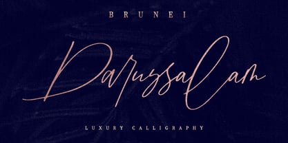 Introducing Brunei Darussalam, a fashionable and luxury handwriting font, which looks like a signature. This font is intentionally made with unique ligatures and alternates. Brunei Darussalam is perfectly suited for branding, logos, business cards, posters, invitations, greeting cards, news, product packaging, blog posters and more. This font is also equipped with unique and interesting ligatures, by using this ligature you can give a real handlettered style. Multi-Language support: ŠÀÁÂÃÄÅÆÇÈÉÊËÌÍÎÏŸŽÐÑÒÓÔÕÖØÙÚÛÜÝßàáâãäåæçèéêëìíîïñòóôõöøùúûüýÿŒœšž Thank you for your purchase!
 - Good Karma by Positype,
$15.00 Good Karma (its namesake) will be extended to you as you use this new relaxed script family. Produced from hand and sumi brush of Neil Summerour, Good Karma is a natural brush textured font family. Good Karma is filled with a lot of heart, reliable and genuine movements, and a wide range of letter options to befit any project needing an honest hand-lettered look. Each typeface comes with an additional set of stylistic alternates (upper AND lowercase) that harmonize wonderfully when you have the Opentype Ligature feature active. Additionally, special double-letter ligatures have been produced for specific combinations in need of more expressive flair, as well as a few swashes that work with the economical strokes originally produced from the sumi brush. To further expand the usefulnesss of this peaceful script, a separate Caps/Small Caps font has been added that provides the simple contrast needed to bring the script fonts forward. Rather than limit the personality of this script, various styles have been produced to complement the original Regular—Upright, Wide, Wide Upright, and the aforementioned Caps fonts are included in hopes of helping you find the perfect variation needed for your composition. Good Karma is the first release of the Positype Relaxed Script Collection of typefaces—all focused on fluid, effortless script fonts for simple use.
 - Retrorelic by Runsell Type,
$9.00 The Retrorelic perfectly represents vintage aesthetics in a contemporary script, serif and slab serif version. This Font Family consists of clean, rough and outline feature as well. The Retrorelic Font Family is perfect for designs such as the logotypes, packaging, branding, quotes, business cards and more custom design. It features uppercase, lowercase, numeral, punctuation and symbols, ligatures, stylistic alternates, multi-lingual support, and is PUA encoded. How to get access alternate glyphs from OpenType fonts Click Here
 - Docket by Parker Creative,
$18.00 With it's distressed markings and rough edges, Docket mimics the appearance of a vintage typewriter from the 1940s. With Docket, you can quickly create graphics with an instant classic feel, and it's application is quite versatile. Create logos, stamps, sublimation designs, social media quotes, monogram products, and even websites with this bohemian typewriter font! Docket's characters are proudly hand-crafted, meticulously kerned, and come in two variations to capture the unique look of an old grunge typewriter.
 - Kabif by Twinletter,
$15.00 Retro is in again! The distinctive font Kabif will give your work a vintage, extraordinary look. With its erratic, rounded, and geometric shapes, this font typifies popular culture from the 1960s and 1970s. A cool and simple font with an easy-to-see and easy-to-read typeface is called Kabif. The Kabif font works best for text, headlines, headers, signage, greeting cards, posters, flyers, invitations, packaging, book covers, printed quotes, album covers, and other visual elements.
 - Carte Blanche by Hanoded,
$20.00 Carte Blanche literally means 'Blank Ticket'. Yeah, yeah, it is also a very 007-ish catchphrase, but I wanted to give this elegant font a 'stylish' name and Carte Blanche popped up. All glyphs were hand drawn on a rather expensive piece of heavy-weight paper and were put into the font in between changing nappies, bouts of the flu and the subsequent wiping of snotty noses. Carte Blanche speaks most Roman-based languages - albeit nasally…
 - Mr Cyrk by Hipopotam Studio,
$18.00 Hand drawn typeface designed for one of our books. You can layer different styles over the background style to achieve lots of colorful effects. Use just one style to get a single color letter or set the fillOne and fillTwo over the background style to get a full, tree color mode. Mr Cyrk has only uppercase characters with alternate glyphs in place of lowercase letters. You can have one style for $18 or all of them for $30.
 - Blinkford by Nathatype,
$29.00 Step back in time and embrace the nostalgic allure of Blinkford, a captivating uppercase display font that transports you to a vintage charm. The characters are bold and robust, evoking a sense of grandeur and prominence that harks back to a bygone era. The open layout enhances legibility and imparts a sense of spaciousness that is characteristic of vintage typography. As a special bonus, this font includes ornaments. Blinkford fits in headlines, logos, branding materials, and many more.
 - Devil's Snare - Unknown license

- (afGiHmtV)* - Unknown license

- Penzance by TEKNIKE,
$45.00 Penzance is a display monospace handwriting font. The typeface is a distinct hand drawn font using a fountain pen quill ink style. The Penzance name means "holy headland" in the Cornish language and is derived from the town on the English coast of Cornwall. Penzance is great for display work, invitations, writing, books, posters, logos and headings.
 - Ithaka by TEKNIKE,
$39.00 Ithaka is a display monospace handwriting font. The typeface is a distinct hand drawn font using a fountain pen quill ink style. The Ithaka name is derived from the legendary home of the hero Odysseus in Homer's epic poem, The Odyssey (Ancient Greek: Ἰθάκα). Ithaka is great for display work, invitations, writing, books, posters, logos and headings.
 - P22 Hiromina 03 by IHOF,
$24.95 Hiromina03 is named after the wife of its designer, Hajime Kawakami. The three fonts in the set are based on Hiromi Kawakami's unique hand-lettering style. The distinctly feminine character of Hiromina03 is harmoniously integrated in all three writing systems, Katakana, Hiragana and Latin. The enclosed key charts give instructions for character placement in Katakana and Hiragana.
 - Sánchez Niu by Latinotype,
$- Sánchez Niu is a redesign of Sánchez—one of the first font families by Latinotype designed in 2011. In the typedesign industry the terms ‘nova’, ‘neue’, ‘next’, ‘new’ are often used to refer to a typeface that has been modified in different ways: redesign, technical readjustments, greater number of characters, etc. At Latinotype we are now starting to use the word ‘niu’ to refer to these kinds of typefaces. Niu is an adaptation of the original word ‘new’, i.e., we have adapted this English word to the phonology and spelling of our own language but keeping the original meaning. Race mixing, diversity, change and adaptation are part of the essence of Latin American culture and, at Latinotype, we are all constantly expressing these elements in everything we do. Latin Power! This new version includes improvements that make it work well with longer text. Such improvements have not had a major effect on the look of the font, though. We have adjusted the original proportions and added a number of new characters as well as OpenType features such as small caps, oldstyle figures, tabular numbers and stylistic alternates. Sánchez Niu contains a set of 720 characters that support 219 languages. The font is well-suited for long text, headlines and logotypes, and it has been optimised for web usage. Sánchez Niu comes with two free fonts—Regular and Regular Italic! Corrections, digital editing and review by César Araya, Rodrigo Fuenzalida and Alfonso García.
 - NoPain by Ingrimayne Type,
$9.00 The letters of NoPain went to a party and had a bit too much to drink. The four NoPain typefaces, regular and bold of NoPainRight and NoPainLeft, were formed by distorting the letters of the wide-serifed font Valgal.
 - Shinobu by Lurinzu Studios,
$15.75 "Shinobu" is an elegant psychedelic display font that combines characteristics of Art Nouveau and Modren San serif types. The name "Shinobu" comes from the anime character " Shinobu Kocho" from an anime called "Demon Slayer". Like "Shinobu's" characteristics, This exudes elegance and poshness while still having that quirkiness. This display font is intended to be used in big-scale designs such as headlines, posters, flyers, apparel, quotes, greeting cards, product packaging, album covers, movies, and more. *This font includes letters, numbers, alternates, and all essential marks needed.
 - Granny Tales by OKSHUtypeCO,
$12.00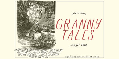 Granny Tales - a new fresh handmade calligraphy font. Very suitable for greeting cards, branding materials, business cards, quotes, posters, and more!This font are perfect for wedding postcard. Or you can create perfect and unique design of your logo, blog, stationery, marketing, magazines and more :) Features : Ligatures UpperCase & Lowercase Numerals & Punctuations Multilingualcharacters(AÀÁÂÃÄÅCÇDÐEÈÉÊËIÌÍÎÏNÑOØÒÓÔÕÖUÙÜÚÛWYÝŸŸ ÆŒßÞàáâãäåæçèéêëìíîïðñòóôõöøùúûüýÿ)
 - Pen And Ink by Rachel Kick,
$10.00 Pen & Ink is a quirky hand-drawn font. Inspired by notetaking and classroom doodles, this font has a friendly and approachable feel that perfectly compliments artwork and social media. Mix and match uppercase and lowercase letters throughout each word to get a truly hand-drawn feel. There are also 33 swash and icon extras.
 - Inka by CarnokyType,
$49.00 Inka is the name by which the closest-ones called my partner. Inka is also the name of a text typeface – in its form very friendly and welcoming. The same way as relationships develop through the life, text typefaces develop, too. I had started the work on this typeface about the same time as I met Inka, while reaching the final output has been a long and progressive process. Inka is a modern serif typeface with wide universality in functions (various editorial usages as books, magazines, annual reports…). The concept and the scope of the complete type family are based on the principle of optical sizes of the typeface designed for the particular use of the size of typesetting. Inka consists of several drawing variations for the typesetting of small sizes (Small), text typesetting (Text), larger typesetting sizes (Title), and headlines sizes (Display). Two constructive alternatives, differing in the height of the construction of the font signs, further extend the variability of the usage of the typeface. Inka A has classical proportions ideal for book typesetting. Inka B has lower ascenders and descenders, lower uppercase glyphs and numbers. Typeface with such construction allows us to use the typesetting efficiently while using tighter leading and still looking more contemporary. Each of the font set (Display, Title, Text, Small) consists of four weights (Regular, Medium, Bold, Black), each has wide character set and a lot of OpenType features. “Inka is dedicated to Inka.”
 - Jatheedo by Twinletter,
$14.00 Jatheedo is a typeface created with original handwriting that may anesthetize your eyes and give a wonderful and beautiful impression. This font is highly versatile in its use. Because of its strong character, this font is attractive when used alone, but it is also stunning when paired with sans or sans serif letters. So, what are you waiting for? Enjoy and give your project a unique appearance. This typeface was created with a natural touch of handwriting that has been developed to generate parts and compositions that meet your requirements. As a result, this typeface is ideal for crafts, children’s writing, adventure posters, food banner titles, wedding invitations, and logos for product packaging.
 - Etelka by Storm Type Foundry,
$49.00 Etelka was designed for purposes of corporate identities, branding, product package design and outside lettering. It works anywhere an extremely legible typeface is needed. Package and label design often requires a wide choice of weights and widths: light and narrowed fonts to fit huge amount of mandatory informations onto a small box, or to squeeze text lines around a bottle, fat and wide styles to emphasize information on a poster or vehicle. The regular styles will serve well for business card, small texts and for your website. Etelka’s design idea is wide, open rounded square. Some details are extremely minimized: lower-case “a, n” or “u” lack their typical spur. The typeface has a distinctive industrial expression with all diagonals slightly softened, and her overall strict mono-linear principle is exceptionally broken only for fine optical adjustments in joints. Cyrillic and Greek scripts are present for international business, as well as rich latin diacritics. Etelka is actually very well suited for all kinds of visual communication, especially orientation systems in modern architecture. The first drawing of the font, which was later named “Etelka”, was submitted in 2004 for the Czech Television identity competition and was rejected by the jury. We later concluded that the design was worth extending to the current superfamily of 42 fonts. It is a reliable typeface for corporate identities and websites.
 - 99 Names of ALLAH Compact by Islamic Calligraphy75,
$12.00 We have transformed the “99 names of ALLAH” into a font. That means each key on your keyboard represents 1 of the 99 names of ALLAH Aaza Wajal. The fonts work with both the English and Arabic Keyboards. We call this Calligraphy "Compact" because as you can see everything is very close and decorative symbols are at a maximum. The first "alef" has neither a "hamzit wasel" nor a "fatha", this indicates to skip that first alef so instead of saying "AR-RAHMAAN" you say "R-RAHMAAN". (in the zip file you will find a pdf file explaining the differences in the "harakat", pronunciation and spelling according to the Holy Quran). The calligraphy is anything but traditional & we have used all the decorative letters except for the "Ye". In other calligraphy you don't usually find the decorative letters: "Dal, Ra & Ye" but we like them and we use them, the important thing is that they don't change the pronunciation or the meaning. Decorative letters used in this calligraphy: "Mim, Aain, Sin, HHe, He, Kaf, Alef, Ta, Dal, Ra & Saad". Purpose & use: - Writers: Highlight the names in your texts in beautiful Islamic calligraphy. - Editors: Use with kinetic typography templates (AE) & editing software. - Designers: The very small details in the names does not affect the quality. Rest assured it is flawless. The MOST IMPORTANT THING about this list is that all the names are 100% ERROR FREE, and you can USE THEM WITH YOUR EYES CLOSED. All the “Tachkilat” are 100% ERROR FREE, all the "Spelling" is 100% ERROR FREE, and they all have been written in accordance with the Holy Quran. No names are missing and no names are duplicated. The list is complete "99 names +1". The +1 is the name “ALLAH” 'Aza wajal. Another important thing is how we use the decorative letters. In every font you will see small decorative letters, these letters are used only in accordance with their respective letters to indicate pronunciation & we don't include them randomly. That means "mim" on top or below the letter "mim", "sin" on top or below the letter "sin", and so on and so forth. Included: Pdf file telling you which key is associated with which name. In that same file we have included the transliteration and explication of all 99 names. Pdf file explaining the differences in the harakat and pronunciation according to the Holy Quran. Here is a link to all the extra files you will need: https://drive.google.com/drive/folders/1Xj2Q8hhmfKD7stY6RILhKPiPfePpI9U4?usp=sharing
 - Truth FB by Font Bureau,
$40.00 In 1994, Apple® Computer, Inc., asked David Berlow for “a future gothic” to replace Chicago®, their system font. Now called Charcoal®, the design was released with Mac® OS 8 in 1996. Through operating system bundles it found its way into every form of design. Released from constraint, Berlow designed Truth FB, a radical series with a spectrum of seven weights. Like its forbear, Truth FB opens new design avenues; FB 2005
 - Aire by Lián Types,
$37.00 Aire is what Sproviero would call a < big display family >. We recommend seeing its user’s guide. After his success with Reina, Sproviero comes out with this big family of 7 members: Each of them loaded with lots of sophisticated ligatures, alternates and the entire cyrillic alphabet. The overall impression that the font gives is lightness and delicateness; that’s the reason the designer chose to call it Aire, or Air, in English. "Aire was somehow having a rest from my fat face Reina [...] It started as a really thin style of Reina, but it rapidly migrated from it and grew up alone. And how it grew..." The inspiration came from his own past creations: “The heavy strokes of Reina were shouting for a more delicate thing. Something more feminine. More fragile. Something which had a lot of elegance and fresh air inside”. Aire responds to this: Sproviero found that many of the typefaces of nowadays which are used for headlines (best known as display fonts) have almost always just one, maybe two weight styles. This was his opportunity to try something new. Aire makes it easier for the user to generate different levels/layers of communication thanks to its variety of styles. With this font you can solve entire decorative pieces of design with just one font, and that was the aim of it. Aire was designed to be playful yet formal: While none of its alternates are activated it can be useful for short to medium length texts; and when the user chooses to make use of its open-type decorative glyphs, it can be useful for headlines with dazzling results. On March of 2012, Aire was chosen to be part of the most important exhibition of typography in Latinoamerica: Tipos Latinos 2012. TECHNICAL Aire is a family with many members. In total, the user can choose between almost 6,000 (!) glyphs (1,000 per style). Each member has variants inside, which are open-type programmed: The user decides which glyph to alternate, equalizing the amount of decoration wanted. Every decorative glyph has its weight adjusted to the style it belongs to. Exclusively for decoration, Aire Fleurons Pro is an open-type programmed set of ornaments. And last but not least, remember Aire is delicate. What’s my point? It is not recommended to activate all the alternates at the same time. It is typo-scientifically proved: A maximum of 3 or 4 alternates per word would be more than enough.
 - Zierfraktur by RMU,
$35.00 This highly stylish, engraved blackletter font was cut by Rudolf Koch between 1919 and 1921 for Klingspor in Offenbach on Main. It was then sold under the name Deutsche Zierschrift. I completely redraw and extended this font and called it Zierfraktur. To take full advantage of this fine headline blackletter font, please use it from, at least, 18 points upward. This font contains a bunch of useful ligatures, and it is recommended to activate both Standard and Discretionary Ligatures. The round s can be reached by typing the # key, and you get the numero sign by typing the combination N-o-period and activating the OT feature Ordinals.
 - Fixture by Sudtipos,
$39.00 Fixture is our massive 72-font take on plentiful offerings of the late 19th century’s typefaces, posters and wood letterpress sundry done in the Grotesk genre. Four widths ranging from Ultra Compressed to Expanded each come in nine weights and accompanying italics. Some common sans-serif alternates, such as the a and g, are included in all the fonts. The idea with this design was to put together a workhorse font family with enough functional flexibility to work in multiple environments, from the subtlety of magazine layout or film credits to the visual drama of billboards or packaging. Aesthetically speaking, it is quite interesting — though in retrospect quite unintentional — that each different width and/or weight of this face ended up pulling a different dominant trait from the melting-pot origins of the entire family. It’s almost like a tribute album to some famous band’s covers of older songs. It may also be a good conversation piece on our tools shaping the very things for which they’re used. Can’t really get any more post-Grotesk than this. In the 21st century, this is the one genre to rule them all.
 - Neuzeit Office Soft Rounded by Linotype,
$29.99 Every year, more and more text is read directly on a computer screen in office applications, or from freshly printed sheets from a copier or laser printer. Clear, legible text faces are more imperative to office communication than ever before. Yet every worker desires a small bit of personality in the corporate world. Most office environments are only equipped with a few basic fonts that are truly optimized for use in text, with laser printers, and on screen. The Linotype Office Alliance fonts guarantee data clarity. All of the font weights within the individual family have the same character measurements; individual letters or words may have their styles changed without line wrap being affected! All numbers, mathematical signs, and currency symbols are tabular; they share the same set character width, ensuring that nothing stands in the way of clear graph, chart, and table design. In addition to being extremely open and legible, the characters in this collection's fonts also share the same capital letter height and the same x-height. The production and reading of financial reports is duly streamlined with the Linotype Office Alliance fonts. The Neuzeit Office family is designed after the model of the original sans serif family Neuzeit S, which was produced by D. Stempel AG and the Linotype Design Studio in 1966. Neuzeit S itself was a redesign of D. Stempel AG's DIN Neuzeit, created by Wilhelm Pischner between 1928 and 1939. Intended to represent its own time, DIN Neuzeit must have struck a harmonious chord. DIN Neuzeit is a constructed, geometric sans serif. It was born during the 1920s, a time of design experimentation and standardization, whose ethos has been made famous by the Bauhaus and De Stijl movements in art, architecture, and design. Upon its redesign as Neuzeit S in the 1960s, other developments in sans serif letter design were taken into account. Neuzeit S looks less geometric, and more gothic, or industrial. Separating it from typefaces like Futura, it has a double-storey a, instead of a less legible, single-storey variant. Unlike more popular grotesque sans serifs like Helvetica, Neuzeit S and especially the redesigned Neuzeit Office contain more open, legible letterforms. Neuzeit Office preserves the characteristic number forms that have been associated with its design for years. After four decades, Neuzeit has been retooled once again, and it is more a child of its age than ever before. Akira Kobayashi, Linotype's Type Director, created the revised and updated Neuzeit Office in 2006. His greatest change was to retool the design to make its performance in text far more optimal. Additionally, he created companion oblique to help emphasize text. The other three families in the Office Alliance system include Metro Office, Times Europa Office and Trump Mediaeval Office.Some weights of the Neuzeit Office are availabla as soft rounded versions. "
 - Mantika Book by Linotype,
$50.99 Mantika Book was originally conceived and drawn parallel to the first Agilita drawings. *[images: pencil drawings] It took several years before having a chance looking at these designs again. But then, my first impulse was to turn this alphabet into a new sanserif, which was to become Mantika Sans. This was the starting point to conceive a super family consisting of different design styles and corresponding weights. The initial drawings of Mantika Book were refined and an Italic was developed to go with it. The aim was to create a modern serif typeface which is reminiscent of humanistic Renaissance typefaces, yet without following a particular historic model. Its large x-height for one is far away from original Renaissance models. Mantika Book was designed as a companion serif typeface to Mantika Sans that can be set for lengthy texts as in books, hence its name. It shares the same x-height with Mantika Sans but has longer ascenders and descenders, making for better word shapes in long, continuous reading. The approach of an ›old-style‹ looking typeface with large minuscules makes Mantika Book also a choice for magazine text settings where one often needs smaller point sizes to fit in a multiple columns layout. The unique details of Mantika Book are the asymetric bracketed serifs in the upright font and its higher stroke contrast than usual in a Renaissance style. The stems are slightly curved inwards. Also, the Italics have a low degree of inclination, which makes longer passages of text set in Italic rather pleasing to read. Another feature Mantika Book shares with Mantika Sans is that all four weights take up the same line length. It covers all European languages plus Cyrillic and Greek, is equipped with lots of useful scientific symbols [double square brackets, angle brackets, empty set, arrows] and the regular weight has small caps. There is a kind of an old-style feeling to Mantika Book, yet these citations were turned into a contemporary serif typeface with a soft but sturdy character.
 - MVB Embarcadero by MVB,
$79.00 MVB Embarcadero lies in a space between grotesque sans serifs and the vernacular signage lettering drawn by engineers. It’s a style that happens to convey credibility and forthrightness without pretense—it’s anti-style, actually. All of this makes for the most versatile of typefaces, capable of delivering any kind of message while staying out of the way. As is often the case with a type design that develops over several years, Embarcadero isn’t the realization of a specific concept. In the ’90s Mark van Bronkhorst began digitizing a blocky slab serif from the Victorian era, which was then set aside for many years. He later revisited the design, paring it down to its bare essentials, and as more time passed, it evolved from a grid-based outline to curves that echoed the rigid skeleton of the original. Eventually it became a complete family with all the readability requirements of a text sans serif, yet maintaining the subtle eccentricities of its inspiration. Functionally, the Embarcadero family is as adaptable as its design. The OpenType Pro set of 20 fonts contains two widths and five weights, each with italics, small caps, a full set of figures, bullets and arrows, and support for most Latin-based languages. In all, Embarcadero is suitable for headlines or text. And—thanks to its simple, square form—it’s ideal for type on screen too.
 - Girltalk by Scholtz Fonts,
$10.00 Cute, curly, & very "little missy", Girltalk was specially designed for the pre-teen & young-teen market. Its design was inspired by the kind of curly handwriting that junior school girls use for notes to each other, diary entries, autograph books etc. Pretty & feminine, with a large dose of cheek, Girltalk is a must for all marketing media aimed at the 7-14 age group: -- “girl style” stationery -- diary covers -- clothing hang-tags -- party invitations -- greeting cards -- book covers -- movie posters -- CD covers -- toy and game advertising media Girltalk can also be used for "big girls"! Great for hen parties, baby showers, pamper parties and other occasions that bring out the "girl in" women. Think pink, think hearts & flowers, think ribbons & bows, add Girltalk to the mix, and you have a winner! Girltalk has been carefully letterspaced and kerned. All upper and lower case characters, punctuation, numerals and accented characters are present.
 - CA Spy Royal by Cape Arcona Type Foundry,
$19.00 Spy Royal is a junctionless script typeface and comes in 6 styles. It’s a hybrid between script and so called streamline fonts. The origins are based on an advertising by Japan Airlines, dated around 1954, offering flights to San Francisco, Honolulu and Okinawa in the new DC-6B “Pacific Courier” airplane. Only the letters for the words “JAPAN AIR LINES” were used, so that the creative part was to reimagine a full font out of just a handful of uppercase letters. Originally released in 2004, Spy Royal was now undergoing a major rework and is now republished with additional styles like shadow-lines and 3D-shadow. Its charm is manifold, we think everything related to cars, racing, hot rod, vintage, cocktails, retro, restaurants, gasoline and of course airlines will look great in Spy Royal. Spy Royal includes alternate characters, ligatures and West European diacritics.
 - Bellarosa by Letterara,
$12.00 Bellarosa is a refined and delicate handwritten font. This lovely script font has a wide spectrum of applications ranging from greeting cards to headlines and is guaranteed to add a romantic feel to your next project. It will turn any design project into a true stand-out. Add it to your most creative ideas and notice how it makes them come alive! This font is PUA encoded which means you can access all of the amazing glyphs and swashes with ease! It also features a wealth of special features including alternate glyphs, swashes, and ligatures.
 - Sellomitha by YuliusParyadi,
$11.00 Sellomitha (Handwritten/Script) is made according to its name which symbolizes charm and charisma. She is glamorous and wants to be the center of attention.This font is readable, catchy, and easy to use. This font is suitable for quotes, logo designs, magazines, business cards, and many other design projects. Sellomitha is includes: - full set uppercase and lowercase letter; - numerals; - multilingual support; - large number of punctuations; - more than 30 ligatures, and swash. Please add this font as your favourite hit like button, or follow me. I'll very happy for that and appreciated it.

