10,000 search results
(0.078 seconds)
- Isabelle Pro by Canada Type,
$39.95 Isabelle is the closest thing to a metal type revival Jim Rimmer ever did. The original metal face was designed and cut in late 1930s Germany, but its propspects were cut short by the arrival of the war. This was one of Jim's favourite faces, most likely because of the refined art deco elements that reminded him of his youthful enthusiasm about everything press-related, and the face's intricately thought balance between calligraphy and typography. Not to mention one of the most beautiful italics ever made. Jim's early 2000s digitization included mathematical corrections to the original metal cut, as well as some functional improvements for digital use. In 2013, during the remastering of the entire Rimmer collection, Isabelle underwent a considerable rethinking/expansion and was rechristened Isabelle Pro. The new revisions include small caps, ligatures, seven types of figures, automatic fractions, extended Latin language support, stylistic alternates that include lowercase serif angle options in the roman and looped ascenders/descenders in the italic, and plenty of extra OpenType features like caps-to-small-caps substitution, case-sensitive positioning, ordinals, and extended class-based kerning. Now each of the Isabelle Pro fonts includes over 680 glyphs. 20% of this font's revenues will be donated to the Canada Type Scholarship Fund, supporting higher typography education in Canada.
 - Salome by Canada Type,
$24.95 Salome is a revival, normalization and elaborate expansion of a 1972 film face called Cantini. The original film type, released by a tiny independent outfit called Letter Graphics, looked like it was hand drawn with little consideration for consistency in essential lettering flow measurements, like angles, stroke widths, and vertical metrics. All these issues have been resolved in this digital version, and the original character set, including the whole lot of alternates, was entirely redrawn and expanded to include even more alternates and many useful ligatures, as well as extended support for Latin-based languages. Combining elements of early 20th century art nouveau with common 1960s and 1970s signage and poster lettering flair, Salome uses curls and curves to wave its fantastic shapes in a most hypnotic dance. Salome simply cannot be unseen. Just like its namesake, the female seduction icon, it does not hesitate to put all of its natural beauty and energy on display in order to get what it wants. Salome comes in all popular font formats. The OpenType version, Salome Pro, combines the main font with the alternates one, and contains convenient features for push-button alternation and ligature substitution in supporting software programs.
 - Touch Me by Latinotype,
$69.00 Touch Me is a Script hand-drawn style typeface—designed by Coto Mendoza—resulting from polyrhythmic exploration, sign deconstruction and altered calligraphic contrast plays with watercolour brush. Coto has been using these experimental calligraphy techniques when creating the catchwords for Macarons, the Boho Family, Bikini Season Script and Matcha Script and so forth. Touch Me was inspired by a character in a story written by Coto while attending a literary workshop with Ina Groovie in Santiago de Chile. The character is a tribal girl who lives on an island in the Caribbean. She is heir of ancestral knowledge and possesses wild beauty, very passionate and sensual: intense, strong and free. These features are reflected in the polyrhythm of the typeface's curves: an irregular baseline, variable x-height, different lengths of initial and terminal strokes (that sometimes expand and sometimes shrink) and amount of brush pressure that generates changes in contrast within the characters. This way, when composing, signs with stroke contrast randomly alternate with monolinear ones and with signs of altered contrast, thanks to the typeface's OpenType programming. The family, with more than 3,000 glyphs, provides a number of alternative characters, swashes, ligatures, initial and terminal forms, in short, a vast ocean of choices! Touch Me is a spontaneous typeface with a fresh and unique personality. It is the perfect choice for short text in both print and digital formats. The family comes with a Script Regular version and a seductive Script Drop that you will enjoy a lot! The Extras set includes some catchwords, dingbats and ornaments that allows for endless composition options. The family also comes with a Caps version —designed by Luciano Vergara—in 2 styles: a funny and big-headed condensed Sans Grotesk display of inverted vertical proportion plus a Grotesk, neutral and slightly expressive Petite. Both versions, available in 6 weights, have been especially designed to create hierarchies when composing. This allows for balance between strokes of different weight when it comes to the Sans and Script fonts. Come and dare yourself! Touch Me! Thanks Alisa for sharing your amazing and beautiful picture with us.
 - Donut Catchy by EmbunStudio2018,
$9.00 You came to the right place, if you need a Bold Clean Script font to make your project perfect such a logo design project, poster design, brand identity, heading, wedding, greeting cards, invitation and more this script handwritten font is into it ! I Created this font for social media need first, but i think this logo is great for corporate branding or logo design project too and boom ! Of Course !
 - Lastari by Mantra Naga Studio,
$20.00 Lastari – a Bold Slab Serif Display Typeface. This typeface has many alternatives with swashes that can make your lettering/logotype more attractive. This font is suitable for logos and various other formal forms, such as invitations, labels, logos, magazines, books, greeting/wedding cards, packaging, fashion, makeup, stationery, novels, labels, or advertising. This font is PUA encoded, which means you can access all of the glyphs and swashes with ease!
 - Misslena by Din Studio,
$29.00 Have you been looking for a serif font? Do you sometimes have an appetite for a bit more wholesome typography? Do you dream of creating headings that stand out and inspire creativity, imagination, and endless fun? Wait no more, we will give you the best choice. Misslena-A Serif Font One of the most elegant, exquisite yet strong fonts. Misslena is made to bring out a modern and stylish view of what you make. This font contains upper & lowercase characters, all punctuation, and numerals. Also features ligatures and alternates characters to help the text flow naturally and add a custom-made feel. Its lighter weights are well-suited for body text. The available stylistic alternates offer a number of different characters that give your logo or business card a unique look. Misslena includes Multilingual Support to make your branding reach a global audience. Inspire your audience, clients, or guests with this beautiful, statement font. Features: Ligatures Alternates PUA Encoded Numerals and Punctuation Thank you for downloading premium fonts from Din Studio
 - Chelvin Serif by Dora Typefoundry,
$17.00 Chelvin - is a strong neoclassical serif font family with high contrast, cool, stylish and unique looks with alternative fonts, Ligatures and multilingual support. This font idea has a wide range of references, from vintage to classic to the modern era, making it the perfect typeface for an understated, modern, and sophisticated look. all forms of beauty and luxurious ligature suitable for brands and designs. Chelvin's wide selection of changing styles and ligatures makes this serif font incredibly versatile. Use Chelvin for your branding, magazine design, logo design, headlines, posters, packaging, cards or wedding invitations. Chelvin includes two styles (Standard / Italic) which each include 114 glyphs. OpenType features include 53 standard ligatures and a small number of character variants, and multilingual support (including multiple currency symbols). Features: • 2 Font weight • Uppercase & Lowercase • Alternative & Ligature Styles • Numbers & Punctuation • Characters with accents • Supports Multiple Languages I can't wait to see what you do with Chelvin! Feel free to use the #Dora Typefoundry tag and the # Chelvin Serif font to show what you've been up to!
 - Down River by Epiclinez,
$18.00 Down River is a sweet hand-lettered font. This smooth buttery font is a perfect companion for your next design project!
 - Trappers And Traders by chrismetcalfe,
$25.00There is something fun about western type. And there is something fun about hand drawn type. Put them together and.... Tada. - Chorasign by Qaratype,
$24.00 Chorasign is a stylish modern calligraphy font with casual chic flair. It is perfect for branding, wedding invites and cards, and maybe for red wine label. Chorasign includes full set of gorgeous uppercase and lowercase letters, numerals, a large range of punctuation. All lowercase letters include beginning and ending swashes, giving realistic hand-lettered style. Main Features: Uppercase & Lowercase letters Punctuation and special characters Multilingual support Beginning lowercase swash: example: -a (hyphenlowercase letter) Ending lowercase swash: example: a- (lowercase letterhyphen) Short underline _1 or _2: example: Chorasing_1 / Chorasign_2 Long underline _3 or _4: example: Chorasing_3 / Chorasign_4
 - Italian Breakfast by Roland Hüse Design,
$12.00 Italian Breakfast is a handwritten, fun and happy modern calligraphy script font designed with iPad. Carefully crafted, clean vectors in Glyphs App. You can create beautiful hand-made typography with its bouncy, organic flow. Contains all Wester and Central European accented characters, currencies: Thai Baht, Euro, Dollar and Yen. For additional accents and/or customisation please feel free to message me here or email contact@rolandhuse.com Italian Breakfast is perfect for all your creative projects wether it be indie logos, printed quotes, invitations, greeting cards, Instagram posts, products, packaging, blog headers etc. Happy creating and good luck with your work!
 - Bio Sans Soft by Dharma Type,
$29.99 Bio Sans Soft is a super neutral sans-serif family for text designed by Ryoichi Tsunekawa and the whole family consists of 6 weights from ExtraLight to ExtraBold and their matching Italics. The basic concept of this family is the same as Bebas Neue which is the our most popular free font and used all over the world, that is to say, Neutral, Natural, Minimal, Harmless, Super-flat, Transparent and Legible. The basic skeleton of their letterform was designed geometrically and the sophisticated design gives them universality, neutrality and sense of unity for the use in all media, all purposes and their large x-heights makes this family legible and readable even on small size screen. Bio Sans supports almost all European languages: Western, Central, South Eastern Europeans and Afrikaans. And proportional figures, superior figures, inferior figures, denominators, numerators, fractions, ordinals and case-sensitive-forms can be accessed by using OpenType features.
 - Jinkay Faux by Twinletter,
$15.00 We’ve created Jinkay, a display typeface with a Japanese style that’s similar to original. Don’t be afraid to use this font in all of your special projects right now; imagine how beautiful and appealing your design will be; your project will instantly captivate all of your audience at first glance; they will easily remember the appearance of your project if you use this font, because it will be unique, different, and stand out from the crowd. Logotypes, food banners, branding, brochure, posters, movie titles, book titles, quotes, and more may all benefit from this font. Of course, using this font in your various design projects will make them excellent and outstanding; many viewers are drawn to the striking and unusual graphic display. Start utilizing this typeface in your projects to make them stand out.
 - Iowan Old Style by ParaType,
$30.00 Iowan Old Style was designed for Bitstream in 1990 by noted sign painter John Downer. Iowan Old Style is a hardy contemporary text design modeled after earlier revivals of Jenson and Griffo typefaces but with a larger x-height, tighter letterfit, and reproportioned capitals. Cyrillic letters were designed by Natalia Vasilyeva in 2016. Iowan Old Style Cyrillic was released by Paratype in 2017.
 - Halavah Twist JNL by Jeff Levine,
$29.00Halavah Twist JNL is a casual serif font designed by Jeffrey N. Levine and modeled after an early-1960s display font that was quite popular in its day. This new interpretation takes on an entirely different look from the original, creating a modern-yet-retro design. Light, playful and fun-loving, Halavah Twist JNL is perfect for any project that exudes a bubbly warmth and enthusiasm. - ITC Bodoni Seventytwo by ITC,
$29.99Giambattista Bodoni (1740-1813) was called the King of Printers; he was a prolific type designer, a masterful engraver of punches and the most widely admired printer of his time. His books and typefaces were created during the 45 years he was the director of the fine press and publishing house of the Duke of Parma in Italy. He produced the best of what are known as modern" style types, basing them on the finest writing of his time. Modern types represented the ultimate typographic development of the late eighteenth and early nineteenth centuries. They have characteristics quite different from the types that preceded them; such as extreme vertical stress, fine hairlines contrasted by bold main strokes, and very subtle, almost non-existent bracketing of sharply defined hairline serifs. Bodoni saw this style as beautiful and harmonious-the natural result of writing done with a well-cut pen, and the look was fashionable and admired. Other punchcutters, such as the Didot family (1689-1853) in France, and J. E. Walbaum (1768-1839) in Germany made their own versions of the modern faces. Even though some nineteenth century critics turned up their noses and called such types shattering and chilly, today the Bodoni moderns are seen in much the same light as they were in his own time. When used with care, the Bodoni types are both romantic and elegant, with a presence that adds tasteful sparkle to headlines and advertising. ITC Bodoni™ was designed by a team of four Americans, after studying Bodoni's steel punches at the Museo Bodoniana in Parma, Italy. They also referred to specimens from the "Manuale Tipografico," a monumental collection of Bodoni's work published by his widow in 1818. The designers sought to do a revival that reflected the subtleties of Bodoni's actual work. They produced three size-specific versions; ITC Bodoni Six for captions and footnotes, ITC Bodoni Twelve for text settings, and ITC Bodoni Seventytwo - a display design modeled on Bodoni's 72-point Papale design. ITC Bodoni includes regular, bold, italics, Old style Figures, small caps, and italic swash fonts. Sumner Stone created the ornaments based on those found in the "Manuale Tipografico." These lovely dingbats can be used as Bodoni did, to separate sections of text or simply accent a page layout or graphic design." - ITC Bodoni Twelve by ITC,
$29.99Giambattista Bodoni (1740-1813) was called the King of Printers; he was a prolific type designer, a masterful engraver of punches and the most widely admired printer of his time. His books and typefaces were created during the 45 years he was the director of the fine press and publishing house of the Duke of Parma in Italy. He produced the best of what are known as modern" style types, basing them on the finest writing of his time. Modern types represented the ultimate typographic development of the late eighteenth and early nineteenth centuries. They have characteristics quite different from the types that preceded them; such as extreme vertical stress, fine hairlines contrasted by bold main strokes, and very subtle, almost non-existent bracketing of sharply defined hairline serifs. Bodoni saw this style as beautiful and harmonious-the natural result of writing done with a well-cut pen, and the look was fashionable and admired. Other punchcutters, such as the Didot family (1689-1853) in France, and J. E. Walbaum (1768-1839) in Germany made their own versions of the modern faces. Even though some nineteenth century critics turned up their noses and called such types shattering and chilly, today the Bodoni moderns are seen in much the same light as they were in his own time. When used with care, the Bodoni types are both romantic and elegant, with a presence that adds tasteful sparkle to headlines and advertising. ITC Bodoni™ was designed by a team of four Americans, after studying Bodoni's steel punches at the Museo Bodoniana in Parma, Italy. They also referred to specimens from the "Manuale Tipografico," a monumental collection of Bodoni's work published by his widow in 1818. The designers sought to do a revival that reflected the subtleties of Bodoni's actual work. They produced three size-specific versions; ITC Bodoni Six for captions and footnotes, ITC Bodoni Twelve for text settings, and ITC Bodoni Seventytwo - a display design modeled on Bodoni's 72-point Papale design. ITC Bodoni includes regular, bold, italics, Old style Figures, small caps, and italic swash fonts. Sumner Stone created the ornaments based on those found in the "Manuale Tipografico." These lovely dingbats can be used as Bodoni did, to separate sections of text or simply accent a page layout or graphic design." - ITC Bodoni Ornaments by ITC,
$29.99Giambattista Bodoni (1740-1813) was called the King of Printers; he was a prolific type designer, a masterful engraver of punches and the most widely admired printer of his time. His books and typefaces were created during the 45 years he was the director of the fine press and publishing house of the Duke of Parma in Italy. He produced the best of what are known as modern" style types, basing them on the finest writing of his time. Modern types represented the ultimate typographic development of the late eighteenth and early nineteenth centuries. They have characteristics quite different from the types that preceded them; such as extreme vertical stress, fine hairlines contrasted by bold main strokes, and very subtle, almost non-existent bracketing of sharply defined hairline serifs. Bodoni saw this style as beautiful and harmonious-the natural result of writing done with a well-cut pen, and the look was fashionable and admired. Other punchcutters, such as the Didot family (1689-1853) in France, and J. E. Walbaum (1768-1839) in Germany made their own versions of the modern faces. Even though some nineteenth century critics turned up their noses and called such types shattering and chilly, today the Bodoni moderns are seen in much the same light as they were in his own time. When used with care, the Bodoni types are both romantic and elegant, with a presence that adds tasteful sparkle to headlines and advertising. ITC Bodoni™ was designed by a team of four Americans, after studying Bodoni's steel punches at the Museo Bodoniana in Parma, Italy. They also referred to specimens from the "Manuale Tipografico," a monumental collection of Bodoni's work published by his widow in 1818. The designers sought to do a revival that reflected the subtleties of Bodoni's actual work. They produced three size-specific versions; ITC Bodoni Six for captions and footnotes, ITC Bodoni Twelve for text settings, and ITC Bodoni Seventytwo - a display design modeled on Bodoni's 72-point Papale design. ITC Bodoni includes regular, bold, italics, Old style Figures, small caps, and italic swash fonts. Sumner Stone created the ornaments based on those found in the "Manuale Tipografico." These lovely dingbats can be used as Bodoni did, to separate sections of text or simply accent a page layout or graphic design." - ITC Bodoni Brush by ITC,
$29.99Giambattista Bodoni (1740-1813) was called the King of Printers; he was a prolific type designer, a masterful engraver of punches and the most widely admired printer of his time. His books and typefaces were created during the 45 years he was the director of the fine press and publishing house of the Duke of Parma in Italy. He produced the best of what are known as modern" style types, basing them on the finest writing of his time. Modern types represented the ultimate typographic development of the late eighteenth and early nineteenth centuries. They have characteristics quite different from the types that preceded them; such as extreme vertical stress, fine hairlines contrasted by bold main strokes, and very subtle, almost non-existent bracketing of sharply defined hairline serifs. Bodoni saw this style as beautiful and harmonious-the natural result of writing done with a well-cut pen, and the look was fashionable and admired. Other punchcutters, such as the Didot family (1689-1853) in France, and J. E. Walbaum (1768-1839) in Germany made their own versions of the modern faces. Even though some nineteenth century critics turned up their noses and called such types shattering and chilly, today the Bodoni moderns are seen in much the same light as they were in his own time. When used with care, the Bodoni types are both romantic and elegant, with a presence that adds tasteful sparkle to headlines and advertising. ITC Bodoni™ was designed by a team of four Americans, after studying Bodoni's steel punches at the Museo Bodoniana in Parma, Italy. They also referred to specimens from the "Manuale Tipografico," a monumental collection of Bodoni's work published by his widow in 1818. The designers sought to do a revival that reflected the subtleties of Bodoni's actual work. They produced three size-specific versions; ITC Bodoni Six for captions and footnotes, ITC Bodoni Twelve for text settings, and ITC Bodoni Seventytwo - a display design modeled on Bodoni's 72-point Papale design. ITC Bodoni includes regular, bold, italics, Old style Figures, small caps, and italic swash fonts. Sumner Stone created the ornaments based on those found in the "Manuale Tipografico." These lovely dingbats can be used as Bodoni did, to separate sections of text or simply accent a page layout or graphic design." - ITC Bodoni Six by ITC,
$40.99Giambattista Bodoni (1740-1813) was called the King of Printers; he was a prolific type designer, a masterful engraver of punches and the most widely admired printer of his time. His books and typefaces were created during the 45 years he was the director of the fine press and publishing house of the Duke of Parma in Italy. He produced the best of what are known as modern" style types, basing them on the finest writing of his time. Modern types represented the ultimate typographic development of the late eighteenth and early nineteenth centuries. They have characteristics quite different from the types that preceded them; such as extreme vertical stress, fine hairlines contrasted by bold main strokes, and very subtle, almost non-existent bracketing of sharply defined hairline serifs. Bodoni saw this style as beautiful and harmonious-the natural result of writing done with a well-cut pen, and the look was fashionable and admired. Other punchcutters, such as the Didot family (1689-1853) in France, and J. E. Walbaum (1768-1839) in Germany made their own versions of the modern faces. Even though some nineteenth century critics turned up their noses and called such types shattering and chilly, today the Bodoni moderns are seen in much the same light as they were in his own time. When used with care, the Bodoni types are both romantic and elegant, with a presence that adds tasteful sparkle to headlines and advertising. ITC Bodoni™ was designed by a team of four Americans, after studying Bodoni's steel punches at the Museo Bodoniana in Parma, Italy. They also referred to specimens from the "Manuale Tipografico," a monumental collection of Bodoni's work published by his widow in 1818. The designers sought to do a revival that reflected the subtleties of Bodoni's actual work. They produced three size-specific versions; ITC Bodoni Six for captions and footnotes, ITC Bodoni Twelve for text settings, and ITC Bodoni Seventytwo - a display design modeled on Bodoni's 72-point Papale design. ITC Bodoni includes regular, bold, italics, Old style Figures, small caps, and italic swash fonts. Sumner Stone created the ornaments based on those found in the "Manuale Tipografico." These lovely dingbats can be used as Bodoni did, to separate sections of text or simply accent a page layout or graphic design." - Fishmonger by Suitcase Type Foundry,
$39.00Fishmonger originated from a commission of two fonts for the corporate identity of a fishmonger shop. When sketching the elementary principles for the lettering, the idea for a modern, extensive font family with a large number of styles was born. The first step consisted of defining the range of widths and weights. Then the master design Medium Regular was completed. The next step was adjusting the Extra Condensed Thin, the Extra Condensed Bold, The Extra Extended Thin and the Extra Extended Bold weights, as they are the vertices of an imaginary square map of the face. This meant that, in order to achieve a harmonious result, the x and y axis needed to be defined. From top to bottom, from the widest to the most condensed cut, the proportions are linear. However, from light to black, the line curves gently, allowing lesser difference between the light cuts, and a dramatic one between the heavier cuts. To ensure the original parameters were respected each position on the vertex was checked against the Medium Regular. After sorting out the ideal set-up, the remaining characters of each of the weights were drawn, and the remaining cuts were interpolated according to the principles above. Fishmonger is a functional, clean design, free of any buoyant, ornamental shapes, almost minimalist. Maybe this is what lends the type family its unique appearance. - Gold Rush by FontMesa,
$25.00This old classic font has an interesting history, it was originally cut with lowercase by the Bruce Type Foundry in 1865 and listed as Ornamented No. 1514. Around 1903 the Bruce foundry was bought by ATF, in 1933 this font was revived by ATF as Caps only and was given the Gold Rush name but was sometimes called Klondike. A similar version of this font with lowercase and radiused serifs was produced by the James Conner's Sons Type Foundry around 1888. In the past other foundries such as the Carroll foundry, Type Founders of Phoenix and the Los Angeles Type Foundry have produced an all caps version of this font. After examining several printed sources of this font from more recent books I found that the original from Bruce's 1882 book was by far the best in design quality, it was also the only printed source that included the lowercase. New open faced, ornamented and distressed versions have been added to this old classic font, there are also many extended characters for Western, Central and Eastern European countries. The Gold Rush Trail OpenType version has alternate double letter pairs included in the font and will automatically be substituted when used in Adobe CS products or other software that takes advantage of OpenType features. Also available is a spurred version of this font listed under the name Gold Spur. - Ziggy Sans by Just Jace,
$5.00 Ziggy Sans is my debut font, a straightforward headline typeface. It was devised from simple sketches and came together fairly smoothly, but very slowly. Each letterform is comprised of only two shapes for maximum consistency, and every letter combination has been painstakingly kerned by hand.
 - FM Julie by FontMeister,
$19.95 ‘Julie’ was created with readability in mind, wide and with a handwritten touch. Julie gives a warm and friendly feeling to your layout. You can use these fonts to create posters, greeting cards, scrapbooks, CD labels, T-shirts, coffee mugs, digital videos websites and banners.
 - Whitelist by Sibelumpagi,
$14.00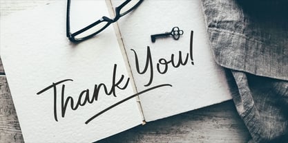 Whitelist is a stylish and elegant marker font. Whitelist was designed to keep a naturally handwritten marker-style look. It’s a good choice for watermarks on photography, apparel, website, t-shirt, product design, signature, logo designs, quotes, branding, business cards, and many other design projects.
 - Bad Medicine by Hanoded,
$15.00 Bad Medicine is a rough Western slab serif font. It was made with a brush and China ink. Bad Medicine is quite a beefy typeface, so use it for your posters, product packaging and book covers! Comes with a herd of diacritics as well.
 - Hastag Vintage by Typefactory,
$14.00 Hastag is a vintage display font that was made by hand and inspired by classic posters. Hastag comes with uppercase, small caps, numerals, symbols & punctuations, alternate, ligature and multilingual support. Perfect to use for Logotype, Letterhead, Poster, Apparel Design, Labels, and many more designs.
 - A Truly Hook by Javanice Studio,
$16.00 Introducing Truly Hook by Javanice Studio a Truly Hook is A Handwritting Font a Truly Hook is perfect for branding project, apparel, labels, magazines, books, greeting / wedding cards, packaging, fashion, make up, stationery, and any type of advertising purpose or just used to express words above the background. This font includes a Truly Hook also multilingual support. Enjoy the font, feel free to comment or feedback, send me PM or email.
 - Sunkids by Wacaksara co,
$18.00 Sunkids is a bold connected script font inspired by the spirit of sports and the Olympic Games. This font is great for your next creative project such as logos, printed quotes, invitations, cards, product packaging, headers, Logotype, Letterhead, Poster, Apparel Design, Label, and etc. Sunkids comes with uppercase, lowercase, numerals, accents (Multilingual characters), punctuations and so many variations on each character include OpenType alternates, PUA encoded and common ligatures.
 - Jorell Lieven by Javanice Studio,
$16.00 Introducing Jorell Lieven by Javanice Studio Jorell Lieven is A Playful Handwritten Font Jorell Lieven is perfect for branding project, apparel, labels, magazines, books, greeting / wedding cards, packaging, fashion, make up, stationery, and any type of advertising purpose or just used to express words above the background. This font includes, Jorell Lieven also multilingual support. Enjoy the font, feel free to comment or feedback, send me PM or email.
 - Buckey Petty by Javanice Studio,
$16.00 Introducing Buckey Petty by Javanice Studio Buckey Petty is A Handwritten Script Font Buckey Petty is perfect for branding project, apparel, labels, magazines, books, greeting / wedding cards, packaging, fashion, make up, stationery, and any type of advertising purpose or just used to express words above the background. This font includes Buckey Petty also multilingual support. Enjoy the font, feel free to comment or feedback, send me PM or email.
 - Jouska by Letterhend,
$14.00 Jouska Textured Brush Script is a beautifully typeface, manually brushed by hand. The texture gives a gritty and grunge look while the regular style gives a natural and casual feel. Perfect combination to use for any design needs such as logotypes, badges, sign boards, posters, headline texts, clothing, wedding invitations, and more. This font comes with many OpenType features like ligatures, stylistic alternates, contextual alternates, swashes, and multi-lingual support.
 - Renulyia by Aisyah,
$12.00 Renulyia is a cute handwriting font that features a playful and casual style. It has a personal and unique touch, with strokes that mimic the look of hand-written letters. This font is perfect for adding a touch of cuteness to your designs, such as invitations, posters, or social media posts. The font is versatile and can be used for various projects, from informal to more formal ones.
 - Pollana Giano by Javanice Studio,
$16.00 Introducing Pollana Giano by Javanice Studio Pollana Giano is A Handwritten Font Pollana Giano is perfect for branding project, apparel, labels, magazines, books, greeting / wedding cards, packaging, fashion, make up, stationery, and any type of advertising purpose or just used to express words above the background. This font includes OTF&TTF&Woff, Pollana Giano also multilingual support. Enjoy the font, feel free to comment or feedback, send me PM or email.
 - Organically by PintassilgoPrints,
$29.00Friendly and generous, this is an organically grown display typeface. Its original handcrafted shapes have been significantly polished, but without losing its old-fashioned charm. The versatile regular cut comes equipped with a wealth of decorative OpenType features such as swashes, majuscule discretionary ligatures and stylistic alternates. The family also comes with a stylish set of useful ornaments and a very eye-catching spiky version. All hand made, with care. - Lattih Tiny by Javanice Studio,
$16.00 Introducing Lattih Tiny by Javanice Studio Lattih Tiny is A Handwritten Script Font Lattih Tiny is perfect for branding project, apparel, labels, magazines, books, greeting / wedding cards, packaging, fashion, make up, stationery, and any type of advertising purpose or just used to express words above the background. This font includes Lattih Tiny also multilingual support. Enjoy the font, feel free to comment or feedback, send me PM or email.
 - Kikola Nafi by Javanice Studio,
$16.00 Introducing Kikola Nafi by Javanice Studio Kikola Nafi is A Urban Brush Font Kikola Nafi is perfect for branding project, apparel, labels, magazines, books, greeting / wedding cards, packaging, fashion, make up, stationery, and any type of advertising purpose or just used to express words above the background. This font includes Kikola Nafi also multilingual support. Enjoy the font, feel free to comment or feedback, send me PM or email.
 - TC Brixton by Tom Chalky,
$19.00 Meet TC Brixton (The Handmade Version of my Brixton Pro font family!), a family of 16 fonts that blends professionalism and timeless elegance with a touch of authenticity. Not all handmade fonts need to be wild, wacky, or bursting with eccentricity. Classic fonts, like Brixton, can be enhanced by the introduction of those perfectly imperfect elements that only hand-drawn fonts can offer! This combination offers reliability and organic charm.
 - Rodchenko by ParaType,
$30.00 Designed at ParaType in 1996-2002 by Tagir Safayev. Inspired by works of Russian Constructivists of the 1920s and 30s: Alexander Rodchenko, Varvara Stepanova, Vladimir and George Stenberg, Gustav Klutsis and others. A geometrical, caps and small caps only, sans serif design. The glyphs are formed using straight lines only. Totally simplified, this face is perceived as a symbol of Russian Avant Garde. For use in advertising and display typography.
 - North Shore by Bruised Goods,
$18.00 NORTH SHORE – The ultimate Hawaiian surf spot typeface, both groovy and mid century inspired. Designed by Lauren Kilbane (on the other coast!) in sunny South Florida, USA. USE THIS FONT FOR: ads, album covers, apparel, cards, flyers, invitations, logos, menus, merchandise, packaging, signage, web, and more. 204 Glyphs Total: Uppercase ONLY, Numbers, Symbols, Punctuation, Emojis, & Language Support. Language Support: Danish, English, French, German, Irish, Italian, Portuguese, Spanish, Swedish, & Swiss German.