10,000 search results
(0.065 seconds)
- MFC Gilchrist Monogram by Monogram Fonts Co.,
$24.95 The inspiration source for MFC Gilchrist Monogram is an extremely ornamented letterset from a vintage embroidery publication from the early 1900's. We’ve digitally recreated the ornamental glyphs from the original design, and created a matching set of smallcaps in order to offer more versatility with this monogram. We have also created two additional sets of alternate glyphs with different fills for more variations. Experiment with all of these in different combinations for unique designs. Download and view the MFC Gilchrist Monogram Guidebook if you would like to learn a little more.
 - Riser by Yumna Type,
$15.00 Riser is an uppercase display font. It projects warm, cute, and slightly futuristic aesthetic. It is a cleanly designed outline font that’s easy to read and will look great in a variety of header and title sizes. This font becomes more special with illustrations as the extras. Features: Ligatures Stylistic Sets Multilingual Supports Uppercase and lowercase PUA Encoded Numerals and Punctuation This font would looks great on your branding, logos, social media quotes, stickers, posters, wall art, merchandise, social media, and many more. Get more inspiration about how to use it by seeing the font preview. Thank you for purchasing our fonts. If you have any further questions, don't hesitate to contact us. Happy Designing.
 - Warm Thanksgiving by Mvmet,
$15.00 Warm Thanksgiving is a warm and fun font for your thanksgiving day, you can use it for everyday use too for its versatility. Create something with it from regular typing notes, to t-shirts, kids’ book designs, greeting cards, stickers, posters, or anything that needs a casual touch. Fall in love with its incredible style and use it to create lovely designs!
 - Cheer Forever by Ditatype,
$29.00 Cheer Forever is a delightful display font that merges the timeless simplicity of a sans serif with playful brush-style accents. With its uppercase letterforms and unique design, this typeface adds a touch of cheerfulness and character to your projects. The defining feature of Cheer Forever lies in its combination of a clean and geometric sans serif base with brush-inspired accents. The uppercase letters maintain a sleek and straightforward appearance, while the brush-style elements bring an element of spontaneity and liveliness. This fusion of styles creates a harmonious balance, resulting in a font that is both contemporary and playful. Inspired by the joyful nature of brush calligraphy, Cheer Forever captures the essence of creativity and self-expression. The brush-inspired accents add a touch of whimsy and personality to each letter, as if they were hand-drawn with a brushstroke. This unique style injects a sense of fun and positivity into your designs. Enjoy the various features available in this font. Features: Ligatures Multilingual Supports PUA Encoded Numerals and Punctuations Cheer Forever fits in logos, titles, headlines, and any design that aims to make a bold statement with a touch of playfulness. It is also particularly well-suited for designs related to children's products, event promotions, and any theme that calls for a touch of creativity. Find out more ways to use this font by taking a look at the font preview. Thanks for purchasing our fonts. Hopefully, you have a great time using our font. Feel free to contact us anytime for further information or when you have trouble with the font. Thanks a lot and happy designing.
 - Kröwn by Vasava Fonts,
$30.00 Kröwn is a ruthless display font family. It is presented in three styles that can be used stacked to create beveling and dimensional effects. Kröwn’s most distinctive feature is the absence of counter shapes, or at least its minimum impact. All counter shapes width is the same as the separation between characters, this creates a blocky, strong and hardcore rhythm. Use it with precaution to build strong titling, powerful logotypes or short letterings. With Kröwn, the less is more, the bigger the better. Its visual style draws inspiration from sword and sorcery fantasy genre and historical periods as the middle age.
 - FeggoliteHatched by Ingrimayne Type,
$4.95 The name FeggoliteHatched comes from the fact that it was created with the help of an old font manipulation program called Incubator Pro. It was an attempt to create a more conventional typeface from the odd monospaced font, FeggoliteMono. As a monospaced font, FeggoliteHatched could be considered a typewriter face, but no typewriter ever produced letters like these. The original version from 1994 is now the italic style and it has a leftward or back slant. The upright or plain version was added much later, in 2018. There is also a choppy upright version included in this family.
 - Buena by mazefonts,
$53.00 Hello Buena - From Wood to Digital Type Buena is the first word I read on a letterpress paper, printed by my colleague and friend Wolfgang Wick. I was fascinated by the power of this fat wooden letters at first glance. So I started to create a digital version of it and »Buena Black« was born. Due to the fact that the original punches had only upper- case glyphs, I created the lowercase characters by myself. After that it was time to design the family... Buena is full of OpenType features. To get fully acces, go to www.mazefonts.de and Download the Type Specimen.
 - Opal by Linotype,
$29.99 Opal Pro is a text family designed by Hannes von Döhren in 2008. It gives every text a noble character. The typeface has long ascenders that clearly rise above the capital letters and a low x-height. Opal’s letters sport inktraps at stroke junctions, which on one hand create a cutout feeling and on the other hand strengthens the image in larger point sizes. In total, the letterforms have clear emphasis on their verticals and horizontals; they do not fear the weight on their curves. In addition to the Italic and Bold, the Opal type family includes a Script face, whose letterforms include connections, similar to handwriting. On top of that, the typeface possesses swash letters for italic and script, small caps, many ligatures and borders & ornaments. With a little bit of care, designers will be able to create the finest of traditional, elegant work with this family.
 - Persia BT by Bitstream,
$50.99Masoud Nejabati has drawn upon his capable calligraphic skills to create this typeface. Persia represents his first latin-based design. This gentle and finely rendered script reveals Nejabati's extensive background in Islamic calligraphic art. The slight back slant further enhances the appearance of hand-scribed pen calligraphy. - Hello Arson by Dismantle Destroy,
$19.00 This font is great for CD covers and posters.
 - Winslow Title by Kimmy Design,
$25.00 Winslow Title is a high contrast modern type family comes in two styles and a monolinear script family. The traditional proportions of Winslow Title are historical in nature and follow the design and style of Winslow Book as a high contrast variant. The Winslow Title Mod family is a contemporary take on the style, with tapering terminals and less pronounced finials. Each family includes both styles, to be accessed through the opentype panel as a stylistic alternate. If preferable, you can purchase the entire family collection to have easier access to both styles, but it's not necessary. The typeface family comprises of roman and italic styles in six weights from Thin to Black and two widths in the roman style: Regular and Narrow. The accompanying script family has a single weight but offers five tracking widths, from Narrow to Wide. The bundle is an elegant combination of styles perfect for titling and display design. The serif typeface is packed with features that make ideal titling styles. Not only do they include the Stylistic Alternates, but also Titling Alternates, Discretionary Ligatures, Small Capitals, Swashes and Contextual Ligatures. As noted previously, the typeface comes in two styles, Traditional and Modern. Each can be accessed either by the Stylistic Alternates or Stylistic Sets. Titling Alternates are alternates that expand the ball terminals to K, R, V, W, and Y (see Titling Alternates slide). Contextual Ligatures are for capital combinations with A that tighten the gap created by the extended serifs. It connects characters with a pairing serif (the lower right serif of the M with the lower right serif of the A) and bridges them together. This combination works for single and multiple A combinations. It is turned on automatically in the Opentype panel and shouldn’t need to be accessed individually. Alternatively, the Discretionary Ligatures feature combines diagonal or baseline stems with lifted small capitals, creating a unique combination of characters. Swashes is an extensive feature that offers up to five swash options per many of each character. These can be selected via the Glyphs panel or as character alternates in Adobe programs. The Script family has a feature set of it’s own, with initial and final swashes on lowercase letters, middle swashes for select characters, and a titling feature that joins words together by replacing the space with a line. Stylistic alternates create a bouncing baseline on connecting strokes. *Note: there is no great need to purchase both families as all styles can be accessed via Opentype features, but if customers prefer to purchase both styles, it can be done by selecting the Complete Typeface Family collection.
 - TA Bankslab by Tural Alisoy,
$33.00 The building of the Northern Bank of St. Petersburg's Baku branch was built in 1903-1905. It was the first Art Nouveau-style building in Baku, Azerbaijan. Later the bank was transformed into the Russian-Asian Bank. After the oil boom in Baku in the 19th century, branches of many banks and new banks were opened in the city. The branch of the Northern Bank of St. Petersburg was among the first banks that was opened in Baku. N.Bayev was the architect of the building for the branch of the Northern Bank of St. Petersburg located at Gorchakovskaya 3 in 1903-1905. The building currently houses the Central Branch of the International Bank of Azerbaijan. My purpose in writing this is not to copy and paste the information from Wikipedia. What attracted me to the building was the word "Банкъ" (Bank) written in Cyrillic letters, which was also used in Azerbaijan during the Soviet era. The exact date of the writing is not known. Every time I pass by this building, I always thought of creating a font of this writing someday. I had taken a photo of the building and saved it on my phone. I did a lot of research on the font and asked a lot of people. However, some did not provide information at all and some said they did not have any information. I was interested in the history of this font but I do not know if this font really existed or it was created by the architect out of nowhere. If there was such a history of this font, I wanted to recreate this font and make it available. If not, I had to create it from scratch in the same way, using only existing letters on the building. Finally, I made up my mind and decided to develop the font with all letters I have got. It was difficult to create a font based on the word, Банкъ. Because in the appearance of the letters, the midline of the letters on A, H, K was very distinct, both in the form of inclination and in more precise degrees. The serif part of the letters, the height of the upper and lower sides, differed from each other. I don't know whether it was done this way when the building was constructed or it happened over time. I prepared and kept the initial version of the font. I took a break for a while. I started digging on the story of the font again. Meanwhile, I was researching and got inspired by similar fonts. Unfortunately, my research on the font's history did not yield any results. I decided to continue finishing up the font. After developing the demo, I created the font by keeping certain parts of these differences in the letters. In addition, I had to consider the development of letters in the Cyrillic, as well as the Latin alphabet, over the past period. Thus, I began to look at the appearance of slab-serif or serif fonts of that time. In general, as I gain more experience in developing fonts, I try to focus on the precision of the design for each font. In recent years, I specifically paid attention to this matter. YouTube channel and articles by Alexandra K.'s of ParaType, as well as, information and samples from TypeType and Fontfabric studios on the Cyrillic alphabet were quite useful. I gathered data regarding the Latin alphabet from various credible sources. I do not know if I could accomplish what I aimed at but I know one thing that I could develop the font. Maybe someday I'll have to revise this font. For now, I share it with you. I created the font in 10 styles. 7 weight from Thin to Extra Black, an Outline, Shadow, and Art Nouveau. The Art Nouveau style was inspired by the texture in the background used for the text on the building. The texture I applied to capital letters adds beauty to the font. If you like the font feel free to use it or simply let me know if your current alphabet doesn't support this font.
 - TA Bankslab Art Nouveau by Tural Alisoy,
$40.00 TA Bankslab graphic presentation at Behance The building of the Northern Bank of St. Petersburg's Baku branch was built in 1903-1905. It was the first Art Nouveau-style building in Baku, Azerbaijan. Later the bank was transformed into the Russian-Asian Bank. After the oil boom in Baku in the 19th century, branches of many banks and new banks were opened in the city. The branch of the Northern Bank of St. Petersburg was among the first banks that was opened in Baku. N.Bayev was the architect of the building for the branch of the Northern Bank of St. Petersburg located at Gorchakovskaya 3 in 1903-1905. The building currently houses the Central Branch of the International Bank of Azerbaijan. My purpose in writing this is not to copy and paste the information from Wikipedia. What attracted me to the building was the word "Банкъ" (Bank) written in Cyrillic letters, which was also used in Azerbaijan during the Soviet era. The exact date of the writing is not known. Every time I pass by this building, I always thought of creating a font of this writing someday. I had taken a photo of the building and saved it on my phone. I did a lot of research on the font and asked a lot of people. However, some did not provide information at all and some said they did not have any information. I was interested in the history of this font but I do not know if this font really existed or it was created by the architect out of nowhere. If there was such a history of this font, I wanted to recreate this font and make it available. If not, I had to create it from scratch in the same way, using only existing letters on the building. Finally, I made up my mind and decided to develop the font with all letters I have got. It was difficult to create a font based on the word, Банкъ. Because in the appearance of the letters, the midline of the letters on A, H, K was very distinct, both in the form of inclination and in more precise degrees. The serif part of the letters, the height of the upper and lower sides, differed from each other. I don't know whether it was done this way when the building was constructed or it happened over time. I prepared and kept the initial version of the font. I took a break for a while. I started digging on the story of the font again. Meanwhile, I was researching and got inspired by similar fonts. Unfortunately, my research on the font's history did not yield any results. I decided to continue finishing up the font. After developing the demo, I created the font by keeping certain parts of these differences in the letters. In addition, I had to consider the development of letters in the Cyrillic, as well as the Latin alphabet, over the past period. Thus, I began to look at the appearance of slab-serif or serif fonts of that time. In general, as I gain more experience in developing fonts, I try to focus on the precision of the design for each font. In recent years, I specifically paid attention to this matter. YouTube channel and articles by Alexandra K.'s of ParaType, as well as, information and samples from TypeType and Fontfabric studios on the Cyrillic alphabet were quite useful. I gathered data regarding the Latin alphabet from various credible sources. I do not know if I could accomplish what I aimed at but I know one thing that I could develop the font. Maybe someday I'll have to revise this font. For now, I share it with you. I created the font in 10 styles. 7 weight from Thin to Extra Black, an Outline, Shadow, and Art Nouveau. The Art Nouveau style was inspired by the texture in the background used for the text on the building. The texture I applied to capital letters adds beauty to the font. If you like the font feel free to use it or simply let me know if your current alphabet doesn't support this font.
 - Growing Garden by Wyarecreatype,
$7.00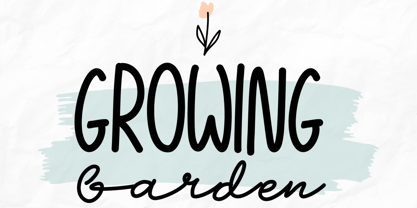 Growing Garden is an elegant and natural trio handwritten font. This original look will appeal to a wide range of crafty ideas. It looks stunning on wedding invitations, thank you cards, quotes, greeting cards, logos, business cards and every other design which needs a handwritten touch. Includes: Uppercase and lowercase For every questions or help, Please contact me. Happy Creating! Thanks!
 - Monkton Aged by Club Type,
$36.99 This antique-aged version of Monkton can be used to imitate old letterpress printed documents such as old English text. The rough edges resemble ink spread on paper to give an old look. The inspiration for this typeface family came from my childhood experiences at Monkton, amidst an historic part of the South West of England. Studies of the original incised capitals of the Trajan column in Rome were analysed and polished for this modern version. The lower case letterforms and numerals were then created in sympathy, taking their proportions from the incised letters of local gravestones. Its name honours not only the area where the original alphabet was conceived and drawn, but also the people responsible for fostering my initial interest in letters.
 - National Nouveau JNL by Jeff Levine,
$29.00 The hand lettered title on the cover for the (ca. 1917) sheet music for “After the War is Over” provided the design inspiration for National Nouveau JNL, which is available in both regular and oblique versions. A precursor to the Art Deco movement which would arrive within the next decade, this bold thick-and-thin design embraces the elements of both Art Nouveau and Art Deco in one type design and gets its name from the patriotic spirit of America during “The Great War”.
 - Fontazia Christmas Baubles by Deniart Systems,
$20.00 DECORATE THE SEASON with 62 retro-style Christmas decorations. These decorative accents are a great addition to your holiday font collection.
 - Stilla by Linotype,
$29.99 François Boltana was a French prolific lettering artist during the late 20th Century. He created the Stilla typeface in 1973. Stilla is a cursive “Fat Face”-style design, reminiscent of the first large advertising and display types produced in the wake of the successful Bodoni, Didot, and Walbaum text faces. Because of this pedigree, Stilla is the perfect headline choice for applications that look back to the 19th century. Stilla could also be used for very short headlines or big logos.
 - Bloody Skinny by Mvmet,
$12.00 Bloody Skinny is a kids friendly blood drips display font! Not only can be used for Halloween theme needs, you can use it too for other things for example graffiti tag or street style art needs. Use it on t-shirts and clothing, for your scary book designs, greeting cards, stickers, posters, banners, or anything that needs a fun touch. Try it to create fabulous designs and feel the fun and cool vibes with it!
 - Retro Smile by Mvmet,
$12.00 Retro Smile is a cool font for your fun displays. It comes with 2 versions (filler and outline). The fun and happy vibe will be there when you use it. You can use it for anything ranging from t-shirts, other merchandise, kids’ book designs, and greeting cards to stickers and posters, or anything that needs a casual touch. Fall in love with its incredibly versatile style, and use it to create lovely designs!
 - Spoodbrush by Dhan Studio,
$20.00 Spoodbrush is a new lowercase brushed textured font family designed to perfectly combine the different styles with one another and allow you to create beautiful designs with a personal touch. It also contains some ligatures and swashes and additionally a Spoodbrush Sans style. Perfect for branding, logos, product packaging, posters, invitations, greeting cards, news, blogs, and everything requesting personal charm. Fonts Included : Spoodbrush One Spoodbrush Two Spoodbrush Bold Spoodbrush Slant Spoodbrush Sans Spoodbrush Extra
 - Gothic Story by Mvmet,
$10.00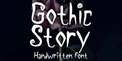 Gothic Story is a kid-friendly gothic handwritten display font, inspired by 90s gothic movies. It will be perfect for your gothic and Halloween-themed needs! You can use it for anything ranging from t-shirts and clothing, to your gothic book designs, Halloween party needs, greeting cards, stickers, posters, banners, or anything that needs a cool touch. Try it to create fabulous designs and feel the gothic and Halloween vibes with it!
 - Silver Fields by Reyrey Blue Std,
$13.00 Introducing Silver Fields. An authentic & organic hand-drawn script font with relaxed style and carries the impression of luxury. It looks stunning on wedding invitations, thank you cards, quotes, greeting cards, logos, business cards and every other design which needs a handwritten touch. Fall in love with its incredibly distinct and timeless style and use it to create spectacular designs! Features : · All Uppercase and Lowercase · Number & Symbol · Supported Languages · Alternates and Ligatures
 - Tuna Salad by Blythe Green,
$14.00 Tuna Salad is a handcrafted, multi-weight, ALL CAPS font with a playful, authentic feel. Type in lowercase to explore alternate characters for each letter! It's perfect for: logos, branding, greeting cards, posters, quotes, magazines, social media, planners, shirts, prints, and more. FEATURES: Alternate characters for each letter to give an authentic, handwritten feel for each word Light and bold to create emphasis and hierarchy in your work Multilingual accents + characters for the global designer
 - Lovers Pro by Scholtz Fonts,
$35.00 Lovers is a romantic, elegant handwritten calligraphic script, with well over 300 additional characters, including standard and discretionary ligatures, swashes and stylistic alternatives. Use of its extensive OpenType features enable the designer to create text that constantly changes, giving the impression of genuine handwriting, but handwriting that has all the flair and styling of hand-done calligraphy produced towards the end of the twentieth century. Lovers is based on traditional calligraphic ideals, but I've combined these with my own brand of relaxed, handwritten spontaneity, to design a font that is formal yet free and accidental, traditional yet contemporary. The font’s extravagant curves and swashes make it perfect for valentine’s day and wedding media, book covers, greeting cards, and certificates, in fact for any design work that requires a romantic or opulently elegant look. The range of stylistic alternatives and swashes enable users to create a wide range of moods in their work. In many ways it is a calligraphy toolkit. Lovers contains the accented characters used in the major European languages. What sets it apart from most other calligraphic fonts is that it appears so genuinely handwritten and avoids the uptight formality that characterizes so many of the fonts in this genre. Try Lovers, enjoy its wealth of OpenType features and let its vigorous yet elegant exuberance delight you and enhance your creativity!
 - Bankal by Hugo Kuder,
$10.00 After a few months my new typeface "Bankal" is here! To create it, I always tried to keep a 90 degree angle. In French when you say that something is "bancal" it means that it's not right. This is why I choose this as a name because despite the name she is right. And for the K it's just for the style here. Bankal is a sans-serif font with 3 variations (bold, regular, light) Check more on my website : https://www.hugokuder.com/ or my instagram : hugokuderdesign
 - Salvation by Device,
$39.00 Rough and ready, bold and urgent. Or playful and fun in bright colours. The original letters were cut from actual potatoes, then scanned in and converted to vector outlines. Lighter and more heavily inked versions were used for the three variants. Using Opentype character-substitution technology, Salvation rotates through three versions of each letter to create a naturally uneven printed effect. Unlike hot metal type, the potatoes were cut the right way around. This produced reversed prints, which were then flipped back in Photoshop. Originally produced for Hughes' Get Lettering activity book, the font was then extended to cover numbers, punctuation and full European language support.
 - Alzheimer by Designsuh,
$12.00 The 'Alzheimer' font has a shape in which parts of the font have been erased as if memories are being erased. The remaining letters, which are minimal enough to be distinguished from other letters, create a different feeling, like an alien language. It is useful for creating titles or logos rather than expressing text. It was produced thinking of all of us adults whose memories are slowly disappearing. May they be full of health and love.
 - Docket by Parker Creative,
$18.00 With it's distressed markings and rough edges, Docket mimics the appearance of a vintage typewriter from the 1940s. With Docket, you can quickly create graphics with an instant classic feel, and it's application is quite versatile. Create logos, stamps, sublimation designs, social media quotes, monogram products, and even websites with this bohemian typewriter font! Docket's characters are proudly hand-crafted, meticulously kerned, and come in two variations to capture the unique look of an old grunge typewriter.
 - Lineare by Tipo,
$35.00 Lineare Serif is an attempt at solving the difficult problem of creating readable text type, seeking new ways to provide readers with some pleasure and rest as they walk along each line, creating a space where there is harmony between man and the printed form. Asymmetric serifs both in their height and width, medium contrast in the stroke, and balanced upward and downward movements make “Lineare Serif” a typeface featuring both attitude and aptitude for editorial purposes.
 - BOSSHOLE - Unknown license

- Blue Note by Sakha Design,
$10.00 Blue Note is a simple and neat handwritten font. Whether you’re using it for crafts, digital design, presentations, or making greeting cards, this font has the potential to become your favorite go-to font, no matter the occasion!
 - Kids Line by Sakha Design,
$10.00 Kids Line is a cute and friendly handwritten font. Whether you’re using it for crafts, digital design, presentations, or making greeting cards, this font has the potential to become your favorite go-to font, no matter the occasion!
 - Winter Cold by Sakha Design,
$10.00 Winter Cold is a sweet and adorable display font. Whether you’re using it for crafts, digital design, presentations, or making greeting cards, this font has the potential to become your favorite go-to font, no matter the occasion!
 - Police JNL by Jeff Levine,
$29.00Police JNL was modeled from one of the many fonts created by the late Alf Becker exclusively for Signs of the Times magazine during the 1930s through the 1950s. This was a bit of a difficult design to translate into a digital font file, because the individual characters did not follow a formal structure as to the width and length of the cast shadows or the letter shapes—such is the way of the hand-lettered alphabet. Special thanks to Tod Swormstedt of ST Publications (and curator of the American Sign Museum in Cincinnati) for providing the archival material to work from in creating this font. Police JNL has a limited character set. The basic A-Z character is on the upper and lower case keys, along with numbers, some punctuation and the dollar and cents signs. - HD Anomie by HyperDeluxe,
$40.00 HD Anomie is a modern geometric sans built in 18 styles with variable support and is brought to you by HyperDeluxe®. Its subtle forms and nuanced curves create a simple structure that could be perceived as mundane, but our goal was to create a typeface that is both mechanical and organic in its forms so it seamlessly fits within the environment it is placed. It's clean, minimal approach gives it a wide array of offline uses such as branding, editorial & print, but its modern design and detailed build makes it perfect for UI & digital applications. The clean visual structure of the letter forms give it great readability at smaller sizes, while also being happy to be shown off at larger sizes. Built to be robust and as versatile as possible we have around 1150 Glyphs per weight including extended Latin & Cyrillic support as well as basic Greek. Anomie also features extras such as 2 arrow sets, circled numbers as well as stylistic alternates and case sensitive forms. Find beauty in the Mundane. Meet HD Anomie.
 - Mandarin Duck by Yasemin Varlik,
$10.00 Mandarin Duck is a very playful typeface where its design was inspired by the rare duck seen in New York once every year. The delicate tail of this duck creates the edges of the characters. It is bold and fun, a perfect typeface for children books and larger texts.
 - Takox by John Moore Type Foundry,
$7.00 Takox is a display typeface based on a synthesis of righteousness extreme, futuristic spirit leads us to a way of plotting the words in a new way and in line with trends and technology synthesis century. Extreme music. Takox is provided with style forms to small caps, in both Regular and Italic. What was the inspiration for designing the font? Takox is the result of my own research in finding straight shapes of great simplicity. What are its main characteristics and features? Display font witn straight shapes of great simplicity. Usage recommendations: This letter design is ideal for use 3D extrusions, ideal to represent natural forms of cristals, metal or mechanical things. Fits indiustriales representations and aerospace, also for extreme music and avant garde.
 - Mirava by Din Studio,
$25.00 Hi, Everyone! Ready to make your branding spark? If you need to create a big, bold logo for your business, work on a poster for an event, or whatever your project may be-then this is the perfect font for you. Mirava Sans-A Sans Serif Font Family If we can give you many options then why not? Mirava San is a package that will delight you. With this family you will get many options to maximize your designs with stylish fonts. This font designed to bring your branding to life and add a touch of modernity, fun and style. Mirava paves the way for you to write the information you need to send out to your audience. Perfect to create amazing headings, logos, menus, social media graphics, and many more. Our font always includes Multilingual Support to make your branding reach a global audience. Features: Multilingual Support PUA Encoded Numerals and Punctuation Thank you for downloading premium fonts from Din Studio
 - Lavaman by Chank,
$49.00Lavaman was created by Chank Diesel in 1995 as a custom font for the Cartoon Network's Space Ghost Coast to Coast web site. This font represents the printed voice of the talk show's surly backstage engineer, who is a man made of molten lava.
