10,000 search results
(0.136 seconds)
- Kigelio by Ivan Rosenberg,
$15.00 KIGELIA is a stylish display serif font inspired by fashion magazines and romance. It is great for short headlines and titles, but it looks great in advertising, vintage mood board, branding, logotypes, packaging, titles, editorial design and modern and vintage design.
 - Heart Quarter by Rometheme,
$16.00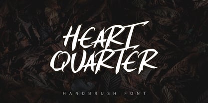 Heart Quarter is a brush font, hand-drawn typeface. It has an elegant, classy look and cool. It’s a great font for fashion, apparel projects, signature, album cover, logo, branding, magazine, social media, & advertisements, but also works great for other projects.
 - Inkie by Turtle Arts,
$20.00Inkie is a hand drawn pen and ink alphabet with scratchy embellishments, and works great whenever you want a handwritten look to your art, but with a bit of extra flair. Inkie looks great both as text and as headlines. - Dungeons by Rometheme,
$18.00 Dungeons font is vintage monoline script font. It has vintage, elegant, old school, classy, and cool. It’s a great font for fashion, apparel projects, signature, album cover, logo, branding, magazine, social media, & advertisements, but also works great for other projects.
 - Stairway by Cooldesignlab,
$12.00 Stairway is a modern and elegant calligraphy script font that comes with exquisite character changes, a kind of decorative script with a modern twist, designed with high detail to present an elegant style. This font is very interesting for you to use because it is smooth, clean, feminine, sensual, glamorous, simple and very easy to read, because there are many luxurious and simple letter relationships. This font style is perfect for your various designs, such as invitations, labels, restaurant menus, logos, fashion, makeup, stationery, novels, magazines, books, greeting / wedding cards, packaging, labels and others. Stairway has 602 glyphs and 392 alternative characters, including multiple language support. With OpenType features with alternative styles and elegant ties. The OpenType features do not work automatically, but you can access them manually and for the best results required for your creativity in combining variations of this Glyph. The Open Type feature can be accessed using smart Open Type programs such as Adobe Illustrator, Adobe In Design, Adobe Photoshop Corel Draw X version, and Microsoft Word. And this font has provided PUA unicode (special code font). So that all alternative characters can be easily fully accessed by the craftsman or designer.
 - 161 Vergilius by GLC,
$38.00 This font was inspired by the rare manuscript Roman Quadrata used by an unknown scribe to inscribe a copy of the Roman poet Virgil’s GEORGICS, somehwere around 161 to 180 AD. Only a few sheets have survived, now preserved by different libraries around the world. In creating this font, we have adapted it for contemporary users, making differences between U and V; I and J (which made no difference at all to ancient Latin scribes) and naturally adding the glyphs for Thorn, Oslash, Lslash, W, Y, as well as the usual accented characters and punctuation, none of which existed at the time. Only capitals are present in the original; but we have provided alternates: so alternating each character A-Z/a-z will give a pleasant appearance of manual script. We have added the Roman numerals “I V X L C D M” in the OTF/TTF versions usable as “Old Style Numerals” alternates.
 - HS Albadr by Hiba Studio,
$59.00 HS Albadr is an Arabic display typeface. It is useful for book titles and graphic projects where a contemporary, geometrical and streamlined look is desired. The font is based on the simple lines of modern and simplified Kufi calligraphy that support Arabic, Persian and Urdu. It has one weight only which is similar to the bold weight. This typeface is created for being used in technical and engineering companies under strict geometric conditions . The company desires to follow the geometrical shape with uniform and equal dimensions in both vertical and horizontal storks; where some parts of the letters are to be cut at a slanting angle of 45 degree to give the impression of a coherent geometrical nature for this font. The typeface HS Albadr is considered as a chain of geometric fonts series designed for engineering companies. After HS Almohandis and HS Alhandasi were designed we are looking forward to giving some additions to the geometric typefaces field.
 - 1st Ave by Design is Culture,
$39.00 1st Ave is the most experimental of my typefaces. I took a picture of a metal and neon sign in the East Village of New York City. These signs are slowly being replaced by LED and LCD displays, but if you look hard, you can still find quite a few in the city. The signs give a mid 20th century feel to the city. To design 1st Ave, I took a picture of the sign, scanned it and increased the contrast in Photoshop so that the photographic forms became line art. There weren't enough letterforms in the sign to create the whole alphabet, so I cut up the strokes and collaged them back together to finish the entire alphabet. Important Note: 1st Ave is an experimental typeface and is not compatible with certain software such as Microsoft Word.
 - FS Pimlico by Fontsmith,
$80.00 Born in the 70s Personal influences are unavoidable in type design and usually find their way through into finished fonts. At Fontsmith, one period in particular provides inspiration, according to FS Pimlico designer, Fernando Mello. “Jason and Phil have always known that I’m very into the visual language of the 70s. I know that Jason shares my love of the 70s and Phil will sometimes admit to being a fan, too. I think that’s the reason they were both so supportive in the development of this font. “And, of course, we all share an interest in good-humoured and intelligent design. We like to think it’s a Fontsmith characteristic.” Back from black FS Pimlico started in an unusual place: with a tubby, penguin-like lowercase “a” that Fernando Mello had been sketching. From “a” grew the rest of the alphabet – a bubbly, fat, friendly family with a brush-written quality that became FS Pimlico Black. The black weight certainly isn’t the normal starting point for creating a regular and bold weight, but Fernando pressed on, driven by a glut of influences: brush-writing; Letraset and early digital systems catalogues; the type of Herb Lubalin and Tony di Spigna; 70s clothes and vinyl; and 70s revival disco nights in London’s Pimlico and Vauxhall. Natural or flourished Not often do fonts come along that seem to span the ages. FS Pimlico is at home in an office environment providing a fresh clear identity in communications or providing text that’s clear and easy to read. But it likes to party, too, 70s style. With the OpenType features switched on, a designer can totally change the look of their work, and create point-of-sale, headlines and titles that stand out and get noticed.
 - FS Pimlico Variable by Fontsmith,
$249.99Born in the 70s Personal influences are unavoidable in type design and usually find their way through into finished fonts. At Fontsmith, one period in particular provides inspiration, according to FS Pimlico designer, Fernando Mello. “Jason and Phil have always known that I’m very into the visual language of the 70s. I know that Jason shares my love of the 70s and Phil will sometimes admit to being a fan, too. I think that’s the reason they were both so supportive in the development of this font. “And, of course, we all share an interest in good-humoured and intelligent design. We like to think it’s a Fontsmith characteristic.” Back from black FS Pimlico started in an unusual place: with a tubby, penguin-like lowercase “a” that Fernando Mello had been sketching. From “a” grew the rest of the alphabet – a bubbly, fat, friendly family with a brush-written quality that became FS Pimlico Black. The black weight certainly isn’t the normal starting point for creating a regular and bold weight, but Fernando pressed on, driven by a glut of influences: brush-writing; Letraset and early digital systems catalogues; the type of Herb Lubalin and Tony di Spigna; 70s clothes and vinyl; and 70s revival disco nights in London’s Pimlico and Vauxhall. Natural or flourished Not often do fonts come along that seem to span the ages. FS Pimlico is at home in an office environment providing a fresh clear identity in communications or providing text that’s clear and easy to read. But it likes to party, too, 70s style. With the OpenType features switched on, a designer can totally change the look of their work, and create point-of-sale, headlines and titles that stand out and get noticed. - 99 Names of ALLAH Subhanahu by Islamic Calligraphy75,
$12.00 We have transformed the “99 names of ALLAH” into a font. That means each key on your keyboard represents 1 of the 99 names of ALLAH Aaza Wajal. The fonts work with both the English and Arabic Keyboards. We call this Calligraphy "Subhanahu Wa Ta'ala" because we have added "Subhanahu Wa Ta'ala" to each and every name. The first "Alef" has a "hamzit wasel", this indicates that the name can be pronounced both as "AR-RAHMAAN" or "R-RAHMAN" (in the zip file you will find a pdf file explaining the differences in the "harakat", pronunciation and spelling according to the Holy Quran). The calligraphy is rectangular shaped, and the "fatha" is big and covers almost the entire name, in most of the names. Decorative letters used in this calligraphy: "Mim, Aain, Sin, HHe, He, Ta, Kaf & Saad". Purpose & use: - Writers: Highlight the names in your texts in beautiful Islamic calligraphy. - Editors: Use with kinetic typography templates (AE) & editing software. - Designers: The very small details in the names does not affect the quality. Rest assured it is flawless. The MOST IMPORTANT THING about this list is that all the names are 100% ERROR FREE, and you can USE THEM WITH YOUR EYES CLOSED. All the “Tachkilat” are 100% ERROR FREE, all the "Spelling" is 100% ERROR FREE, and they all have been written in accordance with the Holy Quran. No names are missing and no names are duplicated. The list is complete "99 names +1". The +1 is the name “ALLAH” 'Aza wajal. Another important thing is how we use the decorative letters. In every font you will see small decorative letters, these letters are used only in accordance with their respective letters to indicate pronunciation & we don't include them randomly. That means "mim" on top or below the letter "mim", "sin" on top or below the letter "sin", and so on and so forth. Included: Pdf file telling you which key is associated with which name. In that same file we have included the transliteration and explication of all 99 names. Pdf file explaining the differences in the harakat and pronunciation according to the Holy Quran.
 - Milonga by Larin Type Co,
$15.00 Milonga This is a beautiful and elegant hand drawn font, will emphasize your individuality in any project. Its relaxed feel makes this font incredibly versatile, fitting a wide range of designs. You can also use them to create a logo or templates, invitations, blog, branding, marketing, book covers, magazines, advertising, stationery, logo design and much more. This font is easy to use has OpenType features
 - Golden Hopes by Mans Greback,
$59.00 Golden Hopes is a modern signature typeface family. A high-quality handwriting font, it is perfect for creating signature logos and watermarks for your photography studio or a wedding invitation. Drawn and created in 2021, this lettering has a quick, optimistic style and a vivid personality. The script family consists of four handwritten styles: Slanted/Regular, Upright, Bold and Upright Bold. The font is built with advanced OpenType functionality and has a guaranteed top-notch quality, containing stylistic and contextual alternates, ligatures and more features; all to give you full control and customizability. It has extensive lingual support, covering all Latin-based languages, from North Europe to South Africa, from America to South-East Asia. It contains all characters and symbols you'll ever need, including all punctuation and numbers.
 - Affair by Sudtipos,
$99.00 Type designers are crazy people. Not crazy in the sense that they think we are Napoleon, but in the sense that the sky can be falling, wars tearing the world apart, disasters splitting the very ground we walk on, plagues circling continents to pick victims randomly, yet we will still perform our ever optimistic task of making some little spot of the world more appealing to the human eye. We ought to be proud of ourselves, I believe. Optimism is hard to come by these days. Regardless of our own personal reasons for doing what we do, the very thing we do is in itself an act of optimism and belief in the inherent beauty that exists within humanity. As recently as ten years ago, I wouldn't have been able to choose the amazing obscure profession I now have, wouldn't have been able to be humbled by the history that falls into my hands and slides in front of my eyes every day, wouldn't have been able to live and work across previously impenetrable cultural lines as I do now, and wouldn't have been able to raise my glass of Malbeck wine to toast every type designer who was before me, is with me, and will be after me. As recently as ten years ago, I wouldn't have been able to mean these words as I wrote them: It’s a small world. Yes, it is a small world, and a wonderfully complex one too. With so much information drowning our senses by the minute, it has become difficult to find clear meaning in almost anything. Something throughout the day is bound to make us feel even smaller in this small world. Most of us find comfort in a routine. Some of us find extended families. But in the end we are all Eleanor Rigbys, lonely on the inside and waiting for a miracle to come. If a miracle can make the world small, another one can perhaps give us meaning. And sometimes a miracle happens for a split second, then gets buried until a crazy type designer finds it. I was on my honeymoon in New York City when I first stumbled upon the letters that eventually started this Affair. A simple, content tourist walking down the streets formerly unknown to me except through pop music and film references. Browsing the shops of the city that made Bob Dylan, Lou Reed, and a thousand other artists. Trying to chase away the tourist mentality, wondering what it would be like to actually live in the city of a billion tiny lights. Tourists don't go to libraries in foreign cities. So I walked into one. Two hours later I wasn't in New York anymore. I wasn't anywhere substantial. I was the crazy type designer at the apex of insanity. La La Land, alphabet heaven, curves and twirls and loops and swashes, ribbons and bows and naked letters. I'm probably not the very first person on this planet to be seduced into starting an Affair while on his honeymoon, but it is something to tease my better half about once in a while. To this day I can't decide if I actually found the worn book, or if the book itself called for me. Its spine was nothing special, sitting on a shelf, tightly flanked by similar spines on either side. Yet it was the only one I picked off that shelf. And I looked at only one page in it before walking to the photocopier and cheating it with an Argentine coin, since I didn't have the American quarter it wanted. That was the beginning. I am now writing this after the Affair is over. And it was an Affair to remember, to pull a phrase. Right now, long after I have drawn and digitized and tested this alphabet, and long after I saw what some of this generation’s type designers saw in it, I have the luxury to speculate on what Affair really is, what made me begin and finish it, what cultural expressions it has, and so on. But in all honesty it wasn't like that. Much like in my Ministry Script experience, I was a driven man, a lover walking the ledge, an infatuated student following the instructions of his teacher while seeing her as a perfect angel. I am not exaggerating when I say that the letters themselves told me how to extend them. I was exploited by an alphabet, and it felt great. Unlike my experience with Ministry Script, where the objective was to push the technology to its limits, this Affair felt like the most natural and casual sequence of processions in the world – my hand following the grid, the grid following what my hand had already done – a circle of creation contained in one square computer cell, then doing it all over again. By contrast, it was the lousiest feeling in the world when I finally reached the conclusion that the Affair was done. What would I do now? Would any commitment I make from now on constitute a betrayal of these past precious months? I'm largely over all that now, of course. I like to think I'm a better man now because of the experience. Affair is an enormous, intricately calligraphic OpenType font based on a 9x9 photocopy of a page from a 1950s lettering book. In any calligraphic font, the global parameters for developing the characters are usually quite volatile and hard to pin down, but in this case it was particularly difficult because the photocopy was too gray and the letters were of different sizes, very intertwined and scan-impossible. So finishing the first few characters in order to establish the global rhythm was quite a long process, after which the work became a unique soothing, numbing routine by which I will always remember this Affair. The result of all the work, at least to the eyes of this crazy designer, is 1950s American lettering with a very Argentine wrapper. My Affair is infused with the spirit of filete, dulce de leche, yerba mate, and Carlos Gardel. Upon finishing the font I was fortunate enough that a few of my colleagues, great type designers and probably much saner than I am, agreed to show me how they envision my Affair in action. The beauty they showed me makes me feel small and yearn for the world to be even smaller now – at least small enough so that my international colleagues and I can meet and exchange stories over a good parrilla. These people, whose kindness is very deserving of my gratitude, and whose beautiful art is very deserving of your appreciation, are in no particular order: Corey Holms, Mariano Lopez Hiriart, Xavier Dupré, Alejandro Ros, Rebecca Alaccari, Laura Meseguer, Neil Summerour, Eduardo Manso, and the Doma group. You can see how they envisioned using Affair in the section of this booklet entitled A Foreign Affair. The rest of this booklet contains all the obligatory technical details that should come with a font this massive. I hope this Affair can bring you as much peace and satisfaction as it brought me, and I hope it can help your imagination soar like mine did when I was doing my duty for beauty.
 - Rettrama by Gassstype,
$23.00 Hello Everyone, introduce our new product Font Rettrama This Is Simple Script Display Font .This is a Textured Natural Style and classy style with a clear style and dramatic movement. This font Rettrama is great for your next creative project such as logos, printed quotes, invitations, cards, You can activate 16 Ligatures glyphs OpenType panel.
 - Novera by René Bieder,
$29.00 The Novera family is a sharp geometric sans in ten weights plus matching italics, available in two versions – Modern and Classic. It has a contemporary, approachable and multifunctional yet characteristic design, that comes with an extensive glyphs set of 1000+ glyphs per font, meeting all typographic demands. The Design Vertical terminals, circular shapes and angular apexes – Novera truely breathes geometry! But the concept goes beyond the application of rational geometry. The intension was to create a highly legible family suitable for every day usage inspired by the work of Paul Renner, Eric Gill or Jakob Erbar, combining the geometric with the human and the functional with the unconventional. Although Novera is inspired by the past, its appearance is unmistakingly modern. Modern vs Classic Novera is available in two versions - Modern and Classic - born from the same source file but with different characters set as default. This creates subtle but effective distinctions such as the double-storey a (Novera Modern) which is optimized for legibility in longer text paragraphs, as opposed to the single-storey a (Novera Classic) which allows a purely geometric appearance. Another distinguishing feature are the ascenders on Novera Mondern, which extend above the cap height for an elegant presence, compared to the ascenders on Novera Classic, ending at the cap height, for a compact and helvetica-flavored look. Novera Modern was intended for usage in body copy, whereas Novera Classic was planned for headlines, short paragraphs or logos, but both versions can be used vice versa too, of course. Alternate Characters To maintain neutrality and a modern appearance, the standard character set largely dispenses with idiosyncratic forms. This is in contrast to the alternative forms with the gill-like lowercase letters g and t as well as a traditional shape of S and the German ligature t/z, which traces back to old German spellings. Also inspired by German poster designs from the early 20th century are the elongated i-dots and dieresis-dots that can create eye-catchers in headlines or logos. By the way, both versions, Novera Modern and Classic, can be created via stylistic set 1, 17 and 18. Opentype Features and Symbols The family comes with many opentype features to support modern typesetting. This includes ligatures, different number sets or alternative shapes for texts set in all caps. If you like arrows and other shapes, you will love Novera! The family has a built-in extensive symbols-set including 48 different arrows and various geometric shapes or icons. Weights With its 40 styles and 1000+ glyphs per font, the Novera family covers all thinkable design scenarios from branding to web, app or editorial usage. It blends in perfectly in text heavy paragraphs with its mid-weights like Light, Regular, Medium or Bold or stands out like a monument in headlines and posters with its extreme weights like Thin, ExtraLight, Black or Ultra. Testfonts If you like to test the fonts before buying the full version, please follow the link below. Please note, all test fonts are available for evaluation purposes only and contain a limited character set! A commercial license for the full version must be purchased separately. Please send a mail to contact@renebieder.com for more information. Download the test fonts here: https://www.renebieder.com/test-fonts
 - Lido STF by Storm Type Foundry,
$39.00Times with a Human Face: In my article of the same name which appeared in the magazine Font, volume 2000 I described the long and trying story of an order for a typeface for the Czech periodical Lidové noviny (People’s Newspaper). My task was to design a modification of the existing Times. The work, however, finally resulted in the complete re-drawing of the typeface. The assignment, which was on the whole wisely formulated, was to design a typeface which would enable “a smooth flow of information in the reader’s eye”, therefore a typeface without any artistic ambitions, from which everything which obstructs legibility would be eliminated. A year later Lidové noviny had a different manager who in the spring of 2001 decided to resume the cooperation. The typeface itself definitely profited from this; I simplified everything which could be simplified, but it still was not “it”, because the other, and obviously more important, requirement of the investor held: “the typeface must look like Times”. And that is why the above-mentioned daily will continue to be printed by a system version of Times, negligently adjusted to local conditions, which is unfortunately a far cry from the original Times New Roman of Stanley Morison. When I was designing Lido, the cooperation with the head of production of Lidové noviny was of great use to me. Many tests were carried out directly on the newspaper rotary press during which numerous weak points of the earliest versions were revealed. The printing tests have proved that the basic design of this typeface is even more legible and economical than that of Times. The final appearance of Lido STF was, however, tuned up without regard to the original assignment – the merrier-looking italics and the more daring modelling of bold lower case letters have been retained. The typeface is suitable for all periodicals wishing to abandon inconspicuously the hideous system typefaces with their even more hideous accents and to change over to the contemporary level of graphic design. It is also most convenient for everyday work in text editors and office applications. It has a fairly large x-height of lower case letters, shortened serifs and simplified endings of rounded strokes. This is typical of the typefaces designed for use in small sizes. Our typeface, however, can sustain enlargement even to the size appropriate for a poster, an information table or a billboard, as it is not trite and at the same time is moderate in expression. Its three supplementary condensed designs correspond to approximately 80% compression and have been, of course, drawn quite separately. The intention to create condensed italics was abandoned; in the case of serif typefaces they always seem to be slightly strained. I named the typeface dutifully "Lido" (after the name of the newspaper) and included it in the retail catalog of my type foundry. In order to prevent being suspected of additionally turning a rejected work into cash, Lido STF in six designs is available free of charge. I should not like it if the issuing of this typeface were understood as an “act out of spite” aimed against the venerable Times. It is rather meant as a reminder that there really are now alternatives to all fonts in all price categories. - Coomeec by Linotype,
$29.99 Although Andi AW. Masry designed his Coomeec typeface with one eye on comic books, this is more than just another cartoon font. Even in our short profile of the font below, we're sure you'll find enough to be surprised by the calligraphic aesthetic and the wide range of potential uses of Coomeec. Typography had been one of Andy AW. Masry's hobbies before he turned professional in 2008 and formed his own agency in Jakarta in Indonesia. The former construction engineer had already spent many hours of his leisure time in following his pastimes of designing, photography and Latin typography. Fascinated by the close interaction between text and image in comic books, one of his first projects was the development of his font Coomeec™. The condensed letters of Coomeec seem to have more in common with a calligraphic brush typeface than a more conventional cartoon font. With the characteristic line forms of a brush font, the not unextensive variations in line thickness and numerous small embellishments to the glyphs, Coomeec can be used to enhance your projects with animated effects. You can achieve this not just in the larger font sizes; the font is also very legible in small sizes thanks to its large x-height. There are certain unusual letter forms, such as that of lowercase 'g', 's' and uppercase 'Y', that provide Coomeec with a touch of the exotic. As Coomeec has numerous character alternatives, you can use it not only to create diverse designs but also to ring the changes with the character of the text itself. There are variants for most lowercase letters, some of which exhibit only minor differences, such as the lack of a curlicue on the 'b', a modified downstroke on the 'h' and an elongated base for the 'k'. In the case of other letters, such as the 'q' and the 'r', there are significant disparities between variants. The uppercase characters are also available in a lively swash style with significantly extended terminals. Among the range of characters of Coomeec are oldstyle and lining figures designed for proportional and tabular setting. All alternatives are available in the form of the corresponding OpenType versions. Coomeec comes in two weights; Regular and Bold, each with its Italic version. The form of the slightly inclined Italic characters is identical to that of their upright counterparts with the exception of the lowercase 'f', which has an ascender in its Italic version. As an OpenType Pro font, the glyphs available for Coomeec ensure that it can be used to set not only western European but also central European texts. Coomeec is not just at home when used to set headlines. The excellent legibility of this individual and vibrant typeface means that it's also ideal for setting shorter texts. The various alternative letters provide the designer with the opportunity to vary the textual appearance, and to choose between creating a more formal or more light-hearted effect. Coomeec is not only available in an OpenType version but is also obtainable as a web font, so that you can employ its exotic features to good effect when creating internet pages.
 - Odorless by RagamKata,
$14.00 Say hello to Odorless - An inky and imperfect handwriting script font with 54 extra Opentype ligatures to add to its naturally handwritten look. Make sure you have your ligatures set to on to see the magic as you type. Great for handwritten quotes, notes, labels, branding or any project that needs an authentic handwritten touch.
 - Farm to Market by Brittney Murphy Design,
$8.00 Farm to Market is a rustic all caps serif font family from Brittney Murphy Design. Featuring a Regular, Bold, and Fancy version with 435+ glyphs in each. The Farm to Market Font Family supports most Latin based languages and has several ligatures and alternates. Great for crafts or decor with a country farmhouse feel! :)
 - Monster Party by Context,
$10.00 Monster Party is an illustrated display face with a lot of character for any haunting occasions. It comes in two styles, Monsters and Bones for whichever your situation calls for. Monsters features two unique sets of upper case creatures for appropriately spooky headline variation. Great for Friday the 13th, Halloween or wherever whimsy is needed.
 - Circensis by RMU,
$35.00 Picking up a concept of Fritz Richter, Circensis is the realization of an adorned diplay font which had not been hitherto available, neither as a hot-metal font nor digitally. It is a great and legible font for circus and variety ads and posters, as well as for films, cafés, ice-cream parlors etc.
 - TwoSeven by Mazkicibe,
$11.00 TwoSeven Font is Sans Serif and modern font combined with a sweet touch and beautifully curved each letter. using a touch of soft curves so that it is pleasing to the eye Twoseven Font Spirit is great for: Wedding invitations, fashion magazines, logos, signatures, and suitable for watermark photography. Features: -Uppercase, -Lowercase, -Numeral, -Punctuation,
 - Emerge BF by Bomparte's Fonts,
$40.00 Emerge BF was inspired by Admiral, c.1900, from the Keystone Type Foundry. Its relatively condensed proportions allow for a close fit in a distinctive, yet highly legible form. It's a great choice for headlines and text settings (where it shows a beautifully crisp, typographic color) on book covers, magazine advertisements, posters and so forth.
 - Fello by Australian Type Foundry,
$23.99 Fello is a geometric sans-serif with a university pedigree. Featuring some of the quirkiest alternates you will ever see, Fello is designed with a modernist tone of voice. Fello is great for display use but also has a large character set and includes many Opentype features, which makes it suitable for text use too.
 - Blimone by Degarism Studio,
$40.00 Blimone Inspired from beautiful Art Nouveau styled and pop culture, Blimone approach with geometric shapes and dynamic humanist blends several calligraphic concepts to create a modernist style but with a strong and unique look. The subfamily Blimone ink-traps and the italic characters to appear monumentally "Sharp" in large sizes and jaggedly imperfect in small sizes. The Bilmone font family includes 24 fonts, Support for the variable version of the font, you can choose the individual thickness and the slopes. Support has many fancy ligatures, common standard ligatures are found in some fonts include fi, ff, ffi, fy, ti, tt, ty, tti, ttl , ffk, ft and the discretionary ligatures are gi, ggi, gt, gk, gj, gl, ggl, gh, gti,ct, cti, cty, et, eti, ety, st, and more. all intended to create a natural look that imitates the flow and spontaneous joins of handwriting.OpenType also supports tabular lining numbers, fractions, Numerator and Denominator.
 - Mistaken by Gassstype,
$23.00 Hello Everyone, introduce our new product font Mistaken is a Bad Brush Font.This is a Textured Natural Style and classy style with a clear style and dramatic movement. This font Mistaken is great for your next creative project such as logos, printed quotes, invitations, cards, product packaging, headers, Logotype, Letterhead, Poster, Design this font is great for your creative projects such as watermark on photography, and perfect for logos & branding, invitation,advertisements,product designs, stationery, wedding designs,label ,product packaging, special events or anything that need handwritting taste. That is has charming, authentic and relaxed characteristic more natural look to your text This font is PUA encoded which means you can access all of Alternate glyphs.
 - WELATTE BRUSH by Gatype,
$11.00 Hi Everyone, introducing our new product WELATTE BRUSH Font,This is a Brush Font is a Natural, Textured and classy style with a clear style and dramatic movement. This WELATTE BRUSH font is great for your next creative project like logos, printed quotes, invitations, cards, product packaging, headers, Logo Type, Letterheads, Posters, This font design is great for your creative projects like watermarks on photography, and perfect for logos & branding, invitations, advertisements, product designs, stationery, wedding designs, labels, product packaging, special events or anything that requires a taste in handwriting. Accessible in Adobe Illustrator, Adobe Photoshop, Adobe InDesign, even working in Microsoft Word. PUA Encoded Characters – Fully accessible without additional design software. Thank You
 - Written By Himself by Gassstype,
$25.00 Hello Everyone, introduce our new product font Written by Himself is a Brush Display Font. This is a Textured Natural Style and classy style with a clear style and dramatic movement. This font Written by Himself is great for your next creative project such as logos, printed quotes, invitations, cards, product packaging, headers, Logotype, Letterhead, Poster, Design this font is great for your creative projects such as watermark on photography, and perfect for logos & branding, invitation,advertisements,product designs, stationery, wedding designs,label ,product packaging, special events or anything taste. That is has charming, authentic and relaxed characteristic more natural look to your text It also features a wealth of special features including Ligatures glyphs.
 - Fast Messages by Gassstype,
$23.00 Hello Everyone, introduce our new product Font Fast Messages is a Fun Display Typeface .This is a Textured Natural Style and classy style with a clear style and dramatic movement. This font Fast Messages is great for your next creative project such as logos, printed quotes, invitations, cards, product packaging, headers, Logotype, Letterhead, Poster, Design this font is great for your creative projects such as watermark on photography, and perfect for logos & branding, invitation,advertisements,product designs, stationery, wedding designs,label ,product packaging, special events or anything that need handwritting taste. That is has charming, authentic and relaxed characteristic more natural look to your text You can activate 14 Alternate and 15 Ligatures OpenType panel.
 - Officially Funky by SilverStag,
$14.00 officially funky is a brand new, creative & unique font duo. It is a part of my font duo series and after French Lovers & Silver Garden it was time to create a font that is both modern and nostalgic. It is a 2 in 1 font, where the sans makes it modern and alternate serif letters & cool ligatures will make each of projects projects 100% unique. The font also includes over 45 ligatures and I am sure you will love this funky vibe. It also includes full language support, punctuation, numerals and detailed instructions how to use alternate letters most of the apps on your computer, as well as in Canva. I invite you to check out the preview images, and I hope you will be immersed in my vision for this creative typeface that, I am sure, will work for all kinds of interesting projects you might be working on this year. If you end up publishing your designs on Instagram, tag me - @silverstagco and I will make sure to showcase your design and work to my audience as well! Officially Funky - Modern Font Duo Includes: Over 45 ligatures in sans & serif font Numerals & Punctuation Web Font Kit is included as well Detailed instructions on how to use alternates in most of the apps on your computer and in Canva Happy creating everyone!
 - Ballet Mechanique by Characters Font Foundry,
$25.00 Ballet Mechanique is a custom designed font for musician Jeroen Borrenbergs, aka Ballet Mechanique. For his upcoming record releases Jeroen asked me to create a special font for him. As co-founder and graphic designer at Stoere Binken Design he creates his own artwork and therefor had very specific wishes. The font should be warm, soft and have soul. He gave me some sketches for his logo that I should use as a starting point. The result is a very narrow, kind of techno, monocased font called "Ballet Mechanique" (what else). After having served his purpose, Jeroen Borrenbergs allowed his font to be sold publicly. Jeroen Borrenberg’s debut work, in 1996, received hugely praising reviews. Muzik Magazine made Evolutionary Entities techno single of the month, Laurent Garnier and Mister C constantly played it in their sets and Morgan Geist just said “I won’t do a review here - let me just encourage all of y’all to listen to and/or pick up the new Eevolute 12″. Beautiful stuff - complex, melodic, soaked in just enough reverb to take it to another room. Check or regret.”
 - Carina Elegant by suhadidesign,
$19.00 Carina elegant classy font Hi ladies and gentlemen! Due to the popularity of the market for modern fonts, I created a serif font that suits your needs. The Carina elegant font is a modern classy elegant serif font. is here to become a market favorite. We made this font look elegant, classy, modern, new style, easy to read, stylish, attractive and easy to use. Carina elegant Font is the right choice for magazine designs, newspapers, fashion, classy designs, beauty, feminine, brand names, branding and other projects. The Carina elegant font is here to enhance the quality of your designs. Follow us for the next classy font creation :) Feature: • Uppercase • Lowercase • Multilingual Support • Numbers and punctuation • Alternatives • Stylistic sets • Ligatures What's included: Carina elegant (OpenType)
 - Opake by Ndiscover,
$36.00 Opake™ is an experimental typeface design that steps away from regular design conventions. Instead of basing the design on a calligraphic tool or geometric shapes, Opake™ is the result of the exercise of creating letters with a single continuous loop line. This unseen technique makes the overall design very unique. Though unconventional, the design resonates with some familiarity because of its calligraphic stroke terminations and some shape decisions that might resemble Cooper Black. In the end Opake™ is a cutting edge non-connecting script font, with a warm and happy feeling. Ideal for large headlines and general display use, but also branding, posters and apparel. If you like unconventional solutions and edgy design, Opake is the font to go for.
 - Ogenblik by Hanoded,
$15.00 The other day, I was thinking how time flies and how my kids grow up so fast. In the blink of an eye, they had turned from babies into almost-teenagers. They're not teenagers yet, but given their tantrums, it does feel like I have three teenagers in the house... ;-) Ogenblik, in Dutch, means: ‘in the blink of an eye’, ‘lightning fast’, or ‘for a brief moment’. It’s similar to the German ‘Augenblick’, which means exactly the same. Ogenblik was made with the same dried out marker pen that helped me create my font Castlerigg. I guess it had more than one extra font in it! Ogenblik is a bit of a grungy, yet quite legible and neat font. Comes with multilingual support.
 - Munderic Godas by Ronny Studio,
$99.00 Munderic Godas Font is a cool alternative for you to easily create a logo for your Underground band or whatever. Using alternate front and ending letters brings the font to life, It comes with a basic character set and a small group of symbols and signs often used in the extreme music sector – the classics of Death- and Blackmetal like pentagram drops, roots, spikes and more. How to easily create Death metal & Black Metal logo from font : https://youtu.be/scdtMQUVWXI Features : - All Caps - numbers & punctuation - Alternate - Symbol Ornament - PUA encoded Please contact us if you have any questions. Enjoy Crafting and thanks for supporting us! :) Thank you
 - Dreamfire by Ronny Studio,
$69.00 Dreamfire Font is a cool alternative for you to easily create a logo for your Underground band or whatever. Using alternate front and ending letters brings the font to life, It comes with a basic character set and a small group of symbols and signs often used in the extreme music sector – the classics of Death- and Blackmetal like pentagram drops, roots, spikes and more. How to easily create Death metal & Black Metal logo from font : https://youtu.be/NBYIjcMmEb4 Features : - All Caps - numbers & punctuation - Alternate - Symbol Ornament - PUA encoded Please contact us if you have any questions. Enjoy Crafting and thanks for supporting us! :) Thank you
 - Cut Along by Hanoded,
$15.00 I made Cut Along by stealing some red cardboard from my kids (red, because they didn’t have any black…) and cutting out the glyphs one by one with a pair of scissors. I then pasted the shapes onto white paper, scanned them and turned them into a font. Cut Along is a very nice font for ads, book covers, packaging and children’s books. Enjoy!
 - Kibly by Khoir,
$15.00 Kibly - Clean, classy serifs have beautiful curves and alternative additions that make this font look elegant, great for logo designs, titles, posters, business cards, branding needs, and more. What's included? Uppercase Characters Lowercase Characters Support 75+ Language Alternative Variation
 - Play Ground by Wacaksara co,
$12.00 Play Ground is a fancy hand-lettering script font with cute styles this font is great for your next creative project such as logos, printed quotes, invitations, cards, product packaging, headers, Logotype, Letterhead, Poster, Apparel Design, Label, and etc.