10,000 search results
(0.101 seconds)
- Filosofia by Emigre,
$69.00 The Filosofia Regular family is designed for text applications. It is somewhat rugged with reduced contrast to withstand the reduction to text sizes. The Filosofia Grand family is intended for display applications and is therefore more delicate and refined. An additional variant, included in the Grand package, is a Unicase version which uses a single height for characters that are otherwise separated into upper and lower case. This is similar to Bradbury Thompson’s Alphabet 26, except that Thompson’s goal was to create a text alphabet free of such redundancies as the two different forms which represent the character “a” or “A”, whereas Filosofia Unicase does have stylistic variants to provide flexibility for headline use.
 - Rustic Darling by Atharuah Studios,
$16.00 Introducing Rustic Darling; A stylish handwritten script font! Equipped with 117 ligatures to create the beauty and unique side of the font. It's the perfect choice for stylish branding & logo projects, wedding invitations and cards, handwritten quotes, editorial designs, and more. What's Included: Rustic Darling comes with a single font file that includes uppercase, lowercase, numbers, punctuation, and multilingual support. That's it! I hope you enjoy it. You can also say hello to me on Instagram: https://www.instagram.com/atharuah_ Thank You!
 - Blushing Spring by Rhd Studio,
$15.00 Blushing Spring is a smooth, elegant, and flowing handwritten font. It has a very balanced character and as a result, it fits into a wide set of designs. Blushing's history features varied baselines, smooth lines, beautiful glyphs and stunning alternatives. Add to your most creative ideas and see how they put them into action! Blushing Spring has 358 Alternates, including multiple language support. With OpenType features with alternative styles and elegant binding. The OpenType feature works automatically, but you can access it manually and for the best results necessary for your creativity in combining these variations of the Glyph.
 - British Green Font Duo by Attract Studio,
$17.00 British Green is a font duo consisting of a script font and a serif font that stylizes attractively when placed side by side. Which comes with upper and lower case characters in each individual font. British Green is a versatile set of fonts that can be used & suited across a variety of design projects. Includes: Serif, Oblique, Script. Multilingual Support PUA Encoded Characters.
 - Amarone by Monotype,
$29.99 Amarone is a spiky calligraphic display typeface with some old fashioned flavour. It was designed by Carl Crossgrove, and includes an extensive set of swash caps which allow for extra drama where needed. Crossgrove wrote each of Amarone's letters by hand using pen and rough paper, and has retained some of this visual texture in the final digital design. The typeface works well at small sizes, but when used at larger sizes this texture comes to the fore. Amarone's elegant, formal character can be modified with its swash caps, which allow the typeface to move from prim and ordered to wildly expressive. Amarone lends itself well to packaging, posters and editorial usage – or in any environment where designers need to evoke times gone by. The Amarone font features an extensive character set with support for over 130 languages, and a range of OpenType typographic features including ligatures, initial and terminal forms, figures, fractions and swashes.
 - 1968 GLC Graffiti by GLC,
$38.00 This font was inspired by the paint brushed letters in use in the 60 - 70s for protest slogans tagged on the cities walls. In those days, we didn't commonly use aerosols like today, so we used paint brushes, with paint or tar cans, drew the letters, and ran away quickly ! Capitals and lower case have the same size, and a lot of alternates characters or ligatures allows the user to vary each letter (until tree alternates for single letters) in each word of a text . Likewise, the words may be easily underscored or intersected by a few stains looking like paint spots, substituted to the following standards characters: [greater], [less], [dagger], [backslash], [bullet], and [underscore].
 - Gamila Arabic by Zaza type,
$24.00 Gamila is a new Arabic font that is inspired by the traditional Naskh style. It is elegant and versatile, with five different weights ranging from light to bold. This font is perfect for a wide range of design projects, including book covers, brochures, posters, and more. The Naskh style is known for its legibility and readability, making Gamila a great choice for long-form text. Whether you are working on a formal document or a creative project, Gamila is sure to impress with its refined and sophisticated appearance.
 - Miss McGee by The Ampersand Forest,
$35.00 Miss McGee is equal parts Grotesque and Geometric, which gives here a no-nonsense, midcentury feel. Her letterforms are strong, wide in profile, and legible, making her a great choice for both text and display! She supports Western European, Cyrillic, and monotonic Greek, and has a full set of true small caps in each. She also has useful ligatures and alternates! Miss McGee is a companion typeface to Mr Chips, also from The Ampersand Forest!
 - JY Shapa by JY&A,
$45.00 Designed by Jure Stojan, JY Shapa—his first serif family for JY&A Fonts—has a wide-pen, calligraphic feel, with the upper half of the letters reasonably conservative to aid recognition, but the lower half more decorative and dynamic to achieve a specific rhythm. The italics are more dynamic, with the upper halves more flowing, with Stojan taking greater liberties with the design. Ligatures such as ct and st are included, as well as small caps for all weights. The JY Shapa fonts come with over 5,000 kerning pairs each.
 - Fansan by W Type Foundry,
$25.00 Organic and sublime, Fansan is an Art Nouveau type family that includes roman, italic, and optical sizes. Its roots can be found in famous works such as Benguiat, Windsor, and Melbourne — worldwide typographic references which all have a sense of being imperfectly appealing. The aesthetic influence of Art Nouveau on Fansan can be seen in the top-heavy stress found in most characters. Applying this stress consistently throughout the character set was a significant challenge in the design of the family. The sharp terminals of numerous lowercase characters — including the a, f and g — provide a visual link between the upper and lowercase forms. As a result, Fansan is able to be elegant and pointed in its lighter weights, and playful and full of character in its heavier styles. Fansan is ideally suited for use at display sizes where personality is needed.
 - Arable by Heyfonts,
$18.00 Arable Font Is "Unique Display Font" refers to a specific type of typography that is characterized by its distinctive, one-of-a-kind design, and it is typically used for eye-catching and decorative purposes. Here's a detailed explanation of what a unique display font is: -Distinctive Design: Unique display fonts stand out because of their distinct and unconventional design. They often deviate from traditional letterforms and can take on a wide range of creative and artistic shapes. Unlike standard, legible fonts used for body text, display fonts prioritize aesthetics over readability. -Specialized Use: Display fonts are not intended for extended reading. Instead, they are used in small quantities for headlines, titles, logos, posters, banners, invitations, and other design elements where visual impact is essential. Their unique and attention-grabbing design makes them ideal for drawing attention to specific text. -Creative Freedom: Designers have creative freedom when creating unique display fonts. This allows for a wide array of styles, from whimsical and ornate to futuristic and abstract. Some display fonts may be inspired by art movements, cultures, historical periods, or nature, leading to highly original and thematic designs. -Limited Character Set: Display fonts often have a limited character set compared to standard fonts. They typically include uppercase letters, numbers, and basic punctuation marks, but may lack lowercase letters or extended characters. This limitation is due to their specialized use and focus on visual impact. -Customization: Some unique display fonts are custom-designed for specific projects or brands. Designers work closely with clients to create a font that aligns with the brand's identity or the project's theme, ensuring a truly unique and tailored result. -Combination with Other Fonts: In many design projects, unique display fonts are paired with more standard, legible fonts to achieve a balance between visual impact and readability. This combination allows for a harmonious and effective overall design.
 - Ye-As-Ta by Grummedia,
$20.00Ye-As-Ta is a unique interpretation of traditional brush drawn oriental calligraphy. A caps only font, the characters type English style left to right but appear laid on their side. When the text box is rotated 90 degrees clockwise the text reads top right to bottom left, oriental style. A fun typeface, though reading can require a little practice! - Pelita by Lafontype,
$25.00 Pelita is a sans serif family which is divided into 2 sub-families, Regular and Grande. Pelita is designed with a terminal that forms a curved angle on one side so as to give the impression of representing firmness and softness. The grande version is a modified version of the main version, but is designed more streamlined with curves and more extreme angles.
 - Digi Antiqua by Linotype,
$39.00DigiAntiqua was designed by the Hell Design Studio in 1968. Its basic forms were influenced by the slab serif fonts produced at the beginning of the industrial era in England around 1820. Its clear and timeless forms are extremely legible even in small point sizes. - Tuzonie by Aah Yes,
$9.95Tuzonie imitates misprinted or degraded and distressed type. It especially imitates type where the outline has only small imperfections, (which at smaller sizes might even appear fairly-well defined) but where the imperfections in the interior of the letter shapes are more obvious and frequent. - DR Krapka Round by Dmitry Rastvortsev,
$29.99 In the DR Krapka Round typefamily, the pixel has a round shape. The font supports OpenType features and contains small capitals, ligatures, oldstyle figures, terminal forms, historical forms, stylistic sets. The dingbats, arrows, emoji are also present. For small texts, it is recommended to use DR Krapka Round-FontSize10px in the font size 10 px. DR Krapka Round typefamily supported European languages based on Latin, Cyrillic and Greek scripts.
 - DR Krapka Rhombus by Dmitry Rastvortsev,
$29.99 In the DR Krapka Rhombus typefamily, the pixel has a rhombus shape. The font supports OpenType features and contains small capitals, ligatures, oldstyle figures, terminal forms, historical forms, stylistic sets. The dingbats, arrows, emoji are also present. For small texts, it is recommended to use DR Krapka Rhombus-FontSize10px in the font size 10 px. DR Krapka Square typefamily supported European languages based on Latin, Cyrillic and Greek scripts.
 - CP Company Flash by FSD,
$6.15 CP Company Flash is the version of CP Company designed for use in Adobe Flash. Available in three versions: Big to be used at 16pt, Medium at 16pt and Small at 8pt. Originally designed to be used in the cpcompany.com web site
 - Sato by Pedroglifos,
$10.00 Sato is a playful sans type designed to be legible without sacrificing authenticity. The subtle ink traps is a nice touch on display sizes, and the balance between curve and edgy terminals make it a great option for identity design and signage.
 - Urban Dope 3d Graffiti by Sipanji21,
$15.00 "Urban Dope" is a graffiti font characterized by its bold letterforms and rounded corners. This font is ideal for a wide range of design projects, including headlines and various other creative endeavors. With its edgy and dynamic style, "Urban Dope" adds an urban flair to your typography, capturing the essence of street culture.
 - Bolyvina by Almarkha Type,
$33.00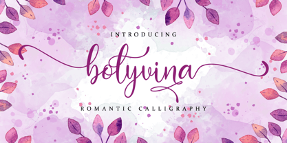 Bolyvina is a beautiful script that feels classy, elegant, and modern. It is perfectly suited for a wide variety of projects! This font is PUA encoded which means you can access all of the magical glyphs and swashes with ease! It also features a wealth of special features including alternate glyphs and ligatures.
 - Geodot by Okaycat,
$24.50 Geodot is subtly faded with a bold graphic appearance. Inspired by atomic structure, it is defined by a harmonious arrangement of tiny spheres. Since the appearance varies widely depending on scale, this font has many possible applications. Geodot is extended, containing West European diacritics & ligatures, making it suitable for multilingual environments and publications.
 - Schuss Slab Pro by typic schuss,
$42.56 I was working about 10 years exclusively for a type company. Based on my experiences, I built this superfamily. Schuss™ Sans PCG is a humanistic sans-serif with a little contrast. Small Caps, greek and cyrillic are included. Also tab, prop, lining, old style and small cap figures. It's a typeface with clear and open characters. All complicated shapes are cleaned and simplified with a bit elegance. Schuss™ Slab Pro is a slab serif, based on the Schuss™ Sans. Schuss™ News Pro is the modeled style between Schuss™ Slab Pro and Schuss™ Serif Pro. Schuss™ Serif Pro is the antiqua shape. Additionally all serifs are cleaned up. There is just one-side-serif in the "n" for example. Tab figures (except small caps), mathematical signs and currency symbols have a width system accross all styles and weights.
 - Schuss Serif Pro by typic schuss,
$42.56 I was working about 10 years exclusively for a type company. Based on my experiences, I built this superfamily. Schuss™ Sans PCG is a humanistic sans-serif with a little contrast. Small Caps, greek and cyrillic are included. Also tab, prop, lining, old style and small cap figures. It's a typeface with clear and open characters. All complicated shapes are cleaned and simplified with a bit elegance. Schuss™ Slab Pro is a slab serif, based on the Schuss™ Sans. Schuss™ News Pro is the modeled style between Schuss™ Slab Pro and Schuss™ Serif Pro. Schuss™ Serif Pro is the antiqua shape. Additionally all serifs are cleaned up. There is just one-side-serif in the "n" for example. Tab figures (except small caps), mathematical signs and currency symbols have a width system accross all styles and weights.
 - Schuss News Pro by typic schuss,
$42.56 I was working about 10 years exclusively for a type company. Based on my experiences, I built this superfamily. Schuss™ Sans PCG is a humanistic sans-serif with a little contrast. Small Caps, greek and cyrillic are included. Also tab, prop, lining, old style and small cap figures. It's a typeface with clear and open characters. All complicated shapes are cleaned and simplified with a bit elegance. Schuss™ Slab Pro is a slab serif, based on the Schuss™ Sans. Schuss™ News Pro is the modeled style between Schuss™ Slab Pro and Schuss™ Serif Pro. Schuss™ Serif Pro is the antiqua shape. Additionally all serifs are cleaned up. There is just one-side-serif in the "n" for example. Tab figures (except small caps), mathematical signs and currency symbols have a width system accross all styles and weights.
 - Schuss Sans PCG by typic schuss,
$- I was working about 10 years exclusively for a type company. Based on my experiences, I built this superfamily. Schuss™ Sans PCG is a humanistic sans-serif with a little contrast. Small Caps, greek and cyrillic are included. Also tab, prop, lining, old style and small cap figures. It's a typeface with clear and open characters. All complicated shapes are cleaned and simplified with a bit elegance. Schuss™ Slab Pro is a slab serif, based on the Schuss™ Sans. Schuss™ News Pro is the modeled style between Schuss™ Slab Pro and Schuss™ Serif Pro. Schuss™ Serif Pro is the antiqua shape. Additionally all serifs are cleaned up. There is just one-side-serif in the "n" for example. Tab figures (except small caps), mathematical signs and currency symbols have a width system accross all styles and weights.
 - Plantago by Schriftlabor,
$29.99 Viktor Solt-Bittner drew logo sketches for an insurance company. Luckily for Schriftlabor, they rejected the design, and he turned the sketches into a font family. Years later, Plantago was expanded, developed and completed by Schriftlabor’s type directors Franziska Hubmann and Lisa Schultz. Plantago shows delicate leaf-like stroke endings and subtle curvings and offers condensed and wide variants. Typeset in 6 weights from Light to Black, 3 widths from Condensed to Extended, both upright and italic, totaling in no less than 36 styles.
 - Nahid by Naghi Naghachian,
$128.00 Nahid is a sans-serif font family designed by Naghi Naghashian in 3 weights: Nahid Light, Nahid Medium and Nahid Bold. It is extremely legible even in very small size. This font family is a contribution to modernisation the Arabic typography, gives the font design of Arabic letters real typographic arrangement und provides more typographic flexibility. Nahid supports Arabic, Persian ( Farsi ) and Urdu. It also includes proportional and tabular numerals for the supported languages. Nahid fulfils the following needs: 1. Explicitly crafted for use in electronic media fulfils the demands of electronic communication. 2. Suitability for multiple applications. Gives the widest potential acceptability. 3. Extreme legibility not only in small sizes, but also when the type is filtered or skewed, e.g., in Photoshop or Illustrator. Bauhaus Arabic’s simplified forms may be artificial obliqued in InDesign or Illustrator, without any loss in quality for the effected text. 4. An attractive typographic image. Nahid was developed for multiple languages and writing conventions. Nahid supports Arabic, Persian and Urdu. It also includes proportional and tabular numerals for the supported languages. 5. The highest degree of calligraphic grace and the clarity of geometric typography.
 - Behtab by Naghi Naghachian,
$108.00 Behtab is a sans-serif font family designed by Naghi Naghashian in tree weights. Behtab Light, Behtab Regular and Behtab Bold. It is extremely legible even in very small size. This font family is a contribution to modernisation the Arabic typography, gives the font design of Arabic letters real typographic arrangement und provides more typographic flexibility. Behtab supports Arabic, Persian ( Farsi ) and Urdu. It also includes proportional and tabular numerals for the supported languages. Behtab design fulfills the following needs: A Explicitly crafted for use in electronic media fulfills the demands of electronic communication. B Suitability for multiple applications. Gives the widest potential acceptability. C Extreme legibility not only in small sizes, but also when the type is filtered or skewed, e.g., in Photoshop or Illustrator. Bauhaus Arabic’s simplified forms may be artificial obliqued in InDesign or Illustrator, without any loss in quality for the effected text. D An attractive typographic image. Behtab was developed for multiple languages and writing conventions. Behtab Arabic supports Arabic, Persian and Urdu. It also includes proportional and tabular numerals for the supported languages. E The highest degree of calligraphic grace and the clarity of geometric typography.
 - Gilan by Naghi Naghachian,
$105.00 Gilan is a sans-serif font family designed by Naghi Naghashian in tree weights, Gilan Light, Gilan Medium and Gilan Bold. It is extremely legible even in very small size. This font family is a contribution to modernisation the Arabic typography, gives the font design of Arabic letters real typographic arrangement und provides more typographic flexibility. Gilan supports Arabic, Persian ( Farsi ) and Urdu. It also includes proportional and tabular numerals for the supported languages. Gilan design fulfills the following needs: A Explicitly crafted for use in electronic media fulfills the demands of electronic communication. B Suitability for multiple applications. Gives the widest potential acceptability. C Extreme legibility not only in small sizes, but also when the type is filtered or skewed, e.g., in Photoshop or Illustrator. Gilan’s simplified forms may be artificial obliqued in InDesign or Illustrator, without any loss in quality for the effected text. D An attractive typographic image. Gilan was developed for multiple languages and writing conventions. Jaleh supports Arabic, Persian and Urdu. It also includes proportional and tabular numerals for the supported languages. E The highest degree of calligraphic grace and the clarity of geometric typography.
 - Baluarte by Tomtype,
$9.00 Baluarte is a display typeface inspired by fortifications and military buildings used to defend and protect a specific place during war times. Its main characteristics are the irregular trace and the solid presence in all its characters. It has 5 weights + obliques It is perfect for titles in big sizes, video game logos, movie titles or credits, posters, and many other visual graphics. Key features Meticulously designed Comes in 5 weights and obliques for each weight Uppercase and lowercase characters Ligatures and fractions Supports a lot of languages Licensed for Personal or Commercial use (OFL)
 - Alonso Flair by BA Graphics,
$45.00This font, as indicated by its namesake, was designed and started by the late Bob Alonso. It represents the first of his unfinished work to be completed by friend and colleague John Bomparte, following Bob's passing in December of 2007. It is a font that speaks with a distinctively robust voice; and would be a great choice for a wide variety of uses. Central European languages are supported through OpenType, and Windows/Mac OSX TrueType versions. - Canniza by Prominent and Affluent,
$30.00 Canniza Typeface Family is a very aesthic display typeface designed for use in large sizes. It features 8 weights, from thin to bold. The typeface features a classic serif design with a modern twist.
 - Retro Goldy by Nirmana Visual,
$22.00 Introducing our new retro style font, designed to take you back to the good old days. With its bold and playful design, this font is perfect for creating eye-catching designs that evoke nostalgia and fun. Inspired by the groovy typography of the 60s and 70s, this font features thick and rounded letterforms, playful curves, and a distinct retro feel. Its versatility and legibility make it a great choice for a wide range of projects, from branding and packaging to posters and social media graphics.
 - Original Garamond by ParaType,
$30.00 The Stempel foundry in Germany produced this version of Garamond in 1925 as a replica of a typeface of a French punchcutter Claude Garamond (middle of the 16th century). This design has an angular incised appearance which is unlike other Garamond types. It is also slightly heavier in weight, and is highly readable as a text face. Well suited for a wide range of applications and treatments. Original Garamond is the Bitstream version of Stempel Garamond. Cyrillic version was developed for ParaType in 2002 by Gayaneh Bagdasaryan..
 - LHF Saratoga Panels 4 by Letterhead Fonts,
$53.00The final collection in the series of 4 fonts. Each font contains 37 expertly drawn panels. All you have to do is add your own text and color for a quick and easy design. All 37 of these panels are exclusive to Letterhead Fonts. Typing each letter generates a different panel. Special Note: Due to the large file size of these fonts, they will not convert for use in Gerber Omega. Instead, Omega users may wish to use an alternate program to type the characters and import them into Omega as .eps files. CorelDraw users should use the "Weld" command rather than "Convert to Curves" command to convert these fonts to vector outlines. Otherwise, the program may crash due to the sheer number of points in each panel. - Hollenbeck JNL by Jeff Levine,
$29.00Hollenbeck JNL is the Art Deco, all-caps cousin of Jeff Levine's Hallandale JNL typeface. This version utilizes the thick-and-thin stroke weights so popular during the Art Deco era, while retaining the look of hand-lettered copy. Best suited at larger point sizes, this font is a nice alternative to the over-used display faces reminiscent of that time period. - Rodeo Roundup by FontMesa,
$30.00 Four years in the making Rodeo Roundup is a very ornate script font where the letters look like a flowing rope with connecting lowercase letters. Due to the high amount of detail in this and other FontMesa fonts some applications may have difficulty displaying the letters larger than 100 point size.
 - Erratic JNL by Jeff Levine,
$29.00 Erratic JNL earns its name from the varying widths and shapes of the hand lettering found on some old Art-Deco era sheet music. Following this unusual pattern throughout the complete typeface, the user finds a mix of traditional Deco type design and an overly wide M, N, W and 8.
 - Pretty September by Good Java Studio,
$20.00 Pretty September is the perfect font for all your fun designs. The main font file is equipped with ordinary characters (A-Z, a-z, 0-9, ligature), as well as more than 300+ glyphs to support most Latin-based languages. Everything is made with the same brush, and everything is the same size as Pretty September, so you can be sure they will work well together! It is suitable for you to use in making t-shirt design, quote, label, packaging, logo type, or long writing. Because we have compiled kerning and matrices that are tailored to your needs.