10,000 search results
(0.253 seconds)
- Kake by Eclectotype,
$30.00 Kake’s upper case letters are inspired by a hand-painted sign outside a temple in Ubud, Bali. The rest of the font is made to fit the style. The hand-made aesthetic is increased by the implementation of contextual alternates, which automatically swap glyphs to alternate forms to avoid the monotony of repeating letters. The amount of variations for each glyph is dependent on letter frequency in English; there are more a’s and e’s than q’s and j’s. Even with only two variations of some glyphs, the programming makes sure that no two matching glyphs are ever next to eachother, and for the most part they will rarely be even two letters apart. This all makes for type that looks like it isn't type. The glyphs bounce and subtly change weight with willful abandon. Some of the letters on that original sign are somewhat quirky. If you're not a fan you can engage stylistic alternates or stylistic sets to change the C, G, S, Y, c, s and y glyphs to a less idiosyncratic form. These variations still have variations themselves, so with contextual alternates on, they will look as random as all the rest. Case sensitive forms and automatic fractions are included, as are 98 ornaments, ranging from the useful to the (let’s just say) esoteric. These can be accessed from the glyph palette. I know you've probably never realized you need an anchor, a fuel pump, skull and crossbones and chess symbols in the same font before, but that doesn't mean you don't! Kake is full on display typography. It’s legible for small blocks of copy but don't go setting essays in it. Unless you really want to... in which case, go for it.
 - Bartosh by jpFonts,
$19.90 Bartosh is the American short form for Bartholomew. Although I chose this font name because of its sound and its short conciseness, I also liked the fact that Bartholomew had been one of the 12 apostles who had worked in India and Iran and the idea that his spirit could be the inspiration for my work.Bartosh was designed for display on the screen: the large x-height and the clear, open shapes facilitate readability. As a result, it develops a strong expression of character and makes it ideal for headings or highlighting individual text passages – it is ideal for captions of any kind. In each of the six weights, it unfolds its own and special charm. The extra-bold version is particularly noteworthy because fonts in this stroke width are rare and it is precisely these extreme bolds that give them a special graphic appeal.For all fonts there are matching italics in a well-developed set of 677 characters. In addition, it is possible to change the digits and currency characters from proportional to tabular or OldStyle via the OpenType feature, and small caps are also available in all fonts.
 - Camille by Arabetics,
$45.00 Camille was designed with exaggerated emphasis on letter vertical characteristic, by virtually eliminating the typical Arabic horizontal line look. This font glyph weights and look and feel are heavily influenced by early Kufic Quranic calligraphy style. Camille supports all Arabetic scripts covered by Unicode 6.1, and the latest Arabic Supplement and Extended-A Unicode blocks, including support for Quranic texts. This font family includes two letter spacing flavors: isolated for small text and overlapped for large or display text. The two spacing flavors have one weight each with a normal and a left-slanted Italic version. The script design of this font family follows the Arabetics Mutamathil Taqlidi style utilizing varying x-heights. The Mutamathil Taqlidi type style uses one glyph per every basic Arabic Unicode character or letter, as defined by the Unicode Standards, and one additional final form glyph, for each freely-connecting letter of the Arabic cursive text. Camille includes the required Lam-Alif ligatures in addition to all vowel diacritic ligatures. Soft-vowel diacritic marks (harakat) are selectively positioned with most of them appearing on similar high and low levels—top left corner—, to clearly distinguish them from the letters. Tatweel is a zero-width glyph.
 - Actay by Arodora Type,
$50.00 Actay Font is an elegant and remarkable family with its highly legible geometric lines. Crowded family members are divided into three separate groups: Normal, Condensed, and Wide. Each group has 20 weights. Actay Font also provides Cyrillic Alphabet support, providing unlimited possibilities in many languages and will not let you down. The fluent functionality of Actay is achieved with multiple OpenType features, such as case-sensitive forms, contextual and stylistic alternates. The standard numerals set encompasses tabular figures and symbols, superiors and inferiors, numerators and denominators, plus fractions. Thanks to its corporate structure, Actay can be shaped and used in accordance with many design trends.
 - Akisa by Twinletter,
$15.00 Akisa is a faux Japanese display typeface with amusing character characters that you may use for a variety of design projects. You will create a project that is striking and memorable in the minds of the entire audience if you use this typeface. Logotypes, food banners, branding, brochure, posters, movie titles, book titles, quotes, and more may all benefit from this font. Of course, using this font in your various design projects will make them excellent and outstanding; many viewers are drawn to the striking and unusual graphic display. Start utilizing this typeface in your projects to make them stand out.
 - Battlefly by Dicubit,
$9.00 Battlefly is a boxy typeface/font designed with carefully handcrafted. This perfectly made to be applied in logo or branding, stationery, books, packaging, fashion, magazines, t-shirt, novels, labels and many advertising purposes. Features: Uppercase Lowercase Number Punctuation Symbol Multilingual All the pictures used in the preview are not included. They are intended only for illustration purpose.
 - Mikey Likes It Corpulent NF by Nick's Fonts,
$10.00Fat and sassy, this ultrabold brush font is based on the works of lettering legend Mike Stevens as seen in his book, Mastering Layout. A natural choice for can't-miss headlines, this typeface also works surprising well for short blocks of body copy. Both the OpenType and Truetype versions of this font contain the complete Latin language character set (Unicode 1252) plus support for Central European (Unicode 1250) languages as well. - Girard by House Industries,
$33.00 Whatever the medium, Girard’s love for typography was the common thread that wove his work together. We are honored that the Girard family has entrusted us to celebrate and expand upon the legacy of this design icon with this collection of fonts. The Girard Slab family gracefully synthesizes illustrative sensibilities into a practical typographic framework. Slab’s three widths and four weights ensure versatility in a modern editorial setting while its gentle curves transcend the sterility of traditional typography to add an unprecedented warmth and personality. From boutique chocolate packaging to the titling sequence for an indie vegan superhero cartoon, Girard Script deftly adds a contemporary sophistication to text and display settings. Inspired by a workhorse lettering style that helped Alexander Girard implement thousands of design elements in his overhaul of the Braniff identity system, Girard Sky pulls its weight in any contemporary application. In Girard Sansusie, each character stands alone as an illustrative element while coming together with its counterparts as a whimsical yet functional typeface. FEATURES: The ligatures feature substitutes specially-drawn letter combinations that combine two, three or even four characters to create smoother transitions and simulate lettering sensibilities. Girard Slab’s three widths and four weights ensure versatility in a modern editorial setting while its gentle curves transcend the sterility of traditional typography to add an unprecedented warmth and personality. Copious alternate characters and “smart” OpenType programming allow Sansusie to escape the rigid confines of typography to come alive as if flowing from Girard’s sketchpad. This animation shows a sampling of the swash characters available in the font. GIRARD CREDITS: Typeface Design: Alexander Girard, Ben Kiel, Ken Barber, Laura Meseguer Typeface Production: Ben Kiel Typeface Direction: Christian Schwartz, Andy Cruz, Ken Barber Like all good subversives, House Industries hides in plain sight while amplifying the look, feel and style of the world’s most interesting brands, products and people. Based in Delaware, visually influencing the world.
 - Adelle by TypeTogether,
$52.00 While Adelle is a slab serif typeface conceived by Veronika Burian and José Scaglione specifically for intensive editorial use, mainly in newspapers, magazines, and online, its personality and flexibility make it a true multipurpose typeface. Adelle’s superior screen rendering and cross-platform consistency has also made it one of our most popular webfonts. The intermediate weights deliver a neutral look when used in text sizes, providing the usual robustness expected in a newspaper font. The unobtrusive appearance, excellent texture, and slightly dark colour allow it to behave flawlessly in continuous text, even in the most unforgiving editorial applications. As it becomes larger in print, Adelle shows its personality through a series of measured particularities which make it easy to remember and identify. Its energetic character, so inherent to slab serif fonts, becomes evident when used for subheadings and headlines. A condensed series of seven weights with matching italics expand Adelle’s possibilities. This extension provides flexible solutions in situations where saving space is vital but losing legibility is not an option. The new condensed series shares the same personality, proportions, and skeleton of the Adelle family, creating an harmonious texture when combined. Be sure to check out the companion to Adelle, Adelle Sans, to complete the look of your design with the intended personality and flexibility. Awards – Third prize for Latin text typeface in the 2009 Granshan Type Design Competition – Won Gold for Original Typeface in the 2010 European Design Awards – Selected in the first Ukrainian typeface competition in 2010 – Exhibited at the Rutenia Calligraphy & Typography Festival (http://rutenia.org.ua/en/index_u.html) in Kyiv, 2010 – Selected in the 2011 Type Directors Club Tokyo Exhibition – Selected in Communication Arts 2011 Typography Annual – Selected in Yearbook of Type I, 2013 – Part of the exhibition «Call for Type» and subsequent book Neue Schriften (New Typefaces)
 - Sagrantino by Monotype,
$50.99 Sagrantino™ shines at large sizes – and in vibrant colors. Think big posters, commanding headlines, massive banners and oversized packaging. Set headlines in the Highlight or Shadow designs and running copy in the Regular – all on the same page! Sagrantino could be called the Lava Lamp of fonts. It’s slick, glossy, retro and futuristic. Somehow, it’s fresh and quirky-classic at the same time. This is a design that challenges you to think outside the text box. In fact, Sagrantino is so lively, it took three Monotype typeface designers, Karl Leuthold, Juan Villanueva and Carl Crossgrove, to draw it. Because it’s a script, Sagrantino pairs perfectly with just about any other design – except another script. Maintain the futuristic retro vibe by combining Sagrantino with a typeface like Biome™ or Neo™ Tech. Looking for a counterpoint? Try a cool sans like Avenir® Next or Univers® Next. OpenType® Pro fonts of Sagrantino enable automatic insertions from a crowd of fancy ligatures and delightful alternate characters – in addition to offering an extended character set supporting most Central European and many Eastern European languages.
 - 99 Names of ALLAH Subhanahu by Islamic Calligraphy75,
$12.00 We have transformed the “99 names of ALLAH” into a font. That means each key on your keyboard represents 1 of the 99 names of ALLAH Aaza Wajal. The fonts work with both the English and Arabic Keyboards. We call this Calligraphy "Subhanahu Wa Ta'ala" because we have added "Subhanahu Wa Ta'ala" to each and every name. The first "Alef" has a "hamzit wasel", this indicates that the name can be pronounced both as "AR-RAHMAAN" or "R-RAHMAN" (in the zip file you will find a pdf file explaining the differences in the "harakat", pronunciation and spelling according to the Holy Quran). The calligraphy is rectangular shaped, and the "fatha" is big and covers almost the entire name, in most of the names. Decorative letters used in this calligraphy: "Mim, Aain, Sin, HHe, He, Ta, Kaf & Saad". Purpose & use: - Writers: Highlight the names in your texts in beautiful Islamic calligraphy. - Editors: Use with kinetic typography templates (AE) & editing software. - Designers: The very small details in the names does not affect the quality. Rest assured it is flawless. The MOST IMPORTANT THING about this list is that all the names are 100% ERROR FREE, and you can USE THEM WITH YOUR EYES CLOSED. All the “Tachkilat” are 100% ERROR FREE, all the "Spelling" is 100% ERROR FREE, and they all have been written in accordance with the Holy Quran. No names are missing and no names are duplicated. The list is complete "99 names +1". The +1 is the name “ALLAH” 'Aza wajal. Another important thing is how we use the decorative letters. In every font you will see small decorative letters, these letters are used only in accordance with their respective letters to indicate pronunciation & we don't include them randomly. That means "mim" on top or below the letter "mim", "sin" on top or below the letter "sin", and so on and so forth. Included: Pdf file telling you which key is associated with which name. In that same file we have included the transliteration and explication of all 99 names. Pdf file explaining the differences in the harakat and pronunciation according to the Holy Quran.
 - Rodeo Rebels by Putracetol,
$24.00 Rodeo Rebels is a display typeface with a retro, cowboy, and western theme. It's perfect for designs that require a bold and masculine touch, such as branding, packaging, posters, and headlines. The font was inspired by vintage rodeo posters and the American Old West, where bold, slab-serif typography was a common sight. To make the most out of Rodeo Rebels, consider using it in designs that require a rugged and tough aesthetic, such as clothing and apparel, whiskey and beer packaging, and Western-themed events. Pairing it with other vintage-inspired elements, such as distressed textures and illustrations, can also help create a cohesive look and feel. With its bold and rugged aesthetic, Rodeo Rebels is a font that demands attention. It's perfect for projects that require a vintage and masculine vibe, and its features make it a versatile choice for a wide range of designs. Give your projects a touch of the American Old West with Rodeo Rebels, and let its bold and rugged style do the talking.
 - MFC Memoriam Initials by Monogram Fonts Co.,
$19.95 The inspiration source for Memoriam Initials is the 1934 Book of American Types by American Type Founders. In that specimen book, they had created a sophisticated two color initial design they called “University Initials” which was only available in metal type at 24, 36, and 48 points. This wonderfully detailed initial style is now digitally recreated and revived for modern use. Memoriam Initials is only capable of initial or single letter monograms due to its unique design. The two color aspect of the original design has been preserved and made accessible within all programs. The Capital character slots contain the background color glyphs, and the lowercase slots hold the outline art for the letters. You can choose a color, type a capital letter, then switch to black and type a lowercase letter for the two color effect, or just type a lowercase letter on its own. It’s that easy! Download and view the Memoriam Initials Guidebook if you would like to learn a little more.
 - Monkton by Club Type,
$36.99 The inspiration for this typeface family came from my childhood experiences at West Monkton, amidst an historic part of the South West of England. Studies of the original incised capitals of the Trajan column in Rome were analysed and polished for this modern version. The lower case letterforms and numerals were then created in sympathy, taking their proportions from the incised letters of local gravestones. Its name honours not only the area where the original alphabet was conceived and drawn, but also the people responsible for fostering my initial interest in letters.
 - DIN Next Arabic by Monotype,
$155.99 DIN Next is a typeface family inspired by the classic industrial German engineering designs, DIN 1451 Engschrift and Mittelschrift. Akira Kobayashi began by revising these two faces-who names just mean ""condensed"" and ""regular"" before expanding them into a new family with seven weights (Light to Black). Each weight ships in three varieties: Regular, Italic, and Condensed, bringing the total number of fonts in the DIN Next family to 21. DIN Next is part of Linotype's Platinum Collection. Linotype has been supplying its customers with the two DIN 1451 fonts since 1980. Recently, they have become more popular than ever, with designers regularly asking for additional weights. The abbreviation ""DIN"" stands for ""Deutsches Institut für Normung e.V."", which is the German Institute for Industrial Standardization. In 1936 the German Standard Committee settled upon DIN 1451 as the standard font for the areas of technology, traffic, administration and business. The design was to be used on German street signs and house numbers. The committee wanted a sans serif, thinking it would be more legible, straightforward, and easy to reproduce. They did not intend for the design to be used for advertisements and other artistically oriented purposes. Nevertheless, because DIN 1451 was seen all over Germany on signs for town names and traffic directions, it became familiar enough to make its way onto the palettes of graphic designers and advertising art directors. The digital version of DIN 1451 would go on to be adopted and used by designers in other countries as well, solidifying its worldwide design reputation. There are many subtle differences in DIN Next's letters when compared with DIN 1451 original. These were added by Kobayashi to make the new family even more versatile in 21st-century media. For instance, although DIN 1451's corners are all pointed angles, DIN Next has rounded them all slightly. Even this softening is a nod to part of DIN 1451's past, however. Many of the signs that use DIN 1451 are cut with routers, which cannot make perfect corners; their rounded heads cut rounded corners best. Linotype's DIN 1451 Engschrift and Mittelschrift are certified by the German DIN Institute for use on official signage projects. Since DIN Next is a new design, these applications within Germany are not possible with it. However, DIN Next may be used for any other project, and it may be used for industrial signage in any other country! DIN Next has been tailored especially for graphic designers, but its industrial heritage makes it surprisingly functional in just about any application. The DIN Next family has been extended with seven Arabic weights and five Devanagari weights. The display of the Devanagari fonts on the website does not show all features of the font and therefore not all language features may be displayed correctly.
 - DIN Next Devanagari by Monotype,
$103.99DIN Next is a typeface family inspired by the classic industrial German engineering designs, DIN 1451 Engschrift and Mittelschrift. Akira Kobayashi began by revising these two faces-who names just mean ""condensed"" and ""regular"" before expanding them into a new family with seven weights (Light to Black). Each weight ships in three varieties: Regular, Italic, and Condensed, bringing the total number of fonts in the DIN Next family to 21. DIN Next is part of Linotype's Platinum Collection. Linotype has been supplying its customers with the two DIN 1451 fonts since 1980. Recently, they have become more popular than ever, with designers regularly asking for additional weights. The abbreviation ""DIN"" stands for ""Deutsches Institut für Normung e.V."", which is the German Institute for Industrial Standardization. In 1936 the German Standard Committee settled upon DIN 1451 as the standard font for the areas of technology, traffic, administration and business. The design was to be used on German street signs and house numbers. The committee wanted a sans serif, thinking it would be more legible, straightforward, and easy to reproduce. They did not intend for the design to be used for advertisements and other artistically oriented purposes. Nevertheless, because DIN 1451 was seen all over Germany on signs for town names and traffic directions, it became familiar enough to make its way onto the palettes of graphic designers and advertising art directors. The digital version of DIN 1451 would go on to be adopted and used by designers in other countries as well, solidifying its worldwide design reputation. There are many subtle differences in DIN Next's letters when compared with DIN 1451 original. These were added by Kobayashi to make the new family even more versatile in 21st-century media. For instance, although DIN 1451's corners are all pointed angles, DIN Next has rounded them all slightly. Even this softening is a nod to part of DIN 1451's past, however. Many of the signs that use DIN 1451 are cut with routers, which cannot make perfect corners; their rounded heads cut rounded corners best. Linotype's DIN 1451 Engschrift and Mittelschrift are certified by the German DIN Institute for use on official signage projects. Since DIN Next is a new design, these applications within Germany are not possible with it. However, DIN Next may be used for any other project, and it may be used for industrial signage in any other country! DIN Next has been tailored especially for graphic designers, but its industrial heritage makes it surprisingly functional in just about any application. The DIN Next family has been extended with seven Arabic weights and five Devanagari weights. The display of the Devanagari fonts on the website does not show all features of the font and therefore not all language features may be displayed correctly. - DIN Next Cyrillic by Monotype,
$65.00DIN Next is a typeface family inspired by the classic industrial German engineering designs, DIN 1451 Engschrift and Mittelschrift. Akira Kobayashi began by revising these two faces-who names just mean ""condensed"" and ""regular"" before expanding them into a new family with seven weights (Light to Black). Each weight ships in three varieties: Regular, Italic, and Condensed, bringing the total number of fonts in the DIN Next family to 21. DIN Next is part of Linotype's Platinum Collection. Linotype has been supplying its customers with the two DIN 1451 fonts since 1980. Recently, they have become more popular than ever, with designers regularly asking for additional weights. The abbreviation ""DIN"" stands for ""Deutsches Institut für Normung e.V."", which is the German Institute for Industrial Standardization. In 1936 the German Standard Committee settled upon DIN 1451 as the standard font for the areas of technology, traffic, administration and business. The design was to be used on German street signs and house numbers. The committee wanted a sans serif, thinking it would be more legible, straightforward, and easy to reproduce. They did not intend for the design to be used for advertisements and other artistically oriented purposes. Nevertheless, because DIN 1451 was seen all over Germany on signs for town names and traffic directions, it became familiar enough to make its way onto the palettes of graphic designers and advertising art directors. The digital version of DIN 1451 would go on to be adopted and used by designers in other countries as well, solidifying its worldwide design reputation. There are many subtle differences in DIN Next's letters when compared with DIN 1451 original. These were added by Kobayashi to make the new family even more versatile in 21st-century media. For instance, although DIN 1451's corners are all pointed angles, DIN Next has rounded them all slightly. Even this softening is a nod to part of DIN 1451's past, however. Many of the signs that use DIN 1451 are cut with routers, which cannot make perfect corners; their rounded heads cut rounded corners best. Linotype's DIN 1451 Engschrift and Mittelschrift are certified by the German DIN Institute for use on official signage projects. Since DIN Next is a new design, these applications within Germany are not possible with it. However, DIN Next may be used for any other project, and it may be used for industrial signage in any other country! DIN Next has been tailored especially for graphic designers, but its industrial heritage makes it surprisingly functional in just about any application. The DIN Next family has been extended with seven Arabic weights and five Devanagari weights. The display of the Devanagari fonts on the website does not show all features of the font and therefore not all language features may be displayed correctly. - DIN Next Paneuropean by Monotype,
$92.99DIN Next is a typeface family inspired by the classic industrial German engineering designs, DIN 1451 Engschrift and Mittelschrift. Akira Kobayashi began by revising these two faces-who names just mean ""condensed"" and ""regular"" before expanding them into a new family with seven weights (Light to Black). Each weight ships in three varieties: Regular, Italic, and Condensed, bringing the total number of fonts in the DIN Next family to 21. DIN Next is part of Linotype's Platinum Collection. Linotype has been supplying its customers with the two DIN 1451 fonts since 1980. Recently, they have become more popular than ever, with designers regularly asking for additional weights. The abbreviation ""DIN"" stands for ""Deutsches Institut für Normung e.V."", which is the German Institute for Industrial Standardization. In 1936 the German Standard Committee settled upon DIN 1451 as the standard font for the areas of technology, traffic, administration and business. The design was to be used on German street signs and house numbers. The committee wanted a sans serif, thinking it would be more legible, straightforward, and easy to reproduce. They did not intend for the design to be used for advertisements and other artistically oriented purposes. Nevertheless, because DIN 1451 was seen all over Germany on signs for town names and traffic directions, it became familiar enough to make its way onto the palettes of graphic designers and advertising art directors. The digital version of DIN 1451 would go on to be adopted and used by designers in other countries as well, solidifying its worldwide design reputation. There are many subtle differences in DIN Next's letters when compared with DIN 1451 original. These were added by Kobayashi to make the new family even more versatile in 21st-century media. For instance, although DIN 1451's corners are all pointed angles, DIN Next has rounded them all slightly. Even this softening is a nod to part of DIN 1451's past, however. Many of the signs that use DIN 1451 are cut with routers, which cannot make perfect corners; their rounded heads cut rounded corners best. Linotype's DIN 1451 Engschrift and Mittelschrift are certified by the German DIN Institute for use on official signage projects. Since DIN Next is a new design, these applications within Germany are not possible with it. However, DIN Next may be used for any other project, and it may be used for industrial signage in any other country! DIN Next has been tailored especially for graphic designers, but its industrial heritage makes it surprisingly functional in just about any application. The DIN Next family has been extended with seven Arabic weights and five Devanagari weights. The display of the Devanagari fonts on the website does not show all features of the font and therefore not all language features may be displayed correctly. - Island Time JNL by Jeff Levine,
$29.00 Island Time JNL is based on the hand-lettered title from a piece of 1940s sheet music called "An Island Melody". This Art Deco typeface is perfect for projects where a clean, yet attractive headline font is needed. The font's name is based on the euphamism popular amongst Caribbean Islanders that when someone is excessively late for an appointment, date or event they are running on "island time".
 - Savigny by insigne,
$22.00 Savigny began as an offshoot of Le Havre. Le Havre met my design objective of a geometric sans serif with a strong art deco touch. Le Havre’s primary inspiration came from the art deco titling of the 1930’s, and the lower case was just icing. The art of the 1930’s is of particular interest to me, and I love the art deco era and its art, and the simplicity of geometric shapes. I am mostly interested in designing display typefaces. In many ways Le Havre was the exact opposite of another popular insigne offering, Aviano Sans. Le Havre has very high ascenders, a lower case and is very condensed. Aviano Sans has no lowercase and extremely extended capitals. With the rise of webfonts I began to see Le Havre being used frequently online. It’s short x-height and very tall ascenders made it difficult to read in on screen text settings as it was intended as display type. With this observation, I felt that there is more room for a geometric sans in the insigne catalog. So I set about to design a new geometric sans using the successful skeleton of the Le Havre family. Although I planned to extend the Le Havre line, the new family is so drastically different I decided on a new name: Savigny. The face evolved and began to take on a few humanist touches. Designed from the very beginning as a webfont, the design is open and pleasing to the eye, with a tall x-height. To optimize it for onscreen settings, the spacing is generous. In addition, it includes extended and condensed members, making it insigne’s first superfamily. The family includes over 100 OpenType alternate characters. These include several style sets. Some are stemless, others are purely geometric, and in a nod to Savigny’s origins, Art Deco titling alternates. Please see the informative .pdf brochure to see these features in action. OpenType capable applications such as Quark or the Adobe suite can take full advantage of the automatically replacing ligatures and alternates. This family also includes the glyphs to support a wide range of languages. Savigny is a great choice for a professional designer who wants a well rounded typeface family that is ready for the web.
 - VVDS Benigne Sans by Vintage Voyage Design Supply,
$14.00 VVDS Benigne Sans is geometric font family consisting of 8 weights ranging from Thin to Ultra Bold with matching italics. Balanced and gently Thin or fat and heavy Ultra Bold, good wide range of widths, which allow use this font not only as a Headers, also as sub-headers or block texts. Also, I love how it looks in infographics. VVDS Benigne Sans is latin-based multilingual and contains all mathematics symbols. OpenTypeFeatures Ligatures, alternates, old style numerals and fractions. Enjoy! VVDS
 - Chateau by Wilton Foundry,
$29.00 On the one hand Chateau is almost palatial but at the same time it has a quite earthy personality as represented by the stenciled strokes. However, this stencil effect serves to refine the strokes by creating the illusion of a completed thin stroke. Chateau is more of a hybrid roundhand script with its contrasting ornate capitals. Originally a fortified residence in France was called a Chateau. Today there are many estates with true Chateaux on them in Bordeaux, but it is customary for any wine-producing estate, no matter how humble, to prefix its name with "Chateau". This is true whether the building itself is a magnificent palace or a shack. The distinctive chateau architecture was in inspiration for the name of this script. Chateau is ideal for packaging design, invitations, announcements, headlines, brochures, menus, weddings, scrapbooking, etc. Chateau is available in Opentype, Postscript and Truetype for Macs and PCs.
 - Conversation Hearts by Harald Geisler,
$- Conversation Hearts are inspired by the sweethearts and conversation hearts that can be found all over the US and Britain, but not in Germany. A source of endless fun and surprise. As a typographer to me they are also a surprising document of written communication. Most people complain that nowadays the inscriptions are not as sweet as they used to be. While they used to held romantic and promising inscriptions like “Be True” “Sweet Talk”, today they carry “Tweet me” “Ur Hot” and “Party Girl”. So i took this as a motivation to work with conversation sweetheart on a conceptial inspirational and typographical level. The obvious: every letter pressed on the keyboard brings out a conversation heart that starts with the letter - i.e. L = Loverboy, H = Heartless but what to write? Since i didn't want to reproduce the old “Fax me” and “Email me” I had to come up with something new. Something with a personal relation and of course something that I Love - what else could i write in the shape of the heart? So I tried to access my upper subconsciousness and looked for two words for every letter in the alphabet. One for the capital letter pressed and one word for the lowercase letter. Resulting in a Kurt Schwitters worthy assemblage of vocables "Post-office" “Internship” “Zebra” “Answers” etc. It is not easy to read a text set in Conversation Hearts but easier as a text set in Zapf-Dingbats. To sparkle the visual appearance uppercase letters are filled hearts with “carved” inscription, while lowercase letters are an outlined heart with written inscription. Conversations Hearts is a part of the Light Hearted Font Collection that is inspired by a recording of Jean Baudrillard with the title, "Die Macht der Verführung" (The Power of Seduction) from 2006. Further inspiration came from the article, "The shape of the heart: I'm all yours". The heart represents sacred and secular love: a bloodless sacrifice. by British writer Louisa Young printed in EYE magazine (#43) London, 2002.
 - Heavy Heap by Typodermic,
$11.95 Get ready to burn rubber with Heavy Heap—the ultimate typeface for fans of hot-rod culture and high-speed thrills! This groovy psychedelic typeface is on fire, with a scorching look that’s sure to turn heads. With three sizzling weights to choose from, you can customize your typography to match your project’s intensity level. And with blistering mathematical symbols, torrid OpenType fractions, and a range of searing hot currency symbols, Heavy Heap is ready to take on any design challenge. But this headliner is more than just a pretty face—it’s a powerhouse of design options. It looks outstanding when used with warp and envelope effects, allowing you to create dynamic, eye-catching layouts that really pop. And with its bold, energetic style, Heavy Heap is perfect for any project that needs a little extra heat. From posters to flyers, from logos to website headers, this font is the ultimate choice for anyone who wants to make a brave statement. So rev up your engines and get ready to hit the road—with Heavy Heap, you’ll be riding in style! Most Latin-based European writing systems are supported, including the following languages. Afaan Oromo, Afar, Afrikaans, Albanian, Alsatian, Aromanian, Aymara, Bashkir (Latin), Basque, Belarusian (Latin), Bemba, Bikol, Bosnian, Breton, Cape Verdean, Creole, Catalan, Cebuano, Chamorro, Chavacano, Chichewa, Crimean Tatar (Latin), Croatian, Czech, Danish, Dawan, Dholuo, Dutch, English, Estonian, Faroese, Fijian, Filipino, Finnish, French, Frisian, Friulian, Gagauz (Latin), Galician, Ganda, Genoese, German, Greenlandic, Guadeloupean Creole, Haitian Creole, Hawaiian, Hiligaynon, Hungarian, Icelandic, Ilocano, Indonesian, Irish, Italian, Jamaican, Kaqchikel, Karakalpak (Latin), Kashubian, Kikongo, Kinyarwanda, Kirundi, Kurdish (Latin), Latvian, Lithuanian, Lombard, Low Saxon, Luxembourgish, Maasai, Makhuwa, Malay, Maltese, Māori, Moldovan, Montenegrin, Ndebele, Neapolitan, Norwegian, Novial, Occitan, Ossetian (Latin), Papiamento, Piedmontese, Polish, Portuguese, Quechua, Rarotongan, Romanian, Romansh, Sami, Sango, Saramaccan, Sardinian, Scottish Gaelic, Serbian (Latin), Shona, Sicilian, Silesian, Slovak, Slovenian, Somali, Sorbian, Sotho, Spanish, Swahili, Swazi, Swedish, Tagalog, Tahitian, Tetum, Tongan, Tshiluba, Tsonga, Tswana, Tumbuka, Turkish, Turkmen (Latin), Tuvaluan, Uzbek (Latin), Venetian, Vepsian, Võro, Walloon, Waray-Waray, Wayuu, Welsh, Wolof, Xhosa, Yapese, Zapotec Zulu and Zuni.
 - Rabert Conan by Muksal Creatives,
$10.00 Rabert Conan Modern Bold serif Font typeface with beautiful alternate and Ligature, special glyphs, ornament and multilingual support. It's a very versatile font that works great in large and small sizes. Perfect for editorial projects, Logo design, Clothing Branding, product packaging, magazine headers, or simply as a stylish text overlay to any background image.
 - Clairveaux by Scriptorium,
$12.00Clairveaux is based on samples of an ornate 12th century calligraphic style. It has some interesting features, including small caps which combine some characteristics of both traditional upper and lower cae character forms. It's ornate enough to look decorative, but not overwhelmingly complex, and looks remarkably attractive when used for titles in a large size. - Terfens by insigne,
$24.99 Terfens is a sans serif with inspiration from chancery scripts like Stefania. Subtly rounded and eschewing harsh technical lines, Terfens is a warm and inviting typeface. Its tall x-height gives it a friendly but not overly informal feel. Its readability and unique contemporary look makes it suitable for a wide range of design applications.
 - Magic by Misprinted Type,
$15.00 Magic is a vintage wide serif distressed stamp-like font with 4 styles to choose from. Ideal for a project that need that rough look and you can always combine styles to customize your type. With 3 styles (+lowercases) all combined into a single font. Styles can be accessed in opentype features “stylistic alternates & Swashes".
 - Awendela Beloved by Muksal Creatives,
$10.00 Awendela Beloved Modern sans serif Font typeface with beautiful Ligature and alternate special glyphs, ornament and multilingual support. It's a very versatile font that works great in large and small sizes. Perfect for editorial projects, Logo design, Clothing Branding, product packaging, magazine headers, or simply as a stylish text overlay to any background image.
 - Diafragma by ParaType,
$30.00 Typeface was designed in 2021-2022 by Alexey Chekulaev. It has small serifs and original contours, it’s also well read in small sizes. Each style has 1400 characters of Latin, extended Cyrillic, Greek, including small caps, as well as alternate characters. Diafragma is a good choice for headings, logos, branding, packaging, publications and websites.
 - Rolade by Akufadhl,
$25.00 Rolade is a Rounded Condensed Sans. Designed for Display purpose. Firstly designed on late 2015 as an All Caps typeface based on a personal project. Rolade has a Rounded and cute character with condensed proportion. It also come with some alternates to give more flavour and variation. Supports a wide range of latin based language.
 - Monstellar by Raditya Type,
$15.00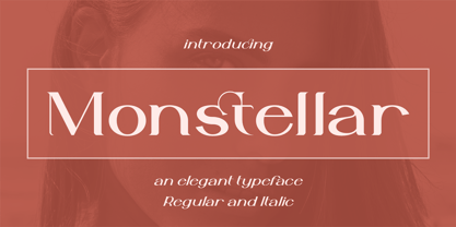 Introducing Monstellar Elegant Typeface Monstellar is a Minimalist Modern Elegant font with beautiful ligatures, and multilingual support. It's a very versatile font that works great in large and small sizes. Monstellar is perfect for branding projects, Logo design, Clothing Branding, product packaging, magazine headers, or simply as a stylish text overlay to any background image.
 - Wiegel Latein Medium - 100% free

- Quirkus - 100% free

- Wiegel Kurrent Medium - 100% free

- Elanor by Dirtyline Studio,
$25.00 Elanor is a serif typeface inspired by Retro ’70s fonts mixed with Experimental touches. Its main features are a diagonal stress and soft curved teardrop shape terminals. It has ligatures that make it more elegant and grotesque elements that give it a modern look and make it more versatile.This typeface both impressive at display sizes and easily readable in text size, while the sharp shapes of the triangular serifs and the distinctive letter shapes show their strength in logo design and impressive editorial use. Elanor come with elegant style, Retro and contrasts, with features an extended latin character set of 555 glyphs covering over 94 languages, Latin & Cyrillic. Elanor is ready to making your projects looking classic but contemporary, finely tuned but assertive, and elegant as the best retro design. 94 languages : Afrikaans, Albanian, Asu, Basque, Belarusian, Bemba, Bena, Bosnian, Bulgarian, Catalan, Chiga, Colognian, Cornish, Croatian, Czech, Danish, Embu, English, Esperanto, Estonian, Filipino, Finnish, French, Friulian, Galician, German, Gusii, Hungarian, Indonesian, Irish, Italian, Kabuverdianu, Kalaallisut, Kalenjin, Kamba, Kikuyu, Kinyarwanda, Latvian, Lithuanian, Low German, Lower Sorbian, Luo, Luxembourgish, Luyia, Macedonian, Machame, Makhuwa-Meetto, Makonde, Malagasy, Malay, Maltese, Manx, Meru, Morisyen, North Ndebele, Norwegian Bokmål, Norwegian Nynorsk, Nyankole, Oromo, Polish, Portuguese, Romanian, Romansh, Rombo, Rundi, Russian, Rwa, Samburu, Sango, Sangu, Scottish Gaelic, Sena, Serbian, Shambala, Shona, Slovak, Slovenian, Soga, Somali, Spanish, Swahili, Swedish, Swiss German, Taita, Teso, Turkmen, Upper Sorbian, Vunjo, Walser, Zulu
 - Paper Caper NF by Nick's Fonts,
$10.00This typeface is an amalgam of two cut-paper typefaces, as presented by Margaret Shepherd in her book, Calligraphic Alphabets Made Easy. Also included are a glue bottle at the bar position, and round-edge scissors at the dagger and double-dagger positions. Both versions of the font include 1252 Latin, 1250 CE (with localization for Romanian and Moldovan). - Royal Bavarian by Wiescher Design,
$39.50 RoyalBavarian was comissioned by King Ludwig the First of Bavaria about 1834. He was probably the greatest king Bavaria ever had, but he fell in disgrace for a short affair with the infamous Lola Montez and subsequently had to resign. He died in 1868, peaceful and happy in Nice on the French Riviera. I happened on an original etching of his type-guidelines for official writers of those days about 20 years ago. I always thought it was a very nice Fraktur (Blackletter), not a sturdy militaristic one as most of them are. Being me, I started with first tests immediately and then just forgot the font on my computer. When I was sorting out old stuff a couple of months ago I happened on the etchings once again and kept on working intermittently on the letters. The Plain cut is pretty much like the king wanted it. The Fancy cut is more to my liking and very decorative. Yours in a royal mood, Gert Wiescher.
 - Aardvark Dreams by Hanoded,
$15.00 Aardvark Dreams… Yes, I guess this is the first font ever to have an aardvark in its name! Aardvark Dreams is a bit of an unusual font. It is didone-ish in style, but the glyphs are slightly warped, giving them an almost liquid appearance. The Vark is a cute font for children’s books, games, posters and artwork. It could also work on psychedelic record-sleeves, but I guess they don’t make ‘em no more. Aardvark Dreams comes with a bunch of ligatures and a whole lotta diacritics!
 - Eurostile Unicase by Linotype,
$29.99 Akira Kobayashi modified his Eurostile Next design into a fun unicase version. Ascenders and descenders have been traded in for alternates of letters that all share the same height. The effect is similar to using all caps, although this is quite a bit more quirky. For example, letters like the lowercase a and e are now the same height as their capital versions and the lowercase y has been raised to fit between the baseline and top height. Odd relationships such as these give Eurostile Unicase a fresh and funky feeling. Try using it for headlines and titles, then use Eurostile Next for the body text!


