10,000 search results
(0.079 seconds)
- Dashing Unicorn by Balpirick,
$15.00 Dashing Unicorn is a sweet and colorful handwritten font. It has beautiful and neat characters and as a result, it matches a wide pool of designs. Add it to your most creative ideas and notice how it makes them come alive!
 - Adelaide Sky by Omaikraf Studio,
$14.00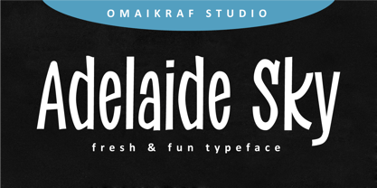 Adelaide Sky is a fun and relaxed display font. Casual and versatile, this font fits a wide range of designs, such as branding, product packaging, invitation, quote, t-shirt, label, poster, logo or any other idea that you wish to develop.
 - Request by Din Studio,
$29.00 Request is a bold and authentic display font. It celebrates abstract shapes in all their eclectic beauty. This font will look truly outstanding in a wide range of contexts. Featured : Accents (Multilingual characters) PUA encoded Numerals and Punctuation (OpenType Standard)
 - Daikon by Pepper Type,
$30.00 Daikon is a semi-closed geometric grotesque featuring rich language support including Cyrillic, various OpenType features and multiple sets of figures. This family’s clean and legible feel makes it useable as both display and body type in any font size.
 - Linotte by JCFonts,
$30.00 Linotte is a rounded sans in 7 styles designed by Joël Carrouché. Small irregularities give the typeface a warm and naive look, while the simple geometric construction provides good legibility in long texts and small sizes. Linotte is an ideal choice for food or kids related products, or anything that needs to convey a human and friendly feeling. Originally released in 2014, Linotte was updated in 2021 with Greek and Cyrillic support, two new styles, and other small additions. Linotte Semibold is 100% free for personal and commercial use. The fonts, provided in OpenType format, include diacritics for most European languages, a set of arrows & icons, and a variety of advanced features like stylistic alternates, case-sensitive forms, sub and superscript, automatic fractions, etc.
 - BF Konkret Grotesk Pro by BrassFonts,
$39.99 BF Konkret Grotesk Pro, designed by Guido Schneider, is a contemporary grotesque with a straightforward style – but a very individual touch. Inspired by classic grotesque typefaces, Konkret Grotesk Pro impresses with its unique character and rhythm: It’s elegant and edgy, flexible and forceful. The Pro family supports up to 220 Latin-based languages. Each of the 16 fonts contains more than 1500 glyphs, including small caps, 7 figure sets, fractions, many ligatures, currency symbols, alternates, special characters and other useful symbols. 11 style sets give you the option to individualize and adjust the typeface to the requirement of your design, without changing the general visual feeling. In this way you can also switch the simply slanted styled Italic into a “real Italic”. BF Konkret Grotesk Pro is a typeface family that can adapt to many requirements without losing its character and expression. The range of 8 weights provides all possibilities. Due to the lovingly designed details, Konkret Grotesk Pro works both in small sizes as well as in display applications. Thus, Konkret Grotesk Pro is ideally suited for contemporary and demanding typographic tasks, both in the fields of editorial design, branding, posters and advertising. (The new Pro edition is the extended and optimized version of the previous BF Konkret Grotesk.)
 - Slandic by Vibrant Types,
$42.00 Headlines are transformed into clear-cut messages with the handwriting type family Slandic. Its robust appeal combines the elegance of script typefaces with the lightness of handwritten notes. What makes the Slandic so playful is the synergy between the quite narrow lowercase letters and the wide uppercase letters. Therefore it might rather be an upright chancery italic of a humanist sans. You can see it very clearly in its sharp upward angles and its long-limbed ascenders. Its visual appeal sets a reliable tone. It is precisely balanced with a solid stroke contrast and confidently angular-shaped curves. Slandic perfectly enhances exciting contrasting typography adding a personal note without giving it a comic spin.
 - Silentium by Adobe,
$35.00Based on 10th century Carolingian scripts, Silentium Pro sparkles with a quiet but ebullient sense of the human hand. As a multi-featured Adobe Originals OpenType family, Silentium includes myriad alternate forms, ligatures, and titling characters that add an air of tasteful liveliness to contemporary graphic design and typography. Designed by Yugoslavian calligrapher and type designer Jovica Veljović, Silentium works well in both display sizes and text setting as small as 8 points. Silentium is the Latin word for silence, a discipline commonly practiced in the medieval European monasteries and court scriptoria where the Carolingian script flourished. Now, more than ten centuries later, Silentium Pro brings the fluid energy of their work to contemporary design and typography. - Curwen Sans by K-Type,
$20.00 Curwen Sans is a monoline sans-serif dating from the early twentieth century. Though contemporary with Johnston’s Underground and Gill Sans, and emerging from the same artistic milieu, Curwen Sans was created solely for in-house use at the Curwen Press in London so never achieved a wide audience or recognition. The original face was cut only in a Medium weight, but the new digital family consists of four weights, each with an optically corrected Oblique, and all containing a full complement of Latin Extended-A characters. K-Type Curwen Sans comprises three packages: • Basic Family (Regular, Oblique, Bold, and Bold Oblique) • Light (Light and Light Oblique) • Medium (Medium and Medium Oblique)
 - Mr Palker by Letterhead Studio-YG,
$35.00 A slab serif Mr Palker and grotesque Mr Palkerson build one superfamily together. These are blank types. In a way even the display ones. Typefaces for newspapers, announcements, cheap advertising and police posters. Mr Palker and Mr Palkerson will turn every language into a fence. And due to six types of faces one can choose what material should the fence be made from — from Thin steel rods to the Black stone blocks. In their simplest appearance Mrs P&P are intended for the solid blank composition in victorian or industrial style. They are quite decent, a bit old-fashioned slab serif and grotesque with closed aperture. All my types have layers. Walker and Palkerson also do. Besides the standard set of symbols, they have 4 add-ons. 1. Alternate glyphs, including unicase ones. 2. Ligatures with A letter. 3. Extra tall small caps. 4. Two-storey ligatures. All this options are intended for the complex composition. The additional letters are rather eccentric as their main function here is to imitate the victorian oddities. Imitate, parody, just not repeat. There are lower-case As and Es in the set in height of small caps and uppercases. They can turn every writing into the unicase. The lower-case A (as well as uppercase and small caps version of it) has deliberately by my taste grown a ludicrous tail. To compensate it I’ve built all the possible ligatures - ад, ал, ая. There are 35 of this ligatures all together. Take a closer look at the Russian letters D, L, K, Ya from the main set as well as their alternates. The additional glyphs are one more comic than the other — on purpose to imitate (not to repeat!) the victorian set. This sets have lowercase numbers. And small caps numbers as well. What a modern typeface without them. They also have an У-letter with a generously curvy tail. As if before the WWI. The Latin of course has alternates as well. It has letters to make the perfect French sound more like the russian provincial version of it. The tails of Js and Ts can be made a little bit more open — or a little bit closed. My favorite feature here, an invention of a kind - extra tall small caps. It allows to compose logos with the small caped uppercases directly from the keyboard. The small caps of this typefaces are usually much taller than the customary ones. This is the kind of small caps that Palker and Palkerson have. More to that, the strokes’ weight and the letters width are corresponded to the uppercases. Just a ready set for making a logo a la 1913 style. With a unicase, one has to mind! One more trick with the tall small caps is a possibility to make them work like lower uppercases. Their height is just in between of lower- and uppercases. Isn’t it great to have an additional set of uppercase working ponies in stock for the case of emergency. And finally — the trademark of Palkers family, two-storey ligatures. They are made in the height of uppercases and turn every writing into an ornament or a puzzle of a kind, while at the same time making them much shorter. Each face has 90 of them. Mainly those are twins: CC, BB, DD and so on. ll this things are for the unhasty compositing, even for lettering. Which means that for the things which are not there you always should have Command+Option+O and some patience. Also — among the two storey ligatures one also can find some belvedere villas. All my types are glasses from the one kaleidoscope. The P&Ps family was preliminary part of the victorian set, which already has 1 Cents and Clarendorf - optionally one can add Costro, Gordoni, Handy, Guardy, Surplus, Red Ring, Red Square, Babaev to the list. And also Sklad, Odessa, Dreamland, Romb, Platinum - here, at Letterhead’s, every second one is victorian. All together our typefaces can allow one to set advertisement of any kind, even the trickiest one, and compose everything, from the coffee place’s menu to the antiquarian magazine.
 - Mr Palkerson by Letterhead Studio-YG,
$35.00 A grotesque Mr Palkerson and slab serif Mr Palker build one superfamily together. These are blank types. In a way even the display ones. Typefaces for newspapers, announcements, cheap advertising and police posters. Mr Palker and Mr Palkerson will turn every language into a fence. And due to six types of faces one can choose what material should the fence be made from — from Thin steel rods to the Black stone blocks. In their simplest appearance Mrs P&P are intended for the solid blank composition in victorian or industrial style. They are quite decent, a bit old-fashioned slab serif and grotesque with closed aperture. All my types have layers. Walker and Palkerson also do. Besides the standard set of symbols, they have 4 add-ons. 1. Alternate glyphs, including unicase ones. 2. Ligatures with A letter. 3. Extra tall small caps. 4. Two-storey ligatures. All this options are intended for the complex composition. The additional letters are rather eccentric as their main function here is to imitate the victorian oddities. Imitate, parody, just not repeat. There are lower-case As and Es in the set in height of small caps and uppercases. They can turn every writing into the unicase. The lower-case A (as well as uppercase and small caps version of it) has deliberately by my taste grown a ludicrous tail. To compensate it I’ve built all the possible ligatures - ад, ал, ая. There are 35 of this ligatures all together. Take a closer look at the Russian letters D, L, K, Ya from the main set as well as their alternates. The additional glyphs are one more comic than the other — on purpose to imitate (not to repeat!) the victorian set. This sets have lowercase numbers. And small caps numbers as well. What a modern typeface without them. They also have an У-letter with a generously curvy tail. As if before the WWI. The Latin of course has alternates as well. It has letters to make the perfect French sound more like the russian provincial version of it. The tails of Js and Ts can be made a little bit more open — or a little bit closed. My favorite feature here, an invention of a kind - extra tall small caps. It allows to compose logos with the small caped uppercases directly from the keyboard. The small caps of this typefaces are usually much taller than the customary ones. This is the kind of small caps that Palker and Palkerson have. More to that, the strokes’ weight and the letters width are corresponded to the uppercases. Just a ready set for making a logo a la 1913 style. With a unicase, one has to mind! One more trick with the tall small caps is a possibility to make them work like lower uppercases. Their height is just in between of lower- and uppercases. Isn’t it great to have an additional set of uppercase working ponies in stock for the case of emergency. And finally — the trademark of Palkerson family, two-storey ligatures. They are made in the height of uppercases and turn every writing into an ornament or a puzzle of a kind, while at the same time making them much shorter. Each face has 90 of them. Mainly those are twins: CC, BB, DD and so on. ll this things are for the unhasty compositing, even for lettering. Which means that for the things which are not there you always should have Command+Option+O and some patience. Also — among the two storey ligatures one also can find some belvedere villas. All my types are glasses from the one kaleidoscope. The P&Ps family was preliminary part of the victorian set, which already has 21 Cents and Clarendorf - optionally one can add Costro, Gordoni, Handy, Guardy, Surplus, Red Ring, Red Square, Babaev to the list. And also Sklad, Odessa, Dreamland, Romb, Platinum - here, at Letterhead’s, every second one is victorian. All together our typefaces can allow one to set advertisement of any kind, even the trickiest one, and compose everything, from the coffee place’s menu to the antiquarian magazine.
 - Quodlibet Serif by Signature Type Foundry,
$43.00 The new typeface system is based on legibility of Renaissance and Baroque Antiqua. It maintains the quality of drawings without an overpowering historical legacy. The current concept makes the system a universal whole. Abrading of sharp edges which could catch one’s attention leads to a fine rounding of details. In this way, a sans drawing does not look hard and sterile unlike most of its contemporaries. Special attention was paid to every detail of each letter. The professional question of how to incorporate brightening wedges into the dark places of individual strokes’ onsets was resolved by rounded shapes that have their graphic response in the detail of the serifs. Particularly in larger sizes the typeface offers drawing sophistication and dimensional interconnection. Apart from Cyrillic alphabet, the alphabet design includes Vietnamese accents.
 - Quodlibet Sans by Signature Type Foundry,
$43.00 The new typeface system is based on legibility of Renaissance and Baroque Antiqua. It maintains the quality of drawings without an overpowering historical legacy. The current concept makes the system a universal whole. Abrading of sharp edges which could catch one’s attention leads to a fine rounding of details. In this way, a sans drawing does not look hard and sterile unlike most of its contemporaries. Special attention was paid to every detail of each letter. The professional question of how to incorporate brightening wedges into the dark places of individual strokes’ onsets was resolved by rounded shapes that have their graphic response in the detail of the serifs. Particularly in larger sizes the typeface offers drawing sophistication and dimensional interconnection. Apart from Cyrillic alphabet, the alphabet design includes Vietnamese accents.
 - Kopius by Kontour Type,
$50.00 The Kopius™ family is a contemporary serif type that features friendly characteristics with round, open counters conveying a relaxed ambiance. The robustness of the characters supports a wide variety of applications including editorial and display use. The uniquely defined novel glyph construction and serif shapes convey an allusion to a brush stroke that bestows a contemporary, texture-rich appearance entirely in tune with functionality. The top and bottom slightly curved stems imply flow and reading direction. Kopius is an exuberant family with a genuinely multifaceted repertoire. This upbeat type comes with a multitude of weights to satisfy any fanciful appetite for a colorful typographic palette. With packaging solutions in mind the family includes sets of expandable and combinable box heading material for a boundless range of adjusted composites. In addition, pertinent labels, weight-adjusted arrows, and word logos complete the Kopius family. OpenType provides advanced layout features including figure sets, small caps, fractions, and more. Herbert Thannhaeuser’s Liberta, an Antiqua type family designed for the East German type foundry VEB Typoart between the middle to end 1950s, has stirred the initial inspiring force for Kopius. Baskerville-like open and modern typeface proportions further characterize Kopius’ letter dimensions. With its affable yet serious demeanor, Kopius is confidently assuming numerous tasks.
 - Josef K Patterns by Juliasys,
$9.60 Franz Kafka’s manuscripts have always been a source of inspiration for designer Julia Sysmäläinen. At first she was just interested in literary aspects but later she noticed that content and visual form can not be separated in the work of this ingenious writer. Analyzing Kafka’s handwriting at the Berlin National Library, Julia was inspired to design the typeface FF Mister – by now a well known classic. Over the years, FF Mister K became a handsome typeface family and even produced offspring: the Josef K Patterns. Some of Kafka’s most expressive letterforms were the starting point for these decorative ornaments. How do the Patterns work? Outlines and fillings correspond to the uppercase and the lowercase letters on your keyboard. You can use them separately or layer them on top of each other. If you write a line of “pattern-text” in lowercase and repeat it underneath in uppercase you get a row of fillings followed by a row of outlines. Now you can color them and then set line space = 0 to get a single line of layered colored ornaments. Alternatively, activating OpenType / stylistic set / stylistic alternates will also unite the two lines to a single layered line. Further magic can be done with OpenType / contextual alternates turned on. On the gallery page of this font family is a downloadable Josef K Patterns.pdf with an alphabetical overview of forms. Hundreds of patterns are possible … we’d love to see some of yours and present them here on the website!
 - Holland Gothic by URW Type Foundry,
$39.99 Blackletter fonts are timelessly beautiful and still very popular. At some point, it seems that every type designer discovers the beauty of these forms and the great pleasure in creating blackletter characters. Like also Dutch designer Coen Hofmann who, after designing Caxtonian Gothic, has designed yet another Blackletter font: Holland Gothic. Holland Gothic reminds of the 18th century »Duytsch« typefaces of Joan Michael Fleischmann and Christoffel Van Dyck. But Hofmann was mainly inspired by the Dutch calligraphers from the 17th and 18th century. Holland Gothic develops its full charm and beauty at larger sizes because of the hairlines in the upper case characters. To enable users composing texts in the style of our ancestors, Coen Hofmann added a series of pre-composed ligatures, also in combination with the long s, plus an alternate form for the lower case r which was used in combination with letters b, d, g, o, p, v, and w.
 - Axion SER by Type Innovations,
$39.00 Axion SER is an original design by Alex Kaczun. Axion SER is a serif style variation based on his original Axion typeface family of fonts. It is a display font not intended for text use. It was designed specifically for display headlines, logotype, branding and similar applications. The entire font has an original look which is strong, dynamic, machine generated and can be widely used in publications and advertising. Axion SER is a futuristic, techno-looking and expressive typeface with an appearance of machined parts with sharp and rounded edges. This attractive display comes in roman with lower case and lining figures.The font is also available with true small capitals and old style figures. The large Pro font character set supports most Central European and many Eastern European languages.
 - Carnival VP by VP Creative Shop,
$21.00 Carnival VP is a long, clean font with Latin and Cyrillic support, tons of alternate glyphs, and multilingual support. It's a very versatile font that works great in large and small sizes. Carnival VP is perfect for branding projects, home-ware designs, product packaging, magazine headers - or simply as a stylish text overlay to any background image. Uppercase, numeral, punctuation and symbols Cyrillic support - Russian, Ukrainian, Bulgarian and more Alternate glyphs Multilingual support To access alternate glyphs in Adobe InDesign or Illustrator, choose Window Type & Tables Glyphs In Photoshop, choose Window Glyphs. In the panel that opens, click the Show menu and choose Alternates for Selection. Double-click an alternate's thumbnail to swap them out. Feel free to contact me if you have any questions! Thank you! Enjoy!
 - Stina by profonts,
$41.99 profonts Stina is an cursive font based on cross stitch pattern. It can be used in (very) tall letters but it also keeps legible in smaller sizes. Because of its joined letter pairs and ligatures it keeps the flow of a "handwritten" cursive font. So, you ever felt like stitching? - Start today.
 - Dragon Scribble by Sipanji21,
$10.00 Dragon Scribble Graffiti is a display font with Curved graffiti style. It will elevate a wide range of design projects to the highest level, be it branding, headings, wedding designs, tittle, signatures, logos, labels, movie, video, magazine, logotype, crafting, packaging, advertising and much more! thank you very much, and have a nice day.
 - Fidelio ND by Neufville Digital,
$45.25 Fidelio is a chancery italic typeface with swashes, designed by José Mendoza y Almeida in 1980. Written with a broad nibbed pen, it has Caps with swash versions, Lower Case and a wide number of ligatures. It is one of the most complete and appealing calligraphies. Fidelio is a Trademark of BauerTypes SL
 - Sothardjo by Isolatype,
$15.00 Introducing! new typeface by wildan type and Isolatype Sothardjo is a delicate, elegant and flowing handwritten font. It has beautiful and well balanced characters and as a result, it matches a wide pool of designs. Sothardjo is PUA encoded which means you can access all of the glyphs and swashes with ease!
 - Arkais by Logitype,
$25.00 Introducing Arkais, a glyphic serif typeface inspired by the rhythmic construction of Gothic architecture. This unique typeface is characterized by slightly broken shoulder and bowl shapes, offering a fresh and classic feel. With contrasting brackets, consistent barb, and beak shapes, Arkais brings a touch of elegance to any project. Arkais features five weight variants—light, regular, medium, bold, and extra—as well as three width options: condensed, normal, and expanded. Each font family also includes italic styles, providing even greater versatility. Equipped with OpenType features, Arkais offers multiple character alternatives, ligatures, small caps, and more, ensuring a tailored look for your designs. Designed as an alternative to current trends, Arkais is perfect for creating strong headers or captivating display text. The typeface supports over 500 basic Latin glyphs, making it suitable for a wide range of projects.
 - Nomad by Coniglio Type,
$20.02 NOMAD —Regular is a stand alone font. Nomad -Regular is a clean, interesting revival font. It is a Display font. Nomad, now exclusively in OpenType .oft by Joseph V Coniglio of Coniglio Type. It is a narrow boldfaced font. Its analog source was comprised of an extremely limited die cut, truly generic, craft, peel-and-stick vinyl set of capital letters of ascenders and numbers. It was purchased at a five & dime stores, hardware department from the 1970's. My father owned an original set of characters: Nomad-Regular is nicely expanded to meet the needs of OpenType. The original adhesive labels adhered to the bows of that small boats so fisherman wouldn't get turned away at the Canadian border for not having their vessels tagged and listed with the appropriate license name and numbers, recorded by customs. It was a required serialization of letters and numbers marked on the side of their vessels. On the other hand, most beer and whisky drinking fishers, card players and bait casters would rather not deal with it, but the boat could not cross over the border without them. (Once part of Market LTD from the 1990's, a collection of limited faces, mostly alpha-numeric and some just plain numeric, used primarily in retail and display situations and titling.) Designer: Joseph V Coniglio Author: Coniglio Type
 - Frank Flowers by Wiescher Design,
$15.00 Frank Flowers are fonts with flowery embellishments. They are useful for all kinds of celebrations, but they also have lots of impact. There are only uppercase letters even on the lowercase keys. Uppercase and lowercase look different, so you can mix them. You can even mix the two sets, it'll look great. I had a lot of fun doing these fonts and I want you to have some fun as well. That's why I sell them very, very cheap, even cheaper if you buy the pair! -Your typedesigner for unusual solutions Gert Wiescher
 - Plantin Infant by Monotype,
$29.99Plantin is a family of text typefaces created by Monotype in 1913. Their namesake, Christophe Plantin (Christoffel Plantijn in Dutch), was born in France during the year 1520. In 1549, he moved to Antwerp, located in present-day Belgium. There he began printing in 1555. For a brief time, he also worked at the University of Leiden, in the Netherlands. Typefaces used in Christophe Plantin's books inspired future typographic developments. In 1913, the English Monotype Corporation's manager Frank Hinman Pierpont directed the Plantin revival. Based on 16th century specimens from the Plantin-Moretus Museum in Antwerp, specifically a type cut by Robert Granjon and a separate cursive Italic, the Plantin" typeface was conceived. Plantin was drawn for use in mechanical typesetting on the international publishing markets. Plantin, and the historical models that inspired it, are old-style typefaces in the French manner, but with x-height that are larger than those found in Claude Garamond's work. Plantin would go on to influence another Monotype design, Times New Roman. Stanley Morison and Victor Larent used Plantin as a reference during that typeface's cutting. Like Garamond, Plantin is exceptionally legible and makes a classic, elegant impression. Plantin is indeed a remarkably accommodating type face. The firm modelling of the strokes and the serifs in the letters make the mass appearance stronger than usual; the absence of thin elements ensures a good result on coated papers; and the compact structure of the letters, without loss of size makes Plantin one of the economical faces in use. In short, it is essentially an all-purpose face, excellent for periodical or jobbing work, and very effective in many sorts of book and magazine publishing. Plantin's Bold weight was especially optimized to provide ample contrast: bulkiness was avoided by introducing a slight sharpening to the serifs' forms." - Plantin Headline by Monotype,
$29.00Plantin is a family of text typefaces created by Monotype in 1913. Their namesake, Christophe Plantin (Christoffel Plantijn in Dutch), was born in France during the year 1520. In 1549, he moved to Antwerp, located in present-day Belgium. There he began printing in 1555. For a brief time, he also worked at the University of Leiden, in the Netherlands. Typefaces used in Christophe Plantin's books inspired future typographic developments. In 1913, the English Monotype Corporation's manager Frank Hinman Pierpont directed the Plantin revival. Based on 16th century specimens from the Plantin-Moretus Museum in Antwerp, specifically a type cut by Robert Granjon and a separate cursive Italic, the Plantin" typeface was conceived. Plantin was drawn for use in mechanical typesetting on the international publishing markets. Plantin, and the historical models that inspired it, are old-style typefaces in the French manner, but with x-height that are larger than those found in Claude Garamond's work. Plantin would go on to influence another Monotype design, Times New Roman. Stanley Morison and Victor Larent used Plantin as a reference during that typeface's cutting. Like Garamond, Plantin is exceptionally legible and makes a classic, elegant impression. Plantin is indeed a remarkably accommodating type face. The firm modelling of the strokes and the serifs in the letters make the mass appearance stronger than usual; the absence of thin elements ensures a good result on coated papers; and the compact structure of the letters, without loss of size makes Plantin one of the economical faces in use. In short, it is essentially an all-purpose face, excellent for periodical or jobbing work, and very effective in many sorts of book and magazine publishing. Plantin's Bold weight was especially optimized to provide ample contrast: bulkiness was avoided by introducing a slight sharpening to the serifs' forms." - Rotis Sans Serif by Monotype,
$45.99 Rotis is a comprehensive family group with Sans Serif, Semi Sans, Serif, and Semi Serif styles, for a total of 17 weights including italics. The four families have similar weights, heights and proportions; though the Sans is primarily monotone, the Semi Sans has swelling strokes, the Semi Serif has just a few serifs, and the Serif has serifs and strokes with mostly vertical axes. Designed by Otl Aicher for Agfa in 1989, Rotis has become something of a European zeitgeist. This highly rationalized yet intriguing type is seen everywhere, from book text to billboards. The blending of sans with serif was almost revolutionary when Aicher first started working on the idea. Traditionalists felt that discarding serifs from some forms and giving unusual curves and edges to others might be something new, but not something better. But Rotis was based on those principles, and has proven itself not only highly legible, but also remarkably successful on a wide scale. Rotis is easily identifiable in all its styles by the cap C and lowercase c and e: note the hooked tops, serifless bottoms, and underslung body curves. Aicher is a long-time teacher of design and has many years of practical experience as a graphic designer. He named Rotis after the small village in southern German where he lives. Rotis is suitable for just about any use: book text, documentation, business reports, business correspondence, magazines, newspapers, posters, advertisements, multimedia, and corporate design.
 - BF Rotwang Pro by BrassFonts,
$39.99 The BF Rotwang™ Pro is a contemporary new edition and re-design of a formerly design by Guido Schneider. Named after the C.L. Rotwang, the inventor of the Mensch-Maschine from the film Metropolis (1925/1926), BF Rotwang plays with the character traits of high-contrast transitional serif typefaces and Didone-style typefaces. BF Rotwang is a typeface characterized by balanced elegance. It is sensitive, sophisticated and self-confident, but unobtrusive. The heavy weights have the power and dynamic for strong headlines and exciting logotypes, the lighter cuts the elegance and lightness for use in continuous text. All letters and characters are a touch condensed, so the typeface looks compact and works space-saving. BF Rotwang™ Pro supports up to 200 Latin-based languages. The family comes with 7 weights plus matching Italics. Each font contains more than 1.220 glyphs, featuring a wide range of alternate characters, small caps, figure sets, fractions, more than 35 ligatures, many currency symbols, special characters and other useful symbols. The style sets give you the option to individualize and adjust the typeface to the requirement of your design, without changing the general visual feeling.
 - Wingdings by Microsoft Corporation,
$29.00The Wingdings™ 1 font was designed by Kris Holmes and Charles Bigelow in 1990 and 1991. Wingdings 1 originally named Lucida Icons, Arrows, and Stars to complement the Lucida text font family by the same designers. Renamed, reorganized, and released in 1992 as Microsoft Wingdings(TM), the three fonts provide a harmoniously designed set of icons representing the common components of personal computer systems and the elements of graphical user interfaces. There are icons for PC, monitor, keyboard, mouse, trackball, hard drive, diskette, tape cassette, printer, fax, etc., as well as icons for file folders, documents, mail, mailboxes, windows, clipboard, and wastebasket. In addition, Wingdings includes icons with both traditional and computer significance, such as writing tools and hands, reading glasses, clipping scissors, bell, bomb, check boxes, as well as more traditional images such as weather signs, religious symbols, astrological signs, encircled numerals, a selection of ampersands and interrobangs, plus elegant flowers and flourishes. Pointing and indicating are frequent functions in graphical interfaces, so in addition to a wide selection of pointing hands, the Wingdings fonts also offer arrows in careful gradations of weight and different directions and styles. For variety and impact as bullets, asterisks, and ornaments, Windings 1 also offers a varied set of geometric circles, squares, polygons, targets, and stars. Character Set: Picture/Symbol - RF Tone by Russian Fonts,
$29.00 Tone was inspired by classic geometric sans-serif fonts but has a distinct modern day spirit. Contains 16 styles from ultralight to black: 8 regulars and 8 italics. Have a multilingual support and big amount of OpenType features. This typeface is comfortable to read in small sizes. Great for big pieces of text or as the main typeface in website design. Logotypes and branding, packaging, posters, editorial design, music covers, navigation systems, videos — these are just a few areas in which Tone can help you. Opentype features: old-style figures, tabular and tabular old-style, tabular currency symbols, ligatures, stylistic alternates, fractions and automatic frations, circled numbers, arrows and stylistic alternates for arrows, superscript and subscript, case sensitive forms. Multilingual support: Latin, latin extended, cyrillic and cyrillic extended (more than 70+ languages).
 - P22 Kelly by IHOF,
$39.95 P22 Kelly is a Celtic-styled uncial font with a medieval gothic flavor and an overall contemporary feel. The font is an addition to Ted Staunton’s collection of historical and period-based fonts. It is ideal for uses that need to evoke the Celtic spirit or the medieval period. Based on half-uncial Irish monastic handwriting of the 8th to 10th centuries, but instead of having a traditional upright stress, has an italic slant. Some Gothic influence is evident—like the thorn-like tick-marks decorating the capitals—but the rounded forms of h, m, n, u emphasize a wide, open, horizontal visual texture. The font is named in honor of the Book of Kells, the 8th-century masterpiece of Celtic calligraphic art, which is kept in Trinity College, Dublin.
 - Signal1885 by astroluxtype,
$20.00 Signal1885 is the abbreviated name for "(Sig)nature Jour(nal)" a font that harkens back to an era, when fine handwriting filled journals with observations of science and adventure. Intimate and reflective of an individual entering his thoughts in his personal journal or a ship’s captain documenting his voyage on a daily basis. Signal1885 is penmanship that reflects hand forms from by-gone days. Its a minimal glyph set which can be used at various sizes as small as 18 points. It includes a selection of ink drips and smudges, that are the “mark” of a hand done entry. These can be placed in strategic places on the type to indicate a hand dragging through or dripping fresh ink on to the paper. Set sail- and keep a diary of your voyage.
 - Megaflakes 2011 by Baseline Fonts,
$20.00 Megaflakes™ 2011 is a geometric set. Looks like this might become a tradition for Baseline Fonts. They are terribly fun for the holidays as well as Christmas in July.
 - Shpinoza MF by Masterfont,
$59.00 A practical font family with 5 weights for all your day by day design needs: headlines, body text, signage etc. High legibility at small sizes. An extended sans serif typeface with rounded endings that provides unique softness appearance without losing legibility.
 - Aeron by District,
$15.00 Aeron started with a no-nonsense geometric sans-serif structure that grew into a functional semi-serif family of fonts. Half-rounded slabs mix with curvy and squared-off terminals for a personable yet structured family that works in all sizes.
 - MAISY by Cultivated Mind,
$29.00 A chic and simple geometric hand font. Maisy comes with a set of icons and is perfect for fashion, marketing, books, websites, magazines, film and television. Maisy comes in two font styles (basic/wide) and four weights (light/regular/bold/black).
 - Darbuka MF by Masterfont,
$59.00 A practical font family with 4 weights for all your day by day design needs: headlines, body text, signage etc. High legibility at small sizes. An extended sans serif typeface with rounded endings that provides unique softness appearance without losing legibility.
 - Meteor Condensed MF by Masterfont,
$59.00 A practical font family with 8 weights for all your day by day design needs: headlines, body text, signage etc. High legibility at small sizes. An extended serif typeface with elegant endings that provide unique softness appearance without losing legibility.
 - Brand Type by VP Creative Shop,
$15.00 Brand Type is a wonderfully versatile and creatively rich logo font that's sure to make your brand or project stand out. With over 150 ligature glyphs and a wide array of alternate glyphs, it offers endless possibilities for customizing your text.