10,000 search results
(0.057 seconds)
- Ghondes by IbraCreative,
$17.00 Ghondes is a contemporary sans-serif typeface that exudes a sleek and minimalist aesthetic, making it a quintessential choice for modern design projects. Characterized by its clean, geometric lines and well-balanced proportions, Ghondes strikes a harmonious balance between elegance and readability. The typeface’s versatile design lends itself to a wide range of applications, from branding and editorial work to digital interfaces, offering a timeless and sophisticated typographic solution for today’s design needs.
 - Senza by Blackmoon Foundry,
$40.00 Senza is a contemporary, neutral, all-purpose sans serif family designed by Elena Albertoni. It was specially designed for the use on screen. With open shapes and large x-heights Senza guarantees high legibility for body text in small sizes. Senza ’s character-set covers all European languages written in Latin alphabet including real small caps, ligatures, proportional and tabular figures. Senza comes in four weights from Light to Black with matching italics.
 - Foundry Form Sans by The Foundry,
$90.00 Foundry Form Sans and Serif were drawn concurrently with matching proportions for harmonious use. Although designed to complement each other both families function independently. The Foundry Form Sans characters have a strong horizontal emphasis for readability; open counters to improve legibility at small sizes; and slightly condensed proportions to ensure economic use of space. Foundry Form Sans has a simplicity of design approach balanced with just enough character to achieve a unique, timeless look.
 - TBS Gartek by TypoBureau Studio,
$19.00 Meet the new Strong and Bold typeface from TBS. TBS GARTEK is a Display typeface It has a single weight ultra bold It come with multilingual glyphs. Good amount at Large Point sizes with combine with any suit typefaces, Headline, Logo font.
 - Zamroot by Evo Studio,
$16.00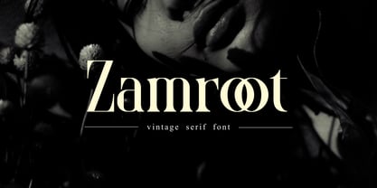 Zamroot a distinct and unique serif font. It feels playfully nostalgic and delivers an incredible vintage aesthetic. Zamroot will elevate a wide range of design projects to the highest level, be it branding, headings, wedding designs, invitations, signatures, logos, labels, and much more!
 - Notably Absent by Ali Hamidi,
$10.00 Notably Absent is a cool and fun styled display font. It will elevate a wide range of crafting ideas, from cards, to branding, labels and much more. Add it confidently to your favorite creations and let yourself be amazed by the outcome generated.
 - Murisa Mondriana by Murisa Studio,
$10.00 Mondriana is a cool and modern looking sans serif font. It will elevate a wide range of crafting ideas, from cards, to branding, labels and much more. Add it confidently to your favorite creations and let yourself be amazed by the outcome generated.
 - Aterline by AEN Creative Studio,
$15.00 Aterline is a simple but elegant slab serif font family. It will elevate a wide range of crafting ideas, from cards to branding, labels, and much more. Add it confidently to your favorite creations and let yourself be amazed by the outcome generated.
 - Admira by FontForum,
$19.99 Coen Hofmann revives an original design by Germany type foundry Schriftguss from 1940: His digital Admira is expanded with an extensive open type character set and even provides full Cyrillic. The face is set to best use at point sizes above 24.
 - Vandal Zoy Graffiti by Sipanji21,
$18.00 Vandal Zoy is a Thick font with a graffiti style and bubble looks. It will elevate a wide range of design projects to the highest level, be it branding, headings, wedding designs, invitations, signatures, logotype, wall art illustration, apparel, labels, and much more!
 - Barbecue by Gaslight,
$20.00 Experimental, geometric, bold sans. Ideal for posters. Only posters, only large size! If you want tranquility and prim punctuality Barbecue is not for you. If you want use Barbecue for body text - you're crazy. If you want madness and hooliganism - Barbecue for you!
 - Shallot by Eko Bimantara,
$24.00 Shallot is a serif font family with sharp and exquisite characteristic. The initial letterforms are made not completely based on calligraphic strokes, which make it more likely close to transitional serif style. The letterforms have high contrast strokes and sharp serif with curved brackets. The upright styles have a fairly wide proportion. The italic styles have 12 degree angle and redrawn lowercase letters. Shallot consist of 4 styles from regular to extrabold with each matching italics. It contains 462 glyphs that support broad latin languages.
 - Monolight by Mostardesign,
$25.00 The Monolight font family is a modern and versatile creation that perfectly blends roundness and simplicity to give your designs a modern and elegant look. With its low-contrast characteristics, this font family can be used for a wide variety of communication projects, ranging from advertising posters to institutional communication media, to professional presentations. In addition to its aesthetic design, Monolight offers advanced technical features, including a set of stylistic variants that allow you to explore different options for customizing letter style. This font is also case sensitive, meaning uppercase and lowercase letters are designed to work harmoniously together. Furthermore, Monolight comes equipped with a complete set of old-style and tabular numerals, providing great precision in tables and professional documents. This feature is particularly useful for professionals in marketing, finance, and accounting who seek to give their tables a professional and well-organized appearance. Finally, the Monolight font is available in 9 weights ranging from Thin to Heavy with corresponding italics, allowing designers to play with contrasts and typographic effects to give their creations a unique and personalized look. With its advanced features and elegant design, the Monolight font is the perfect tool for communication and design professionals looking to create modern and professional projects that stand out from the competition.
 - Rohn by Nine Font,
$29.00 Rohn is a modern squarish typefamily with a large x-height. Its letterforms are based on the shape of square with rounded corners. With particular details and large x- height, it is more legible at small sizes both on screen and paper. It has seven weights from Thin to Black with corresponding oblique styles and each weight includes ligatures, fractions, old style numbers, case-sensitive forms and more. Rohn is ideally suited for branding, logo, packaging, magazine, poster and editorial design.
 - Miss Seshat by Eurotypo,
$48.00 In Egyptian mythology, Seshat was the Ancient Egyptian goddess of wisdom, knowledge, and writing. She was seen as a scribe and record keeper, and her name means she who scrivens, and is credited with inventing writing. Miss Seshat font is a fun, charming and expressive handwritten font with 900 glyphs. They have many advantages of the OpenType futures to choose from: stylistic alternates, contextual alternates, and a full set of standard and discretionary ligatures, Swatches, Beginnings and endings, as a rich set of 120 ornaments, connectors and catch words. Miss Seshat Pro version supports all diacritics for CE languages. They've been specially thought to obtain endless possibilities of composition and to help to make each creation unique and interesting. Miss Seshat font can be used in packaging design, children books, advertising, logotypes, greeting cards, web sites and much more.
 - Pixel Pants by PizzaDude.dk,
$18.00 Pixel Pants is my wanna-be 1980-ies pixelfont. Well, it really looks like a pixel font, but it's kid of fake - at larger sizes you will notice the wacky and uneven lines, but it sure do bring back memories of the 80-ies! I've made 5 different versions of each letter - just to break the monotony of the usual pixel font! Insert coin and enjoy!
 - Wesal Arabic by Zaza type,
$29.00 Wesal is an Arabic typeface with an elegant and modern feeling. It’s luxurious, strong, legible, Clear, Simple, and contemporary. The design is inspired by the Kufic calligraphic style and influenced by the Naskh style. Wesal has a wide range of use possibilities headlines, logotypes, branding, books, magazines, motion graphics, and use on the web and Tv. Orleen consists of 9-weight versions from thin to Black.
 - Gutenberg C by Alter Littera,
$25.00 A slightly roughened version of The Oldtype “Gutenberg B” Font, simulating irregularities and ink spreads associated with old metal types, papers and parchments. Apart from its rough appearance, which will be clearly noticed only at large point sizes, the font is identical to The Oldtype “Gutenberg B” Font. Specimen, detailed character map, OpenType features, and font samples available at Alter Littera’s The Oldtype “Gutenberg C” Font Page.
 - Plinc Goliath by House Industries,
$33.00 Vincent Pacella was a true giant of hand-lettering and typeface design. Of the dozens of styles he designed for Photo-Lettering and International Typeface Corporation, his dominant Goliath towers above the rest. The font is perhaps best known from Herb Lubalin’s American flag that the design legend created for Print magazine’s 40th anniversary cover. Pacella takes “slab” serif to heart with this colossally-proportioned font, using brawny stroke endings and minimal curves to create a powerful figure for maximum visual impact. Take advantage of Goliath’s superior stature to make viewers take notice in industrial settings, sports branding, and oversized outdoor media applications. For comparatively modest musings in accompanying running text, consider partnering it with a comparatively spartan slab serif like Municipal. Or, team up Goliath with a faceted fellow heavyweight like United Sans. Originally drawn in 1970, Goliath was digitized by Ben Kiel with Adam Cruz in 2011. GOLIATH CREDITS: Typeface Design: Vincent Pacella Typeface Digitization: Ben Kiel, Adam Cruz Typeface Production: Ben Kiel Like all good subversives, House Industries hides in plain sight while amplifying the look, feel and style of the world’s most interesting brands, products and people. Based in Delaware, visually influencing the world.
 - Quietism by Michael Rafailyk,
$20.00 A smooth contemplative Antiqua with aspiring to the sky ascenders, inspired by the Quietism philosophy. Clarity of the mind is achieved by bringing the body into a state of calm and contemplation, and this is reflected in the design – the quiet horizontal serifs (body) are opposed to the peaky soaring ascenders (mind). The design also features four optical size subfamilies with different x-height and contrast, oldstyle diagonal stress, oldstyle figures by default, smooth details and slightly dark texture. Video about the Quietism typeface concept: https://www.youtube.com/watch?v=gBqkROHMEAc Scripts: Latin, Greek, Cyrillic. Languages: 480+. The complete list of supported languages: michaelrafailyk.com/quietism The promo images used illustration of Ola Rafailyk, paintings of Pieter Bruegel the Elder and Tom Roberts, photos of Boys in Bristol Photography and Ken Cheung from Pexels, and photo of Rodin's The Thinker at the Musée Rodin.
 - Grenale Slab by insigne,
$- Grenale Slab adds to the new standard of elegance within the Grenale family. Not your typical slab, Grenale has some unique forms that give it a look all its own. This glamourous slab still draws much inspiration from Grenale’s Didone sans and its haute couture influence. Independently attractive, it’s balanced and poised, with well formed strokes. Grenale Slab’s thin weights are simple but vibrant--elegant forms that naturally lend themselves to designer journals and high-end branding along with upscale applications. With added energy and power, the thicker weights give your work a firmer, statlier look. Grenale Slab’s upright versions are also matched by optically adjusted italics. The fashionable typeface includes a multitude of alternates that may be accessed in any OpenType-enabled application. The stylish features include a large group of alternates, swashes, and meticulously refined details with ball terminals and alternate titling caps to accessorize the font. Also included are capital swash alternates, old style figures, and small caps. Peruse the PDF brochure to see these features in action. OpenType enabled applications such as the Adobe suite or Quark can take full advantage of the automatic replacing ligatures and alternates. This family also offers the glyphs to support a wide range of languages. Any of Slab’s weights also provide a well-matched companion to its original counterparts, Grenale #2 and the original Grenale. It’s time to think high-class. Graceful and assured, the carefully crafted forms of Grenale Slab step pleasantly onto each page with elegant charm. Include its range of alternate glyphs, and this chic font is a superb choice for bringing a far more refined look to your copy.
 - Masherbrum Slab by Juraj Chrastina,
$29.00 Subtle slab serifs and distinctive hooks of this square ultra light type face will add a bit of elegant feeling to your sweet designs. Masherbrum Slab looks better in larger sizes.
 - Protonema by Tigade Std,
$25.00 Protonema is inspired by a strong and sharp motivational spirit to always look positively for achieving goals. It is suitable for any sports and related theme for widely range of usage. Such as logos, branding, magazine, label and many more
 - Stay Love by Din Studio,
$29.00 It can be a tough challenge to find a visually best font for your project as an inappropriate font may ruin the project and make it seem unprofessional and careless. Therefore, Stay Love, through which your project will be outstanding, is here for your perfect font to show lovely nuances and displays leaving the best impressions to your project. Stay Love designs are beautifully crafted to look as similar as the artistic humans’ handwritings for unique, interesting displays. The letters, which connect to each other to create continuity and consistency, have high contrasts to show clear differences between the thick and the thin parts of the letters for stronger and more legible writings. Moreover, the swinging letter ends can add feminine touches and elegant beauty to your designs, which you can use in big text sizes for a legibility reason. In addition, you may indeed enjoy the available features here. Features: Alternates Ligatures Multilingual Supports PUA Encoded Numerals and Punctuations Stay Love fits best for any design projects requiring artistic, elegant displays such as wedding invitations, greeting cards, merchandise designs, and more. For such artistic and elegant displays, this script font is also applicable for logo designs, posters, and packaging. Find out more ways to use this font by taking a look at the font preview. Thanks for purchasing our fonts. Hopefully, you have a great time using our font. Feel free to contact us anytime for further information or when you have trouble with the font. Thanks a lot and happy designing.
 - Iova Nova by profonts,
$41.99 Iova Nova is based on Jowa Script, designed by J. Wagner in 1967. The typeface has been redesigned, digitized, completed and expanded as OpenType Pro in the profonts studio. The resdesign includes the modification of the numerals which originally had capheight size. Besides, we complete the character set to cover Western and Eastern Europe including Turkey and Romania. The font contains more than 300 characters. Iova Nova is a young, fresh and casual design.
 - Logopedia Next by Bülent Yüksel,
$19.00 What makes "Logopedia Next" unique is that it has a strong body, upper and lower case letters are the same size and work in perfect harmony. All letters in the character have "alternatives" in various numbers. This feature provides you variety in your designs. It is possible to take your designs to the next level by using "Logopedia Next". "Logopedia Next" is ideal for especially logo design, advertising and packaging, branding and creative industries, banners and billboards and signage as well as web and screen design. "Logopedia Next" provides advanced typographical support for Latin-based languages. An extended character set, supporting Central, Western and Eastern European languages, rounds up the family. The designation “Logopedia Next 500 Regular” forms the central point. Logopedia Next comes 3 weights and italics total 6 types. The family contains a set of 543 glyphs. Classes and Features, Stilistic Style, Fractions and Old Style Numerator just one touch easy In all graphic programs. Logopedia Next"" is the perfect font for web use. Be sure to check out the other siblings of "Logopedia". - Logopedia Now - Logopedia Now Soft - Logopedia Next - Logopedia Next Soft You can enjoy using it.
 - Logopedia Now by Bülent Yüksel,
$19.00 What makes "Logopedia Now" unique is that it has a strong body, upper and lower case letters are the same size and work in perfect harmony. All letters in the character have "alternatives" in various numbers. This feature provides you variety in your designs. It is possible to take your designs to the next level by using "Logopedia Now". "Logopedia Now" is ideal for especially logo design, advertising and packaging, branding and creative industries, banners and billboards and signage as well as web and screen design. "Logopedia Now" provides advanced typographical support for Latin-based languages. An extended character set, supporting Central, Western and Eastern European languages, rounds up the family. The designation “Logopedia Now 500 Regular” forms the central point. "Logopedia Now" comes 3 weights and italics total 6 types. The family contains a set of 543 glyphs. Classes and Features, Stilistic Style, Fractions and Old Style Numerator just one touch easy In all graphic programs. "Logopedia Now" is the perfect font for web use. Be sure to check out the other siblings of "Logopedia". - Logopedia Now - Logopedia Now Soft - Logopedia Next - Logopedia Next Soft You can enjoy using it.
 - Logopedia Next Rounded by Bülent Yüksel,
$19.00 What makes "Logopedia Next Rounded" unique is that it has a strong body, upper and lower case letters are the same size and work in perfect harmony. All letters in the character have "alternatives" in various numbers. This feature provides you variety in your designs. It is possible to take your designs to the next level by using "Logopedia Next Rounded". "Logopedia Next Rounded" is ideal for especially logo design, advertising and packaging, branding and creative industries, banners and billboards and signage as well as web and screen design. "Logopedia Next Rounded" provides advanced typographical support for Latin-based languages. An extended character set, supporting Central, Western and Eastern European languages, rounds up the family. The designation “Logopedia Next Rounded 500 Regular” forms the central point. "Logopedia Next Rounded" comes 3 weights and italics total 6 types. The family contains a set of 543 glyphs. Classes and Features, Stilistic Style, Fractions and Old Style Numerator just one touch easy In all graphic programs. "Logopedia Next Rounded" is the perfect font for web use. Be sure to check out the other siblings of "Logopedia". - Logopedia Now - Logopedia Now Rounded - Logopedia Next - Logopedia Next Rounded You can enjoy using it.
 - Logopedia Now Rounded by Bülent Yüksel,
$19.00 What makes "Logopedia Now Rounded" unique is that it has a strong body, upper and lower case letters are the same size and work in perfect harmony. All letters in the character have "alternatives" in various numbers. This feature provides you variety in your designs. It is possible to take your designs to the next level by using "Logopedia Now Rounded". "Logopedia Now Rounded" is ideal for especially logo design, advertising and packaging, branding and creative industries, banners and billboards and signage as well as web and screen design. "Logopedia Now Rounded" provides advanced typographical support for Latin-based languages. An extended character set, supporting Central, Western and Eastern European languages, rounds up the family. The designation “Logopedia Now Rounded 500 Regular” forms the central point. "Logopedia Now Rounded" comes 3 weights and italics total 6 types. The family contains a set of 543 glyphs. Classes and Features, Stilistic Style, Fractions and Old Style Numerator just one touch easy In all graphic programs. "Logopedia Now Rounded" is the perfect font for web use. Be sure to check out the other siblings of "Logopedia". Logopedia Now Logopedia Now Rounded Logopedia Next Logopedia Next Rounded You can enjoy using it.
 - Hops And Barley by Fenotype,
$25.00 Hops And Barley - a Vintage Font Collection. Hops And Barley includes following: • 6 fonts - a textured and clean version of each • Catchwords, textured and clean version • Ornaments, textured and clean version Hops And Barleys’ core is four font styles. Fonts are designed in the same proportions and they have the same soft edges so that they work great together. Here’s a short introduction to the fonts • Hops And Barley 1 -A Connected Script with Contextual, Swash, Stylistic and Titling Alternates • Hops And Barley 1b -A Bold version of Script • Hops And Barley 2 -A Serif vernacular Swash, Stylistic and Titling Alternates • Hops And Barley 3 -A sturdy Sans Serif with a wide character. • Hops And Barley 3b -A Bold version of Sans Serif • Hops And Barley 4 -A Condensed Sans Serif • Hops And Barley 5 -A set of 61 Catchwords • Hops And Barley 6 -A set of 71 Pictograms Hops and Barley fonts have rugged outline and eroded texture inside the letters. Hops And Barley C stands for Clean - they are an identical set of the styles but they come with straight and clean outlines and softened edges. Hops and Barley fonts work great together or on their own. They’re a fantastic choice for any display use and when paired they can cover the whole display part in any project from website to packaging and from poster to logo.
 - Heidan by Craft Supply Co,
$20.00 Introduction to Heidan Wedge Serif Font Heidan – Wedge Serif Font, embodies a classic yet bold style. It’s designed for versatility and impact. The font showcases a traditional serif structure. It’s perfect for both print and digital media. Distinctive Features Heidan stands out with its noticeable contrast. The strokes vary in thickness, offering a dynamic feel. Wedge serifs add a unique character to each letter. This font is not just a typeface but an artistic statement. Versatility and Usability Heidan’s design ensures readability across various applications. It’s suitable for headings, body text, and branding. The font effortlessly adapts to diverse design needs. It’s ideal for designers seeking a blend of classic and modern. Accessibility and Appeal With its straightforward design, Heidan reaches a wide audience. Its simplicity makes it easy to read, yet it retains a strong presence. The font is a go-to choice for projects needing a touch of elegance. Heidan is more than a font; it’s a versatile tool for creative expression.
 - Yegufet by Twinletter,
$14.00 Introducing our newest font Yegufet its name made in original handwriting that has a young, powerful and energetic character, of course it is very suitable for use for modern and vintage projects, the beautiful and beautiful letterforms make this font look charming for you to use in any of your design projects. This magical font also offers the beauty of abstract typography harmony for a wide variety of design projects, including natural handwriting in digital form for designs, quote designs, for social media business designs, advertisements, trademarks, food and beverage promotion banners, text, posters, a signature, and all designs require handwriting or whatever design you want. This font is equipped with uppercase, lowercase, numbers, punctuation marks, swhases and several variations on each character including multi-language. ================================================== This font is best suited for open type friendly applications. How to get alternative glyphs from open type fonts: http://adobe.ly/1m1fn4Y PUA Character Code - Fully accessible without additional design software. do not hesitate anymore start using this font. and Feel free to send any message you want to convey.
 - Scramble - Unknown license

- Leaf Spring by Letterara,
$14.00 leaf spring is a refined and delicate handwritten font. This lovely script font has a wide spectrum of applications ranging from greeting cards to headlines and is guaranteed to add a romantic feel to your next project. It will turn any design project into a true stand-out. Add it to your most creative ideas and notice how it makes them come alive! This font is PUA encoded which means you can access all of the amazing glyphs and swashes with ease! It also features a wealth of special features including alternate glyphs, swashes, and ligatures.
 - TWT Prospero by Three Islands Press,
$24.00TWT Prospero is the kind of typeface you seldom find in blocks of continuous text these days. Similar fonts based on late-18th-century work by Bodoni, the Didots, and others tend to be reserved for display type: their exaggerated contrast and vanishing hairlines can make you squint and strain at small sizes. But TWT Prospero, with its moderate contrast and fairly robust hairlines, is impressively legible in book text while remaining ideal for use in display situations. The full family has seven styles: roman, italic, bold, bold italic, condensed roman, condensed italic, and condensed bold. - Racoti by Twinletter,
$12.00 Racoti is a sans serif font with four weights: Light, Regular, Medium, and Bold. It has a simple, calm, and elegant aesthetic. This font is ideal for a wide range of projects, including quotes, websites, logos, greeting cards, branding materials, and more! of course, your various design projects will be perfect and extraordinary if you use this font because this font is equipped with a font family, both for titles and subtitles and sentence text, start using our fonts for your extraordinary projects.
 - Quadrim by Artisticandunique,
$40.00 Quadrim - Serif Font Family - Multilingual -12 Style (2020) On the basis of Quadrim, it is a mix of the old-fashioned Roman serif family. The old style serif combination combines, modern aesthetics with fantasy and Art Nouveau serif fonts, making Quadrim a versatile family that can be used in many different design projects. This font offers a wide variety of styles to help you discover the best mood for your projects, from body text to large titles, from classic styles to modern and bold styles. It is very suitable for book and magazines, magazine covers, editorial, titles, websites, logos, invitations, branding, advertising and more. CHARACTER RANGES : Basic Latin, Latin-1 Supplement, Latin Extended-A, Latin Extended-B, General Punctuation, Currency Symbols, CJK Symbols And Punctuation, Private Use Area (plane 0), With this font you can create your unique designs. If you have a question, please contact me. Have a good time.
 - Jazm by Arabetics,
$34.00 Jazm is an Arabetic typeface design with connected glyphs. Jazm was the earliest, pre-Islamic, script style of the modern Arabic script, before branching into Kufi and Naskh styles. The initial script had a lot less, position-dependent shapes and ligatures, and was not strictly connected. It occasionally included minuscule dots to distinguish identical shapes. This font family design is a modern visualization by the designer of the historical Jazm letter shapes following the guidelines of the Mutamathil Taqlidi type style with one glyph for every basic Arabic Unicode character or letter, as defined in Unicode Standards, and one additional final form glyph for each Arabic letter that can connect with other letters from both sides in traditional cursive Arabic strings. Jazm employs variable x-height values. It includes all required Lam-Alif ligatures and selected marks. Tatweel (or Kashida) glyph is a zero width space. Keying it before any glyph will display that glyph isolated form, if desired. Keying Tatweel before Alif Lam Lam Ha will display the Allah ligature. Jazm typeface family includes both Arabic and Arabic-Indic numerals; all required diacritic marks, in addition to Standard English keyboard punctuations and major currency symbols. Jazm is available in regular, bold, black, and corresponding italic (slated to the left) styles.
 - Merlo Neue by Typoforge Studio,
$29.00 Merlo Neue is the younger brother of Merlo. New family received refreshed, more square proportions and a new shape of many glyphs. However, what is the most important in new Merlo, is the wide range of instances – nine new weights, from Hairline to super dark Black – which allows to use the family in a complex way, depending on the user’s needs. Italic version has narrower and lighter proportions. Font has a glyph set for latin script and old-style figures. Merlo Neue would be a great choice for display use as well as for the longer texts. Font Merlo Neue is inspired by a “You And Me Monthly” published by National Magazines Publisher RSW "Prasa” from May 1960 till December 1973 in Poland.
 - Riser by Yumna Type,
$15.00 Riser is an uppercase display font. It projects warm, cute, and slightly futuristic aesthetic. It is a cleanly designed outline font that’s easy to read and will look great in a variety of header and title sizes. This font becomes more special with illustrations as the extras. Features: Ligatures Stylistic Sets Multilingual Supports Uppercase and lowercase PUA Encoded Numerals and Punctuation This font would looks great on your branding, logos, social media quotes, stickers, posters, wall art, merchandise, social media, and many more. Get more inspiration about how to use it by seeing the font preview. Thank you for purchasing our fonts. If you have any further questions, don't hesitate to contact us. Happy Designing.
