10,000 search results
(0.073 seconds)
- Cairo by Viswell,
$19.00 CAIRO is a modern and sleek font that exudes simplicity and sophistication. This minimalist sans-serif font features clean, crisp lines with subtle contrasting strokes, adding just the right amount of edge to its overall design. The font's simple and unassuming style makes it a versatile choice for a wide range of design projects, from branding and advertising to editorial layouts and web design. The font comes in two styles: Regular and Oblique. The Regular style is perfect for headlines and titles, while the Oblique style adds a touch of elegance. The Oblique style is also ideal for creating emphasis and drawing attention to key elements within a design. CAIRO's design is inspired by the contemporary architecture. Its clean, minimalist look reflects the modern and forward-thinking nature of the city, making it a perfect choice for designers who want to create a bold, sophisticated look for their projects.
 - Regent Pro by Storm Type Foundry,
$39.00 This modernized rustic Baroque Roman face paraphrases freely its model from the first half of the 18th century. The shape of the letters has been cleared from all unevenness and softness, but has retained its lively expression. It is deliberately rather cooler than the reverently digitized Baroque Roman type faces, since it was necessary to adjust it with regard to the visual experience of the contemporary reader. In addition, it has bold designs and aligning figures, which also considerably extends the range of its application. It is an entirely reliable text type face for the most demanding extensive works. Thanks to its calm expression and excellent legibility it is widely used when printing series of professional literature.
 - Plinc Banjo by House Industries,
$33.00 When it comes to poster design, the line between wild west and psychedelic can be surprisingly fine. Dave West combined both typographic genres to create his refreshing Banjo. Developed in the late 1960s for Photo-Lettering, Inc., this curvaceous high-contrast sort-of serif might have been born on the nineteenth-century frontier, but it was raised in the counterculture of the mid-twentieth century. Use it wherever the conventional and uncommon collide. Vectorized by Mitja Miklavčič in 2017. Like all good subversives, House Industries hides in plain sight while amplifying the look, feel and style of the world’s most interesting brands, products and people. Based in Delaware, visually influencing the world.
 - Grass Jelly by Yumna Type,
$10.00 Are you looking for a firm, prominent font for your design? Have a try on our unique, eye-catching display font. This is Grass Jelly, a somewhat circled display font to produce artistic, creative, fun nuances. It has thick, strong contrast lines to attract attention and to leave a strong impression for big text sizes to be easily legible. In addition, you can enjoy the available features here. Features: Multilingual Supports PUA Encoded Numerals and Punctuations Grass Jelly fits best for various design projects, such as brandings, posters, banners, headings, magazine covers, quotes, printed products, merchandise, social media, etc. Find out more ways to use this font by taking a look at the font preview. Thanks for purchasing our fonts. Hopefully, you have a great time using our font. Feel free to contact us anytime for further information or when you have trouble with the font. Thanks a lot and happy designing.
 - Vergian by Krafted,
$10.00 Looking for a striking font that’s easy on the eyes? Whether you need a font for your magazine, website, or book, we’ve got a solution. Introducing Vergian – a Modern Serif Font. Clean and easily legible, Vergian is the perfect choice for any text that needs to stand out. Check it out and see the difference that a great font can make. What you’ll get: Multilingual & Ligature Support Full sets of Punctuation and Numerals Compatible with: Adobe Suite Microsoft Office KeyNote Pages Software Requirements: The fonts that you’ll receive in the pack are widely supported by most software. In order to get the full functionality of the selection of standard ligatures (custom created letters) in the script font, any software that can read OpenType fonts will work. We hope you enjoy this font and that it makes your branding sparkle! Feel free to reach out to us if you’d like more information or if you have any concerns.
 - Icarus by Artisticandunique,
$20.00 Icarus - Serif Font Family - Multilingual - 4 Style With its modern vintage look, Icarus font offers a wide variety of styles to help you discover the best mood for your projects, from body text to large titles, classic styles to modern and bold styles. It is very suitable for books and magazines, editorials, titles, websites, logos, branding, advertising and more. With this font you can create your unique designs. If you have a question, please contact me. Have a good time.
 - GROCHES by Surotype,
$20.00 Groches is a contemporary typeface. The typeface can span from a refined vintage feel to an industrial futuristic vibe. Forged from geometric and technical styles with wide characters, make this font type so strong and bold. Comes in two different styles, clean and rusty it brings a vintage touch to any creative project and elevates contemporary editorial layouts. Groches very suitable to use for headlines, sign, display, and logotype, or take it for a spin with short-form body copy.
 - Worn Gothic by Baseline Fonts,
$39.00 Worn Gothic, a typeface from the Grit History™ B family, creates rock solid text-- characters that are weathered, defined and strong, like the body of a gargoyle. Worn Gothic is rugged but legible, whose words stay firmly liquid, like dates stamped in concrete. Disjointed K legs create an unnerving look that makes you stare into the structure of the type. Oddities like this complement the integrity of its fluctuating strokes and consistent X-Height. It offers a few stylistic alternates to maintain readability at any size, in many languages. Worn Gothic offers full Greek character support as well as all punctuation.
 - Bird Script by Lián Types,
$24.95 Characterized by quickness, lightness, and ease of movement, Bird Script is a font which challenges many aspects of type-design: every single stroke, comes directly from the author’s hand and tries to reflect not only the tool used, but also his feelings at the moment of writing. Bird Script is a font filled up with the energic gestures of what it’s called gestural calligraphy, a not very explored field in typography, where hardly ever a letter comes the same way two times: When manipulating the pen, the letterer seeks for the beauty of the differences and the grace of a confident execution. Originally done with a flat speedball pen nib nº5 and retouched with pencil for the bolder elements, it turned into a very pleasant to the eyes font which dances between the formal rules of typography and the artistic look of calligraphy. Bird Script Pro and Bird Script Light Pro come with many ligatures, alternates and ornaments. Into the standard ligatures we find lots of pairs of two and three ligated letters so when they are activated the font seems alive. However if none of them are activated, the font gives a really particular text pattern, specially in smaller sizes. Get Bird Script, add rhythm to your work.
 - Bennet Text by Lipton Letter Design,
$29.00 Bennet, Richard Lipton’s spirited serif superfamily, was inspired by Moth Design’s logotype and stationery system for the North Bennet Street School in Boston. Initially modest in concept, Bennet grew to an expansive suite of 96 fonts tuned for editorial use. The three widths of Bennet’s Display and Banner sizes—Regular, Condensed, and Extra Condensed—are ideal for precise fitting of newspaper and magazine headlines. Lipton developed graded text styles for the series, offering users precise variations to help compensate for varying degrees of ink spread on different types of paper stock during the printing process. For example, because of ink absorption, the lightest grade—Bennet Text One—printed on low-quality newsprint stock will have the same gray value as the darkest grade—Bennet Text Four—on superior coated paper. (Bennet Text Two is the default grade and offered here. Additional grades are available upon request.) Bennet also provides for a stellar reading experience in digital media, its carefully considered details vibrant yet legible on-screen.
 - Cyan Neue by Wilton Foundry,
$29.00 Cyan Neue is a substantial update variation to the original Cyan we launched in 2006. Most notably the contrast has decreased making it more contemporary. Many glyphs have been improved especially in the italics. The design of Cyan Neue was inspired by features found in classic Roman. It shows a preference for geometric Roman proportions while incorporating open centers (B,P,R) and compact serifs. The characters stay true to the same features as the capitals, resulting in an unusually distinctive style. There are many subtle details in Cyan Neue that become more interesting in display sizes, for instance the subtle curves in the serifs and the overall smoothness. Cyan Neue is a robust font that will exceed your expectations. Cyan Neue is clearly ideal for headlines, inscriptions, publications, annual reports, corporate identities, packaging.
 - Cunaeus by George Tulloch,
$21.00 Cunaeus is intended primarily for use in running text. It brings together the types of two renowned sixteenth-century punchcutters: the roman is an interpretation of a pica font cut by Ameet Tavernier (c.1522–1570), and the italic that of a pica font of Robert Granjon (1513–1589/90). Granjon’s italics have inspired a number of revivals in the past, but usually of his more slanted styles; the present digitization features the lesser slant of his so-called ‘droit’ style typical of the mid 1560s. Cunaeus provides wide support for west, central, and east European languages that use the roman alphabet. Among its OpenType features are ligatures, small caps, several sets of numerals, contextual alternates, intelligent implementation of long ‘s’, and fractions. For more detail, please see the pdf available in the Gallery.
 - Rosabella by ParaType,
$30.00 Rosabella is a script typeface with plenty of decorative details — flourishes, swashes, twists and other elements, which impart to the face a gorgeous festive look. An unusually large number of alternates and ligatures make it possible to imitate live calligraphic writing. Lower case letters are divided into several stylistic sets from relatively modest variants to the most decorative contextually-dependent swash shapes. Besides that there are two sets of upper case letters — the second one contains larger and more complex shapes. Letters from the different stylistic sets can be used in a wide variety of combinations with the different levels of embellishments. Rosabella was designated for display material, greetings and advertising.
 - Violethe by Letterafandi Studio,
$16.00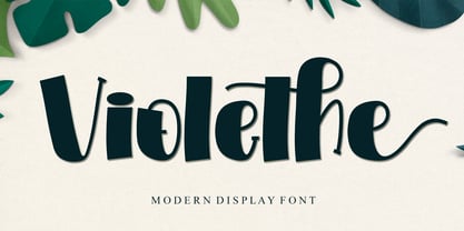 Violethe is a simple and unique-looking display font perfect for a wide variety of products. Use it on your Christmas decorations, Valentine’s Day cards, posters, wedding invitations, branding projects, social media posts, magazines, book covers, and whatever creative project you have in mind, and it will add a fun and friendly touch to your design! This font is PUA encoded, which means you can access all the glyphs and sweeps with ease!
 - Michael Sheikh by Silverdav,
$18.00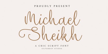 Introducing the “Michael Sheikh” font, a playful and unique handwriting typeface designed to infuse your projects with a touch of whimsy and character. This font offers a delightful collection of alternate characters, providing you with endless creative possibilities. With “Michael Sheikh,” you can effortlessly add and charming touch to your designs. Its handcrafted style lends authenticity and warmth, making it perfect for a wide range of applications, from invitations to branding and beyond.
 - Coreta by Wasabib Type Foundry,
$13.00 Coreta is an elegant serif font that combines classic charm with modern flexibility. With its smooth curves, this font creates stunning visual harmony. Perfect for a variety of projects, from wedding invitations to corporate designs. Thoughtful letter proportions ensure optimal readability at any size. Coreta is not just a font, it's an impressive statement of art. With its unique capabilities, it elevates the appeal of every design with a versatile touch of elegance.
 - Grumbear by Almarkha Type,
$29.00 Grumbear is sweet and playful, but also elegant. This versatile script font has a wide range of applications ranging from greeting cards to kids’ crafts, and is guaranteed to add a sweet touch to your next design. Accessible in the Adobe Illustrator, Adobe Photoshop, Adobe InDesign, even work on Microsoft Word. PUA Encoded Characters – Fully accessible without additional design software. + Fonts include multilingual support for; ä ö ü Ä Ö Ü Thank’s
 - Avocado Creamy by Almarkha Type,
$27.00 Avocado Creamy is sweet and playful, but also Crafty. This versatile script font has a wide range of applications ranging from greeting cards to kids’ crafts, and is guaranteed to add a sweet touch to your next design. Accessible in the Adobe Illustrator, Adobe Photoshop, Adobe InDesign, even work on Microsoft Word. PUA Encoded Characters – Fully accessible without additional design software. Fonts include multilingual support for; ä ö ü Ä Ö Ü ß Thank’s !
 - Dinner by Ingrimayne Type,
$7.00 Dinner is a family of novelty fonts in which the characters are formed from spoons, forks, and knives. Dinner-Regular was designed in 1990, one of the earliest fonts in the IngrimayneType collection. It contains a mixture of knives, forks, and spoons and the lower-case letters are smaller versions of the upper-case letters. In 2021 the family was expanded with Dinner-Knives in which all characters are formed by arranging knife shapes, Dinner-Spoons in which the characters are formed from spoon shapes, and Dinner-Forks in which the characters are formed from fork shapes. All three are caps-only but the characters on the lower-case keys are alternate versions of upper-case letters . Dinner is a decorative display family that needs to be used at a large size. The logical place to use it is for food-related items.
 - Sweetie Darling by Nathatype,
$29.00 Finding a perfect font for your designs may be tough work and time-consuming. Definitely, you never want to have a too plain, common font, but you have trouble finding the one to express your creativity and visions precisely. For that reason, Sweetie Darling is here to meet your needs. Sweetie Darling is a cursive-style handwriting script font. Like other cursive font designs, the letters are interconnected, but another character of this font is that the letters have high contrasts in curved edges to beautify the display. Due to the seemingly complex font style details to add the font’s legibility, it is suggested to apply this font for big text sizes. Additionally, you can enjoy the available features here. Features: Alternates Ligatures Multilingual Supports PUA Encoded Numerals and Punctuations Sweetie Darling fits best for various design projects, such as brandings, headings, magazine covers, quotes, invitations, greeting cards, printed products, merchandise, social media, etc. Find out more ways to use this font by taking a look at the font preview. Thanks for purchasing our fonts. Hopefully, you have a great time using our font. Feel free to contact us anytime for further information or when you have trouble with the font. Thanks a lot and happy designing.
 - Ainslie by insigne,
$- Get your Aussie on! The new typeface, Ainslie, with its mix of influences from Oz, makes its mark as the first semi-serif from insigne Design. Ainslie, named for Mt. Ainslie and Canberra’s inner suburb of the same name, was originally developed for the Canberra Australia Centennial Typeface Competition. Canberra is Australia’s capital, and it’s a planned city designed by American Walter Burley Griffin, a contemporary and one-time associate of Frank Lloyd Wright. Griffin’s plan involved a distinctly geometric design with several focal points--one of which was Mt. Ainslie. This same purely geometric scheme is now the basis for insigne’s new release. Similar to the Chatype project in its scope, its challenge, and the way its concept was developed, Ainslie incorporates influences from Canberra and surrounding areas to form a font that is uniquely Australian. In comparison, Chatype was developed for the city of Chattanooga, Tennessee by insigne in conjunction with designer Robbie de Villiers. Chatype took elements from Chattanooga’s industrial character and Cherokee past and merged them with the area’s technological influences. Likewise, Ainslie takes Canberra’s distinct, geometric design and blends it with the organic, flowing effect of aboriginal art. Add in touches from the smooth, aerodynamic design of the boomerang and Ainslie gives you a look uniquely Australian yet usable in a wide range of applications. The fashionable typeface includes a multitude of alternates that can be accessed in any OpenType-enabled application. These stylish alternates along with a number of swashes as well as meticulously refined details with ball terminals and alternate titling caps keep the font well accessorized. Also included are capital swash alternates, old style figures, and small caps. Peruse the PDF brochure to see these features in action. OpenType enabled applications such as the Adobe suite or Quark can take full advantage of the automatic replacing ligatures and alternates. This family also offers the glyphs to support a wide range of languages. While Ainslie wasn't selected as the final font in the Canberra competition, the outcome allowed for additional adjustments to the typeface. Several approaches were attempted for the final product including a technological hexagonal concept, which may still be developed to another form later. Some of the organic forms were removed and substituted with more abrupt endings, leaving the face looking pretty spiffy and a fair bit more legible. In the end, Ainslie was pulled back to the basic forms from which it was started. Give it a go for your next project. It’s guaranteed to be anything but a barbeque stopper.
 - Kakadu by Ludwig Type,
$55.00 Kakadu is a squarish sans serif, designed to work equally well on paper and on screen. The angular curves in this typeface create a firm and dependable appearance. The square-like forms also provide an inward openness and allow large and open letterforms, adapting perfectly to the orthogonal pixel grid of the monitor. Kakadu works well in small sizes while, it appears strong and distinguished in larger ones. Play the classic snake game and see the Kakadu fonts in action here.
 - Havelock by XO Type Co,
$40.00 Four interchangeable all-caps typefaces, made specifically for designers to layer and play with. Here’s more at the designer’s site. It combines hard and soft, geometry and pattern. Layer and mix styles within a single word, retaining coherent visual tone. Havelock Solid operates as a background layer, Multiline sits nicely atop it, Inline frames Multiline’s center strokes, and Stencil lets details peek through. If you’re working with translucent color, the blending can be gorgeous. Please note, if you're also looking at Havelock Titling: both collections are included in Havelock Complete for a lower price.
 - Jekta by Naghi Naghachian,
$104.00 Jekta is a sans-serif headline font designed by Naghi Naghashian. This is a single weights font, ExtraBold. This font is a contribution to modernisation of Arabic typography, gives the font design of Arabic letters real typographic arrangement und provides more typographic flexibility. Jekta supports Arabic, Persian and Urdu. It also includes proportional and tabular numerals for the supported languages. Jekta design fulfills the following needs: A Explicitly crafted for use in electronic media fulfills the demands of electronic communication. B Suitability for multiple applications. Gives the widest potential acceptability. C Extreme legibility not only in small sizes, but also when the type is filtered or skewed, e.g., in Photoshop or Illustrator. Nima’s simplified forms may be artificial oblilqued in InDesign or Illustrator, without any loss in quality for the effected text. D An attractive typographic image. Jekta was developed for multiple languages and writing conventions. Jekta supports Arabic, Persian and Urdu. It also includes proportional and tabular numerals for the supported languages. E The highest degree of calligraphic grace and the clarity of geometric typography.
 - Frenkel MF by Masterfont,
$59.00 A practical font family with 2 weights for all your needs: headlines, body text, signage etc. High legibility at small sizes.
 - Couponim MF by Masterfont,
$59.00 A practical font family with 4 weights for all your needs: headlines, body text, signage etc. High legibility at small sizes.
 - TeoriaMF by Masterfont,
$59.00 A practical font family with 4 weights for all your needs: headlines, body text, signage etc. High legibility at small sizes.
 - Ainslie Slab by insigne,
$- Holy Dooley! It’s a new Ainslie! Based on the inspiration from Mt. Ainslie and the Ainslie suburb outside Canberra, the original Ainslie adds geometric simplicity with a hint of aboriginal flair to the project. And now the muses of Ainslie are back at work, lending their structure as the foundation of Ainslie Slab. Like its big brothers, the new Ainslie Slab puts together a great mix of influences from Oz for a great looking typeface with some ace new shoes. Slab’s spiffy new slab serifs complement the classic frame, making the result a ripper Aussie typeface that can be used in a great number of applications. Take a look at the trendy typeface’s alternates in action, too. You can access these in any OpenType-enabled application. Alternates, swashes and alternate titling caps allow you to customize your look and feel. Capital swash alternates, old style figures, and compact caps are included to add a bit more flexibility to your work as well. OpenType enabled applications can take complete benefit of your automatic replacing ligatures and alternates, and this font also presents the glyphs to help a wide array of languages. View all of these in the PDF brochure. And then try them out. Combine it with the original Ainslie and Ainslie Sans for more flexibility. Whether you need a good slab for the copy or you want a clean, upbeat look for your headline, Ainslie Slab offers you a unique touch of the Outback that’s anything but out of touch.
 - Rocksane Display by Andrey Sharonov,
$30.00 Rocksane Display is a modern hybrid font with fantastic decorative uppercase and strong serif lowercase for impressive and powerful look. This typeface works fine in big sizes and more suits for example in short tittles, logotypes, names, movie posters, books and music album covers. Rocksane includes 84 beautiful uppercase alternates except of basic set. You can easy get it with special combination like A1, A2, A3 etc. (This hot keys works with activated Standard Ligatures option). In addition, there are 11 End-swashes which harmoniously underline the words. You can quickly get it by the same way with combination like _1, _2, _3 up to _11 (underscore+number). This features works fine in Adobe Photoshop or Illustrator. You can use Rocksane for following languages: Danish, Dutch, English, Estonian, Faroese, Finnish, French, German, Hungarian, Icelandic, Italian, Norwegian, Polish, Portuguese, Slovene, Spanish, Swedish, Turkish.
 - Deserved by Ronny Studio,
$19.00 Deserved is an elegant look typeface. A unique font, with bold and thin sizes, adds to the impression of elegance, luxury and class. This typeface is perfect for logos, branding, travel promotions, social media posts, magazine layouts, product packaging, quotes, or simply as a stylish text overlay onto any background image. 2 Style Font : Regular Italic Deserved Features : Uppercase Lowercase Numbers & Punctuation Multilingual Support Simple installation All of features and special characters of this font are included in one file. So it is easy to accessed by using program or software that support the opentype like Adobe Illustrator, Adobe Photosop, and Adobe Indesign). This font also very easy to use because compatible for all software even for non-opentype supported. Please comment us if you have any questions Thank you and have a nice day. thank you
 - Impacta by Linotype,
$29.99Linotype Impacta is part of the Take Type Library, which features the winners of Linotype’s International Digital Type Design Contest from 1994 to 1997. Dutch artist Marc Lubbers designed Impacta with little contrast between strokes, rather, he depended on the slope of the strokes to give his font character. Impacta can be used in small or large point sizes and its constructed forms bring a modern feel to graphic design. - Quickest by Create Big Supply,
$17.00 Introducing Quickest, a bold and powerful sans serif brush font that will make your designs stand out. With its strong and distinctive characters, Quickest adds a unique touch to your projects, ensuring they grab attention and make an impact. This font is perfect for various design applications, including logos, headlines, posters, and social media graphics. Quickest features both uppercase and lowercase letters, providing flexibility and creative freedom in your typographic compositions. The inclusion of numbers and punctuations allows for seamless integration into your designs, making it suitable for a wide range of projects. With multilingual support, Quickest ensures that your message can reach a global audience. It allows you to express yourself in different languages, opening up new possibilities for your design projects. The font is PUA encoded, enabling easy access to all the glyphs and swashes it offers. This means you can effortlessly incorporate decorative elements and flourishes into your designs, adding a touch of uniqueness and personality.
 - Dylan Condensed by Wiescher Design,
$29.00 Dylan is a Sans typeface in the best American tradition. In order to keep corners open and to make the font more readable in small sizes it has deep cuts where curves join straights. I designed 8 finely tuned weights with fitting italic sets. The fonts includes full smallcaps, language support for most European languages plus Turkish, many fractions, nominator and denominators, Greek mathematical signs and many currency symbols. It is a versatile font that is well suited for many occasions, even for signage.
 - Dylan by Wiescher Design,
$29.00 »Dylan« is a Sans typeface in the best American tradition. In order to keep corners open and to make the font more readable in small sizes it has deep cuts where curves join straights. I designed 7 finely tuned weights with fitting italic sets. The fonts includes full smallcaps, language support for most European languages plus Turkish, many fractions, nominator and denominators, Greek mathematical signs and many currency symbols. It is a versatile font that is well suited for many occasions, even for signage.
 - Insan by Linotype,
$187.99Insan, designed by Ihsan Al-Hammouri in 2005, is a modern Arabic typeface in three different weights. The design is based on simplified Naskh with a very low modulated stroke treatment. It is suited for text settings, especially in brochures and magazines. It is characterized by a large body height and open counters and as such can be used in small sizes. The font includes a matching Latin design and support for Arabic, Persian, and Urdu. It also includes proportional and tabular numerals for the supported languages. - Plethora by Sudtipos,
$49.00 A few years ago I've discovered the work of one of the most prolific typeface designers of the Bruce type Foundry in NYC during late nineteenth century. Browsing Julius Herriet's work I found a very unique kind of ligatures in his patented "Old Style Ornamented" type design. Some letters were designed with a little top tail that allowed them to connect to each other. After that, I found that he also designed a single italic weight of the same font 7 years later. Since the beginning of the Opentype days I’ve been deeply obsessed with exploring different ways to build ligatures, so that lead me up to this point where I felt the need to create “Plethora”, this new font inspired by Herriet’s work. Extrapolating weights, adding variable technology and playing with additional interconnected letters and alternates. Definitely, Plethora means a large or excessive amount of something, and this font tries to bring back this abundance of details two centuries later. Available in 9 weights, from roman to italic, and also as variable format, “Plethora” supports plenty of latin languages and is a perfect choice for today’s design tides.
 - Jubilee by Red Rooster Collection,
$45.00 Jubilee is a glyphic font family with moderate stress, slightly inclined serifs, and storied history. Its original design was created in 1934 by famous English type designer Eric Gill for the Stephenson Blake type foundry. The development name was “Gill Text,” but this was changed to “Cunard” once the famous steamship company showed interest in using the typeface. The company, however, never utilized it. Stephenson Blake changed the name to Jubilee in 1935 to commemorate George V and Queen Mary’s Silver Jubilee Wedding Anniversary announcement. After International TypeFounders, Inc. acquired the exclusive rights to the Stephenson Blake collection, Paul Hickson (P&P Hickson) and Steve Jackaman (ITF) revived the family exclusively for the Red Rooster Collection in 1994. A new, Medium weight was created to accompany the original Light and Bold weights. Jubilee has an inscribed, Renaissance feel, and performs well at all sizes. Its letterforms are sturdy, yet there is an undeniable delicacy to the face.
 - Overexposed by Cool Fonts,
$24.00 This is a "Grunge" style font that looks as if it was overexposed on film. It is funky yet still very readable. It is best used in sizes over 12 points but really looks cool when used over 16 points. This is a favorite for use in video graphics.
 - P22 Cusp by IHOF,
$24.95 This typeface was originally inspired by Art Deco lettering. During the development of the letterforms a strick DeStijl grid was imposed. The lowercase letterforms were created with the influences of rave/techno design styles. The result is a distinctly contemporary display font. The P22 Cusp Family contains 4 fonts: P22 Cusp Round, P22 Cusp Round Slant, P22 Cusp Square, P22 Cusp Square Slant. This font was designed as a display font and may be a bit taxing on the eye at smaller point sizes. The P22 Cusp family is licensed exclusively to P22 type foundry/International House of Fonts.
 - Bree by TypeTogether,
$37.50 The Bree font family is a spry sans serif by Veronika Burian and José Scaglione that delivers a spirited look and feel for branding and headline usage. As an upright italic, Bree shows a pleasant mix of rather unobtrusive capitals with more vivid lowercase letters, giving text a lively appearance. Bree is clearly influenced by handwriting. As such, some of its most characteristic features are the single-story ‘a’, the cursive ‘e’, the outstroke curves of ‘v’ and ‘w’, the flourished ‘Q’, and the fluid shapes of ‘g’, ‘y’, and ‘z’. Alternates of these letters are available when a more neutral look is desired. Bree has a touch of cheekiness, a wide stance for each character, and an extra-large x-height. All this adds up to a big personality, so even when set in small text there is no skimming past the words Bree voices. In 2019, the Bree font family got a huge update. A few shapes were updated or added (the ‘k’ and German capital ‘ß’), two entirely new weights were added (Book and Book Italic), and spacing was perfected. More than that, Vietnamese support was added to Bree Latin, and the Bree Greek and Bree Cyrillic scripts were designed from scratch to parallel the Latin’s tone. Additionally, Bree was designed in variable font format for those who want complete control over the font’s appearance while simultaneously saving digital weight in the form of kilobytes and megabytes. Bree is in the perfect position for the next digital revolution. The complete Bree font family, along with our entire catalogue, has been optimised for today’s varied screen uses. Bree has been chosen for such wide-ranging uses as Breast Cancer Awareness Month in the US, the branding for the country of Peru, and numerous layouts including mobile apps, magazines, newspapers, and books. Awards – Tipos Latinos exhibition 2008 – Several best-of-the-year typeface lists of 2008 MyFonts Top 10 Fonts of 2008 Smashing Magazine: 60 Brilliant Typefaces For Corporate Design https://www.smashingmagazine.com/2008/03/60-brilliant-typefaces-for-corporate-design/ Die besten Schriften 2008 http://www.fontwerk.com/619/die-besten-schriften-2008/ – Selected for Typographica’s Best Typefaces of 2008 – Won Bronze for Original Typeface in the 2009 European Design Awards