10,000 search results
(0.057 seconds)
- Olivita by Plau,
$49.00 Innocent until proven otherwise, Olivita is a heavyweight interpretation of the Typewriter genre. Typewriter fonts have captivated generations of designers and found its way into infinite applications, including Milton Glaser’s classic I heart NY logo. Olivita is a fat-face take on the same idea. There’s a lot to negotiate in making type as bold as possible, with shapes having to contort and distort in order to make a cohesive whole. The x-height is tall yet ascenders and descenders are long. Super size it and see the rich, creamy texture come forward.
 - Sassoon Primary Cond by Sassoon-Williams,
$48.00 Those who design books for young children should consider the different needs of their readers. When laying out pages for young readers, particular care should be taken over word spacing. Don't forget that justifying short lines disrupts spacing. Justification should be used only when absolutely necessary. In the research undertaken with young readers the importance of consistent spacing was clear. It also appeared that the poorer readers profited from wider word spacing, while spacing that suited the poorest readers, positively annoyed the better readers. These typefaces have built-in letter spacing because of their exit strokes, as well as extra clarity designed into them. Sassoon Primary Medium Condensed is a compact style for headlines combining the right amount of weight, yet in a friendly style. When used at large sizes the friendliness of Sassoon types really shines. Why not use it for headings throughout a book. You can find many other new ways to use this typeface. Ideal perhaps for the masthead or a magazine? Free to download resources: How to access Stylistic Sets of alternative letters in these fonts
 - Aloha Beach by HansCo,
$15.00 Aloha beach is a slab type font with rounded characters on each side. You will also get some alternative swashes in it. Use this display slab font to add that special retro vintage touch to any design idea you can think of! Very suitable for logotype, Stickers, Packaging design, Cricut Project, headlines, brand identity, t shirt or apparel industry, posters, magazines, books, YouTube, Instagram, websites, or any of your creative design projects. Enjoy!
 - Mirallove Restimond by MJB Letters,
$20.00 Hello everyone, we hope you have a great day. Say hi to Mirallove Restimond a new casual modern font that is very perfect for branding, wedding designs, quotes, posters, business cards, logotype, display, watermarks, signatures, etc. This font also has a special character in terms of thickness and thinness on each side, so it will give a neat handwritten impression that will make your design look very attractive and it is PUA Encoded.
 - TessieXtraBirds by Ingrimayne Type,
$13.95 A tessellation is a shape that can be used to completely fill the plane—simple examples are isosceles triangles, squares, and hexagons. Tessellation patterns are eye-catching and visually appealing, which is the reason that they have long been popular in a variety of decorative situations. These Tessie fonts have two family members, a solid style that must have different colors when used and an outline style. They can be used separately or they can be used in layers with the outline style on top of the solid style. For rows to align properly, leading must be the same as point size. To see how patterns can be constructed, see the “Samples” file here. Shapes that tessellate and also resemble real-world objects are often called Escher-like tessellations. TessieMoreStuff contains mostly Escher-like tessellations with no clear organizing principle. Most or all of these shapes were discovered/created by the font designer during the past twenty years in the process of designing maze books, colorings books, and a book about tessellations. (Earlier tessellation fonts from IngrimayneType, the TessieDingies fonts, lack a black or filled version so cannot do colored patterns. The addition of a solid style that must be colored makes these new fonts a bit more difficult to use but offers far greater possibilities in getting visually interesting results.)
 - TessieMoreStuff by Ingrimayne Type,
$11.95 A tessellation is a shape that can be used to completely fill the plane—simple examples are isosceles triangles, squares, and hexagons. Tessellation patterns are eye-catching and visually appealing, which is the reason that they have long been popular in a variety of decorative situations. These Tessie fonts have two family members, a solid style that must have different colors when used and an outline style. They can be used separately or they can be used in layers with the outline style on top of the solid style. For rows to align properly, leading must be the same as point size. To see how patterns can be constructed, see the “Samples” file here. Shapes that tessellate and also resemble real-world objects are often called Escher-like tessellations. TessieMoreStuff contains mostly Escher-like tessellations with no clear organizing principle. Most or all of these shapes were discovered/created by the font designer during the past twenty years in the process of designing maze books, colorings books, and a book about tessellations. (Earlier tessellation fonts from IngrimayneType, the TessieDingies fonts, lack a black or filled version so cannot do colored patterns. The addition of a solid style that must be colored makes these new fonts a bit more difficult to use but offers far greater possibilities in getting visually interesting results.)
 - GauFontSpyLetter - Unknown license

- Zona Pro by Intelligent Design,
$10.00 Zona Pro is a geometric sans-serif type family of 8 styles plus matching italics, designed by Kostas Bartsokas in 2013/14. It draws inspiration from 1920’s geometric style faces, having clean and highly readable shapes, and mixes it up in the heavier weights with a slight variance in the stroke widths, lending it a grotesque-ish unique and distinctive look. Zona Pro is multifunctional and versatile. With its modern yet elegant form it performs amazingly in display sizes and headlines. At the same time its really tall x-height makes Zona Pro equally suited for editorials and shorter lines of text in smaller sizes (magazines, newspapers). Zona Pro supports Greek, Western, Central and Eastern European languages, ligatures and special characters.
 - Honey Splash by Yumna Type,
$15.00 Honey Splash is a stylish display font to express unique, fun impressions focusing on various line style combinations in friendly curves. Furthermore, the different shapes and heights makes the font visually unique. In addition, Honey Splash gives you a special bonus called the clipart. Use this font for big text sizes for a legibility reason and make use of the available interesting features to beautify your designs as well. Features: Multilingual Supports PUA Encoded Numerals and Punctuations Honey Splash fits for various design projects, such as posters, banners, logos, magazine covers, quotes, headings, printed products, merchandise, social media, etc. Find out more ways to use this font by taking a look at the font preview. Thanks for purchasing our fonts. Hopefully, you have a great experience using our font. Feel free to contact us for further information when you have a problem using the font. Thank you. Happy designing.
 - Jack History by Ditatype,
$29.00 Jack History is a unique, amazing font inspired by creative, experimental handwritings of which letters are always connected to each other to create surprising, dynamic flows, and adopt unconventional proportions and variations. Some of the letters may actually seem bigger or smaller than the others in free moving and curvy lines to express bravery and freedom nuances of the font. Differences in proportions and letter style changes of the font have become the design’s integral parts. Despite the absence of strict rules, creativity and courage to combine the connected letters in a unique way is all that matters because this script font offers extraordinary attractiveness and uniqueness in all designs. Furthermore, the connected letter flows in various proportions reflect some explorations and innovations in the handwritings. You may then apply this font for big text sizes for a legibility reason and enjoy the available features here. Features: Alternates Ligatures Multilingual Supports PUA Encoded Numerals and Punctuations Jack History fits best for any design projects requiring artistic, elegant displays such as wedding invitations, greeting cards, merchandise designs, and more. For such artistic and elegant displays, this script font is also applicable for logo designs, posters, and packaging. Find out more ways to use this font by taking a look at the font preview. Thanks for purchasing our fonts. Hopefully, you have a great time using our font. Feel free to contact us anytime for further information or when you have trouble with the font. Thanks a lot and happy designing.
 - Hiroshima Gyoshi by 38-lineart,
$14.00 Hiroshima Gyoshi is a handwritten font inspired by ancient Japanese calligraphy. The thick and random strokes look very prominent and play with negative space. You will feel the rhythm in irregularity. it is a bold handwritten font, carefully handcrafted to become a true favorite. Its casual charm makes it appear wonderfully down-to-earth, readable and, ultimately, incredibly versatile. This fantastic font is best suited for headlines of all sizes, as well as for blocks of text that have both maximum and minimum variations. Whether it’s for web, print, moving images or anything else – Hiroshima Gyoshi will look spectacular
 - Cajoun by Linotype,
$29.99Cajoun is a bold serif face from German designer Hans-Jürgen Ellenberger. The letters sit visually low on their baseline, in part due to their small x-height. Also, the curved portions of the letterforms have an old-style distribution of weight, which pulls the eye downward. This font has a contemporary feel, however, with crisp edges, and some pointy terminals. The typeface also contains old style figures. Cajoun is recommended for use in larger applications, where the eye can get a change to dance along its wide curves. Cajoun was designed in 2002, and is part of the Take Type 5 collection from Linotype GmbH." - Brown Amsonia by Nathatype,
$29.00 Brown Amsonia is a lovely script font of which letters are in handwriting to express unique, personal nuances in your designs. Such a handwriting font is available in high contrasts having noticeable differences between the bright and the dark letter parts to produce clear, firm displays making the designs look professional and modern. Besides, Brown Amsonia can express personal, artistic displays to create more interesting, noticeable designs. The letters are interconnected and their details show sharp, curvy scratches on the edges. Due to the complex font style details, this font is better to apply for big text sizes. In addition, you may enjoy the available features here. Features: Ligatures Stylistic Sets Multilingual Supports PUA Encoded Numerals and Punctuations Brown Amsonia fits best for various design projects, such as brandings, invitations, greeting cards, name cards, quotes, printed products, merchandise, social media, etc. Find out more ways to use this font by taking a look at the font preview. Thanks for purchasing our fonts. Hopefully, you have a great time using our font. Feel free to contact us anytime for further information or when you have trouble with the font. Thanks a lot and happy designing.
 - Tangient by Galapagos,
$39.00Designed primarily for display use, Tangient is serviceable down to the larger text sizes. It presents an idiosyncratic profile, with a tight fit, clearly proportionally spaced, yet having the texture of a monospaced design. Its shapes leap out from the page, where well behaved characters would make a more subdued statement. The calligraphy from which Tangient GD was electronically "cut" originally appeared in a series of personal greeting cards prepared by the Zafaranas in celebration of the New Year. - ITC Stylus by ITC,
$29.99ITC Stylus is the work of American designer Dennis Pasternak, who based its forms on those of freehand architectural lettering from historical and contemporary sources. Pasternak points out that while the typeface emulates hand lettering, no pencil drawings or scanned art were used in its creation. The letters bounce slightly across the baseline, giving the typeface the look of true handwriting. ITC Stylus emanates warmth when used for extended text and a fresh quality in display sizes. - Linotype Gneisenauette by Linotype,
$29.99 Linotype Gneisenauette is part of the Take Type Library, selected from the contestants of Linotype’s International Digital Type Design Contests of 1994 and 1997. The handwriting font was designed by Latvian artist Gustavs A. Grinbergs and is available in eight weights. Linotype Gneisenauette is a dynamic font which also reflects a bit of the optimistic spirit of the 1950s. The font is best used for headlines or middle length texts with a point size 12 or larger.
 - Siriella by Nathatype,
$29.00 Siriella is a beautiful handwritten font. It brings an attractive typeface. Made for any professional projects. The font is suitable for any project like logo, t-shirt printing, wedding invitations, and greeting cards to social media quotes, branding, and more! Outstanding in a wide range of contexts. Featured : Standard Ligatures Stylistic Sets Multilingual Support PUA Encoded Numerals and Punctuation
 - Universally Corrupt Pro by The Type Fetish,
$25.00 Universally Corrupt is a distressed, noisy and corroded font that is perfect for hiding any words of truth by burying it in chaos. A “must have” typeface for any politician or corporate C.E.O! It was expanded to include extended Latin, extended Cyrillic and Greek alphabets so it will work with most languages in Europe and the Americas.
 - Notelia by Gatype,
$14.00 Notelia The elegant font I work with is creative in mood and perfect in shape, inspired by today's beautiful serif look. bold, balanced and varied, born for luxury and beauty. includes uppercase letters, numbers, and a wide variety of punctuation marks. Serif font with a modern style. Made for posters, web design, branding, illustrations, badges and many other works.
 - Amike by Letradora,
$15.00 Amike is a natural handwritten font, simulating a very neat, clean handwriting. It works well both as mixed case and all caps. It includes alternates for most characters, that can be used for a random mix using the Contextual Alternates Opentype feature to create a natural written look. It supports a wide character set, including most European languages & Vietnamese.
 - Dealistha by Nathatype,
$29.00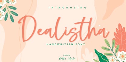 Dealistha is a beautiful handwritten font. It brings an attractive typeface. Made for any professional projects. The font is suitable for any project like logo, t-shirt printing, wedding invitations, and greeting cards to social media quotes, branding, and more! Outstanding in a wide range of contexts. Featured : - Standard Ligatures - Stylistic Sets - Multilingual Support - PUA Encoded - Numerals and Punctuation
 - SF Liberty VF by Sultan Fonts,
$180.00 Liberty is an active contemporary variable font, complete with a flexible range of cases tailored to responsive layouts. The font is clear and legible in small sizes, suitable for printing for large texts, web pages, and other visual uses. Language: Latin default Latin Azerbaijani Latin Catalan Latin Crimean Tatar Latin Kazakh Latin Marshallese Latin Dutch Latin Tatar Latin Turkish
 - Hyollin by Nathatype,
$29.00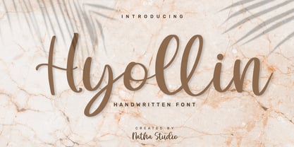 Hyollin is a beautiful handwritten font. It brings an attractive typeface. Made for any professional projects. The font is suitable for any project like logo, t-shirt printing, wedding invitations, and greeting cards to social media quotes, branding, and more! Outstanding in a wide range of contexts. Featured : - Standard Ligatures - Stylistic Sets - Multilingual Support - PUA Encoded - Numerals and Punctuation
 - Berold Artistic by Arttype7,
$21.00 The Berold font is a modern serif font in a classic style that has a distinct uppercase style. It's perfect for fashion, blog sites, instagram, branding, invitations, business cards, weddings and more. Includes 3 alternative character sets UPPERCASE AND LOWERCASE for word start and end appearance, so your design will look even more unique and interesting.
 - Herrmann by driemeyerdesign,
$19.00 Herrmann is a sans serif typeface family. It was especially designed for use in headlines, but it's great legibility also allows for use in longer texts and smaller sizes. The geometrical design gives it a distinct industrial / architectural style. Herrmann comes in 10 styles (thin, light, regular, semibold and bold, all in regular and italic) and has 374 glyphs.
 - Pragnea by Hazztype,
$20.00 Introducing Pragnea, a modern sans serif font with a unique touch. It had many unique quirks such as its distinctive e, curved stroke on R, K, V, W, and many others. The type family consists of three weights plus matching italics. Packed with 300+ glyphs, it works well both for impactful headlines and for reading sizes.
 - Laurel by Fenotype,
$25.00 Often in typography, a standout appeal is required – but preferably without compromising on clarity and legibility. Laurel font family by Fenotype is where the best of both worlds meet – an edgy display letter yet easily legible and appropriate for a wide range of use cases. Brand identities, packaging, posters or editorial – choose Laurel for a touch of unique flair.
 - Compasso by Plau,
$30.00 The idea that mathematical precision and the supposed "purity" of geometric forms are part of the discourse of us graphic designers is not new. Studying typography for some time now and learning about all the small alterations and adjustments that this geometry undergoes to better adapt to the imperfect human eye, I found myself with a new way of seeing things. Compasso is, in a way, a result of my growth as a designer. Established and recognized fonts like Futura, Avenir, and their predecessors (including Tempo - published by the Ludlow foundry in the early 20th century) informed the result of Compasso at some level. Others opened my mind to possibilities. Mallory, Azo Sans, the font designed for Audi by Bold Monday, and many other contemporary sans-serif fonts that left me speechless are also responsible for details present in this font. From the first sketch, the family grew on both sides, gaining condensed and extended counterparts. From there - and from a brilliant insight from designer Nicole Rauen - I learned that Compasso was not about geometry. Compasso is about rhythm. It's about the rhythmic movement that provides a foundation, supports, and also makes you dance and swing. My musical taste is too eclectic, I can go from classical to funk in less than two songs on Spotify. Compasso is also eclectic. It's a font to take your project anywhere, a record to listen to on any occasion.
 - Kontext H by Elster Fonts,
$20.00 Imagine a font that is easier to read the smaller it is – or the further away the text is. There are already many line screen fonts, I wanted to take it to the extreme and use as few lines as possible, while keeping the grid of the fonts metrics. The result is a typeface that lives up to its name. Each individual line makes no sense on its own; individual letters are only recognisable in the context of all associated lines, individual letters are most likely to be recognised in the context of whole words. Attached to a building wall, text would be readable from a great distance and become increasingly difficult to decipher the closer you get to the building. Placed on the ground or on a large flat roof, text would only be readable from an aeroplane or - depending on the size - in Google Earth. Kontext has old style figures, superscript numerals, case-sensitive questiondown and exclamdown and an alternative ampersand, 390 glyphs at all. Use the same value for font size and line spacing to keep the lines in the grid, or change the line spacing in 10% steps. Change the spacing in 100-unit or 25-percent increments increments to keep the grid. The »H« in the font name stands for horizontal (lines). The numbers in the font name refer to the brightness of the background and letters themselves, with the first number describing the background and the second the letters. Starting with »00« (white) to »200« (dark) See also my Family Kontext Dot
 - Kontext V by Elster Fonts,
$20.00 Imagine a font that is easier to read the smaller it is – or the further away the text is. There are already many line screen fonts, I wanted to take it to the extreme and use as few lines as possible, while keeping the grid of the fonts metrics. The result is a typeface that lives up to its name. Each individual line makes no sense on its own; individual letters are only recognisable in the context of all associated lines, individual letters are most likely to be recognised in the context of whole words. Attached to a building wall, text would be readable from a great distance and become increasingly difficult to decipher the closer you get to the building. Placed on the ground or on a large flat roof, text would only be readable from an aeroplane or - depending on the size - in Google Earth. Kontext has old style figures, superscript numerals, case-sensitive questiondown and exclamdown and an alternative ampersand, 390 glyphs at all. Use the same value for font size and line spacing to keep the lines in the grid, or change the line spacing in 10% steps. Change the spacing in 50-unit or 25-percent increments to keep the grid. The »V« in the font name stands for vertical (lines). The numbers in the font name refer to the brightness of the background and letters themselves, with the first number describing the background and the second the letters. Starting with »00« (white) to »200« (dark) See also my family Kontext Dot
 - Neela by Bykineks,
$10.00 Neela is an Art Nouveau serif typeface designed for a variety of design needs. With 27 font families consisting of thin, extralight, light, regular, medium, semibold, bold, extrabold, and black, as well as condensed and expanded types, Neela can be used for various sizes and design needs. Neela is characterized by sleek and elegant letters, with typical Art Nouveau elements, such as subtle and elegant decorative flourishes. This font is suitable for various design needs, such as: Book covers, wine labels, wedding invitations, exhibitions, packaging, merchandise, event billboards, posters and many others. Neela also supports 65 Latin alphabet languages, so it can be used for various design needs throughout the world. Characteristics The letters are sleek and elegant Distinctive Art Nouveau elements Suitable for a variety of design needs Neela is the perfect typeface for designers looking for an elegant and versatile Art Nouveau serif typeface. This font can be used for various design needs, from book design, labels, invitations, to graphic design.
 - Mourich by Arterfak Project,
$15.00 Mourich comes in 2 styles and is recommended for use with stylish and minimalist design. It is carefully designed with medium contrast of the strokes. This font is an all-caps font or has small capitals that very useful for the headline or logo, and is suitable in large or small sizes. Mourich has 500+ glyphs with many OpenType features. There are beautiful ligatures, stylistic alternates, and swashes which you can use it to get your design more softly. Mourich Bold is has 20pt thick from the regular style. The rounded serif gives a strong and assertive look. Beautiful to use as standalone type or combine with regular style. Very much recommended for headlines. Mourich Regular has a minimalist adjustment with more relieved of negative space that awesome to apply in many media. Also useful in the body text or editorial purposes.
 - Letterose by Krafted,
$10.00 Introducing Letterose - A Calligraphy Font Letterose Calligraphy font is designed and carefully handcrafted elegantly and gracefully for your website, for your social media branding, Pinterest banners, printed invitations, and more! Letterose Calligraphy font will never go wrong for your audience, clients, guests or anyone around you! What you’ll get: Multilingual & Ligature Support Full sets of Punctuation and Numerals Compatible with: Adobe Suite Microsoft Office KeyNote Pages Software Requirements: The fonts that you’ll receive in the pack are widely supported by most software. In order to get the full functionality of the selection of standard ligatures (custom created letters) in the script font, any software that can read OpenType fonts will work. We hope you enjoy this font and that it makes your branding sparkle! Feel free to reach out to us if you’d like more information or if you have any concerns.
 - Mojito by ParaType,
$39.00 Mojito is a lively and vigorous calligraphic font based on a brush pen calligraphy. The author carefully rethought all of the character forms and created a very concise and clean outline that would look great in any size. Mojito has about 1,400 characters, including alternatives, ligatures, initial and final forms. That’s why letters are not repeated and their combinations look as natural as possible, especially in Cyrillic. For an all caps set in Mojito you can include the replacement of basic forms with the simplified ones, specifically designed for this purpose. Two additional styles imitate writing over a rough surface and a relief print. Mojito is perfect for packaging and advertising, food and beverages, cafes and restaurants, craftsmanship, children's books, magazines, etc. The font was designed by Zahar Yaschin and released by Paratype in 2017. Additional styles were created by Alexander Lubovenko.
 - Eccentric by Monotype,
$29.99Eccentric was designed in 1881 by Gustav F. Schroeder. It is an all-capital, narrow-bodied, monoline display face that could be described as high waisted. With cross-bars and main junctures more than halfway up the letterforms, every letter - except the W - has a long-legged appearance. Eccentric has a wide range of display uses, from playbills to fashion advertisements. - Stephen Type by Joanne Marie,
$10.00 Stephen Type is a realistic handwriting and signature font. Please see all of the additional pictures to see how it looks and view the glyphs (includes some Latin glyphs). It can be used for a wide range of projects, such as book design, logo designs, online signatures, email signatures, tattoos, t-shirt designs, signs, magazine design, greetings cards, poster design and much more!
 - Benelux by Talbot Type,
$17.99 Benelux is inspired by European styles of the late twentieth century, their origins can be traced back to the Bauhaus. Broadly geometric and with an emphasis on legibility, it's well-balanced and is equally effective at both text and display sizes. Benelux is available in five weights and features an extended character set, including accented characters for Central European languages.
 - Logica Sans by Alexander Sharkov,
$3.00 Let me introduce our cool new sans serif font Logica Sans! It is a versatile font. Great for logo design, mobile apps, online and print use, and a wide variety of projects. We will be constantly updating our font. Add new languages, glyphs, font styles. Follow the updates! We will be glad if our font helps in the development of your project!
 - Literal by Kosinsky,
$25.00 Literal is a classic sans serif typeface with closed shapes. Simple and elegant at the same time, it is perfect for a wide range of uses, where you need both large and small text, be it a print product, website design, logo design and much more. The font supports Extended Latin and Extended Cyrillic. Created in 2019. Type designer Igor Kosinsky.
 - Quador Display by Fontador,
$24.99 Quador Display is a serif, especially designed for contemporary typography on print and screen. The superellipse-based forms and high x-height allow large and open letterforms, perfectly adapted to the pixel grid on screen. The font contains 6 weights from light to ultrabold plus true italics. 1.049 glyphs include 282 ligatures, tabular, old style, fractions …, and a wide range of flexibility for latin language support for every typographical needs. Quador Display is a contemporary serif typeface, special for logotypes, brands, magazines and editorial.
