10,000 search results
(0.036 seconds)
- ITC Tickle by ITC,
$29.99When Patricia Lillie was growing up, she thought the coolest thing in the world would be finding her own name listed in a library catalog. The fantasy came true in 1986 when her first children's book was published. Five more followed. The thrill of seeing her work on library shelves hasn't abated, but today, Lillie is just as likely to see one of her typefaces on the cover of a book. She has created several display faces and image fonts. My first typeface designs were based on lettering I'd done while working for a library, doing graphics work for the children's section," she explains. "I currently do a lot of web design, but type is my favorite thing." The Tickles (ITC Tickle and ITC Tickle Too) are Lillie's first ITC typeface releases. "I was playing around with a Sharpie marker one day and liked the way the letters looked," she recalls. "I started redoing the letters from scratch in Fontographer to see what developed, and liked those letters too." ITC Tickle is a bi-form font (with both cap and lowercase letters of the same size) that clearly breaks a typographic rule or two. ITC Tickle Too has the same basic lettershapes, but they've grown clusters of stipples that give a three-dimensional quality to the design. The result is a friendly, offbeat display family that's guaranteed to add a giggle to your work." - Busy Day by PizzaDude.dk,
$16.00 Today has been a busy day. I managed to take the dog for a walk, go for a run, empty the dishwasher, clean the car, vacuum the entire apartment AND make this font! :) The Busy Day font is all about fun and games: it’s playful, whimsical and legible at the same time. I’ve added an Outline version, Inside and the Regular version. They all work well together or as individual fonts - and they all have multilingual support!
 - Berolina by Solotype,
$19.95A circa 1900 type from the foundry of W. Grauneau, Berlin. A great utility face as it works well as the "plain" face with other decorative type of the same era. Reads well in paragraphs of copy. - Grand Rapids NF by Nick's Fonts,
$10.00This disarming beauty is based on a typeface named "Archer" from the 1905 specimen book from Barnhart Brothers & Spindler. The original was a rather light face; this beefed-up version highlights the face’s charming quirks quite nicely. Both versions of the font include 1252 Latin, 1250 CE (with localization for Romanian and Moldovan). - Oklahoma - Unknown license

- Jubileum by Hanoded,
$15.00 Some time ago, I found myself in a clinic with my wife: at the time she was 20 weeks pregnant and had to do an ultrasound. To pass the time, I leafed through some (ladies') magazines which were lying around. Most of them tackled big issues like which shoes to wear and what type of foundation to plaster on, but one glossy featured a photo shoot. The photographer had found an old building with a beautiful art deco tile mural and had placed his skinny model in front of it. Fortunately for me, the mural featured a lot of text in a beautiful frilly style. I re-created the font I saw and it became "Jubileum" - which just means Jubilee in Dutch.
 - ITC Deelirious by ITC,
$29.99ITC Deelirious is the first typeface of Dee Densmore-D'Amico and its name comes from the astounding number of D's packed into her name. The design came from her own handwriting. The differences between capital and lowercase letters are sometimes arbitrary, but this characteristic and the many alternate letterforms give ITC Deelirious the spontaneity and naturalness of true handwriting. - MFC Spindler Borders by Monogram Fonts Co.,
$19.95 The inspiration source for MFC Spindler Borders is a collection of border treatments revived from the “Catalog 25 TYPE FACES” by Barnhart Brothers & Spindler. The border designs were recreated from two different border sets, “Classic Art Borders” and “Classic Black & White Borders”. This collection of borders represents a structured repetition of elements in various ways to create elegant patterns and backgrounds. You can start with a new document or work on a new layer within an existing document. Select MFC Spindler Borders from the font menu. (Some users may have font previewing enabled in the font menu which will cause the font name to appear as border elements, disable this option in order to choose the name) Make certain that the point size of the font is the same as the leading being applied to the font so the borders will meet up properly. While we’ve adjusted this within the font, your program may override these settings. For instance a 12 point font should have 12 points of leading. Download and view the MFC Spindler Borders Guidebook if you would like to learn a little more.
 - Sunday Thinker by Hanoded,
$16.00 No, no fantastic story about how I came up with the name for this font. It was a Sunday when I thought up Sunday Thinker. It seemed like the right name and it wasn’t taken yet, so there you have it! Sunday Thinker is a thoughtful font, made with creativity in mind. Personally I think it’d look great on product packaging or book covers, but the font will adapt itself to whatever you think of! Just think happy thoughts!
 - Binghamton NF by Nick's Fonts,
$10.00This typeface gets its inspiration from a face designed by Vincent Pacella for PLINC named Bingham, and is evocative of steam locomotives and the Old West. Both versions of this font include the Unicode Latin 1252 and 1250 Central European character sets, with localization for Moldovan and Romanian. - Arx by Superfried,
$32.50 Arx by Superfried is an elegant and intricate display typeface designed for use at large scale. Its Latin name - meaning citadel - connects with the classical features, whilst the phonetic pronunciation nods to the arcs which characterise each glyph. This caps typeface is available in two formats: fade and solid, each featuring two distinct character styles switched via the shift key. Fade features delicate incisions to add depth and the illusion of 3D shading to the arcs. Solid, as its name suggests, is a cleaner, flat alternative.
 - Nov Schmoz Kapop NF by Nick's Fonts,
$10.00The logotype lettering of a 1927 issue of Motion Picture magazine provided the inspiration for this playful romp through the alphabet. Named after an expression of the same time whose origin and meaning are shrouded in mystery. Both versions of this font include the complete Unicode Latin 1252 and Central European 1250 character sets. - Busset City by Haksen,
$11.00 Ladies and Gentleman ! Busset City - a new fresh handmade signature script font. Very suitable for greeting cards, branding materials, business cards, quotes, posters, and more!This font are perfect for wedding postcard. Or you can create perfect and unique design of your logo, blog, stationery, marketing, magazines and more :) Features : UpperCase & Lowercase Numerals & Punctuations Ligatures Multilingualcharacters(AÀÁÂÃÄÅCÇDÐEÈÉÊËIÌÍÎÏNÑOØÒÓÔÕÖUÙÜÚÛWYÝŸŸ ÆŒßÞàáâãäåæçèéêëìíîïðñòóôõöøùúûüýÿ) Busset City OTF Please contact us if you have any questions. Happy Design, Haksen
 - HU Thegame KR by Heummdesign,
$25.00 'HU Thegame KR' was created with a game as a motif, and is a characteristic font with sharp and strong elements. The finishing of the same strokes gives the font a sense of unity and makes it look sharper and colder. This font is suitable for use as a headline. It contains Hangul, Korean.
 - Central Park JNL by Jeff Levine,
$29.00 The beautiful Art Deco monoline pen lettering on the cover of a 1940s piece of sheet music inspired Central Park JNL. The 1940s was an era when couples took romantic walks along the pathways of Manhattan's Central Park or rode around it in hansom cabs. Big bands played at the major clubs and ballrooms and "uptown" meant the well-to-do. Men dressed in their tuxedos and top hats and the ladies were in their jewels and evening gowns.
 - Rotterdam Demo - Personal use only

- No Liming by chicken,
$17.00 A chunky, laid-back typeface inspired by a hand-painted notice on the doors of a mechanic's workshop in Plymouth, Tobago. Two different mostly-uppercase alphabets in one font help to keep things loose. 'Liming'? hanging out, drinking rum, shooting the breeze...
 - Regular Joe by GroupType,
$21.00 Regular Joe was first delivered to the font world by Ron and Joe. Yes, the same Ron and Joe of the ArtParts fame. A few years of being so regular, Regular Joe became, well, just bored. Regular Joe needed company. He wished for a family. After all, most of his font friends had big families. His wishes were granted by FontHaus. So Skinny and Husky were created to be with Regular and all together, they became Family Joe. All is well.
 - Summer Love by Komet & Flicker,
$15.00 Good Vibes Only! This hand drawn brush font gives a loose and laid-back feeling to any project. Included with are 10 common connector words like "the" "and" and "with" which can easily be accessed through Illustrator's glyphs panel. Also included are 24 hand drawn sun & surf themed icons.
 - Conqueror Sans by Letterhead Studio-YG,
$45.00 This sanserif has 18 faces from Light to the Black Italic. Conqueror Sans keeps the vigorous design peculiar to all members of this family, but at the same time it is more neutral, than its having serifs relatives.
 - Tirade by Fontosaurus,
$19.95I'm not sure where the inspiration for Tirade originally came from, but it looks like a good rant, hence the name. - LazyBird by Autographis,
$39.50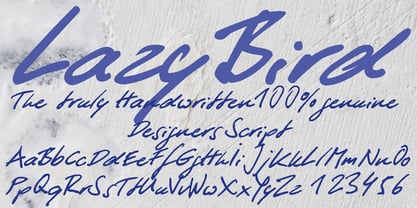 LazyBird is a script with a slick, lazy character.
 - Newark JNL by Jeff Levine,
$29.00 Inspired by a set of vintage alphabet game tile pieces, Newark JNL has similar traits to other slab serif Romans, but enough 'quirky' letter widths to break the rules and have it stand out on its own merits. The name derives from font work files in progress, often saved as 'new work' until a fitting name is decided upon. It seemed only right that this phrase be turned around into a font name itself. Newark JNL is available in both regular and oblique versions.
 - Boot Hill NF by Nick's Fonts,
$10.00 Here's an unusual take on the classic Tuscan face of the 1880s. The unusual finials lend a slightly spooky feel to the face, hence its current name. Both versions support the Latin 1252, Central European 1250, Turkish 1254 and Baltic 1257 codepages.
 - Bully Pulpit NF by Nick's Fonts,
$10.00This engaging headline face is based on a rather pudgy typeface named "Bullion Shadow", which was originally released somewhere on the cusp between the hippie and disco eras, and was equally at home in both. Both versions of this font include the complete Unicode 1252 Latin and Unicode 1250 Central European character sets. - Imperio by Juan I. Siwak,
$40.00 Imperio is a font inspired by old posters, especially those related to constructivism and futurism. It reflects both the rationalism of Bauhaus as a propagandist and revolutionary spirit of an era. On the other hand it is not nostalgic, but instead looks for its own way to get diagonals where there was rigidity. The poster itself is the language of graphic design, and geometry is its ally. This font aims for that goal. It has two variants that derive from its source. Imperio Giga Black attempts to be a negative typography, starting with the black and then searching for small windows in which they begin to uncover the morph. This is an extreme and modern font. Imperio West is a metamorphosis of the original one, with decorative details which transform it into a typeface of wood and saloon font. In all cases we recommend its use in large sizes (up to 20pt) and main titles. Imperio UltraBlack can work in smaller sizes than Imperio Regular.
 - Doobie by Canada Type,
$24.95One would think the whole hippy thing would have died out after the knighting of Mick Jagger and the selling out of the The Who. Not at Canada Type. We still occasionally read Burroughs and Ginsberg, listen to Dylan and Hendrix, and use the backyard to pretend (um, like run barefoot with the dog). And we're always happy to make another psychedelic font. This one is based on an early 1970s film type that went by the names Hoopla and Scorpio. Doobie is a typical hippy font that uses the simplest elements of the art nouveau genre. Bubbly and wavy, Doobie exudes an almost child-like innocence, the ever laid back, optimistic simplicity of flower power. It is right at home alongside the many other psychedelic fonts that make Canada Type the definite home of the groovy alphabet. Far out! - Differentura by ABSTRKT,
$50.00This typeface was developed for the Different Ground exhibition identity (and that explains the name of the font). The aim was to make an absolutely geometric, constructed font. Sometimes even too geometric and too much into it's own rules. But at the same time to make it look very humane, sometimes imperfect and weird, but alive and not soulless. - McKellar Borussian NF by Nick's Fonts,
$10.00This unusual Gothic face was found in the 1882 McKellar, Smiths and Jordan specimen book under the name Borussian, a then-current variant of “Prussian”. This version is true to the original, so please note: a few of the uppercase characters—notably E and G—are rather unusual, so proceed with caution. All versions of this font include the Unicode 1250 Central European character set in addition to the standard Unicode 1252 Latin set. - Kingsmead Script by Hanoded,
$15.00 Last year I spent some time exploring the city of Bath in England. Its claim to fame are the Roman Baths in the city center, which are well worth a visit. Kingsmead is an electoral ward within Bath and I thought it was an apt name for this rather stylish - if old fashioned - font. Kingsmead Script is a handmade font. It comes with diacritics and some discretionary ligatures for double lower case letter combinations.
 - Humorist JNL by Jeff Levine,
$29.00 The May 7, 1936 issue of “The Film Daily” carried an ad for the Will Rogers Memorial Hospital Fund. (In August of 1935 Rogers, along with famed aviator Wiley Post died in a plane crash.) While the fundraising for the hospital was a serious event, Rogers is remembered as a humorist, hence the font’s name of Humorist JNL.
 - 1669 Elzevir by GLC,
$42.00 This family was inspired from the set of font faces used in Amsterdam by Daniel Elzevir to print the famous “Tractatus de corde...” the study on earth anatomy by Richard Lower, in 1669. The punch cutter was the famous Dutch Kristoffel Van Dijk. In our two styles (Normal & Italic), font faces, kernings and spaces are scrupulously the same as in the original. This Pro font covers Western, Eastern and Central European languages (including Celtic), Baltic and Turkish, with standard and “long s” ligatures in each of the two styles. The Roman (Normal) style contains a U stylistic alternate, and the Italique style A.
 - Vingo by Poole,
$32.00Vingo is an understated, elegant, sans serif face. This font is among the first in a series of alphabets I am creating that are dignified and sophisticated. I wish these fonts had been available when I was designing wine labels. These fonts are rooted in "old world" tradition, but are more utilitarian. Some of the funky aspects are downplayed, some are enhanced and updated. Any job that requires understated sophistication is perfect for this face. The name comes from the French for wine, "Vin", and "Go" from gothic-wine gothic or Vingo. - Renslaer by Ingrimayne Type,
$7.00 A condensed and stiff-looking typeface with an enormous x-height, Renslaer is meant for use as a display face. It has the feel of some of the 19th century display faces, which often had the same sort of unpolished look.
 - Night Train by FontMesa,
$19.95 Night Train is a new font built from the ground up; while Night Train may resemble an old classic wood type there are a few lines that make this font a little more modern setting it apart from other wood type revivals. If you're a railroad enthusiast you're sure to enjoy the steam locomotive graphic located on the less than and greater than keys on all versions of this font, due to the fine detail of this train illustration the best printing results will be at 600dpi or higher on a laser printer. An alternate K and R are within the Night Train fonts, for Win Type1 these alternates are on the left and right bracket keys, for Truetype and OpenType you may access the alternates by using the Character Map in Windows or Adobe Illustrator, for OpenType you may also find them on the stylistic alternates page of the glyph map in Illustrator. There's something new with Night Train that the sign making people will love, for the first time FontMesa is pleased to offer a block shadowed version in four directions. One fill font is all that is needed for all four open faced fonts, you'll need an application that works in layers in order to use the fill font with the open faced fonts, simply place the fill font in its own layer then move it behind one of the open faced fonts of Night Train. The Night Train name has been on my list to use as a font name for a few years, a friend from years ago used to sail his boat in the Mackinac race from Chicago to Mackinac Island, the name of that boat was the Night Train. Watching the 2010 Olympic four man U.S. bobsled team win gold with their sled also called Night Train has inspired me to complete this font.
 - Abort Mission by PizzaDude.dk,
$12.00 This is the kind of letters I drew in school back in the 1980ies. I would never have guessed that I would do the same thing like 40 years later! I remember making a simple space game for my VIC-20 computer, and I needed some "data letters" (as I called it) - as far as I can remember, this is close to what I made 40-like years ago. Also, I was inspired by the well known series "Stranger Things" - you know, all that 80ies theme stuff took me down memory lane! :) Anyway, all the letters are handdrawn, using a squared paper as guide - at it may look simple, but it took me quite some time to finish this font (hence the name!)
 - Oliva by Viktor Nübel Type Design,
$25.00 Oliva & Oliva Italic are two strong and funky display fonts. Influences came from typefaces like Futura Black by Paul Renner and Motter Ombra by Othmar Motter, but also Stilla by François Boltana and Allegro by Hans Bohn lay on the desk. All these ingredients were mixed to a new and contemporary type experience and packed in proper OpenType files Oliva & Oliva Italic are OpenType Pro, featuring full Western, Central European, Baltic, Turkish and also Cyrillic language support. They contain ligatures, superior numerals, and a stylish set of decorative ornaments and arrows.
 - Rio Grande NF by Nick's Fonts,
$10.00One in the series of fonts called Whiz-Bang Wood Type, intended to be set large and tight. Rio Grande is a classic ultrabold "Egyptian" face, named for the river that separates Texas from Mexico. The Opentype version of this font supports Unicode 1250 (Central European) languages, as well as Unicode 1252 (Latin) languages. - Pata Slab by In-House International,
$10.00 Pata Slab: the ultra-heavy optimism we all need in 2020 Pata Slab is the type equivalent of a catwalk stomp down a city sidewalk, a font that’s assertive, funky and more than a little sexy. Named after a colloquialism for ‘feet’, Pata features ultra-heavy slabs and contrasting hairline centers that rise from its chunky footprint. The resulting, retro-inspired vertiginous curves add instant attitude to any design. Developed in 2020, Pata is a type of its time.Pata is all upside, as it is a typeface with no descenders — one that elevates all characters to grow upward from the baseline (because, c’mon, we could all use something uplifting right now!) All uppercase characters were built to fit precisely inside a square, so they’re all the same width and height. The lowercase alphabet, eñes, cedillas, punctuation, numbers and symbols all follow the same height restrictions. Despite all that confinement, Pata sports standard-height terminals that connect seamlessly so there’s nearly endless options for modular ligatures. The upshot of all this meticulous awesomeness is that laying out, customizing and stacking text super simple. Pata Slab was created by In-House International, designed Alexander Wright in collaboration with Rodrigo Fuenzalida. It's available for Opentype format (.otf) compatible with Mac and PC.
 - ITC Blair by ITC,
$50.99 The ITC Blair™ typeface is a revival and reimaging of an early 20th century metal typeface of the same name. Even though only available as single weights of extended and condensed proportions, metal fonts of the face were sold well into the 1950s. In 1997, Jim Spiece resurrected the original extended design for digital imaging and, in the process, added two new weights. Almost 20 years later, he collaborated with Monotype type designers to extend the basic family again. The result was a new suite of three condensed designs and italic complements for all the roman weights. The family also benefits from a large set of alternative glyphs and many OpenType® features.

