10,000 search results
(0.059 seconds)
- Rolphie by Aah Yes,
$9.95 Rolphie can be your go-to sans-serif, with 16 easy-to-read weights and 10 versions for each weight, and the subtlety of choice that represents. The versions contained in each weight are: Regular; Condensed; Half-Condensed; Expanded; Small Capitals: and their italic counterparts. (At heavier weights particularly it seemed to be justified to have two Condensed versions). Plus there's 20 funky versions with the letters all shook up (that would make a good title for a song), or jumbled around, plus some Shadow, Doubled-Up, College, and other FX versions. In total there's 180 variations, giving a comprehensive selection of both standard and funky fonts, and that subtle degree of choice of weight. To make things easier, the weights are put in ascending numerical order from 01 to 16, and the FX versions have been stuck in the 80s and 90s, (like two musicians I know). There are grouped packages available for certain weights (which have 10 fonts in them) and the complete family package (180 fonts) which represent better value than the individual fonts, and there's a basic package containing the Normal and Italic versions of all 16 weights (32 fonts). A limit of 5 sub-family packages has been imposed, unfortunately, which precludes a more comprehensive selection. To let you know what's in the font that you might otherwise never know about . . . With Discretionary Ligatures on, you get special characters if you type Mc St. Rd. Bd. Ave. c/o No. (p) (P) - include the full-stop/period. With Stylistic Alternates switched on, you get plenty of extra characters - including a WiFi symbol (type Wifi or WiFi) / bullet numbers instead of ordinary numbers / that different U-dieresis / special characters for c/o No. Mc / an upside down ~ / a huge bullet, and different forms for cent, dollar, percent, per-thousand. As you'd expect, there's all the accented characters for all Western European scripts using Latin letters, and standard ligatures, plus other Open Type features including Class Kerning, Slashed-Zero, Historical Forms, Sub- and Superscript numbers, fractions for halves, thirds and quarters, Ornamental forms giving bullet numbers, etc. There's also the main mathematical operators, symbols like card-suits and male/female signs and so on, and some more obscure stuff like schwa and O-horn, U-horn - and there's lots more if you can Access All Alternates. Much will depend on what your software recognises. The Small Caps versions have (intentionally) lost the ligatures for lower case ff, fi, fj, fl, fr, fu, ffi, ffj, ffl, ffr, ffu. The names for the weights are not absolute - we had to make up some names to make them stretch out to sixteen - so rather - see them as relative to each other, being in ascending numerical order by weight.
 - Bloody Ichor by Attype Studio,
$13.00 Bloody Ichor is a delicate and fun display dripping blood for Halloween layered display Font. Combine it with Bloody Ichor - Extrude to make an amazing 3D effect on your letter! Bloody Ichor perfect for halloween promotion, branding, logo, invitation, stationery, social media post, product packaging, merchandise, blog design, game titles, cute style design, Book/Cover Title and more. What's Included : - Multilingual Support - Made it into separated file to make it easier to use by beginner & separated file user can use the font with software which doesn't accept open type features. --- Hope you enjoy with our font! Attype Studio
 - Yasminda by Attype Studio,
$16.00 Yasminda is a layered script font with versatile style and use it to create spectacular designs Combine it with Yasminda - Extrude to make an amazing 3D effect on your letter! Yasminda perfect for wedding promotion, branding, logo, invitation, stationery, social media post, product packaging, merchandise, blog design, game titles, cute style design, Book/Cover Title and more. What's Included : - Multilingual Support - Made it into separated file to make it easier to use by beginner & separated file user can use the font with software which doesn't accept open type features. --- Hope you enjoy with our font! Attype Studio
 - Mittan Candy by Attype Studio,
$13.00 Mittan Candy is a script font with versatile ending style and use it to create spectacular designs Combine it with Mittan Candy - Ending Swash to make an amazing effect on your letter! Mittan Candy perfect for wedding promotion, branding, logo, invitation, stationery, social media post, product packaging, merchandise, blog design, game titles, cute style design, Book/Cover Title and more. What's Included : - Multilingual Support - Made it into separated file to make it easier to use by beginner & separated file user can use the font with software which doesn't accept open type features. --- Hope you enjoy with our font! Attype Studio
 - Carle by Kaer,
$19.00 Carle is a display font family with regular and colored styles. 3D style letters are based on impossible isometric shapes. Perfect for childish labels, illusion company, birthday posters etc. What you will get: Colored, regular and shadow styles Uppercase only (lowercase glyphs are same) Numbers and symbols Please feel free to request to add characters you need: kaer.pro@gmail.com You can use color fonts in PS since CC 2017, AI since CC 2018, ID since CC 2019, QuarkXPress since 2018, Pixelmator, Sketch, Affinity Designer Since macOS 10.14 Mojave, Paint.NET Windows only. Please note that the Canva do not support color fonts!
 - Agfolan by Attype Studio,
$13.00 Agfolan is a layered script font with autumn or Fall theme, use it to create spectacular designs. Combine it with Agfolan - Extrude to make an amazing 3D effect on your letter! Agfolan perfect for Autumn or Fall promotion, branding, logo, invitation, stationery, social media post, product packaging, merchandise, blog design, game titles, cute style design, Book/Cover Title and more. What's Included : - Multilingual Support - Made it into separated file to make it easier to use by beginner & separated file user can use the font with software which doesn't accept open type features. --- Hope you enjoy with our font! Attype Studio
 - Quanta by Alphabets,
$17.95Quanta was designed without reference to existing sansserif faces. As an original design, Quanta draws on principles of letterform developed during my studies of lettercarving (in Wales with Ieuan Rees) and Roman proportion. My intention was to produce a highly legible and adaptable sans-serif, initially intended to be a TrueType GX font, then as a Multiple Master font, later as a five weight range from extremely thin to extra black. A related uncial design will be released shortly. - Croiscella by takoliko,
$9.00 Hello. Introducing our sans serif typeface "Croiscella" Croiscella is elegant and modern sans serif font. it has a geometric, classy, and simple atmosphere. Croiscella came with 2 weight, Reguler and Bold, 2 Slant fonts. It has a ligature and support multilingual language. It can easily be matched to an incredibly large set of projects, and good for communicating your brands. So add it to your creative ideas and notice how it makes them stand out! Enjoy
 - Gillebra by CBRTEXT Studio,
$15.00 Gillebra is a modern calligraphic monoline script font with soft, clean curves. It contains a complete set of uppercase & lowercase letters, a wide variety of punctuation marks, numbers, and multilingual support. Perfect for adding a touch of elegance to your projects and branding. Also with their help, you can make beautiful wedding inscriptions or frames for your home. This font is also suitable to be used to help your business, such as book covers, stationery, marketing, magazines, and more.
 - Mirabella by Larin Type Co,
$15.00 Mirabella script- a new handmade calligraphy font. This font is ideal for branding and decorate your any project, are perfect for wedding invitation or your blog. Also with their help, you can create a logo or beautiful frame for your home. Or just use for your small business, book covers, stationery, marketing, magazines and more. Also for you, I have prepared many alternatives that will help you make your project more unique. Following international symbols support: ÀÁÂÃÄÅĄÇĆÈÉÊËĘÌÍÎÏÐÑŃŁÒÓÔÕÖØÙÚÛÜŚŠŸÝŹŻŽßàáâãäåçèéêëìíîïðñòóôõöøùúûüýÿąćęłńśšźżž
 - Riads Script by Arsa Visual,
$9.00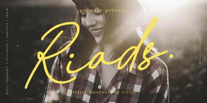 Introducing "Riads - Stylish Handwriting Font" with a signature style look. "Riads Script" very recommended for you who want to make some designs with natural handwriting style. This font easy to use and perfect for elegant branding, greeting cards, wedding design, name card design, invitation design, poster, packaging, romantic book cover designs, handwritten quotes, unique social media post, and so much more. Feature and what inside: • Uppercase and Lowercase • Uppercase and Lowercase Alternates • Number and Punctuation • Ligature • Swashes • Multi Languages
 - VVDS Fifties by Vintage Voyage Design Supply,
$15.00Fifties is a mix of classic geometric and a bit of humanistic grotesque. The goal was to create the font for present with look to the past. In other words, I tried to came back the Modernism aesthetics of XX century into nowadays. The result gives you 60 styles including Italic (Slanted). Your typography may be airy and elegant with Expanded Thin, catchy and expressive with Condensed Bold or dynamic and sharp with Expanded Bold Italic. You will find your way to use this family certainly. Theatre posters or party flyers, vintage t-shirt or modern web service, movie titles or magazine header and even infographic – Fifties will suit you everywhere. You may use the completed styles or may use a Variable Font. To make it as you want to. Weights: Thin / Light / Regular / Medium / Semi Bold / Bold. Widths: Condensed / SemiCondensed / Medium / SemiExpanded / Expanded OTF and Variable Font (TTF) OpenType features: Stylistic alternates for A, G, K, M, N, R, W, a, e, g, j, m, n, r, t, u, w, y; Fraction figures; Subscript and Superscript figures; Tabular figures; Typographic spaces: Em / En / Third / Quarter / Thin / Sixth / Hair - Exelancer by Popskraft,
$19.00 We are proud to present the futuristic Excelancer font. This font was inspired by passion for space stories. The uniqueness of this font lies in the rare combination of a wibrant style of decorative capital letters and perfectly balanced lowercase charachters that read well in any massive text. Thus, you get a universal font kit with which all the tasks of futuristic design are solved. However, this font will become a decoration not only for fantastic stories, but also for everything related to technology, development, progress and even sports. In short, this is the pure energy of the future!
 - TOMO Tosca by TOMO Fonts,
$15.00 Tosca is a new face designed by TOMO FONTS. Is a massive all-caps font with a stone age feel. Good-humoured shapes ideal strong messages. Very useful for kids related stuff, like books, posters, or websites. Lowercases are a slightly different from uppercases for a more natural look. Enjoy!
 - Bohemian Cassidy by Letterhanna Studio,
$19.00 Bohemian Cassidy is a lovely handwriting script font. It's perfect for signatures, logo type, weddings, posters, brochure or any display use. Bohemian Cassidy is perfect to get a more charismatic impression or give a unique touch to your projects and branding, greeting cards, wedding, banner, name card, lettering, fonts pairing, etc.
 - Polar Press by Attype Studio,
$14.00 Polar Press is a vintage all caps font with 2 styles: clean and rough, and includes 22 ligatures. Polar Press is a strong font and is perfect for branding, logos, invitations, stationery, social media posts, product packaging, merchandise, blog design, game titles, retro style design, Book/Cover Titles and more.
 - Serat by Wahyu and Sani Co.,
$24.00 Serat is a medium contrast flared serif with mixed up styles of classic typefaces which is highly influenced by early stages of Latin based hand writing. The lowercase are modernized versions of Carolingian minuscules, vertical stems which touch the baseline have been modified to have horizontal cut for simpler look and keep the calligraphic style for terminals & stroke ends. Then the uppercase are flared serif which were influenced by Roman inscriptional capitals. The font name was taken from the Javanese word "serat" which means writing (noun). It comes with some unique features, such as: - Carolingian style alternate for some letters (a,e,f,g,t), also comes with separated stylistic set for long 's', and long left leg 'x' and alternative ampersand. - Discretionary ligatures for all caps titling. - Standard Ligatures. - Tabular and Proportional for both Lining and Old-style figure. - Fraction with Nominator and Denominator. - Superscript and Subscript for numbers, etc. Serat would be suitable for "classic" themed work; poster, book cover, branding, videography, etc.
 - Duckie by Eclectotype,
$40.00 Eclectotype's continuing battle against whitespace continues full cream ahead with Duckie, and fat-bottomed script that packs a whole lotta weight into the softest of punches. The forms feel familiar, like they're straight from funky disco album covers, but this is a 100% original face. Don't let its retro charm dissuade you from taking it for a spin in more contemporary settings; it might just surprise you! Now for the features bit: OpenType features include ligatures, swashes, contextual alternates and stylistic sets. The stylistic sets are 1. swap the script r swap to a normal r, 2. swap the script upper case i to a more familiar seriffed version, 3. the number four changes to an open form, and lastly, 4. loopy ascenders in the lower case close in and lose the hole. You should not use this in all caps settings. Pretty please.
 - Galix by Eclectotype,
$40.00 Galix is a technical sans designed to look futuristic without any of the retro appearance often found in this genre. It has a squarish, slightly condensed anatomy, and is characterized by thin joints and deep ink traps that add a sparkle to the otherwise monoline typeface. In the italic styles, these cuts are accentuated even more which creates a feeling of speed in the letterforms. Galix is optimized for display typography (the ascender height is the same as the cap height, and the spacing is somewhat tight) but the middle weights are very readable at smaller sizes, where I'd recommend adding a little tracking. OpenType features include ft and tt ligatures, stylistic sets/alternates, automatic fractions, tabular, superscript and subscript figures, case sensitive forms. Perfect for websites, apps, infographics, magazines and logotypes, Galix is technical but with a warmth and personality that is often missing from this genre.
 - CA Play by Cape Arcona Type Foundry,
$29.00 This font invites you to play with it. The Real version has longer tails, while the Roman version cuts them up to make the font more suitable for text. The Script version connects the letters, while the Dynamic version is just an italic style.
 - MVB Solitaire Pro by MVB,
$39.00 A typeface is a tool. Sure, there are frilly fonts that are more art than craft, showy faces that exist merely to call attention to themselves. But, in the end, any functional typeface worth its salt lives to serve one thing first: the text, the content. Everything else—the fashion of the moment, the allure of individual words and letters—is secondary. MVB Solitaire™ epitomizes this universal typographic mandate. As a tempered sans serif somewhere between a humanist and a gothic, MVB Solitaire captures a 21st-century neutrality. But practical doesn’t have to mean banal. MVB Solitaire has a soul. While some “neutral” type is dead the moment the ink hits the page, MVB Solitaire delivers text that feels lively, contemporary, relevant. Readers will not tire of this type. Behind the useful exterior is an arsenal of thoughtful technical features. It’s no surprise that this family’s creator, Mark van Bronkhorst, was first a graphic designer before becoming a type designer. Mark built all the goodies into MVB Solitaire that he would appreciate as a user: case-sensitive punctuation; alternate forms that can be invoked individually or together; oldstyle and lining figures in both tabular and proportional widths; slightly shorter lining figures that don’t stand out in running text, but also cap-height figures for all-cap settings; and the ability to speak nearly any Latin-based language. MVB Solitaire aspires to be the sort of workhorse that a designer keeps installed on their system at all times. It is a family bound to have a permanent spot in the font menu, always at the ready for projects (those most common of all) where the typography mustn’t mask the message. It has that quality that all truly useful typefaces have: the capacity to get the job done without getting in the way.
 - Aquaduct Reverse Italic - Personal use only

- Autumn Deco - Unknown license

- Mobie FA by Fontarte,
$39.00 FA Mobie is a contemporary decorative fat face. For use on posters, leaflets, ads.
 - Lawyerbait by Zang-O-Fonts,
$25.00Lawyerbait was designed to be a clean, light and easy to read display face. - Kanibal by Milos Zlatanovic,
$80.00 Kanibal is typeface that creates a game of different shapes and styles. Have fun!
 - Vianova Serif Pro by Elsner+Flake,
$59.00 The font superfamily Vianova contains each 12 weights of Sans and Slab and 8 weights of the Serif style. The design from Jürgen Adolph dates back into the 1990s, when he studied Communication Design with Werner Schneider as a professor at the Fachhochschule Stuttgart. Adolph started his carrier 1995 at Michael Conrad & Leo Burnett. He was responsible for trade marks as Adidas, BMW, Germanwings and Merz. He has been honored as a member of the Art Directors Club (ADC) with more than 100 awards. On February 26, 2014, Jürgen Adolph wrote the following: “I was already interested in typography, even when I could not yet read. Letterforms, for instance, above storefronts downtown, had an irresistible appeal for me. Therefore, it is probably not a coincidence that, after finishing high school, I began an apprenticeship with a provider of signage and neon-advertising in Saarbrücken, and – in the late 1980s – I placed highest in my field in my state. When I continued my studies in communications design in Wiesbaden, I was introduced to the highest standards in calligraphy and type design. “Typography begins with writing” my revered teacher, Professor Werner Schneider, taught me. Indefatigably, he supported me during the development of my typeface “Vianova” – which began as part of a studies program – and accompanied me on my journey even when its more austere letterforms did not necessarily conform to his own aesthetic ideals. The completely analogue development of the types – designed entirely with ink and opaque white on cardboard – covered several academic semesters. In order to find its appropriate form, writing with a flat nib was used. Once, when I showed some intermediate designs to Günter Gerhard Lange, who occasionally honored our school with a visit, he commented in his own inimitable manner: “Not bad what you are doing there. But if you want to make a living with this, you might as well order your coffin now.” At that time, I was concentrating mainly on the serif version. But things reached a different level of complexity when, during a meeting with Günther Flake which had been arranged by Professor Schneider, he suggested that I enlarge the offering with a sans and slab version of the typeface. So – a few more months went by, but at the same time, Elsner+Flake already began with the digitilization process. In order to avoid the fate predicted by Günter Gerhard Lange, I went into “servitude” in the advertising industry (Michael Conrad & Leo Burnett) and design field (Rempen& Partner, SchömanCorporate, Claus Koch) and worked for several years as the Creative Director at KW43 in Düsseldorf concerned with corporate design development and expansion (among others for A. Lange & Söhne, Deichmann, Germanwings, Langenscheidt, Montblanc.”
 - Vianova Slab Pro by Elsner+Flake,
$59.00 The font superfamily Vianova contains each 12 weights of Sans and Slab and 8 weights of the Serif style. The design from Jürgen Adolph dates back into the 1990s, when he studied Communication Design with Werner Schneider as a professor at the Fachhochschule Stuttgart. Adolph started his carrier 1995 at Michael Conrad & Leo Burnett. He was responsible for trade marks as Adidas, BMW, Germanwings and Merz. He has been honored as a member of the Art Directors Club (ADC) with more than 100 awards. On February 26, 2014, Jürgen Adolph wrote the following: “I was already interested in typography, even when I could not yet read. Letterforms, for instance, above storefronts downtown, had an irresistible appeal for me. Therefore, it is probably not a coincidence that, after finishing high school, I began an apprenticeship with a provider of signage and neon-advertising in Saarbrücken, and – in the late 1980s – I placed highest in my field in my state. When I continued my studies in communications design in Wiesbaden, I was introduced to the highest standards in calligraphy and type design. “Typography begins with writing” my revered teacher, Professor Werner Schneider, taught me. Indefatigably, he supported me during the development of my typeface “Vianova” – which began as part of a studies program – and accompanied me on my journey even when its more austere letterforms did not necessarily conform to his own aesthetic ideals. The completely analogue development of the types – designed entirely with ink and opaque white on cardboard – covered several academic semesters. In order to find its appropriate form, writing with a flat nib was used. Once, when I showed some intermediate designs to Günter Gerhard Lange, who occasionally honored our school with a visit, he commented in his own inimitable manner: “Not bad what you are doing there. But if you want to make a living with this, you might as well order your coffin now.” At that time, I was concentrating mainly on the serif version. But things reached a different level of complexity when, during a meeting with Günther Flake which had been arranged by Professor Schneider, he suggested that I enlarge the offering with a sans and slab version of the typeface. So – a few more months went by, but at the same time, Elsner+Flake already began with the digitilization process. In order to avoid the fate predicted by Günter Gerhard Lange, I went into “servitude” in the advertising industry (Michael Conrad & Leo Burnett) and design field (Rempen& Partner, SchömanCorporate, Claus Koch) and worked for several years as the Creative Director at KW43 in Düsseldorf concerned with corporate design development and expansion (among others for A. Lange & Söhne, Deichmann, Germanwings, Langenscheidt, Montblanc.”
 - Vianova Sans Pro by Elsner+Flake,
$59.00 The font superfamily Vianova contains each 12 weights of Sans and Slab and 8 weights of the Serif style. The design from Jürgen Adolph dates back into the 90th, when he studied Communication Design with Werner Schneider as a professor at the Fachhochschule Stuttgart. Adolph started his carrier 1995 at Michael Conrad & Leo Burnett. He was responsible for trade marks as Adidas, BMW, Germanwings and Merz. He has been honoured as a member of the Art Director Club (ADC) with more than 100 awards. On February 26, 2014, Jürgen Adolph wrote the following: “I was already interested in typography, even when I could not yet read. Letterforms, for instance, above storefronts downtown, had an irresistible appeal for me. Therefore, it is probably not a coincidence that, after finishing high school, I began an apprenticeship with a provider of signage and neon-advertising in Saarbrücken, and – in the late 1980s – I placed highest in my field in my state. When I continued my studies in communications design in Wiesbaden, I was introduced to the highest standards in calligraphy and type design. “Typography begins with writing” my revered teacher, Professor Werner Schneider, taught me. Indefatigably, he supported me during the development of my typeface “Vianova” – which began as part of a studies program – and accompanied me on my journey even when its more austere letterforms did not necessarily conform to his own aesthetic ideals. The completely analogue development of the types – designed entirely with ink and opaque white on cardboard – covered several academic semesters. In order to find its appropriate form, writing with a flat nib was used. Once, when I showed some intermediate designs to Günter Gerhard Lange, who occasionally honored our school with a visit, he commented in his own inimitable manner: “Not bad what you are doing there. But if you want to make a living with this, you might as well order your coffin now.” At that time, I was concentrating mainly on the serif version. But things reached a different level of complexity when, during a meeting with Günther Flake which had been arranged by Professor Schneider, he suggested that I enlarge the offering with a sans and slab version of the typeface. So – a few more months went by, but at the same time, Elsner+Flake already began with the digitilization process. In order to avoid the fate predicted by Günter Gerhard Lange, I went into “servitude” in the advertising industry (Michael Conrad & Leo Burnett) and design field (Rempen& Partner, SchömanCorporate, Claus Koch) and worked for several years as the Creative Director at KW43 in Düsseldorf concerned with corporate design development and expansion (among others for A. Lange & Söhne, Deichmann, Germanwings, Langenscheidt, Montblanc.”
 - Deberny by Typorium,
$15.00 The Deberny typeface is an interpretation–carrying a contemporary imprint–of a typographic style which appeared and spread at the end of the 19th century until the begining of the 20th. These typefaces were named Italian, Venetian, Veronese and were classified in the Hellenic category, a spontaneous typographic movement caracterized by triangular and heavy serifs. They found their inspiration among numerous references, from incised to slab serif typefaces and their extreme expressions in wood type letterforms. The Deberny font family is made of 26 styles in 3 complementary sets of style, offering a wide palette of visual resonance: • Deberny Line is ideally suited for editorial, branding, posters and billboards. It has sharp contrast between thick and thin strokes. Heavy horizontal strokes are not frequent in roman letters, but here they fit naturally with the italic letters. • Deberny Open is a stylish outline declination of Deberny Line Medium and Medium Italic. • Deberny Text is an adaptation of Deberny Line made for broader use. Its shapes are less contrasted, which makes it perfectly legible for print or screen reading in small size text. Old style figures and small caps complete Deberny Text in all its 8 styles. The Deberny typeface family supports Latin-based languages and will be available soon in Cyrillic and Greek. Deberny Narrow will be released this year in all its 26 styles.
 - Bandica by IbraCreative,
$17.00 Bandica – A Bold Sans-serif Display Font Bandica is a striking sans-serif display font that boldly commands attention with its modern and assertive aesthetic. Characterized by clean lines and a lack of serifs, this typeface exudes confidence and contemporary style. The bold weight of Bandica amplifies its impact, making it ideal for headlines, banners, and other prominent design elements. The letterforms are meticulously crafted, ensuring a balance between readability and visual flair. With its distinctive personality and strong presence, Bandica stands out as a versatile choice for graphic designers seeking a bold and impactful typographic solution. Bandica is perfect for branding projects, logo, wedding designs, social media posts, advertisements, product packaging, product designs, label, photography, watermark, invitation, stationery, game, fashion and any projects. Fonts include multilingual support for; Afrikaans, Albanian, Czech, Danish, Dutch, English, Estonian, Finnish, French, German, Hungarian, Italian, Latvian, Lithuanian, Norwegian, Polish, Portuguese, Slovak, Slovenian, Spanish, Swedish.
 - Treefrog by Three Islands Press,
$39.00 A one-time co-worker of mine sometimes used a fanciful inkpen-style script in display-lettering situations. I liked it a lot. "Phil," I says, "why not do the whole alphabet, maybe a few little dingbats, and I'll make a font." Well, one day he presented me with a stack of posterboard; he'd done some letters, all right -- hundreds of 'em. I managed to boil these down into a typeface called Treefrog, a name that seems to match its organic jumble, its tall x-height, its left- and right-leaning stems, its thick and thin strokes. Full release has many dingbats.
 - Roos by Canada Type,
$24.95 The Roos family is a digitization and expansion of the last typeface designed by Sjoerd Hendrik De Roos, called De Roos Romein (and Cursief). It was designed and produced during the years of the second World War, and unveiled in the summer of 1947 to celebrate De Roos's 70th birthday. In 1948, the first fonts produced were used for a special edition of the Dutch Constitution on which Juliana took the oath during her inauguration as the Queen of the Netherlands. To this day this typeface is widely regarded as De Roos's best design, with one of the most beautiful italics ever drawn. In contrast with all his previous roman faces, which were based on the Jenson model, De Roos's last type recalls the letter forms of the Renaissance, specifically those of Claude Garamont from around 1530, but with a much refined and elegant treatment, with stems sloping towards the ascending, slightly cupped serifs, a tall and distinguished lowercase, and an economic width that really shines in the spectacular italic, which harmonizes extremely well with its roman partner. The Roos family contains romans, italics and small caps in regular, semibold and display weights, as well as a magnificent set of initial caps. All the fonts contain extended language support, surpassing the usual Western Latin codepages to include characters for Central and Eastern European languages, as well as Baltic, Celtic/Welsh, Esperanto, Maltese, and Turkish.
 - Navaja by Andinistas,
$39.95 Very few letter types with the context of grunge style fonts offer hierarchies to differentiate words in sentences or paragraphs. With Navaja I developed a font family that meets this need. This family is useful to organize the information into a hierarchy with an eroded look. Its central idea mixes grotesque, geometric and humanistic letter conventions. This way, Navaja is a grunge-sans with dense proportions to make graphic design with eroded character. Its main purpose appeared when one of my customers asked me for a t-shirt design for a fan club of an important football player. For this reason its starting point were stained and muddy letters characterizing the toughness and coldness of the sport. Over time their glyphs began to imitate the robustness of "wood type & Tuscan Type" widely used in posters in the late nineteenth century. Its purpose was strengthened in a family with 6 members that when mixed they produce mind catching contrast levels ideal for designing T-shirts, stickers, flyers, brochures, posters, billboards, cinema or TV. Therefore its variants are short up and down height X combined with different widths that by working together produce information that radiates outstanding apparently destroyed controlled violence. Navaja Dingbats consists of 52 illustrations useful for frames and textures. In that vein, the origin of each member comes from skeletons of Roman and Italic calligraphy. The low amount of contrast between thick and thin lines matching the contours apparently gnawed but strictly regulated by optical adjustments equating the sum between full and empty areas. Factors such as finishes, shapes and counter internal and external forms are meticulously planned although its scruffy look which strategic arrangements are offset to provide color typographical homogeneous. And in conclusion, I have plans to continue expanding the family with more complete versions in the future.
 - Chancery Lane by K-Type,
$20.00 Chancery Lane is a condensed cursive with a breezy, flowing feel. Many of the lowercase characters join up, some uppercase ones too, and the two fonts are slantier than many other chancery-inspired faces, inclined at almost 20°. Each glyph has slightly rounded corners to bestow softness and warmth. The typeface emerged from a study of pen lettering, italic scripts and chancery hands – down a rabbit hole and along the Chancery Lane. The research ranged from early cancellaresca manuscripts to contemporary fonts, and also calligraphic work, most notably that of Indian artist Mayank Baranwal whose lowercase letters inspired many of the Chancery Lane glyphs. Uppercase characters have been designed to harmonise with the lowercase rather than providing overly ornamental openers, true to origins that were functional rather than fancy. Both the capitals and the uppercase alternates are unfussy and relatively simple, and the lowercase swash characters are similarly understated, only modestly flourished. Stylistic alternates and lowercase swash characters can be accessed using OpenType-aware applications or font management software.
 - Varietta by Sudtipos,
$39.00 Varietta is the result of my fascination with photographing the type designs of some marquees in Spanish markets. In them you can see many letter designs with reversed contrast and in different widths, probably based on the possibilities of photocomposition. At the same time I was working on the expansion of the Hastile typeface designed by Alessandro Butti for the Nebiolo foundry in Italy in the late 1930s, of which I had not seen any digitization. As I am not a fan of perfect revivals, I thought it could be interesting to connect Spain and Italy in a single typeface. The first step was to expand Butti's design to 27 styles, ranging from thin condensed to black expanded. To look for the Spanish connection and its characteristic inverse contrast I took advantage of the current technology that allows variable typefaces with many axes. From this, three scenarios of horizontal contrast were incorporated (top, bottom and mixed) which allows infinite possibilities of use. The final result is a collection of 108 static typefaces or a single variable file.
 - Ainslie Slab by insigne,
$- Holy Dooley! It’s a new Ainslie! Based on the inspiration from Mt. Ainslie and the Ainslie suburb outside Canberra, the original Ainslie adds geometric simplicity with a hint of aboriginal flair to the project. And now the muses of Ainslie are back at work, lending their structure as the foundation of Ainslie Slab. Like its big brothers, the new Ainslie Slab puts together a great mix of influences from Oz for a great looking typeface with some ace new shoes. Slab’s spiffy new slab serifs complement the classic frame, making the result a ripper Aussie typeface that can be used in a great number of applications. Take a look at the trendy typeface’s alternates in action, too. You can access these in any OpenType-enabled application. Alternates, swashes and alternate titling caps allow you to customize your look and feel. Capital swash alternates, old style figures, and compact caps are included to add a bit more flexibility to your work as well. OpenType enabled applications can take complete benefit of your automatic replacing ligatures and alternates, and this font also presents the glyphs to help a wide array of languages. View all of these in the PDF brochure. And then try them out. Combine it with the original Ainslie and Ainslie Sans for more flexibility. Whether you need a good slab for the copy or you want a clean, upbeat look for your headline, Ainslie Slab offers you a unique touch of the Outback that’s anything but out of touch.
 - Taler by Serebryakov,
$40.00 Taler is a serif typeface is represented by seven weights. It was conceived as a continuation of the sans-serif Nekst. In the process of design it became clear that it is a completely different typeface. The rectangular, slightly elongated serifs, the plastic stiffness, and the combination of different styles make Taler a true representative of contemporary. It's old-fashioned and modern, it's for a display titles and for plain text, it's rough and elegant — it's all present in design at the same time. The duality of it nature is it peculiarity.
 - Lewis by Thierry Fétiveau,
$10.00 Lewis is a stencil typeface inspired by vintage sign painting. Lewis is designed for display use within printed publications as it has a high contrast of organic forms. Lewis consists of 3 styles; Classic, Display and Inline. Each style is based on the same skeleton but with a different personality. The Classic style is a simple and elegant stencil typeface which is also the original structure of Lewis. The Display style features intertwined flourish like parts and the last member of the family is the Inline style which features subtle internal details.
 - Bannikova by ParaType,
$30.00 Designed at Polygraphmash type design bureau in 1946-51 by Galina Bannikova, inspired by Russian Grazhdansky early- and mid-18th century typefaces as well as Roman Humanist typefaces of the Renaissance. With the archaic features of some characters the face is well recognized because of unique shapes. It is one of the best original typefaces of the Soviet typography. The typeface is useful in text and display composition, in fiction and art books. The revised, improved and completed digital version was designed at ParaType in 2001 by Lyubov Kuznetsova.

