10,000 search results
(0.058 seconds)
- East Village JNL by Jeff Levine,
$29.00 The Federal Art Project division of the WPA (Works Progress Administration) employed numerous artists, musicians, actors and other creative sorts in a effort to help many survive the Great Depression of the 1930s. One of the posters created by this project was for a "Card Party and Barter Benefit" with proceeds going toward the Nassau Art Teachers Benefit Fund - taking place at the Coca-Cola plant in Rockville Centre, New York. East Village JNL was derived from this poster, and is available in both regular and oblique versions.
 - Keswick by Hanoded,
$15.00 Keswick is a beautiful small town in the English Lake District. It is a good place to hang out for a while and explore the surrounding National Park. During your stay you could visit the Keswick Pencil Factory - which brings us to this nice font… Keswick font was created using a 6B pencil (the crumbly, soft kind) and a lot of patience. I have to admit, the pencil used was not made in Keswick. Sorry 'bout that…
 - Tomate by Re-Type,
$45.00 Tomate started in 2006 as a brush lettering exercise for a poster and was later used for the ReType identity. In 2008 its author decided to turn it into a super fat typeface suitable for packaging and mass consumption products. The possibilities of ultra heavy forms are explored in this alphabet; trying to solve the design problems that these sort of forms present. Tomate shows influences from the beautiful Goudy Heavyface Italic which is a design the author admires.
 - Aberration by Mad Irishman Productions,
$22.00Aberration is a distressed display typeface with a flair for exploration. Suitable for headings where you want to convey just a hint of danger, this font includes Cyrillic and Greek characters. - Abhartach by Fontdation,
$18.00 Introducing Abhartach, funky reverse-contrast display typeface. A perfect mix from both classic and modern typography. Packed with lots of alternate characters and ligatures (and faux-italic style too!), lets you explore more letter variations that will level up your designing projects. Check out the entire preview images to get the inspiration & hints of how powerful slash beautiful this typeface is. Hope you enjoy this typeface as much as we created it for you! Cheers!
 - Vibertus by Cercurius,
$19.95 A revival of “Gras Vibert”, a French fat face originally cast by the Didot typefoundry in Paris. It was cut in 1840 by Vibert, an engraver employed by the foundry. The capitals are heavier than the lowercase letters, and the characters g, k, y and & are rather peculiarly shaped, exaggerating the vertical stress. The font is designed for large sizes.
 - Pagoda International by Poole,
$18.50Imagine there's an explosion in a comic book, the exclamation that follows is set in PAGODA INTERNATIONAL. This font is inspired by the graphics on one of Honolulu's 1950's skyscrapers - The Pagoda Hotel with the International Ballroom. Created by former wine label designer, Wesley Poole, Pagoda is the opposite of sophisticated elegance. "Big, fat, and horsy, that's what I was after. It's the wacky juxtaposition of these familiar shapes that makes it work. Just try a couple words. You'll be surprised! I'm glad this one's behind me. It's my first pancake." - Camp Wendigo by Dear Sue,
$12.00 Camp Wendigo is a textured, hand-painted brush display font inspired by national parks, and camping in the great outdoors. Explore your logo designs, school displays, posters, signs, inspirational quotes, merch and packaging with these fun, woodsy letters! Caps Only Fonts.
 - Liet Display by Stanley fonts,
$9.99 Casual and Elegant. Liet Display© is an upright italic that plays with formality by subtly exploring the spaces between serif, sans-serif and italic styles. I recommend Liet Display© for post-apocalyptic packaging, branding, and editorial design. Dominic
 - Union by Alias Collection,
$60.00 A softer, streamlined and more elegant development of the ideas originally explored in Jude. Incised letterforms are now rounder and more intuitive, less geometric. Union is a modern classic‚ typeface, avoiding quirky idiosyncrasies to produce a useable and highly contemporary type.
 - Antiquarian by Three Islands Press,
$39.00 The titles struck me as handsome -- the titles and captions and place labels on a page I have of Henri Abraham Chatelain's Atlas Historique. I'd already modeled Antiquarian Scribe after the neat, slanted penmanship used in the body text of Chatelain's famous old world atlas; now I felt compelled to digitize this legible roman handlettering, as well. The letterforms are strong and handsome. They've got a certain deft, organic character. A personality. I can't fully explain it. But this antique alphabet seems suitable for many applications. Antiquarian is a full-featured font that works well with Antiquarian Scribe.
 - P22 Albers by P22 Type Foundry,
$24.95 This set of typefaces was produced in conjunction with the Guggenheim Museum and the Josef Albers Foundation. Josef Albers was one of the most important artists and educators of the twentieth century. He was a member of the Bauhaus first as a student and then as a teacher from 1920 until its closing in 1933. He then moved to America, where he continued making art and teaching at numerous institutions until his death. Known principally as an abstract painter, he was also an accomplished designer, draftsman, typographer, and photographer. His works explore permutations of form, color, and perception using a restricted visual vocabulary. Created when he was at the Bauhaus, his Kombinationschrift alphabets exemplify the school's ethos. Using 10 basic shapes based on the circle and the rectangle, he created a system of lettering that was meant to be efficient, easy to learn, and inexpensive to produce. These 10 shapes in combination could form any letter or number. The letterforms of this computer version were taken directly from Albers' drawings and notes.
 - Nurture Your Best by Seemly Fonts,
$14.00 Nurture Your Best is a modern and clean font. Its versatility and neat vibe will brighten up each of your designs. Have fun with this beautiful font and explore its endless variations.
 - Aethelred NF by Nick's Fonts,
$10.00This unicase typeface, with alternate characters in several of the lowercase positions, is patterned after Mosaik, designed by Martin Kausche for Schriftgeißerei Stempel in 1954. A stencil treatment has been employed, and the outlines have been roughened to enhance its ancient feel. The typeface is named for a king of England, Æðelred the Unready, who ruled over a millenium ago. Unlike its namesake, this typeface is quite ready to do yeoman's duty on your next project. The Opentype, Truetype and Windows Postscript versions of this font contain both the Windows 1252/ANSI character set and the 1250/Central European character set. - Kingsmead Script by Hanoded,
$15.00 Last year I spent some time exploring the city of Bath in England. Its claim to fame are the Roman Baths in the city center, which are well worth a visit. Kingsmead is an electoral ward within Bath and I thought it was an apt name for this rather stylish - if old fashioned - font. Kingsmead Script is a handmade font. It comes with diacritics and some discretionary ligatures for double lower case letter combinations.
 - Perfect Delight 1992 by Four Lines Std,
$15.00 Perfect Delight 1992 It's the font that turns ordinary into extraordinary. Let the font transport you to a world where the past and present coexist harmoniously. It's more than a font; it's an experience waiting to be explored. Try it today and embark on a creative journey that marries the best of retro aesthetics with contemporary readability.
 - Greuceanu by DePlictis Types,
$36.00 “Greuceanu” is the the name of a brave romanian fairy tale character and his mission was to eliberate de Sun and the Moon that were stolen by some Dragon like creatures that in romanian folklore they are called “ Zmei”. It inspired me to create this decorative uppercase display typeface with strong influences from old cyrillic writing and also a touch of fun and geometrical construction explorations. Besides Extended Latin Support it includes also Cyrillic and Greek alphabets as you already can expect from most of DePlictis Types releases. This decorative typeface goes well for use in book covers and headlines and only your creativity is the limit of its usability.
 - Clamshell by Jafar07,
$20.00 Clamshell Modern Caligraphy Script font is a harmonious blend of elegance and contemporary flair, seamlessly adaptable to modern and classic design landscapes. It effortlessly radiates timeless elegance and is tailored to meet the needs of professionals seeking designs that are both sophisticated and versatile. Easy to use yet rich in detail, this font is the ideal choice for designers who value both beauty and functionality in their work. Explore this font collection now and infuse your designs with the captivating essence of calligraphy.
 - Hughoney by Arterfak Project,
$17.00 Introducing our new exploration of a brush font, Hughoney . This freestyle script font is created by creative randomization the letter shapes. Gives minimalist, sweet, elegant and solid looks to your creative projects. This font has a lot of feature that you can apply as you need. The features in this font have a consistent adjustment with the basic letters. This sweet brush font is suitable for your poster, quotes, t-shirt design, menu, product design, invitation, etc. Very recommended for Headline or your display. We hope you are interested.
 - Galix Mono by Eclectotype,
$25.00 This monospaced version of Galix was commissioned in 2037 by the space exploration company Earth2, as part of a major overhaul of their branding, which had used, since 2021, a generic sans serif (much like every other company). Many specialists in both design and space exploration suggested that this very rebrand started a chain of events that concluded with the invention of time travel in 2041. Contrary to the perceived notion put forward in popular Science Fiction, time travel is only (as of now) possible in the digital realm. It was considered fitting that included among the first files sent back in time should be the Galix Mono typeface, which was remade in OTF format to ensure that it would work with the technology available in 2019. Earth2, for all their insight, did not foresee that the release of the typeface in September of 2019, would lessen the impact of their rebrand. What kind idiots would rebrand a forward looking company with a font that was, by then, almost 18 years old? The subsequent lacklustre response to the redesign didn’t inspire the tidal wave of R&D funding Earth2 had anticipated, and the company went into administration in the summer of 2039, having never invented the time travel which made the release of Galix Mono in 2019 possible. Experts believe that the files sent back in time, although their very sending made it impossible for them to be sent, remained as “time relics” of the future that might have been.
 - Strong Passion by Seemly Fonts,
$14.00 Strong Passion is a cool, clean, and simple display font. It will look stunning on any food menu, poster, flyer, or print. Use this font for your designs and explore its endless possibilities.
 - Old Vic by Solotype,
$19.95This is Solotype's version of a popular mid-nineteenth century style explored by several early foundries. It reads surprisingly well in paragraphs, and is a handy font for work with a Victorian theme. - Argufy by Ali Hamidi,
$10.00 Argufy is a cool, vintage styled and organic display font. It will look stunning on any food menu, poster flyer or print. Use this font for your designs and explore its endless possibilities.
 - Swank by ITC,
$29.99Jill Bell's typefaces are energetic, highly decorative, and refreshingly unpredictable. Some are friendly and childlike, while others are rough and nervous. Her latest creation is ITC Swank, a connected script whose shabby-chic" sophistication communicates a worn elegance. Bell begins the design process "with black stuff on white paper," she explains, preferring to draw letters before she digitizes them. Often the inspiration for her typefaces comes from a piece of hand-lettering. "Bruno began as a reminder to buy cat food," she says, "and ITC Swank started out as a small bit of lettering for Wurlitzer Pianos." Bell finds that working with blocks of lettering is a good start for script typefaces. "If I'm drawing a script typeface, I have to write out sentences in the letters first," she explains. "Drawing each letter separately doesn't establish the flow and spontaneity that scripts deserve." Bell's newest design is ITC Swank. It's a somewhat tattered formal script with definite links to early copperplate scripts. Though probably not for wedding invitations, Swank's elegant underpinnings are evident, with its slightly narrow proportions and a baseline that can best be called "bouncy." Graphic designers will appreciate the abundance of swash letters, making it easy to create distinctive headlines and short blocks of copy. Bell has a fondness for the "open, genuine" quality of Chinese and Japanese calligraphy. "Eastern styles incorporate the natural flow of the hand," she says. "Natural, human qualities shine through. Mistakes are accepted, not scorned as in the 'white-out' Western culture." This philosophy is evident in Bell's own designs. Whether it's ITC Clover 's carefree spirit, the slightly spooky Hollyweird, Caribbean 's< rustic charm or the weathered elegance of ITC Swank, there is a natural honesty in her work." - Shikamaru by Arterfak Project,
$17.00 Shikamaru is a Japanese-style typeface. Designed with minimalist rough stroke and Kanji letters inspired. This font is an all-caps font that has different shapes between the uppercase and lowercase. Simple and more Japanese feel! Shikamaru is perfect for display, especially for Japanese food, merchandise, logo, poster, short quote, movie, games, apparel. Equipped with stylistic alternates which came (and explored) from the Mandarin letters. PUA Encoded with multilingual support!
 - Catastrophique by Comicraft,
$19.00 It’s a Towering Inferno of a Font! It’s a Poseidon Adventure, an Earthquake and a Sharknado of Devastating Proportions! Don’t Look Up -- these cracked and chunky letterforms are signifiers of a Magnificent Disaster! A Perfect Storm of Tip Top Type by Comicraft's Starkings & Roshell with artist Lisa Davighi. Dante’s Peak has exploded and the Deluge has begun. Don’t save this font for the Day After, when worlds collide — Armageddon is Now!
 - Jungle Fever Shaded NF by Nick's Fonts,
$10.00Here’s a different take on my face Jungle Fever, patterned after Neuland Black, originally designed by Rudolph Koch for Gebr. Klingspor in 1923. A “sunrise” shading pattern has been employed to add visual impact and warmth to headlines. Best used in sizes of 48 point and above. All versions of this font include the Unicode 1250 Central European character set in addition to the standard Unicode 1252 Latin set. - Cardamon by Linotype,
$50.99 “My goal in creating the Cardamon family,” says Brigitte Schuster of her first design, “was to make an unobtrusive serif typeface which, at the same time, has a determined and straightforward demeanor.” “I wanted to design a typeface with sharp edges and corners,” explains Schuster. “I was influenced by the angularities in Vojtěch Preissig‘s “Antiqua” and “Cursive” in addition to Oldřich Menhart‘s “Menhart” typeface.”
 - Shifttype by Ali Güzel,
$18.00 An experimental typeface with at least 3 characters each, uppercase, lowercase, numbers, and punctuation marks. It would be great for experimenting with different typefaces to decide what's the general taste of your logo or designing a poster, music cover, etc. Or just use the typeface with exploring its alternate glyphs, enjoy!
 - 1565 Renaissance by GLC,
$20.00 This set of initial letters was inspired from French renaissance decorated letters. It is a typical pattern, one among dozen quite similar, but this one was in use in Paris, unchanged, for centuries, and was still in use in the beginning of 1900s. This explains the difference between I and J, U and V. These characters were engraved years after the original set. Our font was inspired from a late 1800s publication. It can be used as well with Humane fonts (like our 1543 Humane Janson or 1592 GLC Garamond) as with modern fonts like our 1820 Modern or 1906 French News.
 - Aureata by preussTYPE,
$30.00 Whenever I've stayed in Munich my friend Michael Bundscherer and I go on a typographical expedition. When we talk about that, we remember the bygone world of sign painter. On one of the facades of a furniture shop in Munich, you can discover the lettering of the name in golden letters. This one convinced us because of the simple elegance Art Deco. These letters on the facade are in any case the character set, which forms the basis of this document. The missing (especially the lowercase letters and the numbers) were modeled. The "OPEN" called version tries to replicate the 3-D effect. The font is particularly suitable for shorter texts and headlines.
 - Novaria Vista by Sipanji21,
$20.00 "Novaria Vista" is a futuristic display font. Fonts with a futuristic theme often embrace technological and forward-looking aesthetics. They are commonly used in various design projects that aim to convey modernity, innovation, and a vision of the future. With "Novaria Vista," you can create designs that exude a sense of advancement and a futuristic touch. This font is suitable for projects related to technology, science fiction, space exploration, and other themes where a futuristic style is desired.
 - Cotford by Monotype,
$49.99 New from the Monotype Studio, Cotford is a contemporary serif from Creative Type Director, Tom Foley. Dynamic, adaptable, and surprising—Cotford is a languid serif that ranges from delicate thins, bending and reaching like flower stems, to bold heavy weights that command the page and screen with confidence and vintage charm. And as a variable font, Cotford allows designers to explore and refine the design almost endlessly, unearthing its many visual tones and hidden secrets. Foley set out to design a soulful, contemporary serif typeface that delivers all the versatility and robustness today's designers expect. The variable font unlocks an expandsive spectrum of visual expression that allows designers to explore, tweak, and adjust the typeface until they find the perfect weight, contrast, and optical size for their project. At the same time, Cotford’s static weights follow a traditional model of 3 text and 5 display weights, making it a strong choice for brands looking for simple implementation. A pop serif for the digital age, Cotford takes you places. Cotford font field guide including best practices, font pairings and alternatives.
 - Phaserwave by Mysterylab,
$22.00 Part of the wave of modern explorations expanding on the 50+ year-old traditions of groovy psychedelic typography, Mysterylab brings you Phaserwave. With an intriguing fusion of pillowy shapes and sharp stroke ends, this font cooks up a heady mélange of whimsical flow and high precision. We've applied our usual meticulous attention to great kerning, extensive character set, and seamless functionality, so this font's ready to rock your designs any way you might want to do it.
 - Mati by Sudtipos,
$19.00 Father's Day, or June 17 of this year, is in the middle of Argentinian winter. And like people do on wintery Sunday mornings, I was bundled up in bed with too many covers, pillows and comforters. Feeling good and not thinking about anything in particular, Father's Day was nowhere in the vicinity of my mind. My eleven year old son, Matías, came into the room with a handmade present for me. Up to this point, my Father's Day gift history was nothing unusual. Books, socks, hand-painted wooden spoons, the kind of thing any father would expect from his pre-teen son. So you can understand when I say I was bracing myself to fake excitement at my son's present. But this Father's Day was special. I didn't have to fake excitement. I was in fact excited beyond my own belief. Matí's handmade present was a complete alphabet drawn on an A4 paper. Grungy, childish, and sweeter than a ton of honey. He'd spent days making it, three-dimensioning the letters, wiggle-shadowing them. Incredible. A common annoyance for graphic designers is explaining to people, even those close to them, what they do for a living. You have to somehow make it understandable that you are a visual communicator, not an artist. Part of the problem is the fact that "graphic designer" and "visual communicator" are just not in the dictionary of standard professions out there. If you're a plumber, you can wrap all the duties of your job with 3.5 words: I'm a plumber. If you're a graphic designer, no wrapper, 3.5 or 300 words, will ever cover it. I've spent many hours throughout the years explaining to my own family and friends what I do for a living, but most of them still come back and ask what it is exactly that I do for dough. When you're a type designer, that problem magnifies itself considerably. When someone asks you what you do for a living, you start looking for the nearest exit, but none of the ones you can find is any good. All the one-line descriptions are vague, and every single one of them queues a long, one-sided conversation that usually ends with someone getting too drunk listening, or too tired of talking. Now imagine being a type designer, with a curious eleven year old son. The kid is curious as to why daddy keeps writing huge letters on the computer screen. Let's go play some ball, dad. As soon as I finish working, son. He looks over my shoulder and sees a big twirly H on the screen. To him it looks like a game, like I'm not working. And I have to explain it to him again. This Father's Day, my son gave me the one present that tells me he finally understands what I do for a living. Perhaps he is even comfortable with it, or curious enough about that he wants to try it out himself. Either way, it was the happiest Father's Day I've ever had, and I'm prouder of my son than of everything else I've done in my life. This is Matí's font. I hope you find it useful.
 - Dzulfiqar by Aisyah,
$12.00 Dzulfiqar is a simple and dainty handwritten font. Its natural and unique style makes it incredibly fitting to a large pool of designs. Use this font for your designs and explore its endless possibilities.
 - Seryliat by Aisyah,
$12.00 Seryliat is a simple and dainty handwritten font. Its natural and unique style makes it incredibly fitting to a large pool of designs. Use this font for your designs and explore its endless possibilities.
 - Phobey by Aisyah,
$12.00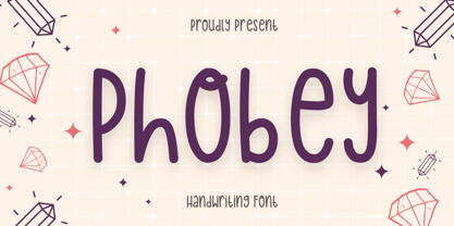 Phobey is a simple and dainty handwritten font. Its natural and unique style makes it incredibly fitting to a large pool of designs. Use this font for your designs and explore its endless possibilities.
 - Gladsome Morning by Seemly Fonts,
$14.00 Gladsome Morning is a cool, clean, and simple display font. It will look stunning on any food packaging design, poster, flyer, or print. Use this font for your designs and explore its endless possibilities.
 - Mesotone BT by Bitstream,
$50.99Matt Desmond (MADType, Pufficlaude BT) would like you to meet Mesotone BT. This computer typeface design is monoweight and somewhat monowidth. The squarish unicase glyph forms feature eased corners and rounded terminal ends, which takes some of the edge off its techi look. Yet Mesotone still inspires one to explore the outer limits of the design universe. So, don’t tone it down; Mess with the fringes. Get Mesotone. Available in PostScript OpenType format, Mesotone’s extended glyph set covers the Western and Central European, Baltic and Turkish languages.