10,000 search results
(0.401 seconds)
- Danizatti script by Slex Studio,
$15.00 I want to create a font, which is very elegant. So I made Danizatti Script, a kind of classic decorative script with a modern twist. This is a display font intended for vintage logos, fashion labels, custom card headers, badges, food packaging designs, especially wine labels. Actually a lot of great style was consumed when creating this type :) there are 300 fancy letter and punctuation glyphs. I also offer a number of viable stylistic alternatives for multiple letters. NOTE, that you will get full access to font options only in Open Type smart applications like InDesign or Illustrator. You can find more about how to access OpenType features in Adobe Apps here: http://fontfeed.com/archives/opentype-in-adobe-creative-suite-the-raiders-of-the-lost-glyphs-pt_1/ Check out my other elegant script fonts at the my frofile
 - Koi by Talbot Type,
$19.50 Koi is a highly original, outline display font. Each character is represented by a single continuous line to create a fluid and rhythmic look. The result is something of a hybrid, sitting somewhere between an outline and an inline style, and with an asymmetrical look — something quite rare in a typeface. Many of the characters look like ready made logotypes. Further customisation is easily achieved by extending the end strokes of characters, possibly aligning them and joining them to others to create bespoke arrangements.
 - TwentyFourNinetyOne by steve mehallo,
$19.91 TwentyFourNinetyOne [2491] is a reinterpretation of the alphabet of 1919 by Theo van Doesburg; the original a true rendering of the thinking of the Dutch-based art movement “de Stijl.” Jump forward to 1980 and prop lettering used on the Buck Rogers in the 25th Century television series; a vernacular typeface that was a utilitarian mix of geometry and pixel-based forms, used to symbolize the futuristic universe of 2491. At times it would appear on spaceships, laser guns, signage at space ports or in one episode, a Spandex tapestry. It only seemed logical to combine and rethink the letterforms, add ligatures + other extras, and see what the results would be. Futuristic, fun and bold to read! 2491: In the future, all type will look like this.
 - Brillo by Alessandro Pivetta Type,
$15.00 Brillo Typeface stems from the effort of combining the modern look of a grotesque sans serif font with the elegance of the calligraphic copperplate's swashes. The result is a typeface that is perfectly suitable for modern graphic applications, such as publishing, branding and web, but which has some ornamental features that differentiate it from all the other grotesque families. Brillo doesn't want to be a neutral typeface. It's a font with a strong personality, which can give outstanding aesthetic and conceptual relevance to the graphic projects which will be used in. Brillo is a typeface thought for titling rather than for texts. For this reason it works better with character sizes bigger than 16 points.
 - Hot Salsa by Sudtipos,
$59.00 Hot Salsa is a calligraphic script font inspired by the classic, fairly well-made brush letters from the casual sign painting style, mixed with the fast and gestural tags you can find on walls all around the world. This is a fresh font that allows you to play with its numerous swashes, alternates and ligatures to make it feel more sober or a little flirty depending on your needs. Hot Salsa started with a brush pen and a lot of paper. These were later re-traced onto many layers of tracing paper with the intention of maintaining the brush pen and handmade feeling while making the structure consistent to ensure its readability and performance.
 - ZT Yaglo by Khaiuns,
$16.00 ZT Yaglo is a dynamic and expressive display font, from the first impression you may have noticed that this font is a fishing rod-like concept, with a consistent rhythmic curve that gets sharper at the ends. The ZT Yaglo typeface is framed in a sans theme and added a serif feel to produce a bold, geometric typeface in all thicknesses. ZT Yaglo mixes a simple sans style for extra bold serif energy with the feel of calligraphic shapes. The thicker your choice of style, the more striking the flow of changes in shape becomes spiky. ZT Yaglo is a cool alternative for you to create branding projects, Logo designs, Apparel Branding, product packaging, magazine headers or just as a stylish text overlay onto any background image. ZT Yaglo has 9 Styles, 1 Free for Commercial, and one Variable font. each face has 457 glyphs. Includes Standard Ligature, and the "&" character has an alternate letter in each Weight. I hope you have fun using ZT Yaglo. Thanks for using this font ~ Khaiuns X zelowtype
 - Bordeaux by ITC,
$40.99David Quay designed Bordeaux to exhibit characteristics common in the typefaces of the Romantic era, the period which produced the novels of Victor Hugo, the music of Berlioz and the fairy tales of Hans Christian Andersen. Bordeaux displays the emotive quality one associates with the times. The font is intended for titles and headlines and combines well with Syntax for the body of the text. - P22 Insectile by P22 Type Foundry,
$24.95 Programmers often try to knock the "bugs" out of their computers, but P22 allows you to install them and use them to your advantage. Insectile is a set with 38 accurate insect illustrations and a font (Infestia) made up of actual scanned and rearranged insect parts.
 - Teacup by Hanoded,
$15.00 I remember a tea ceremony I attended in Fukuoka, Japan. The teahouse was set in a small, but beautiful garden and the whole idea of the ceremony was to appreciate the view from the porch. I thought the tea was quite bitter, but the view was unsurpassed. From time to time these memories pop up and I have to use them - that is why I named this font Teacup. Teacup is a slightly eroded all caps font, made entirely by hand with a Japanese marker pen and some high quality textured paper. It comes in a romantic open style and a more solid closed style. Teacup is filled to the brim with diacritics.
 - Orange Mochi by RA Studio,
$14.00 Flying, elegant, handwritten font Orange Mochi. The font is built on the basis of personal handwriting, has narrow and wide glyphs, brave external elements, alternative letters and funny ligatures. The font works well in an array of text, titles and logos. Display font Extended latin & cyrillic
 - Churchward Montezuma by BluHead Studio,
$25.00 Churchward Montezuma is the latest OpenType font family released by BluHead Studio, LLC. from the exciting and unique typeface library of Joseph Churchward. The cut-in motif gives this four weight serif family a unique look suitable for display work, and the lighter weights hold up well in text.
 - Tangled PW by Patty Whack Fonts,
$25.00 Tangled PW is suitable for display use for titles, etc. This font contains the basic characters. Uppercase, lowercase, numerals, and basic punctuation. See the character map for all of the included characters. Tangled PW is available in OpenType and TrueType format which are both included in the same package.
 - Algoria by Sealoung,
$15.00 Algoria is a functional sans serif that includes open character openings, a uniform distribution of white and black, and excellent readability. The general neutrality of the font patterns is not without elegance, and all the details of the typeface are crafted with mathematical precision and love. Typographic designs are developed for the widest possible range of tasks that any quality corporate font must accomplish.
 - Gesego by Twinletter,
$18.00 Introducing our newest font called Gasego, this font will bring a unique touch to your design, Gasego Groovy font is one of the right choices. With precise curves and soft lines, this fun font is sure to add something special to your designs. It’s never too late to start incorporating this cool font into your work, so don’t wait and use it now!
 - Halberg by Krafted,
$10.00 Wish to infuse some tradition and nostalgia into your project? Whether you’re working on a logo, promo materials, packaging, or invitations, we’ve got just the thing to elevate your design. Introducing Halberg - a Vintage Serif Font. From luxury brands to artisan businesses, Halberg has a timeless appeal to customers. Give it a shot and see how a great font improves the way people see you. What you’ll get: Multilingual & Ligature Support Full sets of Punctuation and Numerals Compatible with: Adobe Suite Microsoft Office Keynote Pages Software Requirements: The fonts that you’ll receive in the pack are widely supported by most software. In order to get the full functionality of the selection of standard ligatures (custom-created letters) in the script font, any software that can read OpenType fonts will work. We hope you enjoy this font and that it makes your branding sparkle! Feel free to reach out to us if you’d like more information or if you have any concerns.
 - Le Havre Titling by insigne,
$24.00 Throughout time, history’s architects have incorporated some of the finest illustrations of type into their great works--cuneiform on Mesopotamian ziggurats; Greek etched into the temples of the gods; inscriptions marking the monuments of mighty Rome. From these Roman inscriptions specifically, we take our capital letters of today; and while we've lost the need for serifs over time, our current characters maintain the classical foundations, even after being distilled to their simplistic forms. Here’s where we have the basis for Le Havre Titling. This updated face is a carefully optimized version of Le Havre that uses purely capital lettering. Originally inspired by the golden period of the passenger ship and the French port that bid a rich bon voyage to so many famed, luxurious ocean liners of the Roaring Twenties and Thirties, the typeface includes an exciting array of ligatures that brings it into the present day and gives designers a tremendous amount of versatility in their work. With its seven weights, Titling looks equally at home on the side of a building as it does in a finely crafted invitation. With over five hundred glyphs, Le Havre Titling offers a multiplicity of options for your projects. Combine ligatures, play around with two sets of art deco forms, use original caps, and more; every one of these is obtainable with the OpenType functionality. The new design also shares five weights with the original Le Havre, allowing you to maximize your potential through its interchangeability. Titling’s Thin weights are delicate but not too fragile, and its geometric forms give each individual composition you create an exquisite and beautiful sense of emotion. Without a doubt, this fresh, fashionable take on the classical forms offers your reader refined, yet unanticipated approach as he or she travels through your text.
 - Sil Vous Plait NF by Nick's Fonts,
$10.00Morris Fuller Benton's 1917 typeface named Invitation provided the pattern for this elegant and endearing face. Classic Engravers Roman style caps are exquisitely balanced with a sinewy lowercase, adding warmth and charm. All versions of this font include the Unicode 1250 Central European character set in addition to the standard Unicode 1252 Latin set. - Boho A Gogo NF by Nick's Fonts,
$10.00 Letterforms from the 30s, inspired by Bauhaus Bold, combine with super 70s styling to create this disco-era delight. The bold characters, rendered by prismatic multilines, create striking headlines with a strong architectural feel. Both versions of this Pro Series font contain the complete Unicode Latin A character complement, along with extended ligatures and fractions.
 - Trochilida NF by Nick's Fonts,
$10.00This Albert Auspurg offering from 1915 for the German foundry Schelter & Giesecke was originally called Kolibri, or Hummingbird. The design combines formal elegance with a carefree, wide stance, making it a perfect choice for inviting headlines. Both versions of this font include the complete Unicode Latin 1252, Central European 1250 and Turkish 1254 character sets. - Ricksta by Twinletter,
$17.00 Ricksta is a charming gothic serif font, with a unique sharp touch. If you are looking for an eye-catching and truly powerful look in your various visual branding design projects, then Ricksta is the answer. This font has been created with detail and precision to meet the needs of your branding projects. With families that include regular, shadow, slant, and distort, you have a variety of options to create a look that matches your brand identity. Ricksta also features alternate ligatures and characters, giving you the ability to create truly unique and captivating letter designs. Ricksta also supports multiple languages. That way, you can reach a global audience without limitations. This is your chance to make your brand stand out with a strong character. So, prepare yourself to turn your branding projects into stunning works of typographic art. Get Ricksta now and see how this unique gothic serif look will add a special appeal to your brand and your projects.
 - Penster Bross by Letterhend,
$17.00 Penster Bross is a standout bold font with rough and stamp version. The texture of the font makes this font looks great for retro and vintage theme.This font is also suitable to be applied especially in logo, and the other various formal forms such as invitations, labels, logos, magazines, books, greeting / wedding cards, packaging, fashion, make up, stationery, novels, labels or any type of advertising purpose. Features : - rough and stamp version - numbers and punctuation - multilingual - PUA encoded We highly recommend using a program that supports OpenType features and Glyphs panels like many of Adobe apps and Corel Draw, so you can see and access all Glyph variations.
 - TF Voide Murdered by Teenage Foundry,
$19.00 TF Voide Murdered - Death Metal Font. Our Death Metal Font is the perfect tool to amplify the raw energy and intensity of your designs. Crafted with meticulous attention to detail, this font embodies the essence of heaviness, chaos, and rebellion. Featuring jagged edges, sharp contours, and intricate letterforms, our Death Metal Font exudes a ferocious brutality that will leave a lasting impact on your audience. Each character is meticulously designed to evoke a sense of darkness and aggression, making it an ideal choice for album covers, band logos, merchandise, and more. Features: Uppercase, Lowercase, Numeral, Opentype Features, Punctuation & Multilingual. For any questions please contact me 🙂 Thanks!
 - Romios by Letterara,
$21.00 Introducing "Romios", a modern serif and elegant font family with 10 unique styles. Each style features distinctive serifs and clean lines, resulting in a modern yet classic look. This font family is perfect for any project that requires a touch of sophistication, from editorial design to branding and advertising. The versatility of Romios font makes it an excellent choice for both digital and print media. With its PUA encoding, accessing the various glyphs and swashes is a breeze. Each style is carefully crafted to ensure legibility, making it an excellent choice for international audiences. Make your designs stand out with Romios font - the perfect balance of modern and classic typography.
 - Demon Say Hi by Gassstype,
$27.00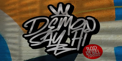 Hello Everyone, introduce our new product Demon Say Hi is Rebel Typeface Font with a natural feel. This handmade font will make your design has a beautiful natural touch for each details. This font is PUA encoded which means you can access all of the magical glyphs with ease!
 - Slim Kim by Wiescher Design,
$39.50 Slim Kim is the sister font of Julienne. It mixes perfectly with Julienn. So whenever you need an especially slim serif font this is it! Slim Kim has very spiky serifs, so I did not want to make an extra-slim version. Enjoy this spiky font, your Gert Wiescher.
 - Unfair by Vozzy,
$9.00 Introducing a vintage look label font family named "Unfair". All available characters you can see at the screenshot. This font have 3 styles with 3 version of each - Regular, Shadow and Rough. This font will good viewed on any retro design like poster, t-shirt, label, logo etc.
 - Gerush by ZetDesign,
$15.00 Gerush is a font in the form of a fingerprint. This font is neatly crafted to present a formal yet memorable and unique feel. very suitable for brand identity and other uses. This font is made in a regular and light style with an italic style in each.
 - Bellvyne by Krafted,
$10.00 Looking for an elegant but unique serif font that looks equally great on screen as well as on paper? Introducing Bellvyne - A Serif Font. Stylish with a touch of modern, Bellvyne is perfect for making your brand stand out. It’s a great choice for web pages, apps, ads, banners, promotions, printed cards, packaging, and pretty much anything else your project needs. What you’ll get: Multilingual & Ligature Support Full sets of Punctuation and Numerals Compatible with: Adobe Suite Microsoft Office Keynote Pages Software Requirements: The fonts that you’ll receive in the pack are widely supported by most software. In order to get the full functionality of the selection of standard ligatures (custom created letters) in the script font, any software that can read OpenType fonts will work. We hope you enjoy this font and that it makes your branding sparkle! Feel free to reach out to us if you’d like more information or if you have any concerns.
 - Wylie Voigen by Krafted,
$10.00 Looking for a serif font that will make your brand stand out? Introducing Wylie Voigen – A Modern Serif Font. A mix of culture and style, Wylie Voigen is excellent for showing what makes your business unique. Wylie Voigen allows you to make stunning web pages, apps, ads, merchandise, printed cards, and anything else your business needs. What you’ll get: Multilingual & Ligature Support Full sets of Punctuation and Numerals Compatible with: Adobe Suite Microsoft Office KeyNote Pages Software Requirements: The fonts that you’ll receive in the pack are widely supported by most software. In order to get the full functionality of the selection of standard ligatures (custom created letters) in the script font, any software that can read OpenType fonts will work. We hope you enjoy this font and that it makes your branding sparkle! Feel free to reach out to us if you’d like more information or if you have any concerns.
 - Vertigirl - Unknown license

- Hiragino Serif by SCREEN Graphic Solutions,
$210.00 Hiragino Serif (Mincho) is a font adapted for the digital age. It was designed to permit finely detailed tuning that allows the sizes of both kanji and kana to be adjusted for greatest visibility. It also broadly satisfies the needs of modern graphic design in advertising, posters, pamphlets, magazines, and other such uses. The font makes the counters comfortably wide while gracefully raising the text's center of balance, ensuring that the typeset characters will be smooth and well-defined. It gives each line a modern impression thanks to a judicious balance of light and shade and draws out a vivid readability that makes it possible to comfortable push forward with one’s reading. Latin alphabet and numbers have all been originally designed so that the weights of typeface and the flow of the baseline between Japanese and Latin characters are extremely consistent. Of particular note, vertically formatted text that mixes both Japanese and Latin characters can be beautifully rendered using only this typeface. Thanks to the use of authentic and sophisticated basic design , it creates a different atmosphere by combination of optional unique kana typefaces.
 - Mix Label by Mix Fonts,
$13.00 Get the handwritten, labeled look you love with MIX LABEL – the perfect font for creating clean, thick designs. Inspired by the look of school supplies labeled with a Sharpie marker, this font is ideal for replicating the handwritten style of labels and addresses on mailers. Whether you’re looking to add a personal touch to your branding or simply want a unique font, MIX LABEL has got you covered. Don’t settle for boring, generic fonts – label your designs with MIX LABEL and stand out from the crowd. Includes the following characters: ABCDEFGHIJKLMNOPQRSTUVWXYZ abcdefghijklmnopqrstuvwxyz 0123456789 !@$#%^&*()`~♥❤✿•· ÷×+−±≈=≠≥≤[]‹›:;'",.|/?{}“”‘’-–—_ …©®™«»°¹²³ªº¡¿x₱¢€£¥§№† ÁÀÂÄÃÅĂĀĄÆĆĈČÇÐĐÉÈÊËĖĒĘĜĤIÍÌÎÏĪĮĴŁŃÑŇ ÓÒÔÖÕØŌŐŒŔŘŚŜŠȘŤȚÚÙÛÜŮŰŪŲẂẀŴÝŶŸŹẐŽŻÞ áàâäãåăāąæćĉčçðđéèêëėēęĝĥıíìîïīįĵłńñň óòôöõøōőœŕřśŝšșťțúùûüůűūųẃẁŵýŷÿźẑžżþß Discretionary Ligatures: bb dd ee gg kk ll mm nn oo pp tt
 - Bronson by Ronny Studio,
$22.00 Bronson is a sans serif family that comes in 7 weights. The Bronson font has a very bold body, but still has high contrast. This font looks very modern when paired with contrasting design colors. This font is impressive and features a clean and elegant font, professionally shaped, and as a result, it will easily match a variety of creations that require a different touch. Add it with confidence to your projects, and you'll love the results. This typeface is perfect for elegant logos, branding, promotions, book covers, magazine layouts, or simply as a stylish text overlay onto any background image. Bronson Features : Uppercase Lowercase Numbers & Punctuation Multilingual Support Simple installation All of features and special characters of this font are included in one file. So it is easy to accessed by using program or software that support the opentype like Adobe Illustrator, Adobe Photosop, and Adobe Indesign). This font also very easy to use because compatible for all software even for non-opentype supported. Please comment us if you have any questions Thank you and have a nice day. thank you
 - Jorge by Galapagos,
$39.00(pronounced hor-hay) Some years ago my wife and I had our evening meal in a restaurant on what is called the northshore of Massachusetts. Of course, if you check a globe or map you'll see that the pilgrims needed a compass, it should have been called the eastshore as it's on the east end of the rectangle/hook we call the Commonwealth of Mass. In any event, the menu our waitress gave us was hand-lettered with shapes that I used to develop the 4 fonts called Jorge. When I brought the preliminary drawings into the office Steve Zafarana, a designer and cartoonist referred to them as Jorge's new design, the name stuck. - Stone Hinge Pro by CheapProFonts,
$10.00 This font has sort of a rustic an ancient look, like stone carvings... The lowercase j has been redesigned to better fit with the other letters, and I've also made an alternate f (as an OpenType contextual alternate) to make a tighter fit with following tall letters. ALL fonts from CheapProFonts have very extensive language support: They contain some unusual diacritic letters (some of which are contained in the Latin Extended-B Unicode block) supporting: Cornish, Filipino (Tagalog), Guarani, Luxembourgian, Malagasy, Romanian, Ulithian and Welsh. They also contain all glyphs in the Latin Extended-A Unicode block (which among others cover the Central European and Baltic areas) supporting: Afrikaans, Belarusian (Lacinka), Bosnian, Catalan, Chichewa, Croatian, Czech, Dutch, Esperanto, Greenlandic, Hungarian, Kashubian, Kurdish (Kurmanji), Latvian, Lithuanian, Maltese, Maori, Polish, Saami (Inari), Saami (North), Serbian (latin), Slovak(ian), Slovene, Sorbian (Lower), Sorbian (Upper), Turkish and Turkmen. And they of course contain all the usual "western" glyphs supporting: Albanian, Basque, Breton, Chamorro, Danish, Estonian, Faroese, Finnish, French, Frisian, Galican, German, Icelandic, Indonesian, Irish (Gaelic), Italian, Northern Sotho, Norwegian, Occitan, Portuguese, Rhaeto-Romance, Sami (Lule), Sami (South), Scots (Gaelic), Spanish, Swedish, Tswana, Walloon and Yapese.
 - Cabrito Flare by insigne,
$35.00 Cabrito Flare joins the Cabrito font family, a family designed to help younglings with the recognition of letter shapes. The original fonts are part of the development of a children's book, The Clothes Letters Wear. Cabrito Flare combines the simplicity and readability of the original Cabrito with an elegant flare serif. Now, this latest addition brings a new flavor to the table. Cabrito Flare brings fluid, carefree, medium contrast fun. It takes a more calligraphic direction than most. Cabrito combines structure and handwriting. There's a fluid balance of both characteristics, and Flare is no exception. It’s a unique combination of functional elegance with a little spice and a dollop of friendly. Fifty-four well-designed fonts give you many readable options to work with while developing your design. Cabrito Flare includes a suite of OpenType features. Alternative forms, ligatures, figures, and titling caps are all here. Preview these functions in the interactive PDF manual. There are glyphs for 72 languages; more than 600 glyphs await you. Cabrito Flare is an excellent choice for websites, as well as for brochures and packaging. Like Cabrito, used by several visible brands, Cabrito Flare is also an excellent option to define your logo. Try the taste of Cabrito Flare and be sure to dip in and sample some of the other Cabrito members: Original flavor, Didone, Sans, Serif, Semi, Contrast, and Inverto.
 - Kyoto Northern by 38-lineart,
$14.00 Kyoto Northern is a great choice for a brand identity, suitable for packaging, web banners, headlines and business cards, very unique and natural. This font is handwritten using a marker pen, equipped with a ligature following the habit of writing quickly, so you can feel the sensation of handwriting which is very natural. When you write in a relaxed and calm state, your writing will look very good and the writing flows well. Kyoto is the name of the city that we chose as a representative of calm and natural. Type and feel the amazing handwriting.
 - Merlin by Linotype,
$29.00Linotype Merlin is part of the Take Type Library, which features the winners of Linotype’s International Digital Type Design Contest from 1994 to 1997. This font was designed by Anne Boskamp and its alphabet consists exclusively of capital letters. At the same time aggressive and sensitive, Merlin looks as though it were scratched onto paper with a pen tip saturated with ink. Like characters from another time, the letters fall into place and make an impression which is both vulnerable and strong, lively and reserved. Merlin’s historical roots lie in the archaic pictograms in the caves of Stone Age civilizations. - New Lincoln Gothic BT by Bitstream,
$50.99New Lincoln Gothic is an elegant sanserif, generous in width and x-height. There are twelve weights ranging from Hairline to UltraBold and an italic for each weight. At the stroke ends are gentle flares, and some of the round characters possess an interesting and distinctive asymmetry. The character set supports Central Europe, and there are three figure sets, extended fractions, superior and inferior numbers, and a few alternates, all accessible via OpenType features. Back in 1965, Thomas Lincoln had an idea for a new sanserif typeface, a homage of sorts, to ancient Roman artisans. The Trajan Column in Rome, erected in 113 AD, has an inscription that is considered to be the basis for western European lettering. Lincoln admired these beautiful letterforms and so, being inspired, he set out to design a new sanserif typeface based on the proportions and subtleties of the letters found in the Trajan Inscription. Lincoln accomplished what he set out to do by creating Lincoln Gothic. The typeface consisted only of capital letters. Lincoln intentionally omitted a lowercase to keep true his reference to the Trajan Inscription, which contains only magiscule specimens. The design won him the first Visual Graphics Corporation (VGC) National Typeface Competition in 1965. The legendary Herb Lubalin even used it to design a promotional poster! All this was back in the day when typositor film strips and photo type were all the rage in setting headlines. Fast forward now to the next millennium. Thomas Lincoln has had a long, illustrious career as a graphic designer. Still, he has one project that feels incomplete; Lincoln Gothic does not have a lowercase. It is the need to finish the design that drives Lincoln to resurrect his prize winning design and create its digital incarnation. Thus, New Lincoln Gothic was born. Lacking the original drawings, Lincoln had to locate some old typositor strips in order to get started. He had them scanned and imported the data into Freehand where he refined the shapes and sketched out a lowercase. He then imported that data into Fontographer, where he worked the glyphs again and refined the spacing, and started generating additional weights and italics. His enthusiasm went unchecked and he created 14 weights! It was about that time that Lincoln contacted Bitstream about publishing the family. Lincoln worked with Bitstream to narrow down the family (only to twelve weights), interpolate the various weights using three masters, and extend the character set to support CE and some alternate figure sets. Bitstream handled the hinting and all production details and built the final CFF OpenType fonts using FontLab Studio 5. - Rufina by TipoType,
$16.00 Rufina was as tall and thin as a reed. Elegant but with that distance that well-defined forms seem to impose. Her voice, however, was sweeter, closer, and when she spoke her name, like a slow whisper, one felt like what she had come to say could be read in her image. Rufina’s story can only be told through a detour because her origin does not coincide with her birth. Rufina was born on a Sunday afternoon while her father was drawing black letters on a white background, and her mother was trying to join those same letters to form words that could tell a story. But her origin goes much further back, and that is why she is pierced by a story that precedes her, even though it is not her own. Maybe her origin can be traced back to that autumn night in which that tall man with that distant demeanor ran into that woman with that sweet smile and elegant aspect. He looked at her in such a way that he was trapped by that gaze, even though they found no words to say to each other, and they stayed in silence. Somehow, some words leaked into that gaze because since that moment they were never apart again. Later, after they started talking, projects started coming up and then coexistence and arguments, routines and mismatches. But in that chaos of crossed words in their life together, something was stable through the silence of the gazes. In those gazes, the silent words sustained that indescribable love that they didn’t even try to understand. And in one of those silences, Rufina appeared, when that man told that woman that he needed a text to try out his new font, and she saw him look at her with that same fascination of the first time, and she started to write something with those forms that he was giving her as a gift. Rufina was as tall and thin as a reed, wrote her mother when Rufina was born. Photo (Fragilité): Karin Topolanski / Post: Raw (www.raw.com.uy) - María Pérez Gutiérrez
