10,000 search results
(0.049 seconds)
- Gunydrops by Ahmad Jamaludin,
$17.00 Presenting for you, Gunydrops! Gunydrops - it's retro, bold, and playful, really ties together your piece to give it that retro feel. Perfect for make any project like header, quote, layout magazine and other. Even better if you use it on 60s and 70s design project Embracing the psychedelia era combine with groovy style, it came with vector extras and open type features such as stylistic alternates What's you get? Extras AI and EPS Unique letterforms Works on PC & Mac Simple Installations Accessible in Adobe Illustrator, Adobe Photoshop, Microsoft Word even work on Canva! PUA Encoded Characters Fully accessible without additional design software. Come and say hello over on Instagram! https://www.instagram.com/dharmas.studio/ Dharmas Studio
 - Wubberly by Set Sail Studios,
$16.99 Add some Y2K-inspired bubble typography to your designs with Wubberly! A fun, flowing, and irresistibly gloopy font set containing 2 sets of uppercase characters, as well as 50 swashes and shapes to compliment your bubble text. Whether your project needs a nostalgic pop or just something fun and eye-catching, it's an undeniably playful choice for display text, logo designs, product packaging, social media and more. Try applying your own 3D textures to it for extra wow factor—chrome, liquid, bubble, slime, the choice is yours! Wubberly contains language support for English, French, Italian, Spanish, Portuguese, German, Swedish, Norwegian, Danish, Dutch, Finnish, Indonesian, Malay, Hungarian, Polish, Croatian, Turkish, Romanian, Czech, Latvian, Lithuanian, Slovak, Slovenian.
 - Swollen - Unknown license

- ZiGzAgEo - Personal use only

- Art-Decoretta - Unknown license

- Major Production NF by Nick's Fonts,
$10.00 This typeface was designed specifically for producing movie posters, as well as VHS and DVD packaging for them. The uppercase letters are ultracondensed, and the lowercase letters are small caps, approximately a third the size of the uppercase. Also included are various logos and symbols suitable for the intended use, including those for MPAA ratings, and various audio and video formats. Both versions of this font include the complete Unicode Latin 1252 and Central European 1250 character sets.
 - Bravado NF by Nick's Fonts,
$10.00 This growing family of friendly faces is based on the typeface Bravour, designed in 1913 by Martin Jacoby-Boy for the D. Stempel AG foundry in Frankfurt am Main. The wide stance and very large x-height shared by the family members makes them warm and inviting, and equally suitable for use in headlines or text blocks. All versions of this font include the Unicode 1250 Central European character set in addition to the standard Unicode 1252 Latin set.
 - Magola by Andinistas,
$39.95 Magola is a creamy flavor font family whose purpose is to season with emotions the reading of words and phrases formed by puffy glyphs coated with a caramel of empty spaces external and internal. Independently or in groups, members of the family serve to decorate and organize packaging or advertising material in letters apparently crafted for food or entertainment contexts. Its starting point was to draw letters like a ballon fish evolved into a black version with empty areas and microscopic contrasted with colorful inflated and filled areas. Then the challenge was based on the sum transferred between full and empty into a lighter caliber. In that vein, its overall design adapted skeletons of italics and Roman calligraphy. Therefore, its regular, bold and black files have great height "x" with upwards and downwards extremely short and large internal counterblocks to facilitate reading. In this regard, to strengthen its objective and capture the reader's attention, its kind of contrast and simulated auctions flat tip brush strokes, and amount of contrast between thick and thin in the black version is slightly inverted. Its sizes, smooth strokes and irregular lines reinforce its traditional spirit, so it is favorable to shine the information on posters or large-format media. In short, its optical conformation based on a non-literal way, in metrics similar in all family members to be easily exchanged without changing the ìxî height. It is therefore a striking and versatile tool, that besides being useful in large sizes, can be used in small sizes as well. And more importantly, its general concept is more profitable when its members are mixed to nest headings, subheadings and short paragraphs, designed according to size, position, color and location in logos, covers, posters, ads and flyers.
 - Stuffed Shirt JNL by Jeff Levine,
$29.00 Stuffed Shirt JNL acquires its name from a term popularized during the years when the Art Deco period flourished. The Great Depression further widened the gap between the 'haves' and the 'have nots'. Occasionally, some of those that 'had' (and some who pretended they did) came off as standoffish, egotistical and pompously arrogant. Such individuals were referred to as a "stuffed shirt"; a blowhard who thought he was better than others. In this case, Stuffed Shirt JNL is no more than a dual-line adaptation of Playwright JNL, itself an interpretation of the classic Broadway type design in a way that emulates the hand lettering of old-time sign painters.
 - Type Warmers JNL by Jeff Levine,
$29.00 The name Type Warmers JNL traces its lineage to small catalog booklets issued by Indianapolis' Cobb Shinn for his line of letterpress cuts; of which a few can be found included within this typeface. Presumably type could "warm up to" these stock illustrations and work hand-in-hand to deliver the message, hence the "Type Warmers" sobriquet. Originally known for illustrating many attractive and comical postcards of the early 1900s, Shinn moved into the field of purchasing stock art and redistributing them as electrotypes or "cuts", the predecessor to today's digital clip art. A number of the cartoons he sold can be found in the Shinn Kickers JNL font.
 - Deslucida - Personal use only

- Soligant by Reyrey Blue Std,
$19.00 Soligant an unique, elegant and classic serif font with a vintage chic look. Soligant is perfect for your up coming projects. Such as luxury logo and branding, classy editorial design, woman magazine, cosmetic brand, fashion promotional, art gallery branding, museum, historical of architectural, boutique branding, stationery design, blog design, modern advertising design, card invitation, art quote, home decor, book/cover title, special events and any more. Add it confidently to your favorite creations and let yourself be amazed by the outcome generated. Features : · All Uppercase and Lowercase · Number & Symbol · Supported Languages · Alternates and Ligatures · PUA Encoded
 - Morning Magpie by Ana's Fonts,
$15.00 Morning Magpie is a cute handmade brush font with matching illustrations and decorative elements. With an alternates character set, it is perfect for any design that needs a quirky handwritten feel, such as logotypes, postcards and tags, social media quotes. The illustrations will also look great in patterns, in wrapping paper and backgrounds. Morning Magpie includes: Morning Magpie, a brush font with ligatures for a more natural handwritten look Morning Magpie Alternate, a set of alternative characters for A-Z, a-z and 0-9 Morning Magpie Ornaments, a set of 52 drawings, swashed and underlines
 - Seraphina by Muksal Creatives,
$15.00 Seraphina is a variable serif font that boasts beauty across 18 distinct styles, ranging from the delicate "Thin" to the boldest "Black". Each style offers italic capabilities, enriching the spectrum of your design possibilities. The elegance encapsulated within each letter creates a captivating impression, making it ideal for branding seeking prominence and fashion styles aiming to convey an elegant and exclusive message. Seraphina beckons to be applied across various design mediums, leaving a distinctive mark on logos, posters, and other design products. With a bestowment of grace and luxury within each character, Seraphina unlocks doors to captivating creations and consistent impressions. It stands as an outstanding choice for design projects that demand a touch of both refined classicism and modernity.
 - President by Linotype,
$29.99In 1952, Charles Peignot made a bold and fortuitous move: he invited a young Swiss designer to Paris to be the art director of the Deberny & Peignot type foundry. This started the professional type design career of Adrian Frutiger; and since then he has designed an astonishing range of masterful typefaces. One of the earliest for Deberny & Peignot was Président, a sharp-seriffed Latin titling face. Latin" is a typographic designation for roman typefaces with wedge or triangular-shaped serifs, a stylistic form that Frutiger would return to later with his beautiful typeface Méridien. Président™ has wide, solid shapes; very little contrast between thick and thin strokes; and an air of assurance. Use this titling font for business cards, announcements, or artistic signage." - Ongunkan Varna Vinca by Runic World Tamgacı,
$50.00 The Vinča script is a cache of symbols found belonging to the Vinča culture of the central Balkans over 7000 years ago. The symbols have been a topic of debate amongst historians. The Tărtăria tablets are three tablets discovered in 1961 in the village of Tărtăria(Hungarian: Alsótatárlaka). This is about 30 km (19 mi) from Alba Iulia in Romania.The tablets, dated to around 5300 BC, have symbols inclay: the Vinča symbols. Some claim they are a yet undeciphered language. If this is so, they would be the earliest known form of writing. In 1908 similar symbols were found during excavations, by Miloje Vasić (1869–1956) in Vinča. This is a suburb of Belgrade (Serbia), some 300 km from Turdaș. Later, more were found in another part of Belgrade. Since 1875 over one hundred and fifty Vinča sites have been found in Serbia alone. Many, including Vinča itself, have not been fully excavated. The culture of the whole area is called the Vinča culture. Although some of these symbols look exactly the same as some letters in Etruscan, Greek, and Aramaic, they are generally regarded as a an original, independent development.
 - Mati by Sudtipos,
$19.00 Father's Day, or June 17 of this year, is in the middle of Argentinian winter. And like people do on wintery Sunday mornings, I was bundled up in bed with too many covers, pillows and comforters. Feeling good and not thinking about anything in particular, Father's Day was nowhere in the vicinity of my mind. My eleven year old son, Matías, came into the room with a handmade present for me. Up to this point, my Father's Day gift history was nothing unusual. Books, socks, hand-painted wooden spoons, the kind of thing any father would expect from his pre-teen son. So you can understand when I say I was bracing myself to fake excitement at my son's present. But this Father's Day was special. I didn't have to fake excitement. I was in fact excited beyond my own belief. Matí's handmade present was a complete alphabet drawn on an A4 paper. Grungy, childish, and sweeter than a ton of honey. He'd spent days making it, three-dimensioning the letters, wiggle-shadowing them. Incredible. A common annoyance for graphic designers is explaining to people, even those close to them, what they do for a living. You have to somehow make it understandable that you are a visual communicator, not an artist. Part of the problem is the fact that "graphic designer" and "visual communicator" are just not in the dictionary of standard professions out there. If you're a plumber, you can wrap all the duties of your job with 3.5 words: I'm a plumber. If you're a graphic designer, no wrapper, 3.5 or 300 words, will ever cover it. I've spent many hours throughout the years explaining to my own family and friends what I do for a living, but most of them still come back and ask what it is exactly that I do for dough. When you're a type designer, that problem magnifies itself considerably. When someone asks you what you do for a living, you start looking for the nearest exit, but none of the ones you can find is any good. All the one-line descriptions are vague, and every single one of them queues a long, one-sided conversation that usually ends with someone getting too drunk listening, or too tired of talking. Now imagine being a type designer, with a curious eleven year old son. The kid is curious as to why daddy keeps writing huge letters on the computer screen. Let's go play some ball, dad. As soon as I finish working, son. He looks over my shoulder and sees a big twirly H on the screen. To him it looks like a game, like I'm not working. And I have to explain it to him again. This Father's Day, my son gave me the one present that tells me he finally understands what I do for a living. Perhaps he is even comfortable with it, or curious enough about that he wants to try it out himself. Either way, it was the happiest Father's Day I've ever had, and I'm prouder of my son than of everything else I've done in my life. This is Matí's font. I hope you find it useful.
 - Malambo by Sudtipos,
$59.00 The master of the dancing brush, Angel Koziupa, and the node-obsessed perfectionist, Alejandro Paul, offer up another bucket of fun with Malambo. This time Koziupa allows his brush to jitter one whole millimeter, and Paul digitizes with two eyes instead of his usual three. Follow your heart, but consume an ounce of peroxide first. Full of energy and cheeky mischief, Malambo tells the eye amusing stories of mirrorless shaving accidents, wine mistakenly poured over the morning cereal, and someone who trips over his own shadow on the dance floor, yet keeps on dancing. And dancing is what this typeface is all about. Malambo is a traditional Argentine dance performed by the gauchos (the Argentine equivalent of 19th century North American cowboys?). The gauchos are still around in the less than touristic areas of Argentina. And although they dance quite passionately and make the heartiest parrillas, most of them probably don't know what a font is. But you know, and we know. And that's something. Malambo was selected as the Best in show display font at the Biennial Letras Latinas.
 - Isabel Condensed by Letritas,
$30.00 Isabel Condensed and Isabel were made out of necessity to create a new font for children and teenagers, that could be enough friendly and versatile for text in words or even easy-to-read long texts. The purpose of Isabel is to combine all the nice and friendly features of the simple letters that the teachers teach to the pupils at primary school, as they starting to learn to read, together with the normal editorial fonts we read every day. In this way it generates a very joyful serif font, or even friendly font, with some conservative aspects. In other words, Isabel is a font that, despite of being a “classic features” typography, is proud to show its innocent and ingenuous elements, this gives to the font a new point of view. The family is composed of 3 parts: the regular version, the italic version and the unicase version. Each one of them has 5 weights. The italic version has 825 characters; the regular and unicase have 739 and are composed for 220 latin languages, plus cyrilic.
 - Isabel SemiCondensed by Letritas,
$30.00 Isabel SemiCondensed, together with Isabel condensed and Isabel were made out of necessity to create a new font for children and teenagers, that could be enough friendly and versatile for text in words or even easy-to- read long texts. The purpose of Isabel is to combine all the nice and friendly features of the simple letters that the teachers teach to the pupils at primary school, as they starting to learn to read, together with the normal editorial fonts we read every day. In this way it generates a very joyful serif font, or even friendly font, with some conservative aspects. In other words, Isabel is a font that, despite of being a “classic features” typography, is proud to show its innocent and ingenuous elements, this gives to the font a new point of view. The family is composed of 3 parts: the regular version, the italic version and the unicase version. Each one of them has 5 weights. The italic version has 825 characters; the regular and unicase have 739 and are composed for 220 latin languages, plus cyrilic.
 - P22 Numismatic by IHOF,
$24.95 This set of letters and ornaments is loosely based on on a typeface that was offered by the DeVinne Press at the turn of the century. We can speculate from its name that this type was used as a display font to try to equate the look of letters on 15th and 16th century heraldic cartouches, seals, stamps, medals and other inscriptional lettering. The sample was digitized with an “antiqued” outline to further enhance this ancient inscriptional theme. The letters were then grouped in the font with the more traditional Roman letters as the capitals and the Lombardic forms as the miniscules. The original type sample contained some unusual 15th century inscriptional numbers which have been included as extras in the font so the user the has the option to create an authentic looking design.
 - Signsurfers Script by Learning Kiddos,
$18.99 Signsurfer is a unique retro font - a signpainter font, handwritten by me. Inspired by the golden ages of handlettering, this script font highlights: - a bouncy baseline - tight spacing - and full Latin support --- Lots of really cool catchwords & shapes (you will get all the catchwords & shapes seen in the preview pics), five alternates and 37 ligatures help you to really get creative with this one. --- What you can use it for: - branding - logotype - poster - t-shirt designs - all kind of labels - greeting cards - wedding invitations ...and so much more --- This font also works great as a running text, too. = ) --- Process behind it: first I drew all of those fancy letters & catchwords with a brush on paper. I then carefully traced all of those letters & catchwords in Illustrator and transferred them into my Font Creator program. This helped getting the unique sign painters flow. --- Note: You will a need program that support OpenType Features for accessing the alternative glyphs.
 - Odishi - Unknown license

- Prillwitz Pro by preussTYPE,
$49.00 Johann Carl Ludwig Prillwitz, the German punch cutter and type founder, cut the first classic Didot letters even earlier than Walbaum. The earliest proof of so-called Prillwitz letters is dated 12 April 1790. Inspired by the big discoveries of archaeology and through the translations of classical authors, the bourgeoisie was enthused about the Greek and Roman ideal of aesthetics. The enthusiasm for the Greek and Roman experienced a revival and was also shared by Goethe and contemporaries. »Seeking the country of Greece with one’s soul«. All Literates who are considered nowadays as German Classics of that time kept coming back to the Greek topics, thinking of Schiller and Wieland. The works of Wieland were published in Leipzig by Göschen. Göschen used typefaces which had been produced by until then unknown punch cutter. This punch cutter from Jena created with these typefaces master works of classicist German typography. They can stand without any exaggeration on the same level as that of Didot and Bodoni. This unknown gentleman was known as Johann Carl Ludwig Prillwitz. Prillwitz published his typefaces on 12th April 1790 for the first time. This date is significant because this happened ten years before Walbaum. Prillwitz was an owner of a very successful foundry. When the last of his 7 children died shortly before reaching adulthood his hope of his works was destroyed, Prillwitz lost his will to live. He died six months later. His wife followed him shortly after. The typeface Prillwitz as a digital font was created in three optical styles (Normal, Book and Display). The typeface Prillwitz Press was created especially for a printing in small sizes for newspapers. »Prillwitz Press« combines aesthetic and functional attributes which make written text highly readable. It was originally designed for a newspaper with medium contrast to withstand harsh printing conditions. Its structure is quite narrow which makes this typeface ideal for body text and headlines where space is at premium. For the Normal – even more for the Book – a soft and reader-friendly outline was created through a so-called »Schmitz« and optimized in numerous test prints. The arris character and the common maximal stroke width contrast of the known classicist typefaces (Didot/Bodoni) were edited by the study of the original prints. This was also done in order to reach a very good readability in small type sizes. This typeface is perfectly suited to scientific and belletristic works. Accordingly it has three styles: Regular, Bold and Italic as Highlighting (1). The typeface Prillwitz is a complete new interpretation and continuing development of the conservated originals from 1790. They have been kept in the German Library in Leipzig. It was always given the priority to keep the strong roughness and at the same time optimizing the readability of this striking font. The type family has all important characters for an efficient and typographic high quality work. ----------- (1) Accentuation of particular words or word orders (e.g. proper names, terms etc.). Typographic means for Highlighting could be Italic, SmallCaps or semi-bold.
 - Cosmic Sans by Zachary Mazur,
$15.00 Cosmic Sans was my first font ever created for a school project. The class I made this font for was my Advanced Typography and was a semester project. I really couldn't think of a title for this font, until one of my good friends said, "Why don't you name it Cosmic Sans?" I searched the internet for any other fonts with that name, and sure enough there wasn't. Thus the name stuck. This font is more or less a display font, thus every secondary character was not created. I hope you enjoy this font and much as I have while creating it!
 - Akisa by Twinletter,
$15.00 Akisa is a faux Japanese display typeface with amusing character characters that you may use for a variety of design projects. You will create a project that is striking and memorable in the minds of the entire audience if you use this typeface. Logotypes, food banners, branding, brochure, posters, movie titles, book titles, quotes, and more may all benefit from this font. Of course, using this font in your various design projects will make them excellent and outstanding; many viewers are drawn to the striking and unusual graphic display. Start utilizing this typeface in your projects to make them stand out.
 - Bukama by Twinletter,
$15.00 BUKAMA font is a faux Japanese font with a distinctive and unusual shape. If you use this font in a special project, it will look straight away and fit into the composition of the visual display that has an Asian design theme. Logotypes, food banners, branding, brochure, posters, movie titles, book titles, quotes, and more may all benefit from this font. Of course, using this font in your various design projects will make them excellent and outstanding; many viewers are drawn to the striking and unusual graphic display. Start utilizing this typeface in your projects to make them stand out.
 - Deep Mind by Ben Hodosi,
$19.00 Deep Mind font is a special appearance display type. You can easily create text, frames, and seamless patterns embedded in illusory type optical patterns in a variety of layouts. In addition to repeating and intertwining lines, the unique optical effect is provided by the use of variable line widths. Deep Mind basically uses two line widths. The base style pattern appears with a thicker line thickness. The other style is the opposite. The characters embedded in the pattern are rendered as a secondary image using a thinner thickness, which is provided by the use of a variable line width. This gives it a modern and unique look. All characters are the same width and height for easy and simpler use. The glyphs connect perfectly on both sides, also below and above each other. This guarantees the continuity and smoothness of the pattern. The basic pattern can also be selected and used with the thinner line thickness for variability and completeness of the optical illusion (by typing "z"). There are also tiles that provide a smooth transition from thin to thick or from thick to thin line thickness. Of course, in all four directions. You can access these tiles by typing the characters: “lmno and p". The negative version provides additional opportunities for versatile use. Type the same letter several times and the pattern will repeat. Type in: “zzzzzz". You can create a frame using the closing elements as follows: Type in: “abcdefgh and ijk" The font has a separate option for placing your own logo, in square and circular forms. Type in: “rs and tuvw and xy" The font contains 119 glyphs, which include uppercase, numbers, punctuation, symbols, patterns, frames, closing elements, and tiles that provide a continuous transition between different line widths. Deep Mind font is ideal for any use that has an innovative and modernist purpose, adaptable to display decorations, running borders or repeating patterns. It can be used in larger sizes as display fonts, as headers, and for attention-grabbing use. Small sizes are ideal for use in Security Printers as microtext and background printing system.
 - Niemeyer by Latinotype,
$36.00 Oscar Niemeyer is one of the greatest architects of our time—his unique way of mixing straight lines and abstract curves gives rise to an unmistakable and characteristic style. This typeface is my own tribute to Brazilian architect Oscar Niemeyer. The design process started when my wife and I visited Brazil while she was running a series of workshops on calligraphy. In my spare time, I would walk through the streets of beautiful cities like Rio de Janeiro or São Paulo, enjoying the local architecture and urban life. I had also the opportunity to attend to some of the workshops during which I was able to observe the organic of calligraphy and people. Then, I started to draw some shapes that reflected everything about this beautiful place: Niemeyer’s architecture and work and, in his own words ‘the curves on the body of the beloved woman’. This versatile typeface comes in 8 weights with matching italics, alternative characters, oldstyle figures and much more! Niemeyer is well-suited for logotypes, advertising, publishing, branding and corporate use. Special thanks to everyone in the Latinotype Team (especially to César Araya) for their support, help with corrections and digital editing.
 - Almanor Peninsula by Subqi Studio,
$15.00 Introducing our new font, Almanor Peninsula . Not too shabby a name, right? A display logotype script, not too bold and not too thin either. This font has been created for your sporty display projects, whatever they may be. This font contains the basic script ligature 'tt' with some necessary alternates here and there. Plus some swash for the cherry on top. This font is PUA encoded already, so you can access all the glyphs with the basic character map apps. So have fun with this one !
 - Vorvalla by Agny Hasya Studio,
$9.00 Vorvalla is a Gothic Decorative Display Serif Font Featured with Uppercase and Lowercase, Numerals, Punctuation, and OpenType Features. Perfect for your design projects like logos, branding, advertising, product designs, stationery, magazine designs, book/cover title designs, photography, art quotes, Special events, labels, product packaging, and more.
 - Sweet Curly by Inumocca,
$19.00 Sweet Curly inspired from Girls handlettering, more unique character decorative, fancy, powerfull and beautiful. Really Beautiful font to covering your Project, like For logos, Poster art, Magazine, Branding, Sticker and more your project design. - Unique glyphs - Multilingual Characters - UPPERCASE - Lowercase - Numeric - Symbol - Punctuation Character - PUA encoded inumoccatype
 - Ghetto by Bosstypestudio,
$12.00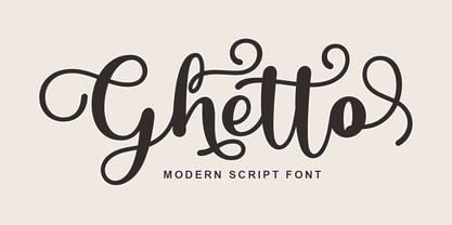 Ghetto is a modern script with handwriting, decorative characters, and dancing baselines! It's very suitable in use like blog headers, t-shirts, and for weddings, social media, product design, stationery, advertising, clothing, book covers, business cards, greeting cards, branding, merchandise, invitations and handmade quotes and more.
 - Colesberg Script by Letrasupply Typefoundry,
$20.00 Inspired by vintage script letters, Colesberg Script comes with layered font styles, alternates characters, swash, and ornaments. Have fun with these fonts, you can make a beautiful decorative type and perfect script for any project such as custom name, logos, quotes, invitation, and more creative project easily.
 - Escaut by Eurotypo,
$26.00 Escaut is a modern calligraphic font, with a casual style and a lot of rhythm. It is designed with a pen with its characteristic ink discharges. Escaut includes a huge variety of ligatures and decorative characters in upper and lower case, to give it more handwriting reality
 - Michael by Tanincreate,
$10.00 Michael Script - a casual handwritten style font with a range of ligatures, opentype stylistic ends, decorative swashes, perfect for any awesome projects that need handwriting taste. Suggested for logos, titles, body texts, branding, invitations and also when used along other fonts with strong and bold styles.
 - Silent Forest by Gassstype,
$27.00 Introducing Silent Forest is a best Terrible Hand Drawn Font that is handwritten brush casually and quickly. Letters are made with brushes on Procreate. Then scanned and carefully drawn into vector format. That is why Silent Forest has charming, authentic and relaxed characteristic more natural look to your text with a more natural look to your text. You can activate Ligature OpenType panel to make these two styles. It also has many alternatives and underlines that make your text and design more interesting. Silent Forest is perfect for homeware designs,branding projects, Logo design, Quotes product packaging.
 - Tequila by BA Graphics,
$45.00 A revival from the past this animated letter will fit right into todays market. With its subtle flair and Latin feeling it will surely give a feeling of pure fun. This style was very popular in the 40s and 50s then it was reborn in the 60s and 70s once again it is coming back and becoming popular again.
 - Rawuh by Product Type,
$18.00 Rawuh is a unique gothic blackletter for your designs. If you want to stand out from the crowd and add a touch of elegance, then this is the font you need. The blackletter style works perfectly for any Gothic themed tattoo, label, packaging, branding or project! use this font right away to make awesome projects happen!
 - 1483 Rotunda Lyon by GLC,
$38.00 Towards the end of the 1400s, in Lyon (France), was living Barthélémy Buyer, descendant of a rich family of merchants. In the end of 1472, he engaged a typographist from Liège (Belgium): Guillaume Le Roy. The first book stemming from their print shop was the Compendium breve ( by Pope Innocent III.) using Blackletter “textura”. Many books followed, most often illustrated with wood carving. In 1483, to print a French translated “Eneide”, they used a venetian “Rotunda” blackletter. Our font was inspired by this “Rotunda” set, with historical forms and ligatures enriched with accented letters and other characters not existing in the original.


