10,000 search results
(0.04 seconds)
- Garcog by Patria Ari,
$24.00 Garcog : The Ultimate Typeface for Mechanical Aesthetics. Inspired by the intricate design of gears and cogs, Garcog features upper shapes cut like precision engineering. This unique font adds a touch of industrial sophistication to your projects, making it the perfect choice for conveying precision, innovation, and mechanical excellence. Ideal for engineering, manufacturing, and tech-related designs, Garcog is the font that propels your message into a new dimension of creativity.
 - Bodyhand by Bodyhand,
$10.00 The main problem with handwritten fonts is the limited use in body text. Bodyhand is specifically designed to remedy this, for example when designing children's books with a larger amount of text or in similar contexts. Bodyhand is especially adapted to read comfortably even when used in small font size and requires approximately the same space as the fonts we usually use in body text, such as Times or Helvetica.
 - Brushin by Mandarin,
$15.00 Brushin is an handwritten display font inspired by the straightforward rigidness of Grotesque sans-serif fonts. It features two stylistic sets for every glyphs in font so it gives you the choice to not repeat the same glyph design in big titles and/or small statements. The font was designed on paper with a brush and then scanned, vectorised through Photoshop and finally compiled in Glyphs as and OTF font file.
 - Hybi11 Amigo by Hybi-Types,
$12.50 You can’t reinvent the wheel When it comes to designing a sans serif, many designers stick closely to existing models. How boring! Others try to demonstrate self-reliance by special stylistic elements – at the cost of readability or aesthetics, or both. I did chose a different way: My Font should just look pretty and friendly, being the good buddy for all days. This is how the name is explained.
 - Thunder Garage by Din Studio,
$25.00 Font is the most significant design element which can be difficult to find the excellent one for a certain design. For that reason, we offer you a solution by combining two fonts into one. With Thunder Garage, finding a perfect font combination is never this easy. Thunder Garage is a duo font combination between brush and sans serif fonts which you use together in one design. Each font is beautifully created to support one another perfectly. Using a duo font gives interesting contrast and visual variations to your designs. The brush font is made similar to a handwriting style with brush details to show you personal, informal impressions. You are free to use this duo font as either one lovely set or as separated parts based on your needs. In addition, enjoy the other features available in this font. Features: Ligatures Multilingual Supports PUA Encoded Numerals and Punctuations Thunder Garage fits best for various design projects, such as brandings, posters, banners, logos, magazine covers, quotes, headings, printed products, merchandise, social media, etc. Find out more ways to use this font by taking a look at the font preview. Thanks for purchasing our fonts. Hopefully, you have a great time using our font. Feel free to contact us anytime for further information or when you have trouble with the font. Thanks a lot and happy designing.
 - Nadella by Abbasy Studio,
$15.00 Nadella Script is beauty combinations of script layered and sans font . It has 7 font on script and 1 sans inside. Both combination are perfect for you to make design more detail. You can express the style on script font, you can add line, shadow, extrude, inline_1, inline_2, or inline_3. Changing the color of the other layer as just easy as change standard color of the fonts but it’s make more detail. with 1 more sans font, and some extras. you no longer need to worry about how to make effect and ornament on the text. This font is suitable for young, passionate design, such as logo design, t-shirts, branding, and various other design purposes.
 - Spirits by Latinotype,
$29.00 Spirits design was initially based on Hermann Ihlenburg's Schoeffer Old Style from the 1912 ATF catalog. Soft is the closest version to the printed original typeface. Neutral, with more formal serifs, is ideal for editorial design, for example newspaper headlines. Sharp, more contemporary, is the best choice for meeting today's design needs. Condensed proportions and large x-height, features found in the original font, make Spirits ideally suited for headlines and branding design. As you would expect from Latinotype, this font comes with a standard character set that supports over 200 languages. Each version includes its own alternates and comes in 4 weights, ranging from Light to Black, resulting in a total of 12 font styles.
 - Jambetica - Personal use only

- Vilonti by Owl king project,
$39.00 Vilonti a new font family from the Owlking project Vilonti designed by ilen nalishawa. a font that carries 20 weights including italics in it. Vilonti inspired by the legendary logo of sports products, so our desire arose to create a font that looks clean, simple, professional, and can be applied more broadly, both for font based logo design needs, or for making paragraphs or sentences. We hope Vilonti can collaborated with your imagination. Let's start desiging. be happy.
 - Inglesa by Sudtipos,
$59.00 In the past, in Argentina, it was common to attend to calligraphy classes during the first years of high school. That experience left a mark on me that over the years mixed up with my practice as a type designer. “Caligrafía Inglesa” is, basically, the spanish translation for the copperplate calligraphic style. This was the initial idea that led the spirit of the project, but from the beginning it started to develop a typographic personality of its own. The new Inglesa font comes in 6 weights –from a skinny monolinear to an elegant black– with a companion set of roman caps. The harmony in both styles transmits as a result, a strong english spirit but with a fresh latin spice, assuring the perfect combination for any elegant design. Inglesa Script includes a vast amount of alternates, endings and swashes, allowing the designers to create infinite combinations making any design unique. The Inglesa family supports a wide range of Latin alphabet-based languages.
 - Solina by Scratch Design,
$14.00 Solina is an exciting typeface that is inspired by the future life which is full of robots, mechanics, speed races, automotive and life in space. References to this font are based on the science-fiction visual of the modern-futurism mindset, making it perfect for any project that requires a futuristic and technologically advanced design. This font is perfect for creating sci-fi movie posters, technology-based branding, packaging, event and festival materials, automotive designs, and many more.
 - Banan by Arabetics,
$39.00 An isolated letters display typeface design which emphasizes the vertical stems and has an overall Arabian tales and oriental look and feel. All letters start with a prominent vertical stem shaped as pirate sword and ends in very narrow stroke. Banan font family has two members, regular and left-slanted italic styles. This font family design follows the guidelines of Mutamathil Taqlidi type style with one glyph for every basic Arabic Unicode character or letter, as defined in the latest Unicode Standards, and one additional final form glyph, for the freely-connecting letters in traditional Arabic cursive text. Banan employs variable x-height values. It includes only the Lam-Alif ligatures. Soft-vowel diacritic marks, harakat, are selectively positioned. Most of them appear by default on the same level, following a letter, to ensure that they would not interfere visually with letters. Tatweel is a zero-width glyph. Keying the tatweel key before Alif-Lam-Lam-Ha will display the Allah ligature. Banan includes both Arabic and Arabic-Indic numerals, in addition to standard punctuations.
 - Nuqat by Arabetics,
$39.00 An isolated letters typeface design with a comic feel. All letters start with a prominent circular dot. All final shape letters end with a smaller dot, in addition. The Nuqat (Arabic for dots) font family has four members which include two weights, normal and bold, and comes in regular and left-slanted italic styles. This font family design follows the guidelines of Mutamathil Taqlidi type style with one glyph for every basic Arabic Unicode character or letter, as defined in the latest Unicode Standards, and one additional final form glyph, for the freely-connecting letters in traditional Arabic cursive text. The Nuqat font family employs variable x-height values. Nuqat includes only Lam-Alif ligatures. Soft-vowel diacritic marks, harakat, are selectively positioned. Most of them appear by default on the same level, following a letter, to ensure that they would not interfere visually with letters. Tatweel is a zero-width glyph. Keying the tatweel key before Alif-Lam-Lam-Ha will display the Allah ligature. Nuqat includes both Arabic and Arabic-Indic numerals, in addition to standard punctuations.
 - Jazzy Roll JNL by Jeff Levine,
$29.00 The 1915 sheet music for the tune "Dancing the Jelly Roll Song" by Nat Vincent and Herman Paley featured the title hand-lettered in a sans serif design strongly influenced by the Art Nouveau movement of the early 20th Century. This formed the basis for Jazzy Roll JNL.
 - H-AND-S by AND,
$89.00 A common creation: (to pass from one hand to the other): For the first time, various hand-signs from diverse sources are unified into one single visual style. This compendium is the result of 15 years of incubation and 7 years of creation. In his travels throughout the world, graphic designer Jean-Benoit Levy, principal of the visual studio AND, has collected pictures of multiple hand signage. Uncertain what to do with those signs, he kept them year after year until the idea came to unify almost 200 handsigns into one single family. In accordance with this entire collection, the name of the typeface is a mix: "h-and-s". A global collection: (To put in good hands): We all have one thing in common: Hand-signs are an international language, they are meant to be understood by all of us. Each of us regularly comes in contact with modern hieroglyphs such as the hand-sign-codes that are so prevalent in our daily life. This way of communication belongs to no one in particular and to all of us in general. Even if the sense of certain signs varies from one culture to the other, there is a common hand-sign language. We are surrounded by this language of handsigns each time we step in a store, we eat, open a container of milk, we clean up, use package of wash-powder, by shaving, when we work, use tools, at home, by tearing the envelope of a condom, by traveling, etc. When we encounter these signs, we all understand them easily. A visual connection: (To go hand in hand): This typeface is a global visual statement. Collecting, ordering, redrawing, unifying. Reconstructed and assembled into one original alphabet, H-AND-S is a unique and complex signs program. Our choice is based on daily gestures and global hand-codes. Logically this typeface starts with the "American Sign Language" and expands on two type-variations, each on two levels of keyboard. The international team of H-AND-S would like to send his special thanks to all of the anonymous graphic designers throughout the world who designed different hand-signage and who influenced and inspired to create such a sign collection into one unified family. We, the global nomad team of AND, hope that you will enjoy our H-AND-S. Additional Credits Production: Studio AND. www.and.ch. Concept, Idea & Creative Direction: Jean-Benoît Lévy, Switzerland / USA. Research & Sketches: Eva Schubert, Germany. Illustration, Graphic Design & Visual Fusion: Diana Stoen, USA. Transfer, Adaptation & Refining: Moonkyung Choi, Korea. Finalization & Checking: Sylvestre Lucia, Switzerland. Coaching & Technical Advice: Mike Kohnke, USA. Creative Energy & Implementation: Joachim Müller-Lancé, Germany / USA.
 - P22 Underground by P22 Type Foundry,
$24.95 Underground Pro expands on the historical design by Edward Johnston, licensed exclusively to P22 from the London Transport Museum. The overall design of Underground Pro is kept as intended by Johnston and remains within his system of proportions. Additional OpenType features, such as Small Caps and Petite Caps, are included in all 6 weights. A Titling option that mimics London Transport signage is offered in the medium weight. The addition of many Unicode ranges for unprecedented language support makes this the most expansive P22 font family ever. Each Pro font weight collectively contains over 5000 glyphs, covering most Latin based languages, with separate Greek (polytonic) and Cyrillic versions. The outlines of the original Regular and Bold have been subtly redrawn and expanded, they are now available as Medium and Heavy respectively.
 - Legan by PeGGO Fonts,
$39.00 Legan, created by PeGGO Fonts, is a typeface with a large number of glyphs. The uppercase letters follow the classical Trajan pattern. It is designed with several geometrical proportions such as root five, divine proportion (Golden Ratio), regular square, and others, just like the Greek Trajan letters used on Trajan’s Column. The major innovation is a lowercase that is designed in accordance with the same Trajan rules. My concern for the global community is reflected by the large number of diacritics I have provided, first on the basic alphabet, then on extended latin languages, as well as ones for Cyrillic and Greek. Because it is OpenType, there are various setup possibilities including traditional ligatures, as well as various alternates. Altogether you will find this a very playful, fashionable, and elegant typeface.
 - PF Champion Script Pro by Parachute,
$125.00 PF Champion Script Pro is perhaps the most advanced and powerful calligraphic family ever made. It received an award for Excellence in Type Design from the International Type Design Competition ‘Modern Cyrillic 2009’ which was held in Moscow. Most recently, it received another award from the 3rd International Eastern Type Design Competition - Granshan Awards 2010. This typeface was first presented in June 2007 at the 3rd International Conference on Typography and Visual Communication (ICTVC) and was met with rave reviews. It is based mainly on the manuscripts of the 18th century English calligrapher Joseph Champion. Developed over a period of two and a half years, each one of the 2 weights is loaded with 4300 glyphs(!), offering simultaneous support for all European languages based on the Latin, Greek and Cyrillic scripts. Furthermore, a wide selection of alternate forms and ligatures is included for all languages, in order to accommodate diverse design aesthetics. These alternates are either applied automatically through an advanced programming scheme, or manually through several OpenType features. An attempt was made to design a contemporary script typeface with classic roots, by following certain guidelines, i.e. lowercase characters were designed so they are less inclined, have a higher x-height and are less condensed than the original. Several characters were stripped-off their connecting lines in order to enhance legibility. Four sets of alternate swashed capitals as well as a plethora of ornaments and frames (117) was included. Small caps and their alternate forms were designed to replace the capitals which disrupt the flow of text within a sentence with their extravagant swashes. All characters were carefully designed with the proper weight in order to sustain harsh printing conditions (on special papers), a situation which affects mainly the light connecting parts of calligraphic typefaces. Finally, it was programmed in such a way as to preserve handwriting qualities, by designing an extensive array of ligatures and alternate glyphs in all languages, never before released or incorporated within the same font.
 - Dulya by Pesotsky Victor,
$15.00 "Dulya" is a weird, funny and irrational font. The design of the letters is based on the handwriting which is usually taught in school but the letters' graphics are geometrically transformed to make them interesting. The font has many alternative characters, so you can very freely control the texture of the text. Dulya supports Basic Latin and Extended Latin, Cyrillic — in total about 90 languages are supported. The font has one Regular weight, alternative characters, Uppercase and lowercase. Dulya font was designed by Viktor Pesotsky.
 - ITC Seven Treasures Ornaments by ITC,
$29.99Akira Kobayashi's ITC Seven Treasures is a symbol font for use in patterns and textures. The interlocking patterns, usually circular or oval, are taken primarily from motifs used in Japanese textiles. Most of these designs are known as komon, or tiny patterns," and they are often applied to kimono and other textiles, although their use is not limited to fabrics. They also appear carved in wood in traditional architecture, and painted in pictures as background patterns. Each of the individual designs in ITC Seven Treasures Ornaments is carefully sized and spaced so that it will fit together into a continuous pattern. Most overlap slightly but precisely, so that when you type a row of them you can't tell where one leaves off and the next begins. They may be combined or alternated to vary the texture of a background pattern." - Matwin by Eyad Al-Samman,
$10.00 The idea behind designing ‘Matwin’ font was related to the youngest children of the designer namely the M-A fraternal twin. The name of the typeface (i.e., Matwin or M-A-Twin) was composed by merging three linguistic small syllables. The ‘-Twin’ syllable refers to the non-identical twin of the designer. The ‘M-’ and ‘A-’ syllables refer to the initial letters of the twin’s first names (i.e., Muhammad and Abdul-Wli) respectively. The typeface ‘Matwin’ has a personal trait which makes it as one of the most favorite fonts for the designer among his humble collection of fonts. Modestly, it is the designer’s handwriting and it has been designed to be added to the script font family known as brush un-joined. The brief process for having this typeface alive was done by firstly scanning the real script for each Latin letter, digit, symbol which were handwritten earlier by the designer himself. Then, the combination of these many scanned characters was manipulated using digital programs to produce at the end the complete typeface. The typeface has the essential glyphs comprising the character set required for most of the Latin, Western, and Eastern European languages including the Irish language. It combines +605 characters and this makes it as a pro font. It also entitles it to be applicable for usage in many languages of different communities and nations worldwide. ‘Matwin’ is dedicated for those who search for a genuine handwriting typeface with a natural touch and informal style to be added on their different published and produced products and services. It is more preferable when it is used in artistic, typographic, and other works using the lowercase letters or by mixing both upper- and lower-case letters. Moreover, the typeface is appropriate for any type of typographic and graphic designs in web, print, and other media such as boards and walls. It is also preferable to be used in the wide fields related to publications especially children-related ones, comics, printed or handwritten menus of cafeterias and restaurants at universities and public places, as well as other prints related to services and production industries. It also can create a very personal and friendly impact when used in headlines, books and novels’ covers, posters, titles, messages, envelopes addresses, grocery lists, postcards, ads, fliers, journals, paper arts, public notices, invitations, scrapbooks, notations, products’ surfaces for organic foods and juices, logos, medical packages related to children, Android applications, as well as products and corporates branding and the like. In a nutshell, ‘Matwin’ typeface fits without a glitch those (i.e., designers, typographers, publishers, artists, packagers, service providers, and so on) who have drastic and strong tendency towards imprinting their works with spontaneous and outlandish touches made by this typeface. Please, enjoy it extremely.
 - Crazy Rooster by Sipanji21,
$16.00 Crazy Rooster is a Strong and rounded display font with a graffiti-like appearance. Use this font for any crafting project, apparel design, logotype, advertising, wall decoration, and pretty much anything that requires a personalized look. Take your designs to the next level with this stunning font!
 - Fd Artheria Script by Fortunes Co,
$23.00 Artheria is a script font with a classic vintage style. The classic style of this font is suitable for retro/vintage-themed designs but can also be used for designs with other styles. This font is equipped with 130+ stylistic sets, Ligatures, and multi-language support.
 - Gowes by Twinletter,
$15.00 We designed Gowes, a graffiti-themed display font, for your bold, forceful, and speedy projects. This font was created as a supporting element for your limitless creativity. If you use this typeface, your project will have a unique and distinctive design. Your visual presentation will pique the interest of your audience. If you utilize this typeface, all of your creations will be of good quality. This graffiti font is great for product logos, poster titles, headlines, packaging, film titles, logotypes, gorgeous writing, and trendy graffiti designs, among other things. Of course, if you utilize this font in your numerous creative projects, they will be perfect and outstanding. Use this typeface right away for your one-of-a-kind and remarkable projects.
 - Stgotic by Latinotype,
$10.00 Stgotic, designed in 2006, was the first digital font designed by Daniel Hernández. It is a blackletter typeface designed for low resolution screen devices. Stgotic was designed to be seen at 8 pts (and multiples of 8). In the year 2006, it was recognized as the best screen font by the TipoGráfica magazine in the context of the Bienal de Letras Latinas.
 - Kiperman by Harbor Type,
$29.00 🏆 Selected for Tipos Latinos 9. 🏆 Selected for the 13th Biennial of Brazilian Graphic Design. 🏆 Hiii Typography 2018 Merit Award. Kiperman is a text typeface designed in honor of Henrique Leão Kiperman, founder of the publishing house Artmed, now Grupo A. Its forms are simple and straightforward, with no unnecessary embellishments that could disturb the reading. The fonts are slightly narrower than normal, which yields higher efficiency without compromising reading comfort. Besides that, its italics are not just a slanted version of the romans, but rather a separate drawing. With a slope of 8°, its calligraphic structure provides the right amount of emphasis when necessary. The Kiperman typeface works best when setting books, magazines, ebooks and websites. It will also work very well in branding and packaging projects where a sober typeface is needed. The inspiration for the design came from the personality of the honoree. Just as Henrique always wanted to stay away from spotlights, the Kiperman typeface was designed so that it would not call attention to itself or impose any obstacles in the understanding of the text. In this way, the fonts revere Henrique’s legacy by respecting and honoring the published content. Henrique Leão Kiperman began his career in 1958, selling medical books in travels through the interior of the Brazilian states of Paraná and Santa Catarina. In 1973, he opened a bookstore in downtown Porto Alegre, the Artes Médicas Sul, and a few years later edited his first book. Since then, his company has grown to become one of the most important publishers in Brazil in the area of scientific, technical and professional books, with more than 2400 active titles distributed among the McGraw Hill, Bookman, Artmed, Penso and Artes Médicas imprints. Henrique passed away in 2017 at the age of 79. The Kiperman type family has been commissioned by Grupo A and is available for licensing. This was the way found for the fonts to be read by more people, spreading some of his spirit around the world.
 - Merside by Putracetol,
$28.00 Merside - Premium Serif Font Merside - Premium Serif Font is a stunning typeface that exudes sophistication and elegance. The font's clean and crisp lines make it a versatile choice for various design projects, from high-end branding to classic book covers and posters. The font was crafted with the utmost care and attention to detail, resulting in a timeless typeface that will elevate any design. Merside - Premium Serif Font is the perfect choice for designers who want to convey a sense of luxury and exclusivity in their work. The font's classic serif style adds a touch of refinement, while the clean lines give it a modern twist. Whether you are designing a logo for a luxury brand, creating marketing materials for a high-end fashion label, or designing a product packaging, Merside will add a touch of elegance and sophistication to your project. One of the standout features of Merside - Premium Serif Font is its OpenType features, which include alternates and ligatures. These features give designers more creative freedom, allowing them to customize the font and create unique and eye-catching designs. The font also includes uppercase and lowercase letters, as well as number, punctuation, and symbol glyphs. Additionally, Merside supports multiple languages, making it an excellent choice for global brands. The font is compatible with a wide range of design software and platforms. You can easily install and use Merside - Premium Serif Font on your computer or device, making it a convenient and accessible choice for designers. If you are looking for a premium serif font that will make your design stand out, Merside - Premium Serif Font is an excellent choice. With its elegant and refined style, it is perfect for creating luxury branding, elegant design, and high-end fashion. This font will give your project a timeless and classic look that will never go out of style. In summary, Merside - Premium Serif Font is a stunning and versatile font that is perfect for designers who want to create high-end and sophisticated designs. With its classic serif style, OpenType features, and multilanguage support, it is a font that will elevate any design project.
 - Quinter by Picatype,
$15.00 Quinter is inspired by the writing on the vintage beer labels from the good old days, but still has a strong modern appearance. It come with 2 types of styles. Each combination has been carefully crafted to make your design look better. Ideal for product names, packages, labels, old-fashioned coffee shops, bars and everything with special characteristics in the past. This combination allows you to easily build beautiful vintage designs in a short amount of time. To enable the OpenType Stylistic alternates, you need a program that supports OpenType features such as Adobe Illustrator CS, Adobe Indesign & CorelDraw X6-X7, Microsoft Word 2010 or later versions. We hope you enjoy the font, please feel free to comment if you have any thoughts or feedback. Or simply send me a PM or email me at picatypestudio@gmail.com. Thanks for purchasing and have fun!
 - Hollie Mally by Good Java Studio,
$500.00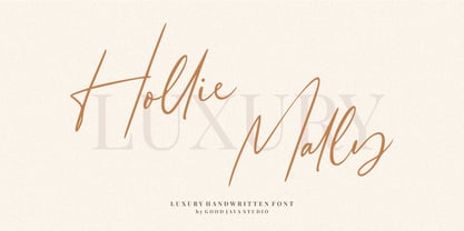 Hollie Mally handwritten font is a natural & modern script font. It's perfect for logos, invitations, stationery, wedding designs, social media posts, advertisements, product packaging, product designs, label, photography, watermark, special events or anything. This font includes ligatures and Multilingual support. What are the advantages of Hollie Mally? - Very simple installation - PUA Encoded open - Very great for branding, logotype, handlettering, invitations, or fashion branding. - Multilingual Support - Support for Adobe Illustrator, Corel Draw, Indesign or Adobe Photoshop - Support for MAC or WINDOWS
 - Poliphilus by Monotype,
$29.99Poliphilus is a facsimile of the text of the 'Hypnerotomachia Poliphili', after which it is named, published by Aldus Manutius in Venice in 1499, using a type that had been cut by Francesco Griffo. As a design, Poliphilus is related to Bembo, but whereas Bembo was redrawn, with the intention of making a new face based on an old design, Poliphilus is an exact copy of fifteenth century printing on hand made paper. So exact in fact that even the original ink spread is reproduced. This may not seem like a very sound idea for a typeface, but the letterforms are good and the design is functionally successful. Blado, the italic for use with Poliphilus, was used by Antonio Blado in 1539, and designed by the calligrapher Ludovico degli Arrighi. The Poliphilus type is used mainly for book and text work." - Antum by Rotterlab Studio,
$10.00 Antum is a vintage bold script font that is heavily inspired by vintage and retro modern styles All characters have imperfect shapes which give a natural look in the design. These easily work together and are perfect for creating traditional style logos, labels, package designs, lettering for t-shirts and more. Feature : Uppercase + Lowercase Number + Punctuation OpenType Features Multilingual support Multilingual support It also includes a clean version without textures. OpenType features (ligatures and alternatives) help make your writing more interesting. There is also an alternative swash This font has a vintage feel with a stylish stamp on each letter. great for Logotype, Branding Design, Vintage Logo Design, Digital Lettering Art, Retro, brush fonts, script fonts, bold scripts, Vintage fonts and any vintage design needs. Software to use this font: Adobe Illustrator, Adobe Photoshop, Adobe Indesign, Word, Corel draw, inkscape). Cheers! Thank You
 - Goudy Type by Matteson Typographics,
$19.95 Goudy Type was designed by Frederic Goudy for ATF in 1916. He endeavored to create a lively design with some brush-lettering qualities. In his words, he believed he was still attempting to ‘find himself’ as a designer. Thirty years later he was shown the design and could hardly recollect its creation. Steve Matteson has digitized Goudy Type to preserve its place in typographic history.
 - Evening Paper JNL by Jeff Levine,
$29.00 Evening Paper JNL, one could say, was "culled from the headlines". It was. The front page headlines from some 1938 newspapers archived online were the basic model for this font. The typeface design goes back to a font first issued by Ludlow in the 1920s.
 - HWT Catchwords by Hamilton Wood Type Collection,
$24.95 Catchwords have always been offered alongside standard alphabets in wood type catalogs and so often appear on posters as a decorative punch that they have become part of the wood type vernacular. Words like 'The', 'And', 'To', 'For', and less common abbreviations could be inserted into a design along with decorative ornaments or stars when space was tight or to add variety in the design. HWT Catchwords features over 80 words based directly on designs offered by Hamilton and other wood type manufacturers of the 19th and early 20th Century.
 - Prosaic Std by Typofonderie,
$59.00 A Postmodern vernacular sanserif in 8 fonts Prosaic designed by Aurélien Vret is a Postmodern typographic tribute to the french vernacular signs created by local producers in order to directly market their products visible along the roads. These signs drawn with a brush on artisanal billboards do not respect any typographic rules. The construction of these letterforms is hybrid and does not respect any ductus. Nevertheless the use of certain tools provokes a certain mechanism in the development of letter shapes. It’s after many experiments with a flat brush, that’s these letterforms have been reconstructed and perfected by Aurélien Vret. This is the starting point for the development of an easily reproducible sanserif with different contemporary writing tools. From non-typographical references of Prosaic towards readability innovation The influence of the tool is revealed in the letterforms: angular counterforms contrasting to the smoothed external shapes. This formal contrast gives to Prosaic a good legibility in small sizes. These internal angles indirectly influenced by the tool, open the counterforms. In the past, to deal with phototype limitations in typeface production, some foundries modified the final design by adding ink traps. In our high resolution digital world, these ink traps — now fashionable among some designers — have little or no effect when literally added to any design. Should one see in it a tribute to the previous limitations? Difficult to say. Meanwhile, there are typeface designers such as Ladislas Mandel, Roger Excoffon, and Gerard Unger who have long tried to push the limits of readability by opening the counters of their typefaces. Whatever the technology, such design research for a large counters have a positive impact on visual perception of typefaces in a small body text. The innovative design of counter-forms of the Prosaic appears in this second approach. Itself reinforced by an exaggerated x-height as if attempting to go beyond the formal limits of the Latin typography. It is interesting to note how the analysis of a non-typographical letters process has led to the development of a new typographic concept by improving legibility in small sizes. Disconnected to typical typographic roots in its elaboration, Prosaic is somewhat unclassifiable. The formal result could easily be described as a sturdy Postmodern humanistic sanserif! Humanistic sanserif because of its open endings. Sturdy because of its monumental x-height, featuring a “finish” mixing structured endings details. The visual interplay of angles and roundness produces a design without concessions. Finally, Prosaic is Postmodern in the sense it is a skeptical interpretation of vernacular sign paintings. Starting from a reconstruction of them in order to re-structure new forms with the objective of designing a new typeface. Referring to typographic analogy, the Prosaic Black is comparable to the Antique Olive Nord, while the thinner versions can refer to Frutiger or some versions of the Ladislas Mandel typefaces intended for telephone directories. Prosaic, a Postmodern vernacular sanserif Prosaic is radical, because it comes from a long artistic reflection of its designer, Aurélien Vret, as well a multidisciplinary artist. The Prosaic is also a dual tone typeface because it helps to serve the readability in very small sizes and brings a sturdy typographic power to large sizes. Prosaic, a Postmodern vernacular sanserif
 - PF Das Grotesk Pro by Parachute,
$79.00 Das Grotesk was inspired by earlier nineteenth-century grotesques, but it is much more related to American gothic designs such as those by M.F. Benton. Due to their pure geometric structure, most grotesque typefaces tend to have a rather monotonous and lifeless appearance, thus failing to express the ideals of the modern creed. Das Grotesk on the other hand is a lively design with several distinguishable characteristics which attract attention when set at large sizes, whilst they become subtle and blend evenly at small sizes, fostering a neutral identity. This is a very legible and space-saving typeface with a narrow structure. It was designed with slanted curved ends and sheared terminals applied on several straight strokes. It has two-storey ‘a’ and ‘g’ but includes single-storey alternates. The family consists of 14 weights ranging from Extra Thin to Black (including true-italics). It provides simultaneous support for Latin, Cyrillic and Greek and is loaded with several advanced typographic features such as small caps. Download its complehensive PDF Specimen Manual for further details.
 - Chunky Beard by IKIIKOWRK,
$17.00 Proudly present Chunky Beard - Retro Type, created by ikiiko. Chunky Beard is a vintage font with bold, rounded letterforms with vintage vibes from the 60's era. These fonts often have heavy, wide strokes and lack clear borders, giving them a warm and inviting appeal. Rounded edges, exaggerated curves, and exaggerated serifs are some of the characteristics of 60s vintage-type typography. Additionally, they often have very constant stroke weight across letters, further accentuating their distinctive appearance. From posters and flyers to logos and branding materials, bold typography with a vintage '60s feel is a great way to add a dash of retro charm to any design project. The font it self is grab people's attention with their vibrant, fun, vintage appeal and undeniable aesthetic. This kind is ideal for projects that seek to convey a sense of nostalgia and the retro vibes as well as retro-themed designs. As a movie title, corporate logo, quote, poster design, magazine layout, or just as a chic text overlay to any background image. What's Included? Uppercase & Lowercase Numbers & Punctuation Multilingual Support Works on PC & Mac
 - Esca by Monotype,
$50.99 Esca is a display typeface designed by Jim Ford with highly compressed proportions yet with a subtle calligraphic touch. This Lite version of the typeface was designed as part of a font marathon over the course of 3.5 days in Monotype’s NY office. The design started with the aim of fitting 4 letters onto one sheet of paper and the resulting typeface keeps that tight proportion. The Esca design is mixed case and is ideally suited for logos, short headlines, and album covers. It has a great architectural feel to it that makes it suitable in signage applications and large scale settings. Monotype is proud to support Room to Read’s work in literacy and girls’ education through our font marathon initiative.
 - Repath by Nathatype,
$29.00 Ready to slay your design with a epic font? Get it now. Repath is a awesome serif font. This font expresses a heart desire for strong and sophistication design overall. The weight of the font brings strength to any title or header you apply to it, On the other hand, the curves of the letters and numbers convey sense of elegance. As our commitment to support your brand globally recognized, we always come with multilingual options. Features: Alternates Ligatures Uppercase and lowercase PUA Encoded Numerals and Punctuation It can be used for branding, logos, social media quotes, stickers, posters, vintage designs, wall art, merchandise, social media, and many more. Get more inspiration by seeing the preview. Thank you for purchasing premium fonts from Din Studio! Happy Designing!
 - TF Gaelic by Fontdation,
$20.00 Introducing TF Gaelic, a vintage serif that heavily inluenced by the form of Gaelic letters. We incorporate some twist on the letters to keep this font relevant to todays designing needs.
