10,000 search results
(0.102 seconds)
- Al Ghazalia by Nathatype,
$29.00 Al-Ghazalia is an exquisite font meticulously crafted to capture the essence of Arabic calligraphy. Al-Ghazalia is not just a font; it's a bridge between tradition and modernity. The characters in Al-Ghazalia embrace the rich tradition of Arabic lettering, featuring graceful, curvaceous lines and a stunning high-contrast design. Each letter is thoughtfully shaped, exhibiting the intricate beauty of Arabic calligraphy while adding a contemporary touch. In addition, you can also enjoy the features here. Features: Alternates Swashes Multilingual Supports PUA Encoded Numerals and Punctuations Al-Ghazalia fits in headlines, logos, posters, flyers, branding materials, greeting cards, print media, editorial layouts, and many more designs. Find out more ways to use this font by taking a look at the font preview. Thanks for purchasing our fonts. Hopefully, you have a great time using our font. Feel free to contact us anytime for further information or when you have trouble with the font. Thanks a lot and happy designing.
 - Caplosy by Craft Supply Co,
$20.00 Caplosy – Trippy Font is a font that transcends the boundaries of conventional typography, drawing inspiration from the mesmerizing world of psychedelia. Its letterforms twist and twirl in a captivating dance, inviting you to explore a typographic realm that’s equal parts strange and spellbinding. This font is your passport to the extraordinary, a choice that says “ordinary” is simply not an option. Whether you’re designing album covers, posters, or any creative endeavor that craves a mind-bending twist, Caplosy adds a touch of mystique and magic. Its unconventional, serpentine design transports viewers into a realm of altered perception, where the typography itself becomes a hypnotic journey. Caplosy is like a wormhole into a trippy, surreal dimension within the world of fonts. It’s the ideal choice for projects that want to challenge reality, creating a visually tantalizing, thought-provoking experience that’s nothing short of an artistic adventure. Choose Caplosy when you’re ready to take your design on a mind-bending trip through the extraordinary.
 - Mica Valo by Jolicia Type,
$19.00 Mica Valo is a sophisticated serif font that exudes timeless elegance and refinement. Its graceful curves and meticulous detailing make it the perfect choice for projects that demand a touch of class. The inspiration for Mica Valo is drawn from the seamless marriage of classic serif aesthetics and a modern sensibility. The result is a font that transcends time, adding a touch of grace and poise to any visual composition. What sets Mica Valo apart is its Alternate version, which introduces a unique twist to the classic serif style. The alternates offer a subtle variation in letterforms, providing designers with the flexibility to experiment and create distinct, personalized looks. This feature makes Mica Valo an ideal choice for branding, editorial design, and other creative projects where a touch of individuality is desired. Incorporate Mica Valo into your creative toolkit and let its elegant vibes and alternate options elevate your designs to new heights, leaving a lasting impression on your audience.
 - Academica by Storm Type Foundry,
$44.00 Josef Týfa first published the Academia typeface in 1967-68. It was the winning design from competition aimed at new typeface for scientific texts, announced by Grafotechna. It was cut and cast in metal in 1968 in 8 and 10 point sizes of plain, italic and semi-bold designs. In 2003 Josef Týfa with František Štorm began to work on its digital version. During 2004 Týfa approved certain differences from the original drawings in order to bring more original and timeless feeling to this successful typeface. Vertical stem outlines are no more straight, but softly slendered in the middle, italics were quietened, uppercase proportions brought closer to antique principle. Light and Black designs served (as usual) as starting points for interpolation of remainig weights. The new name Academica distinguishes the present digital transcription from the original idea. It comprises Týfa’s rational concept for scientific application with versatility to other genres of literature.
 - Phrasa by Arrière-garde,
$12.00 Phrasa is a robust humanist sans-serif typeface family which will carry you through most of your design needs. Designed for legibility, she truly shines in running text. However her solid (yet elegant) construction allows for usage in such settings as branding or signage. Phrasa's most prominent features are: 13 weights, from hairline to black Moderate x-height Large apertures Modern capitals proportions Designed for readability… … without sacrificing good looks True Italics Small capitals Adobe Latin 3 language range Cyrillic alphabet Old-style and tabular figures The idea behind Phrasa was to create a stylish typeface but with legibility in mind. The inspiration came from history, namely from two of the most legible typefaces known: Garamond and Gill Sans. The new typeface boasts a smooth, easy-on-the-eyes texture which allows the reader to simply sink into the text. It also posses a set of true italics to compliment it. Phrasa has a broad linguistic range, spanning from extended latin alphabet to cyrillic.
 - Capitolina by Typefolio,
$39.00 Capitolina is a family of 10 typefaces with a contemporary design style, based on different historical models. The original shape of serifs was a reference to 19th century’s Clarendon types though this inspiration remains as a subtle feature of the final design. Even subtler are the calligraphic influences, better noticed in the italics. The result is a set of typefaces that look more ‘constructed’ than ‘written’, referring to a rationalist style. However, it has a distinct approach to the aesthetic treatment of typographic forms that resembles the humanist tradition. Available in five weights of roman and italic types, Capitolina has a wide glyph palette that contains 800 glyphs in each font. Besides supporting basic Latin, western, central, and southeastern European sets, it has several OpenType features, such as case-sensitive forms, small capitals, ligatures, localized forms, number forms, fractions and more. Capitolina is, therefore, a great choice for projects in editorial design and other related applications.
 - Murisa Barbara by Murisa Studio,
$10.00 This time we present to you our newest font. Barbara is one of our proud fonts. Barbara is designed with the inspiration of a woman's beauty. Barbara was born with stunning elegance. You can use this font for your daily needs, such as writing a message, quote words, or the name of the recipient of your invitation. You can of course also use this font in your products. Barbara will perfect your product. Elegance, cheerfulness, beauty will be the main attraction for your product. Get it right now.
 - P22 Nebiornaments by IHOF,
$24.95 P22 Nebiornaments contains over 100 ornaments based on the Italian Nebiolo Type Foundry designs of the 1950s. Many of these ornaments are designed to create complex patterns and continuous borders. The simple geometric shapes allow for endless combinations for a wide variety of uses.
 - F2F MadZine by Linotype,
$29.99Inspired by the Techno sound of the 1990s, Alexander Branczyk designed a series of new, wild and controversial fonts which mark a complete departure from typographic traditions. MadZine font is part of the Face2Face package, together with 7 other fonts from young and unconventional designers. - Parenting JNL by Jeff Levine,
$29.00 Parenting JNL is a stylized Art Deco sans serif type design originally found on a vintage WPA (Works Progress Administration) poster designed by the Federal Art Project and touting the topic of "The Job of Being a Parent". Available in regular and oblique versions.
 - Really Gold by Yumna Type,
$12.00 If you have a dream to create an awesome designs or projects? Whatever your project it is-then we've got what you want. Really Gold, the gold combination between script and uppercase display font. The display font is fun, playful, readable and has a youthful touch that make it up to date while the script shows the simple but yet elegant style. As extras you will get 15 illustrations to maximize your design. Features: Ligatures Stylistic Sets Swashes Multilingual Supports Uppercase and lowercase PUA Encoded Numerals and Punctuation It is best to be apply on your branding, logos, social media quotes, stickers, posters, wall art, merchandise, social media, and many more. Get more inspiration about how to use it by seeing the font preview. Thank you for purchasing our fonts. If you have any further questions, don't hesitate to contact us. Happy Designing.
 - Montarsi by insigne,
$32.00 Montarsi is a typeface designed by Jeremy Dooley, inspired by Arabic calligraphy and contemporary design trends. The letters are fluid and graceful, inspired by the curves and swirls of Arabic script. Montarsi is a bold, contemporary calligraphic face with broad strokes and high contrast. It has a variety of styles and weights to give you an extensive range of design options. This font family, which includes eight weights, is ideal for producing brief texts for editorial, fashion, branding, magazine, television, window displays, and other media applications. Small caps, old-style figures, and width variations are also included. It's ideal for writing brief sentences because of the increased x-height. Montarsi is a classic spirit reinvented in a modern language, influenced by the delicate curves of letters and the way ink glides across paper. We especially thank Lucas Azevedo and ikern.
 - Mourich by Arterfak Project,
$15.00 Mourich comes in 2 styles and is recommended for use with stylish and minimalist design. It is carefully designed with medium contrast of the strokes. This font is an all-caps font or has small capitals that very useful for the headline or logo, and is suitable in large or small sizes. Mourich has 500+ glyphs with many OpenType features. There are beautiful ligatures, stylistic alternates, and swashes which you can use it to get your design more softly. Mourich Bold is has 20pt thick from the regular style. The rounded serif gives a strong and assertive look. Beautiful to use as standalone type or combine with regular style. Very much recommended for headlines. Mourich Regular has a minimalist adjustment with more relieved of negative space that awesome to apply in many media. Also useful in the body text or editorial purposes.
 - Sabana by fragTYPE,
$20.00 Sabana is my first step in font design. A font that is born from the organic, from a creative process that starts from improvisation as a result of my training as an artist. To design Sabana I asked myself the question, why not make a font that emulates my own writing? as I found it fun to see my handwriting on a computer. This font can be used in a wide range of projects such as editorial design, motion graphics, web, advertising and branding where emulating handwriting is a necessity. The font has coverage for more than 200 languages ??derived of the latin alphabet in addition to Cyrillic. Sabana is where I come from, where I am from, a constant on the horizon that is occasionally interrupted by vertical lines and that together make a perfect visual symphony.
 - Excited Alphabets by Harald Geisler,
$50.00 Excited-Alphabets is a lowercase display font. The letterform is sans-serif with a few appendages to give the letters a life-like and cheerful form. Also, each Letter has two poses (i.e. s and S) which makes it easy to design the perfect headline, characters can also be chosen individually from the glyphs menu to get a unique look. Its dynamic or ‘dancing’ look makes it perfect for (short) editorial headlines, celebratory lines, fun branding, social media posts, website headers, posters, ads, products, stationery designs and more. Excited alphabets was born in Frankfurt (Germany) when two ‘almost-neighbours’ met at a coffee shop. Inspired by the illustration of Sumbo Pinheiro, Excited was designed by Harald Geisler and Sumbo Pinheiro. From quirky illustration to font, this was a fun project to work on because each alphabet comes with its own sassy character.
 - Lubaline by Lián Types,
$39.00 Who haven't heard the phrase that ‘any past time was better’?. Although I sometimes find this phrase a little too pessimistic (because I try to think that the best is yet to come), it may be true regarding my passion, typography. I'm too young (29) unfortunately, and this means I did not have the pleasure of being contemporary with maybe the man who has influenced my work the most (1). The man that showed that letters are more than just letters to be read. Herb Lubalin (1918-1981), also called sometimes as ‘the rule basher’ (2), smashed the taboos and sacred rules of type design and gave it personality. He rejected the functionalist philosophy of europeans in favor of an eclectic and exuberant style. To him, letters were not merely vessels of form, they were objects of meaning. (3). Nowadays, when looking at his portfolio, who dares to deny that the term ‘typography’ and ‘beauty’ may go hand-in-hand without any problem? Ed Benguiat, one of Herb’s partners, still likes making jokes with the phrase “screw legibility, type should be beautiful” and what I understand of this is not to forget the rules, but to know and break them carefully. In an era of pure eclecticism, we, the lovers of flourishes and swashes, can't do nothing but admire all the legacy that Lubalin, this wonderful type-guru, left. My font Lubaline read as “the line of Lubalin” is my humble tribute to him. Those who know his work, may see the influences easily like in his ‘Beards’ (1976) and ‘The Sound of Music’ (1965) posters; the art-deco forms in many of his amazing logos and practically in all his creations where letters seem to be alive just like you and me. I really hope that the future finds me still learning more and more about type-design and letterforms, and like him, always willing to make innovations in my field: Because letters are not just letters to be read. NOTES (1) These are some of my fonts in which some of Lubalin’s influences can be seen (in order of creation): Reina, Aire, Erotica, String, Beatle, Heroe, Selfie, Model, Seventies, and many others that are still in progress. (2) (3) Steven Heller. Herb Lubalin: Rule Basher. U&lc (1998) http://www.printmag.com/imprint/my-favorite-lubalin/
 - Leal by VP Creative Shop,
$14.00 Introducing Leal serif typeface - regular and italic fonts Leal is long and retro typeface loaded with 2 fonts, alternate glyphs and multilingual support. It's a very versatile font that works great in large and small sizes. This font is perfect for branding projects, home-ware designs, product packaging, magazine headers - or simply as a stylish text overlay to any background image. FEATURES Uppercase, lowercase, numeral, punctuation & Symbol regular italic alternate glyphs Multilingual support No special software is required to type out the standard characters of the Typeface. Canva friendly How to access alternate glyphs? To access alternate glyphs in Adobe InDesign or Illustrator, choose Window Type & Tables Glyphs In Photoshop, choose Window Glyphs. In the panel that opens, click the Show menu and choose Alternates for Selection. Double-click an alternate's thumbnail to swap them out. Feel free to contact me if you have any questions! Mock ups and backgrounds used are not included. Thank you! Enjoy!
 - Arcadian by VP Creative Shop,
$12.00 Introducing Arcadian - elegant serif typeface Arcadian is fragile and elegant typeface with alternate glyphs and multilingual support. It's a very versatile font that works great in large and small sizes. This font is perfect for branding projects, home-ware designs, product packaging, magazine headers - or simply as a stylish text overlay to any background image. FEATURES Uppercase, lowercase, numeral, punctuation & Symbol regular and italic alternate glyphs Multilingual support No special software is required to type out the standard characters of the Typeface. Canva friendly How to access alternate glyphs? To access alternate glyphs in Adobe InDesign or Illustrator, choose Window Type & Tables Glyphs In Photoshop, choose Window Glyphs. In the panel that opens, click the Show menu and choose Alternates for Selection. Double-click an alternate's thumbnail to swap them out. Feel free to contact me if you have any questions! Mock ups and backgrounds used are not included. Thank you! Enjoy!
 - Nafiri by HandletterYean,
$17.00 Every customer loves to see something unique, beautiful, exciting, and elegant, right? Don't be confused to find an interesting font that attracts their attention, we have a special font named Nafiri. Nafiri is a beautiful and attractive font that represents the excitement of Christmas and Winter holiday. Titling, swashes, alternates, & underline of this font makes your design unique and stand out. Nafiri was designed to have a simple look without losing its elegance and uniqueness. This font shows that you have a modern spirit on high-quality products and services. Features of this font give an artistic touch to your work. It is also applicable to any use like business logo, branding, wedding invitation, and anything you want. Check out our font collection for more great and artistic fonts. Pick your most favorite font and use it as you like to reach your goals. What’s included: 1. Nafiri font file 2. This font completed with: standard glyph, stylistic alternate, titling, swash, stylistic set 01-08 3. Works both on Mac & PC 4. Simple installation 5. Accessible in the Adobe Illustrator, Adobe Photoshop, Adobe InDesign, and CorelDraw 6. Support multilingual; ä ö ü Ä Ö Ü ß ¿ ¡ To access the alternate glyphs, you need a program that supports openType features such as Adobe Illustrator CS, Adobe Photoshop CC, Adobe Indesign and CorelDraw. More information about how to access alternate glyphs, check out this link ( goo.gl/ZT7PqK )
 - FS Pimlico by Fontsmith,
$80.00 Born in the 70s Personal influences are unavoidable in type design and usually find their way through into finished fonts. At Fontsmith, one period in particular provides inspiration, according to FS Pimlico designer, Fernando Mello. “Jason and Phil have always known that I’m very into the visual language of the 70s. I know that Jason shares my love of the 70s and Phil will sometimes admit to being a fan, too. I think that’s the reason they were both so supportive in the development of this font. “And, of course, we all share an interest in good-humoured and intelligent design. We like to think it’s a Fontsmith characteristic.” Back from black FS Pimlico started in an unusual place: with a tubby, penguin-like lowercase “a” that Fernando Mello had been sketching. From “a” grew the rest of the alphabet – a bubbly, fat, friendly family with a brush-written quality that became FS Pimlico Black. The black weight certainly isn’t the normal starting point for creating a regular and bold weight, but Fernando pressed on, driven by a glut of influences: brush-writing; Letraset and early digital systems catalogues; the type of Herb Lubalin and Tony di Spigna; 70s clothes and vinyl; and 70s revival disco nights in London’s Pimlico and Vauxhall. Natural or flourished Not often do fonts come along that seem to span the ages. FS Pimlico is at home in an office environment providing a fresh clear identity in communications or providing text that’s clear and easy to read. But it likes to party, too, 70s style. With the OpenType features switched on, a designer can totally change the look of their work, and create point-of-sale, headlines and titles that stand out and get noticed.
 - FS Pimlico Variable by Fontsmith,
$249.99Born in the 70s Personal influences are unavoidable in type design and usually find their way through into finished fonts. At Fontsmith, one period in particular provides inspiration, according to FS Pimlico designer, Fernando Mello. “Jason and Phil have always known that I’m very into the visual language of the 70s. I know that Jason shares my love of the 70s and Phil will sometimes admit to being a fan, too. I think that’s the reason they were both so supportive in the development of this font. “And, of course, we all share an interest in good-humoured and intelligent design. We like to think it’s a Fontsmith characteristic.” Back from black FS Pimlico started in an unusual place: with a tubby, penguin-like lowercase “a” that Fernando Mello had been sketching. From “a” grew the rest of the alphabet – a bubbly, fat, friendly family with a brush-written quality that became FS Pimlico Black. The black weight certainly isn’t the normal starting point for creating a regular and bold weight, but Fernando pressed on, driven by a glut of influences: brush-writing; Letraset and early digital systems catalogues; the type of Herb Lubalin and Tony di Spigna; 70s clothes and vinyl; and 70s revival disco nights in London’s Pimlico and Vauxhall. Natural or flourished Not often do fonts come along that seem to span the ages. FS Pimlico is at home in an office environment providing a fresh clear identity in communications or providing text that’s clear and easy to read. But it likes to party, too, 70s style. With the OpenType features switched on, a designer can totally change the look of their work, and create point-of-sale, headlines and titles that stand out and get noticed. - Taca by Rúben R Dias,
$42.00 Taca is a typeface built around a shape that Portuguese designer Rúben R Dias calls a “squircle” — neither square nor circle. We usually associate the rounded, convex box with the television screens of the 1960s and Aldo Novarese’s classic typeface, Eurostile. But whereas Eurostile is cold and machined, Taca is warm and rugged, as if it was molded from clay or carved from stone. Taca’s organic nature is also derived from another unique feature: rounded crotches at the right angles where perpendicular strokes meet. This subtle finish, along with blunt stroke endings, softens the otherwise rigid skeleton. With such a strong conceptual vision, Taca could be relegated to the bin of experimental designs, severely limited in their application. But that fate is usually born of a less experienced maker. As a teacher, designer, and letterpress printer, Dias is a type user, keenly aware of the functional requirements of good type. Taca is therefore not a slave to its concept, but a working font family, effective in various sizes and environments. Its lettershapes break away from the base shape whenever it makes sense for legibility, while still maintaining the flavor of the design as a whole. That said, a set of squircle-shaped alternates give the user the flexibility to get more stylized if the situation calls for it. Fitting to its functional aims, Taca has many of the features one expects of a proper text font: upper and lowercase figures, case-sensitive punctuation, and Extended Latin language support. The simplicity, openness, and squareness of Taca’s forms also make it an ideal design for the pixel grid of screen displays.
 - Alaskan Malamute by Letterara,
$12.00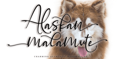 Alaskan Malamute is charming authentic handwriting font. This is a beautiful combination of timeless elegance and authentic calligraphy. Alaskan Malamute is the perfect font for making original and outstanding designs. This font is PUA encoded which means you can access all of the cute glyphs and swashes with ease! It also features a wealth of special features including alternate glyphs and ligatures.
 - Kaprice NF by Nick's Fonts,
$10.00This unusual sans typeface was inspired by a serif face called Faust, designed by Albert Kapr for the Institut für Buchgestaltung in 1959. Its mix of medieval, Jugenstil and Bauhaus influences makes it an intriguing choice for your next project. Both versions of this font include the Unicode Latin 1252 and 1250 Central European character sets, with localization for Moldovan and Romanian. - Ultimate Battle by Letterara,
$12.00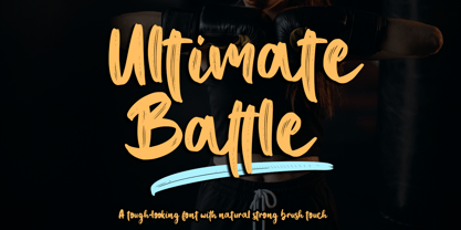 Ultimate Battle is a stylish and incredibly natural elegant handwritten font. This font was particularly crafted for those who need a strong and looks like a natural brush to their designs. Add it confidently to your projects, and you will love the results. This font is PUA encoded which means you can access all of the glyphs and swashes with ease!
 - Turista Gorda NF by Nick's Fonts,
$10.00Here’s another offering from the Baltimore Type Foundry, originally called Airport Tourist, which was obviously influenced by Paul Renner’s Futura Display, designed in 1932 for Bauersche Gießerei. This version features tight sidebearings and aggressive kerning, so your headlines will pack a punch. This font contains the complete Latin language character set (Unicode 1252) plus support for Central European (Unicode 1250) languages as well. - Blastday by Beary,
$10.00 Blastday is a cool and stylish serif font, featuring its own unique style and modern look. Masterfully designed to become a true favorite, this font has the potential to bring each of your creative ideas to the highest level! This typeface is perfect for an elegant & luxury logo, book or movie title, fashion brand, magazine, clothes, lettering, quotes and more.
 - Bord by Linecreative,
$16.00 Bord is a type of display font that gives a clean, minimalist and futuristic impression. This font is equipped with upper and lowercase letters (all caps) but the uppercase have futuristic characters and their lowercase give a clean impression, so the combination of upper and lower case letters can give unlimited impression of design, This font supports multiple languages as well.
 - Quadrivium NF by Nick's Fonts,
$10.00A classic typeface with timeless appeal, based on the venerable Weiss Initials II, designed by Eric Rudolf Weiss for Bauersche Gießerei in 1931. Essentially a monocase font, this version also includes variants located at lowercase a, e and g. Both versions of this font contain the Unicode 1252 (Latin) and Unicode 1250 (Central European) character sets, with localization for Romanian and Moldovan. - Monster Scratch by Letterara,
$12.00 Monster Scratch is a display font created to complement each of your Halloween parties. Spooky and incredibly unique, this font will elevate each of your designs to the highest level. Add it to your Halloween crafts, horror movie posters, and anything else that requires a spectacular look. This font is PUA encoded which means you can access all of the glyphs.
 - Dee Dee by TipografiaRamis,
$39.00 This is a second edition of Deedee type family, originally designed in 2011. Deedee is a geometric sans serif typeface family of ten styles with extended support for most Latin languages plus Cyrillic. Revisions in this edition included minor adjustments to glyph shapes and improved kerning tables. The typeface is ideal for use in display sizes and is quite legible in the text.
 - Courage Union by Invasi Studio,
$16.00 Inspired by vintage sportswear. The Courage Union font is designed in slab serif style with a vintage athletic feel. There are six varieties: regular, rough, halftone, outline, outline rough, and outline halftone. Ensuring carefully crafted styles result from the use of this font. This font can be used for anything from logos to social media content to cheering for your favorite sports team.
 - Olde Megrat NF by Nick's Fonts,
$10.00This rough-hewn offering is patterned after Antikva Margaret, designed by Zoltán Nagy for VGC in the mid-60s. Its energetic and, at times, eccentric letterforms make this face a perfect choice for headlines and subheads that will be noticed. Both versions include the complete Latin 1252, Central European 1250 and Turkish 1254 character sets, as well as localization for Moldovan and Romanian. - Angelissa by Rockboys Studio,
$28.00 Angelissa. This beautiful script is for those who are needing of elegance and stylish for their designs and particularly well suited for wedding invitations, save the date cards and feminine branding. This font is PUA encoded which means you can access all of the glyphs and swashes with ease! It features a varying baseline, smooth lines, gorgeous glyphs and stunning alternates.
 - Eerie Lake County by The Design Speak,
$100.00 This is another scary font by the good fellows at The Design Speak. Meant to be eerie but also had a stylistic rock and roll vibe. We have you covered for things like thriller book covers and movie posters. Or anything you want to have an eerie feel. This was a hand-crafted font using a Wacom tablet and adobe illustrator.
 - Anisette Std Petite by Typofonderie,
$59.00 Geometric font inspired by shop signs in 4 styles Anisette has sprouted as a way to test some ideas of designs. It has started with a simple line construction (not outlines as usual) that can be easily expanded and condensed in its width in Illustrator. Subsequently, this principle of multiple widths and extreme weights permitted to Jean François Porchez to have a better understanding with the limitations associated with the use of MultipleMaster to create intermediate font weights. Anisette built around the idea of two widths capitals can be described as a geometric sanserif typeface influenced by the 30s and the Art Deco movement. Its design relies on multiple sources, from Banjo through Cassandre posters, but especially lettering of Paul Iribe. In France, at that time, the Art Deco spirit is mainly capitals. Gérard Blanchard has pointed to Jean Francois that Art Nouveau typefaces designed by Bellery-Desfontaines was featured before the Banjo with this principle of two widths capitals. The complementarity between the two typefaces are these wide capitals mixed with narrow capitals for the Anisette while the Anisette Petite – in its latest version proposes capitals on a square proportions, intermediate between the two others sets. Of course, the Anisette Petite fonts also includes lowercases too. Anisette Petite, a geometric font inspired by shop signs in 4 styles So, when Jean François Porchez has decided to create lowercases the story became more complicated. His stylistic references couldn’t be restricted anymore to the French Art-déco period but to the shop signs present in our cities throughout the twentieth century. These signs, lettering pieces aren’t the typical foundry typefaces. Simply because the influences of these painted letters are different, not directly connected to foundry roots which generally follow typography history. The outcome is a palette of slightly strange shapes, without strictly not following geometrical, mechanical and historical principles such as those that typically appear in typefaces marketed by foundries. As an example, the Anisette Petite r starts with a small and visible sort of apex that no other similar glyphs such as n or m feature, but present at the end of the l and y. The famous g loop is actually inspired by Chancery scripts, which has nothing to do with the lettering. The goal is of course to mix forms without direct reports, in order to properly celebrate this lettering spirit. This is why the e almost finishes horizontally as the Rotis – and the top a which must logically follow this principle and is drawn more round-curly. This weird choice seemed so odd to its designer that he shared his doubts and asked for advise to Jeremy Tankard who immediately was reassuring: “Oddly, your new top a is fine, it brings roundness to the typeface, when the previous pushes towards Anisette Petite to unwanted austerity.” The Anisette Petite, since its early days, is a mixture of non-consistent but charming shapes. Anisette, an Art Déco typeface Anisette Petite Club des directeurs artistiques, 46e palmarès Bukva:raz 2001
 - Chlara Typeface by Krismagraph,
$17.00 Chlara is a Modern Ligature Serif Font. It's soft curves mixed with high contrast glyphs, give it a feminine and masculine quality. It comes with epic ligatures and alternates. Great in layout design for quotes or body copy, best used as a display for headings, logos, branding, magazines, product packaging and invitations. Accessible in the Adobe Illustrator, Adobe Photoshop, Adobe InDesign, even work on Microsoft Word. PUA Encoded Characters – Fully accessible without additional design software. Fonts include multilingual support Image used : All photographs/pictures/vector used in the preview are not included, they are intended for illustration purpose only. Feel free to follow, like and share. Thanks so much for checking out my shop! If you need a custom license or have questions, please email to: krismagraph@gmail.com
 - Bushcraft by Cultivated Mind,
$35.00 Bushcraft is a fun geometric monoline script and sans serif font. This family includes five weights, a sans serif font and art. Bushcraft Basic and Pro scripts are simplistic with a geometric look. Bushcraft Basic scripts comes with one set of 63 alternates and ligatures. Bushcraft Pro scripts includes 278 alternates and ligatures. Both versions supports extended Latin Pro and OpenType. Bushcraft Sans is an all caps, vintage inspired font that pairs nicely with the scripts and artwork. Bushcraft is well-suited for type art, murals, product design, books, film, television, branding, magazines, signage and other creative projects. To use the OpenType ligatures/alternates you will need to use any program that supports OpenType features such as Adobe Illustrator CS and Adobe InDesign. Fonts designed by Cindy Kinash.
 - Blanche by ErlosDesign,
$17.00 Blanche Font is a modern calligraphy font with handwritten, sophisticated flows. It is full of hearts and glyphs:). It is perfect for branding, wedding invites, and cards. Blanche Font includes a full set of lovely uppercase and lowercase letters, multilingual symbols, numerals, punctuation and ligatures. Also it includes: -long lowercase beginning and ending swashes -lowercase ending heart swashes, which serve to connect two words or letters (This is so perfect for invitations, monograms) -short lowercase ending heart swashes. The font has a smooth texture, so it would be perfect for your design. The file you will get is: • Works on PC & Mac • Simple installation • Can be accessed in Adobe Illustrator, Adobe Photoshop, Adobe InDesign, and even works in Microsoft Word. • Encoded PUA Character - Can be accessed completely without additional design software. Enjoy!
 - Lens Grotesk by Typedepot,
$39.99 Lens Grotesk is a Neo-grotesque type family of 16 fonts born as a result of a very conscious research in the field of the neutral Swiss aesthetic. There's a reason for all the prominent examples of this design like Helvetica and Univers to be used on a daily basis for more than 70 years and it's a simple one - they just work. The closed terminals, the low contrast, uniform widths and proportions makes the Neo-grotesques feel just right. Although very often branded as stiff, the neutral Neo grotesques are here to stay and Lens Grotesk is our own reading of the popular style. Lens Grotesk takes the Neo-grotesk model one step further adding a pinch of Geometric sans-serif to the mix thus creating a way more modern and contemporary looking design. Characterized with more generous oval proportions and slightly more open terminals, Lens Grotesk keeps the modulation and rhythm needed for a slightly longer texts while visibly keeping everything in order. Zooming in you'll find traces of the Geometric aesthetic - the robust almost right angled approach of the arches and tails (look t, f, j, y) and the way more circular rounded shapes. Like all our fonts, Lens Grotesk is equipped with a range of OpenType features, stylistic alternatives and of course Cyrillic support. It comes in a pack of 16 fonts with 8 styles and their matching italics or one variable font file available with all full family purchases. Live Tester | Download Demo Fonts | Subscribe