10,000 search results
(0.104 seconds)
- Grandis by Eimantas Paškonis,
$- Grandis ("chainlink") was initially intended for a first person shooter’s UI, so this guided the design. The font had to be readable while maintaining sci-fi feel and also to not rely on kerning (most video games don’t support it). This meant a large x-height, steep diagonals and squared bowls to reduce the amount of white space between letters. Tabular numbers as default facilitate UI design where timers or tables are involved. What makes the font stand out from similar grotesks is the letters’ classical proportions with wide bowls and narrow rectangles. The result is a readable, versatile workhorse with an interesting dynamic rhythm and where extreme weights/widths can also be used for display purposes. Supports multilingual Latin and Cyrillic, including Bulgarian and Serbian alternates.
 - Ingleby II by David Engelby Foundry,
$25.00 Ingleby II is a typeface with firm roots in the classic stroke of the pen. The digital design of Ingleby II is legible and distinct in small sizes as well as expressive when used for larger display design. It contains small caps, an innovative range of subtle ligatures, dingbats and adjusted variations of numerals. The glyphs have many detailed designs for better legibility and precise kerning. Also, the italic glyphs are designed with optical accuracy in relation to the skewing of stem width and height. I hope you will welcome the Ingleby II family as a part of your personal font toolbox.
 - College Nouveau JNL by Jeff Levine,
$29.00 By the late 1920s, lettering and design had already begun to feel the influences of what would become the Art Deco Movement. The sheet music for the 1927 song "Without You Sweetheart" had its title hand lettered in a block style letter with rounded corners – with the exception of the 'S' and 'R' in "Sweetheart"; reflecting design elements of both styles. For consistency, those letters were changed to fit the rest of the design, and the result is the digital font College Nouveau JNL, available in both regular and oblique versions.
 - Capires by Craft Supply Co,
$20.00 Capires - Art Deco Font is a captivating fusion of two iconic art movements, Art Deco and Art Nouveau, blended into a contemporary typeface that pays homage to the rich artistic heritage of both styles. This font beautifully combines the geometric precision of Art Deco with the intricate, organic motifs of Art Nouveau, resulting in a harmonious masterpiece of design. Capires is the perfect choice for projects that demand a unique and mesmerizing synthesis of these two influential art movements. Whether you're working on branding, packaging, or editorial design, Capires brings a sense of timeless elegance and artistic richness to your work. With Capires, your designs seamlessly bridge the gap between past and present, making it an exceptional choice for projects that seek to capture the essence of both Art Deco's geometric refinement and Art Nouveau's flowing, ornamental beauty. This font transforms your creations into an elegant and visually captivating experience, where tradition meets modernity in a harmonious embrace.
 - Brays by suhadidesign,
$16.00 According to the market demand, fonts tend to be unique fonts, so I decided to make a unique display serif font that is in your view. The Brays font is a font with many ligatures that is very unique and sought after, comes with a stylish style to become a market favorite. We keep this font looking elegant, classy, easy to read, stylish, attractive and easy to use. Brays Font is a great choice for beauty brands, magazines, travel, newspapers, books, brand names, branding, branding, quotes, album covers, and other projects. The Brays font is here to take the quality of your designs to a higher level. Brays Font is my Twenty ninth Font created in 2022 The Brays font style will make you love designing and taking advantage of the cool design results for this font. Continue to follow us for updates on making further fonts :) Font Features: • All capital letters • Stylistic ligatures • Stylistic alternate • Multilingual Support • Numeral and punctuation
 - Truecolor by Ditatype,
$29.00 Truecolor is a bold and distinctive brush font that commands attention. The characters in this font are characterized by their robust, square forms, which give the font a sense of solidity and reliability. Each letter is meticulously designed to maintain a cohesive and balanced appearance, adding an air of authority and visual impact to your text. It has the power to transform your text into a striking focal point, ensuring that every word is seen and remembered. In addition, you can also enjoy the features here. Features: Ligatures Stylistic Sets Multilingual Supports PUA Encoded Numerals and Punctuations Truecolor fits in headlines, logos, posters, flyers, branding materials, print media, editorial layouts, and many more designs. Find out more ways to use this font by taking a look at the font preview. Thanks for purchasing our fonts. Hopefully, you have a great time using our font. Feel free to contact us anytime for further information or when you have trouble with the font. Thanks a lot and happy designing.
 - Marthine Diamond by Timurtype,
$14.00 Introduced by Timurtype Studio! Marthine Diamond is a Modern Handbrushed Script Font This font unlocks the appeal of contemporary design with a modern handwritten font, a symphony of sophistication and spontaneity. This font effortlessly combines the precision of digital craftsmanship with the organic flow of hand-drawn elegance. Each letter is a brushstroke of innovation, adding a dynamic and bespoke touch to your project. The sleek curves and smooth lines of modern hand script fonts create visual harmony, infusing your designs with a sense of stylish authenticity. Enhance your creative expression, as these fonts integrate seamlessly into a modern aesthetic, offering the perfect balance between avant-garde pieces and timeless works of art. Let your words take on a new dimension, where art blends technology and tradition, giving life to a contemporary narrative that is visually striking and uniquely yours Marthine Diamond Font also supports multilingualism. Enhance your designs with our original fonts, feel free to comment or provide feedback, Enjoy the fonts 😊 Thank You
 - Colotus by Ditatype,
$29.00 Colotus is a striking sans-serif display font that immediately captures the eye. The characters in Colotus is made in bold and solid square forms, imparting a sense of reliability and authority. However, what truly sets Colotus apart is its subtle brush detail that adds a touch of handcrafted charm. This brush detail infuses the font with a sense of artistry, creating a captivating blend of contemporary design and organic creativity. In addition, you can also enjoy the features here. Features: Alternates Ligatures Multilingual Supports PUA Encoded Numerals and Punctuations Colotus fits in headlines, logos, posters, flyers, branding materials, print media, editorial layouts, and many more designs. Find out more ways to use this font by taking a look at the font preview. Thanks for purchasing our fonts. Hopefully, you have a great time using our font. Feel free to contact us anytime for further information or when you have trouble with the font. Thanks a lot and happy designing.
 - Bomber TV by Kustomtype,
$25.00 I was asked by a good friend of mine to design his tattoo lettering. This fellow prefered an easy stencil with no ornament, such as swirls or loops. After some preliminary design I finally accepted the challenge and while completing the whole alphabet, the idea of creating a cool font of it occured to me. Only a few months later this new font family already contained 4 weights, every weight has a companion Italic style, punctuation, numerals and mathematical operators, as well as all accented characters. Bomber TV is a brand-new font and all glyphs have been contemplated very carefully so that all characters match in a well-balanced and streaming way. In both shaped weights, the font suits extraordinary well for headings, slogans etc. The cleanly cut and powerful Bomber TV font can easily be used for logotype, games, prints, magazines, web, apps, packaging, posters, T-shirts, signage & design projects. The font is original and custom made by Kustomtype.
 - Myflora by Nathatype,
$29.00 Myflora is a high level serif font in simple styles to create formal, modern, elegant impressions on your designs. Like the other serif font, its main characteristic is the small hooks on the letters’ edges. Besides, its morphological letter forms are simply presented with high contrasts and wide spaces to be legible enough to use in any text sizes. Furthermore, you can enjoy the available features in this font. Features: Ligatures Multilingual Supports PUA Encoded Numerals and Punctuations Myflora fits for various design projects, such as posters, banners, logos, magazine covers, quotes, headings, printed products, invitations, name cards, merchandise, social media, etc. Find out more ways to use this font by taking a look at the font preview. Thanks for purchasing our fonts. Hopefully, you have a great experience using our font. Feel free to contact us for further information when you have a problem using the font. Thank you. Happy designing.
 - Adventure Island by Larin Type Co,
$12.00 Adventure Island this is a stunning font family that consists of two types of fonts, script and sans serif, and each has 8 weights (Regular, Rough, Halftone, Pressed, Bold, Bold rough, Bold halftone, Bold pressed,). With their help, a lot of options are opened for you to create your projects, both in vintage and in modern style. These fonts are like twin brothers, they fit perfectly and complement each other. The Script type has flowing shapes and is made to shine and lively for the full hand-signature effect. Sans serif type is also made in monoline and has rounded corners and smooth lines. The script style has alternatives for uppercases and many alternates for lowercaes, with them you can make your design more expressive, varied and playful, change them and you will see how many options you can get for your design, also use swashes touches to complement your design. Enjoy using! The font includes 8 script fonts and 8 sans serif fonts (Regular, Rough, Halftone, Pressed, Bold, Bold rough, Bold halftone, Bold pressed,) Full alphabet with Uppercase and Lowercase A-z for script Full alphabet with Uppercase for sans serif Numbers, fractions for all fonts Punctuation and mathematical symbols for all fonts Alternates Uppercase and Lowercase also ampersand for script Swashes for script Multilingual support all fonts
 - Love Ayu by MC Creative,
$15.00 Love Ayu a new modern & fresh calligraphy font with a lot of stylistic alternate make this font looks natural, elegant, and perfect for any awesome projects. Love Ayu is perfect for many different project such as wedding designs, logos & branding, invitation, stationery, social media posts, advertisements, product packaging, product designs, label, photography, watermark, special events or anything. What’s Included : Standard Glyphs Ligature Works on PC & Mac Simple installations Accessible in the Adobe Illustrator, Adobe Photoshop, Adobe InDesign, even work on Microsoft Word. PUA Encoded Characters – Fully accessible without additional design software. Fonts include multilingual support for; ä ö ü Ä Ö Ü ß ¿ ¡ Thank you for your purchase! Hope you enjoy with our font!
 - Rusthian by MC Creative,
$10.00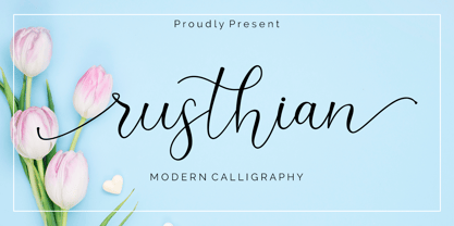 Rusthian a new modern & fresh calligraphy font with a lot of stylistic alternate make this font looks natural, elegant, and perfect for any awesome projects. Rusthian is perfect for many different project such as logos & branding, invitation, stationery, wedding designs, social media posts, advertisements, product packaging, product designs, label, photography, watermark, special events or anything. What’s Included : Standard Glyphs Ligature Works on PC & Mac Simple installations Accessible in the Adobe Illustrator, Adobe Photoshop, Adobe InDesign, even work on Microsoft Word. PUA Encoded Characters – Fully accessible without additional design software. Fonts include multilingual support for; ä ö ü Ä Ö Ü ß ¿ ¡ Thank you for your purchase! Hope you enjoy with our font!
 - Sicheli by Aqeela Studio,
$15.00 Sicheli is a new modern modern, brush and calligraphy script, including decorative characters. It's so beautiful with invitations, perfect for logos, stationery, wedding designs, media posts, advertisements, product packaging, product designs, labels, photography, air signs, special events, greeting cards, branding materials, business cards, quotes, posters and much more. It includes with 329 glyphs. Alternative characters are divided into several OpenType features such as Stylistic Sets, Stylistic Alternates. The OpenType feature can be accessed by using OpenType savvy programs such as Adobe Illustrator, Adobe InDesign, Adobe Photoshop Corel Draw X version, and Microsoft Word. And this font has already been given. So all alternative characters can be easily accessed by craftsmen or designers. Regards Aqeela
 - Rimela by MC Creative,
$14.00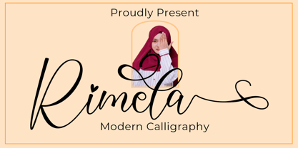 Rimela a new modern & fresh calligraphy font with a lot of stylistic alternate make this font looks natural, elegant, and perfect for any awesome projects. Rimela is perfect for many different project such as logos & branding, invitation, stationery, wedding designs, social media posts, advertisements, product packaging, product designs, label, photography, watermark, special events or anything. What’s Included : Standard Glyphs Ligature Works on PC & Mac Simple installations Accessible in the Adobe Illustrator, Adobe Photoshop, Adobe InDesign, even work on Microsoft Word. PUA Encoded Characters – Fully accessible without additional design software. Fonts include multilingual support for; ä ö ü Ä Ö Ü ß ¿ ¡ Thank you for your purchase! Hope you enjoy with our font!
 - Heliopride by Keristyper Studio,
$14.00 Heliopride A Monoline Script Font was fully thought out to easily meld inside your designs. An excellent choice to add the right amount of elegance. This custom-made font was specifically designed to fit whatever you need. Perfect for social media posts and ads, printed quotes, t-shirt designs, packaging, or even as a modern text overlay to any background image. Heliopride Handwriting Font multilingual support: Afrikaans, Albanian, Catalan, Danish, Dutch, English, Estonian, French, Finnish, German, Icelandic, Indonesian, Italian, Malay, Norwegian, Portuguese, Spanish, Swedish, Zulu, and many more. What’s Included : Standard & Multilingual glyphs Ligature Works on PC & Mac Simple installations Accessible in Adobe Illustrator, Adobe Photoshop, Adobe InDesign, and even work on Microsoft Word. Hope you enjoy our font!
 - Miguella Charlotte by Kotak Kuning Studio,
$19.00 Miguella Charlotte is a beautiful handwritten script font. Perfect for making elegant stylish statements - or adding a touch of class to your designs. This script has a multitude of natural-looking ligatures in its OpenType features - making the font look as close to natural handwriting as possible. Miguella Charlotte is perfect for many different projects such as logos & branding, invitation, stationery, wedding designs, social media posts, advertisements, product packaging, product designs, label, photography, watermark, special events, or anything. I highly recommend using a program that supports OpenType features and Glyphs panels such as Adobe Illustrator, Adobe Photoshop CC, Adobe InDesign, or CorelDraw, so you can see and access all Glyph variations. Thank you.
 - Thoderan Notes by Kotak Kuning Studio,
$20.00 Thoderan Notes is a beautiful handwritten script font. Perfect for making elegant stylish statements - or adding a touch of class to your designs. This script has a multitude of natural-looking ligatures in its OpenType features - making the font look as close to natural handwriting as possible. Thoderan Notes is perfect for many different projects such as logos & branding, invitation, stationery, wedding designs, social media posts, advertisements, product packaging, product designs, label, photography, watermark, special events, or anything. I highly recommend using a program that supports OpenType features and Glyphs panels such as Adobe Illustrator, Adobe Photoshop CC, Adobe InDesign, or CorelDraw, so you can see and access all Glyph variations. Thank you.
 - Amelia Stanley by Kotak Kuning Studio,
$19.00 Amelia Stanley is a beautiful handwritten script font. Perfect for making elegant stylish statements - or adding a touch of class to your designs. This script has a multitude of natural-looking ligatures in its OpenType features - making the font look as close to natural handwriting as possible. Amelia Stanley is perfect for many different projects such as logos & branding, invitation, stationery, wedding designs, social media posts, advertisements, product packaging, product designs, label, photography, watermark, special events, or anything. I highly recommend using a program that supports OpenType features and Glyphs panels such as Adobe Illustrator, Adobe Photoshop CC, Adobe InDesign, or CorelDraw, so you can see and access all Glyph variations. Thank you.
 - Malliya Signature by Kotak Kuning Studio,
$20.00 Malliya Signature is a beautiful handwritten script font. Perfect for making elegant stylish statements - or adding a touch of class to your designs. This script has a multitude of natural-looking ligatures in its OpenType features - making the font look as close to natural handwriting as possible. Malliya Signature is perfect for many different projects such as logos & branding, invitation, stationery, wedding designs, social media posts, advertisements, product packaging, product designs, label, photography, watermark, special events, or anything. We highly recommend using a program that supports OpenType features and Glyphs panels such as Adobe Illustrator, Adobe Photoshop CC, Adobe InDesign, or CorelDraw, so you can see and access all Glyph variations. Thank you.
 - Jazking by Taznix Creative,
$15.00 Jazking is a bold and fun display font, carefully handcrafted to become a true favorite. Use this gorgeous and unique comic book/cartoon style font to bring any DIY project to life! Jazking is perfect for branding projects, logo, wedding designs, social media posts, advertisements, product packaging, product designs, label, photography, watermark, invitation, stationery and any projects that need Clildren Comic Or cartoon taste. What's Included : Standard glyphs Ligature Works on PC & Mac Simple installations Accessible in the Adobe Illustrator, Adobe Photoshop, Adobe InDesign, even work on Microsoft Word. PUA Encoded Characters - Fully accessible without additional design software. Fonts include multilingual support for; ä ö ü Ä Ö Ü ß ¿ ¡ Hope you enjoy with our font! Taznix
 - Beth Harmone by MotionTail,
$18.00 Based on our experience as a graphic designer who works for a lot of companies, we often are requested to design a logo in a unique style but with an elegant shape. So, we try to brainstorming and create this font to make the idea is going out. This is perfect for BRANDING and LOGO DESIGN. You will get classy, elegant, and certainly unique logos with this font. Beth Harmone is also included full set of: · uppercase letters · multilingual symbols · numerals · punctuation Wish you enjoy our font. :)
 - Shinemoon by Scratch Design,
$14.00 Introducing, Shinemoon, a futuristic font by Scratch Design Shinemoon is a sans-based font with futuristic hi-tech lowercase & uppercase that will make your design look futuristic and modern. This font will be suitable for science-fiction movie posters, advertising, or projects that match with hi-tech, robots, space, future, planet or race. You can mix and match the uppercase and lowercase to make your design more stunning and stand out. This font is also included with ligatures, alternates and multi-language. Enjoy this futuristic font!
 - Lets study by Jehansyah,
$9.00 Let's Study the font is this handcrafted font, with bold and round style which is very beautiful to use as a design font of choice for your project, its unique character will make this font design look very natural, there are some additions that let you make your creation more real, suitable for all designs, posters, magazines, covers, invitations, media stories, social media, novels, story books and many more, this font will support your feelings when you want to express something cheerful or enthusiastic about learning
 - Boboli by Stefano Tonti,
$35.00 The Boboli garden in Florence (16th century) is one of the first examples of Italian renaissance garden, where nature was shaped into geometric beauty; the Boboli font was designed in the same spirit, filtered by a Modernist view. It comes in two sets, Autumn/Winter and Spring/Summer: by mixing them you can compose the typographic season of your choice. From the geometric, minimal Fall/Winter set stem the leaves of the baroque-esque Spring/Summer set, with many stylistic alternatives that allow perfect matching. The two opposite styles merge perfectly, because the leaves are not mere decorations but organic part of the structure, achieved by sampling the curves of the basic glyphs. With Boboli design meets nature, Bauhaus goes greenhouse.
 - Derlina Script by Nk Studio,
$14.00 Modern font Derlina Script is a modern typeface, each letter has been carefully crafted to make your text look beautiful. With a modern script style, this font will suit a wide variety of projects, for example: weddings, invitations, greeting cards, posters, business cards, quotes, blog headers, branding, logos, fashion, clothing, letters, stationery, etc. The modern Derlina Script font includes alternative glyphs and a beautiful swirl in fonts including style sets, ligatures, etc. The Open Type feature can be accessed using smart Open Type programs such as Adobe Illustrator CS, Adobe Indesign & CorelDraw X6-X7 and Microsoft Word. And this Font has provided PUA unicode (custom coded font). so that all stunts are fully accessible to the craftsman or designer.
 - Cooked by Sudtipos,
$79.00 Koziupa and Paul are just as good in the kitchen as they are on the drawing board. Cooked is their choice offering of stir-fried and juicy alphabet ready to complement any visual stew you can put together. This meaty course, with even meatier OpenType programming, was designed to crank up the volume on the viewer's senses of smell and taste, and induce drooling at a mere glance. Cooked is just as suitable in packaging as it is on posters, books or music stressing the wild, adventurous and extremely pleasurable side of life. Lot of alternates of each letter are included. Enjoy!
 - Goudy Two Shoes by Canada Type,
$24.95Goudy Two Shoes is a digitization and expansion of a 1970s type called Goudy Fancy, which originated with Lettergraphics as a film type, then was released into the dry transfer (rub-on) arena, where it became really popular. This digital expansion of the original design contains many additional characters, including "plain" variants on the caps, as well as extra alternates and swashes, and even a few curly ornaments. Goudy Two Shoes comes in all popular font formats. The Postscript and True Type versions ship as 2 fonts, while the OpenType version is a single font programmed with features for OT-savvy applications. - Dinkle by Chank,
$30.00 The Dinkle fonts are the creation of a sketchbook artist who spent years refining her craft, Diana Hollingsworth Gessler. She created the Dinkle handwriting fonts for use in her book "Very New Orleans," and now you can use it in four convenient styles: Regular, Bold, Italic and Bold Italic. Each font in this family was drawn individually, capturing nuanced differences of natural penmanship when the weights are paired together. A hand-lettered journal style, the highly legible Dinkle fonts offer tidy text and clear captions. Use it for signage, quotations, or anywhere you need a personal touch in your designs.
 - Minimalist by Ingrimayne Type,
$12.95 PostScript fonts are constructed by connecting dots, dots that have special attributes that control the shape of the connecting lines. In designing Minimalist, I wanted to see how few dots could be used to construct each letter. This is the source of the name--it is (or was) a minimum-point alphabet. I did not expect much from it, and was surprised that it turned out as well as it did. Since I originally drew it, I have added some points to some of the letters to get them to generate proper bitmaps, so it no longer has minimum points.
 - Primark by Cititype,
$17.00 Primark is a chic, modern and elegant script font with a prominent appearance, it's a great choice for logotypes, brand names, digital signatures, online portfolios, website banners, posters, wedding invitations, book titles, and headlines. The Primark font consists of 3 fonts, the primamark regular, alternate and swash. they are designed in the same metric so that the two fonts can be combined with each other. Come with ligatures to make it more natural impression and supported by diacritic that supports various language. Chic, Modern, elegant and stand out are words that can describe the definition of this font.
 - Mirage by Chris Costello,
$22.75 I designed Mirage using ink and a calligraphy brush to evoke the writing styles of ancient and exotic civilizations. After completing the project, it was filed and forgotten. About 15 years later, I was sifting through some of my old art files and found a "photostat" of the entire character set... a truly a magnificent archeological discovery. Then I thought, hey, maybe it's day has come. Why not share it with the world?... a completely digitized version for the new millennium. This unique font is a versatile, calligraphic option for travel, history, and greeting card themes. What other uses can you imagine?
 - Hadriano by Monotype,
$29.99When traveling in Paris, American designer Frederic W. Goudy did a rubbing of a second century marble inscription he found in the Louvre. After ruminating on these letterforms for several years, he drew a titling typeface in 1918, all around the letters P, R, and E. He called the new face Hadriano" as that name was in the original inscription. Robert Wiebking cut the matrices, and the Continental Typefounders Association released the font. Goudy designed a lowercase at the request of Monotype in 1930, though he didn't really like the idea of adding lowercase to an inscriptional letterform. The lowercase looks much like some of Goudy's other Roman faces. Compugraphic added more weights in the late 1970s, and made the shapes more cohesive. Hadriano has nicely cupped serifs and sturdy, generous body shapes. Distinctive individual letters include the cap A and Q, and the lowercase e, g, and z. Hadriano™ is an excellent choice for impressive headings and vigorous display lines." - Sukoro by Twinletter,
$15.00 Sukoro, our newest font, is now available. Because everyone does not necessarily comprehend Japanese letters, we give fonts with letters that can be used for your project, which is, of course, your project. A display font with a Japanese theme or an Asian font, which we produced to fulfill the needs of your Japanese-themed project. can be understood by people all over the world We create abstract fonts while still focusing on optical balance, ensuring that your product stands out from the crowd. Logotypes, food banners, branding, brochure, posters, movie titles, book titles, quotes, and more may all benefit from this font. Of course, using this font in your various design projects will make them excellent and outstanding; many viewers are drawn to the striking and unusual graphic display. Start utilizing this typeface in your projects to make them stand out.
 - FF Infra by FontFont,
$50.99 FF Infra™ is a fresh take on the robust sans serif typefaces of the early 20th century. Drawn by Gabriel Richter, it’s a friendly, inviting – and multi-talented family. Whether long blocks of editorial text, or snackable copy in web pages and blog posts, FF Infra’s 20 typefaces are easy on the eyes in both print and digital environments. The design also performs as well at petite sizes, as it does at supersized display settings. Pair FF Infra with an old style or Didone serif design and you’ll have powerful and distinctive typographic pages! FF Infra is available in 10 weights, ranging from a delicate light to a commanding black, each with an italic companion. OpenType® Pro fonts of FF infra have an extended character set supporting most Central European and many Eastern European languages, in addition to providing for the automatic insertion of ligatures and fractions. Each font also contains four sets of figures and a bevy of arrows that are ideal for wayfinding and similar info-graphic projects. A generous lowercase x-height, open counters and subtle graduations between family weights, make for a family that is at home in a wide range of sizes, and comfortable in everything from large signage, content for mobile apps, product manuals and full-scale branding projects. In addition, to provide design diversity, Richter drew alternate designs for the a, G and ß. Richter first became interested in fonts and the art of creating typefaces while studying communication design at Düsseldorf University of Applied Sciences. His first designs were experimental, but these lead a position at FontShop International in 2013, where he developed his typeface design skills. A strong background in font production, hinting and font marketing were also part of his FontShop experience. Richter worked as freelance graphic and type designer until he founded übertype in 2017. He also invests back into the type community through the type design courses he teaches at his alma mater. FF Infra is Richter’s first commercial design for Monotype. We’re sure that you’ll find it as versatile and powerful as we do.
 - Schotis Text by Huy!Fonts,
$35.00 Schotis Text is a workhorse typeface designed for perfect reading on running texts. Its design is based in Scotch Roman 19th-century style but designed from scratch, with a more contemporary and not nostalgic look. It has seven weights plus matching italics, with 1100 glyphs per font, with a very extended character set for Latin based languages as well as Vietnamese, and shows all its potential with OpenType-savvy applications. Every font includes small caps, ligatures, old-style, lining, proportional and tabular figures, superscript, subscript, numerators, denominators, and fractions. The Scotch Romans were one of the most used letters during the 19th and early 20th century, but they don’t have their own place in the main typographical classifications. They appeared at the beginning of the 19th century with Pica No. 2 in the catalog of William Miller (1813) and assumed the British route towards high contrast and vertical axis modern Romans. In fact, they were called just Modern. In opposition to the continental route of Fournier, Didot, and Bodoni, the English way opted for a wider, more legible letter also resistant to bad printing conditions. The name Schotis comes from the misspelling of Scottish that gave the name to a popular dance in Madrid in the 19th-century. It first was called Schotis and today is knows as Chotis.
 - Lilla Letter Lover by Letterground Foundry,
$11.99 "Lilla Letter Lover" is a captivating font designed specifically for children's books. This delightful typeface brings an element of playfulness to reading, while also enhancing phonemic awareness. The font's remarkable strength lies in bridging the gap between handwritten and printed letters. For early readers, this transition can be challenging, but "Lilla Letter Lover" simplifies the process. It merges the familiar aspects of handwritten letterforms with the clarity of printed text, providing a seamless reading experience. This feature ensures that children can comfortably navigate both forms of writing, enhancing their overall literacy skills. The whimsical charm of "Lilla Letter Lover" instantly captures young readers' imaginations. Each letter is thoughtfully designed with basic shapes and simplicity in mind, for an experience where letters come to life, fostering a love for reading and storytelling. Additionally, "Lilla Letter Lover" offers a unique opportunity for sight-based spelling learning. The visually distinctive presentation of words helps young readers to develop a strong visual memory of spelling patterns. This visual association enables them to recognize and recall words with ease, strengthening their reading and writing proficiency. In summary, "Lilla Letter Lover" is not just a font; it is an enchanting gateway to make reading a joyous adventure for children of all ages.
 - DT Decopolis Hotel by Dragon Tongue Foundry,
$9.00 DT Decopolis Hotel is a sharply stylised Sans Serif Art Deco font, crafted with a wide oval, dissected and contrasted against precision straight edges and pixel sharp corners. The Capitals have a raised centre line, aligning with the tall lowercase height. A nostalgic looking Art Deco font referencing the 1920's to 1940's during the Golden age of Hollywood, Art Moderne and the rise of luxury items from 100 years ago. Totally geometric with great variations in glyph widths designed to attract attention and create Headlines. DT Decopolis Hotel is a display font with clean simple lines, intended to create a sleek elegance that displays the sophistication of a by-gone era. With both upper and lower-case, this font is Great for Logotypes, Headlines, Strap-lines and smaller descriptive text to give that authentic Art Deco look and feel. Evoking the Art Deco Era of the Great Gatsby, glamorous Hotels and Movie Theatres of the period. Packed with over 500 glyphs, you will enjoy the uniqueness of this typeface! Inspired by 1920's Art Deco, Artisual Deco is a 2020's celebration dedicated to the hundred-year-old history of geometric design. This retro typeface will be the perfect fit for your logo designs or graphic project. DT Decopolis Hotel is a perfect choice for designs with a luxurious but minimalist look and feel. Useful in headlines, logos or product packaging it will match perfectly against sloped script fonts. The typeface works perfectly in both All-Caps or full Upper and lower case. Use with Contextual/Standard Ligatures turned on when possible. to allow the letters to match their neighbours. This will also enable larger Caps for the first letter of a new sentence.
 - Wordless Script by Sudtipos,
$59.00 We are very happy to announce the release of our first collaboration with master calligrapher, designer and illustrator Gabriel Martínez Meave from México. The first in the series of new designs is Wordless Script, an emotional calligraphic typeface published by Sudtipos. Speechless. Breathless. Wordless. There are letters that transcend simple functionality and sheer legibility, to be recognized instead by their style, their charm, their emotion. It’s like when we don’t remember the exact sentences, but we recall the tone of the voice of a loved one: it just doesn’t matter WHAT he or she said, but HOW he or she said it. Wordless Script is the font of choice for writing those things that go beyond words. Based on the connected-scripts of late 18th-century England, this typeface preserves the irregular finish and gestural strokes of the pointed nib. It is, so to speak, a personal rendition of the English roundhand as originally executed with the bird’s quill. Imbued with a Rococo, neoclassical, romantic spirit, Wordless radiates the gallantry of a time when the celebrated «douceur de vivre» that Talleyrand was so fond of was still alive and well; echoes of which still haunt us in our eclectic 21st-century, which has once again come to appreciate these magnificent styles of old. Wordless features alternate variants of most letters, ligatures and multiple calligraphic endings, ideal for elegant labels, high-end packaging and personalized stationery, as well as compositions for selected brands, exquisite titlings, verses, letters and short texts, like those meant to be read with the eyes only or intended for whispering into someone’s ear.
 - Sigmund Freud Typeface by Harald Geisler,
$29.00 “For those who regret what keyboards and touch screens have done to their penmanship, typographer Harald Geisler has an answer: Sigmund Freud.” — The Wall Street Journal Sigmund Freud was a neurologist who lived from 1856 to 1939. His research and studies led to the foundation of ‘Psychoanalysis’. When I first saw Freud’s century old letters, I was fascinated by the beauty of these historic manuscripts. It made me smile to imagine a person writing his or her shrink a letter set in Freud’s handwriting. I started to plan creating a font based on his manuscripts. I contacted the Sigmund Freud Museum Vienna and Freud Museum London. To start the creation I selected eight handwritten documents from the archive in Vienna – This selection of specimen was my orientation during the design process. The Samples were created between 1883 to 1938 and are of various character such as handwritten scientific papers, personal letters, notes and a telegram. A successful Kickstarter Campaign "The Sigmund Freud Typeface - A Letter to your Shrink" with over 1400 Backers enabled me to visit the archive in Vienna and study the original manuscripts of Sigmund Freud. After a year of preparation and design work, I finished four alphabets based on Freud’s handwriting. What are the different Versions PRO, Kurrent, #1, #2, #3 and #4 about? “This project gives people the convenience afforded by the computer while maintaining the romantic nostalgia, beauty, and character of letter writing with real handwriting.” — Daniel Vahab, The Huffington Post When you write with your hand, every letter looks a little different. When you write a text on your computer every letter looks exactly the same. In order to make type look like handwriting, I chose four different variations of each letter from Freud’s manuscripts, drew and stored them in the font. The font is then programmed to exchange letters while you are typing. This makes the rendered result on your screen or print look like unique handwriting. PRO While you are typing… the PRO Version actively combines all four alphabets and exchanges them automatically. Through this mechanism never the same two o’s will stand next to each other. With every touch a unique look is generated. This works in certain applications i.e. Word 2010(or newer), Pages, TextEdit, Editor(Pre-installed on Windows 7 or newer), InDesign, Illustrator… →Here you can see an animation of what this effect looks like in action. (Please Note: some applications like LibreOffice, OpenOffice do currently not support this feature. Date: December 2013) #1 #2 #3 and #4 The Sigmund Freud Typeface #1, #2, #3 and #4 each hold one individual lowercase alphabet based on Freud’s handwriting. Kurrent Most of Freud’s correspondence was written in German. Until the 1950′s a different handwriting was taught throughout German speaking countries (Switzerland, Austria, Germany). This style is called Kurrent. The name Kurrent and Cursive derive from the Latin word currere - to run, hurry - both styles were designed to write fast. As you can see in the samples above, Freud practiced both Kurrent and when writing english Cursive (Latin script or Joined-up). Kurrent has three significantly different letters (s,h,e). Use Kurrent to render the authentic look of an historic Sigmund Freud letter in German. Bundle On the Top of this page you can get all six fonts of the Sigmund Freud Typeface Family in a bundle. International Typeface All styles of the Sigmund Freud Typeface feature a wide range of accented letters so you can write to all your friends in Sweden (Bjørn) France (Chloé & Zoë), Ireland (Dáirine), Poland (Łucja), Germany (Jörg) and almost everywhere around the globe (Find a complete list in the tech specs). Usage recommendations I hope that this design will be valuable to you and most of all that you have fun with this typeface! 1. Point Size — To reproduce the size of Sigmund Freud’s handwriting adjust the type size between 18-24 point in your word processor. If you are using an imaging software like Photoshop set the resolution to 300dpi and adjust the point size between 18-24. 2. Line Spacing — Narrow the line hight until swashes of capital letters touch the baseline above. This also happens when you write a letter and gives the document a unique handwritten look. 3. Right Aligned — Freud had the habit to write towards the right edge of the page and start loosely on the left. Set your text alignment to ‘right’ to incorporate this dramatic expression also to your documents. What do other People say about the Sigmund Freud Typeface? “Wouldn’t you love to write a letter to your shrink using the Sigmund Freud typeface?” — Dorothy Tan, Design TAXI ''“JUST DON’T WRITE A LETTER TO YOUR MOTHER WITH IT… …until the reader looks a bit closer, and they see 70+ years of modern science weighing in on turn-of-the-century pop psychology."'' — Mark Willson, Fast Company “Doctor, what does it mean if you dream of creating a font of Freud’s handwriting?” — Ayun Halliday, Open Culture “…geekily romantic, at once artistic and scientific” — Edie Jarolim, Freud’s Butcher “…sympathisch” — Jürgen Siebert, Fontblog !WOW! Thank you for reading the complete font description! You are awesome! If you still have a question please contact me through MyFonts or my website haraldgeisler.com. Credits This project was made possible by the help of 1481 Backers on Kickstarter and the kind support of the Sigmund Freud Museum Vienna and the Freud Museum London. Thank you. All of Freud’s Manuscripts shown are © Sigmund Freud Museum Vienna. Poster Image: IN17 - Sigmund Freud, Germany 1932. © Freud Museum London. Flag Image: IN19 - Sigmund Freud 1930’s. © Freud Museum London.