10,000 search results
(0.503 seconds)
- Baby Fun by Beary,
$12.00 Baby Fun is inspired by the playfulness of hand lettering. This font can be used for comic design, children's books, preschool name tag and more.
 - Subikto Tree by Subtitude,
$27.00 Subikto Tree is an ode to Mother Nature. This summer enjoy so many variety of trees in your design, be green and forget the blues.
 - Simple Serif by Gerald Gallo,
$20.00 The Simple Serif fonts are designed as hand-lettered serif fonts. They are casual and informal and are ideal for use in conveying these qualities.
 - Mr Darcy by insigne,
$- Only occasionally are we graced with a font so pleasant and enjoyable to our company as the wonderfully amiable Mr. Darcy. The attractive elegance of the contemporary has been conveyed into Victorian times. Feel the call of modernity and friendliness with this antique Victorian-esque typeface. Itís gentlemanly elegance and grace commands the artboard. The elegant Mr. Darcy is sufficiently compete with its additional characters--to be stated precisely, more than 136 defining alternates. These optional features are carefully displayed within the supplied brochure. The employ of the Mr. Darcy family moreover demands the proper implements, such as an program that supports Opentype features such as, Adobe Illustrator, Adobe InDesign, Adobe PhotoShop, CorelDRAW, or Quark. Be sure to check with the Userís Guideline for all the OpenType options and employ them with wit and vigor. OpenType options are there to help you develop your own custom vision. Five different weights offer plenty of design options and offers the versatility of character as possessed only by a refined gentleman...or a refined typeface.
 - Tsanger Yun Hei SC by Tsanger,
$198.00 Tsanger Yunhei was designed and published by Tsanger. Tsanger Yunhei contains 8 styles and family package options. The designer has made unique treatment on the shape and structure of the pen, based on the Chinese calligraphy style and writing, which makes it easier to identify under the same size of the font and group reading effect better. Tsanger Yunhei is more in line with the aesthetic habits of Chinese characters getting the reading an easy task. This font adopts GB 2312—1980 standard, with a total of 6763 Chinese characters, matching Latin letters, Greek letters, Hiragana, Katakana, Russian Cyrillic letters, etc.
 - Hagemann JNL by Jeff Levine,
$29.00 One of the most enduring type styles of the Art Deco era is Huxley Vertical. Its clean lines and stylish appeal have transcended changing times and tastes. Many typefaces have been inspired by the original, including the model used to create this font. The design was found in the book "Lettering and Alphabets", first published in 1946 by J. Albert Cavanagh. By re-drawing it from scratch, the missing numerals, punctuation, special characters and accents were added. Hagemann JNL and its oblique version are named in honor of one of Jeff Levine's friends within the type design community -- Michael Hagemann of Font Mesa.
 - LTC Pabst Oldstyle by Lanston Type Co.,
$24.95 Frederic W. Goudy originally designed Pabst in 1902. This lettering was used by the Pabst Brewing Company for their promotional materials. It was later developed into type for ATF. Goudy later licensed Pabst Oldstyle to the Lanston Type Library. Lanston Pabst Oldstyle features several differences from the more familiar ATF version. Some caps are narrower while some lower case characters are wider than the ATF version. The descenders are also shorter in the Lanston version. Logotypes of italic words and, of, and the are included as originally designed as well as ligatures including the unusual tt ligature.
 - SK Goldilocks by Salih Kizilkaya,
$12.99 SK Goldilocks is a grotesque font family. It is designed to meet all your typographic needs in your daily and professional life. You can use it in many areas from the title to the body texts, as well as in media such as logos, posters and packaging. SK Goldilocks takes its name from the "Goldilocks Zone" given to the habitable zone of the solar system and aims to open a new field in design for you. Thanks to the 14 different fonts and 6720 glyphs it contains, it contains many typographic materials that you will need. In this way, you can easily use it in your designs or in your daily life. You can visit my Behance account to examine the project images in more detail.
 - Pacific Script by Scholtz Fonts,
$19.95 Pacific Script is a font inspired by an alphabet created by Howard Trafton in the 1930s. However, I felt it needed some changes to bring it to the cutting edge of 21st century font design. Though designed as a display font, it works very successfully in longer passages of text, however, it should not be used in font sizes less than about 15 point. Small x height in contrast to extravagant caps gives the font a very dramatic feel. Though it has cursive qualities, the characters in this font do not connect, making it slightly more legible and less like handwriting. The inclusion of 26 alternate upper case characters give the user the freedom to create a hand crafted design. Language support includes all European character sets.
 - Carina Elegant by suhadidesign,
$19.00 Carina elegant classy font Hi ladies and gentlemen! Due to the popularity of the market for modern fonts, I created a serif font that suits your needs. The Carina elegant font is a modern classy elegant serif font. is here to become a market favorite. We made this font look elegant, classy, modern, new style, easy to read, stylish, attractive and easy to use. Carina elegant Font is the right choice for magazine designs, newspapers, fashion, classy designs, beauty, feminine, brand names, branding and other projects. The Carina elegant font is here to enhance the quality of your designs. Follow us for the next classy font creation :) Feature: • Uppercase • Lowercase • Multilingual Support • Numbers and punctuation • Alternatives • Stylistic sets • Ligatures What's included: Carina elegant (OpenType)
 - Le Monde Livre Std by Typofonderie,
$59.00 A text face in 4 styles Before the arrival of Phototypesetting, each font size had a specific design. Le Monde Livre, designed by Jean François Porchez, along with Le Monde Journal re-establishes this practice. When Le Monde Journal was developed specifically for use at small point sizes (below 10 points.) Le Monde Livre works beautifully for book typography, magazine settings. In comparison to the italics in Le Monde Journal, Le Monde Livre’s italics are of a totally different design, closer to the models of the Renaissance. The families match well together on the same page, Le Monde Journal for small sizes settings, Le Monde Livre for large settings. The verticals metrics and proportions of Le Monde Livre are calibrated to match perfectly others Typofonderie families.
 - Poblano by Niche,
$26.99 Poblano is a masterfully designed flared typeface, inspired by Gothic Tuscan that incorporates an aura of modern fun and classic southwest whimsy. With serifs that embody the beautiful, natural curve of the Poblano Pepper, it captures the pepper’s essence and attitude of having the perfect amount of piquant heat. Perfectly suited for menus, headlines, and logos, Poblano will be the ideal garnish to complete and elevate your food, rustic, grunge and hipster themed designs. The Poblano menu includes: • A range of styles from elegantly thin to boastful black • Over 400 glyphs per weight • More than 50 stylistic alternatives • Upper and lowercase characters • Uniquely stylized to elevate your design and add that finishing touch This is the ultimate niche solution to both display and functional Tuscan serif fonts.
 - Graphique Next by profonts,
$41.99 The original Graphique Pro was designed by the famous Swiss designer Hermann Eidenbenz in 1945 and included one outline shadow style. His idea of a very narrow, very economic headline font became increasingly more popular over the last decades and since the recent trend of layered fonts his idea is more up-to-date than ever. profonts studio now took the idea of the Graphique Pro to its next level: Graphique Pro Next. This layered type family consists of 8 styles which can be combined in plenty of ways to create unique designs. The fonts thereby preserve the outstanding and timeless drawings of the original Graphique Pro font and will add an aesthetic and fresh look to every project. Please have a look at the Graphique Pro Next Type Specimen for more details about the language support and font layer combinations.
 - Mantul Pro by Struggle Studio,
$12.00 Mantul Pro is inspired by the sans-serif style and a little modern touch, making this font luxurious & neat. Mantul itself has a meaning (Mantap Betul = Really Good), because it requires very good accuracy in doing so making this font the best. After a long journey of doing this font work, finally finished.made very carefully has 19 font styles that are luxurious & extraordinary.This font is done for a very long time, and therefore the font can be considered as a very extraordinary and best font. Can be used for designs, logos, labels, badges, clothing designs, letterhead and titles, stationery, etc.
 - Latina by Latinotype,
$49.00 Latina is our first humanist typeface designed for use in continuous text. This font is based on calligraphy, but calligraphic features have been changed in order to make Latina a more neutral font. This prevents readers from losing their focus when reading continuous text. On the other hand, these same features get highlighted when using the font for headlines or display text. This 11-weight family includes italics and small caps, and supports 219 different languages as well as several sets of figures. Latina is the perfect choice for publishing design (books and magazines), branding and advertising.
 - Triplex by Emigre,
$39.00 Although initially designed as a rational/geometric font, Triplex developed into one of Zuzana Licko's most intuitive typeface designs at the time. Its first extensive use was in Emigre magazine #14, a special issue devoted to Swiss designers published in 1990. Triplex was intended as a friendly substitute for Helvetica. The name Triplex refers to the three versions that make up the entire family; Triplex, Triplex Serif and Triplex Italic. Each version of the typeface comes in light, bold and extra bold. The italic was designed and drawn by type designer and sign painter John Downer, and was designed to work with both the serif and sans serif versions. See also Triplex Italic OT.
 - Vesta by Linotype,
$29.99 In the late 1990s Gerard Unger won the assignment to design the signage system for the Holy Year celebrations to be held in Rome in 2000. The system he developed in cooperation with the design agency n|p|k used a classically inspired serif typeface, but the earlier proposals included a sans-serif, which became Vesta (2001). Vesta is a versatile family that can be used as a display face alongside Unger's serif faces Gulliver, Capitolium or Coranto; it can also be used on its own, even in longer texts. Vesta is narrower and therefore more economical than some commonly used sans serifs such as Arial and Helvetica; there is also a noticeable contrast between thick and thin parts, which makes it more lively. Vesta is to be extended with narrow versions, small capitals and old style numerals, along with some special versions for headlines.
 - Ransom Clearcut NF by Nick's Fonts,
$10.00Will Ransom designed the uppercase letters in this typeface for Barnhart Brothers & Spindler in the 1920s, under the name Clearcut Shaded Caps. The lowercase letters come from another BB&S typeface named Clearcut Italic. An elegant headline face, best used sparingly, the font includes decorative flourishes in the brace, bracket and en dash positions. - Bacode by Ditatype,
$29.00 Your design tells who you really are and should represent your personality. Without the right font, it will be hard to be prominent and to impress your audience. Therefore, Bacode is the answer to your necessity. Bacode is a font type to produce manual brush-looking displays to show natural, casual, informal impressions to make people feel close to the brand or design displayed. Its letter proportions are equal, yet high in contrast to be more visually attractive. However, brush fonts are less legible in lengthy texts. As a result, they are more suitable to apply for short texts. You can also enjoy the available features here. Features: Multilingual Supports PUA Encoded Numerals and Punctuations Bacode fits best for various design projects, such as brandings, posters, banners, headings, magazine covers, quotes, invitations, name cards, printed products, merchandise, social media, etc. Find out more ways to use this font by taking a look at the font preview. Thanks for purchasing our fonts. Hopefully, you have a great time using our font. Feel free to contact us anytime for further information or when you have trouble with the font. Thanks a lot and happy designing.
 - Master Rumble by Alit Design,
$24.00 Introducing "Master Rumble" - an exquisite font that embodies the timeless elegance of the Victorian era. With its ornate details and refined aesthetics, this font exudes a sense of grandeur and sophistication. "Master Rumble" offers two distinct versions: the regular and expanded. The regular version maintains the classic proportions and delicate details, perfect for creating elegant headlines and body text. The expanded version, on the other hand, provides a more dramatic and impactful look, making it ideal for titles and display purposes. These two variants offer versatility and flexibility to suit different design needs. With an impressive collection of 646 glyphs, "Master Rumble" empowers you to craft captivating typographic compositions. The font boasts an extensive range of alternative characters, allowing you to experiment with different letterforms and create unique combinations. This abundance of options gives you the freedom to customize and tailor the font to perfectly match your creative vision. Enhancing the font's allure, "Master Rumble" comes with an additional 146 ornamental elements. These ornaments beautifully complement the Victorian style, enabling you to adorn your designs with decorative flourishes, frames, and borders. These intricate details add a touch of opulence and bring a sense of refinement to your typographic creations. In conclusion, "Master Rumble" is a font that epitomizes the Victorian elegance, offering a perfect balance between classic charm and contemporary design. With its regular and expanded versions, extensive glyph set, alternative characters, ornamental elements, and multilingual support, this font empowers designers to create captivating and sophisticated typographic designs that leave a lasting impression. Elevate your creative projects and embrace the timeless beauty of "Master Rumble".
 - Kompot Slab by VP Creative Shop,
$20.00 Introducing Kompot - This is the Greatest Font... actually typeface with 2 styles Kompot Slab is swirly, vintage typeface with 2 styles to enchant your next project. They are loaded alternate glyphs and multilingual support. Very versatile fonts that works great in large and small sizes. Basic latin, advanced latin, basic Cyrillic and advanced Cyrillic character sets are supported! Kompot Slab is perfect for branding projects, home-ware designs, product packaging, magazine headers - or simply as a stylish text overlay to any background image. Uppercase numeral, punctuation & Symbol Regular Outline Alternate glyphs Multilingual support Basic and Advanced Cyrillic support How to access alternate glyphs? To access alternate glyphs in Adobe InDesign or Illustrator, choose Window Type & Tables Glyphs In Photoshop, choose Window Glyphs. In the panel that opens, click the Show menu and choose Alternates for Selection. Double-click an alternate's thumbnail to swap them out. Feel free to contact me if you have any questions! Mock ups and backgrounds used are not included. Thank you! Enjoy!
 - Decondor by Alit Design,
$12.00 Introducing DECONDOR Typeface DECONDOR font family consists of 14 families, from Thin to Heavy style fonts. The elegant modern font creates a unique design and is sure to steal the eye of the design target audience. Besides being unique, the DECONDOR font also has a luxury simple character that makes the design charming and classic luxurious. These a fonts are perfect for designs with the concept of elegant, luxury, romance, fashion, classic royal and so on.
 - Serp and Molot by ParaType,
$30.00 Designed for ParaType in 2003 by Tagir Safayev. The typeface was inspired by some of the Cyrillic letterforms of Sergey Chekhonin (1878-1936). Chekhonin belonged to the World of Art group, which is so closely associated with the flowering of Russian book and theater design at the beginning of the 20th century. For use in advertising and display typography. Serp & Molot has been adjugded Award of Excellence in Type Design of 'bukva:raz!' ATypI International Type Design Competition, 2001.
 - Perspective Sans by Bülent Yüksel,
$29.00 The font primarily had a strong body. Family has a four layered experience. All and in harmony. This font has a strong personality, that makes it perfect for use in headline sizes. Also use for print, motion graphics, logo design, packaging design, t-shirts and more. By using layers, you can design different colors and sizes by repositioning lights and shadows. This will allow you to take your designs to the next level. Using this unique font, you'll have a lot of fun and produce beautiful materials. You can contact me at buyuksel@hotmail.com, pre-purchase and post-purchase with questions and for technical support. There is nothing as satisfying as to do a good quality and properly job. You can enjoy using it.
 - Charming by Sensatype Studio,
$15.00 Charming is a classy font and decorative font for brand and logo design. Inspired by the name, we try to develop some functional font with classy touch and decorative in one package. Based on our experience as a graphic designer who works for a lot of companies, we often are requested to design any graphics with a classy style and decorative. So, we try to brainstorming and create this font to make the idea is going out. This is perfect for BRANDING and LOGO DESIGN. You will get classy, elegant, and certainly unique logos with this font. Charming font is also included full set of: uppercase and lowercase letters multilingual symbols numerals punctuation 2 Style Font Wish you enjoy our font. :)
 - Ahattom Script by Creative Lafont,
$10.00 Ahattom is modern script font, every single letters have been carefully crafted to make your text looks beautiful. With modern script style this font will perfect for many different project, e.g : quotes, blog header, poster, wedding, branding, logo, fashion, apparel, letter, invitation, stationery, etc. Ahattom including alternate glyphs and beautiful swirl in a font including stylistic sets, Ligatures etc. The Open Type features can be accessed by using Open Type savvy programs such as Adobe Illustrator CS, Adobe Indesign & CorelDraw X6-X7 and Microsoft Word. And this Font has given PUA unicode (specially coded fonts). so that all the alternate characters can easily be accessed in full by a craftsman or designer. Files Include : - Ahattom Script Features: - Basic Latin A-Z and a-z - Numbers & Symbols - Stylistic Set &Ligature - PUA Encode - Latin Pro Support Character In order to use the beautiful swashes, you need a program that supports OpenType features such as Adobe Illustrator CS, Adobe Photoshop CC, Adobe Indesign and Corel Draw. Thanks for looking and happy designing :-)
 - Elfinotes by Gassstype,
$22.00 Hello Everyone, introduce our new product Elfinotes is a Fun Display Font .This is Cute & Lovely Craft font with a natural handwritten feel. This handmade font will make your design has a beautiful natural touch for each details. It is perfect for any design project as Invitation,logo, book cover, craft or any design purposes. Elfinotes is font with strong and challenging nuances. very suitable for the title, typography, Poster, magazines, brochures, packaging,Websites and much more for your design needs, making your designs more modern and professional
 - Raisin Muffin by Gassstype,
$23.00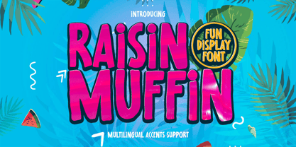 Hello Everyone, introduce our new product Raisin Muffin is a Fun Display Font .This is Cute & Lovely Craft font with a natural handwritten feel. This handmade font will make your design has a beautiful natural touch for each details. It is perfect for any design project as Invitation,logo, book cover, craft or any design purposes. Raisin Muffin is font with Creative Display Fun and challenging nuances. very suitable for the title, typography, Poster, magazines, brochures, packaging,Websites and much more for your design needs, making your designs more modern and professional.
 - Konsecta by Alandya TypeFoundry,
$19.00 Konsecta - Unique and versatile serif display Konsecta serif display is a single weight typeface that aims to explore new design solutions. With a bold form a strong contrast, this design hints both at past typeface styles while being unique and original in it’s appearance. This font is suitable for use in many design forms, for example magazines, postcards, logos, DIY Projects, invitation card, quotes, vintage look design, wedding projects and much more. If you like unconventional solutions and edgy design, Konsecta serif display is the font to go for.
 - Korolev Rounded by Device,
$39.00 DF Korolev is a 72 weight geometric sans serif family based on lettering by an anonymous Soviet graphic designer from the propaganda displays at the Communist Red Square parade in 1937. It has been named in honor of Sergey Pavlovich Korolyov, or Korolev, considered by many to be the father of practical astronomics. Rational and robust, it is also elegant and refined. Tracings done in Illustrator over a photograph featuring this type pinned down some of the basic character shapes. These were then imported into FontLab, where the full glyph complement was developed. The lower-case has been designed from scratch, and adheres to the structural logic of the uppercase as closely as possible. The complete Korolev super-family includes standard, italic, condensed, and compressed versions, each in five weights. The Alternate families come with a double-story “a”. Authoritative yet friendly, Korolev Rounded is a versatile addition to the Korolev range.
 - Hallo Skull by Letterara,
$14.00 Hallo Skull is a fun friendly and spooky display font. It is suitable for each of your party designs or Halloween creation. Add it to your creative Halloween-themed ideas and notice how it makes them stand out! This font is PUA encoded which means you can access all of the glyphs.
 - Niemeyer by Latinotype,
$36.00 Oscar Niemeyer is one of the greatest architects of our time—his unique way of mixing straight lines and abstract curves gives rise to an unmistakable and characteristic style. This typeface is my own tribute to Brazilian architect Oscar Niemeyer. The design process started when my wife and I visited Brazil while she was running a series of workshops on calligraphy. In my spare time, I would walk through the streets of beautiful cities like Rio de Janeiro or São Paulo, enjoying the local architecture and urban life. I had also the opportunity to attend to some of the workshops during which I was able to observe the organic of calligraphy and people. Then, I started to draw some shapes that reflected everything about this beautiful place: Niemeyer’s architecture and work and, in his own words ‘the curves on the body of the beloved woman’. This versatile typeface comes in 8 weights with matching italics, alternative characters, oldstyle figures and much more! Niemeyer is well-suited for logotypes, advertising, publishing, branding and corporate use. Special thanks to everyone in the Latinotype Team (especially to César Araya) for their support, help with corrections and digital editing.
 - Divine Instinct by AkaliDz,
$10.00 Divine Instinct is a cool, bold and authentic blackletter font. Masterfully designed to become a true favorite, this font has the potential to bring each of your creative ideas to the highest level! this font contains : custom upper cases custom lower cases custom numbers default poncuation marks
 - Persia BT by Bitstream,
$50.99Masoud Nejabati has drawn upon his capable calligraphic skills to create this typeface. Persia represents his first latin-based design. This gentle and finely rendered script reveals Nejabati's extensive background in Islamic calligraphic art. The slight back slant further enhances the appearance of hand-scribed pen calligraphy. - Historism Border 2D by 2D Typo,
$36.00 Historism Border 2D is a collection of ornaments organized into four font files. The ornaments can be divided into two groups: Friezes (borders) and Rapports (patterns). All the ornaments attribute to the period of Historicism, which prevailed in art in the middle of the 19th century. The ornaments are based on elements of architectural decorations of Lviv buildings in Ukraine. The author personally collected the material and embodied it in the font. This makes the font exclusive and unique among other digital collections of ornaments. These patterns are perfectly suited to be used in the design of invitations, diplomas, certificates or other printed materials in classic-style design.
 - Gageac by Eurotypo,
$29.00 Gageac is a classic "Didona" font, characterized by an extreme contrast in the thick and thin strokes, by the use of short serifs, and by the vertical stress of the letters. This typeface is slightly condensed, the ascenders were lowered, the thick strokes were exaggerated and enriched with a full set of OpenType features of tails, ligatures, alternates and swashes, giving them an excellent legibility and a very clear and elegant appearance. The italic version is a true "italic" so some glyphs were adjusted. Gageac Italic was carefully designed and drawn to be combined with Gageac Regular.
 - ITC Quorum by ITC,
$29.99Australian typographer Harry Pears continues to explore ancient type forms while maintaining his consultancy business Typeface Research Pty. Ltd., of Lake Cathie, Australia. Born in Quirindi, Australia, Harry has had a long career in printing and graphic arts and has been the guiding force behind the creation of the Lindisfarne Nova family. Lindisfarne Nova Incised and Lindisfarne Runes are wonderful illustrative companions to the Lindisfarne Nova text fonts. In a unique partnership, Harry develops the concepts, and calligrapher Margaret Layson brings the designs to life. They both then work on the digital incarnation in a true collaboration. - Staple by Ajeet Mestry,
$50.00 Staple is a Display Font. Each letter and number is made up of a clever arrangement of staples. Together, they retain the simplicity and beauty of a perfectly folded stapler pin. This creates a font that provides very good readability, solid shape and simple elegance that makes it perfect for use as a display font. To add elegance to the font, the letters and numerals are designed to retain the pin identity across all characters. Care has been taken so that the pins do not overlap. Nor are the pins bent or twisted into unnatural shapes to create the characters.
 - Amsterdam Signature by Lettersiro,
$25.00 The Amsterdam font is a simple and classy font, comes with 4 Elegant Variations, opentype features such as stylistic alternates,initial and final form, and ligatures. We keep this font looks elegant, classy, readable, stylish, catchy and easy to use. The Amsterdam Font is the great choice for watermark on photography, signature or signature logo design, quotes, album cover, business card, and many other design project. From business cards to photo watermarks, The Amsterdam is here to elevate your work to the highest level
 - MFC Sansome Monogram by Monogram Fonts Co.,
$19.00 The inspiration source for MFC Sansome Monogram is a decorative serif lettering style that comes from the book Henderson's Sign Painter from 1906. Known as "Rustic Roman" and originally designed by John F. Irwin, this fantastic typeface has been digitally revived and expanded for monogram designs. While the original lettering did not include numerals and was never originally intended for monograms, its ornate nature lends itself so wonderfully to the craft. A PDF guidebook for MFC Sansome Monogram is available under the Gallery tab.