10,000 search results
(0.028 seconds)
- Beni by Nois,
$18.00 Beni is a bold & strong sans serif font family beautifully crafted to perform in short headlines in posters or contemporary interface design. Each character has been optically adjusted for maximum effect in the space between; as such, this is a strong contender for movie posters, titling, album artwork, and any design project that needs a clean sans serif that makes an impact wherever it is applied. This type family is available in four unique weights that stand well apart from one another in visual style. Beni Light is the runway model of the family, standing with a narrow posture and towering height. It’s a fantastic choice for conveying a message in a limited horizontal space. Beni Regular and Beni Bold are shorter in stature but both pack a punch, carrying bold strokes that speak with confidence and offer great legibility. The heaviest of the heavy, Beni Black is the super-bold, go-to type design for projects that need an impossibly strong type design at the helm. Beni extends multilingual support to Basic Latin, Western European, Euro, Catalan, Baltic, Turkish, Central European, Pan African Latin, Igbo Onwu, and Basic Greek for design projects intended for an international audience.
 - Skolar Sans PE by Rosetta,
$70.00 Any prototype you can imagine, Skolar Sans can materialise. This industrious type family is more than just a versatile partner for our award-winning Skolar collection: it is a true sans-serif type system envisioned for the age of responsive design. We developed Skolar Sans to accommodate contemporary typographers and the challenges they confront: an ever-changing spectrum of outputs and devices, in which serious typography can get lost. Skolar Sans is engineered to cope with complex editorial texts and data-rich layouts alike. Its construction is designed for easy reading, and its subtle personal style and a touch of flourish. From gently thin to black, the finely-tuned weight variants will fit any composition from wide-screen dashboards to compact mobile editorial designs. Its four subtly graded width variants allow you to fit any page context with comfort. The 72 styles; 36 weight and width variants in uprights and true italics with ligatures, arrows, scientific figure variants, and fleurons. The two variable fonts (one for uprights and one for the italics) allow user precise navigation of the Skolar Sans design space and streamline delivery. The linguistic scope of Skolar Sans PE is an exact match to Skolar PE: Latin, Cyrillic, and Greek (including polytonic) scripts and support for hundreds of languages and transliterations.
 - Droid Sans by Ascender,
$92.99 Droid Sans Pro Font Family (2 fonts) are a humanist sans serif typeface designed by Steve Matteson, Type Director of Ascender Corp. The Font Family is an approachable, friendly set of typefaces optimized for display on screen. It was designed to provide optimal quality and legibility. It features upright stress, open forms and a neutral appearance. The font was optimized for user interfaces and to be comfortable for reading on a mobile handset in menus, web browser and other screen text. The font family contains Old Style Figures (requires an application that support advanced OpenType typographic features) and extensive character set coverage including Western Europe, Eastern/Central Europe, Baltic, Cyrillic, Greek and Turkish support. Contains: Droid Sans Pro Regular & Droid Sans Pro Bold
 - PF Fusion Sans Pro by Parachute,
$79.00 Fusion Sans is an amalgamation of traditional early nineteenth-century sans-serif letters. Despite its monotone structure it retains certain features common to roman. For instance lowercase ‘a’ and the two-storey ‘g’ are normal roman characters, while most letters are designed with a thinning of stroke at the junction of rounds to stems. Other letters are borrowed from earlier gothics, like lowercase ‘t’ which was first seen on a typeface that was developed by Paul Rand for Westinghouse in 1960. Fusion Sans is a tall family of 4 weights which is suitable for long headlines. The new ‘Pro’ version developed in 2006, provides support for all European languages including Greek and Cyrillic while it comes loaded with 19 special OpenType features.
 - Linotte by JCFonts,
$30.00 Linotte is a rounded sans in 7 styles designed by Joël Carrouché. Small irregularities give the typeface a warm and naive look, while the simple geometric construction provides good legibility in long texts and small sizes. Linotte is an ideal choice for food or kids related products, or anything that needs to convey a human and friendly feeling. Originally released in 2014, Linotte was updated in 2021 with Greek and Cyrillic support, two new styles, and other small additions. Linotte Semibold is 100% free for personal and commercial use. The fonts, provided in OpenType format, include diacritics for most European languages, a set of arrows & icons, and a variety of advanced features like stylistic alternates, case-sensitive forms, sub and superscript, automatic fractions, etc.
 - Vinque by Typodermic,
$- Vinque is an interpretation of a nineteenth century Arts & Crafts revival of medieval lettering. British type designer William Morris completed Troy in 1891—a splendid blackletter typeface in the medieval style. It’s beautiful but some modern uses like UI and video game text require a less ornate gothic appearance. Vinque is simple. It avoids strong vertical blackletter strokes which can present problems for contemporary readers. The end result is an uncomplicated, crisp typeface that successfully conveys medievalness to the reader. Vinque was released in 2002 in one style: Regular. In 2019, Vinque was expanded to seven weights and italics. Language support was bolstered to support most current Latin based languages as well as Greek and Cyrillic. OpenType fractions, f-ligatures and old-style numerals are supported.
 - Zona Pro by Intelligent Design,
$10.00 Zona Pro is a geometric sans-serif type family of 8 styles plus matching italics, designed by Kostas Bartsokas in 2013/14. It draws inspiration from 1920’s geometric style faces, having clean and highly readable shapes, and mixes it up in the heavier weights with a slight variance in the stroke widths, lending it a grotesque-ish unique and distinctive look. Zona Pro is multifunctional and versatile. With its modern yet elegant form it performs amazingly in display sizes and headlines. At the same time its really tall x-height makes Zona Pro equally suited for editorials and shorter lines of text in smaller sizes (magazines, newspapers). Zona Pro supports Greek, Western, Central and Eastern European languages, ligatures and special characters.
 - Alphii by Typodermic,
$11.95 Attention all designers and typographers! Discover the font that will take your work to the next level— Alphii. This sophisticated, angular typeface is the perfect blend of precision and simplicity. Its clean, straight lines exude elegance and sophistication, while its easy-to-read nature makes it the perfect choice for conveying serious technical information. Alphii is a typeface that means business. It’s the perfect choice for those who want to communicate with confidence and authority. With four weights and italics available, you can customize your message to suit your needs. Whether you’re creating a sleek corporate logo or designing a technical manual, Alphii has got you covered. So why settle for a font that just looks good when you can have one that performs? With Alphii, you’ll be able to communicate your message with precision and style. Don’t miss out on this incredible typeface—try Alphii today! Most Latin-based European, Greek, and some Cyrillic-based writing systems are supported, including the following languages. Afaan Oromo, Afar, Afrikaans, Albanian, Alsatian, Aromanian, Aymara, Bashkir (Latin), Basque, Belarusian (Latin), Bemba, Bikol, Bosnian, Breton, Bulgarian, Cape Verdean, Creole, Catalan, Cebuano, Chamorro, Chavacano, Chichewa, Crimean Tatar (Latin), Croatian, Czech, Danish, Dawan, Dholuo, Dutch, English, Estonian, Faroese, Fijian, Filipino, Finnish, French, Frisian, Friulian, Gagauz (Latin), Galician, Ganda, Genoese, German, Greek, Greenlandic, Guadeloupean Creole, Haitian Creole, Hawaiian, Hiligaynon, Hungarian, Icelandic, Ilocano, Indonesian, Irish, Italian, Jamaican, Kaqchikel, Karakalpak (Latin), Kashubian, Kikongo, Kinyarwanda, Kirundi, Komi-Permyak, Kurdish (Latin), Latvian, Lithuanian, Lombard, Low Saxon, Luxembourgish, Maasai, Macedonian, Makhuwa, Malay, Maltese, Māori, Moldovan, Montenegrin, Ndebele, Neapolitan, Norwegian, Novial, Occitan, Ossetian, Ossetian (Latin), Papiamento, Piedmontese, Polish, Portuguese, Quechua, Rarotongan, Romanian, Romansh, Russian, Sami, Sango, Saramaccan, Sardinian, Scottish Gaelic, Serbian, Serbian (Latin), Shona, Sicilian, Silesian, Slovak, Slovenian, Somali, Sorbian, Sotho, Spanish, Swahili, Swazi, Swedish, Tagalog, Tahitian, Tetum, Tongan, Tshiluba, Tsonga, Tswana, Tumbuka, Turkish, Turkmen (Latin), Tuvaluan, Uzbek (Latin), Ukrainian, Venetian, Vepsian, Võro, Walloon, Waray-Waray, Wayuu, Welsh, Wolof, Xhosa, Yapese, Zapotec Zulu and Zuni.
 - Glister PS by pentagonistudio,
$19.00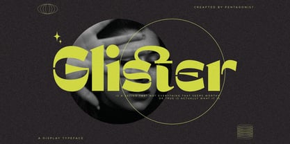 Glister Is An Stylish Display Character Inspired By Cheek Style. SOFTWARE REQUIREMENTS : Fonts and alternate : No special software required they may be used in any basic program /website apps that allows standard fonts That's it folks! You can go ahead and get cracking :) Follow My Shop For Upcoming Updates Including Additional Glyphs And Language Support. And Please Message Me If You Want Your Language Included or If There Are Any Features or Glyph Requests, Feel Free to Send me A Message. Have a Good Day !
 - Simplify by pentagonistudio,
$19.00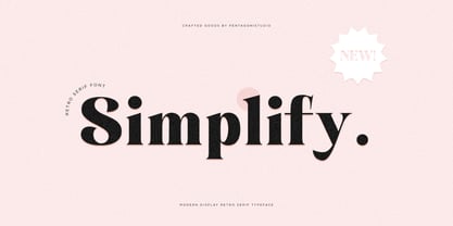 Simplify Is A Modern Display Character Inspired By Stylish and Cheek Style. SOFTWARE REQUIREMENTS : Fonts and alternate : No special software required they may be used in any basic program /website apps that allows standard fonts That's it folks! You can go ahead and get cracking :) Follow My Shop For Upcoming Updates Including Additional Glyphs And Language Support. And Please Message Me If You Want Your Language Included or If There Are Any Features or Glyph Requests, Feel Free to Send me A Message. Have a Good Day !
 - Girl Script by Scholtz Fonts,
$10.00 Based on the popular Girltalk font, cute, cheeky Girlscript, was specially designed for the young-teen market. I felt that it was time for Girltalk to have a "big sister" script font to complete the group. Pretty & feminine, with a large dose of cheek, Girlscript is great for: -- “girl style” stationery -- diary covers -- clothing hang-tags -- party invitations -- greeting cards -- book covers -- movie posters -- CD covers -- game advertising media Girlscript is perfect for hen parties, baby showers, pamper parties and other occasions that bring out the “girl in” women. Think sugar 'n spice, think cute 'n cheeky, add a dash of Girlscript and you're on a winning streak! Girlscript is fully professional, carefully letterspaced and kerned. All upper and lower case characters, punctuation, numerals and accented characters are present.
 - Circe by ParaType,
$50.00 Circe™ is a geometric sans-serif with some humanist qualities. It consists of seven weights from Thin to Extra Bold in both Normal and Italic styles. Circe, like the Greek goddess it is named after, is capable of metamorphosis. While being clean and simple in its basic form, Circe can become intricate and fancy with its numerous decorative glyph variations. The extensive character set provides support for almost all European languages based on Latin and Cyrillic scripts. Abundant alternates and swash variants organized in stylistic sets inspire creative design options. Circe is good for small point size paragraphs as well as for headlines and posters. The typeface was designed by Alexandra Korolkova and released by Paratype in 2011. The Italic styles were added in 2018 by Alexandra Korolkova and Maria Kharlamova (Selezeneva).
 - Astrochemistry by Typodermic,
$11.95 Looking for a typeface that packs a punch and leaves a lasting impression on your audience? Look no further than Astrochemistry! This hefty, square typeface is the perfect choice for delivering magnificent headlines that demand attention and leave a lasting impact. With its seamless contrast with sans-serif body copy, Astrochemistry is the ultimate choice for those seeking to cut through difficult situations and rigid systems with ease. It’s the perfect choice for those seeking to expand their reach and influence, helping clients envision product brands that connect with their target audience and establish preference. In a world where every moment counts, Astrochemistry is the ultimate weapon for winning the battle at the moment of truth. With its bold and striking design, this font is sure to leave a lasting impression on your audience, ensuring that your brand stands out from the competition and remains top of mind for years to come. So if you’re ready to take your brand to the next level and make a lasting impression on your audience, choose Astrochemistry today and experience the power of cutting-edge design! Most Latin-based European, Greek, and some Cyrillic-based writing systems are supported, including the following languages. Afaan Oromo, Afar, Afrikaans, Albanian, Alsatian, Aromanian, Aymara, Bashkir (Latin), Basque, Belarusian (Latin), Bemba, Bikol, Bosnian, Breton, Bulgarian, Cape Verdean, Creole, Catalan, Cebuano, Chamorro, Chavacano, Chichewa, Crimean Tatar (Latin), Croatian, Czech, Danish, Dawan, Dholuo, Dutch, English, Estonian, Faroese, Fijian, Filipino, Finnish, French, Frisian, Friulian, Gagauz (Latin), Galician, Ganda, Genoese, German, Greek, Greenlandic, Guadeloupean Creole, Haitian Creole, Hawaiian, Hiligaynon, Hungarian, Icelandic, Ilocano, Indonesian, Irish, Italian, Jamaican, Kaqchikel, Karakalpak (Latin), Kashubian, Kikongo, Kinyarwanda, Kirundi, Komi-Permyak, Kurdish (Latin), Latvian, Lithuanian, Lombard, Low Saxon, Luxembourgish, Maasai, Macedonian, Makhuwa, Malay, Maltese, Māori, Moldovan, Montenegrin, Ndebele, Neapolitan, Norwegian, Novial, Occitan, Ossetian, Ossetian (Latin), Papiamento, Piedmontese, Polish, Portuguese, Quechua, Rarotongan, Romanian, Romansh, Russian, Sami, Sango, Saramaccan, Sardinian, Scottish Gaelic, Serbian, Serbian (Latin), Shona, Sicilian, Silesian, Slovak, Slovenian, Somali, Sorbian, Sotho, Spanish, Swahili, Swazi, Swedish, Tagalog, Tahitian, Tetum, Tongan, Tshiluba, Tsonga, Tswana, Tumbuka, Turkish, Turkmen (Latin), Tuvaluan, Uzbek (Latin), Ukrainian, Venetian, Vepsian, Võro, Walloon, Waray-Waray, Wayuu, Welsh, Wolof, Xhosa, Yapese, Zapotec Zulu and Zuni.
 - Vox Round by Canada Type,
$39.95 Vox Round is the softer version of the Vox family. The original brief for Vox was a extensive monoline typeface that can be both precise and friendly, yet contain enough choice of seamlessly interchangeable variants for the user to be able to completely transform the personality of the typeface depending on the application. Basically, a sans serif with applications that range from clean and transparent information relay to sleek and angular branding. When the first version of Vox was released in 2007, it became an instant hit with interface designers, product packagers, sports channels, transport engineers and electronics manufacturers. This new version (2013) is the expanded treatment, which is even more dedicated to the original idea of abundant application flexibility. The family was expanded to five weights and two widths, with corresponding italics, for a total of 20 fonts. Each font contains 1240 glyphs. Localization includes Cyrillic and Greek, as well as extended Latin language support. Built-in OpenType features include small caps, caps to small caps, four completely interchangeable sytlistic alternates sets, automatic fractions, six types of figures, ordinals, and meticulous class-based kerning. This kind of typeface malleability is not an easy thing to come by these days.
 - Normative Pro by Green Type,
$37.00 Normative Pro is a sans-serif font family that includes a 12 styles (6 weight and italics), supports Latin, Cyrillic, Greek, Eastern European, Baltic and Turkish scripts. The family uses a large number of useful Open Type features: small caps, contextual alternatives, stylistic alternates, fractions, proportional and tabular figures and more. Normative Pro is a font with a wide sphere of application, legible from very small sizes to very large ones. Can be used both in technical documentation, office work, business communication, as well as in advertising, visual communication, magazines and posters, in branding and packaging.
 - Stiana by WDC Fonts,
$30.00 Stiana font is a venetian serif in modern design. The general idea was inspired by beautiful masterpieces of Nicolas Jensen and William Morris. Stiana holds fine, balanced readability of venetian serif, and both 21st century trends. Letterforms are expressive and bold enough to use font as display, but it also fits nicely for text. Stiana supports Western Europe, Cyrillic and Greek languages. Stiana is surely a good choice both for screen applications and print media. Its multipurpose spreads over package design, logos, headlines, body texts, stationary and back labels. Also very good for books and magazines.
 - Petulante by PintassilgoPrints,
$20.00 Petulante is a striking and creative hand-drawn face with a scribbled feel. It's an all-caps font and brings two options for each letter and numeral for a more organic and natural look. There are yet a few ornaments to add an extra something here and there. Petulante is ideal for book covers, packaging, apparel, album art, posters, or any situation where you want a stylish and uncommon hand-crafted look. And let's not forget to mention the broad language coverage: Petulante speaks more than 208 languages, including Russian and Greek. Yes, just take it everywhere!
 - Raincoat by Typodermic,
$11.95 Looking for a typeface that oozes class and style? Look no further than Raincoat. This stunning display font combines the best of both worlds, with a geometric sans serif that’s been given a timeless, antique feel. But Raincoat is more than just a pretty face. With its OpenType features, it’s a font that can truly personalize your designs. Letter combinations are transformed into custom ligatures, making your work truly unique. From the altered ends of the “T” to the interlocking rings of the “O”, Raincoat is a typeface that adds a touch of personality to any design. So if you’re looking to make a statement, whether it’s for a logo, poster, or website, Raincoat is the perfect choice. With its candid style and classy design, it’s a font that’s sure to impress. So why not try Raincoat today and see for yourself the creative design options it can bring to your work? Most Latin-based European, Greek, and most Cyrillic-based writing systems are supported, including the following languages. Afaan Oromo, Afar, Afrikaans, Albanian, Alsatian, Aromanian, Aymara, Bashkir, Bashkir (Latin), Basque, Belarusian, Belarusian (Latin), Bemba, Bikol, Bosnian, Breton, Bulgarian, Buryat, Cape Verdean, Creole, Catalan, Cebuano, Chamorro, Chavacano, Chichewa, Crimean Tatar (Latin), Croatian, Czech, Danish, Dawan, Dholuo, Dungan, Dutch, English, Estonian, Faroese, Fijian, Filipino, Finnish, French, Frisian, Friulian, Gagauz (Latin), Galician, Ganda, Genoese, German, Greek, Greenlandic, Guadeloupean Creole, Haitian Creole, Hawaiian, Hiligaynon, Hungarian, Icelandic, Ilocano, Indonesian, Irish, Italian, Jamaican, Kalmyk, Kaqchikel, Karakalpak (Latin), Kashubian, Kazakh, Khalkha, Kikongo, Kinyarwanda, Kirundi, Komi-Permyak, Kurdish, Kurdish (Latin), Kyrgyz, Latvian, Lithuanian, Lombard, Low Saxon, Luxembourgish, Maasai, Macedonian, Makhuwa, Malay, Maltese, Māori, Moldovan, Montenegrin, Ndebele, Neapolitan, Norwegian, Novial, Occitan, Ossetian, Ossetian (Latin), Papiamento, Piedmontese, Polish, Portuguese, Quechua, Rarotongan, Romanian, Romansh, Russian, Rusyn, Sami, Sango, Saramaccan, Sardinian, Scottish Gaelic, Serbian, Serbian (Latin), Shona, Sicilian, Silesian, Slovak, Slovenian, Somali, Sorbian, Sotho, Spanish, Swahili, Swazi, Swedish, Tagalog, Tahitian, Tajik, Tatar, Tetum, Tongan, Tshiluba, Tsonga, Tswana, Tumbuka, Turkish, Turkmen (Latin), Tuvaluan, Ukrainian, Uzbek, Uzbek (Latin), Venetian, Vepsian, Võro, Walloon, Waray-Waray, Wayuu, Welsh, Wolof, Xhosa, Yapese, Zapotec Zulu and Zuni.
 - Century Gothic Paneuropean Variable by Monotype,
$209.99 Century Gothic™ is based on Monotype 20th Century, which was drawn by Sol Hess between 1936 and 1947. Century Gothic maintains the basic design of 20th Century but has an enlarged x-height and has been modified to ensure satisfactory output from modern digital systems. The design is influenced by the geometric style sans serif faces which were popular during the 1920s and 30s. The Century Gothic font family is useful for headlines and general display work and for small quantities of text, particularly in advertising. Century Gothic family has been extended to 14 weights in a Pan-European character set from Thin to Black and their corresponding Italics. The already existing 4 weights of Regular and Bold with their Italics are additionally still available in the STD character set. For international communication, the W1G versions offer the appropriate character set. They contain Latin, Greek and Cyrillic characters and thus support all languages and writing systems that are in official use in Western, Eastern and Central Europe. Century Gothic Variable is features two axes: Weight and Italic. The Weight axis has preset instances from Light to Black. The Italic axis is a switch between upright and italic. Looking for the perfect way to complete your project? Check out Aptifer™ Slab, ITC Berkeley Old Style®, FF Franziska™, Frutiger®, ITC Legacy® Square Serif or Plantin®.
 - Century Gothic Paneuropean by Monotype,
$50.99Century Gothic™ is based on Monotype 20th Century, which was drawn by Sol Hess between 1936 and 1947. Century Gothic maintains the basic design of 20th Century but has an enlarged x-height and has been modified to ensure satisfactory output from modern digital systems. The design is influenced by the geometric style sans serif faces which were popular during the 1920s and 30s. The Century Gothic font family is useful for headlines and general display work and for small quantities of text, particularly in advertising. Century Gothic family has been extended to 14 weights in a Pan-European character set from Thin to Black and their corresponding Italics. The already existing 4 weights of Regular and Bold with their Italics are additionally still available in the STD character set. For international communication, the W1G versions offer the appropriate character set. They contain Latin, Greek and Cyrillic characters and thus support all languages and writing systems that are in official use in Western, Eastern and Central Europe. Century Gothic Variable is features two axes: Weight and Italic. The Weight axis has preset instances from Light to Black. The Italic axis is a switch between upright and italic. Looking for the perfect way to complete your project? Check out Aptifer™ Slab, ITC Berkeley Old Style®, FF Franziska™, Frutiger®, ITC Legacy® Square Serif or Plantin®. - Sedid by Fontuma,
$20.00 Sedid, “solidity; It is an Arabic term meaning “righteousness”. In particular, the correctness and soundness of a word is indicated by this word. The fact that I gave this name to the writing family is to point out its accuracy and robustness. This typeface, which is sans serif, consists of three families: ▪ Sedid: Font family containing Latin letters ▪ Sedid Pro: Font family including Latin, Arabic and Hebrew alphabets ▪ Sedid World: A family of typefaces including Latin, Cyrillic, Greek, Arabic and Hebrew alphabets Those who want to meet a new face of writing for their works and projects and make a difference in their work should meet the Sedid writing family. This typeface is as serious as it is affectionate, and solid as well as elegant. The Sedid font family can be used as a text and title font in all publishing and printing areas, magazines, newspapers, books, banner and poster designs, and websites. Sedid also has a pleasant-looking, flexible face with smooth lines and transitions. The inner and outer spaces of the font are proportioned so that the text can be read easily. Sedid font family consists of 14 fonts, seven plain and seven italic. The font family includes open type features, as well as a large number of ligatures, small caps, modifiers, and currency symbols of many countries.
 - Tremendo by The Ampersand Forest,
$20.00 Tremendo is a gothic sans serif superfamily with a large number of widths and weights that make it a great choice for versatility, clarity, and dynamism. Built with both grotesque and geometric principles in mind, it's remarkably useful for everything from print copy to the largest display applications. If you're looking for a family that will serve your needs, and be noticed Tremendo is it! A note on the name: "Tremendo" is Italian for "too much, insufferable, awful." It's a tongue-in-cheek moniker for a family that's rather monstrous in size and forceful in impact. Give it a try and you'll see that it's much more of a workhorse than it may at first seem to be!
 - Pexico Micro by Setup,
$- Pexico Micro is a pixel typeface that uses 5 by 7 grid (capital letter) in 8 styles: 4 basic styles for text setting — Regular, Bold, Narrow, and Mono and 4 stylistic variations of the Regular style for display setting — Outline, Dots, Round, and Inverse. It fits the display's pixel grid when used at 10pt size or its multiples. Pexico Micro supports Latin, Cyrillic, and Greek Monotonic scripts, all with thoroughly designed diacritics. Moreover, Pexico Micro makes use of advanced OpenType features, just as any other modern text typeface. Each style also has 9 sets of numbers, small capitals and is properly kerned. For more information go to For more information go to Urtd.
 - HU Garaetteok by Heummdesign,
$15.00 English HU Garaetteok is a cute headline typeface that expresses a straight stroke and end in a round shape. The characteristics of the writing were added with straight strokes and lively curves. There are 1 weights of HU Garaetteok : Extra bold Cyrillic HU Garetteok - это милый типограф заголовка, который выражает прямые штрихи и заканчивается в круглой форме. Характеристики письма были добавлены прямыми штрихами и оживленными кривыми. Есть 1 вес HU Garetteok : Extra gras Greek HU Garaetteok είναι μια χαριτωμένη γραμματοσειρά επικεφαλίδα που εκφράζει ένα ευθύ εγκεφαλικό επεισόδιο και να τελειώσει σε ένα στρογγυλό σχήμα. Τα χαρακτηριστικά της γραφής προστέθηκαν με ευθείες πινελιές και ζωντανές καμπύλες. Υπάρχουν 1 βάρη hu Garaetteok: Εξαιρετικά τολμηρό
 - PF DIN Stencil Pro by Parachute,
$65.00 DIN Stencil Pro on Behance. DIN Stencil Pro: Specimen Manual PDF. Despite the fact that over the years several designers have manually created stencil lettering based on DIN for various projects, there had never been a professional digital stencil version of a DIN-based typeface until 2010 when the original DIN Stencil was first released. The Pro version was released in 2014 and adds multiscript support for Cyrillic and Greek. DIN Stencil Pro was based on its original counterpart DIN Text Pro and was particularly designed to address contemporary projects, by incorporating elements and weights which are akin to industries such as fashion, music, video, architecture, sports and communications. Traditionally, stencils have been used extensively for military equipment, goods packaging, transportation, shop signs, seed sacks and prison uniforms. In the old days, stencilled markings of ownership were printed on personal possessions, while stencilled signatures on shirts were typical of 19th century stencilling. Two companies dominated the market in the mid-twentieth century: the Marsh Stencil Machine Company in the United States and the Sächsische Metall Schablonen Fabrik in Germany. Ever since the late 1930s, it was the German Sächsische Metall Schablonen Fabrik which used heavily the new DIN 1451 standard font (introduced in 1936), attempting to overthrow the reign of the Didot-style modern roman which was at the time the most common stencil letter in Germany. These letters were manufactured mainly as individual zinc stencils which could be ordered in sizes between 10 and 100mm. The DIN Stencil family manages to preserve several traditional stencil features, but introduces additional modernities which enhance its pleasing characteristics which make it an ideal choice for a large number of contemporary projects. Furthermore, the spacing attributes of the glyphs were redefined and legibility was improved by revising the shape of the letterforms. The DIN Stencil Pro family is an enhanced version of the popular DIN Stencil. It consists of 8 diverse weights from the elegant Hairline to the muscular Black and supports Latin, Cyrillic, Greek, Eastern European, Turkish and Baltic. The new version 3.0 includes several additions such the recently unicode encoded character of the German uppercase Eszett (ẞ), the Russian currency symbol for Rouble (₽), Ukrainian Hryvnia (₴), Azeri and Kazakh letterforms.
 - Slowglass by Adam Jagosz,
$29.00 Slowglass is a geometric semi-serif accompanied by geohumanist italics. Softly rounded edges lend it a friendly tone. The typeface includes two categories of stylistic alternates, available as font features as well as complementary font subfamilies. Text forms for increased legibility (Slowglass Text) and uncial-inspired unicase variants (Slowglass Alt). At over 1500 glyphs per weight, the fonts support 80+ Latin-based languages (incl. Vietnamese), 14 Cyrillic-based languages and polytonic Greek. OpenType features: Six sets of figures: proportional / tabular × oldstyle / lining / petite (ss20) Superscript and subscript figures Fractions, numerators, denominators Optional slashed zero Case-sensitive forms Glyph composition/decomposition (support for Navajo and Greek) Localization (Dutch, Marshallese, Bulgarian) Stylistic Sets: ss01 Roman: Two-story a, loopy α / Italic: Loopy α ss02 Roman: Simple g / Italic: Simple k ss03 Unicase r ss04 Alt f t г п т γ ss05 Descending η χ ss06 Unicase β ζ θ ξ ss07 Alt в г д ж з к п т ю ss08 Latinized ς, cursive и й ss09 Round Δ Λ Д д Л л Љ љ ss10 Full-stem a q ss11 Seriffed I ss12 Unicase A ss13 Unicase E Ω ss14 Descending F T Г П ss15 Descending G P Q Y ss16 Unicase M N И H Y ss17 Extending Φ Ψ ss20 Petite figures
 - UniOpt by ParaType,
$25.00 An experimental font designed by Viktor Kharyk in Op Art style. UniOpt is based on free brush technique similar to experimental lettering of the early decades of the 20th century; for instance to ‘Graficheskaya Azbuka’ (‘Graphic ABC’) by Peter Miturich and works by Victor Vasareli. The face is legible even at small sizes and quite useful to an original display matter, initials and logos. The rigid double-wide structure allows to create complicated decorative works using vertical composition. Interesting that diacritical marks are also placed inside of character square fields and don’t destroy geometrical order. The decorative abilities of the font are increased by inverted versions of characters that may be used in different combinations including in color. The character set contains expanded Latin, Greek and Cyrillic ranges. UniOpt was awarded for type design excellence at TypeArt’05 Contest in Moscow. Licensed by ParaType in 2006.
 - Jolie by Scholtz Fonts,
$22.00 Jolie personifies romance. With its dramatic swashes, generously curved lines, and full, richly fashioned upper case characters, it evokes floral perfumes, roses, violin music and romantic evenings. The richly complex uppercase characters provide a backdrop and a contrast for the simple elegant and readable lowercase characters. The font is perfect for wedding stationery, clothing branding, packaging, music posters and all other romantic possibilities Jolie introduces a simple method for applying the elegantly beautiful end-of-word or end-of-sentence swashes. Simply type in a three-character code and [hey presto] the swash suddenly appears. Clear and readable, Jolie has all the features usually included in a fully professional font. Language support includes all European character sets, Greek symbols and all punctuation. Jolie makes use of OpenType features to avoid the mechanical look caused by two identical characters that are placed side by side.
 - Times New Roman Windows compatible by Monotype,In 1931, The Times of London commissioned a new text type design from Stanley Morison and the Monotype Corporation, after Morison had written an article criticizing The Times for being badly printed and typographically behind the times. The new design was supervised by Stanley Morison and drawn by Victor Lardent, an artist from the advertising department of The Times. Morison used an older typeface, Plantin, as the basis for his design, but made revisions for legibility and economy of space (always important concerns for newspapers). As the old type used by the newspaper had been called Times Old Roman," Morison's revision became "Times New Roman." The Times of London debuted the new typeface in October 1932, and after one year the design was released for commercial sale. The Times New Roman World Version is an extension of the original Times New Roman with several other scripts like with the Helvetica World fonts. It is part of the Windows Vista system. The following code pages are supported:1250 Latin 2: Eastern European 1251 Cyrillic 1253 Greek 1254 Turkish 1255 Hebrew 1256 Arabic Note: The Roman and Bold versions include the arabic scripts but they are not part in the corresponding italic versions. 1257 Windows Baltic 1258 Windows Vietnamese
- Banjax by Monotype,
$25.99 Banjax is a humanist sans serif typeface, designed to be highly versatile and efficient in both print and digital environments. The extreme weights are perfect for display purposes, with the central core weights ideal for body copy. While Banjax has a branding focus, it would be suitable for pretty much any text application in any Latin language. See more detailed examples here. Distinguishing features include a large x-height, short descenders, distinctive asymmetrical contrast, angled terminals, squared dots and punctuation, and maybe a little flair here and there to enhance this typeface’s personality. Overall, Banjax makes for a pleasant reading experience with enough nuances to make it an ideal choice for branding purposes. Key features: 9 weights in Roman and Italic Small Caps, Petite Caps and 3 Alternates Latin Extended and Basic Greek glyphs 1100 glyphs per font.
 - FF Bauer Grotesk Paneuropean by FontFont,
$40.99FF Bauer Grotesk is a revival of the metal type Friedrich Bauer Grotesk, released between 1933 and 1934 by the foundry Trennert & Sohn in Hamburg Altona, Germany. The geometric construction of the typeface, infused with the art deco zeitgeist of that era, is closely related to such famous German designs as Futura, Erbar, Kabel and Super Grotesk that debuted a few years earlier. However, FF Bauer Grotesk stands out for being less dogmatic with the geometry, lending the design a warmer, more homogenous feeling. The oval “O” is a good example of that, as well as characteristic shapes like the capital M or the unconventionally differing endings of “c” and “s” which make for a less constructed look. The design was started by Thomas Ackermann, and he collaborated with Felix Bonge to evolve his original ideas into this fresh, modern geometric typeface family. FF Bauer Grotesk contains 6 weights with accompanying italics, and a wide range of OpenType typographic features including small caps, figure styles, fractions and contextual alternates. NEW: the new FF Bauer Grotesk W1G versions features a pan-European character set for international communications. The W1G character set supports almost all the popular languages/writing systems in western, eastern, and central Europe based on the Latin alphabet including Vietnamese, and also several based on Cyrillic and Greek alphabets. - HD Colton by HyperDeluxe,
$35.00 HD Colton is a 90-style super-sans from London Design Studio HyperDeluxe®. Using a combination of horizontal & vertical terminals along with squarish ovals, it is built with a confident structure that feels so much more than a neutral sans, it feels iconic. Engineered in 5 widths, compressed to extra wide, and in nine weights, HD Colton features a huge 90 styles that will offer your brand ultimate flexibility and variation in one font family. The black weights will help bring prominence to your brand while the light to mid weights will help you tell your story at a smaller size. HD Colton includes 1200+ glyphs per style, providing you with a workhorse sans that supports 200+ languages including extended Latin, extended Cyrillic and basic Greek. Also included are 5 stylistic sets, 2 arrow sets & numerous OpenType features (see last poster for complete list). The HD Colton complete family package comes with a single, 3-axis variable font so you'll have an infinite amount of combinations and uses for you to experiment with and add that touch of finesse to your visuals. Variable fonts are tech friendly providing smaller sizes for developers to work with, while also being responsive and used for motion design on the web. HD Colton key features: 3-Axis Variable Font. 90 Styles. 1200+ Glyphs Per Style. 5 Widths (Compressed, Condensed, Regular, Wide, Extra Wide). 200+ Languages Supported. Extended Latin, Extended Cyrillic, Greek Support. Stylistic Alternates for some key glyphs (J, Q, G, l, &, Arrows). Extensive OpenType features.
 - Mir by Juliasys,
$22.00 Мир is Mir. The Russian word Мир (Mir) means both World and Peace. The rendezvous of the two terms seems quite unique and utopistic today, but it is comforting to see that it was natural at some time deep down in Russian history. Bits of both meanings were going through my mind while I was designing this typeface. Mir’s character set is multiscript – Latin, Cyrillic and Greek – and extends to many parts of the linguistic world. In fact it covers more than 100 languages. Stylistic consistency between the language systems make typographic border crossings painless even where national borders are still closely guarded. And in regions where mathematics, physics or chemistry are to be expressed, a rich set of OpenType features lets Mir master also these situations. Serious things are best be said in a relaxed, unpretentious way. So Mir doesn’t put on a show. Mir has authority without being authoritarian, it is serious but not stern. It can explain difficult things and stay calm and down to earth at the same time. Mir Medium has another useful feature: It can be freely downloaded and used by anybody anywhere. You can test the Mir Family with free Mir Medium and get more styles when you need them. @juliasys
 - Lapidaria by SIAS,
$34.90 Lapidaria is a typeface that may be described as a ‘geometric sans with humanist qualities’. Its mood is smart and sober, its appeal is calm, cool and classical. Though quite well performing even in longer text bodies, a particular strength of Lapidaria lies in display typography. The most peculiar aspect of Lapidaria is its new family concept: for the very first time ever a tricameral alphabet model has been realized as a general-use sans: uppercase, lowercase and middlecase letters blending smoothly into one typographic tone, thus offering entirely new typographic possibilities. – The middlecase (or uncial) sorts being accommodated in the lowercase positions of the Medior fonts. All nine fonts equally offer full character coverage for all Euro-Latin languages – and for Greek. There are a lots of special characters and ligatures. Last but not least, a set of ten ornament characters (in each font) will let you make sparkling designs which will thrill your clients. Each font contains about 500 characters, that makes over 4,500 in total for the complete Lapidaria family package. __________________________________________________________________________________________
 - Rawhide by Canada Type,
$29.95 Rawhide is a fresh digitization and expansion of a very popular (yet uncredited) early 1970s film type called Yippie, which was commonly used in wild west cartoons and comics. Publishers of Lucky Luke, the famous Belgian comic by Morris, used these bouncy letters for the titling on a few of their soft cover editions, and different variations of it were used throughout the 1970s and 1980s by cartoon classic Looney Tunes and a variety of wild west animations and comics. It slowly disappeared without fanfare when desktop publishing became the norm. Here it is again now for the computer age, available as a high quality font with a complete character set that accommodates more than 20 Latin-based languages. In short, Rawhide comes with an impressive track record, and is a must for any funny cowboy design or off the wall wild west layout. This set of fonts contains a very expanded character set that includes full support for Central, Eastern and Western European languages, as well as Baltic, Turkish, Esperanto, Greek, Cyrillic and Vietnamese.
 - Crucifix by Canada Type,
$39.95In June of 2004, Canada Type released Crucifix, a condensed three-tiers typeface that tried to bridge the gap between traditional blackletter forms and the traditional European gothics. The main goal of Crucifix was to have as many as 4 different variations on each letter form, so the original release consisted of three fonts: a main font with a standard character set, a small caps set, and a unicase variation. Now Canada Type presents the next generation of this typeface: Crucifix 2.0 and Crucifix Pro. This new version takes advantage of both Unicode and OpenType technologies to make Crucifix as versatile as ever. The PostScript Type 1 and the True Type version boast extended Latin character set support, including Western, Eastern and Central European, Turkish and Baltic, as well as two non-Latin scripts: Cryillic and Greek. The OpenType version, Crucifix Pro, goes even further by including all of above in one font, along with proper automation to accommodate on-the-fly ligatures, small caps, numerators, denominators, some fractions and a ton of stylistic and contextual alternates - all programmed to work with the latest OpenType-enabled programs. Unique, stark, and with more than 900 characters, Crucifix has that clinical sharpness and special dramatic wonder to make it perfect for mystery, gothic, and horror design settings. - VAG Rounded Next by Monotype,
$57.99 VAG Rounded Next brings a classic 1970s typeface up to date, keeping all of its easy going, approachable personality but adding some much-needed versatility and language support. Originally commissioned by Volkswagen, VAG Rounded remained in use by the company until the early 90s and has also been used by Apple, Skype and Myspace. Its enduring appeal lies in its appealingly rounded terminals, and its immediate, informal tone of voice. “When you look at the Volkswagen Beetle it has these curves that are timeless and legendary,” says Steve Matteson, who led the creation of VAG Rounded Next. “I think that's what stands out in this design – that friendly aesthetic, and the simple line and circle.” This new version offers 700 glyphs with pan European language support (including Greek and Cyrllic), as well as 10 weights of upright and italic styles. New display weights Shine and Rough – which create “chocolate popsicle” and “rust” effects – are begging to be used in branding, packaging and editorial projects, while the lighter weights are well suited for text. VAG Rounded Next Variables are font files which are featuring one axis and have a preset instance from Thin to Black.
 - Nina by Microsoft Corporation,
$49.00Nina™ Family is a new condensed sans serif typeface designed to be as readable as possible at small sizes, whilst squeezing in as many characters per inch as feasibly possible. Nina Family typeface was designed for Microsoft by world renowned type designer Matthew Carter, and hand-instructed by leading hinting expert, Tom Rickner. Character Set: Latin-1, WGL Pan-European (Eastern Europe, Cyrillic, Greek and Turkish). - Thicker by Zetafonts,
$39.00 Thicker is a type-family designed for Zetafonts by Francesco Canovaro with Andrea Tartarelli. A geometric sans typeface on steroids, it was first designed in the muscular Extrablack weight with the aesthetics of high-power dynamic typefaces used in sports communication, and then developed in the lighter weights where the shapes show some vintage-inspired proportions and the slightly squared look that nods to Novarese famous Eurostile, eponymous with retro-futurism. With these diverse influences the typeface allows for both impressive display use and effective logo design as well as more fine-tuned editorial use in body text - with a natural inclination for effective and powerful advertising. Sports typography usually uses italics to add dynamism and impact, and Thicker complies with this by offering a choice of three alternate italic forms with different slant, made even more customizable by the inclusion of variable font technology that allows fine tuning of the weight range as well as precise choice of typeface slant. In each of the 44 weights of the typeface family (as well as in the all-in-one variable type solution) Thicker offers a extended charset of over 900 latin, Cyrillic and Greek glyphs, covering over two hundred languages and including useful Open Type features (Alternate forms, Positional Numerals, Small Caps and Case Sensitive Forms) for flawless typesetting.
 - New Yorker Type Pro by Wiescher Design,
$45.00 New-Yorker-Type was one of the first typefaces I tried my hand at in 1985. I meant it as a revival of the typeface used by the New Yorker magazine. I did not scan it. I just looked at the type and redrew it completely by hand. Only much later did I come to know, that there is a bundle of similar typefaces of that period. Rea Irvin's design for New-Yorker magazine was just one of them, maybe the best. In the next step I repaired some of the mistakes that I made more than thirty years ago. Now on the eve of 2020 I gave the font a complete overhaul and added a set of Swash Initials, Cyrillic and Greek glyphs and many ligatures. The font now has 1075 glyphs and is all set for most latin writing systems. On top of that I made two versions, a Classic one with rounded corners and a pointed Pro version for a more up-to-date look. Take your pick. Yours sincerely, honoring Rea Irvin a great type- and magazine-designer, Gert Wiescher