10,000 search results
(0.298 seconds)
- Svarga by Krismagraph,
$19.00 Introducing our new "Svarga", Elegant Fashionable Typeface with Unique, Classy and Stylish. Svarga Typeface is a classy and elegant serif typeface – This font is both modern and nostalgic and works great for logos, magazine, social media. Already matched up and ready to be used together for your next design! For those of you who are needing a touch of elegant, stylish, classy, chic and modernity for your designs, this font was created for you!
 - De Vinne by Bitstream,
$29.99 This revival of the Bruce Foundry’s No. 11 is typical of the nineteenth century types derived from the work of Didot and Bodoni; the face remains popular with lawyers and government printers. In fact, Theodore Low De Vinne opposed this kind of design as hard to print and read; he had Century designed to replace it.
 - Portiere by Cititype,
$14.00 "Portiere" is a natural handwritten font, we created this font using a marker pen, the natural emphasis of the pen makes the round size random. We write one by one on the paper and then we select each glyph to be the font. This is how we get a natural impression. To sharpen the natural impression we made several ligatures because in natural writing you will not find the same composition. Activate the ligature and feel a natural writing sensation. This font is very suitable for writing quotes and short sentences. Even more so for text animations such as on YouTube and other social media. Its unique shape also allows it to be used for logos.
 - Kropotkin Std by sugargliderz,
$30.00 This typeface design was influenced by the British Rail corporate type introduced in an old lettering instruction book published in Japan. Of course, the only clue to this typeface is the lettering instruction book at hand. Therefore, this typeface is based on the British Rail corporate type introduced in an old lettering instruction book published in Japan, and I have expanded the design variations. I started with the Bold design first. Then I designed Light, Regular, and Black in that order. Light and Regular are intended to be used as the text type, while Bold and Black are intended to be used as the base for logotypes, headlines, and other eye-catchers.
 - Ongunkan All Runics Unicode by Runic World Tamgacı,
$250.00 The product of 5 months of work. This unicode font supports 1 latin and 16 ancient languages. When you install this font, the latin alphabet will appear if you do not have the appropriate software. Although there are other unicode fonts that print these ancient texts, this font has the design I use in all my fonts. That's the difference. You can easily use this font with related software. https://www.babelstone.co.uk/Software/BabelPad.html you can choose my font with babelstone babelpad software at this address and write it here and then copy and paste it to the relevant place. This font includes the following languages. Latin, Old Hungarian, Old Turkic, Old Italic, Runic, Tifinagh, Lycian, Lydian, Carian ,Phoenician, Cypriot, Ogham, Old South Arabian, Old North Arabian, Includes, Old Percian, and Ugaritic. This is a unicode font. Please learn how to use it and buy it.
 - Ongunkan Adinkra Script by Runic World Tamgacı,
$80.00 The Adinkra alphabet is a way to write some of the languages spoken in Ghana and Ivory Coast, such as Akan, Dagbani, Ewe and Ga. It is a simplified version of the Adinkra symbols, and was introduced in 2015 by Charles M. Korankye, who has written a number of books about it. According to tradition, the Adinkra symbols were created by Nana Kwadwo Agyemang Adinkra, the King Gyaman people in the Ashanti region of Ghana from 1810 to 1820. Or they were created by Gyaman people, and the king liked them so much that he wore them on his clothes and named that after himself. The Adinkra symbols are used as decoration, logos, arts, sculpture, pottery and so on. The symbols represent sayings, proverbs or concepts, such as wisdom, authority, strength, unity, love adaptability, wealth, peace, war or agreement. Since Unicode codes have not been assigned yet, it is designed on a latin-based font. Please contact me if you want changes to the keyboard layout.
 - Sign Sans JNL by Jeff Levine,
$29.00 The original source of design for Sign Sans JNL was an image online of an old New York drinking establishment called the Lenox Lounge. The metal channels encasing the neon had an unusual "feel" to some of the letters. While the original E,G and U of the sign looked "interesting", they didn't quite fit the font's layout. Those letters were scrapped for more traditional versions of them.
 - Antique by Storm Type Foundry,
$26.00The concept of the Baroque Roman type face is something which is remote from us. Ungrateful theorists gave Baroque type faces the ill-sounding attribute "Transitional", as if the Baroque Roman type face wilfully diverted from the tradition and at the same time did not manage to mature. This "transition" was originally meant as an intermediate stage between the Aldine/Garamond Roman face of the Renaissance, and its modern counterpart, as represented by Bodoni or Didot. Otherwise there was also a "transition" from a slanted axis of the shadow to a perpendicular one. What a petty detail led to the pejorative designation of Baroque type faces! If a bookseller were to tell his customers that they are about to choose a book which is set in some sort of transitional type face, he would probably go bust. After all, a reader, for his money, would not put up with some typographical experimentation. He wants to read a book without losing his eyesight while doing so. Nevertheless, it was Baroque typography which gave the world the most legible type faces. In those days the craft of punch-cutting was gradually separating itself from that of book-printing, but also from publishing and bookselling. Previously all these activities could be performed by a single person. The punch-cutter, who at that time was already fully occupied with the production of letters, achieved better results than he would have achieved if his creative talents were to be diffused in a printing office or a bookseller's shop. Thus it was possible that for example the printer John Baskerville did not cut a single letter in his entire lifetime, for he used the services of the accomplished punch-cutter John Handy. It became the custom that one type founder supplied type to multiple printing offices, so that the same type faces appeared in various parts of the world. The type face was losing its national character. In the Renaissance period it is still quite easy to distinguish for example a French Roman type face from a Venetian one; in the Baroque period this could be achieved only with great difficulties. Imagination and variety of shapes, which so far have been reserved only to the fine arts, now come into play. Thanks to technological progress, book printers are now able to reproduce hairstrokes and imitate calligraphic type faces. Scripts and elaborate ornaments are no longer the privilege of copper-engravers. Also the appearance of the basic, body design is slowly undergoing a change. The Renaissance canonical stiffness is now replaced with colour and contrast. The page of the book is suddenly darker, its lay-out more varied and its lines more compact. For Baroque type designers made a simple, yet ingenious discovery - they enlarged the x-height and reduced the ascenders to the cap-height. The type face thus became seemingly larger, and hence more legible, but at the same time more economical in composition; the type area was increasing to the detriment of the margins. Paper was expensive, and the aim of all the publishers was, therefore, to sell as many ideas in as small a book block as possible. A narrowed, bold majuscule, designed for use on the title page, appeared for the first time in the Late Baroque period. Also the title page was laid out with the highest possible economy. It comprised as a rule the brief contents of the book and the address of the bookseller, i.e. roughly that which is now placed on the flaps and in the imprint lines. Bold upper-case letters in the first line dramatically give way to the more subtle italics, the third line is highlighted with vermilion; a few words set in lower-case letters are scattered in-between, and then vermilion appears again. Somewhere in the middle there is an ornament, a monogram or an engraving as a kind of climax of the drama, while at the foot of the title-page all this din is quietened by a line with the name of the printer and the year expressed in Roman numerals, set in 8-point body size. Every Baroque title-page could well pass muster as a striking poster. The pride of every book printer was the publication of a type specimen book - a typographical manual. Among these manuals the one published by Fournier stands out - also as regards the selection of the texts for the specimen type matter. It reveals the scope of knowledge and education of the master typographers of that period. The same Fournier established a system of typographical measurement which, revised by Didot, is still used today. Baskerville introduced the smoothing of paper by a hot steel roller, in order that he could print astonishingly sharp letters, etc. ... In other words - Baroque typography deserves anything else but the attribute "transitional". In the first half of the 18th century, besides persons whose names are prominent and well-known up to the present, as was Caslon, there were many type founders who did not manage to publish their manuals or forgot to become famous in some other way. They often imitated the type faces of their more experienced contemporaries, but many of them arrived at a quite strange, even weird originality, which ran completely outside the mainstream of typographical art. The prints from which we have drawn inspiration for these six digital designs come from Paris, Vienna and Prague, from the period around 1750. The transcription of letters in their intact form is our firm principle. Does it mean, therefore, that the task of the digital restorer is to copy meticulously the outline of the letter with all inadequacies of the particular imprint? No. The type face should not to evoke the rustic atmosphere of letterpress after printing, but to analyze the appearance of the punches before they are imprinted. It is also necessary to take account of the size of the type face and to avoid excessive enlargement or reduction. Let us keep in mind that every size requires its own design. The longer we work on the computer where a change in size is child's play, the more we are convinced that the appearance of a letter is tied to its proportions, and therefore, to a fixed size. We are also aware of the fact that the computer is a straightjacket of the type face and that the dictate of mathematical vectors effectively kills any hint of naturalness. That is why we strive to preserve in these six alphabets the numerous anomalies to which later no type designer ever returned due to their obvious eccentricity. Please accept this PostScript study as an attempt (possibly futile, possibly inspirational) to brush up the warm magic of Baroque prints. Hopefully it will give pleasure in today's modern type designer's nihilism. - Kesora Faux by Twinletter,
$15.00 KESORA is a Japanese-style font that we carefully crafted to give your composition the proper look. This font is really versatile, so you may use it for a wide range of projects. Your project will always appear special to your audience if it has the proper composition, beautiful appearance, and unique shape. Logotypes, food banners, branding, brochure, posters, movie titles, book titles, quotes, and more may all benefit from this font. Of course, using this font in your various design projects will make them excellent and outstanding; many viewers are drawn to the striking and unusual graphic display. Start utilizing this typeface in your projects to make them stand out.
 - Miluero by Luxfont,
$18.00 Introducing the stylized Miluero family. Graceful cut, rounded corners combined with austere shapes. Accent fonts with color padding and a classic basic monochrome version in the set. Perfect for logos, headlines and captions. Looks elegant in a minimalist modern design. An assortment of colors will help you get started quickly. This font family is based on the Regular font Pacardo - which means that if necessary you can combine these two families and they will be absolutely stylistically identical and complement each other. Check the quality before purchasing and try the FREE DEMO version of the font to make sure your software supports color fonts. P.s. Have suggestions for color combinations? Write me an email with the subject "Miluero Color" on: ld.luxfont@gmail.com Features: - Free Demo font to check it works. - Uppercase and lowercase the same size but different forms. - Color in letters. - Kerning. IMPORTANT: - Multicolor version of this font will show up only in apps that are compatible with color fonts, like Adobe Photoshop CC 2017.0.1 and above, Illustrator CC 2018. Learn more about color fonts & their support in third-party apps on www.colorfonts.wtf -Don't worry about what you can't see the preview of the font in the tab "Individual Styles" - all fonts are working and have passed technical inspection, but not displayed, they just because the website MyFonts is not yet able to show a preview of colored fonts. Then if you have software with support colored fonts - you can be sure that after installing fonts into the system you will be able to use them like every other classic font. Question/answer: How to install a font? The procedure for installing the font in the system has not changed. Install the font as you would install the classic fonts. How can I change the font color to my color? · Adobe Illustrator: Convert text to outline and easily change color to your taste as if you were repainting a simple vector shape. · Adobe Photoshop: You can easily repaint text layer with Layer effects and color overlay. ld.luxfont@gmail.com
 - Farela by Asenbayu,
$14.00 The Farela font is a serif ligature font that has an attractive elegant appearance. You can use this font in vintage, classic, and retro designs. This font gives a beautiful, classy and luxurious feel to your designs. This font is perfect for projects such as logos, branding, fashion, magazines, labels, posters, album covers and many more. This font features Open Type Format, Kerning, Ligature Style, Alternative Style, Numeral, Symbol and Multilingual Supports. Note: To use the alternate and ligature features, please look in the Glyph Panel / Character Map in your software to be able to access all the glyphs in this font. The ligature style in this font is simply "Standard Ligature", meaning it appears automatically. To set your desired letter binding, you can block letters or add them from the glyph panel. Thank you!
 - La Rosaleda by Mevstory Studio,
$15.00 La Rosaleda Font Duo is a ligature font pair with 30 amazing chic logo templates. With this open type font duo you can explore your creativity in unlimited way. To recreate your brand all you need is mix and match from the La Rosa font duo. This font duo is full of stylish ligatures, so that your writing with La Rosaleda can stand out. - Font Features: All fonts are OpenType fonts All fonts are fully vector designed Accurate kerning for all serif family Amazing ligatures to look natural in script font Alternative characters for script lowercase alphabets Multilingual Support for Both Scrip and Serif All OpenType fonts, Serif and Script. 30 Fully editable logos for Adobe Photoshop or Adobe Illustrator Font installing help file for PC and Mac Web-fonts for Script and Serif
 - Mystical Woods by Missy Meyer,
$12.00 Mystical Woods is a script and caps font duo. I went back to the basics for this one -- ink and a brush on paper. I cleaned up the letters enough so that there are no jagged edges, but left enough of the character to keep that inky look -- those are the Rough fonts. Then I went back through again and cleaned the heck out of them, making every line and curve smooth for our cut-crafting friends -- those are the Smooth fonts. Since these two fonts were written together with the same tools and style, you can also mix the script letters in with the caps letters! Each font comes with a full set of standard characters and punctuation, as well as over 300 extended Latin characters for language support. And the script fonts also have 45 double-letter ligatures!
 - Rufina by TipoType,
$16.00 Rufina was as tall and thin as a reed. Elegant but with that distance that well-defined forms seem to impose. Her voice, however, was sweeter, closer, and when she spoke her name, like a slow whisper, one felt like what she had come to say could be read in her image. Rufina’s story can only be told through a detour because her origin does not coincide with her birth. Rufina was born on a Sunday afternoon while her father was drawing black letters on a white background, and her mother was trying to join those same letters to form words that could tell a story. But her origin goes much further back, and that is why she is pierced by a story that precedes her, even though it is not her own. Maybe her origin can be traced back to that autumn night in which that tall man with that distant demeanor ran into that woman with that sweet smile and elegant aspect. He looked at her in such a way that he was trapped by that gaze, even though they found no words to say to each other, and they stayed in silence. Somehow, some words leaked into that gaze because since that moment they were never apart again. Later, after they started talking, projects started coming up and then coexistence and arguments, routines and mismatches. But in that chaos of crossed words in their life together, something was stable through the silence of the gazes. In those gazes, the silent words sustained that indescribable love that they didn’t even try to understand. And in one of those silences, Rufina appeared, when that man told that woman that he needed a text to try out his new font, and she saw him look at her with that same fascination of the first time, and she started to write something with those forms that he was giving her as a gift. Rufina was as tall and thin as a reed, wrote her mother when Rufina was born. Photo (Fragilité): Karin Topolanski / Post: Raw (www.raw.com.uy) - María Pérez Gutiérrez
 - Colarino by Luxfont,
$18.00 Introducing the incredible, multicolored Colarino family. They are a unique family with perfect color transitions. Modern color combination was used. Letters do not just have a banal linear gradient, here the colors are randomly mixed in a different order, which resembles a watercolor paint or a complex vector mesh. Some variants resemble a sunset, others a sea wave and a cote d'azur. Color in the letters is complemented by transparency, which allows them to perfectly fit into both light and dark backgrounds - the letters take on the background color and do not look superfluous. Unique multi-colored design. Perfect for trending covers and headlines. Looks great in advertising and attracts attention. Very original and versatile family. This font family is based on the Regular font Pacardo - which means that if necessary you can combine these two families and they will be absolutely stylistically identical and complement each other. Check the quality before purchasing and try the FREE DEMO version of the font to make sure your software supports color fonts. P.s. Have suggestions for color combinations? Write me an email with the subject "Colarino Color" on: ld.luxfont@gmail.com Features: · Free Demo font to check it works. · Uppercase and lowercase the same size but different colors. · Transparency in letters. · Mega high-quality coloring of letters. · Kerning. IMPORTANT: - Multicolor version of this font will show up only in apps that are compatible with color fonts, like Adobe Photoshop CC 2017.0.1 and above, Illustrator CC 2018. Learn more about color fonts & their support in third-party apps on www.colorfonts.wtf -Don't worry about what you can't see the preview of the font in the tab "Individual Styles" - all fonts are working and have passed technical inspection, but not displayed, they just because the website MyFonts is not yet able to show a preview of colored fonts. Then if you have software with support colored fonts - you can be sure that after installing fonts into the system you will be able to use them like every other classic font. Question/answer: How to install a font? The procedure for installing the font in the system has not changed. Install the font as you would install the other classic fonts. How can I change the font color to my color? · Adobe Illustrator: Convert text to outline and easily change color to your taste as if you were repainting a simple vector shape. · Adobe Photoshop: You can easily repaint text layer with Layer effects and color overlay. ld.luxfont@gmail.com
 - Allisha Croft by Maulana Creative,
$11.00 Allisha Croft is a beautiful feminine script font, With a high contrast stroke clean and fun characters. It has Opentype features of ligatures, makes it a perfect choice for branding and digital designs. Use this font for logos, social media, websites, blogs, instagram, social media, business cards, branding, and more! Allisha Croft font support multilingual more than 100+ language. and good pair for your secondary text font with sans or serif. Make a stunning work with Allisha Croft beautiful feminine script font. Cheers, MaulanaCreative
 - Seven Moon by Four Lines Std,
$15.00 Introducing Seven Moon: A Retro-Inspired Font with Bold and Cheerful Charm. Seven Moon's cheerful charm shines through every character, evoking a sense of nostalgia and excitement. Its bold strokes and unique shape give it a strong presence, while its playful nature adds a touch of warmth and approachability. This font is designed to command attention and leave a lasting impression. Its distinct style ensures that your message will be conveyed with impact, making it an excellent choice for branding, advertising, social media graphics, and more.
 - Goldshift by Maulana Creative,
$10.00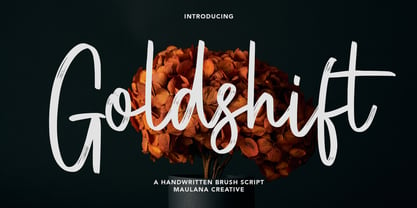 Goldshift is a modern handwritten brush script font, With a rough brush stroke and fun characters. It has Opentype features of ligatures and extra swash, makes it a perfect choice for branding and digital designs. Use this font for logos, social media, websites, blogs, instagram, social media, business cards, branding, and more! Goldshift font support multilingual more than 100+ language. and good pair for your secondary text font with sans or serif. Make a stunning work with Goldshift handwritten brush script font. Cheers, MaulanaCreative
 - Truly Happy by Olivetype,
$18.00 Truly Happy is an ideal font choice for anyone looking to add a bit of fun and playfulness to their projects. This handwritten font has a light and airy feel, making it ideal for any creative project. With its cute and whimsical details, Truly Happy will surely bring a smile to everyone who sees it. So what’s included : Basic Latin Uppercase and Lowercase Numbers, symbols, and punctuations Multilingual Support. PUA Encoded and fully accessible without additional design software Simple Installations Works on PC & Mac Cheers.
 - Rick's Cafe by NorFonts,
$30.00 Rick's Cafe font is my emulation of those typefaces used in newspapers, it's being inspired from my "NorB TypeWriter" typeface. You may want to use this font with any word processing program for text and display use, print and web projects, apps and ePub, comic books, graphic identities, branding, editorial, advertising, restaurant menus, newspapers, scrapbooking, cards and invitations and any casual lettering purpose… or even just for fun! Rick's Cafe font comes in 4 styles, Normal and Bold each with Italic and Condensed versions.
 - Scarville by Factory738,
$15.00 This year's Halloween is approaching quickly!!! Scarville is an excellent choice for Halloween projects. Use its eerie atmosphere as a jumping-off point for your Horror project. There are numbers, punctuation, and multilingual letters included. These ligatures will come in handy for whatever your imagination brings to mind up.. 7 Styles Basic Latin A-Z and a-z Numerals & Punctuation Stylistic Ligatures Multilingual Support for ä ö ü Ä Ö Ü ... Free updates and feature additions Thanks for looking, and I hope you enjoy it.
 - Bad Poser by Gassstype,
$25.00 Here comes a New font, Bad Poser is a All Caps Brush Font that is written casually and quickly. Letters are made with brushes on Procreate. Then crafted carefully drawn into vector format. That is why Bad Poser has Stylish and strong characteristic more natural look to your text with a more modern look to your text. Bad Poser is perfect for homeware designs,branding projects, Logo design, Quotes product packagingprinted quotes, invitations, cards, product packaging, headers, Logotype, Letterhead, PosterLabel, cartoon, and comic etc.
 - Moonsticky by Maulana Creative,
$10.00 Moonsticky is a modern handwritten font. With contrast stroke and fun character. It has Opentype features of ligatures and alternate lowercase to legibility in a short text, makes it a perfect choice for branding and digital designs. Use this font for logos, social media, websites, blogs, instagram, social media, business cards, branding, and more! Moonsticky handwritten font support multilingual more than 100+ language. and good pair for your secondary text font with sans or serif. Make a stunning work with Moonsticky handwritten font. Cheers, MaulanaCreative
 - Leo Slab by Lebbad Design,
$27.95 Leo Slab is a clean, contemporary slab-serif font. It's bold extended design makes it a perfect choice for headline and larger text block use. Extremely readable for a strong impact! Leo Ornate is a decorative companion to Leo Slab. With it's detailed inlines and linear drop shadow, Leo Ornate is ideally suited for use on headlines, display titles, logos, as well as a variety of other applications. Bold, extended and robust, this font is sure to make a strong impact in your next design.
 - Samuri by Twinletter,
$15.00 SAMURI is our newest font with Japanese style features, developed with an exotic and relaxed shape, this font is extremely attractive to match your extraordinary project, using this font will instantly make your project look exquisite, charming, and everyone will be glad to view the look. Unlike the rest, your project will be one-of-a-kind. Logotypes, food banners, branding, brochure, posters, movie titles, book titles, quotes, and more may all benefit from this font. Of course, using this font in your various design projects will make them excellent and outstanding; many viewers are drawn to the striking and unusual graphic display. Start utilizing this typeface in your projects to make them stand out.
 - Sagitaria by Sensatype Studio,
$15.00 Santiago is A Modern Chic Stylish font that special crafted with love to make your brand standout. A new font that we created special for branding needs, with unique characters and awesome ligature characters are ready to add value of your brand. It so nice to leverage designer or product owner that need solutions to make their design look more beauty, chic and modern. And specially for Santiago font, We prepared any ligature characters to help you create unlimited variations for your creative needs. Sagitaria Modern chic font ready with: Any options to get creative variations (combination of Ligature) Preview as a inspirations that you can do with Sagitaria font Ready with Lowercase and Uppercase characters Wish you enjoy our font. :)
 - American Oak by Ian Barnard,
$15.00 I've always been drawn to the beautiful typography of whiskey, gin, rum & bourbon bottle labels, as they enhanced the history that is behind this aged old spirits. A combination of elegant scripts and rugged serifs, these labels give sensibility to the slow process which these spirits go through in the distilling process.
 - Hysteria Rollers by Din Studio,
$20.00 Hi, Everyone! Looking for a font that will make your branding stand out? Do you sometimes have an appetite for a bit more wholesome typography? Looking for a fabulous, stylish, and adventure font? We've got what you want. Hysteria Rollers - A Sans Script Font Duo Hysteria Rollers is a fantastic font duo. An uppercase sans serif font is accompanied by a gorgeous handcrafted script brush font that works together in perfect harmony. Designed primarily as a captivating font to add the right amount of modernity and style, This font duo is an excellent choice to ensure a great font match for your designs and projects! Our font always includes Multilingual Support to make your branding reach a global audience. Features: Ligatures Alternates Stylistic Set Swashes PUA Encoded Numerals and Punctuation Thank you for downloading premium fonts from Din Studio
 - Freaky by Shakira Studio,
$17.00 Start good day for new font! present to you, Freaky! Freaky is a unique display serif font with two versions, regular and outline. Specially designed to create a striking and eccentric look in a variety of design projects. Freaky is a great choice for design projects that require a unique and striking visual identity. From bold branding to creative t-shirt designs, this font will add an unforgettable visual touch to any design medium you use. What did you get? Unique letterforms Works on PC & Mac Simple Installations Accessible in the Adobe Illustrator, Adobe Photoshop, Microsoft Word even work on Canva! PUA Encoded Characters Fully accessible without additional design software. I really hope you'll get pleasure using Freaky font and it will be perfect addition to your font collection! If you have some questions, please write me a letter! Shakira Studio
 - Aphrodite Slim by Typesenses,
$57.00 Aphrodite Slim Pro is not just a lighter version of its sister Aphrodite Pro. Aphrodite Slim Pro has duplicated the quantity of characters of its partner, and that means more than 500 new glyphs, reaching a total of more than 1000. More delicate and meticulous, Aphrodite Slim Pro is once more a new typography with deep calligraphic ideals: We immersed ourselves into the world of each calligraphy ductus and each calligraphy masters by studying from decoration to lettering books. This was the key for the logic of Aphrodite Slim’s behavior. The new concept of Aphrodite Slim Pro was to join diverse styles of calligraphy in one in order to achieve an autonomous expressiveness, in fact, this is what calligraphy aims to, and we agreed to bring those ideals to the world of typography: It is justifiable to be inspired in hundred-year-old calligraphies, but it is even better if the results you obtain have a plus. A personal plus. During the creation process we were wondering whether it was possible to mix certain strokes of such rigid styles as uncial, (Li·n’s favourite style), with strokes of the copperplate, (Sav’s favourite style), and also to take and mix cualities of cancelleresca cursiva, formata and moderna; finally giving our creation a roman-transition italic look. So Aphrodite Slim takes ideals and aspects from those formal styles, following its own logic though, and emphasizing the fact of being a decorative typography. Calligraphy masters of our past are who we are in debt with. They are the cause we have lovely letters now. They have been spontaneous at the moment of creation, what differs from the type-designers of nowadays, whose spontaneity is more limited. Digital faces that we are used to see these days are a result of long hours of optical adjustments, grids, macros and inspirations of other existing typography, but without personal contributions. Aphrodite Slim wants to refute this. Its mission is to rescue de spontaneity of the artesanal lettering in order to obtain unique words; those which only calligraphy masters of our past or lettering artists of our present could give us. We have worked hard to achieve this, making Aphrodite the most universal font we could: It was necessary to study the most common words, focalizing more in the ones referring to “sensitivity”, of four of the most spoken languages in the world. Aphrodite Slim has an enormous quantity of decorative characters and special ligatures for phrases and words in English, French, Spanish and German. (See English, Français, Español, Deutsch PDF in the gallery section). We promise there is no existing type that decorates/ligates glyphs and words like Aphrodite Slim does: It is the first time a font like this really considers its purpose. -The way glyphs are ligated is insane- : Aphrodite Slim rescues some ideals of persons like Jan van den Velde (Italian cancilleresca writing of XVI Century) who understands ascenders and descenders as possibilities to beautify the lines of writing with curved strokes that seem to be dancing above and below of the words. This master also creates ascenders and descenders even where they are not necessary, on letters that do not actually need them: Aphrodite Slim takes this ideal. The font counts with a wide range of glyphs that seem not to be satisfied with its more primitive form and prefer to extreme their parts to be decorative. It also existed masters of calligraphy like José de Casanova of XVII Century, who, with a magnificant skill and a really personal mark, had the particularity of ligating words that were actually separated with spaces. This is another innovative feature in Aphrodite Slim. An investigation of the most common beginnings and endings words of the English language was done. Having that feature activated (discretionary ligatures), common words will start to ligate or to be decorated even when they are separated by spaces. Impossible to forget Francesco Periccioli of XVII Century and our experience us designers to face with works of him: His letters, that today are included in the group of cancellerescas modernas, have been a direct inspiration to the oldstyle figures and historical forms variables in Aphrodite Slim. Giovanni Antonio Tagliente (XVI Century) and his particular way of making tails and diagonals longer than usual, qualities that our creation reflects too. Finally, our adventures in Biblioteca Nacional and Barrio San Telmo, Buenos Aires, were essential for us to make Aphrodite Slim more complete and interesting: Sav did an excellent work when studying how the decorative miscellanea and swirls of early XX century were. She also investigated what particularities made those roman titling characters look antique so she could rescue some ideals for the oldstyle figures and historical forms variables. This also leaded her to create the ornaments variable in Aphrodite Slim. We are really proud of presenting Aphrodite Slim Pro, a typography that was the result of days and nights of working hard, because we do love what we do; and we are glad we are living in a present that gives us the possibility to spread this kind of art, because that is the way we consider our job: Aphrodite Slim Pro is Art. Hope you can appreciate the enormous work this type has. Features. Aphrodite Slim Pro is the most complete variable. It includes more than 1000 glyphs. Thanks to the Open-Type programming, it counts with a easy way to change/alternate glyphs if the application in which the font is used supports this. The variables contained in Aphrodite Slim Pro are also offered separately. Aphrodite Slim Text: It is the variable for lines and paragraphs. Thus it is the least ornamental and the most accurate to achieve a satisfying legibility. It has the Standard Ligatures feature in order to improve the possible conflicts some glyphs could have by others. Aphrodite Slim Contextual: It is the one that makes emphasis in decorating. It has the particularity of ligating/decorating words of common use in English, French, Spanish and German. It also has the quality of ligating common beginnings and endings of the common words in English. Aphrodite Slim Stylistic: With similar features of Slim Contextual. It includes a set of decorative numbers for a display use. Aphrodite Slim Swash: This one has special beginnings and endings to decorate words. Aphrodite Slim Endings: It makes words look as a signature. Aphrodite Slim Historical: It adds an antique look to the written word. It also has the special historical ligature function. Aphrodite Slim Titling: This one is the most decorative. Its copperplate inspired ornaments give words a special color, in order to handle the quantity of decoration, it comes with the standard ligature feature, which has the most common ligatures plus others that make decorative swirls not to be conflictive. Aphrodite Slim Ornaments: A set of 52 ornaments. Aphrodite Slim Pro includes all this features plus the Stylistic Set 1; Stylistic Set 2 and the possibility of Slashed Zero. We recommend you to check out the gallery in order to see all these features in action.
 - Glamour Absolute by Nicky Laatz,
$42.00 Introducing "Glamour Absolute" - A brand new "two-faced" bold serif with both modern and vintage curves. A Two-faced beauty : Modern or Vintage If you are going Vintage Retro : Access your OpenType features to access the large selection of alternate letters and ligatures, select the letters you like from the large variety to get the vintage look you are after. Vary between a light and heavy vintage look based on how many letters you alter. If you are going Modern Chic : Just type with regular letters :) Play with your letter spacing to add even more class to your designs. Due to its split personality , Glamour Absolute is a very versatile font, covering a wide range project types, from bold magazine imagery , to wedding invitations, to branding, poster design and so much more.
 - Savigny by insigne,
$22.00 Savigny began as an offshoot of Le Havre. Le Havre met my design objective of a geometric sans serif with a strong art deco touch. Le Havre’s primary inspiration came from the art deco titling of the 1930’s, and the lower case was just icing. The art of the 1930’s is of particular interest to me, and I love the art deco era and its art, and the simplicity of geometric shapes. I am mostly interested in designing display typefaces. In many ways Le Havre was the exact opposite of another popular insigne offering, Aviano Sans. Le Havre has very high ascenders, a lower case and is very condensed. Aviano Sans has no lowercase and extremely extended capitals. With the rise of webfonts I began to see Le Havre being used frequently online. It’s short x-height and very tall ascenders made it difficult to read in on screen text settings as it was intended as display type. With this observation, I felt that there is more room for a geometric sans in the insigne catalog. So I set about to design a new geometric sans using the successful skeleton of the Le Havre family. Although I planned to extend the Le Havre line, the new family is so drastically different I decided on a new name: Savigny. The face evolved and began to take on a few humanist touches. Designed from the very beginning as a webfont, the design is open and pleasing to the eye, with a tall x-height. To optimize it for onscreen settings, the spacing is generous. In addition, it includes extended and condensed members, making it insigne’s first superfamily. The family includes over 100 OpenType alternate characters. These include several style sets. Some are stemless, others are purely geometric, and in a nod to Savigny’s origins, Art Deco titling alternates. Please see the informative .pdf brochure to see these features in action. OpenType capable applications such as Quark or the Adobe suite can take full advantage of the automatically replacing ligatures and alternates. This family also includes the glyphs to support a wide range of languages. Savigny is a great choice for a professional designer who wants a well rounded typeface family that is ready for the web.
 - Overnight Oats by Hanoded,
$11.00 I recently walked part of the South West Coast Path in the UK. A couple of days in the hike, I came across a small cafe and I decided to have an oat latte (I am lactose intolerant). Since it was early in the morning, the breakfast menu was out and one of the items I noticed was ‘Overnight Oats’. I normally cook my oats with some lactose free milk and water, but apparently you can soak them overnight, add fruit and nuts and eat it like that. I tried it, it’s ok, but I think I prefer the cooked version. Overnight Oats is a bit of an odd font: it is very higgledy piggledy, yet legible and unique. If you want something out of the ordinary, then this may be your font!
 - Dunver by Putracetol,
$24.00 Introducing Dunver - a display typeface font inspired by vintage albums and posters from 1960s music bands. The classic typeface, combined with fun and groovy impressions, make Dunver a unique and distinct font choice. This font is perfect for any kind of display purpose, including album covers, posters, labels, t-shirts, apparel, signage, quotes, logos, greeting cards, and logotypes. Dunver is especially well-suited for music and party events. With its retro feel and bold design, it can help you create designs that perfectly capture the energy and excitement of the event. Whether you're designing posters, flyers, or social media graphics for your next gig or music festival, Dunver can help you make an impact. The font comes with a range of features, including alternate characters divided into several OpenType features such as Swash, Stylistic Sets, Stylistic Alternates, Contextual Alternates, and Ligature. These OpenType features can be accessed using OpenType savvy programs such as Adobe Illustrator, Adobe InDesign, Adobe Photoshop CorelDRAW X version, and Microsoft Word. In the zip package, you will find Dunver in otf, ttf, and woff formats. It comes with uppercase and lowercase letters, opentype alternates and ligatures, numbers, punctuation, and symbols, as well as multilanguage support. Dunver is not just a font - it's a versatile tool that can help you bring your creative vision to life.
 - Piel Script by Sudtipos,
$89.00 Over the past couple of years I received quite a number of unusual and surprising requests to modify my type designs to suit projects of personal nature, but none top the ones that asked me to typeset and modify tattoos using Burgues Script or Adios. At first the whole idea was amusing to me, kind of like an inside joke. I had worked in corporate branding for a few years before becoming a type designer, and suddenly I was being asked to get involved in personal branding, as literally “personal” and “branding” as the expression can get. After a few such requests I began pondering the whole thing from a professional perspective. It was typography, after all, no matter how unusual the method or medium. A very personal kind of typography, too. The messages being typeset were commemorating friends, family, births, deaths, loves, principles, and things that influenced people in a deep and direct way, so much so that they chose to etch that influence on their bodies and wear it forever. And when you decide to wear something forever, style is of the essence. After digging into the tattooing scene, I have a whole new respect for tattoo artists. Wielding that machine is not easy, and driving pigment into people’s skin is an enormous responsibility. Not to mention that they're some of the very few who still use a crafty, hands-on process that is all but obsolete in other ornamentation methods. Some artists go the extra mile and take the time to develop their own lettering for tattooing purposes, and some are inventive enough to create letters based on the tattoo’s concept. But they are not the norm. Generally speaking, most tattoo artists use generic type designs to typeset words. Even the popular blackletter designs have become quite generic over the past few decades. I still cringe when I see something like Bank Script embedded into people’s skin, turning them into breathing, walking shareholder invitations or government bonds. There’s been quite a few attempts at making fonts out of whatever original tattoo designer typefaces can be found out there - wavy pseudo-comical letters, or rough thick brush scripts, but as far as I could tell a stylish skin script was never attempted in the digital age. And that’s why I decided to design Piel Script. Piel is Spanish for skin. In a way, Piel Script is a removed cousin of Burgues Script. Although the initial sketches were infused with some 1930s showcard lettering ideas (particularly those of B. Boley, whose amazing work was shown in Sign of the Times magazine), most of the important decisions about letter shapes and connectivity were reached by observing whatever strengths and weaknesses can be seen in tattoos using Burgues. Tattoos using Adios also provided some minor input. In retrospect, I suppose Affair exercised some influence as well, albeit in a minor way. I guess what I'm trying to say is there is as much of me in Piel Script as there is in any of the other major scripts I designed, even though the driving vision for it is entirely different from anything else I have ever done. I hope you like Piel Script. If you decide it to use it on your skin, I'll be very flattered. If you decide to use it on your skateboard or book cover, I'll be just as happy. Scripts can't get any more personal than this. Piel Script received the Letter2 award, where they selected the best 53 typefaces of the last decade, organised by ATypI.
 - Medinah by Trustha,
$15.00 Medinah is a stunning and bold script, completely suitable for a large number of designs. This font will leave you breathless, and give all your designs the impact they need to stand out from the crowd.
 - Sabon Georgian by Linotype,
$67.99The Sabon® Georgian design translates the original Sabon typeface into Georgian language. Its old style Latin-based design traits and proportions have been carefully and beautifully interpreted as Georgian script characters. In the early 1960s, a group of German master printers wanted a typeface family which would provide them with consistent and predictable results, whether it was used as machine or hand-set composition. They approached one of Germany’s most distinguished type designers, Jan Tschichold, to undertake the design task. The end result of the design commission is a typographic tour de force, and the face that establishes Tschichold’s reputation as a type designer. The completed design, released in 1966, not only solved the imposed design problem of the early 1960s, it is also an exceptionally beautiful and useful digital design. The Sabon® Georgian design further extends the range of this remarkable typeface - American Spirit STF by Altered Ego,
$30.00American Spirit STF is a glorious collection of contemporary patriotic symbols: US Flags (traditional and contemporary), a variety of stars, eagles, torches, and combinations of them all. Designed for print and web, this collection is useful for embellishing your designs with a subtle (or not-so-subtle) patriotic touch. The flags have been designed for easy ungrouping in a drawing program, in order to colorize the union and stripes. And as a special feature, American Spirit™ splits the flags into two characters (the union and the stripes) that can be separately colored and will kern together based on the character chosen. Suggestions for doing this are included in every package. This versatile collection also contains a special contemporary version of the US Flag, with rounded corners on the union and stripes, and a five-pointed asterisk-like shape as the stars. (This allows the stars to appear as stars at smaller sizes.) Show your American Spirit! Sign up today for this contemporary collection of patriotic symbols! - Olimpico by MAC Rhino Fonts,
$59.00 The name of this typeface is a hymn to the Stadio Olimpico in Rome. The home arena to the World's most beautiful football club – AS ROMA. A club with many great players through the years. The biggest of them all, is already a living legend… Francesco Totti. The design is a 2-weight family perfect for elegant display work. The regular weight is more even in blackness while the bold weight carry more contrast.
 - Minnak by Esintype,
$18.00 Minnak, as a whole geometric display type is our take on Square Kufic (Makili) style Latin script fonts, comes in eleven weights with linear progression. It is an Uniwidth typeface at the core. From Hairline to Black, all multiplexed weights take up the same space in width and can be used interchangeably. Supports wide range of Open Type features, with many stylistic alternates in 12 context. Minnak is also have a close relation with pixel fonts, because in spite of its based on Makili forms, it all started as a pixel font in the drawing stage before further steps came into play. The key difference between Minnak and Makili style is that the latter must have the exact square counters with no diagonal strokes, and any other components of a letterform must conform to be proportional. Such style-specific requirements determine the overall dimensions of the glyphs and therefore, there can be only minor differences between the typefaces. In Minnak, counters are rectangular because of its narrow and condensed proportions, but the Makili form influence is still manifest. This impression is best confirmed with Medium weight where negative spaces and stem thickness are equal. Contrast and virtually no optical correction were presented, as characteristic of its genre had to have equal horizontal and vertical line thicknesses. As per the minimal and authentic look of the type, all glyphs are drawn as straight or only as 45-degree diagonal strokes. The representation of the ‘diagonalless’ approach is preserved by stylistic alternatives, making its similarity in visual aesthetics clearly visible. Marks and punctuation is another feature that doesn’t follow the strict rules of the origin style. Although not a pixel font, all building parts of the glyphs in Minnak share the same unit precision as they are designed with pixel equivalents in mind. Even space characters are designed to match glyph widths, meeting the demands of certain typesetting or multi-line lettering compositions. With its Pseudo Ancient and Runic alternates, extention parts and ornaments included in all weights, Minnak is suitable for branding, logo and monogram designs, the screen titles and headlines, packaging, posters, book covers and more, where it shines at big sizes. Its pixel font-like appearance makes it a significant choice for the modern compositions. Thanks to mostly uniform width design, it is possible to use Minnak also as a system for lettering. This feature can be used as vertical fitting of the letters between the lines. As a casual expression in Turkish, “Minnak” is one of the seven typeface designs in Esintype's ancient scripts of Anatolia project, Tituli Anatolian series — representing Seljuk period in the medieval Anatolia and their tradition of architectural stone ornamentation.