10,000 search results
(0.032 seconds)
- Hiragino Sans by SCREEN Graphic Solutions,
$210.00 Mindful that Hiragino Sans (Kaku Gothic) would be used in conjunction with Hiragino Serif (Mincho), SCREEN developed a font that anticipated today’s world where most people do their reading on displays and yet still has an orthodox letterform that does not blur when printed on paper. In short, our goal with this font was to create a new concept that responds to the demands of today’s times. This font offers weight variations from W0 to W9 and is extremely versatile. This makes it well-suited to all visual expression media including paper, metallic textures, resins, cloth, television, movies, broadcasting, websites, and electronic displays. One of the design’s strongpoints is that it elides serif on the right side of each stroke, thus delivering more spacious counters and a comfortable appearance. Thanks to this, the typeface not only delivers a contemporary, lively impression same as Latin sans serif typefaces, but also heightens the natural continuity and readability of text whether it is set vertically or horizontally. As a result, it makes it possible to bring a strong appealing power to text. Without a doubt, this is typeface that above else embodies the role of Sans Serif.
 - Plz Print Bold Cond by Outside the Line,
$19.00 A bold, energetic, friendly font with a little bounce to it. A good, casual headline font. Works back well with Plz Print or Plz Script.
 - LFT Etica by TypeTogether,
$35.00 LFT Etica, the-moralist-typefamily-project, was born at the end of 2000, but its development is ongoing, overcoming many hurdles and diversions. The starting point for the designers at Leftloft were the common "cold" grotesk sans serifs, ubiquitous and often badly applied in their everyday visual environment. The challenge was to obtain the same force, versatility and color, but with a much warmer feel. The resulting design has soft strokes, open counters and terminals; aesthetically resting somewhere between a grotesque and humanist sans serif. It successfully combines masculine force with female delicacy. LFT Etica’s wide range of styles, together with a large character set and OpenType features, such as 4 sets of numerals, fractions, several stylistic alternates and a set of arrows and dingbats, allows for a vast variety of applications, be they editorial or corporate.
 - Halfroy by Heypentype,
$20.00 Halfroy is our answer to generic geometric sans trends exploding nowadays who creates sameness. Halfroy brings new sans perspectives by combining rounded and sharp edges to create delicate sans fonts. See the difference by looking at counter-shapes compared to outline, insides counter shapes you will sees a sharp edges while round but not geometrical on outlines. Halfroy gives your project unique visual impact whatever your design project is, but we recommend using thin, semibold to Fat as display then light and regular. Halfroy taken inspirations not from looking at other sans typeface, but its design inspirations comes from observing a land contour and geographical statistics in our city, Kota Batu. We found that our city geographic consist of steep slope like waves with sharp peaks and surrounded by small and third highest mountains peak on our country. From then on we begin visualize and applied on few letters. Take a look on our 'O', 'f', 's' letters, its like a stone carved letters. Its hard edges and soft edges outline clearly draws from our inspiration source. Even Halfroy looks stony, hard as individual letters, we treat this type with humanist approach in mind. Therefore you can sense a friendly yet casuals of typical sans serif fonts when it grouped together to form a words or sentences. We hope Halfroy will gives your design project a unique on its own.
 - Newport Classic SG by Spiece Graphics,
$39.00 Willard T. Sniffin designed this extra condensed art deco typeface for American Type Founders in 1932. Low-waisted capital letters curve in stunning geometric fashion next to large, oversized lowercase letters. The heart of this classic design is undeniably 1930s but it also looks just fine in contemporary situations. Many of the original alternate characters plus a few new ones have been included in this complete digital version. Newport Classic with Alternates is also available as an OpenType font. This version now contains small caps, lining and oldstyle figures, prebuilt fractions, stylistic alternates, word ornaments and a wide assortment of f-ligatures. These advanced features currently work in Adobe Creative Suite InDesign and Illustrator. Check for OpenType advanced feature support in other applications as it gradually becomes available with upgrades.
 - Alergia Remix by Borutta Group,
$19.00 Alergia Remix, designed by Mateusz Machalski, is the younger sister of Alergia Grotesk. Remixed styles were made as a hybrid between a linear antiqua and a geometric display typeface. Alergia Remix is characterised by a lot of details, which gives it a strong character. Unpredictable construction in the letters a,s,g,e,m,h etc. in combination with a delicate contrast, makes Alergia Remix a good choice for many display purposes . The whole family has a comprehensive set of characters. In additionton to Latin letters, Alergia Remix also has a full set of characters for Vietnamese, extended Cyrillic (with Abkhasian) and Greek.
 - Calypso I by Typolar,
$65.00 Calypso I (Italian) draws its inspiration from type founders' plentiful show-off-letters, which were typical on title pages and lithographs in the early 19th century. It borrows luscious details from these but inherits a stiff modern backbone from its parent, Calypso E (Egyptian). Within the Calypso type family all fonts share the same dimensions and work together consistently. Calypso I supports many languages and includes, for example, four sets of basic numerals, circled numbers, alternative characters, case sensitive forms and dingbats. Give it a go on drop caps and headlines or even set short paragraphs with it. It loves colour and effects.
 - Nouveau Calendar JNL by Jeff Levine,
$29.00 Inspired by the lettering on Koloman Moser’s poster design for Fromme’s Calendar (circa 1912), Nouveau Calendar JNL is available in both regular and oblique versions. According to Wikipedia: “Koloman Moser (30 March 1868 – 18 October 1918) was an Austrian artist who exerted considerable influence on twentieth-century graphic art and one of the foremost artists of the Vienna Secession movement and a co-founder of Wiener Werkstätte. Moser designed a wide array of art works, including books and graphic works from postage stamps to magazine vignettes; fashion; stained glass windows, porcelains and ceramics, blown glass, tableware, silver, jewelry, and furniture.”
 - Ambulance Shotgun Pro by CheapProFonts,
$10.00 Another grungy masterpiece from Guillaume - this one with a woodprint touch. I have made the lowercase letters different from the uppercase by removing the cross-shaped counters and flipping where possible. Even the numbers have solid variants - available as OpenType "Stylistic Alts". Enjoy the new flexible possibilities! ALL fonts from CheapProFonts have very extensive language support: They contain some unusual diacritic letters (some of which are contained in the Latin Extended-B Unicode block) supporting: Cornish, Filipino (Tagalog), Guarani, Luxembourgian, Malagasy, Romanian, Ulithian and Welsh. They also contain all glyphs in the Latin Extended-A Unicode block (which among others cover the Central European and Baltic areas) supporting: Afrikaans, Belarusian (Lacinka), Bosnian, Catalan, Chichewa, Croatian, Czech, Dutch, Esperanto, Greenlandic, Hungarian, Kashubian, Kurdish (Kurmanji), Latvian, Lithuanian, Maltese, Maori, Polish, Saami (Inari), Saami (North), Serbian (latin), Slovak(ian), Slovene, Sorbian (Lower), Sorbian (Upper), Turkish and Turkmen. And they of course contain all the usual "western" glyphs supporting: Albanian, Basque, Breton, Chamorro, Danish, Estonian, Faroese, Finnish, French, Frisian, Galican, German, Icelandic, Indonesian, Irish (Gaelic), Italian, Northern Sotho, Norwegian, Occitan, Portuguese, Rhaeto-Romance, Sami (Lule), Sami (South), Scots (Gaelic), Spanish, Swedish, Tswana, Walloon and Yapese.
 - Prosaic Std by Typofonderie,
$59.00 A Postmodern vernacular sanserif in 8 fonts Prosaic designed by Aurélien Vret is a Postmodern typographic tribute to the french vernacular signs created by local producers in order to directly market their products visible along the roads. These signs drawn with a brush on artisanal billboards do not respect any typographic rules. The construction of these letterforms is hybrid and does not respect any ductus. Nevertheless the use of certain tools provokes a certain mechanism in the development of letter shapes. It’s after many experiments with a flat brush, that’s these letterforms have been reconstructed and perfected by Aurélien Vret. This is the starting point for the development of an easily reproducible sanserif with different contemporary writing tools. From non-typographical references of Prosaic towards readability innovation The influence of the tool is revealed in the letterforms: angular counterforms contrasting to the smoothed external shapes. This formal contrast gives to Prosaic a good legibility in small sizes. These internal angles indirectly influenced by the tool, open the counterforms. In the past, to deal with phototype limitations in typeface production, some foundries modified the final design by adding ink traps. In our high resolution digital world, these ink traps — now fashionable among some designers — have little or no effect when literally added to any design. Should one see in it a tribute to the previous limitations? Difficult to say. Meanwhile, there are typeface designers such as Ladislas Mandel, Roger Excoffon, and Gerard Unger who have long tried to push the limits of readability by opening the counters of their typefaces. Whatever the technology, such design research for a large counters have a positive impact on visual perception of typefaces in a small body text. The innovative design of counter-forms of the Prosaic appears in this second approach. Itself reinforced by an exaggerated x-height as if attempting to go beyond the formal limits of the Latin typography. It is interesting to note how the analysis of a non-typographical letters process has led to the development of a new typographic concept by improving legibility in small sizes. Disconnected to typical typographic roots in its elaboration, Prosaic is somewhat unclassifiable. The formal result could easily be described as a sturdy Postmodern humanistic sanserif! Humanistic sanserif because of its open endings. Sturdy because of its monumental x-height, featuring a “finish” mixing structured endings details. The visual interplay of angles and roundness produces a design without concessions. Finally, Prosaic is Postmodern in the sense it is a skeptical interpretation of vernacular sign paintings. Starting from a reconstruction of them in order to re-structure new forms with the objective of designing a new typeface. Referring to typographic analogy, the Prosaic Black is comparable to the Antique Olive Nord, while the thinner versions can refer to Frutiger or some versions of the Ladislas Mandel typefaces intended for telephone directories. Prosaic, a Postmodern vernacular sanserif Prosaic is radical, because it comes from a long artistic reflection of its designer, Aurélien Vret, as well a multidisciplinary artist. The Prosaic is also a dual tone typeface because it helps to serve the readability in very small sizes and brings a sturdy typographic power to large sizes. Prosaic, a Postmodern vernacular sanserif
 - Blue Goblet Serif by insigne,
$6.99 Blue Goblet is a series of fonts and ornaments by Cory Godbey and Jeremy Dooley. This best selling series has now been extended to include a new member, Blue Goblet Serif. Blue Goblet Serif comes with a variety of weights and also an outline version. Blue Goblet is hand-lettered by the artist, Cory Godbey, and is organic, spontaneous and exuberant. Characters bounce and dance above and below the baseline and x-height, making this a whimsical and fun script. Not only is Blue Goblet Serif a excellent choice, it also is a member of a wide family of different fonts. You can use it side by side with the original Blue Goblet, and there are a wide range of ornaments available, totaling over 350 illustrations! These illustrations include frames, florals and other text ornaments that can be inserted into your text and resized at will. This makes the Blue Goblet series a great pick when you want a type system that works very well together for a very unique and consistent look. The Blue Goblet series continues to grow and be expanded, making it a valuable investment. Blue Goblet Serif also includes auto replacing ligatures that make it appear that the script was drawn by the artists own hand, just for you! Blue Goblet Serif also includes a wide variety of alternates that can be accessed in any OpenType enabled application. Blue Goblet includes over 150 OpenType glyphs, and is loaded with features including an even more unique alternate alphabet. Included are swash alternates, style sets, old style figures and small caps. Please see the informative PDF brochure to see these features in action. OpenType enabled applications such as the Adobe suite or Quark can take full advantage of the automatic replacing ligatures and alternates. This family also includes the glyphs to support a wide range of languages. Blue Goblet Serif is great choice for display and short blocks of display text, children's books, packaging, or other unique applications. Fill in the counter spaces with color for a unique look, or alternate the different weights. Use Blue Goblet whenever you want to inject a sense of fun and whimsy to your designs. Give the Blue Goblet series a try today!
 - ITC New Veljovic by ITC,
$57.99 Thirty years after its first appearance, Jovica Veljović has produced ITC New Veljovic Pro, a completely revised edition of his first typeface, ITC Veljovic (1984). Prof. Veljović has tapped into all the experience he has garnered over the past decades; by carefully adjusting the proportions of the characters he has provided the new typeface with a more harmonious presence. The serifs have been subtly curtailed and the letters made slightly more condensed. Some new features of ITC New Veljovic are the double-story “g” with its completely closed loop and the more open forms of the “c” and “e”. In the italic variants, the latter is much rounder. Thanks to Veljović’s outstanding work, the optimized ITC New Veljovic can now be used in all contemporary applications. The new Condensed style saves considerable space when it comes to setting longer texts. The Display versions show off the striking, crystal-clear shapes of the design at their best in larger point sizes.
 - VTF Gladius by VarsityType,
$18.00 This dynamic athletic block has the need for speed. VT Gladius is a display typeface loaded with energy and ready to take off. Each letterform is built on a system of angles that generate a distinct rhythm, drawing the eye through the shape, making every word feel more dynamic. Further reinforcing this are the slightly thicker baseline-adjacent horizontal stems — alluding to the ink-pooling that lower strokes have in traditional penmanship — creating a “bounce” that gives each letter that much more personality. For further customization, the “Disable Speed Cuts” OpenType feature and discretionary ligatures serve as another fine-tuning tool. With five weights, a stencil version, and oblique styles for each, this 12-font family is ready to kick things in to another gear.
 - Risque Pro by Stiggy & Sands,
$29.00 Our Risque Pro draws inspiration from the title screen of the 1962 Looney Toons cartoon, "Martian through Georgia". Originally an all Capitals reference, Risque includes Capitals, lowercase, and SmallCaps sets as festive and irregular in its bounce as the cartoon reference. This frolicking fun typeface has retro roots, but also an all around offbeat personality that opens it up to a wide gamut of uses. Opentype features include: - SmallCaps. - Full set of Inferiors and Superiors for limitless fractions. - Tabular, Proportional, and Oldstyle figure sets (along with SmallCaps versions of the figures). - Stylistic Alternates for Caps to SmallCaps conversion.
 - MyBella by Eurotypo,
$22.00 MyBella is a casual script font, its slight bounce and intentional irregularity gives your words a wonderful flow. The thick and thin strokes in this typeface combine balance and harmony. With OpenType features such as Stylistics and Contextual alternates, Swashes, Ligatures, and Stylistic sets specially designed to help your creativity and make it easier to make the impressive and elegant typographic work. MyBella looks lovely on wedding invitations, greeting cards, logos, business-cards, fashion, magazines, food packaging and menus, book covers and whatever your imagination holds!
 - Megatropolis by Just My Type,
$35.00 Introducing Megatropolis : intellectual, architectural, urban and urbane. What started as an idea where the counters would be letters (3 scribbled glyphs on a piece of scrap paper), has grown into a mighty font family of eight stackable fonts. First came Megatropolis itself, a Deco font within a Deco font; Double Deco, you might say. In Illustrator, you can deconstruct it to make solid letters, outline letters or just the inset letters on their own, and you can stack them how you wish. Or you can get the whole Megatropolis family with Black , Outline , Inset , Smog , Shade and Shade with Inset and keep them all separate stackable, editable fonts. In addition, there’s Megatropolis Benday (available in TT only), with its fabulous stackable comic dots. Megatropolis is a typographer’s playground.
 - ITC Handel Gothic by ITC,
$40.99 The Handel Gothic? typeface has been a mainstay of graphic communication for over 40 years - all the while looking as current as tomorrow. Designed by Don Handel in the mid-1960s, and used in the 1973 United Airlines logo developed by Saul Bass, Handel Gothic was an instant success when released to the graphic design community. Its generous lowercase x-height, full-bodied counters and square proportions make the design highly readable at a wide range of sizes. Handel Gothic's slightly idiosyncratic character shapes gave the face a futuristic look 40 years ago that retains its power today. In addition, its Uncial-like lowercase is instantly identifiable - and unique among sans serif typestyles. Award-winning type designer Rod McDonald was attracted to the simple, decisive forms of the original, but he felt the design needed to be refined and updated. ?One of my goals was to bring a modern typographic discipline to what was really an old phototypesetting font.? To achieve his goal, McDonald re-proportioned every character and balanced the delicate relationship between the curves and the straight strokes. He also added a number of alternate characters to extend the range of the design. ?I wanted to give designers a large enough character set so they wouldn't feel constrained in what they could do. I want them to be able to play with the fonts, not just set words.? McDonald enlarged the family from the single-weight original to five weights, each with a full suite of alternate characters.In 2015 Nadine Chahine designed matching arabic weights to this family.
 - Handel Gothic by URW Type Foundry,
$35.00 The Handel Gothic? typeface has been a mainstay of graphic communication for over 40 years - all the while looking as current as tomorrow. Designed by Don Handel in the mid-1960s, and used in the 1973 United Airlines logo developed by Saul Bass, Handel Gothic was an instant success when released to the graphic design community. Its generous lowercase x-height, full-bodied counters and square proportions make the design highly readable at a wide range of sizes. Handel Gothic's slightly idiosyncratic character shapes gave the face a futuristic look 40 years ago that retains its power today. In addition, its Uncial-like lowercase is instantly identifiable - and unique among sans serif typestyles.
 - Handel Gothic by Linotype,
$40.99The Handel Gothic™ typeface has been a mainstay of graphic communication for over 40 years - all the while looking as current as tomorrow. Designed by Don Handel in the mid-1960s, and used in the 1973 United Airlines logo developed by Saul Bass, Handel Gothic was an instant success when released to the graphic design community. Its generous lowercase x-height, full-bodied counters and square proportions make the design highly readable at a wide range of sizes. Handel Gothic's slightly idiosyncratic character shapes gave the face a futuristic look 40 years ago that retains its power today. In addition, its Uncial-like lowercase is instantly identifiable - and unique among sans serif typestyles. - Duffy Script by Shinntype,
$39.00 An interpretation of the lettering of contemporary illustrator Amanda Duffy. Each font contains four glyphs for each character (including all numbers, punctuation, and symbols), which OpenType coding sets in “random” order for a subtle, natural effect. Use a curved path to further accentuate the bounced quality of the letters. Try out different combinations of glyphs by inserting the cursor in front of your headline and hitting the space bar repeatedly: each time,the text will be represented by a different sequence of glyphs.
 - Stempel by Linotype,
$29.99The Stempel family consists of two fonts; each made to look like a set of block stamps. Each letter appears inside its own roughly drawn square. Stempel One's letters are very simple form/counterform objects. Stempel Two's forms are more ornate: each square stamp has a thin border inside of it, and then the individual letterforms have been knocked-out, so that the colored area depicts the counters around the letters rather than the letters themselves. As a line of text is typed, a box appears for each letter entered, and all of the boxes slightly nudge against each other to form the line. The Stempel fonts have the appearance of a hand-made quality to them. Their forms appear too random, too delicate, and too thought out to have been made on a machine. Using these fonts will add a nice warm, linoleum-cut touch to your work. Both Stempel One and Stempel Two were designed by German designer Martina Balke in 2002, and are part of the Take Type 5 collection from Linotype GmbH." - Bodoni by Linotype,
$29.99 Giambattista Bodoni (1740–1813) was called the King of Printers and the Bodoni font owes its creation in 1767 to his masterful cutting techniques. Predecessors in a similar style were the typefaces of Pierre Simon Fournier (1712–1768) and the Didot family (1689-1836). The Bodoni font distinguishes itself through the strength of its characters and embodies the rational thinking of the Enlightenment. The new typefaces displaced the Old Face and Transitional styles and was the most popular typeface until the mid-19th century. Bodoni’s influence on typography was dominant until the end of the 19th century and, even today, inspires new creations. Working with this font requires care, as the strong emphasis of the vertical strokes and the marked contrast between the fine and thick lines lessens Bodoni’s legibility, and the font is therefore better in larger print with generous spacing. The Bodoni of Morris F. Benton appeared in 1911 with American Type Founders.
 - Let's Jazz by Unio Creative Solutions,
$9.00 Introducing “Let’s Jazz” - a playful typeface which is inspired by iconic mid-century American advertising and lettering. With this project we wanted to homage the dazzling graphics of those booming years and the result is a jazzy typeface that provides a condensed aspect with a bouncy rhythm. As previously said, Let’s Jazz gives the spontaneous vibe of this sensational music genre but it has been also designed with a strong focus to the very distinct look of Saul Bass graphics, which are honestly still fresh and convincing, even nowadays. Let’s Jazz offers two versions, Regular and Stamp. Each version contains more than 450 glyphs and covers several languages based on the Latin alphabet; the jazzy experience is enhanced with OpenType (OTF) support for small caps and includes some neat ligatures and alternates plus the oldstyle bouncy numerals*. This package is a powerful tool in a wide variety of design purposes: headlines, packaging, logotypes, badges, posters and much more. *Let’s Jazz has built-in OpenType features enabled for Adobe® Creative Suite® and any other opentype capable software. All the extra characters has been additionally coded with “PUA Unicode”, which basically means that this font duo is totally accessible without any additional design software. All the extra characters can now be copied straight out the FontBook (Mac) or CharacterMap (Win) and pasted into your favorite text editor. Official mini-tutorials available here: - How to access alternates, ligatures and swashes in Font Book®: https://youtu.be/mGKlvKr0ReI - How to use alternates, ligatures and swashes in Photoshop®: https://youtu.be/46ZtDbHwUAc Specifications: - Multi-language Support (Central, Eastern, Western European languages) - OpenType features (Standard and Discretionary Ligatures, Alternates, Small Caps, OldStyle Numerals) - PUA Coded Extra Characters Thanks for viewing, Unio.
 - Hey Bombshell by Make Media Co,
$12.00 Are you looking for a fun, bouncy lettering set for envelopes, logos, typography, branding and greeting cards?! Well look no further! Created with stationary in mind, Hey Bombshell is sweet, sassy and LOADED with extras to make your work stand out!
 - Bluesy Rain by Epiclinez,
$18.00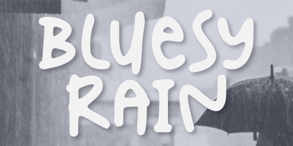 Introducing Bluesy Rain –a cute and fun typeface suitable for creating eye-catching posters, logos, and crafting projects. From its bouncy letterforms to its playful style, hopefully, Bluesy Rain can bring a touch of joy to your design. Thank You
 - Platz Groteske FJ by Frncojonastype,
$27.00 fj Platz Groteske™ is the new font from frncojonastype project that culminates after almost 5 years of learning and development. fj Platz Groteske™ is a Neo-grotesk font with slight geometrical proportions with humanistic terminations. For this occasion, this font will show the normal version, however, the entire project contemplate condensed family, extended and the development of alphabets as Cyrrilic and Greek. This proposal is to improve the legibility in the Neo-grotesk fonts with generous gaps, vertical and square counter form and ascendents that exceed slightly the capitals. Counts with old numbers, small caps, modern numbers, tabular, numerators and denominators to fraccions, reference numbers to notes and formulas to face confidant and complex different stages. Ideal to editorial projects of informative content - scientific and titular of a huge impact because of the various alternative characters, stylistic options and a optometrical version to risky designers. To exclusive licenses and to follow the develop of this project, please visit frncojonas.com (WIP) Learn about upcoming releases, work in progress and get to know us better! Instagram: @frnco.jonas
 - Sweet Azalea by Fromletterel,
$14.00 Sweet azalea is an all rounder font, very easy to adjust following your needs, it can be used as signature, branding, web design and of course used as casual script font to add a handwriting touch, all is available in just one file. Plus featured with ligatures and swash alternates.
 - Reverie OT by District,
$20.00 Reverie is a cheerful band of letters that bounce across the page and get together to create words in four weights. Generous spacing and a modest x-height project an airy typeface that's open but not frail. Quirky without being too whimsical. Use the regular weight for surprisingly readable text or put the light and heavy weights to use for decorative headlines and titles. Reverie OT is the follow-up to the popular Reverie. This version comes loaded with new features: ligatures, small caps, swash caps, a larger numeral set, more language glyphs, and a fourth, heavy weight. This all adds up to a vastly more functional and flexible family of fonts.
 - Exo Soft by Polimateria,
$35.00 Exo Soft. Technology meets humanity. The geometric design got organic with carefully crafted smoothed edges. Exo Soft is a contemporary sans-serif font with a warm and humane feeling. It has an extended language support (both in Latin and Cyrillic) and an handful set of Opentype features. The 9 weights plus correspondent italics give Exo Soft a huge versatility. Because aesthetics are not everything Exo Soft was fine tuned in order to perform well both in screen and in print. The large x-height and open counters makes it function well even on small font sizes but the full potential of Exo Soft will be seen on headlines, branding and advertising.
 - Alpineo by Soneri Type,
$32.00 Alpineo is a display type family, optical mono linear and a bit squarish in nature. It has a distinct stroke-joint style, which is a prominent feature of its design. It has been designed to be a little eye-catching yet legible. It has clear and distinguishable letterforms, which helps to elaborate and emphasis the message. It is graphically strong and command viewer’s attention. The overall appearance of type is suitable in setting it as logotype, punchline, title, headline, etc. The type family consists of six weights viz. Thin, ExLight, Light, Regular, Medium and Bold. Alpineo is designed by Aakash Soneri, founder Soneritype in the year 2017.
 - Morandi by Monotype,
$50.99 Morandi is the first commercial sans serif font created by Jovica Veljović – a much-awarded designer who's been creating typefaces for over thirty years. The product of years of crafting letterforms, Morandi is supremely graceful. Each detail has been carefully refined for legibility, with open counters and generous apertures, and the bottom of round strokes slightly flattened. Not just elegant in appearance, Morandi is an efficient design, versatile enough to work in print and digital environments, including on-screen applications. The family offers three weight ranges and includes a large multi-national character set – making it a practical choice, as well as an aesthetic one.
 - Hargloves Sans by Heypentype,
$20.00 Hargloves sans remixes between grotesque proportions and 80’ industrial inspired-typefaces. Yes, it is a major improvement from original Hargloves fonts with completely different projections. Hargloves Sans intended primarily for text, editorial or long-form text. This new design emphasized on reader joy experience when reading text without losing typeface characters. Hargloves Sans support almost all Latin script language, roughly around 356 latin language according to hyperglot analytics. This language coverage is heypentype priority to serve all possible Latin script language all over the world. The premise is simple, because it is text typeface it should cover all Latin script languages whether its popular language or not. Hargloves Sans have a higher x-height compared to Hargloves. Higher x-height will give a seamless, undistracted reading. The open counter on nearly squared proportions is Hargloves Sans main character. There’s a lot of feature coming for this typeface in the future.
 - Metuo by Twinletter,
$12.00 For the younger generation, San Serif has been modernized. Metuo is a modern font available in four weights. Easy to read with eye-catching graphics. It goes well with tech and futuristic themes and may be used for a variety of things, including business logos, packaging, and posters, as well as smaller items like banners, advertisements, apparel design, and letterheads. If you choose this typeface, your project will instantly be engaging and enjoyable, so get started right now! of course, your various design projects will be perfect and extraordinary if you use this font because this font is equipped with a font family, both for titles and subtitles and sentence text, start using our fonts for your extraordinary projects.
 - Caslon #3 by Linotype,
$29.99The Englishman William Caslon (1672–1766) first cut his typeface Caslon in 1725. His major influences were the Dutch designers Christoffel van Dijcks and Dirck Voskens. The Caslon font was long known as the script of kings, although on the other side of the political spectrum, the Americans used it as well for their Declaration of Independence. The characteristics of the earlier Renaissance typefaces are only barely detectable. The serifs are finer and the axis of the curvature is almost or completely vertical. The overall impression which Caslon makes is serious, elegant and linear. Next to Baskerville, Caslon is known as the embodiment of the English Baroque-Antiqua and has gone through numerous new interpretations, meaning that every Caslon is slightly different. American Type Founders presented a Caslon in 1905 which is true to the forms of the original. This font is relatively wide and comes complete with small caps and old style figures. - Salvatore by W Type Foundry,
$25.00 Salvatore is the neo-grotesque younger brother of Nutmeg type family. It comes with 36 weights that have been separated in two flavours. The first half is Salvatore normal, which has more neutral features; and the second one is Salvatore Roman, which has more versatility at the end of the characters. The name comes from the Mad Men character Salvatore Romano, who was a publisher in the mid 60s. In that period, grotesques typefaces ruled advertising, nevertheless, there wasn't a typeface that represented publishers as Salvatore Romano, that’s why we gave birth to this project. Designed with powerful OpenType features in mind, each weight includes alternate characters, ligatures, fractions, special numbers, arrows, extended language support and many more… Perfectly suited for graphic design and any display/text use. The 36 fonts are the first part of a larger Salvatore family. We’re proud to introduce: Salvatore.
 - Iquory by PizzaDude.dk,
$20.00 Iquory is a charming, slightly rugged hand-drawn font. With bouncing letters and unpredictable curves, it could very easily give your text that feeling of randomness you are looking for! While the uppercase is very steady - the lowercase just screams for a party - so what are you waiting for? Oh, I almost forgot - the font comes with some nice ligatures for a handful of double letters! You will need to use OpenType supporting applications to use the autoligatures.
 - Ekeras V2 by Type Innovations,
$39.00 Ekeras V2 Inline is an original design by Alex Kaczun. It is a display font not intended for text use. It was designed specifically for display headlines, logotype, branding and similar applications. Primarily a display, this extremely versatile font has generous proportions, large counters and loose fitting which also allow the font to work well across a wide range of text sizes. The entire font has an original look which is strong, dynamic, machine generated and can be widely used in publications and advertising. Ekeras is a futuristic, techno-looking and dynamic typeface with an appearance of machined-like parts with sharp and rounded edges. The large Pro font character set supports most Central European and many Eastern European languages.
 - Cresta by James Todd,
$40.00 Loaded with personality and functionality, Cresta is built to look good while surviving the worst conditions. It is at home on screen and in a magazine. Its six weights are intended to be used everywhere. Unlike most typefaces, Cresta was built without a reference. For this project, everything design choice was based on what worked best for a workhorse sans serif family. Cresta was originally created as the primary typeface for this website. This meant it needed to work in copy, headlines, and navigation across all devices, browsers and operating systems. This meant it needed to be sturdy and have enough character to make it stand out from other UI typefaces. With its large x-height, ample counters, and giant apertures, Cresta is meant for easy utility in rough conditions. Even with all of this, that doesnít mean that its dull; as the weights increase, the style of Cresta becomes more appearant. This style is defined most apparently by the terminals on the lowercase r and the angle of the joins between the curved and straight strokes (such as in the connection on the n).
 - Nannaula by UlianaShabanova,
$15.00 Welcome to the new font! A fun and playful handwritten font with universal letters that looks great in ALL CAPITAL letters or is regularly used in sentence cases. Perfect for book covers, children's books, birthday invitations, stationery, calendars, magazines, Instagram posts and more! Each letter is a tall, all caps typeface with lots of bouncy glyphs Please note that the Nannaula-colorvector font is COLOR and COLOR CANNOT be changed! BUT Nannaula-normal font is normal font and you can change the color:) Feel free to email me shabanovasprt@gmail.com if you have any questions. :)
 - Alvarisky by Putracetol,
$24.00 Alvarisky is a stylish script font that inspired by combination of streetwear, bouncy and hand lettering styles. Ideal for logos, badge, label, apparel, club, event, handwritten quotes, product packaging, header, poster, merchandise, social media & greeting cards. Alvarisky come with opentype feature like ligature and a lot of alternates character. Its help you to make beautiful lettering. This font is also support multi language.