10,000 search results
(0.058 seconds)
- Frygia by Stawix,
$29.00 Frygia is inspired by the astonishing mythology along with a new method and approach of type design. As an example, the construction of the lowercase g; the line structure which is slightly curved helps to aid the optical illusion and the integration of Industrial San Serif style making Frygia extremely compatible and ready for every usage on the layout. Frygia Family consisted of 20 styles and 10 weights, ranging from the thinnest Hairline to the boldest Black and a Semi Rounded corner to suit the concept of the typeface.
 - Rombi Technocrat by Mans Greback,
$39.00 Rombi Technocrat is a geometric, heavy font that features a unique combination of square shapes and slanting angles. Inspired by the dynamics of forward movement and the rigidity of structured design, this italicized font family brings a sense of purpose and direction to your creative projects. The Rombi Technocrat font family includes five weights: Thin, Light, Regular, Bold, and Black, providing a broad range of stylistic options for designs that call for a distinct, angular touch. The font is built with advanced OpenType functionality and has a guaranteed top-notch quality, containing stylistic and contextual alternates, ligatures, and more features; all to give you full control and customizability. It has extensive lingual support, covering all Latin-based languages, from Northern Europe to South Africa, from America to South-East Asia. It contains all characters and symbols you'll ever need, including all punctuation and numbers.
 - Astogria Bejha by Figuree Studio,
$18.00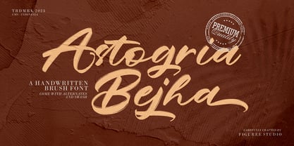 Introducing Astogria Bejha! Astogria Bejha is modern hand-drawn brush font that combines attractive curves with a fresh urban edge; delivering a stylish brush font that is guaranteed to add an eye-catching appeal to your logo designs, brand imagery, handwritten quotes, product packaging, merchandise, social media post, or website font. Features: Uppercase and Lowercase Number and Punctuation Ligature Stylistic Alternate Swash Versatile for branding, headline, or printing product Detailed dry brush markers I hope you enjoy this font. If you have questions, don't hesitate to give me a message Thank You!
 - Gliny by Typesketchbook,
$45.00 Gliny was created by mixing different styles of handwriting fonts that derived from various tools such as pen, markers, drafting pens, painting brushes, writing brush and etc. In order to develop a new and diverse font styles. We also keep incomplete details and uneven textures that resulted from a writing process. We provide various font styles to help you mix and match them to suit your creative work harmoniously. Gliny comes with different font families such as brush, slab serif, heavy, handmade script for making your amazing work !!
 - Demagogue by Hanoded,
$15.00 I was listening to the radio and a song caught my attention. It was ‘Demagogue’ by a band called the Urban Dance Squad. That song brought back memories from when I was a student, so I decided to name this font after it. Demagogue was made using a Sharpie pen and a piece of expensive paper. The result is a very legible, very neat and very bold font. Demagogue is ideal for when you want to get your message across, but hopefully not in a demagogue-ish way! ;-)
 - Faubourg by Positype,
$39.00 Faubourg marks the first professional typeface release by Marie Boulanger. As much traditional as it is unconventional in its celebration of letterforms, this typeface dances on the page and screen as it moves from a more conventional appearance to monoline and back again. The flowing silk-like undulation only accentuates this distinguishing feature and produces one opportunity after the next for headline settings where the word is as important as the content supporting it.
 - Terital United by Letterbox,
$80.00 The long and frustrating search for a dynamic, monoline script drew our attention to the lack of such a typeface. This prompted us to create our very own, Terital, named after the 1960s Italian overcoat advertisement that was the original reference point for its 2003 creation. Fearing the odd all-caps script setting, we cheekily designed Terital as a lowercase set. This limitation was revised in the 2011 version. Beautiful swash capitals were also added.
 - Quanta by Alphabets,
$17.95Quanta was designed without reference to existing sansserif faces. As an original design, Quanta draws on principles of letterform developed during my studies of lettercarving (in Wales with Ieuan Rees) and Roman proportion. My intention was to produce a highly legible and adaptable sans-serif, initially intended to be a TrueType GX font, then as a Multiple Master font, later as a five weight range from extremely thin to extra black. A related uncial design will be released shortly. - Hello Radio by Invasi Studio,
$18.00 Say hello to Hello Radio font, the perfect font to add a touch of vintage charm to your designs! With its monoline stroke script style, this font brings back the good old days with a fun and quirky twist. The best part? It supports multilingual characters, so you can spread the retro vibes in any language you desire. Every character in Hello Radio font has a delightful imperfect shape, giving your designs a natural and handcrafted feel. It's like having your vintage radio station right at your fingertips! This font is a true team player, cooperating effortlessly with other elements in your design. Whether you're creating traditional-style logos, labels, package designs, or awesome lettering for t-shirts, Hello Radio Font has got you covered.
 - Koya Sans by JAM Type Design,
$15.00 Koya Sans is a contemporary, humanist sans with a friendly yet clear and distinct personality. It is designed for excellent legibility, particularly for long continuous reading. The sharp terminals add liveliness and variety to the carefully crafted letterforms. Koya Sans, a highly versatile type family consisting 12 styles that are designed to work equally well on paper and on screen. The family ranges from Thin to Black variations, with complimenting italics. Inspired by a trip to the Buddhist temple of Kōyasan south of Osaka, Japan, this carefully crafted sans serif typeface with its sharp terminals loosely emulating the sharp corners of the temple’s pagoda roof.
 - Giacinta by Okaycat,
$29.50Giacinta is developed as a fresh alternate take on the traditional black-letter style. Rather than simply reproducing the standard uncial or Old English style, Luke William Turvey followed the tradition of Bastarda, making up his own scripted style with the Latin standards in mind. This style was conjured purely from imagination, so while it bares a resemblance to the standards, keeps its own original flavor. Giacinta is extended, containing the full West European diacritics & a full set of ligatures, making it suitable for multilingual environments & publications. Use Giacinta for medieval themed projects, certificates, awards, diplomas, anything that you want to look old fashioned and stately. - FS Pele by Fontsmith,
$50.00 Iconic Conjuring memories of chunky typefaces from the late-60s and early-70s, and named after the world’s greatest footballer of that and probably any other era, FS Pele is one of a set of Fontsmith fonts designed specifically for headlines and other prominent applications. “We wanted to create fonts that could be integral to the design of posters, album covers and magazines,” says Jason Smith. Welcome to FS Pele, iconic, like its namesake (though, perhaps, a little less nimble). Big Pele, little Pele There was only one Pele. But there are two sizes of FS Pele. FS Pele One, with the finer counters and details, adds considerable weight and style at large sizes, especially in big block headlines on posters. FS Pele Two’s thicker “slots” make it a better choice for smaller-sized text. A load of blocks FS Pele began as an exercise by Phil Garnham in turning squares into legible letters, via the least means necessary. The idea extended his ideas about logo-making, and the search for a stamp-like brand mark that lends authority, stability and instant identification. “The thought that the type was a 2D/3D jigsaw of slotted, architectural pieces was almost an after-thought. I wanted to create a strong, stacking, block aesthetic for the most contemporary poster design. “At the time there were a lot of designers creating their own versions of the same thing but I wanted to take the blocker forms to the next step, and infer a more legible text without sacrificing the idea.”
 - FS Pele Variable by Fontsmith,
$199.99Iconic Conjuring memories of chunky typefaces from the late-60s and early-70s, and named after the world’s greatest footballer of that and probably any other era, FS Pele is one of a set of Fontsmith fonts designed specifically for headlines and other prominent applications. “We wanted to create fonts that could be integral to the design of posters, album covers and magazines,” says Jason Smith. Welcome to FS Pele, iconic, like its namesake (though, perhaps, a little less nimble). Big Pele, little Pele There was only one Pele. But there are two sizes of FS Pele. FS Pele One, with the finer counters and details, adds considerable weight and style at large sizes, especially in big block headlines on posters. FS Pele Two’s thicker “slots” make it a better choice for smaller-sized text. A load of blocks FS Pele began as an exercise by Phil Garnham in turning squares into legible letters, via the least means necessary. The idea extended his ideas about logo-making, and the search for a stamp-like brand mark that lends authority, stability and instant identification. “The thought that the type was a 2D/3D jigsaw of slotted, architectural pieces was almost an after-thought. I wanted to create a strong, stacking, block aesthetic for the most contemporary poster design. “At the time there were a lot of designers creating their own versions of the same thing but I wanted to take the blocker forms to the next step, and infer a more legible text without sacrificing the idea.” - Capital by Fenotype,
$19.00 Capital is a multifunctional super family with modernist roots. It is comprised of two distinct subfamilies: Gothic and Serif. Both share the same structure and proportions and come in seven weights – thin, light, regular, bold, extra bold and black, along with corresponding italics. Both Capital families are equipped with a full set of Cyrillic characters, making them a versatile choice for multinational use. All Capital fonts come with the following Open Type features: Small Caps, Old Style Figures, Fractions, Numero-sign & Ligatures. Features specific for Gothic roman versions only are Circle Numerals, Titling alternate for the R character and Arrows. The Gothic italics have a Titling alternates feature where the true italic forms are omitted and replaced with simpler stroke endings. Both Capital gothic and Serif families are true workhorse fonts that can carry out almost any typographic task. Combine them both for the best results – multi-pack available for a no-brainer price.
 - Kremlin II Pro by CheapProFonts,
$10.00 Most uppercase letters of these constructivist fonts are made to look like cyrillic letters, so by carefully interspersing those you can set your text and headlines with it and make it look Russian! To a native Russian this of course looks very silly indeed, so to make amends for toying with their letters I have also included a full proper and genuine cyrillic character set. So these are the first CheapProFonts fonts to support languages using the cyrillic script in addition to the usual 65 latin-based languages. Check out Kremlin Pro for a version with different designs for these glyphs: ¡ ¿ 0 3 6 9 K k M m N n R r V v X x ? ! ALL fonts from CheapProFonts have very extensive language support: They contain some unusual diacritic letters (some of which are contained in the Latin Extended-B Unicode block) supporting: Cornish, Filipino (Tagalog), Guarani, Luxembourgian, Malagasy, Romanian, Ulithian and Welsh. They also contain all glyphs in the Latin Extended-A Unicode block (which among others cover the Central European and Baltic areas) supporting: Afrikaans, Belarusian (Lacinka), Bosnian, Catalan, Chichewa, Croatian, Czech, Dutch, Esperanto, Greenlandic, Hungarian, Kashubian, Kurdish (Kurmanji), Latvian, Lithuanian, Maltese, Maori, Polish, Saami (Inari), Saami (North), Serbian (latin), Slovak(ian), Slovene, Sorbian (Lower), Sorbian (Upper), Turkish and Turkmen. And they of course contain all the usual "western" glyphs supporting: Albanian, Basque, Breton, Chamorro, Danish, Estonian, Faroese, Finnish, French, Frisian, Galican, German, Icelandic, Indonesian, Irish (Gaelic), Italian, Northern Sotho, Norwegian, Occitan, Portuguese, Rhaeto-Romance, Sami (Lule), Sami (South), Scots (Gaelic), Spanish, Swedish, Tswana, Walloon and Yapese.
 - Kremlin Pro by CheapProFonts,
$10.00 Most uppercase letters of these constructivist fonts are made to look like cyrillic letters, so by carefully interspersing those you can set your text and headlines with it and make it look Russian! To a native Russian this of course looks very silly indeed, so to make amends for toying with their letters I have also included a full proper and genuine cyrillic character set. So these are the first CheapProFonts fonts to support languages using the cyrillic script in addition to the usual 65 latin-based languages. Check out Kremlin II Pro for a version with different designs for these glyphs: ¡ ¿ 0 3 6 9 K k M m N n R r V v X x ? ! ALL fonts from CheapProFonts have very extensive language support: They contain some unusual diacritic letters (some of which are contained in the Latin Extended-B Unicode block) supporting: Cornish, Filipino (Tagalog), Guarani, Luxembourgian, Malagasy, Romanian, Ulithian and Welsh. They also contain all glyphs in the Latin Extended-A Unicode block (which among others cover the Central European and Baltic areas) supporting: Afrikaans, Belarusian (Lacinka), Bosnian, Catalan, Chichewa, Croatian, Czech, Dutch, Esperanto, Greenlandic, Hungarian, Kashubian, Kurdish (Kurmanji), Latvian, Lithuanian, Maltese, Maori, Polish, Saami (Inari), Saami (North), Serbian (latin), Slovak(ian), Slovene, Sorbian (Lower), Sorbian (Upper), Turkish and Turkmen. And they of course contain all the usual "western" glyphs supporting: Albanian, Basque, Breton, Chamorro, Danish, Estonian, Faroese, Finnish, French, Frisian, Galican, German, Icelandic, Indonesian, Irish (Gaelic), Italian, Northern Sotho, Norwegian, Occitan, Portuguese, Rhaeto-Romance, Sami (Lule), Sami (South), Scots (Gaelic), Spanish, Swedish, Tswana, Walloon and Yapese.
 - Teen Years JNL by Jeff Levine,
$29.00 Teen Years JNL was inspired by the hand lettered name for the Joyce Records label (circa 1956) which first recorded the New York doo-wop group The Crests (of “16 Candles” fame). The type design is a block sans serif, and is available in both regular and oblique versions.
 - Red Star by Comicraft,
$39.00 The Red Star has risen. Capitalism is on the decline. Under the supervision of Kommisar Christian Gossett and his Red Star cabinet, Comrade Craft has completed the revolutionary new Soviet Block Letters; RedStar, RedSquare and DropCase. The Proletariat is instructed to rejoice. Today is truly a Red Letter Day!
 - Song Merchant JNL by Jeff Levine,
$29.00 Although the early 1900s through the 1920s seemed to be the "Golden Age" of ridiculously long novelty song titles, it appears that even the decade of the 1940s had its fair share as well. Song Merchant JNL was modeled from the hand lettered [but exhausting] title of the sheet music for "Princess Poo-Poo-Ly Has Plenty Pa-Pa-Ya (and she Loves to Give it Away)". Despite the obvious double-entendre inferences of the title, the square block letters with rounded corners make for a useful headline font (even if the source material it was drawn from is quite forgettable). Available in regular and oblique versions.
 - Encorpada Classic by dooType,
$20.00 Encorpada classic brings the best features of the Didone genre, but with a 21st century look and feel. With smooth details Encorpada Classic is a elegant choice for your type library. The Encorpada family began in 2011 with the release of Encorpada Black. After that instant success, in 2012, dooType brought to us Encorpada PRO. Encorpada Classic retains the main look and feel of his predecessors, but is designed with more functional considerations. With 14 styles, Encorpada Classic is a fine choice.
 - Jojo by Canada Type,
$24.95 A little more flower and a little less power, please. Fun, friendly, fashionable, and feminine to a fault, Jojo takes display typography to a whole new level, where eyes can’t help but appreciate the day and the design at hand. It takes a graphic designer very little imagination to see these letters on posters, book covers, clothes, and craft paraphernalia. Or how about a sign over a bakery? A music sleeve? A romantic comedy titling? Cosmetics products? Pretty much anywhere! Jojo takes its name from a Beatles song about getting back to where we once belonged. It also takes most of its shapes from vintage photo-setting days, when an art nouveau typeface called Spring, by B. Jacquet, was putting happy times back where they belonged, which was everywhere. The original photo-setting face came in just 26 letters and 10 numerals. This digital retooling optimizes the original forms and expands on them, for a full character set of over 430 glyphs, including ligatures and stylistic alternates, and support for the majority of Latin languages.
 - Sign and Display JNL by Jeff Levine,
$29.00 Sign and Display JNL is a long-overdue companion font to 2009’s Sign and Poster JNL. The original design models were Art Deco influenced die-cut cardboard letters and numbers manufactured by the Duro Decal Company of Chicago. Square in shape with rounded corners, the thick cardboard letters were used for making show-cards and other display signage. Subsequently, Duro used the same style of lettering to manufacture water-applied decals for boat identification and other uses. It was a set of these decals (with a black outline and yellow interior) that inspired the outline typeface Sign and Display JNL, which is available in both regular and oblique versions.
 - Sock Hop JNL by Jeff Levine,
$29.00Back in the 1950s and 1960s a popular event was the sock hop - when kids would meet in the school gymnasium, kick off their shoes and dance to the popular records of the day. Sock Hop JNL recalls those simpler times. - Julia Script by ITC,
$29.99Julia Script is a playful calligraphic font designed by David Harris in 1983. It takes the viewer back to the flower power of the 1970s. Generous capitals with cheerful, rounded stroke beginnings and endings contrast perfectly with the narrower, closer, but nevertheless vibrant lower case letters. Characteristic of this typeface and similar to Candice is the marked increase in stroke width in the lower third of the figures. This detail is reminiscent of the platform shoes typical of the 1970s. Julia Script suggests freedom and fun and can often be found on party fliers and retro advertisements. Used sparingly in headlines and slogans, Julia Script will be sure to attract attention. - Emmeline by Dear Alison,
$19.00 There's something about the endless variations of handwriting, the tactile process of pen, pencil or brush to paper, and the personal and ephemeral quality as a whole. I recently came across some old handwritten letters from when my younger sister was going to college, and as soon as I saw them, a flood of memories came back to me. All just from seeing her handwriting. That's just one thing handwriting can do. I hope you find enjoyment in my sister's handwriting as much as I still do. This font is complete with alternates that will auto-typeset via the ligature feature to give a more handwritten feel.
 - Nexa Script by Fontfabric,
$40.00 Nexa Script is a clean version of the famous multifaceted font system Nexa Rust . All fonts from the family was successfully designed to match perfect to the other two members of this huge font system - Nexa and Nexa Slab . You can be sure that Nexa Script is equipped with the most advanced typographic Open Type features such as extended sets of ligatures, fractions, alternate characters, superscripts and subscripts, etc. The font family is most suitable for headlines of all sizes, as well as for text blocks that come in both maximum and minimum variations. Nexa Script font styles are applicable for any type of graphic design in web, print, motion graphics etc and perfect for t-shirts and other items like posters and logos.
 - Alina by Melvastype,
$35.00 Alina is a laid-back condensed script font. Alina includes OpenType ligatures to all lowercase double letters to make them subtly differ from each other. So Alina feels a little bit more hand lettered and lively.
 - Essence Round by kloeg architecture,
$24.00 This font is especially designed by architects for architect, urban planners, landscape architects, industrial and product designers. It is ideal for the use with line drawings. Because of it's geometric shape it blends in with your drawings. It's adjusted to fit most of the common line width types. It also contains many icons, especially for use in these professions. On top of that you can find many glyphs and icons to create legends and title blocks. More information about kloeg design.
 - Essence by kloeg architecture,
$29.00 This font is especially designed by architects for architect, urban planners, landscape architects, industrial and product designers. It is ideal for the use with line drawings. Because of it's geometric shape it blends in with your drawings. It's adjusted to fit most of the common line width types. It also contains many icons, especially for use in these professions. On top of that you can find many glyphs and icons to create legends and title blocks. More information about kloeg design.
 - Changa by Tipo,
$12.00 Changa is a layered font intended for titles or short texts blocks, with its short ascenders and descenders and a set of lowercase letters inscribed within a square. The uppercases case gains slightly more in height and develops its morphology in a single height in order to make it possible to create text composition with minimum line spacing. Its counter-shapes are rectangular, featuring small curvatures in opposite vertexes which accompany and break the shapes, thus evoking a modern style.
 - Magazine Grotesque by Latinotype,
$29.00 Magazine Grotesque is a sans-serif font specially designed for headlines and titles. Its unique features make it different from the traditional Grotesk typefaces. For example, outstroke extending beyond body in 'a' and 'e' letters or closed aperture in 'c', creating an unusual rhythm. Magazine Grotesque is the perfect choice for logos, titles, headlines and short blocks of text. As you would expect from Latinotype, this face comes with a standard set of 487 characters that support over 200 Latin-based languages.
 - FF Prater Script by FontFont,
$62.99 German type designers Henning Wagenbreth and Steffen Sauerteig created this display and script FontFont in 2000. The font is ideally suited for advertising and packaging, festive occasions, film and tv, editorial and publishing as well as poster and billboards. FF Prater Script provides advanced typographical support with features such as ligatures, alternate characters, and case-sensitive forms. It comes with proportional lining and tabular lining figures. This FontFont is a member of the FF Prater super family, which also includes FF Prater Block, FF Prater Sans, and FF Prater Serif.
 - FormPattern Color Six by Tarallo Design,
$14.99 Use this font to make lines, borders, patterns, backgrounds, unique bullets, or use it inline within text. Let your imagination explore the possibilities to combine these geometric shapes. Use letter spacing to connect the shapes in a continuous pattern, or space them apart horizontally. Stack them vertically and control their distance with leading (line spacing). Make fields of pattern and explore layering and opacity for color mixing. FormPattern Color Six takes inspiration from mosaic patterns seen in the south of Italy. It is easier to use this font to make patterns than to use drawings because you can control the size, color, and spacing from the type menu. It is also an effective way to make web graphics that are responsive with text. Using it is simple. As you type, forms will appear instead of letters. Each font in this collection is a colored set. The sets are primary, secondary, tertiary, analogous, dark, old world, vintage, greyscale, cool grey, and warm grey. There is a solid font that can be colored in the same way as regular fonts. The color fonts are accessed in the type menu where you would normally find the different weights or italics Most design software, such as Illustrator, InDesign, and Photoshop provide a glyphs palette where you can choose the precise form you want. It can work with the simplest text editors too. However, these may not support the color options. FormPattern Color Six is a vector-based and fully scalable SVG OpenType format. Color fonts are supported by Photoshop 2017, Illustrator 2018, and QuarkXPress 2018 (and later versions). This version of FormPattern Color Six is compatible with all FormPattern fonts by Tarallo Design. The display artwork shows it paired with the typeface Scanno.
 - Kids Brush by Yoga Letter,
$15.00 "Kids Brush" is a playful font that is cute and unique. This font is equipped with uppercase, lowercase, numerals, punctuation, and multilingual support. Very suitable for posters: 4th of July, summer, back to school, classmate, camping, father's day, teacher, Christmas, and others.
 - Stampede by FontMesa,
$25.00Stampede was created from a small sample of letters found on an old document dating back to 1902 from the Chicago, Indiana & Eastern Railway Co. - Fd Massive by Fortunes Co,
$19.00 Massive moon is headline font with a retro feel transports readers to a bygone era, invoking nostalgia and charm. Its bold strokes and quirky serifs harken back to the golden age of design, reminiscent of vintage posters and classic advertisements. The typeface exudes a timeless appeal, seamlessly merging the flair of yesteryear with modern readability. Each character carries a sense of character, mirroring the craftsmanship of mid-century typography. The warm color palette and slightly distressed texture further amplify the retro vibe, adding a touch of authenticity. This font doesn't just convey information; it tells a story, bridging the gap between the past and present.
 - Bakeshop by Melvastype,
$29.00 Bakeshop is a casual script font family. It is drawn with rounded marker so the contrast is quite low. It has bumps at the end of strokes where the pen has stopped and the ink has spread. Bakeshop includes three weights and has both connecting and non-connecting versions. Connecting Bakeshop versions has OpenType features like Final Forms, looping connections with lowercase e, high connecting stroke with ascenders and plenty of discretionary ligatures. You can enable Final Forms either enabling Final Form feature or Contextual Alternates. If you want to use the high connection strokes with ascenders enable Stylistic Alternates or Stylistic Set 2. And if you like to use the ligatures just enable Discretionary Ligatures feature.
 - Savage Sword by Comicraft,
$29.00 Mother of Mitra, Crom’s Devils and other Savage WORDS! The only thing better than one dead Pict is TWO! Or THREE! Or FOUR! And what better than this SAVAGE font to sound the sword strokes of a BARBARIAN BORN?! Hack! Slice! Cut your fiendish foes into pieces with Comicraft’s SAVAGE SWORD and tell your SAVAGE TALES to all and sundry and even those you’ve sundered! BE AWARE! Handle with care and keep some neosporin or other antibacterial cream at hand -- being Savage and filled with Berserker Rage may result in unintended wounds to yourself and your kinsmen. Savage Sword features two sets of automatically alternating uppercase characters, plus support for Western & Central Europe and Vietnamese.
 - Just Be by Roland Hüse Design,
$12.00 JUST BE is a playful brush script. Perfect for titles, headings and logotypes for blogs, ads, quote prints, home decor, book title, invitation, birthday, custom product, lifestyle imagery (like quotes and stuff). Character set contains Eastern and Western European Latin accented letters. For additional customisations (for logotypes for example) please email me at contact@rolandhuse.com You MAY NOT sell this font or claim them as your own. You MAY NOT edit or rename this font. You MAY NOT redistribute this font. Thank you I hope you like this font & good luck with your project! Roland Instagram: @rolandhusedesign Background images of "Just Be" main poster by Annie Spratt from unsplash https://unsplash.com/@anniespratt "Your best moments in life are ahead" by Helena Hertz https://unsplash.com/@imperiumnordique paper bag mock up by Graphic Burger https://graphicburger.com"
 - La Brilliante by Lucky Type,
$20.00 La Brilliante is the newest signature font perfect for wedding invitations, website headers, logos and more. La Brilliante is designed with natural handwriting which will make your design look unique and very beautiful. La Brilliante has front and back swashes in lowercase letters and has more than 50 ligatures that will beautify your writing. Thank you very much for viewing.