10,000 search results
(0.094 seconds)
- Quietism Variable by Michael Rafailyk,
$150.00 A smooth contemplative Antiqua with aspiring to the sky ascenders, inspired by the Quietism philosophy. Clarity of the mind is achieved by bringing the body into a state of calm and contemplation, and this is reflected in the design – the quiet horizontal serifs (body) are opposed to the peaky soaring ascenders (mind). The design also features four optical size subfamilies with different x-height and contrast, oldstyle diagonal stress, oldstyle figures by default, smooth details and slightly dark texture. Variable axes: Weight, Contrast, X-Height. Scripts: Latin, Greek, Cyrillic. Languages: 480+. The complete list of supported languages: michaelrafailyk.com/quietism Kerning: 4553 class-to-class pairs. Hinting: Not applied. Format: TTF – OpenType with TrueType outlines. Variable Font: Quietism Variable provides more options than static versions, and has three axes: Weight (Thin–Black), Contrast (Low-High), and X-Height (Low-High). Variable fonts includes thousands of styles that you can access using a sliders on graphic editor or via CSS on web browser. Mixing different axes gives you extra styles not represented by static fonts. Optical Size: The typeface is represented by four subfamilies: Text (low contrast, high x-height – for paragraph 10-20 pt), Deck (medium contrast, medium x-height – for subheading 20+ pt), Display (high contrast, medium x-height – for heading 72+ pt), Poster (high contrast, low x-height – for big size 120+ pt). Small Caps: Lowercase letters and Oldstyle Figures are replaced with Small Capitals forms. Capitals to Small Caps: Uppercase letters, all figures, and some punctuation are replaced with Small Capitals forms. Case Sensitive Forms: ()[]{}‹›«»-–—•·#%‰@ and Arrows are centered on capitals. Oldstyle figures are replaced with Lining figures. Oldstyle Figures: 0123456789 #%‰. Designed to work with lowercase letters. Used by default. Lining Figures: 0123456789 #%‰. Figures are the same height as uppercase letters (cap height). Proportional Figures: Lining, Oldstyle, Small Caps, Capitals to Small Caps. Tabular Figures: Lining, Oldstyle, Small Caps, Capitals to Small Caps. Ordinals: adehnorst. Superscript, Subscript, Numerator, Denominator: 0123456789. Fractions: ¼½¾⅐⅑⅒⅓⅔⅕⅖⅗⅘⅙⅚⅛⅜⅝⅞⅟ (precomposed). Any other fractions (even those typed through a slash) will also be displayed correctly, with the automatic replacement to Numerator + fraction + Denominator. Slashed Zero: All 0 figures. Contextual Alternates: Number sign character (#) before uppercase letters is replaced by its version centered on capitals. Hyphen character (-) between two uppercase letters is replaced by its version centered on capitals. First of two TT letters is replaced by its alternate form. Letters vwy before the letters fijmnprtuvwxy are replaced with an alternate shorter versions that fits better in the context. Contextual Alternates (Greek): ΆΈΉΊΌΎΏ. Greek uppercase accented characters lose their tonos accent and retain only dieresis in All Caps and Small Caps modes. Turned on by default. If you need tonos accents in All Caps then turn off Contextual Alternates (calt) feature. Stylistic Alternates: FTГТИЦЩцщ and their versions with diacritical marks. Stylistic Set 01 “Arrows”: Left <- Right -> Up Left Right <-> Up Down North West South East \> South West Stylistic Set 02 “Round-Square Cyrillic”: ДИЙЍЛФвгджзийѝклнптцчшщьъю characters are replaced with its Bulgarian or Russian forms. Stylistic Set 03 “Cyrillic Tse Shcha short tails”: ЦЩцщ characters are replaced with its alternate form with short tail. Stylistic Set 04 “Cyrillic I full serifs”: ИЙЍӢ characters are replaced with its alternate form with inner serifs. Stylistic Set 05 “FT bent inward serif”: FTГ characters and their versions with diacritical marks are replaced with its alternate form with right head serif that bent inside. Stylistic Set 06 “Small Caps centered on Capitals”: Small Caps are vertically centered on uppercase letters. Standard Ligatures: fi fl fb ff fh fj fk ffb ffh ffi ffj ffk ffl. Discretionary Ligatures: Th ct st. Localized Forms: 52 character substitutions for Azeri, Bulgarian, Catalan, Dutch, German, Kazakh, Macedonian, Moldavian, Polish, Romanian, Serbian, Tatar, Turkish. Glyph Composition/Decomposition (Diacritics): Full Latin and based Vietnamese set of diacritics (571 characters). Precomposed.
 - Hells Kittchen Devil God by TypoGraphicDesign,
$19.00 CHARACTERISTICS The font name is a pun on the German word "Kittchen" (English prison/jail) and the English "Hell’s Kitchen". The character of the font looks as though the scum here — the guilty and innocent prisoners carved/scratched their signs and messages at the prison walls of their jail cell. The cold, creepy and scratchy character of the handwritten typeface is a very unique gloomy atmosphere. APPLICATION AREA The scary, dark, horror, trash, handwritten script font "Hells Kittchen Devil God" with many symbols/dingbats would look creepy good at rusty display size for headlines. Magazines or websites, movie posters, music covers or webbanner. TECHNICAL SPECIFICATIONS Headline Font / Display Font / Trash Script "Hells Kittchen Devil God" OpenType Font with 375 glyphs — many symbols/dingbats, alternative letters and ligatures (with accents &€) & 2 style (regular, bold)
 - Califunkia by CounterPoint Type Studio,
$29.99 A heavy, cartoonish and fun font based on a hand lettered 1960s advertisement. The hand-lettered original gave me the idea to expand this into an OpenType font with multiple interlocking ligatures. There are over 260 alternate ligatures found the in the "Discretionary Ligatures" OpenType Feature, which will lend the font a hand drawn look. The ligature glyphs can also be accessed via the glyph palette. Great for any design that requires a fun and light-hearted mood. Contains language support for both Latin-based and most Eastern European languages.
 - Casual Deco JNL by Jeff Levine,
$29.00 The hand lettered sans serif title on the1931 sheet music for “(Potatoes are Cheaper-Tomatoes are Cheaper) Now’s the Time to Fall in Love” presented another opportunity to create a typeface from the wealth of unusual alphabets found on the covers of vintage and antique song sheets. However, it seems that even as late as the 1930s, song writers had the urge to pen long-worded titles for their musical compositions. This thirteen word verbal excursion became the model for Casual Deco JNL, which is available in both regular and oblique versions.
 - HWT Aetna by Hamilton Wood Type Collection,
$24.95 HWT Aetna is a revival of the sturdy Roman style of wood type most often called simply Aetna. This new digital version by Aaron Bell features four widths all based on the various widths commonly offered by 19th Century wood type manufacturers. In addition, there is a four-layer all-caps version Aetna based on the the famous Wm. Page Chromatic Types, that allows the user the ability to easily create these chromatic streamer and shadow effects. Both the multiple width Aetnas and Streamer component fonts support full Western and Eastern European languages.
 - Retro Nouveau JNL by Jeff Levine,
$29.00 Because of the large influx of Irish immigrants during the late 1800s and early 1900s, it was not unusual for songwriters of the day to craft songs around Irish themes, offering a nostalgic link to their homeland. One such 1917 piece entitled "You Brought Ireland Right Over to Me" had the title hand lettered on the sheet music cover in a sans serif design reflecting the popular Art Nouveau movement of the day. This design is now available digitally as Retro Nouveau JNL, in both regular and oblique versions.
 - Novelty Script by HiH,
$10.00 Novelty Script is a bold dynamic script, sharply delineated, yet fluid. Most of the lower case letters and many of the upper case letters have joins. The typeface was designed by Nicholas J. Werner and Gustave F. Schroeder and patented in March 1893. The original release was by the Central Type Foundry of St. Louis, Missouri. Although a part of ATF from 1892, the Central Type Foundry continued to operate under its own name until 1895. Novelty Script uses our new encoding, as noted in the All_customer_readme.txt. The Euro symbol has been moved to position 128 and the Zcaron/zcaron have been added at positions 142/158 respectively. Otherwise, Novelty Script has our usual idiosyncratic glyph selection, with the German ch/ck instead of braces, Western European accented letters, lower case “o” and “u” with Hungarian umlaut and our usual Hand-in-Hand symbol. But that is not all. With the takeover of the Central Type Foundry by ATF, a group of special characters appeared. All are included in this font, except the “&Co” and the "'s", for a total of nine in all. The “Ch” and “nd” ligatures are especially interesting because of the impact they have on the color and overall appearance of the page. Download the PDF Type Specimen for locations. This is a fun font to use. Its strength is print, where it gives a page a refreshing look. The joins sometimes have difficulty on the screen, in spite of extensive hinting. Playing around with small changes on the point size can pay dividends. Not for the faint-of-heart. Are you up to the challenge?
 - Stabillo by HansCo,
$15.00 Stabillo font family is specially designed for food logo brand identity and packaging design projects. There are several ligature in both fonts and alternate characters just in the Italic version. Some projects that are suitable for this font are food and beverage brand logo, including clothing, flyer designs, posters or brochures. Enjoy!
 - Bonaro by Sabrcreative,
$20.00 Introducing the Bonaro Vintage Retro Serif All Caps Font, a versatile collection that brings timeless elegance and a touch of nostalgia to your design projects. With its 10 distinct styles, this font offers a treasure trove of possibilities, making it an essential asset for designers seeking to infuse their work with vintage charm.
 - Balneario by Sudtipos,
$39.00 Cities often have their own voice, a voice that can be read... in each location and each business, voice portraying a cultural fabric with an array of manifestations. Balneario Script is a small tribute to a coastal port and tourist city. Through the Sign Painters, in its golden age, a clear, friendly, practical, and functional way of making itself heard evolved. Far from wanting to be perfect, a typeface seeks to be close, warm, and casual. Inspired by the gestures of the brush, Balneario Script reverts to the use of “Casual Letters” so used by Sign Painters. In this adaptation, we sought to adjust its morphology to optimize its performance in small formats and extend the system to include lower case letters as part of the set. The set of fonts has two script weights in addition to an all caps version. The design emphasizes creating a harmonious morphological criterion. Friendly, rhythmic, and with a firm stroke Balneario Script is unique, ideal for headlines and short texts that need to be gestural but simple and highly functional. This typeface was designed to be used in promotional posters or for relaxed and fun Packagings. Balneario Script goes beyond constructive or functional aspects. It seeks to capture the smell of the sea, the warm summer breeze and the nostalgic feeling of a city that from its daily life, knew how to forge a unique personality. This atmosphere allows it to host millions of tourists year after year, and with them reinforce their spirit each summer.
 - Closer by Mint Type,
$35.00 Closer is a highly customizable Swiss Grotesque with overclosed aperture. Being a bit wider than the average grotesque and featuring some humanistic shapes, Closer feels less bland though still relatively neutral. Closer comes in 9 weights (18 styles altogether), features extensive language support including Cyrillic and is highly customizable with 7 stylistic sets to mix and match.
 - One Ton by Luke Thompson,
$10.00 One Ton is a really chunky stencil face that sticks to some strict rules, giving it a distinctively industrial, angular look. It's designed so that the spaces between characters all align in a strong grid. It can bring a ton of personality to signage, branding, editorial and packaging projects where you can afford to be a bit experimental.
 - Jossie by Olivetype,
$18.00 Jossie is a cool brush font. The style is a little bit rough, suitable for all of your logos, branding, social media, and crafty DIY projects. Features : Basic Latin A-Z & a-z Numbers Symbols, and punctuations Ligatures and swashes Multilingual support: from Afrikaans Albanian Catalan Danish to Dutch English Spanish Swedish Zulu. Accented Characters : ÀÁÂÃÄÅÆÇÈÉÊËÌÍÎÏÑÒÓÔÕÖØŒŠÙÚÛÜŸÝŽàáâãäåæçèéêëìíîïñòóôõöøœšùúûüýÿžß Thank you
 - Clinica Pro by Mint Type,
$- Clinica Pro is a modern take on Swiss grotesques, with a little bit of an added personality. It features 8 weights, italics, 6 sets of figures, small caps and a bunch of ligatures. Still relatively neutral, it lets a brand stand out of the grotesque-crowded environment with support for multiple languages as well as Cyrillic script.
 - Beachvibes Script by Brainware Graphic,
$12.00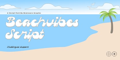 Beachvibes Script is A funky display script font, little bit retro psychedelic and groovy, a funky and modern font featuring playful and whimsical letterforms that will catch the eye. With its unique style and bold personality, it’s perfect for adding a touch of fun and character to any project, from branding to packaging to social media graphics.
 - Woodchip by Fontasmic,
$16.99 The Woodchip fonts are a collection of fun and edgy, worn and pitted, rough and crunchy typefaces. Styled to be comic & playful enough for children's products, yet edgy enough to advertise a dirt bike/monster truck marathon and anything in between. Sink your teeth in. It’s suitable for some interesting titling and short bits of copy.
 - Noad Sans by Groteskly Yours,
$60.00 Noad Sans is an experimental sans serif typeface with a strong character and some very unique visual features. At the core of Noad Sans is a sturdy sans serif with closed apertures and fairly simple letterforms. The defining feature of Noad Sans, however, is its visualised nodes: all control points of Bézier curves in each of the fonts in the family are intentionally visualised. The effect of this feature is largely defined by the usage: in titles and larger bodies of text, the visualised nodes stand out and create a rhythmic pattern of their own. In smaller sizes, the sans serif base of the font becomes more prominent and the nodes create a visual fuzz. Noad Sans comes in 6 styles and as a Variable Font with two axes–Optical Size and Slant. The size of each node can be changed from the smallest (Mini and Mini Italic) to the largest (Extra and Extra Italic). Variable Font technology allows you to fine tune the size of the nodes and the slant angle, so that your version of Noad Sans can be truly unique. Noad Sans has a large character set of 570+ glyphs, covering the vast majority of Latin based languages. In addition to that there are dozens of special characters, punctuation, numbers, and symbols. Noad Sans is equipped with a number of useful OpenType features, such as Case-Sensitive Punctuation, Stylistic Alternates, Ligatures, Fractions and many more. Noad Sans began as an experimental project, and during its development the spirit of experimentation was at the heart of the project. Thanks to the unique nature of the typeface, it can feel at home in a variety of settings: from web development, graphic and product design to more novel uses like 3D and NFTs. Noad Sans type family includes 6 static fonts (Mini, Mini Italic, Regular, Regular Italic, Extra and Extra Italic) and one variable font. Each style can be purchased separately. There is a free trial version of Noad Sans that can be downloaded free of charge on MyFonts. For more information on the typeface, feel free to download Noad Sans PDF Specimen.
 - Estienne by Solotype,
$19.95Many fonts have carried this name. Ours goes back to just before 1900 in France. This general style had considerable popularity among job printers all over Europe. We have even seen it used for name imprints on medical school diplomas, which seems a bit grotesk. Surely you can do something better with it. - Torus Variations by Monotype,
$25.99 Torus Variations are an addition to the original monoline Torus family from 2017. The four new styles are Biline, Outline, Inline and Notched. The Torus family has been designed specifically for use in logo design, headlines and for branding purposes. While the default character sets are distinctive in their own right, graphic designers will love playing with the numerous alternate glyphs that will help them create unique wordmarks and logo designs. Torus’ simplistic forms and soft terminals make this a lovely, warm typeface perfect for a multitude of typographic applications. Key features: • 4 styles • 6 weights • 49 Alternates (via 2 Stylistic Sets) • Full European character set (Latin only) • 550+ glyphs per font.
 - Yapari by Power Type,
$15.00 YAPARI is a font inspired by a street typography located in a Makassar city 2005, this writing is poured into a font and then made several variations of width which are Wide, Extended, and Expanded kind of stretched font then have thickness ranging from Thin, Extra Light, Light, Regular, Medium, Semi Bold, Bold, Extra Bold, Ultra. This font is suitable for use for design projects that have a bold impression and can also be used for all lines of media as well as formal and informal
 - Terfens Contrast by insigne,
$35.00 Terfens draws influence from chancery scripts, updating it for the twenty-first century. Terfens Contrast is derived from Terfens' DNA and retains its humanist tone. It’s tall x-height gives it a friendly but not informal feel. With Terfen Contrast, calligraphy-inspired letterforms are rendered with a high contrast nib, lending raw vitality and expressivity. This juxtaposition gives the letters a sense of firmness and energy, but also of heavenly, delicate beauty. Terfens is a full-service branding and packaging solution, containing a lot of personality, combining the passion of a broad nib pen with the beauty of a brush. Terfens is a "workhorse typeface" comprising 48 typefaces in three widths and eight weights. There are ligatures and swashes in all weights, as well as support for more than 72 languages. Another powerful typeface to add to your collection of eye-catching fonts. Terfens draws influence from chancery scripts, updating it for the twenty-first century. Terfens Contrast is derived from Terfens' DNA and retains its humanist tone. It’s tall x-height gives it a friendly but not informal feel. With Terfen Contrast, calligraphy-inspired letterforms are rendered with a high contrast nib, lending raw vitality and expressivity. This juxtaposition gives the letters a sense of firmness and energy, but also of heavenly, delicate beauty. Terfens is a full-service branding and packaging solution, containing a lot of personality, combining the passion of a broad nib pen with the beauty of a brush. Terfens is a "workhorse typeface" comprising 48 typefaces in three widths and eight weights. There are ligatures and swashes in all weights, as well as support for more than 72 languages. Another powerful typeface to add to your collection of eye-catching fonts. • Recommended uses: modern branding and logo design, powerful editorial design, exciting packaging, and a wide range of additional jobs. • 54 font styles, including eight weights, eight italics, and three widths. • Each weight has 500+ glyphs. Useful Opentype features include: Access All Alternates, Discretionary Ligatures, Denominators, Fractions, Kerning, Standard Ligatures, Lining Figures, Numerators, Oldstyle Figures, Ordinals, Scientific Inferiors, Subscript and Superscript.
 - Free Money by Jeremy Woods,
$10.00 Free money is an organic-looking display font. It was inspired by gig poster art, alternative comics and b-grade movies.
 - FR Warrior Plain - Personal use only

- FF Comma Trial - Personal use only

- FF Spoken Trial - Personal use only

- FF PQR Trial - Personal use only

- Lemonstyle Sweet - Personal use only

- Futurex Roughly Sliced - Unknown license

- Futurex Arthur - Unknown license

- Futurex - AlternatLC - Unknown license

- Futurex - AlternateTC - Unknown license

- Intervogue by Miller Type Foundry,
$25.99 Released by Intertype in the 1930’s, Vogue was a geometric sans serif rival to Futura and Kabel. Vogue had many unique quirks such as its distinctive G, that striking Q with a vertical tail, and many others. Almost ninety years later there has been no decent digital revival of this wonderful typeface... until now. Intervogue brings this classic to life in the modern age. Seven weights complete with true obliques and an alternate cut give Intervogue the versatility to be a true workhorse.
 - Intervogue Soft by Miller Type Foundry,
$25.99 Released by Intertype in the 1930’s, Vogue, was a geometric sans serif rival to Futura and Kabel. Vogue had many unique quirks like its distinct G, that striking Q with a vertical tail, and many others. Almost ninety years later there has been no decent digital revival of this wonderful typeface... until now. Intervogue Soft brings this classic to life in the modern age. Seven weights complete with true obliques and an alternate cut give Intervogue Soft the versatility to be a true workhorse.
 - Hannah and Clay by loryn ipsum,
$14.00 HANNAH & CLAY | handwritten serif font After the love that MILK & CLAY received, I thought I would make a serif version for all you serif typeface lovers out there. It is the handwritten version of one of my favourite fonts 'hannah hannah'. I absolutely love how this turned out and the unpolished warm feeling this font has. It feels very high-end, but still approachable, inviting and grounded because of its soft edges and human feel. I hope you love it as much as I do xx
 - Pixel Disc by Ech000,
$9.00 This unique typeface is a great addition to a graphics designer collection. Great for pixel artists who want a unique text style for their works, album artwork and much more. This font contains over 400+ unique glyphs to accommodate for English, Latin languages, most symbols and much more. All characters feature the same size disc surrounding letters utilising negative space through the design. Created by Kole Cook for Ech000 Foundry. The font is inspired by computer text and command line with a unique twist.
 - P22 FLW Terracotta by P22 Type Foundry,
$29.95The lettering and 100 extras for this font set, the third in P22’s Frank Lloyd Wright series, are derived from letterforms and decorative embellishments found in Wright’s early work (1893–1910) and in his book, The House Beautiful (1896–97). Wright based his delicate graphic designs on stylized natural plant forms. Users go this font can adorn their graphics with these beautiful motifs. Terracotta Regular and Terracotta Alt have been remastered and now contain almost 400 characters including support for Western and Central European languages. - Mandarin Whispers by Hanoded,
$17.00 In Dutch, a Mandarijn is a Tangerine. I found out that it is called a Mandarin in Australia as well! I really like Mandarins, so I thought I’d give them their well-deserved place in the spotlights by naming a font after them. The whispers part - well, that’s just because it sounded good. Mandarin Whispers is a very nice brush font, which was actually not made with a brush, but with a cheapie marker pen. It comes with all the bells & whistles, so have a ball!
 - Pikelet by Aah Yes,
$14.00Pikelet is a misprinted grunge font ideally suited to headlines, poster and display. As well as irregularities of printing in the actual letters, the ordinary versions contain "print errors" around some of the letters, whereas the Clean versions are identical but without those extra bits of overprint. The All Caps version has 2 sets of capitals which are different to the capitals in the Regular version (and to each other). And the jumbled versions have varying amounts of mis-alignment, but not variations in size. There's also an extensive selection of accented characters for both Western & Eastern European languages, and punctuation and fractions. - Alpha Bravo by Wiescher Design,
$39.50 AlphaBravo was born on a napkin. I was just doodling, playing around with letterforms when the ballpoint glided a little bit too far and suddenly I had my first letter with the dash sticking out on the left of the e’s horizontal line. I quickly checked on how many letters I could let a line stick out! Then I wrote a couple of words that way and letters joined in the most unusual places, creating new closed forms. I gave the font a try and quickly discovered, that I had stumbled onto an interesting new typeface. I didn't know how to call it, so I simply used the first two letters of the alphabet, Alpha and Bravo. Looking forward to Charlie and Delta, your very curious, Gert Wiescher.
 - Xpress Rounded by Wiescher Design,
$12.00 »XPress-Rounded« is my new addition to »XPress«, my Sans-Serif that impresses – especially in small sizes – with its outstanding readability. »XPress-Rounded« looks very different, almost like a completely new font. But the rounded version has the same seven precisely calibrated weights from »Thin« to »Heavy« and its corresponding italics make this font-family universally usable. The »XPress« fonts got their bearings from the fabulous American »Gothic« fonts of the twenties of last century. Modern, present day elements, high lowercase letters and infinitesimal elegant slight curves in start- and end strokes make the font family not only great for body copy, but also very useful in advertising. Enjoy! »XPress-Rounded« ist meine neue Erweiterung zur »XPress« Familie, die durch aussergewöhnliche Lesbarkeit auffällt. »XPress-Rounded« sieht jedoch vollkommen anders aus als sein älterer Bruder. »XPress-Rounded« hat jedoch die selben sieben präzise aufeinander abgestimmten Schnitte von »Thin« bis »Heavy« und die dazu passenden Kursiven. Das macht die Schriftfamilie vielseitig einsatzfähig. Die »XPress« Schriften basieren auf der Formensprache der grossen amerikanischen Groteskschriften der zwanziger Jahre des letzten Jahrhunderts. Durch moderne Formelemente, große Mittellängen und unendlich leichte, elegante An- und Abstriche ist die Schrift jedoch nicht nur als Textschrift, sondern auch im gesamten Bereich der Werbung vielseitig einsetzbar. Viel Erfolg!


