10,000 search results
(0.053 seconds)
- P22 FLW Midway by P22 Type Foundry,
$29.95 This font set is based on Frank Lloyd Wright's hand-lettering found on the Chicago Midway Gardens working drawings from 1913. This type of architectural lettering is a bit more casual than standard lettering found on most blueprints. It evokes the personality of Frank Lloyd Wright and complements the other fonts in the P22 FLW font series. Midway One and Midway Two can be used interchangeably to give a more naturalistic feeling of hand lettering. Midway Ornaments features over 100 decorative border elements that can be combined is many ways for surprising and effective decorative motifs. Midway One and Midway Two have been remastered and now contain over 400 characters including support for Western and Central European languages.
 - Mandatory by K-Type,
$20.00 Mandatory is a full small caps font developed from the typeface used for UK vehicle registration plates. There is improved stroke separation on the M and W which are pointed at the centre, and the tail of the Q is thinner and clearer.
 - RMU Luchs by RMU,
$35.00 Jakob Erbar’s Art Deco font ‚Lux‘, released by Ludwig & Mayer in 1929, completely redrawn and redesign. The German umlaut glyphs Ä, Ö, and Ü come in their original form in the uppercases; in the lowercases the dieresis was placed above the letters.
 - Galak Round by Luhop Creative,
$27.00 Galak Pro is a modern geometric sans serif family characterized by its simplicity and extensive functionality.consisting of 9 weights ranging from Hairline to Heavy with matching italics. It supports Extended Latin, Cyrillic and Greek. This blend produce a typeface of modern, clean and contemporary appearance that has implicit on its core a classic vibe, nourishing the text with a timeless elegance.In use, the form and function balance of its design allow it freely travel through a diverse range of fields and possibilities like short text settings, brands, headlines or signage systems with grace and naturality. Galak Pro is available in variable font format and in 18 different individual styles (9 weights), with a set of supports over 200 latin languages and including an extensive repertoire of opentype features like small caps, ligatures, stylistic alternates, proportional and tabular figures,and many other resources to please your typographic urges.
 - Galak Pro by Luhop Creative,
$99.99 Galak Pro is a modern geometric sans serif family characterized by its simplicity and extensive functionality.consisting of 9 weights ranging from Hairline to Heavy with matching italics. It supports Extended Latin, Cyrillic and Greek. This blend produce a typeface of modern, clean and contemporary appearance that has implicit on its core a classic vibe, nourishing the text with a timeless elegance.In use, the form and function balance of its design allow it freely travel through a diverse range of fields and possibilities like short text settings, brands, headlines or signage systems with grace and naturality. Galak Pro is available in variable font format and in 18 different individual styles (9 weights), with a set of supports over 200 latin languages and including an extensive repertoire of opentype features like small caps, ligatures, stylistic alternates, proportional and tabular figures,and many other resources to please your typographic urges.
 - Worthe Numerals by House Industries,
$33.00 Worthe Numerals come out of a time-tested development cycle where House Industries employees ask “What if this could be just a little more…”. After pushing traditional didot forms to the limit, these digits were originally applied to a set of wood blocks. But, who says replenishable Michigan-grown basswood should have all the fun? So we added everything one needs to stylishly set their current currency and credit default swap hedges, while also being able to set the appropriate fractional take from their blog’s micropayment structure. Made to be large, attract attention, and —when needed— drop a shadow, Worthe Numerals brighten the daily drumbeat of numerical gloom. Like all good subversives, House Industries hides in plain sight while amplifying the look, feel and style of the world’s most interesting brands, products and people. Based in Delaware, visually influencing the world.
 - Umba Sans by TypeThis!Studio,
$29.00 UMBA Sans is a contemporary typeface designed by Anita Jürgeleit. The wide shaped curves show a new aesthetic appeal in an unexpected pleasant way. Umba Sans fulfills your corporate design needs as well as your editorial demands and helps to push your design to the next level. Thirty styles from thin to bold and matching italics - as well as small caps and alternates - help you create a contemporary design. Umba Sans provides a wide range of variations. Your design may have many faces but it all matches together. Separate styles for alternate and small caps will show up in your font menu, making sure that you stay aware of the wide range of possibilities your new favourite typeface provides. If you like our fonts, you might want to sign up at: www.typethis.studio
 - Lucida Handwriting by Monotype,
$40.99 Lucida Handwriting is a casual, connected script designed for smooth and fun reading on screens and in print. Its relaxed personality and vigorous energy sends a distinctive message. Lucida Handwriting was originally released in one weight. It is now available in five weights, from Thin to Black. Lucida Handwriting was designed by Kris Holmes and Charles Bigelow based on historic blackletter style cursives. As with other joining script typefaces, all capital letters usage is not recommended: it is best to use upper and lowercase for optimal legibility. Lucida Handwriting is part of the Lucida superfamily of fonts from Bigelow & Holmes. Lucida is highly regarded for legibility and its extensive range of type styles. The Lucida Handwriting typeface family has a Standard character set with 255 glyphs supporting the basic range of Latin languages.
 - Slantblaze Pro by Campotype,
$25.00 We Redesigned this Slantblaze-Pro. Slantblaze Pro is an exteme slanted display script with characteristics: Simple, Thick, Contrast, and Dynamic. First launched in 2011, and now we present it again in a new version to provide the best user experience. As italics (default), Slantblaze Pro has aloof challenge as a display font. It was designed as an alternative for headline, title in any purpose such as header, brands, packaging, identity, automotive logo, etc. What’s new and changed: This version 2.02 comes in a True Type OT-flavor version. The outline were designed to be smoother than before. Redesign of ‘C’, ‘E’, ‘F’, ‘G’, ‘T’, and some changes to all other smallcases Removed: question.sc, questiondown.sc, exclam.sc and exclamdown.sc assuming they will never be used Rewrite the features structure and adding some new related to all changes New swashed glyphs: A-Z The writing system of numbers is completed with the old-style version and each tabular and proportional method New contextual (calt) to an alternative look of “A" when combined with all lowercase. Also in this feature we have another way to access Ornaments is more interactive by combining dlig and calt features. Another new glyph may be access only in feature (salt)
 - Lady Edith by MKGD,
$13.00 Lady Edith harkens back to the days of flappers and cocktail parties. The early part of the twentieth century, when Art Deco was at it’s height and high fashion was all the rage. A time of beauty, class and elegance. A minimalistic font with clean lines and just enough flare to make it unique. The perfect font for any occasion that needs a bit of high end magic. There is no lower case for Lady Edith as it is a decorative font. The Upper case version serves both the upper and lower case keys. Lady Edith has a glyph count of 397 and supports the following languages; Supported Languages: Afrikaans, Albanian, Asu, Basque, Bemba, Bena, Bosnian, Catalan, Chiga, Colognian, Cornish, Croatian, Czech, Danish, Embu, English, Esperanto, Estonian, Faroese, Filipino, Finnish, French, Friulian, Galician, German, Gusii, Hungarian, Icelandic, Indonesian, Irish, Italian, Kabuverdianu, Kalaallisut, Kalenjin, Kamba, Kikuyu, Kinyarwanda, Latvian, Lithuanian, Low German, Lower Sorbian, Luo, Luxembourgish, Luyia, Machame, Makhuwa-Meetto, Makonde, Malagasy, Malay, Maltese, Manx, Meru, Morisyen, North Ndebele, Norwegian Bokmål, Norwegian Nynorsk, Nyankole, Oromo, Polish, Portuguese, Romanian, Romansh, Rombo, Rundi, Rwa, Samburu, Sango, Sangu, Scottish Gaelic, Sena, Shambala, Shona, Slovak, Slovenian, Soga, Somali, Spanish, Swahili, Swedish, Swiss German, Taita, Teso, Turkmen, Upper Sorbian, Vunjo, Walser, Zulu
 - Genie by Canada Type,
$24.95The flower children of Canada Type are at it again. This time we went above and beyond the call of duty and right into the land of reconstruction in order to make this font. When we saw a few letters from an early 1970s film type called Jefferson Aeroplane, we had the sudden urge to bring their beauty to digital life. But since further research revealed no more letters or information, we just had to "wing" the rest of this Aeroplane. Now this Genie is out of the lava lamp, and it's nothing short of groovy. A few symbols and alternates come within the font, so make sure to check out the very full character set. We love this font so much that we couldn't help but play with it for a week. Some of the Wes Wilson-inspired results are in this page's gallery, so check them out for a flashback. Keep on trucking! - Zapfino Extra X by Linotype,
$29.99Today's digital font technology allowed the world-renowned typeface designer/calligrapher Hermann Zapf to finally realize a vision he first had more than fifty years ago: creating a typeface that could capture the freedom and liveliness of beautiful handwriting. The basic Zapfino™ font family, released in 1998, consists of four alphabets with many additional stylistic alternates that can be freely mixed together to emulate the variations in handwritten text. In 2003, Herman Zapf completely reworked the Zapfino design, creating Zapfino™ Extra. This large expansion of the Zapfino family was designed in close collaboration with Akira Kobayashi. Zapfino™ Extra includes a cornucopia of new characters. It features exuberant hyper-flourishes, elegant small caps, dozens of ornaments, more alternates and ligatures, index characters, and a very useful bold version, named Zapfino™ Forte. A version of the 1998 Zapfino typeface ships as one of the pre-installed fonts included with Mac OSX. The Mac OSX version's letters are four times larger than the Linotype standard. In order to minimize compatibility problems for Macintosh users, Linotype has created OSX versions of its Zapfino Extra Pro typefaces, which have been enlarged to correlate visually with the Mac OS Zapfino system font. These special Linotype fonts can be distinguished by the letter X" in their name. Zapfino Extra is an OpenType format font, which is available in two versions. Which version you purchase should depend on which software applications you use the most and what features they support! The Contextual version of Zapfino Extra Pro contains a treasure-trove of extra contextual features. When created in 2004, this was the most advanced OpenType font released to date. By purchasing this version, users of OpenType-supporting applications, such as Adobe InDesign, may access all of the features available in the entire Zapfino family through just two fonts, Zapfino Extra LT Pro (Contextual) and Zapfino Forte LT Pro! Unfortunately, most non-Adobe applications currently do not support the contextual features made possible by recent OpenType developments. Users of Quark XPress and Microsoft Office should instead purchase all of the non-contextual fonts of Zapfino Extra Pro family, in order to access all of the Zapfino Extra family's 1676 glyphs. The Zapfino Extra family's character set supports 48 western and central European languages. Use Zapfino Extra to produce unusual and graceful advertisements, packaging, and invitations. Zapfino Extra is so joyously abundant that it's tempting to over-indulge, so be sure to check out the tips for working well with the possibilities." - Klandestin by Dryy Type,
$18.00 Klandestin Typeface An aesthetic font that has a unique and elegant character to use. Klandestin is a beautiful and elegant serif Font with script for alternate. This font I created is meaningful & very versatile, it goes well with a variety of designs, elevating them to the highest level. Add this font to your favorite creative ideas and watch how it becomes real! Features : Uppercase, Lowercase, Numerical, Alternates, Ligatures & Multilingual Support There it is! I really hope you enjoy it
 - Regent Pro by Storm Type Foundry,
$39.00 This modernized rustic Baroque Roman face paraphrases freely its model from the first half of the 18th century. The shape of the letters has been cleared from all unevenness and softness, but has retained its lively expression. It is deliberately rather cooler than the reverently digitized Baroque Roman type faces, since it was necessary to adjust it with regard to the visual experience of the contemporary reader. In addition, it has bold designs and aligning figures, which also considerably extends the range of its application. It is an entirely reliable text type face for the most demanding extensive works. Thanks to its calm expression and excellent legibility it is widely used when printing series of professional literature.
 - Baro B by Our House Graphics,
$15.00 Baro is a powerful, fun and expressive font, great for loud, cheerful and super-fat headlines and packaging for odd novelty toys. With its bold and distinctive stylized geometric forms, it is ideal for logos, heavy machinery and wacky party invites. Baro had its beginning in a handful of rigidly geometric uppercase letters from an unidentified 1960�s or 70�s era press-down lettering font, which in turn was possibly a revival of a 20�s era Art Deco font. The exercise quickly expanded into a complete typeface with 300+ characters, including several catch words (word glyphs), stylistic alternates, discretionary ligatures, multilingual support and both lining and old style numerals. Baro maintains much of the characteristic geometric rigidity of the original handful of letters, but � With the addition of just a little bit of flare, a bit of cheerfulness breaks through, like a wink and a smile on the face of a fat and otherwise stern policeman.
 - Spinosa BT by Bitstream,
$50.99Stephen Chick, of In Your Typeface Productions (IYTP) foundry, has created this rather prickly type design. Although for display, it is surprisingly legible at smaller point sizes. There is an Inline version, and also an Inline Extra version, which has only the inner contours of the Inline itself, which can be combined with the Regular to create cool two-color effects. The extended glyph set supports Central Europe. - Unicore by Halbfett,
$30.00 Unicore is a large family of geometric sans serif fonts. Design wise, it is inspired by classic 20th-century typefaces like Futura, Gill Sans, and Avenir. It fuses their aura with contemporary elements, like a unique harmonisation of width and height. You can see this in the lowercase letters especially and it helps support the fonts’ legibility. The regular weights in the family are optimised for body text.
 - Buddy Slender by Hackberry Font Foundry,
$24.95 Buddy Slender is the narrower version of the companion sans for Contenu, the book font family designed for a book on book family design called Practical Font Design. It's a loose, free, easy to read sans, so when my wife suggested Buddy, it clicked. This is the 2-font Buddy Slender family of Regular & Bold. I made a new more limited feature set for these fonts due to their designed usage.
 - Etoxina by FSdesign-Salmina,
$39.00 Etoxina is designed especially for the burgeoning market of starships and other space cruisers. Etoxina has been developed with the contribution of experts in navigation through space and time. The fonts are ideal for internal and external use (including zero-g and occasional bursts of cosmic rays), and with their simplified forms are expected to survive well in non-linear galaxies. With their unusual diagonal half-pixels the fonts are striking as abstract designs at astronomical sizes, where small text may be placed within the black holes formed inside the letters. On explicit suggestion of Mr. Spock true capital letters have been added.
 - Itoxina by FSdesign-Salmina,
$39.00 Itoxina is designed especially for the burgeoning market of starships and other space cruisers. Itoxina has been developed with the contribution of experts in navigation through space and time. The fonts are ideal for internal and external use (including zero-g and occasional bursts of cosmic rays), and with their simplified forms are expected to survive well in non-linear galaxies. With their unusual diagonal half-pixels the fonts are striking as abstract designs at astronomical sizes, where small text may be placed within the black holes formed inside the letters. On explicit suggestion of Mr. Spock true capital letters have been added.
 - Happy Kids by Beary,
$12.00 Happy Kids embodies fun, quirkiness and authenticity. It features gorgeous and fun characters that will brighten up your crafting projects. It will elevate a wide range of design projects to the highest level, be it branding, comic design, children's books, headings, invitations, labels, and much more
 - Sundarta by Arendxstudio,
$15.00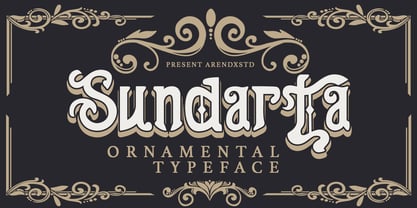 Sundarta is a vintage font that is unique and very suitable for the display needs of each of your retro designs. Sundarta comes with OpenType features such stylistic alternates, stylistic sets & ligatures. It's suitable for logotypes, posters, badges, book covers, t-shirt designs, packaging and more.
 - Little Bosquee by Doehantz Studio,
$12.00 Little Bossque is a modern sans serif family. Its variety of weights provide a range of choices that will help you find the best typographic color for your project. Lighter weights are well-suited for body text while heavier ones are ideal for high impact headlines
 - King Slayer by OzType.,
$7.50 King Slayer is a strong versatile serif font, the design details have been fine tuned to offer excellent readability on any screen size. King Slayer comes in three weights from regular to bold, with matching true italics, for a full range of editorial and advertising uses.
 - Charlea by Kereatype,
$24.00 Charlea is a serif typeface inspired by the beauty of modern serifs, fused with modern appeal to cater to contemporary needs. It includes 20 fonts ranging from Thin to Extra Black, with true italics. Charlea offers numerous possibilities for application in various graphic or editorial projects.
 - Qoxiem by Almarkha Type,
$29.00 Introducing our latest Modern Slab called Qoxiem can make your logotype become more interesting. inspired by the decorative arts and architecture movement Qoxiem fonts is perfect for your project and allows you to create designs, headlines, posters, logos, badges, t-shirts and many more that are beautiful.
 - Biosphere by Fype Co,
$16.00 Biosphere is inspired by industrial style typeface that's will give look a modern and technical industrial display font. That will take any design idea to the next level, covering a wide range of project types such as poster design, book covers, prints, headlines, id cards, packaging, branding.
 - PR Scrolls 05 by PR Fonts,
$10.05 Inspired by food labels, signs and coats of arms, PR Scrolls is a collection of images which can be used for framing text in contexts where antiquity, craftsmanship, or traditional quality are conveyed. Most of the glyphs are presented in a range of four or more widths.
 - VVDS Benigne Sans by Vintage Voyage Design Supply,
$14.00 VVDS Benigne Sans is geometric font family consisting of 8 weights ranging from Thin to Ultra Bold with matching italics. Balanced and gently Thin or fat and heavy Ultra Bold, good wide range of widths, which allow use this font not only as a Headers, also as sub-headers or block texts. Also, I love how it looks in infographics. VVDS Benigne Sans is latin-based multilingual and contains all mathematics symbols. OpenTypeFeatures Ligatures, alternates, old style numerals and fractions. Enjoy! VVDS
 - Hernández Niu by Latinotype,
$29.00 In the typedesign industry the terms ‘nova’, ‘neue’, ‘next’, ‘new’ are often used to refer to a typeface that has been modified in different ways: redesign, technical readjustments, greater number of characters, etc. At Latinotype we are now starting to use the word ‘niu’ to refer to these kinds of typefaces. Niu is an adaptation of the original word ‘new’, i.e., we have adapted this English word to the phonology and spelling of our own language but keeping the original meaning. Race mixing, diversity, change and adaptation are part of the essence of Latin American culture and, at Latinotype, we are all constantly expressing these elements in everything we do. Latin Power! Hernández Niu was designed by César Araya and Daniel Hernández. The font is based on the design of Hernández Bold: the thickest weight has been adapted to fit small text better. Five new styles have been added, ranging from neutral to more expressive fonts. Hernández Niu is a display slab serif font of thickened serifs, functional expressive ink-traps and true italics. Detailed forms and counterforms allow this typeface to be used in very large sizes. Hernández Niu is well-suited for publishing, small text and headlines. A wide variety of weights make the font a perfect choice for hierarchical type-setting, branding, logotypes, magazines, etc. This font consists of 6 weights, ranging from Extra Light to Heavy, each with matching true italics. Hernández Niu comes with a set of 397 characters, making it possible to use the font in 212 different languages.
 - Codec Pro by Zetafonts,
$39.00 Codec Pro is the newest incarnation of the Codec family, developed in 2017 by Francesco Canovaro, Cosimo Lorenzo Pancini and Andrea Tartarelli as a research on the subtleties and the variations on the theme of the geometric sans-serif design. The original typeface has been completely redesigned and expanded to feature a wide range of eleven weights, from the hairline thin to the bulky fat, while the character set has been extended to include not only latin, cyrillic and greek but also arabic, farsi and urdu scripts. A veritable swiss-knife for the designer, Codec Pro also includes a wide range of alternates and stylistic sets that cover all the subfamilies and the moods of the original type system. So while the standard set (Codec Cold) has terminals cut parallel or perpendicular to the baseline, emphasizing geometry for a more constructed look, stylistic set 4 (Codec Warm) uses open diagonal cuts and humanist shapes to give the typeface a gentler, warmer feeling. Set 3 (Codec Cold Logo) comes alive with funky ligatures, while Set 5 (Codec Warm Logo) stretches uppercase characters horizontally for a dynamic, unexpected effect
 - D.I.Y. Time by Latinotype,
$19.00 D.I.Y. Time is a hand drawn type system designed by Luciano and Coto inspired by the DIY philosophy which has been transformed into a whole global counterculture movement, identifying the new generations that reprice the handwork, paying attention to quality, processes and materials used in the manufacture of goods and objects, food, clothing, furniture etc. This beautiful philosophy inspires us every day. Is present in our homes, in our lifestyle and this time we have given him way through a typeface family that mixes different styles but integrates them through language handmade. The result is a typeface based on hand lettering drawing with different brushes and pens on paper. With versions ranging from organic proposals as DIY time hand to other based on the classic proportions of Gill as DIY time sans. To accompany a set of compound words designed on the needs of small farmers and a set of ornaments illustrated, everything you need to begin to make your own.
 - Smashed Display by Raquel Fernandes,
$17.49 Smashed Typeface is a reversed-contrast, slab serif, display font. Was inspired by the old west days that we can often see in printing, circus posters and wanted notices in western movies, even tho the style was really used in many parts of the world during that period. This style is sometimes called as "circus letter" too. Was designed to have a modern look, using straighter lines and an extended style, can be used on various situations like posters, logos for restaurants, alternative business like an old washing station (as you can see on the next images), music bands etc. I believe that is a promising typography that can be used by various designers in a lot of diverse project. It counts with 226 multi language characters, one weight on version 1.0, on a next version I hope to take this project to another level, creating a variable typeface from condensed to really extended weights. It would complete this typography and eliminate the limits of use.
 - Space Armada by Wing's Art Studio,
$10.00 Space Armada - A Science-Fiction Font for Out of this World Designs! Space Armada is inspired by a 1980s interpretation of the future, referencing blockbuster sci-fi action movies of the period, along with the emerging video-game consoles and home computer technologies. It's nine unique fonts are designed to work together in a variety of ways, so you can layer it's different styles on top of each other to retro-futuristic effect!* Here's an example of how it works: Start by placing the Regular font on top of the Bold for a simple base outline. Add contrasting gradients to both fonts for an instant metallic or chrome effect. Take it a step further with one of the readymade Outlines for an embossed look. Overlay the Wireframe font for a glimpse inside the machine! This looks particularly good when you apply a glow effect and reduce it's opacity so the other layers show through. That's just one way to use it. Check out my visuals for more usage ideas! You can also follow my short tutorial! Space Armada is an all-caps font with unique uppercase and lowercase characters, along with a range of alternatives for experimentation with different looks. It also includes punctuation, numerals and language support, plus a selection of underlines and symbols. It's a highly customisable font, perfect for retro designs such as movie titles, posters, games, book covers and more! Every care has been taken to ensure that all fonts align perfectly when layering. Due to the variations in how different software handles text tracking, some minor tweaking may be required for pixel perfect alignment.
 - Hasta Luego by Hanoded,
$15.00 Hasta Luego means ‘see you later’ in Spanish. It is something you say when parting, but it doesn’t really mean you’ll have to see each other again. Hasta Luego is a happy, all caps font. It’s a bit random, a bit wobbly and it comes with some interesting discretionary ligatures for you to play with.
 - Beauty Rose by Nissa Nana,
$25.00 Beauty Rose is an enchanting handwritten font. This versatile script font has a wide spectrum of applications ranging from greeting cards to headlines and is guaranteed to add a romantic feel to your next project.
 - Northlane by Hindia Studio,
$15.00 Northlane is minimalist font with smooth and elegant rounded edges. This font is projecting modern and futuristic vibes, perfectly suited for graphic design application ranging from editorial and corporate design to web and interaction design.
 - Bebopalula by Studio K,
$45.00 No prizes for guessing this font family was inspired by the 1950s - the sounds (Buddy, Eddie, Elvis), the styles (polka dots, petticoats and Dior's New Look), and the kitsch, from furry dice above the dashboard to plaster ducks over the mantlepiece! A particular point of reference is the furnishings and fabrics of the Fifties (with their distinctive kidney shapes and angular curves) as showcased in the Festival of Britain 1951. See also my other fun fonts Barrowboy, Calypso and Pier Arcade.
 - Farm Doodles by Outside the Line,
$19.00 Farm Doodles... perfect collection of illustrations to be used for everything from the farm to table movement to the current weddings on a farm trend. 30 illustrations of farm animals... beehive, fish, bunny, chickens, cows, goat, sheep, pig and horse. Farm buildings, weather vane, windmill, tractor, milk can, hay bale, trees. And food... tomato, carrots, peas, spinach, apples, beets. Mix and match with other Outside the Line illustration fonts.
 - Scratch by ITC,
$29.99Scratch was designed by Andrew Smith in 1995. It looks as thought many fine lines were drawn next to and over each other with a felt-tipped pen. Small bits of white peek out among the strokes and give the font its dynamic character. Flexible and sketchy, the forms are based on those of a classic sans serif cursive typeface. Scratch is meant exclusively as a headline or display font.