10,000 search results
(0.567 seconds)
- Hawkes by Kimmy Design,
$15.00 Hawkes is an extensive handmade typeface family that comes with a bundle of weights, widths and styles, all designed to work cohesively. Here is a breakdown of the Hawkes family. Hawkes Sans: The primary subfamily is a sans-serif typeface that includes nine fonts: three weights (light, medium and bold) and three widths (narrow, regular and wide). Within this set are an array of stylistic features; including small capitals, character style alternatives, discretionary ligatures and contextual alternatives. See details below for more information on OpenType Features. Hawkes Variable Width Sans: The secondary subfamily is the same base sans-serif fonts but combined in variating widths. Essentially, it takes all three widths of each weight and randomly mixes them together. This creates a funky and creative alternative to the more traditional sans-serif set. The variations are for the uppercase, lowercase, small capitals, ligatures and numbers. Hawkes Script: The last subfamily is the script typeface. It’s a quirky script with variations of its own, including ligatures, swashes and contextual alternatives (again, see below for further details.) The script font works great as a complimentary style to the sans-serif, or on it’s own. FEATURES Alright, let’s get into all the extra goodies this typeface has to offer. Small Capitals: Small caps are short capital letters designed to blend with lowercase text. These aren’t just capital letters just scaled down but designed to fit with the weight of both the lowercase and capitals. With Hawkes, small caps can either sit on the baseline (in line with the base of the capital and lowercase) or to be lifted to match the height of the capital letters by applying the discretionary ligature setting in the OpenType panel. These small capitals have a dot underlining them that sit along the baseline. The feature offers a unique display affect that is great for logos, titles and other headline needs. Discretionary Ligatures: A discretionary ligature is more decorative and unique combination than a standard ligature and can be applied at the users discretion (as the name indicates.) The specific styling for these ligatures varies for different fonts. With Hawkes, they are used as an all capital styling feature, or to lift the small capitals to align with the height of the capitals. In the former setting, both lowercase and uppercase letters are first changed to all capitals, then a specialized set of letter combinations are transitioned so small characters are positioned within a main capital letter. These combinations only happen with main characters that include an applicable stem, such as C F K L R T Y. Some of these combinations include two or three characters. When Small Caps is turned ‘on’, this feature will lift the small caps to the height of the capital letter. For more information, please check out the user guide! Stylistic Alternatives: Stylistic alternates are a secondary form of a character, often used to enhance the look or style of a font. For Hawkes, these alternatives provide a slightly more handmade feel. A - the capital and small capital A will lose its pointed apex and become rounded. Think of it more as an upside-down U than an up-side-down V ;-) Oo, G, Ss, Cc- these characters’ topmost terminal becomes a loop. The O is applied automatically, the G S and C need to be turn on individually. Titling Alternatives: This feature does sort of the opposite of what it intends. Instead of being used for titling purposes, this feature makes the text look better in paragraph text settings. Kk Rr h n m - curved terminals on the are straightened e - the counter stroke also gets straightened from a more looping motion y - the shape of y is changed from a rounded character to a sharper apex (think more like a ‘v’ than ‘u’) Contextual Alternatives: Contextual alternates are glyphs designed to work within context of other adjacent glyphs. With Hawkes Sans, there are three slightly different variations per character. The feature rotates the application of each variation. This helps with organic authenticity, so if you have two e’s next to each other, they won’t look identical (reflecting the natural variations in handwriting and lettering.) With Hawkes Variable width fonts, I have created a contextual pattern that randomizes the widths of each character. So, when the feature is turned ‘on’ in the OpenType panel, the widths would alternate in a pattern such as: Narrow, Wide, Regular, Narrow, Regular Wide, Narrow, etc. It happens automatically so the user doesn’t have to think or worry about getting a random seed. With Hawkes Script, contextual alternates allow strokes to connect properly from one character to the next while maintaining a believable, natural flow. Connecting strokes are present for two letters next to each other but are replaced by a shorter stroke when located at the end of a word or sentence. Some characters have in-strokes when located at the start of a word. When a character is preceded by a capital letter that doesn’t connect, it too needs an in-stroke or altered spacing. This feature is complicated and messy, but luckily you don’t really have to think about it! I’ve done all the coding so all you have to do is turn ‘on’ the feature in the OpenType panel and you are off to the races! I’m just letting you know what’s happening behind the scenes. Swashes: These are just for Hawkes Script and provide tail swashes to the start and ends of letters. There are three different options. You can pick the basic option by turning ‘on’ the swash feature in the OpenType panel, or you can pick using the Glyph panel. Stylistic Sets: This feature work in new versions of Illustrator CC and InDesign CC. You can pick specific styling sets instead of turning on an entire feature. For example, let’s say you want to have a loopy S, but not a loopy C or O, you can just turn on the S in the Style Set. It also helps create the little drop box that pops up when you hover over a character, showing you the alternates associated with that character. This makes it easy to pick and choose specific styles you want in a word or headline. ---------- And there it is folks! That’s all the basic info on Hawkes, I know it’s been a lot and I appreciate you hanging on. If you are like me and need more of a visual reference to accessing all these goodies, I’ve made a user guide to help navigate Hawkes and everything it has to offer. Altogether this extensive family boasts 14 total fonts in a wide array of styles, weights and widths, making it a great addition to any handmade type collection. Enjoy!
 - From Skyler by Mans Greback,
$59.00 From Skyler is a fast and wild handwriting font. The typeface is created by Måns Grebäck and supports a wide range of Latin languages. It has several alternate characters, both stylistic and contextual, to make the variation within the lettering more natural.
 - Forge Caffeine by Nocturnal Workspace,
$9.00 FEATURES Standard Ligature Stylistic Alternate Fraction, Numerator, Denominator Includes a range of multilingual characters. PUA encoded To improve the quality of use & enrich the font family, we always update the fonts that have been published. Feel free to give us suggestions. Thank you!
 - Este by Michael Prewitt,
$20.00 Este is a modern sans serif typeface. The family has 7 weights, ranging from Thin to Bold and is suited for branding, logo, transportation, product design, advertising and packaging. The modern feel is complimented by alternative characters via the OTF stylistic sets.
 - Born Strong by Rook Supply,
$16.00 Born Strong is built with athletics in mind. The goal was to make the perfect typeface for sports teams, college football, athletic wear and everything in between. The font family supports a wide range of languages and is available in many different weights.
 - Rightside by FHFont,
$18.00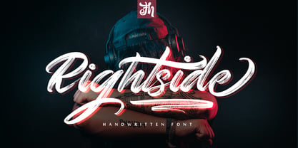 Rightside is a script font designed with a dry brush. The font includes OpenType features. Suitable for element design, events, t-shirts, logos, badges, stickers, awesome artwork, and more.
 - Esmetralda by FHFont,
$17.00 Esmetralda is a Modern Calligraphy Script with opentype features included in the font. Suitable for design, element design, wedding, events, t-shirt, logo, badges, sticker, and other awesome work.
 - Verdaguera by Type-Ø-Tones,
$40.00 Another rebirth: Verdaguera. The all time Catalan people's choice. Now with a complete set of characters that covers a wide range of latin alphabet languages. Catalan included, of course.
 - Detention JNL by Jeff Levine,
$29.00Detention JNL is simply the hand printing of its designer, Jeff Levine. Its uses range from personalizing notes and messages to a graffiti look or as "legible grunge lettering". - Monotype Sorts by Monotype,
$29.99Monotype Sorts is a collection of symbols for use with a wide range of contemporary typefaces. The Monotype Sorts font contains useful bullets, stars, arrows and figures in circles. - Anno by Linotype,
$29.99The impulse behind André Maaßen’s design of the Anno typeface was the design of a New Year’s card for the year 2000 (Anno 2000). His desire to create the perfect printed image developed into a family with four styles: Anno 1, Anno 1 Italic, Anno 2, and Anno 2 Italic. Anno 1 and its Italic are semi-classicist typefaces, with a high degree of stroke contrast, while Anno 2 and its Italic are semi-grotesks, with less stroke contrast. Both Anno 1 and Anno 2 are sans serifs typefaces, but they each offer a new interpretation of the genre. The Anno typeface may be used in a number of applications and sizes. And it is naturally suitable for New Year’s greetings and other cards, of course! - Ongunkan Kensington Runestone by Runic World Tamgacı,
$70.00 The Kensington Runestone is a rune-covered slab of brownstone that was claimed to have been discovered in central Minnesota in the United States in 1898. Olof Öhman, a Swedish immigrant, reported that he dug it out of a field in the largely rural town of Solem in Douglas County. It was then named after the nearest settlement, Kensington. The inscription claims to be a record left behind by Scandinavian explorers in the 14th century (internally dated to 1362). There has been a long-standing debate as to the stone's authenticity, but since the first scientific review in 1910, scientific consensus has classified it as a 19th-century hoax, and some critics have directly accused Öhman of fabricating it. there is community.
 - Bejo by Twinletter,
$15.00 BEJO is a display font in the Japanese style, with each letter having its own individual personality. This font is appropriate for a wide range of project demands, particularly those involving Asian features. By utilizing this typeface, you will create a project with a gorgeous, original, and elegant appearance that will be remembered by many people. Logotypes, food banners, branding, brochure, posters, movie titles, book titles, quotes, and more may all benefit from this font. Of course, using this font in your various design projects will make them excellent and outstanding; many viewers are drawn to the striking and unusual graphic display. Start utilizing this typeface in your projects to make them stand out.
 - Sildetas by insigne,
$22.00 Sildetas is an elegant high-contrast script face. Sildetas was conceived as non-connected, high-contrast and ultra heavy script, as best exemplified by the Black weight. However, it was too much of a temptation to design a hairline variant, and this exploration gave the family’s lighter weights an elegant, graceful feel. The script was modified further to use connected letterforms as the primary glyphs. With its unique swirled ball terminals, this versatile script draws immediate attention. The face glides and flows across the page and the swirling ball terminals provide an interesting diversion to the flow. The lighter weights have an almost spencerian look. Sildetas includes six weights and is a very unique script face. Lighter weights can be used for elegant invitiations. Sildetas can get the job done for many unique design tasks. Sildetas includes many useful OpenType features, including a set of non-connecting and titling alternates, ligatures, and two types of end swashes. Opentype features include simplified swashed stylistic alternates without ball terminals, swash endings, ending contextual alternates, discretionary ligatures, ligatures and five different stylistic sets filled with alternates. In total, there are over 60 alternate letterforms. OpenType-capable applications such as Quark or the Adobe suite can take full advantage of the automatically replacing ligatures and alternates. This family also includes the glyphs to support a wide range of languages.
 - Pier Arcade by Studio K,
$45.00 This font is inspired by all those end-of-the-pier amusement arcades and fairground rides. It’s also a bit of a nod to comic book graphics of the Marvel era and the superheroes who deliver knockout punches in a spew of drop shadow typography. With Pier Arcade you can now create your own fairground ride or comic book adventure. Enjoy! See also my other fun fonts Bebopalula, Barrowboy and Calypso.
 - Northash by Arterfak Project,
$17.00 Introducing Northas the vintage stencil font inspired by the old-school signage and military design. This font has a bit condensed letterform that gives a strong look and dignified. Perfect for many themes such as sports, military, urban, wildlife, vintage, and more! Fonts featured : Uppercase Small caps Numbers Symbols & punctuation Accented characters Alternates Catchwords: in, out, the, with, de, of, at, and, etc. Thank you for your support and happy designing!
 - Stateside by Studio K,
$45.00 Stateside is a bold condensed serif with a vintage feel. It has an urban and, I like to think, urbane character which puts me in mind of classic Thirties architecture like the Rockefeller Centre or the Empire State Building. I did consider calling it Rockefeller, but the family might think it a bit of a liberty, and I can’t afford to get into a copyright battle with them!
 - Pykes Peak by Sentinel Type,
$30.00Pyke's Peak is a spirit type descended from Paeleoflex: The Angel of the Odd. Wraith-like forms mix Roman inscriptional letters with an ar'deco theme for an ethereal graphic art effect. Suitable for magazines and editorial design, book jackets & interiors, posters & broadsides, art & craft objects and other things needing a touch of the extraordinary. Over 500 extra characters give Pyke's Peak unusual range and ability. Mirror capitals, phantom forms, dot phantoms, "superposed" (overlapping) ligatures, capitalized ligatures and fitted pairs for hours of trippy rub-down arcadian magic. Includes hanging numerals, lining numerals, full punctuation, standard math & monetary symbols. Accented characters for Latin 1 and Latin 2 cover the following languages: Albanian, Catalan, Danish, Dutch, English, Estonian, Finnish, French, German, Icelandic, Italian, Norwegian, Spanish and Swedish. Available in OpenType format only. Pykes Peak comes in two versions: (1) Pyke's Peak the full-blown OpenType version with over 500 extra characters, (2) Pyke's Peak Zero, the zero cost version with full Latin 1 & 2 character set but no extra characters. Pyke's Peak Zero is free to download, is licensed for commercial and personal (non-profit) use, and may be embedded on webpages using the CSS @font-face property. This typeface is dedicated to Australian musician James "Jock" Paull, who is a free spirit. - Quartal by ParaType,
$25.00 Quartal is a family of stylish sans serif typefaces of condensed proportions. The family consists of 5 regular weights, 4 condensed ones and 13 extended styles (7 upright and 6 italic). At first there was intention to release just 4 condensed weights for headlines and advertising texts, but later 5 styles of wider proportions were added. As the result the area of applications becomes much wider due to possibility to use the font for smaller point sizes. The name "Quartal", which in this case means city quarter, according to author's associations emphasizes the advertising nature of the design most suitable to the urban environment. Character set of the fonts covers alphabets of Western Europe and basic Cyrillic languages. In addition, it includes a range of alternatives, especially in Cyrillic part. Design was done by Oleg Karpinsky. Released by ParaType in 2010. In 2011 13 new styles of extended proportions were added to Quartal family by the same author. 7 new weights and 6 corresponding italics make Quartal useful for setting not very long texts in advertising and display matter, and for magazines as well.
 - PF Bulletin Sans Pro by Parachute,
$79.00 This is a grotesque typeface which was derived from an older more simple version designed back in 2000. Bulletin Sans Pro is distinguished by its selective deep cuts which give this typeface a robust and contemporary look. These cuts become more apparent at larger sizes while they create a more subtle effect at smaller sizes. For intense titles try the black version. When space and legibility for long texts are critical, use the lighter versions. The family consists of 10 fonts—from black to light—including true italics. It supports 20 special OpenType features like small caps, fractions, ordinals, etc. and offers multilingual support for all European languages including Greek and Cyrillic. Finally, every font in this family has been completed with 270 copyright-free symbols, some of which have been proposed by several international organizations for packaging, public areas, environment, transportation, computers, fabric care and urban lifestyle.
 - Thermal Shock by Hanoded,
$15.00 We used to have a composite worktop in our 'old' kitchen. It was cheap and the kitchen-guy warned us not to put any hot pans on the worktop, as it could crack due to Thermal Shock. Duh... When we installed our new kitchen, we opted for a ceramic worktop, which can handle hot pans being placed on it! Thermal Shock font is a very nice, handmade brush font. If you ever bought any brush fonts of mine, you will know that I almost always use Chinese ink and cheap brushes to create 'the look'. It is always a bit of a surprise how a Chinese ink brush font turns out: I created one the other day and it looked horrible, so it was banned.. Thermal Shock turned out to be a looker. Thermal Shock comes with one set of alternate glyphs, extensive language support (including Greek and Vietnamese) and a guarantee it won't crack in super hot designs.
 - Breathe by Lián Types,
$20.00 ATTENTION COSTUMERS! A new version of this font was released in 2019. Take a look: Breathe Neue Reaching a total of more than 1000 glyphs, Breathe Pro is Maximiliano R. Sproviero’s gift of the year. The aim of the designer was once more to give the user the chance to play and travel from very formal and conservative letterforms to the amazing world of swashes and flourishes. Possibilities of alternating and ligating characters in this font are absolutely fantastic. After his last creation, Parfait Script, Lián wanted to make a more universal font. Delighted by typographic works of Didot and his followers of the beginnings of 1800, Maximiliano R. Sproviero started what became another obsessive project, which is now named Breathe, “cuando las letras respiran...” what could be translated as “when letters breathe”, due to the feeling that you are reading letters that are alive. Breathe comes in two styles which have a significant difference as regards to the quantity of glyphs available inside. If you want to get the most complete style, with over 1000 glyphs, (including contextual alternates, stylistic alternates, swashes, terminal forms, titling alternates, historical forms, stylistic sets, standard ligatures, stylistic ligatures, decorative ligatures and frames) then your choice should be Breathe Pro. On the other hand, if you are interested in having a less decorative font with the nice touch of Lián’s style, then your choice should be Breathe Standard, a more limited version of Breathe, including terminal forms (leaves) and frames. With Breathe Pro you will surely have fun at the same time you are designing and that is not an unimportant thing. The world of type-designers is growing each year, and the features of Open-Type are letting them think their creations as if they were truly pieces of art. At least, Breathe Pro is inspired in the Art of our predecessors, those who with a pen loaded of ink would decorate each letter, each page in such a lovely way. Yes, -lovely- is the word. We would not have the amazing lettering artists, calligraphers, typographers of nowadays if that -love for letters- had not traveled from generation to generation. Breathe Pro is an example of this love. An example of what Maximiliano R. Sproviero feels about typography and letters. Pssst... Look for more images and the User’s Guide at the gallery section to see it in use! http://origin.myfonts.com/s/aw/original/89/0/46067.pdf
 - Fabrikat Kompakt by HVD Fonts,
$40.00 Fabrikat Kompakt (formally known as Fabrikat) is a type family designed by Christoph Koeberlin with creative input of Hannes von Döhren. The Sans Serif family is published by HVD Fonts and consists of seven weights plus matching italics. Its geometric design is based on German 20th century engineers’ typefaces and has a plain and precise appearance. The shapes are optically corrected, yet retain an uncut charm. They work best in display as well as text sizes. The type family is equipped for complex, professional typography with OpenType Features like alternate letters, arrows, fractions and an extended character set to support Central and Eastern European as well as Western European Languages.
 - Sassoon Sans US by Sassoon-Williams,
$48.00 North American version for teaching children’s first letterforms With dots and arrows these print script fonts have no ‘exit stroke’ found in the European version. An upright typeface family developed to meet the demand for letters to produce pupil material for handwriting as well as for reading. Upright letters with extended ascenders and descenders are ideal on screen. They facilitate word recognition. Teachers can print desk strips, charts of letter families and alphabet friezes, as well as consistent material across the curriculum. Together these typefaces provide a valuable resource for special needs teachers. Free to download resources How to access Stylistic Sets of alternative letters in these fonts
 - Wonderlova by Mokatype Studio,
$25.00 Hello Introducing, Wonderlova - Wonderful Display Serif is an elegant, unique font that uses Ligatures to smoothly link letters. inspired by the famous minimalist logo, perfect for the purposes of designing templates, brochures, videos, advertising branding, logos, and more. Perfect for adding a unique twist to word-mark logos, monograms, or pull quotes. International Accent Works on PC & Mac Simple installations Accessible in Adobe Illustrator, Adobe Photoshop, Adobe InDesign, even work on Microsoft Word. PUA Encoded Characters - Fully accessible without additional design software. Fonts include multilingual support Image used: All photographs/pictures/vectors used in the preview are not included, they are intended for illustration purposes only. Thank You
 - Soup Du Jour by PizzaDude.dk,
$18.00 "Soup Du Jour" is French and simply means "Soup Of the Day" - may not sound interesting, but I can tell you that I have had several tasty soup of the day served. I wanted to make a font that resembles that feeling of not really knowing what you get served, but you got a feeling that it is something good! The font has got 6 different versions of each letter, and they automatically changes as you type - it makes your text organic and lively, and probably quite tasty too! :) "Soup Du Jour" is also a well-known quote from one of my favourite movies: "Dumb and dumber"
 - Dream Miracless by Zeenesia Studio,
$12.00 Introducing Dream Miracless Font Dream Miracless is a Monoline Lettering Font. Its came with three weight, Thin, Regular, and Bold. Dream Miracless is perfect for product packaging, branding project, megazine, social media, wedding, or just used to express words above the background. What’s Included : - Standard glyphs - Multilingual - Web Font - Works on PC & Mac Simple installations Accessible in the Adobe Illustrator, Adobe Photoshop, Adobe InDesign, even work on Microsoft Word. PUA Encoded Characters – Fully accessible without additional design software. Fonts include multilingual support Image used : All photographs/pictures/vector used in the preview are not included, they are intended for illustration purpose only. Cheers! Thank You
 - Spotted Fever - Unknown license

- Joyful Heart by Azetype,
$12.00 Have you ever used a handwritten font on your design project? Have you ever felt bored or dissatisfied with its glyphs style that looks stiff and doesn't flow even doesn't really characterize the peculiarities of a handwritten font? Or fonts that don't have alternative glyphs so they look monotonous in a word or even sentence. And in the end, it makes your projects so far from your expectations, even your clients. It's so frustrating, isn't it? Just wake up from your dissatisfaction and this is your time to make a good choice for your design project. So, we have a solution to fix it. We introduce 'Joyful Heart' just for you. This is a font that really characterizes from the handwritten style. This font is crafted carefully in every its single scratch, created to look as close to a natural handwritten font so that it can create the perfect combination on each glyph. Happy Creating www.azetypestudios.com
 - Lust Script by Positype,
$49.00 Boom. You asked for more, um, well just ‘more’—more swashes, more options, more weights, more of everything. I cannot give you more weights. The design just won’t allow it and anything else would be a compromise or a bastardization of the exemplars just to make money that I am unwilling to do. But, I did give you an overly indulgent, 90% cacao bar and espresso, Lust Script Fine. The ending strokes on these glyphs will literally draw blood. Enjoy it as much as I have. The Lust Collection is the culmination of 5 years of exploration and development, and I am very excited to share it with everyone. When the original Lust was first conceived in 2010 and released a year and half later, I had planned for a Script and a Sans to accompany it. The Script was released about a year later, but I paused the Sans. The primary reason was the amount of feedback and requests I was receiving for alternate versions, expansions, and ‘hey, have you considered making?’ and so on. I listen to my customers and what they are needing… and besides, I was stalling with the Sans. Like Optima and other earlier high-contrast sans, they are difficult to deliver responsibly without suffering from ill-conceived excess or timidity. The new Lust Collection aggregates all of that past customer feedback and distills it into 6 separate families, each adhering to the original Lust precept of exercises in indulgence and each based in large part on the original 2010 exemplars produced for Lust. I just hate that it took so long to deliver, but better right, than rushed, I imagine.
 - Peter by Vibrant Types,
$33.00 Peter started as a sketch in the static sans-serif tradition of Helvetica®. Then slight references to the calligraphic origin of type were added, giving it a more distinct character. This neo-grotesque sans has rational and clear basic letterforms, while in its details it unfolds attributes of humanist type. As a neo-grotesque sans it claims a very modest design, yet being a bit wider than its relatives and offering the warmth of humanist drafts. The early sketch grew to a type family of 18 fonts and now supports 700+ glyphs with pro opentype features.
 - FF Berlage Burcht by FontFont,
$58.99 FF Berlage started as a research project about the typography of the prominent Dutch architect Hendrik Pieter Berlage (1856 1935). Donald Beekman based the design on a great number of sources, but mainly lettering found in two of Berlage s most quintessential buildings, the Amsterdam Commodities Exchange building (called Beurs van Berlage), and the ANDB building for the Amsterdam diamond cutters union (called De Burcht). Berlage is considered the father of modern architecture in The Netherlands due to his revolutionary theories on architecture and design, that would greatly influence many Dutch architect groups, like the Amsterdam School and De Stijl.
 - FF Berlage Beurs by FontFont,
$58.99 FF Berlage started as a research project about the typography of the prominent Dutch architect Hendrik Pieter Berlage (1856 1935). Donald Beekman based the design on a great number of sources, but mainly lettering found in two of Berlage s most quintessential buildings, the Amsterdam Commodities Exchange building (called Beurs van Berlage), and the ANDB building for the Amsterdam diamond cutters union (called De Burcht). Berlage is considered the father of modern architecture in The Netherlands due to his revolutionary theories on architecture and design, that would greatly influence many Dutch architect groups, like the Amsterdam School and De Stijl.
 - Reslaby by Letterayu Studio,
$19.00 Reslaby is a Vintage Slab Serif font that will make your designs look unique and fun. It's perfect for labels, quotes, posters, DIY projects, branding, packaging, greeting cards, websites, photos, photographic overlays, signs, window art, scrapbooking, tags and more! What's Included : + Standard glyphs + Web Font + Multilingual Accent + Works on PC & Mac + Simple installations Accessible in the Adobe Illustrator, Adobe Photoshop, Adobe InDesign, even work on Microsoft Word. PUA Encoded Characters - Fully accessible without additional design software. Fonts include multilingual support Image used : All photographs/pictures/vector used in the preview are not included, they are intended for illustration purpose only. Thank You
 - Tabarnak by Canada Type,
$24.95 Tabarnak started out as an assessment and correction of an old concept by George Wilkens. The original idea was for a bold upright alphabet reminiscent of Oz Cooper’s work, but ornamented with some shocard/signage traits. That idea was radically redrawn and reinvented to become a simple 21st century font made to turn heads and induce a friendly rush. Tabarnouche is Tabarnak’s “jittery” incarnation. Just as great for packaging as they are for ads, posters, book and magazine covers, both Tabarnak and Tabarnouche come with about 600 characters, including tons of alternates, and support for the majority of Latin-based languages.
 - M Hei PRC by Monotype HK,
$523.99 Although traditional Heiti typefaces may not be as lively as Songti, the modesty of M Hei makes is enduring and stand out from other similar typefaces. M Hei’s design is based on the hallmarks of traditional Heiti typefaces: it has little to no thick-thin contrast in strokes and has square cut terminals. Its dots (點), ticks (剔) and downstrokes (撇、捺) are subtly curved and longer than usual; all stems (豎) and crossbars (橫) remain simple and clear; and hooks (勾) appear rounded. Together they make a harmonious form which is clean but pure, classy but contemporary.
 - MollyO by Atlantic Fonts,
$28.00 MollyO font family is based on the original, reliably cool handwriting of illustrator (and dear friend), MollyO of mollyOcards. Like MollyO herself, this font is unique, unpretentious, and beautiful. Part printed and part script, it has the authentic connections and stops of a contemporary, casual font. For the truest handwritten feel, keep discretionary ligatures on, or turn them off where you want more evenness. MollyO is expressive in all-caps, available in two weights, and with effortless warmth and inky flow, will bring a wide range of creative projects to life.
 - A Day That Feels Better by Clevus,
$14.00 Proudly present A Day That Feels Better Typeface, created by ClevUs, A nostalgic serif & calligraphic italic that has own unique style & modern look. This typeface is perfect for an elegant & luxury logo, book or movie title design, fashion brand, magazine, clothes, lettering, quotes, and so much more. Font Features : Letters, numbers, symbols, and punctuation 101 alternates and ligatures No special software required they may be used even in Canva, any basic program /website apps that allows standard fonts That's it folks! Multilingual Support Language Support: Danish, English, Estonian, Filipino, Finnish, French, Friulian, Galician, German, Gusii, Indonesian, Irish, Italian, Luxembourgish, Norwegian Bokmål, Norwegian Nynorsk, Nyankole, Oromo, Portuguese, Romansh, Rombo, Spanish, Swedish, Swiss-German, Uzbek (Latin) Follow My Shop For Upcoming Updates Including Additional Glyphs And Language Support. And Please Message Me If You Want Your Language Included or If There Are Any Features or Glyph Requests, Feel Free to Send me A Message. Have a Good Day !
 - Ayeria by Clevus,
$16.00 Proudly present Ayeria is a Multipurpose serif font with a touch of elegant. Comes with alternatives and ligatures, this typeface is perfect for an elegant & luxury logo, book or movie title design, fashion brand, magazine, clothes, lettering, quotes, and so much more. Font Features : Ayeria Lettres, numbers, symbols, and punctuation 28 alternates and ligatures No special software required they may be used even in Canva, any basic program /website app that allows standard fonts That's it, folks! Multilingual Support Language Support: Danish, English, Estonian, Filipino, Finnish, French, Friulian, Galician, German, Gusii, Indonesian, Irish, Italian, Luxembourgish, Norwegian Bokmål, Norwegian Nynorsk, Nyankole, Oromo, Portuguese, Romansh, Rombo, Spanish, Swedish, Swiss-German, Uzbek (Latin). Follow My Shop For Upcoming Updates Including Additional Glyphs And Language Support. And Please Message Me If You Want Your Language Included or If There Are Any Features or Glyph Requests, Feel Free to Send me A Message. Have a Good Day!
 - Nomina by Tokotype,
$40.00 Nomina is a family of sans serif fonts for use from large to small sizes. The weights of the family itself contain 16 styles plus italic, ranging from ExtraLight to Black. The font family takes was inspired by classic Grotesk typefaces such as Venus and Akziden Grotesk. Unlike any other modern Grotesk typefaces, the details of the contrast in this font family are quite subtle and yet still harmonize while standing in between another character, the open apertures help them to increase the quirkiness accompanied by the sharp terminals on each rounded glyphs. The Nomina family is well equipped with lots of selective alternates and OpenType features, and the main usage of this font is universal, this means this can use it any design style as long as the look and feel keep match with its characteristics.
