10,000 search results
(0.159 seconds)
- Retrolight by Almarkha Type,
$29.00 Introducing Neon Font called Retrolight A unique Fonts with Retro Style can make your logotype become more interesting. inspired by real world neon light signs, it features minimal letter forms with smooth rounded corners and, true to real neon tubes, strictly uses lines with open start and end points. This font is perfect for adding your own glowing light effects or can be used to actually design real world neon signs. Retrolight fonts is perfect for your project and allows you to create designs, headlines, posters, logos, badges, t-shirts and many more that are beautiful. It is also best used for posts, logos, posters, certificates, labels and more.
 - Avaneonz by Almarkha Type,
$29.00 Introducing Neon Font called Avaneonz A unique Fonts with Retro Style can make your logotype become more interesting. inspired by real world neon light signs, it features minimal letter forms with smooth rounded corners and, true to real neon tubes, strictly uses lines with open start and end points. This font is perfect for adding your own glowing light effects or can be used to actually design real world neon signs. Avaneonz fonts is perfect for your project and allows you to create designs, headlines, posters, logos, badges, t-shirts and many more that are beautiful. It is also best used for posts, logos, posters, certificates, labels and more.
 - Neonblitz by Almarkha Type,
$33.00 Introducing Neon Font called Neonblitz A unique Fonts with Retro Style can make your logotype become more interesting. inspired by real world neon light signs, it features minimal letter forms with smooth rounded corners and, true to real neon tubes, strictly uses lines with open start and end points. This font is perfect for adding your own glowing light effects or can be used to actually design real world neon signs. Neonblitz fonts is perfect for your project and allows you to create designs, headlines, posters, logos, badges, t-shirts and many more that are beautiful. It is also best used for posts, logos, posters, certificates, labels and more.
 - Bartharos by Keristyper Studio,
$14.00 Introducing Bartharos which has an elegant and natural hand lettering brush style like handmade. This font is best suited for your design projects that are fun, bold, and sporty. Can also be applied to logotype designs, website headers, making multiple letters for quotes, t-shirt designs, etc. Bartharos multilingual support: Afrikaans, Albanian, Catalan, Danish, Dutch, English, Estonian, French, Finnish, German, Icelandic, Indonesian, Italian, Malay, Norwegian, Portuguese, Spanish, Swedish, Zulu, and many more. What’s Included : Web Fonts Standard & Multilingual glyphs Ligature Works on PC & Mac Simple installations Accessible in Adobe Illustrator, Adobe Photoshop, Adobe InDesign, and even work on Microsoft Word. Hope you enjoy our font!
 - Stacker by Almarkha Type,
$29.00 Introducing Neon Sci-fi Futuristic Font called Stacker A unique Fonts with Futuristic Style can make your logotype become more interesting. inspired by real world neon light signs, it features minimal letter forms with smooth rounded corners and, true to real neon tubes, strictly uses lines with open start and end points. This font is perfect for adding your own glowing light effects or can be used to actually design real world neon signs. Stacker fonts is perfect for your project and allows you to create designs, headlines, posters, logos, badges, and many more that are beautiful. It is also best used for posts, logos, posters, labels and more.
 - HU Retroround KR by Heummdesign,
$50.00 'HU Retroround KR' is a font that captures the feel of the retro typefaces used on signboards during Korea's modernization era. This font has a variable function, allowing users to fine-tune the thickness they want. (Available only in Adobe programs.) Six basic weights are provided so that they can be used even in programs that do not apply the variable function. This font includes Hangul, Korean.
 - Caligari Pro by Elsner+Flake,
$99.00 The silent film »The Cabinet of Dr. Caligari« (1920) is undoubtedly one of the breathtaking milestones within the German Expressionist Movement, a time of extraordinarily creative works of art as a reaction to a world in rapid change. The original intertitles of Caligari were worked out by the set designers (and painters) Walter Reimann, Walter Röhrig, and Hermann Warm, using a unique expressionistic language of form for dramatic and iconic lettering. When in 2010 KOMA AMOK’s Joerg Ewald Meißner and Gerd Sebastian Jakob were commissioned by the Institut Mathildenhöhe Darmstadt and publisher Hatje Cantz to design the catalog for the exhibition »The Total Artwork in Expressionism«—showing works of art, architecture, film, literature, theater, and dance—it was soon perfectly clear that a new typeface, inspired by the Caligari intertitles, should speak for all the expressionistic arts. An intense process of research and analysis began. The original letters of the Caligari intertitles were individuals on their own. Furthermore, each of the three title designers had added his specific approach to the basic Caligari type style. From hundreds of different As to Zs a choice had to be made, which should be THE characteristic Caligari letter for a digital typesetting font. Finally the chosen letters were cut and drawn again, missing letters were added according to the formal priniciples, all-in-all 1000 glyphs were digitised to complete a usefull OpenType font ready for use. When in the autumn of 2010 the exhibition started successfully with great media interest, the posters all over Darmstadt announced »You must become Caligari!« – set in the brandnew typeface. The font Caligari Pro offers alternative forms for every letter and a whole bunch of ligatures, thus creating an expressive, individual image of headlines and text. By using included Stylistic Alternates the image will get even more vivid. Caligari comes with a complete set of expressionist ornaments and true old style figures—thus the heyday of the Expressionist Movement and the era of the silent films can be revived typographically by the means of today: »Express Yourself!«.
 - Librum Sans by Hackberry Font Foundry,
$24.95 This is the companion sans family to make the Librum serif families work as well as they do. By companion, I do mean stylistically compatible. But mainly, they have the same vertical metrics. So they work very well for run-in heads, inline character styles, and all the rest of the needs in large books with complex formatting. They are designed for use in InDesign, and they work very well in that environment. The fonts use the same OpenType feature files as the rest of the Librum families. The feature files for the italic and bold are more limited—as I have rarely used things like that [over the past 20+ years]. The character shapes are a bit whimsical. The original ancestor of this book design sans was a very playful font I released as Aerle. It’s been calmed down a lot but is still loose and friendly. For a great deal, see Librum Book Design Group , for a package containing all fifteen fonts!
 - Acarau Display by Tipogra Fio,
$30.00 Acarau is a 6 fonts display typeface with high reverse contrast—since from Roman capitals and calligraphy, usually Latin alphabet letters have thiner horizontal steams and thicker verticals, these features being optical or visual—quite adequate for logos, headlines and posters. Moreover, the style of the typeface is inspired by Italics form factor: lowercase letters having less strokes to make their shapes; A has one story; E has one stroke shape, such as K, G, Y and Z; F has a descent. To give it more calligraphic feeling, there is contrast for uppercases as well, this is very perceived by the diagonal letters like A, K, M, N, V, W, X, Y and Z. J also has a descent. Q and R have natural swashes, but they have alternates in case the costumer want to go for more usual forms—including accent marked letters. Acarau is a 12 months project, the contrast for uppercases were increasing as the process was made. In the middle it is found suitable blend the letter shapes with the history of Brazilian music from the 70’s and 80’s, since the font has a tropical, warm, spicy and nostalgic feeling. Songs from bands and singers that emerged on Rio de Janeiro like Paralamas do Sucesso, Cazuza, Lulu Santos and Kid Abelha bring the beach accent and rhythm that this font has. OpenType features complement the set, which has Multi-Lingual support for a comprehensive Latin set, including Vietnamese—meaning more than 640 glyphs: Case-Sensitive forms, so symbols can properly align to uppercase letters; Ligatures, to better reading for z_y and L_I, and style for s_s, w_w_w; also for ease arrows and punctuation typing; Stylistic Set 1: two story a—including accent marked letters; Stylistic Set 2: two story g—including accent marked letters; Stylistic Set 3: diagonal (usual) z—including accent marked letters; Stylistic Set 4: flower i and j dots; Contextual alternates; Terminal forms, for R and Q; Ordinals.
 - Cabrito Inverto by insigne,
$- Life’s always more fun when you reverse the stress. The same goes for the new member of the Cabrito family. Cabrito itself is a recently developed slab serif made for the kid’s book The Clothes Letters Wear. Cabrito proved to be more popular than I thought, and I promised I would create an inverted style for this new addition to the font world--a variant that would pair well with the original or even stand well on its own. And so now, here it is. Cabrito Inverto, which features the reversed stress of the strokes from a font’s “normal” traits. Inverted stress fonts are most often associated with cowboys and the Old West. The inverted stress gives it a happy-go-lucky appearance, not to be taken too seriously. It’s a pleasantly rounded, not-so-strictly geometric typeface with handwriting-inspired forms. Whew, that’s a mouthful! Inverto’s bundle of alternates is accessible in any OpenType-enabled program. It contains a workforce of alternates, swashes, and alternate titling caps to embellish the font. Also bundled are swash alternates, aged design and style figures, and compact caps. Peruse the PDF brochure to examine out these solutions in action. OpenType-enabled purposes such as Adobe suite or Quark will allow ligatures and alternates. This font family also includes the glyphs for 72 different languages. Cabrito Inverto does pair well with Cabrito. There is even an extra font weight, Black, for when you want to punch it up a bit. Jeremy Dooley designed Inverto to be a welcoming, day-to-day font family. Use it to express friendliness on just about anything, from candy to food to children’s toys. Cabrito Inverto’s one-of-a-kind visual appearance brings a bundle of fun to the party. Buy Cabrito Inverto to give a boost to your designs every day of the week.
 - Seibi Shirogane by Nihon Literal,
$169.00 With an attractive hand-penned style featuring a natural balance between kanji and kana, characters are perfectly aligned whether typeset vertically or horizontally. Leave plenty of space between lines for the best effect. タテ組・ヨコ組でもラインが揃う、漢字とかなのバランスも自然な手書き風の心地よいペンタッチです。行間をあけてゆったり組むのがおすすめです。硬筆ではなく、行書風の脈絡が生きたペンタッチなので、柔らかでも読みやすい印象の書体です。
 - Geneo Std by Typofonderie,
$59.00 A robust oldstyle, an elegant slab, 8 styles Geneo, created by Stéphane Elbaz, is a synthesis of historic and present-day visions of typography, a slab serif constructed on an oblique axis. Its subtle contrast evokes both Renaissance elegance and the robustness of the Egyptian typefaces that were in vogue during the 19th century. Geneo falls halfway between the classic styles of Garamond and Transitionnals, with aspects of contemporary slab serifs like Rockwell, Boton, as well a bit informal. From this blend of styles and genres, it emerges with a singular identity perfectly suited for modern illustrations of quality, savoir-faire, and culture. Geneo’s limited contrast has been carefully crafted to make the font adaptable for use as both text and headlines, as well as for small-print elements like footnotes, appendices, and captions. The variety and precision of certain weights, like Regular, allow minute adjustments of the font color in text compositions. This flexibility is especially useful for displaying on devices with high pixel densities such as the latest iPhone or iPad, on which text may appear too thin. Flexibility and sturdiness The sturdiness of Geneo makes it a perfect choice for posters, logos, print and any project that requires finesse and sophistication. It provides alternate versions of some letters such as g and a to give you the flexibility you need for your typographic projects. Geneo pairs perfectly with contemporary typeface genre. Geneo, a new typeface designed by Stéphane Elbaz Tokyo TDC 2014 Type Directors Club 2009
 - Robert Moore by Harvester Type,
$15.00 Robert Moore is a font that was specially designed for comics. A lot of work has been done. At first, glyphs were drawn manually using different markers, then they were transferred to the font. The font was tested on real printing and digital comics. The world of fonts for comics is big and I wanted to create even more variability for authors with one family, which is why a variable version was created containing two axes: weight and italics. This gives you more options. A large number of glyphs, multilingualism, ligatures, and a capital give even more scope for work and creativity. The name was created from the names of the authors of the comics Robert Kirkman and Alana Moore, so the Robert Moore font turned out. Although the font was made for comics, it is not limited to them. Posters, logos, covers, text, headings, prints, product design, web, interfaces are not all options for using the font.
 - Shiny Ink Display by Lloyd David Designs,
$14.99 Hi there, thanks for looking at my first typeface. It began as one of my original sketches back in 2019 as a freelance graphic designer trying to create unique letterforms that I could use for posters or websites with other possible use cases in mind for commercial use. The sketches were then passed on to and worked on with Vladimir Tsagolov who has more experience in creating professional typefaces, the experience for me was invaluable, and I have many more typefaces I'm now working on. Shiny Ink Display is a collection of hand drawn fonts based on the flow of reflective viscous ink with 7 styles, some styles can be interchangeable and used on top of each other. For example, Shiny Ink Display Plain, can be used with Shiny Ink Display Plain Lined to create shadows underneath it, at angles not available with the Shadow styles you'll see in the font collection. Shiny Ink Display has various use cases, maybe even infinite, but more specifically for posters or websites with large text, though it bodes quite well at smaller sizes, and is visually appealing to its viewers as long as it's at a legible font size. When it comes to font pairing, Shiny Ink Display works especially well with Monospace and sans-serif fonts. You can check the poster examples on this page to help you imagine what you could do with the font styles. I also had in mind manufactured products, but I could leave that to you to create your ideas with the available font styles. In regards to languages or typing on a keyboard, most of the English/European latin or cyrillic language keys are supported, so you'll have lots of glyph characters to play with for a number of ideas you may have. All the best with your projects using my fonts, if there are any issues, don't hesitate to contact me for support: lloyddaviddesigns.co.uk - Lloyd David
 - Teramo by ROHH,
$29.00 Teramo™ is daring, sharp and dynamic. Its personality is derived from asymmetry and movement. It is a contemporary serif family full of modern design elements playing with proportions of works of XV and XVI century masters such as Francesco Griffo or Claude Garamond. The family features four optical sizes. Display sizes feature extreme stroke contrast and are intended for fashion, lifestyle, cosmetics, magazine, business, hi-tech and advertising use. Text styles are created for all kinds of body copy — long and short paragraphs, books and websites in any modern design context. They are crafted to be elegant and legible, featuring more generous spacing and scrupulous kerning. Display weights are designed as modern, extraordinary variations on didone style. Teramo’s letterforms are merging classical proportions and precise, contemporary details such as asymmetric serifs, sharp edges and unconventional glyph shapes. Another important factor constituating Teramo’s personality is an angled axis, unusual for didone families and giving the typeface much more organic and dynamic feel. Teramo features a lively true italics strongly related to cursive handwriting. The italic styles imply movement, energy and fluency, introducing a new color to paragraph text, as well as being a powerful and interesting standalone display type. The family introduces additional titling letter variations for headlines and display uses, such as sharp and modern lowercase “y” or uppercase alternates for better all caps typography. Teramo consists of 56 fonts in 4 optical sizes - 28 uprights and their corresponding true italics + 2 variable fonts. It has extended language support as well as broad number of OpenType features, such as case sensitive forms, standard and discretionary ligatures, titling alternates, contextual alternates, lining, oldstyle figures, slashed zero, fractions, superscript and subscript, ordinals, currencies and symbols.
 - Blank Manuscript by Aah Yes,
$14.95Blank Manuscript allows you to produce sophisticated musical scoresheets even on basic Word Processors - anything from simple plain staves to complex full-page orchestral scores of your own design, to write in the notation yourself. The basic stuff is really easy and straightforward, but there's some quite advanced things you can do as well. So Copy and Save these Instructions. • The main stuff is simple and tends to follow the initial letter. Treble, Bass and Alto clefs are on upper case T B A (there are more clefs, below). The 5 Lines for the clefs are on L or l. • A small v will give a small vertical line (like a bar line) and a Big U will give a Big Upright - these can start or end a line or piece. • Time Signatures - type the following letters: Think of W for Waltz and it's easy to remember that 3/4 time is on W. Then from that they go up or down together like this: V=2/4 W=3/4 X=4/4 Y=5/4 Z=6/4 Compound Times are on H I J K like this: H=3/8 I=6/8 J=9/8 K=12/8 Common Time and Cut Common symbols can be found on semi-colon and colon respectively (all begin with Co- ). 2/2 3/2 are on lower case a and b, 7/4 and 7/8 are on lower case c and d, 5/8 is on small k (think POL-k-A) • Flat signs are on the numbers. Flat signs on LINES 1 to 5 are on numbers 1 to 5. Flat signs on SPACES 1 to 5 are on numbers 6 to 0 (space 1 being above line 1, space 5 being above the top line of the stave). Sharp signs are on the letters BELOW the long-row numbers. Which is q w e r t for the sharp signs on Lines 1 to 5, and y u i o p for sharp signs on spaces 1 to 5. Doing it this way means it works the same for all clefs, whether Treble, Bass, Alto, Tenor or any other. Sharp and Flat Signs always go in this order, depending on how many sharps or flats your key signature requires: Treble Clef Sharps t i p r u o e Flats 3 9 7 4 2 8 6 Bass Clef Sharps r u o e t i w Flats 2 8 6 3 1 7 = Alto Clef Sharps o e t i w r u Flats 7 4 2 8 6 3 1 • Guitar Chord Boxes are on G and g (G for Guitar) Upper Case G has a thick line across the top Lower case g has an open top, for chords up the fretboard TAB symbols are available: Six-string Tablature is on s & S for Six. Four-string Tablature is on f & F for Four. (Lower case has the "TAB" symbol on it, Upper Case has just the lines to continue.) Five-string tablature, is on lower case "j" (as in BAN-j-O) and of course L or l will continue the 5 lines. •RARE CLEF SIGNS including Tenor Clef, are on various punctuation marks, i.e. dollar, percent, circumflex, ampersand & asterisk, above the numbers 4 to 8. NOTE: The important symbols were kept on the letter and number keys, which are fairly standard all over, but some of the less important symbols are on various punctuation keys, which in different countries are not the same as on my keyboard. If it comes out wrong on your system, all I can say is it's right on the systems we've tried, and they'll be in here somewhere, probably on a different key. CLOSING THE ENDS OF THE LINES and BAR-LINES is done with the 3 varieties of brackets - brackets, brace and parentheses - Left/Right for the Left/Right end of the line. Parentheses L/R () which are above 9, 0 give a clef with a small vertical upright (the same as a bar line). Brace L/R and Brackets L/R (both on the 2 keys to the right of P on my keyboard) will close off a staff line with tall upright bars. Brace gives a double upright - one thick, one thin. Brackets give a single tall upright. A Big Upright is on Big U, (Big U for Big Upright) and a small vertical line is on small v (small v for small vertical). The Big Upright is the maximum height, and the small vertical is exactly the same height as a stave. And there's a tall upright Bar, on Bar (which is to the left of z on my keyboard, with Shift,) which is the same height as the bar on upper case U but twice as broad. • There's a staff intended for writing melodies, which is a little bit higher up than an ordinary treble clef giving a space underneath to put lyrics in - on m and M for Melody line. Lower case has the Treble Clef on, Upper case M has just the higher-up staff lines with no clef. (Use mMMMMMMM etc.) However this clef will be in the wrong place to put in sharp and flat signs, key signatures and so on, so if you use this clef you'll have to write the sharps, flats and key signature yourself. There's also a clef that's smaller (less tall) than the ordinary clef, but with the same horizontal spacing so it will align with other standard-sized clefs - on slash (a plain clef) and backslash (with a Treble Clef). • There are some large brackets for enclosing groups of staves, such as you'd use on large orchestral scores, on Upper Case N O P Q R, which can aid clarity. N and O on the left, Q and R on the right. P is a Perpendicular line to be used on both sides to increase the height of the enclosure, in this way but with the staff lines in between: N Q P P P P P P O R OTHERS —————————————— • Repeat marks are on comma (left) and period/full stop (right). • Hyphen is left as a sort of hyphen - it's a thin line like a single staff line, with the same horizontal spacing as ordinary staff lines - in case you want to draw a line across for a Percussion Instrument, or a Title or Lyric Line. • Space is a Space, but with HALF the width or horizontal spacing as ordinary staff lines, so 2 space symbols will be the same width as a clef symbol or line. • Grave (to the left of 1 on the long row, or hold down Alt and type 0096 then let go) gives a staff line that is one eighth the width of an ordinary staff line. • If you want manuscript in a clef and key which requires a flat or sharp sign in the space underneath the 5 lines, they’re on = equals and + plus . SYMBOLS • Many of these symbols will only be useful if you have worked out in advance which bars will need them, but they are here in case you've done that and wish to include them. • Symbols for p and f (piano and forte) are on 'less than' and 'greater than' < > (above comma and full stop) and m for mezzo is on Question, next to them. They can be combined to make mp, mf, ff, pp, etc. These signs -- and other signs and symbols like Pedal Sign, Coda Sign and so on -- can be found on various punctuation mark keys, including above 1, 2, 3 in the long row, and others around the keyboard. There's a sort of logic to their layout, but in different countries the keys are likely to give different results to what is stated here, so it's probably best to just try the punctuation and see if there's any you might want to use. (But on my keyboard a Coda sign is on circumflex - because of the visual similarity. Pedal sign is on underscore. A "Sign" symbol is on exclamation mark.) They were only included in case you really need them to be printed rather than handwritten. • However, a Copyright symbol is deemed necessary, and also included are a "Registered" symbol and a TradeMark symbol. They are found in the conventional places, and can be accessed by holding down ALT and typing 0169, 0174 or 0153 respectively in the numberpad section and letting go. • Staff lines with arco and pizz. above are on capital C and D respectively ---C for ar-C-o. • An empty circle above a staff line (to indicate sections by writing letters A, B, C or 1,2,3 inside for rehearsal marks) is on n. The actual signs for an A, B, C and D in a circle above the staff line can be produced by holding down ALT and typing 0188, 0189, 0190 and 0191 respectively and letting go. • The word "Page", for indicating page numbers, is on the numbersign key. • The two quotes keys, (quote single and quote double) have symbols representing "Tempo is", and "play as triplets", respectively. • INSTRUMENT NAMES There's a whole lot of Instrument Names built in (over a hundred) which can be printed out above the clef, and you do it like this. Hold down Alt and type in the given number in the numberpad section, then let go. For Piccolo it's 0130, for Flute it's 0131, Cornet is on 0154, Violin is on 0193, and the numbers go up to over 0250, it's a fairly complete set. There's also a blank which is used to align un-named clefs on 0096. Put them at the very beginning of the line for the best results. Here they are: WOODWIND Piccolo 0130 Flute 0131 Oboe 0132 Clarinet 0133 Eng Horn 0134 Bassoon 0135 Soprano Sax 0137 Alto Sax 0138 Tenor Sax 0139 Baritone Sax 0140 Saxophone 0142 Contrabassoon 0145 Recorder 0146 Alto Flute 0147 Bass Flute 0148 Oboe d'Amore 0149 Cor anglais 0152 Pipes 0241 Whistle 0242 BRASS Cornet 0154 Trumpet 0155 Flugelhorn 0156 Trombone 0158 Euphonium 0159 Tuba 0161 French Horn 0162 Horn 0163 Tenor Trombone 0164 Bass Trombone 0165 Alto Trombone 0166 Piccolo Cornet 0167 Piccolo Trumpet 0168 Bass Trumpet 0170 Bass Tuba 0171 Brass 0172 VOICES Vocal 0175 Melody 0176 Solo 0177 Harmony 0178 Soprano 0179 Alto 0180 Tenor 0181 Baritone 0182 Treble 0183 Bass 0197 (see also PLUCKED STRINGS) Descant 0184 Mezzo Soprano 0185 Contralto 0186 Counter Tenor 0187 Lead 0206 BOWED STRINGS Strings 0192 Violin 0193 Viola 0194 Cello 0195 Contrabass 0196 Bass 0197 Double Bass 0198 Violoncello 0199 Violin 1 0200 Violin 2 0201 Fiddle 0252 PLUCKED STRINGS Harp 0202 Guitar 0203 Ac. Gtr 0204 El. Gtr 0205 Lead 0206 Bass 0197 Ac. Bass 0207 El. Bass 0208 Slide Gtr 0209 Mandolin 0210 Banjo 0211 Ukelele 0212 Zither 0213 Sitar 0214 Lute 0215 Pedal Steel 0216 Nylon Gtr. 0238 Koto 0239 Fretless 0244 KEYBOARDS + ORGAN Piano 0217 El. Piano 0218 Organ 0219 El. Organ 0220 Harpsichord 0221 Celesta 0222 Accordion 0223 Clavinet 0224 Harmonium 0225 Synth 0226 Synth Bass 0227 Keyboards 0228 Sampler 0249 PERCUSSION and TUNED PERCUSSION Percussion 0229 Drums 0230 Vibes 0231 Marimba 0232 Glockenspiel 0233 Xylophone 0234 Bass marimba 0235 Tubular Bells 0236 Steel Drums 0237 Kalimba 0240 OTHERS Harmonica 0246 Mouth Organ 0247 FX 0251 Intro 0243 Verse 0245 Refrain 0248 Chorus 0250 un-named 0096 (this is a small spacer stave for aligning clefs without a name) ALSO copyright 0169 registered 0174 TradeMark 0153 Rehearsal marks 0188-0191 (giving A, B, C, D in a circle, an empty circle is on n ) Clef signs for Treble Bass Alto without any staff lines 0253-0255 An Alphabetic List of all signs: a 2/2 time b 3/2 time c 7/4 time d 7/8 time e sharp sign, centre line f Tab sign for 4-string tab g Guitar Chord Box, no nut h half-width stave I sharp sign, third space up j Tab sign for 5-string tab k 5/8 time l Lines - 5 horizontal lines for a stave m Melody Clef - a standard clef but placed higher up, with Treble sign n Stave with an empty circle above o sharp sign, fourth space up p sharp sign, space above stave q sharp sign, bottom line r sharp sign, fourth line up s Tab sign for 6-string tab t sharp sign, top line (fifth line up) u sharp sign, second space up v vertical line (bar-line) w sharp sign, second line up x Fretboard, four strings y sharp sign, first space up z Fretboard, five strings A Alto Clef B Bass Clef C “arco” above stave D “pizz.” above stave E Double Vertical Lines F Four Horizontal lines (for 4-string tab) G Guitar Chord Box with nut H 3/8 time I 6/8 time J 9/8 time K 12/8 time L Lines - 5 horizontal lines for a stave M Melody Clef - a standard clef but placed higher up, plain N Bounding Line for grouping clefs - top left O Bounding Line for grouping clefs - bottom left P Bounding Line for grouping clefs - Perpendicular Q Bounding Line for grouping clefs - top right R Bounding Line for grouping clefs - bottom right S Six Horizontal lines (for 6-string tab) T Treble Clef U tall, thin Upright line V 2/4 time W 3 / 4 time X 4/4 time Y 5/4 time Z 6/4 time 1 flat sign, first line up (the lowest line) 2 flat sign, second line up 3 flat sign, third line up 4 flat sign, fourth line up 5 flat sign, fifth line up (the top line) 6 flat sign, first space up (the lowest space) 7 flat sign, second space up 8 flat sign, third space up 9 flat sign, fourth space up 0 flat sign, space above stave - Ah, the Edo font by Vic Fieger, you say? Imagine if a brush, after a night out drinking with its inky pals, decided to take a stroll across the canvas, leaving behind a trail filled with personality,...
- PF DIN Display Pro by Parachute,
$79.00 While DIN Display seems to retain DIN’s basic characteristics, it shines with its sharper corners and contemporary look. Completed in 2002, it was first released and published in Parachute’s award-winning 2003 catalog and immediately was a hit. It has been used successfully in magazines, corporate applications and packaging in fields such as music, fashion, technology, visual arts. The ‘Pro’ series has been enhanced with more weights, multilingual support and opentype features in all different styles. Specifically, this superfamily supports simultaneously Latin, Greek and Cyrillic, while each one of its 15 weights contains 1197 glyphs and 20 opentype features. Additionally, every font in this superfamily has been completed with 270 copyright-free symbols, some of which have been proposed by several international organizations. This is a set of very useful daily symbols for packaging, branding and advertising. Symbols for public areas, environment, transportation, computers, fabric care and urban life.
 - Amalligna by AEN Creative Studio,
$14.00 Amalligna Monogram is an incredibly beautiful and romantic handwritten font, featuring little hearts as ornaments. It looks stunning on wedding invitations, thank you cards, quotes, greeting cards, logos, business cards and every other design which needs a handwritten touch.
 - Barbara Calligraphy by AEN Creative Studio,
$12.00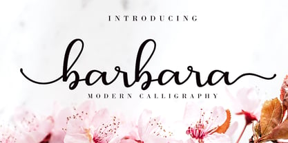 Barbara Calligraphy is a beautiful script font. It has a classy, elegant, and modern look which can be used for logos, branding, invitations, stationery, wedding designs, social media posts, and every other design in need of a handwritten touch.
 - Hardinge by Typefactory,
$14.00 Hardinge is born from an original and blackletter style font. It has a classic, vintage-style which is perfect for logos, branding materials, t-shirts, prints, business cards, and every other design which needs a unique and striking typeface.
 - Barokah by Alifinart Studio,
$14.00 Do you want to create a design with a luxurious and casual style? Barokah Serif Font is the best choice. This is a modern display font has a lot of ligature for uppercase and lowercase. This serif font are perfect for luxury projects and will keep your creativity flowing. Typeface Story In 2021, we released Barokah Script and at that time a lot of people loved it. However, we feel that Barokah Script should be combined with a serif font with a luxurious and casual style, so that it will become a popular for everyone. That's why, today—after 1 year—we are releasing Barokah Serif, as the best match for Barokah Script. Why Barokah Serif Font? Barokah Serif is a font with a myriad of ligatures, both uppercase and lowercase. In this font, there are Stylistic Alternates for each capital letter with an authentic and elegant design. In the lowercase letters you will find an amazing variety of ligatures and in a luxurious style. This will make each of your designs look elegant and classy. For ease of use, we divide it into two; Standard and Discretionary Ligatures. Features: - Uppercase and lowercase letters - Numbers and punctuation - Lots of ligatures for uppercase and lowercase - Stylistic Alternates for each capital letter - True type hinting - Multilingual Standard and Discretionary Ligatures Standard and Discretionary Ligatures are available for the following letter combinations: LA LI LU LE LO LL RA RI RU RE RO KA KI KU KE KO XA XI XU XE XO ZA ZI ZU ZE ZO RS AS MS KS HS EV EW DO OC OG DG OO OQ TT NN WWW SS Th fi ff ffi fj ffj ft fl ffl fb ffb fh ffh fk ffk ſi ſſ ſſi ſl ſſl ſt ct st tt an ah am ap ar ab en eh em ep er eb cn ch cm cp cr cb un uh um up u rub gi gj ti tti tj ss ri rj www Language Supports Afrikaans, Albanian, Asu, Basque, Bemba, Bena, Breton, Catalan, Chiga, Colognian, Cornish, Croatian, Czech, Danish, Dutch, Embu, English, Esperanto, Estonian, Faroese, Filipino, Finnish, French, Friulian, Galician, German, Gusii, Hungarian, Indonesian, Irish, Italian, Kabuverdianu, Kalaallisut, Kalenjin, Kamba, Kikuyu, Kinyarwanda, Latvian, Lithuanian, Lower Sorbian, Luo, Luxembourgish, Luyia, Machame, Makhuwa-Meetto, Makonde, Malagasy, Maltese, Manx, Meru, Morisyen, North Ndebele, Norwegian Bokmål, Norwegian Nynorsk, Nyankole, Oromo, Polish, Portuguese, Quechua, Romanian, Romansh, Rombo, Rundi, Rwa, Samburu, Sango, Sangu, Scottish Gaelic, Sena, Serbian, Shambala, Shona, Slovak, Soga, Somali, Spanish, Swahili, Swedish, Swiss German, Taita, Teso, Turkish, Upper Sorbian, Uzbek (Latin), Volapük, Vunjo, Walser, Zulu Suggested Uses Perfect for branding projects, logo or logotype, promotion, book cover, invitation, letterhead, website, and more. Conclusion Barokah Serif is a luxurious authentic font and a must-have in your font collection. Get the Barokah Serif Font now… ----------------------------------- Alifinart Studio alifinart@gmail.com Instagram | Behance
 - Urban Barbarian by Comicraft,
$19.00 He’s been mixing one part artist and one part barbarian since 2005. Brutal, ruthless, cutthroat, he moves through the concrete jungle, unsheathing his, um, sword, taking what he wants without care or remorse. He follows no rules. He is the URBAN BARBARIAN. The Spoils of Battle Await Him! Is he Conan? Roger ‘Mad Men’ Sterling? No, he’s Dan Panosian. Artist. Author. Lover of fine women, drinker of fine scotch, drawer of fine pictures. This is his fine font. Well, one of them. See the families related to Urban Barbarian: Dan Panosian Features: Two fonts: all-uppercase GIANT and upper/lowercase DWARF.
 - Basmala by Afkari Studio,
$17.00 Basmala - An Arabic Style Typeface NEW Ramadhan and Islamic font, Basmala, is an Arabic-styled display typeface. This Islamic Ramadhan Arabic font is perfect for any graphic design related to the Islamic style. You will get an Arabic feel to every text you type using this font. Made with Latin characters so that it can be read internationally which does not have to be able to read Arabic characters This Islamic font is suitable for branding, product packaging, quotes, flyers, posters, logotype, apparel, T-shirt, Hoodie, book covers, movie title, advertising, and more. Features; - Uppercase, Lowercase, Number, and Punctuation - Special Alternates and ligatures - Works on PC & Mac - Simple installations - Accessible in Adobe Illustrator, Adobe Photoshop, Adobe InDesign, even work on Microsoft Word - Fully accessible without additional design software. - Mültîlíñgúãl Sùppört for; ä ö ü Ä Ö Ü ß ¿ ¡ Hope you enjoy our font and this font is useful font for your projects!
 - Saleha by Afkari Studio,
$19.00 Saleha - An Arabic Style Typeface NEW Ramadan and Islamic font, Saleha, is an Arabic-styled display typeface. This Islamic Ramadhan Arabic font is perfect for any graphic design related to the Islamic or Arabic style. You will get an Arabic feel to every text you type using this font. Made with Latin characters so that it can be read internationally which does not have to be able to read Arabic characters This Islamic font is suitable for branding, product packaging, quotes, flyers, posters, logotype, apparel, T-shirt, Hoodie, book covers, movie title, advertising, and more. Features; - Uppercase, Lowercase, Number, and Punctuation - Special Alternates and ligatures - Works on PC & Mac - Simple installations - Accessible in Adobe Illustrator, Adobe Photoshop, Adobe InDesign, even work on Microsoft Word - Fully accessible without additional design software. - Mültîlíñgúãl Sùppört for; ä ö ü Ä Ö Ü ß ¿ ¡ Hope you enjoy our font and this font is useful font for your projects!
 - Kemanala by IbraCreative,
$17.00 Kemanala – An Enchanting Script Typeface Kemanala, an enchanting script typeface, dances gracefully across the page, intertwining elegance with whimsy. Its flowing and organic strokes exude a wonderful sense of fluidity, capturing the essence of handwritten beauty. Each letter in Kemanala is meticulously crafted, featuring delicate curves and stylish flourishes that add a touch of sophistication to any design. Whether adorning invitations, branding materials, or artistic projects, Kemanala effortlessly bridges the gap between timeless charm and contemporary style. With its versatility and charm, this script typeface invites users to weave a narrative of their own, making every written expression a journey into the realms of enchantment and creativity. Kemanala stands as a testament to the artistry of script typography, offering a harmonious balance between classic appeal and a touch of delightful modernity. Kemanala is perfect for branding projects, logo, wedding designs, social media posts, advertisements, product packaging, product designs, label, photography, watermark, invitation, stationery, game, fashion and any projects. Fonts include multilingual support for; Afrikaans, Albanian, Czech, Danish, Dutch, English, Estonian, Finnish, French, German, Hungarian, Italian, Latvian, Lithuanian, Norwegian, Polish, Portuguese, Slovak, Slovenian, Spanish, Swedish.
 - Rameau by Linotype,
$29.99Rameau for classic elegance The type family Rameau™ was designed by Sarah Lazarevic She started with the italics; these she derived from the manuscript of the opera Les fêtes de l´hymen et de l´amour", the music for which was composed by Jean-Philippe Rameau in 1747. In the 18th century, musical compositions were published in the form of impressions from copper plates that had been hand-engraved in contrast with books and other texts, which were printed from moveable lead type. The italic letters of Rameau include many ligatures and are thus typical of the engraving style of the period. Rameau exhibits much of the harmonious rhythm associated with genuine manuscript. The marked Antiqua contrasts make the pages on which the font is used quite literally sparkle. This effect is enhanced by the excessively sharp terminals and the prominent serifs of the upper case letters. This highly legible and stylish type family can be used for printing high quality books, invitations, menus and all kinds of texts - anywhere the grace and elegance of France in the 18th century is to be invoked." - Admiral by Greater Albion Typefounders,
$12.00 Admiral was inspired by and extrapolated from the Art Nouveau lettering incised into the facade of a local hostelry. This gave us some inspiration for the capitals 'A', 'B', 'C', 'E', 'H', 'I', 'L', 'O', 'S', 'T' and 'U'; we then had great fun extrapolating the rest! The source of the name Admiral can be spotted if you look at characters such as 'A', 'H' and 'N'. Admiral's distinctive charm and humour lends it to projects with a 1900s Art Nouveau theme, be they book covers, posters, signage, invitations, cards, or anything else you enjoy!
 - Halogen by Positype,
$29.00 Who doesn't want or need an expansive contemporary extended sans that has a sense of style and swagger… what if it had a lowercase, small caps and various numeral options… how could you say no? This was the foundational argument I made for myself when I drew the initial alphabet on my birthday last year (something I do each year, draw a new font, kind of a fun OCD thing). I wanted to see a wide, utilitarian sans that had more to it than just a basic character set and didn't resemble standard geometric models. As I continued sketching, the letterforms were being influenced more by my 'lettering tendencies' than the normal mechanical trappings of drawing flat, wide letters. The letters have retained aspects of letters created by hand — stresses, modulation, naturally ending terminals. Truncation and quick clipping of strokes became antithetical to the letterforms I drew, so I continued this once I brought the design into the computer. I kept it precise and dependable, but made every attempt to keep a conscientiously crafted typeface and not let it devolve into a grid-based drone. As such, it works just as well looking back in time as much as it does assuming a lead role in a sci-fi movie. Halogen does deliver and opts not to take a short cut and provide an anemic offering of glyphs — a modern typeface offered today must provide more than just the basics and this one does — lowercase, smallcaps, old style numerals, tabular forms, stylistic and titling alternates, fractions, case-sensitive features, and even an alternate uppercase ordinal set is included. So go make cool print and digital things with it, now.
 - Futurum Parqez by Parquillian Design,
$19.00 Futurum Parqez is the first collaborative font for Parquillian Design. The idea for this font first came to the creator, Jose V Lopez, almost 40 years ago. A couple years ago he shared his concepts and we were gradually able to collaborate on editing the designs and turn them into a working font. The philosophy behind the font is to use a standardized frame format and the fewest strokes possible, while maintaining legibility, to create an original minimalist and modern style.
 - Girltalk by Scholtz Fonts,
$10.00 Cute, curly, & very "little missy", Girltalk was specially designed for the pre-teen & young-teen market. Its design was inspired by the kind of curly handwriting that junior school girls use for notes to each other, diary entries, autograph books etc. Pretty & feminine, with a large dose of cheek, Girltalk is a must for all marketing media aimed at the 7-14 age group: -- “girl style” stationery -- diary covers -- clothing hang-tags -- party invitations -- greeting cards -- book covers -- movie posters -- CD covers -- toy and game advertising media Girltalk can also be used for "big girls"! Great for hen parties, baby showers, pamper parties and other occasions that bring out the "girl in" women. Think pink, think hearts & flowers, think ribbons & bows, add Girltalk to the mix, and you have a winner! Girltalk has been carefully letterspaced and kerned. All upper and lower case characters, punctuation, numerals and accented characters are present.
 - Tipsy Waitress by Saja TypeWorks,
$12.00 The clock struck 2am. In the Wixendorf Café, a dingy diner off Route 75, the waitress behind the bar took another swig of whiskey—it was one of those nights. Ask to get a cup of coffee and you’re never sure how much will end up in your cup and how much will end up on the bar top. But it is hot, and paired with a plate of cherry pie? Why, that place is a slice of heaven. Tipsy Waitress, with a few too many swigs of liquor, is full of character and ready for any task—if you don’t mind a bit of sloppiness! The font includes: - A complete set of uppercase and lowercase letters, basic punctuation, numerals and currency figures, and diacritics - Western Europe language support - A whole heck of a lot of fun Need an extended license? Simply email us at hello@sajatypeworks.com and we’ll be happy to help! A collaboration between Dave Savage of Savage Monsters and Aaron Bell of Saja Typeworks. Get in touch: We’re here to help! If you have any questions or need assistance, please DM or contact us via hello@sajatypeworks.com Languages supported: Abneki, Afaan Oromo, Afar, Albanian, Alsatian, Amis, Anuta, Aragonese, Aranese, Arrernte, Arvanitic (Latin), Asturian, Aymara, Basque, Bikol, Bislama, Breton, Cape Verdean Creole, Cebuano, Chamorro, Chavacano, Chickasaw, Cofán, Corsican, Dawan, Delaware, Dholuo, Drehu, English, Faroese, Fijian, Filipino, Folkspraak, French, Frisian, Friulian, Galician, Genoese, German, Gooniyandi, Guadeloupean Creole, Haitian Creole, Hän, Hiligaynon, Hopi, Ido, Ilocano, Indonesian, Interglossa, Interlingua, Irish, Italian, Jamaican, Javanese (Latin), Jèrriais, Kala Kagaw Ya, Kapampangan (Latin), Kaqchikel, Kikongo, Kinyarwanda, Kiribati, Kirundi, Klingon, Latin, Lojban, Lombard, Makhuwa, Malay, Manx, Marquesan, Meriam Mir, Mohawk, Montagnais, Murrinh-Patha, Nagamese Creole, Ndebele, Neapolitan, Ngiyambaa, Norweigan, Novial, Occidental, Occitan, Oshiwambo, Palauan, Papiamento, Piedmontese, Portuguese, Potawatomi, Q’eqchi’, Quechua, Rarotongan, Romansh, Rotokas, Sami (Southern Sami), Samoan, Sango, Saramaccan, Sardinian, Scottish Gaelic, Seri, Seychellois Creole, Shawnee, Shona, Sicilian, Slovio (Latin), Somali, Sotho, Spanish, Sranan, Sundanese (Latin), Swahili, Swazi, Swedish, Tagalog, Tetum, Tok Pisin, Tokelauan, Tshiluba, Tsonga, Tswana, Tumbuka, Tzotzil, Uzbek (Latin), Volapük, Walloon, Waray-Waray, Warlpiri, Wayuu, Welsh, Wik-Mungkan, Wiradjuri, Xhosa, Yapese, Yindjibarndi, Zapotec, Zulu.
 - Barth by Remedy667,
$18.00 If you’re in need of some serious typography, stop scrolling. Barth. Yoooou heard that right. Designed with a love for horror movies and 90s Nickelodeon nostalgia, Barth is the best font. Get serious about your design work, get Barth. It’s burgery. Looking for a horror font that is as fun and nostalgic as it is eye-catching? Barth. Yoooou heard that right. This retro font is sure to get your viewers hooked on your work with its bold style and innocent yet spooky lettering. It’s perfect for posters, books, movies, even restaurant signage and beyond. Features Doubles Elimination gives you a more natural look. Stands out and get noticed…. be heard. Includes a Remedy667 Font Catalog PDF, all your favorite fonts in one handy catalog. Additional Information Some fonts may require special graphic design software to access OpenType features. Examples of these programs are Adobe Illustrator, Adobe Photoshop, Adobe Indesign, and Corel Draw. Feedback is always welcome. If there is anything missing from our typefaces that you would like to see, or if there are any issues that occur when using them. Please don’t hesitate to contact us or email me at nick@remedy667.com and let us know.
 - Salvador by Homelessfonts,
$49.00 Homelessfonts is an initiative by the Arrels foundation to support, raise awareness and bring some dignity to the life of homeless people in Barcelona Spain. Each of the fonts was carefully digitized from the handwriting of different homeless people who agreed to participate in this initiative. A biography/story of each homeless person captures their story, to help raise awareness and bring some dignity to the life of homeless people. Monotype is pleased to donate all revenue from the sales of Homelessfonts to the Arrels foundation in support of their mission to provide the homeless people in Barcelona with a path to independence with accommodations, food, social and health care. Salvador was born in a small village in the province of Seville, Spain where he lived until 2002. During many years he worked in restaurants, construction, and in the fields, until he decided to go try his luck in Palma de Mallorca. There he worked in hotels and in construction, until the economic crisis erupted and he was left without work or benefits of any kind and he began to live in the street: “The street has few good things, but it teaches you to be more selfless, to share with others what you have, even if it isn’t much.” In 2006, a friend encouraged him to come along to Barcelona and bought his plane ticket. Once there, things did not go much better and he had to continue living in the street. A year ago he left behind that life and now he explains his experience in guided tours to school groups: “I like it because I see that many of them are interested and they ask questions. It is good that they learn.”
 - Integra by Sudtipos,
$39.00 Semi-serif? Semi-sans? Emerging from the hazy border that divides Sans from Serif, Integra aims to integrate both styles in a cool, elegant, contemporary fashion. With its sleek anatomy, flared terminals and almost non-existent straight lines, Integra was inspired by the stressed, modulated, unserifed letterforms incised in the early 15th-century ledger tombs at Santa Croce church in Florence, and the neoclassical grotto inscriptions at Stourhead in England that dates from the mid 18th-century. Integra, however, gives a contemporary, even futuristic twist to these references by featuring original, audacious shapes on key letters like L, E and X; as well as with the modern, generous proportions of its lowercase; infusing it all with a flowing, luminous, Latin American feel. Integra comes in several weights and italic styles, for text composition and display usage. Its rounded counterforms and arch-like shapes lend texts a spacious, neat, architectural quality, perfect for sophisticated content.
 - Coffee Beans Time by TypoGraphicDesign,
$9.00 The typeface Coffee Beans Time is designed from 2018–2022 for the font foundry Typo Graphic Design by Manuel Viergutz and Annelena Grascht as a graphic design and photography project. The display font based on the original coffee beans and create a dingbat pattern. 3 font-styles (Dingbats, Mix, Coffee Ground) with 304 glyphs (Adobe Latin 2) incl. decorative extras like icons, arrows, dingbats, emojis, symbols, geometric shapes (type the word #LOVE for ♥︎ or #SMILE for ☺ as OpenType-Feature dlig) and stylistic alternates (2 stylistic sets). For use in logos, magazines, posters, advertisement plus as webfont for decorative headlines. The font works best for display size. Have fun with this font & use the DEMO-FONT (with reduced glyph-set) FOR FREE! ■ Font Name: Coffee Beans Time ■ Font Styles: 3 (Dingbats, Mix, Ground) + DEMO (with reduced glyph-set) ■ Font Category: Display for headline size ■ Glyph Set: 304 glyphs (Adobe Latin 2) incl. extras like icons (decorative extras like arrows, dingbats, emojis, symbols) ■ 93 languages: Afrikaans Albanian Asu Basque Bemba Bena Breton Catalan Chiga Cornish Danish Dutch English Estonian Faroese Filipino Finnish French Friulian Galician German Gusii Indonesian Irish Italian Kabuverdianu Kalenjin Kinyarwanda Luo Luxembourgish Luyia Machame Makhuwa-Meetto Makonde Malagasy Manx Morisyen North Ndebele Norwegian Bokmål Norwegian Nynorsk Nyankole Oromo Portuguese Quechua Romansh Rombo Rundi Rwa Samburu Sango Sangu Scottish Gaelic Sena Shambala Shona Soga Somali Spanish Swahili Swedish Swiss German Taita Teso Uzbek (Latin) Volapük Vunjo Welsh Western Frisian Zulu ■ Design Date: 2018–2022 ■ Type Designer: Manuel Viergutz und Annelena Grascht
 - Sagittarius by Hoefler & Co.,
$51.99 A typeface with lightly-worn futurism, Sagittarius is equally at home among the beauty and wellness aisles, or the coils of the warp core. The Sagittarius typeface was designed by Jonathan Hoefler in 2021. A decorative adaptation of Hoefler’s Peristyle typeface (2017), Sagittarius’s rounded corners and streamlined shapes recall the digital aesthetic of the first alphabets designed for machine reading, a style that survives as a cheeky Space Age invocation of futurism. Sagittarius was created for The Historical Dictionary of Science Fiction, where it first appeared in 2021. From the desk of the designer: Typeface designers spend a lot of time chasing down strange valences. We try to figure out what’s producing that whiff of Art Deco, or that vaguely militaristic air, or what’s making a once solemn typeface suddenly feel tongue-in-cheek. If we can identify the source of these qualities, we can cultivate them, and change the direction of the design; more often, we just extinguish them without mercy. Sometimes, we get the chance to follow a third path, which is how we arrived at Sagittarius. During the development of Peristyle, our family of compact, high-contrast sans serifs, I often found myself unwittingly humming space-age pop songs. Nothing about Peristyle’s chic and elegant letterforms suggested the deadpan romp of “The Planet Plan” by United Future Organization, let alone “Music To Watch Space Girls By” from the ill-advised (but delicious) Leonard Nimoy Presents Mr. Spock’s Music from Outer Space, but there they were. Something in the fonts was provoking an afterimage of the otherworldly, as if the typeface was sliding in and out of a parallel universe of high-tech spycraft and low-tech brawls with rubber-masked aliens. It might have had something to do with a new eyeglass prescription. But I liked the effect, and started thinking about creating an alternate, space-age version of the typeface, one with a little more funk, and a lot more fun. I wondered if softer edges, a measured dose of seventies retrofuturism, and some proper draftsmanship might produce a typeface not only suitable for sci-fi potboilers, but for more serious projects, too: why not a line of skin care products, a fitness system, a high-end digital camera, or a music festival? I put a pin in the idea, wondering if there’d ever be a project that called for equal parts sobriety and fantasy. And almost immediately, exactly such a project appeared. The Historical Dictionary of Science Fiction Jesse Sheidlower is a lexicographer, a former Editor at Large for the Oxford English Dictionary, and a longtime friend. He’s someone who takes equal pleasure in the words ‘usufructuary’ and ‘megaboss,’ and therefore a welcome collaborator for the typeface designer whose love of the Flemish baroque is matched by a fondness for alphabets made of logs. Jesse was preparing to launch The Historical Dictionary of Science Fiction, a comprehensive online resource dedicated to the terminology of the genre, whose combination of scholarship and joy was a perfect fit for the typeface I imagined. For linguists, there’d be well-researched citations to explain how the hitherto uninvented ‘force field’ and ‘warp speed’ came to enter the lexicon. For science fiction fans, there’d be definitive (and sometimes surprising) histories of the argot of Stars both Trek and Wars. And for everyone, there’d be the pleasure of discovering science fiction’s less enduring contributions, from ‘saucerman’ to ‘braintape,’ each ripe for a comeback. A moderated, crowdsourced project, the dictionary is now online and growing every day. You’ll find it dressed in three font families from H&Co: Whitney ScreenSmart for its text, Decimal for its navigational icons, and Sagittarius for its headlines — with some of the font’s more fantastical alternate characters turned on. The New Typeface Sagittarius is a typeface whose rounded corners and streamlined forms give it a romantically scientific voice. In the interest of versatility, its letterforms make only oblique references to specific technologies, helping the typeface remain open to interpretation. But for projects that need the full-throated voice of science fiction, a few sets of digital accessories are included, which designers can introduce at their own discretion. There are alternate letters with futuristic pedigrees, from the barless A popularized by Danne & Blackburn’s 1975 ‘worm’ logo for NASA, to a disconnected K recalling the 1968 RCA logo by Lippincott & Margulies. A collection of digitally-inspired symbols are included for decorative use, from the evocative MICR symbols of electronic banking, to the obligatory barcodes that forever haunt human–machine interactions. More widely applicable are the font’s arrows and manicules, and the automatic substitutions that resolve thirty-four awkward combinations of letters with streamlined ligatures. About the Name Sagittarius is one of thirteen constellations of the zodiac, and home to some of astronomy’s most inspiring discoveries. In 1977, a powerful radio signal originating in the Sagittarius constellation was considered by many to be the most compelling recorded evidence of extraterrestrial life. Thanks to an astronomer’s enthusiastically penned comment, the 72-second transmission became known as the Wow! signal, and it galvanized support for one of science’s most affecting projects, the Search for Extraterrestrial Intelligence (SETI). More recently, Sagittarius has been identified as the location of a staggering celestial discovery: a supermassive black hole, some 44 million kilometers in diameter, in the Galactic Center of the Milky Way. <
 - Divina Proportione by Intellecta Design,
$29.00 Divina Proportione is based from the original studies from Luca Pacioli. Luca Pacioli was born in 1446 or 1447 in Sansepolcro (Tuscany) where he received an abbaco education. Luca Pacioli was born in 1446 or 1447 in Sansepolcro (Tuscany) where he received an abbaco education. [This was education in the vernacular (i.e. the local tongue) rather than Latin and focused on the knowledge required of merchants.] He moved to Venice around 1464 where he continued his own education while working as a tutor to the three sons of a merchant. It was during this period that he wrote his first book -- a treatise on arithmetic for the three boys he was tutoring. Between 1472 and 1475, he became a Franciscan friar. In 1475, he started teaching in Perugia and wrote a comprehensive abbaco textbook in the vernacular for his students during 1477 and 1478. It is thought that he then started teaching university mathematics (rather than abbaco) and he did so in a number of Italian universities, including Perugia, holding the first chair in mathematics in two of them. He also continued to work as a private abbaco tutor of mathematics and was, in fact, instructed to stop teaching at this level in Sansepolcro in 1491. In 1494, his first book to be printed, Summa de arithmetica, geometria, proportioni et proportionalita, was published in Venice. In 1497, he accepted an invitation from Lodovico Sforza ("Il Moro") to work in Milan. There he met, collaborated with, lived with, and taught mathematics to Leonardo da Vinci. In 1499, Pacioli and Leonardo were forced to flee Milan when Louis XII of France seized the city and drove their patron out. Their paths appear to have finally separated around 1506. Pacioli died aged 70 in 1517, most likely in Sansepolcro where it is thought he had spent much of his final years. De divina proportione (written in Milan in 1496–98, published in Venice in 1509). Two versions of the original manuscript are extant, one in the Biblioteca Ambrosiana in Milan, the other in the Bibliothèque Publique et Universitaire in Geneva. The subject was mathematical and artistic proportion, especially the mathematics of the golden ratio and its application in architecture. Leonardo da Vinci drew the illustrations of the regular solids in De divina proportione while he lived with and took mathematics lessons from Pacioli. Leonardo's drawings are probably the first illustrations of skeletonic solids, an easy distinction between front and back. The work also discusses the use of perspective by painters such as Piero della Francesca, Melozzo da Forlì, and Marco Palmezzano. As a side note, the "M" logo used by the Metropolitan Museum of Art in New York City is taken from De divina proportione. “ The Ancients, having taken into consideration the rigorous construction of the human body, elaborated all their works, as especially their holy temples, according to these proportions; for they found here the two principal figures without which no project is possible: the perfection of the circle, the principle of all regular bodies, and the equilateral square. ” —De divina proportione
 - Rogsant Crisp by Mans Greback,
$69.00 Rogsant Crisp is a luxurious sans serif typeface that combines contrasting letterforms with delicate and fine features, creating a beautiful and tasteful appearance. Designed by Mans Greback & Delaga, this clean and clear font exudes professionalism and style, making it perfect for fashion, art, and high-end branding projects. The elegance of Rogsant Crisp lies in its attention to detail and carefully crafted letterforms, which allow for a harmonious balance between sophistication and readability. With its refined appearance, Rogsant Crisp is an ideal choice for both print and digital designs that require a touch of luxury and delicacy. The font is built with advanced OpenType functionality and has a guaranteed top-notch quality, containing stylistic and contextual alternates, ligatures, and more features; all to give you full control and customizability. It has extensive lingual support, covering all Latin-based languages, from Northern Europe to South Africa, from America to South-East Asia. It contains all characters and symbols you'll ever need, including all punctuation and numbers. Mans Greback is a dedicated typeface designer from Sweden, who continually strives to create innovative and unique fonts. His passion for design and typography shines through in his work, earning him recognition from designers around the globe.
 - Enthra Centro by Akrtype Studio,
$19.00 Enthra Centro script is an elegant combination of a script . It is slender, feminine and classy, while still maintaining a friendly feel. Enthra Centro script is versatile and will work perfectly for e-commerce brands, wedding boutiques, initial name cards or any business that wants to appear upscale and chic. With its many varian stylistic character Enthra Centro script is perfect for creating original and functional designs. It has extensive language support and alternates, stylistic sets that add visual interest to every letter. You can use the Enthra Centro script for high-end logotypes and magazine headlines, but let’s not forget greeting cards, invitations, posters, ads and the various web and screen usages. The overall feel of the font is elegant, sophisticated with a touch of informal and it is ideal if you want to convey a sense of class and style.