10,000 search results
(0.068 seconds)
- Deus by Renegade Fonts,
$22.00 Deus is when type design is brought to extreme. It tries to answer the question whether you can design all glyphs in one axis of stress. It does not try to be all purpose, useful at all sizes, legible or readable and most of all it does not try to be neutral. It has its own style you either accept or not. But if you do so, it has many great stuff inside. Every glyph has the same width across four masters, so you can change the style in one title or even make an animation out of that. It also has some cool animated emojis, so make sure you take all four styles! Deus has two sets of styles. "Deus" that has an expanded glyph set, and "Deus Basic" that comes with a limited glyph set. You can play around with "Deus Basic" since you get it for free, then fall in love with this font family and go for the full version.
 - Culoare v.2 by Luxfont,
$19.00 Introducing Culoare V2.0 is the second version of the space bright color gradient font. (The first version is here - Culoare) This is a new set with completely new color combinations, bright and saturated like neon. 3 types of stylization in 9 different color gradient combinations with soft transitions. Letters seem to be backlit and it looks very original in addition to stylish minimalist glyphs. Lots of design use cases. Ideal for promotional illustrations, headlines and covers. Font family is based on the Regular font Boldini - which means that if necessary you can combine these two families and they will be absolutely stylistically identical and complement each other. Check the quality before purchasing and try the FREE DEMO version of the font to make sure your software supports color fonts. P.s. Have suggestions for color combinations? Write me an email with the subject "Culoare V2 Color" on: ld.luxfont@gmail.com Features: - Free Demo font to check it works. - Uppercase and lowercase the same size but different colors. - Transparency in letters. - Kerning. IMPORTANT: - Multicolor version of this font will show up only in apps that are compatible with color fonts, like Adobe Photoshop CC 2017.0.1 and above, Illustrator CC 2018. Learn more about color fonts & their support in third-party apps on www.colorfonts.wtf -Don't worry about what you can't see the preview of the font in the tab "Individual Styles" - all fonts are working and have passed technical inspection, but not displayed, they just because the website MyFonts is not yet able to show a preview of colored fonts. Then if you have software with support colored fonts - you can be sure that after installing fonts into the system you will be able to use them like every other classic font. Question/answer: How to install a font? The procedure for installing the font in the system has not changed. Install the font as you would install the classic fonts. How can I change the font color to my color? · Adobe Illustrator: Convert text to outline and easily change color to your taste as if you were repainting a simple vector shape. · Adobe Photoshop: You can easily repaint text layer with Layer effects and color overlay. ld.luxfont@gmail.com
 - Bahar by Hurufatfont,
$29.00 Bahar was inspired by the playful-energetic nature of Cooper Black from Souvenir's soft but confident stance and was born from the idea of creating a new structure by blending this structure with calligraphic strokes. The title and body are presented in two sets for perfect results. Bahar has a wide variety of character alternatives to create the perfect and fun title. It offers calligraphic flavors with swashes, start-finish forms, and fun ligatures. Bahar Text is prepared for Body texts and offers a good reading experience. Does not include swash and style alternatives. Bahar consists of five weights, Bahar Text four, a total of nine weights, and 18 styles with true italics. For each weight, there is a complete set of open type features including ligatures, small caps, old-style and table numbers, and positional numbers.
 - Salden by Canada Type,
$40.00 The Salden fonts are our tribute to the man who was dubbed the face of the Dutch book, and whose work is considered essential in 20th century Dutch design history. Helmut Salden’s exquisite book cover designs were the gold standard in the Netherlands for more than four decades. His influence over Dutch lettering artists and book designers ranges far and wide, and his work continues to be used commercially and exhibited to this very day. At the root of Salden’s design work was a unique eye for counter space and incredible lettering skills that never failed to awe, regardless of category or genre. This made our attention to his lettering all the more focused within our appreciation to his overall aesthetic. Though Salden never designed alphabets to be turned into typefaces (he drew sets of letters which he sometimes recycled and modified to fit various projects), we thought there was enough there to deduce what a few different typefaces by Salden would have looked like. The man was prolific, so there were certainly enough forms to guide us, and enough variation in style to push our excitement even further. And so we contacted the right people, obtained access to the relevant material, and had a lot of fun from there. This set covers the gamut of Salden’s lettering talents. Included are his famous caps, his untamed, chunky flare sans serif in two widths, his unique Roman letters and an italic companion and, most recognizable of all, his one-of-a-kind scripty upright italic lowercase shapes, which he used alongside Roman caps drawn specifically for that kind of combination titling. All the fonts in this set include Pan-European glyph sets. They’re also loaded with extras. Salden Roman (908 glyphs) and Salden Italic (976 glyphs) each come with built-in small caps (and caps-to-small-caps), quite a few ligatures, and two different sets of alternates. Salden Black and Salden Black Condensed (636 glyphs each) come with a set of alternates, and both lining and oldstyle figures. Salden Caps (597 glyphs) comes with a set of alternates, and Salden Titling (886 glyphs) comes with a quite a lot of swashed forms and alternates (including as many six variants for some forms), a few discretionary ligatures, and two sets of figures. There are also some form alternates for the Cyrillic and Greek sets included in all six fonts. These alphabets were enjoyably studied and meticulously developed over the past ten years or so. We consider ourselves very fortunate to be the ones bringing them to the world as our contribution to maintaining the legacy of a legendary talent and a great designer. The majority of the work was based on Salden’s original drawings, access to which was graciously provided by Museum Meermanno in The Hague. The Salden fonts were done in agreement with Stichting 1940-1945, and their sale will in part benefit Museum Meermanno.
 - Bohemik by Lemonthe,
$12.00 Bohemik is a delightful bouncy script font that adds a playful touch to any design. With its charming curves and energetic strokes, it brings joy and liveliness to your projects. Comes with regular and outline styles. Perfect for logos, quotes, social media posts, invitations, and creative branding materials, this font infuses your work with a cheerful and dynamic spirit.
 - The font Action Man Shaded by Iconian Fonts is a standout typeface that beckons the adventurous spirit within its viewers. Crafted by the imaginative minds at Iconian Fonts, this font exudes action-p...
- Nophine by Mantype Studio,
$18.00 Nophine is a typeface conceived by Sulai Man specifically for intensive editorial use, mainly in newspapers, magazines, and online, its personality and flexibility make it a true multipurpose typeface. The intermediate weights deliver a neutral look when used in text sizes, providing the usual robustness expected in a newspaper font. The unobtrusive appearance, excellent texture, and slightly colour allow it to behave flawlessly in continuous text, even in the most unforgiving editorial applications. As it becomes larger in print,Nophine shows its personality through a series of measured particularities which make it easy to remember and identify. Its energetic character, becomes evident when used for subheadings and headlines.
 - Gerdika by Mantype Studio,
$22.00 Gerdika is a typeface conceived by Sulai Man specifically for intensive editorial use, mainly in newspapers, magazines, and online, its personality and flexibility make it a true multipurpose typeface. The intermediate weights deliver a neutral look when used in text sizes, providing the usual robustness expected in a newspaper font. The unobtrusive appearance, excellent texture, and slightly colour allow it to behave flawlessly in continuous text, even in the most unforgiving editorial applications. As it becomes larger in print,Gerdika shows its personality through a series of measured particularities which make it easy to remember and identify. Its energetic character, becomes evident when used for subheadings and headlines.
 - Komikaze - 100% free

- Sigmund Freud Typeface by Harald Geisler,
$29.00 “For those who regret what keyboards and touch screens have done to their penmanship, typographer Harald Geisler has an answer: Sigmund Freud.” — The Wall Street Journal Sigmund Freud was a neurologist who lived from 1856 to 1939. His research and studies led to the foundation of ‘Psychoanalysis’. When I first saw Freud’s century old letters, I was fascinated by the beauty of these historic manuscripts. It made me smile to imagine a person writing his or her shrink a letter set in Freud’s handwriting. I started to plan creating a font based on his manuscripts. I contacted the Sigmund Freud Museum Vienna and Freud Museum London. To start the creation I selected eight handwritten documents from the archive in Vienna – This selection of specimen was my orientation during the design process. The Samples were created between 1883 to 1938 and are of various character such as handwritten scientific papers, personal letters, notes and a telegram. A successful Kickstarter Campaign "The Sigmund Freud Typeface - A Letter to your Shrink" with over 1400 Backers enabled me to visit the archive in Vienna and study the original manuscripts of Sigmund Freud. After a year of preparation and design work, I finished four alphabets based on Freud’s handwriting. What are the different Versions PRO, Kurrent, #1, #2, #3 and #4 about? “This project gives people the convenience afforded by the computer while maintaining the romantic nostalgia, beauty, and character of letter writing with real handwriting.” — Daniel Vahab, The Huffington Post When you write with your hand, every letter looks a little different. When you write a text on your computer every letter looks exactly the same. In order to make type look like handwriting, I chose four different variations of each letter from Freud’s manuscripts, drew and stored them in the font. The font is then programmed to exchange letters while you are typing. This makes the rendered result on your screen or print look like unique handwriting. PRO While you are typing… the PRO Version actively combines all four alphabets and exchanges them automatically. Through this mechanism never the same two o’s will stand next to each other. With every touch a unique look is generated. This works in certain applications i.e. Word 2010(or newer), Pages, TextEdit, Editor(Pre-installed on Windows 7 or newer), InDesign, Illustrator… →Here you can see an animation of what this effect looks like in action. (Please Note: some applications like LibreOffice, OpenOffice do currently not support this feature. Date: December 2013) #1 #2 #3 and #4 The Sigmund Freud Typeface #1, #2, #3 and #4 each hold one individual lowercase alphabet based on Freud’s handwriting. Kurrent Most of Freud’s correspondence was written in German. Until the 1950′s a different handwriting was taught throughout German speaking countries (Switzerland, Austria, Germany). This style is called Kurrent. The name Kurrent and Cursive derive from the Latin word currere - to run, hurry - both styles were designed to write fast. As you can see in the samples above, Freud practiced both Kurrent and when writing english Cursive (Latin script or Joined-up). Kurrent has three significantly different letters (s,h,e). Use Kurrent to render the authentic look of an historic Sigmund Freud letter in German. Bundle On the Top of this page you can get all six fonts of the Sigmund Freud Typeface Family in a bundle. International Typeface All styles of the Sigmund Freud Typeface feature a wide range of accented letters so you can write to all your friends in Sweden (Bjørn) France (Chloé & Zoë), Ireland (Dáirine), Poland (Łucja), Germany (Jörg) and almost everywhere around the globe (Find a complete list in the tech specs). Usage recommendations I hope that this design will be valuable to you and most of all that you have fun with this typeface! 1. Point Size — To reproduce the size of Sigmund Freud’s handwriting adjust the type size between 18-24 point in your word processor. If you are using an imaging software like Photoshop set the resolution to 300dpi and adjust the point size between 18-24. 2. Line Spacing — Narrow the line hight until swashes of capital letters touch the baseline above. This also happens when you write a letter and gives the document a unique handwritten look. 3. Right Aligned — Freud had the habit to write towards the right edge of the page and start loosely on the left. Set your text alignment to ‘right’ to incorporate this dramatic expression also to your documents. What do other People say about the Sigmund Freud Typeface? “Wouldn’t you love to write a letter to your shrink using the Sigmund Freud typeface?” — Dorothy Tan, Design TAXI ''“JUST DON’T WRITE A LETTER TO YOUR MOTHER WITH IT… …until the reader looks a bit closer, and they see 70+ years of modern science weighing in on turn-of-the-century pop psychology."'' — Mark Willson, Fast Company “Doctor, what does it mean if you dream of creating a font of Freud’s handwriting?” — Ayun Halliday, Open Culture “…geekily romantic, at once artistic and scientific” — Edie Jarolim, Freud’s Butcher “…sympathisch” — Jürgen Siebert, Fontblog !WOW! Thank you for reading the complete font description! You are awesome! If you still have a question please contact me through MyFonts or my website haraldgeisler.com. Credits This project was made possible by the help of 1481 Backers on Kickstarter and the kind support of the Sigmund Freud Museum Vienna and the Freud Museum London. Thank you. All of Freud’s Manuscripts shown are © Sigmund Freud Museum Vienna. Poster Image: IN17 - Sigmund Freud, Germany 1932. © Freud Museum London. Flag Image: IN19 - Sigmund Freud 1930’s. © Freud Museum London.
 - Hope Sans by Monotype,
$50.99 Hope Sans™ takes the jaunty style of 1950s and 60s lettering and melds it with the jubilant 1970s swashes of Bookman. The result is a sans serif family that is lively, inviting and deeply customizable. Its basic sans serif forms create engaging text, while a roaring collection of swash designs, alternate characters and ligatures make it a natural for attention-grabbing display typography. Hope Sans has been selected by the judges of the 22nd Annual TDC Typeface Design Competition to receive the Certificate of Typographic Excellence. The middle weights of the family are easy on the eyes and shine at smaller sizes and in blocks of text copy. Their friendly vibe also translates well to web and interactive design projects. Spacing is open, counters are large and Hope Sans’ range of six weights can provide just the right design for virtually any need. Headlines, subheads, banners and navigational links are naturals for its lightest and boldest weights – either with, or without, the swash letters. “Hope Sans is a paint box,” says its designer, Charles Nix. “In its basic form, it’s a sturdy grotesque, capable of setting text in a cool and relaxed way. But a bit of accenting with the alternate forms easily creates an entirely different mood and meaning. And for those that are willing to really mix with it, the variety of alternate characters can build truly unique typographic statements.”
 - Cowling Sans AOE by Astigmatic,
$24.95 Cowling Sans AOE is a charming Art Deco architectural style typeface. It is the cleaned-up, refined revival and elaboration of a lettering design from “Lettering for Commercial Purposes” by Wm. Hugh Gordon published in 1918. What began as a basic character set of Capitals, lowercase, and two styles of ampersand has been expanded to a full character set including unlimited fractionals, superiors & inferiors, ordinals, tabular, proportional, and oldstyle figures, and an expanded language glyph set, all with a smallcaps and Caps to Smallcap set to match. This lettering style exudes the charm of its era with every word set in it by way of the small details that set it apart from other sans typestyles.
 - Mama Bunny by Beary,
$12.00 Mama Bunny was inspired by a playful style in combination with Hand Lettering. Every single letters have been carefully crafted to make your text looks beautiful. I hope this can inspire you for your work. Font is PUA encoded so you can access the extras from the character map in most design software. Files Include : Alternate Stylistic Character Multilanguage Support PUA Encoded To enable the OpenType Stylistic alternates, you need a program that supports OpenType features such as Adobe Illustrator CS, Adobe Indesign & CorelDraw. There are additional ways to access alternates, using Character Map (Windows), Nexus Font (Windows), Font Book (Mac) or a software program such as PopChar (for Windows and Mac). Happy Creating!
 - Kumala Script by Rillatype,
$17.00 Introducing "Kumala Handwritten Script," a font crafted with artistic finesse and a touch of personal charm. Embracing the beauty of imperfection, this script font captures the essence of hand-drawn strokes, bringing a unique character to your projects. Whether used for invitations, quotes, or branding, "Kumala" adds a distinctively human touch. Its fluid lines and versatile nature make it a perfect choice for those seeking a blend of elegance and informality. With a range of characters and a warm, inviting vibe, "Kumala Handwritten Script" is designed to elevate your creative expressions. Unlock the potential of personalized typography with "Kumala Handwritten Script" and infuse your designs with a handwritten authenticity that resonates with every stroke.
 - Broadways Beautiful by IbraCreative,
$14.10 Broadways Beautiful is an enchanting handwritten font that captures the essence of elegance and grace. With its meticulously crafted letterforms, each stroke in Broadways flows seamlessly, exuding a timeless and sophisticated beauty. The gentle curves and delicate details of this font give it a handcrafted and personalized touch, making it a perfect choice for projects that demand a sense of refinement and charm. Broadways adds a touch of allure to wedding invitations, luxury branding, and artistic displays. Its versatility is evident in its ability to seamlessly adapt to various design contexts, infusing each project with a captivating and beautiful handwritten aesthetic. With Broadways, every character is a work of art, enhancing the visual appeal of any creative endeavor.
 - Berringer by Hustle Supply Co,
$20.00 Introducing Berringer A Vintage Type Family Berringer is a vintage sans serif family including Textured, Rough & Clean versions as well as Oblique versions of each. Click on the "View All Glyphs Below" image to see every glyph included in each font file. Berringer includes western european characters. Berringer is a versatile sans serif typeface that gives a vintage aesthetic. With it's unique & distinct characteristics it sets itself apart, while also maintaining a strong timeless appeal overall. Rough & Textured versions allow Berringer to be a complete set without the need for 3rd party effects to create a printed look, eliminating a step in the process of finalising your piece. Thank you for checking this out! Jeremy
 - Dettreon Smith by Letterena Studios,
$10.00 Looking for the perfect font to use on invitations or branding? Hoping to travel your audience to a world of gorgeous, elegant, versatile, yet modern? Then, you go to the right path. Introducing Dettreon Smith - A Signature Font Dettreon Smith is a modern and elegant handcrafted signature font to embrace your audiences or guests. Every stroke and curve was created to capture the essence of elegance and style. Perfect for social media posts and ads, printed quotes, t-shirt designs, packaging, or even as a modern text overlay to any background image. Dettreon Smith includes Multilingual Options to make your branding globally acceptable. Features: Ligatures Swash Multilingual Support PUA Encoded Numerals and Punctuation
 - Quigglesmith by Comicraft,
$19.00 It's just downed a Cortado in one gulp, it's shaved the sides of its head and its grown a magnificent beard groomed with the very best beard oils. Turn around and you'll find that it has illustrated today's specials in chalk on the wall sized blackboard behind the espresso machines it's Quigglesmith! Penned by Comicraft's very own Chattanooga Barista, Sarah Hedrick, with a foam art finale by Swell John Roshell, it's sure to dye its hair purple by the weekend. Quigglesmith is as variable in its weights as your soy/almond/oat/hazelnut milk choices at the coffee bar, and is sure to bring customers back for more. Have a Biscotti on us. Quigglesmith contains an alternate version of each upper and lowercase letter which automatically cycle for a natural, hand-drawn appearance. Each weight contains 538 glyphs and supports 220 languages.
 - MFC Brass Rules Petit by Monogram Fonts Co.,
$9.95 Although brass line rules were a common feature in almost every vintage type catalog, these were recreated from those by the Franklin Type Foundry. Filling the Numerals and all Capital and Lowercase glyph slots are a total of 62 traditional Brass Rule designs, all extendable by combining with other rules, or by extending the pin line by simply typing a dash "-". A truly sleek and simple utilitarian font for invitations, menus, business cards, and whatnot. Download and view the "MFC Brass Rules Petit Guidebook" if you would like to learn a little more.
 - Black Ghost by Rotterlab Studio,
$12.00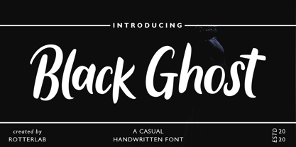 Black Ghost is a classy script font. Combined with that textured handwritten brush will make your design project even stronger. Made for professional project branding. This works best for logos, branding, and of course quotes. Each letter has a unique and beautiful touch. Features: PUA Encoded Multilingual Support Numbers and Punctuation Please send us a message if you have any questions or concerns, Thank you for downloading premium fonts from Rotterlab Studio
 - Nullomis by Kulturrrno,
$5.00 Nullomis is a modern display font inspired by Soviet Period, anti-utopia and Ancient Rome (I don't know why). It was originally planned to create an ultracondensed headliner, but now it’s a flexible font set with 49 styles or just one Variable Font with all capabilities. Best using for posters, headlines and tags. Extended latin glyph set 7 weights 3 widths Alternate crossbar heights or all of this and more in one Variable font
 - Mozziano by Mostardesign,
$15.00 Created in 2010 by Olivier Gourvat, Mozziano is an elegant cross between geometric and round shapes. Its post-retro style opposes also fine and thick lines. This font can be used for very short texts however it is particularly effective for headlines in larger point sizes so that its details are emphasized. Mozziano best used in experimental designs. Mozziano contain an extensive character set that includes support for Central and Eastern European languages.
 - Bestgift by Nathatype,
$29.00 Bestgift is a striking display font available in regular and outline styles, both featuring a very thick weight and low contrast. With its commanding presence and versatile design, this typeface is the perfect choice for a wide range of creative projects. The very thick weight of Bestgift commands attention and ensures a strong visual impact. Each character is robust and substantial, making a bold statement in any composition. The thick strokes exude confidence and stability, adding a sense of reliability to your designs. With low contrast letters, it offers a balanced and uniform appearance. The consistent stroke width throughout the font creates a cohesive and harmonious visual experience. This display font comes in both regular and outline styles, providing flexibility and versatility to suit different design needs. The regular style exudes solidity and strength, while the outline style adds a touch of modernity and sophistication. This combination allows you to create captivating designs with contrasting elements, adding depth and visual interest to your compositions. For the best legibility you can use it in the bigger text. Enjoy the available features here. Features: Ligatures Multilingual Supports PUA Encoded Numerals and Punctuations Bestgift fits in headlines, logos, attention-grabbing titles, product packaging, branding materials, editorial layouts and website headers. Find out more ways to use this font by taking a look at the font preview. Thanks for purchasing our fonts. Hopefully, you have a great time using our font. Feel free to contact us anytime for further information or when you have trouble with the font. Thanks a lot and happy designing.
 - Rapsed Vintage by Craft Supply Co,
$20.00 Introduction to Rapsed Vintage – Stamp Font Rapsed – Vintage Font is a unique serif font, embodying a retro and vintage feel. It features a grunge, stamped, rough appearance, ideal for nostalgic designs. This font captures the essence of a bygone era, making it perfect for projects seeking a classic display. Design and Texture Rapsed’s design boasts large, prominent serifs, giving it a bold and distinct look. Its textured, rough edges simulate a stamped effect, adding an authentic vintage character. This grunge aesthetic is not only eye-catching but also adds depth to the font, enhancing its retro appeal. Versatility in Use Rapsed is versatile for various design applications, from branding to poster creation. Its vintage style is perfect for thematic restaurants, event flyers, and historical projects. Additionally, its distinct appearance makes it suitable for book covers and merchandise that require a touch of nostalgia. Accessibility and Appeal Designed to be user-friendly, Rapsed appeals to a wide range of audiences. Its simplicity in design ensures readability, while its unique character captures interest. This font is a valuable asset for designers aiming to infuse a vintage feel in their work, bridging the gap between past and present design trends.
 - Athernal by Typerline,
$16.00 Athernal is elegant script typeface. This font also based from a brushpen lettering. Beautiful and unique with authentic charm, add a handwritten and elegant feel to any design project. This is perfect for branding, logos, brochures, business cards, wedding stationary, invitations, and every other design which needs a handwritten and elegant feel.
 - The font Chicago House_trial by The Original 19 evokes a sense of nostalgia while simultaneously embracing modern design sensibilities, making it uniquely versatile and appealing. This font, with its...
- Paralucent Slab by Device,
$39.00 Paralucent Slab is an addition to the ever-popular Paralucent family. Paralucent is versatile all-purpose modern sans and slab serif design. Available in seven weights, from Thin to Heavy, with corresponding italics, it avoids some of the more eccentric calligraphic quirks of Akzidenz or Helvetica or the cool precision of Univers for an elegant, functional, yet warm design. Several core ideas inform Paralucent’s design. Prime attention has given to the negative space between characters, giving a more even “colour”, especially in text. For example, the J, L and T have shorter arms than comparable sans typefaces, while the M and W are wider. The A has a lower bar, opening up the interior counter. An unusually high lower-case x-height again helps to give a more even colour and improve legibility. Care has been taken to rationalise repeated elements like the tails on lower-case letters, or the Q and the “ear” of the g. Typographic design solutions that are consistent across all these features add more stylistic cohesion. ‘Ink traps’ are exaggerated incisions used to open up a letter's narrower internal angles, which can become clogged with ink, especially in small point sizes. Now largely redundant due to the high quality of modern print, they are still sometimes used as a stylistic quirk or design feature. Now that digital fonts are often reversed or outlined, or enlarged to enormous sizes, these can also lead to unexpected or obtrusive results. Paralucent takes these inevitable digital manipulations into account, and adds optical corrections without resort to ink traps. The family has been picked up by many UK and US publishers, featuring heavily in magazines like Loaded, Heat and TV Quick, as well as high-end coffee-table photography books and gallery websites. The addition of the Slab family adds even more options for running text and headline.
 - Felek by Mili + Wise,
$12.00 Introducing Felek - hand-drawn sans serif font with a lot of character. Playful, bouncy & cute. Perfect for creating logos, greeting cards, posters, packaging and so much more! Suitable also for longer paragraphs, for example in children's books. Its charming and warm character will help you give your project a truly unique feel. Designed and kerned with care and love to make using it a breeze. What you will get - a hand-drawn font with lots of stylistic alternates and ligatures - a dingbat font with 53 illustrations and icons - multilingual support with accented characters for international designers Happy creating!
 - VVDS Rashfield by Vintage Voyage Design Supply,
$20.00 Rashfield is a soft serif type family in 5 weights and italics. Inspired by classical Windsor mood in Woody Allen movie titles, with outward bent h, m, n and a lot of modern alternates. Softly character with a hint of retro feeling. Rashfield has a lots of stylistic alternates that makes it very playful in various uses like logos, prints, branding, web design, packaging and more. Use it to create short powerful phrases and headlines and also use it in longer text like paragraphs and block texts. Perfect for modern projects with a little retro mood feel.
 - Utily Sans by Latinotype,
$39.00 Utily Sans emerges from the question: "What would the world be like if Paul Renner had had greater inclination towards humanism rather than geometry?" Utily Sans glyph proportions and shapes make it suitable for long-form text. This typeface shows geometric simplicity with humanist shapes. It looks like Futura, but has a feel closer to Garamond. Utily Sans is composed of 6 weights with their matching italics, an alternate character set that brings it back to its geometric origin, uppercase discretionary ligatures for expressive titles, as well as small caps, lining figures and old style numbers. These features make the font well-suited for large and small sized compositions, for short or long text. Utily Sans is the first Latinotype font with Cyrillic support, additional to the usual support for over 200 Latin-based languages.
 - Revla Round by Eclectotype,
$40.00 Squeezing yet more life out of the Revla skeleton! This is Revla Round, a child-friendly version of Revla Sans, completely overhauled so there's no chance of cutting yourself on any corners. Every rounded terminal and corner has been painstakingly drawn, rather than using a round-corners filter. OpenType contextual alternates make for text that is lively and bouncy, without the monotony of obviously repeating letterforms. It's shamelessly fun, but pretty serious at the same time. The range of weights can be used to maintain an even colour across different sizes - use lighter weights for bigger sizes and vice versa. OpenType features include automatic fractions, ordinals, contextual alternates, standard and discretionary ligatures, and case-sensitve forms. Obviously, in sharing a common skeleton, it will work well with other members of the ever-growing Revla Superfamily.
 - ITC Caslon No. 224 by ITC,
$40.99 The Englishman William Caslon (1672-1766) first cut his typeface Caslon in 1725. His major influences were the Dutch designers Christoffel van Dijcks and Dirck Voskens. The Caslon font was long known as the script of kings, although on the other side of the political spectrum, the Americans used it as well for their Declaration of Independence. The characteristics of the earlier Renaissance typefaces are only barely detectable. The serifs are finer and the axis of the curvature is almost or completely vertical. The overall impression which Caslon makes is serious, elegant and linear. Next to Baskerville, Caslon font is known as the embodiment of the English Baroque-Antiqua and has gone through numerous new interpretations, meaning that every Caslon is slightly different. ITC Caslon 224 was designed by Edward Benguiat and appeared with ITC in 1982. It is the text font which expanded upon the title font ITC Caslon 223. The alterations in the proportions of the letters make this Caslon 224 a noticeable departure from the original, but make the font overall more legible.
 - Classic Grotesque by Monotype,
$40.99 Classic Grotesque by Rod McDonald: a traditional font with a modern face. The growing popularity of grotesque typefaces meant that many new sans serif analogues were published in the early 20th century. Setting machines were not compatible with each other but all foundries wanted to offer up-to-date fonts, and as a result numerous different typeface families appeared that seem almost identical at first glance and yet go their separate ways with regard to details. One of the first fonts created with automatic typesetting in mind was Monotype Grotesque®. Although this typeface that was designed and published by Frank Hinman Pierpont in 1926 has since been digitalised, it has never achieved the status of other grotesque fonts of this period. But Monotype Grotesque was always one of designer Rod McDonald’s favourites, and he was overjoyed when he finally got the go-ahead from Monotype in 2008 to update this “hidden treasure”. The design process lasted four years, with regular interruptions due to the need to complete projects for other clients. In retrospect, McDonald admits that he had no idea at the beginning of just how challenging and complex a task it would be to create Classic Grotesque™. It took him considerable time before he found the right approach. In his initial drafts, he tried to develop Monotype Grotesque only to find that the result was almost identical with Arial®, a typeface that is also derived in many respects from Monotype Grotesque. It was only when he went back a stage, and incorporated elements of Bauer Font’s Venus™ and Ideal Grotesk by the Julius Klinkhardt foundry into the design process, that he found the way forward. Both these typefaces had served as the original inspiration for Monotype Grotesque. The name says it all: Classic Grotesque has all the attributes of the early grotesque fonts of the 20th century: The slightly artificial nature gives the characters a formal appearance. There are very few and only minor variations in line width. The tittles of the ‘i’ and ‘j’, the umlaut diacritic and other diacritic marks are rectangular. Interestingly, it is among the uppercase letters that certain variations from the standard pattern can be found, and it is these that enliven the typeface. Hence the horizontal bars of the “E”, “F” and “L” have bevelled terminals. The chamfered terminal of the bow of the “J” has a particular flamboyance, while the slightly curved descender of the “Q” provides for additional dynamism. The character alternatives available through the OpenType option provide the designer with a wealth of opportunities. These include a closed “a”, a double-counter “g” and an “e” in which the transverse bar deviates slightly from the horizontal. The seven different weights also extend the scope of uses of Classic Grotesque. These range from the delicate Light to the super thick Extrabold. There are genuine italic versions of each weight; these are not only slightly narrower than their counterparts, but also have variant shapes. The “a” is closed, the “f” has a semi-descender while the “e” is rounded. Its neutral appearance and excellent features mean that Classic Grotesque is suitable for use in nearly all imaginable applications. Even during the design phase, McDonald used his new font to set books and in promotional projects. However, he would be pleased to learn of possible applications that he himself has not yet considered. Classic Grotesque, which has its own individual character despite its neutral and restrained appearance, is the ideal partner for your print and web project.
 - Lab Slab Pro by Vanarchiv,
$50.00 Lab Slab Pro is a geometric slab typeface with a technological and minimalist look and is suitable for use in large sizes. It has eight versatile weights, (from Thin to Black) including true italics for each one, and a wide range of stylish alternate characters to improve its use in different graphic contexts. The name of this typeface was inspired by an experiment, mixing a structure with calligraphic influences and completely geometrical and structured drawings. Lab Slab Pro has a wide range of OpenType® features such as: small caps, old style/titling and small caps figures, fractions, superior and inferior scripts, scientific components and ligatures. Lab Slab Pro is Lab's best and most powerful mutation designed by Tiponautas.
 - Okeffe by Putracetol,
$28.00 OKEFFE is a amazing serif font with beautiful ligatures, tons of alternative glyphs and multilingual support. It’s groovy, clean and unique with vintage fell. OKEFFE is very versatile font that works great in large and small sizes. Helps to create layout design in 60s or 70s design projects. Come with open type feature with a lot of alternates, its help you to make great lettering. OKEFFE best uses for heading headlines, cover, poster, logos, quotes, product packaging, merchandise, social media & greeting cards and many more. This font is also support multi language. To access the alternate glyphs, you need a program that supports OpenType features such as Adobe Illustrator CS, Adobe Photoshop CC, Adobe Indesign and Corel Draw.
 - Merona Island by Krismagraph,
$19.00 Merona Island is a Modern Ligature Serif Font. Its soft curves mixed with high contrast glyphs, give it a feminine and masculine quality. It comes with 107 unique ligatures and 45 alternates. Great in layout design for quotes or body copy, best used as a display for headings, logos, branding, magazines, product packaging, and invitations. Accessible in Adobe Illustrator, Adobe Photoshop, Adobe InDesign, and even work on Microsoft Word. PUA Encoded Characters – Fully accessible without additional design software. Fonts include multilingual support. Image used: All photographs/pictures/vectors used in the preview are not included, they are intended for illustration only. Feel free to follow, like, and share. Thanks so much for checking out my shop!
 - Northeast Oregon by Nathatype,
$29.00 Are you looking for a handwritten font? Do you dream of creating headings that stand out and inspire creativity, imagination, and endless fun? Wait no more, we will give you the best choice. Northeast Oregon-A Handwritten Font Northeast Oregon is a elegant designed with a modern vibe. It brings charming curves and satisfying patterns This handwritten font is perfect for anything beautiful and neat.. A real head-turner for your presentation, designs, branding, quotes, invitation, website illustrations, and much more. Our font always includes Multilingual Support to make your branding reach a global audience. Features: Ligatures Stylistic Sets PUA Encoded Numerals and Punctuation Thank you for downloading premium fonts from Din Studio
 - Los Lana Niu by Latinotype,
$45.00 Los Lana Niu was designed by Bruno Jara and Luciano Vergara. The typeface is based on Los Lana (2007). Along with the redesign, the font has increased from 1 to 24 different styles. This new version preserves the rustic aesthetics of the original typeface, but it lacks of curves and it visually looks as if it was a nirregular font. Los Lana Niu comes with a wide range of ligatures included in every weight: from Thin to Black. In order to offer a wide array of uses, the typeface has been structured by adding acomplete family of small caps, which makes this font well-suited for headlines, posters, branding and publishing design. Los Lana Niu comprises 3 subfamilies: Los Lana Niu Essential (392 glyphs) – including both regular and alt versions, Los Lana Niu Small Caps (392 glyphs) and Los Lana Niu (820 glyphs), which includes a variety of OpenType features such as stylistic ligatures, contextual alternates and small caps.
 - Truecolor by Ditatype,
$29.00 Truecolor is a bold and distinctive brush font that commands attention. The characters in this font are characterized by their robust, square forms, which give the font a sense of solidity and reliability. Each letter is meticulously designed to maintain a cohesive and balanced appearance, adding an air of authority and visual impact to your text. It has the power to transform your text into a striking focal point, ensuring that every word is seen and remembered. In addition, you can also enjoy the features here. Features: Ligatures Stylistic Sets Multilingual Supports PUA Encoded Numerals and Punctuations Truecolor fits in headlines, logos, posters, flyers, branding materials, print media, editorial layouts, and many more designs. Find out more ways to use this font by taking a look at the font preview. Thanks for purchasing our fonts. Hopefully, you have a great time using our font. Feel free to contact us anytime for further information or when you have trouble with the font. Thanks a lot and happy designing.
 - Raldrich by Krafted,
$10.00 Wish to make a real impact on your customers and clients? With the right font, you’ll leave a strong impression every time. Introducing Raldrich - A Handcrafted Font. From product labels and printed materials to web design and social media posts, this font simply makes a difference. Regardless of where you use it, Raldrich will turn your design from good to outstanding. Ready for that next step? What you’ll get: Multilingual & Ligature Support Full sets of Punctuation and Numerals Compatible with: Adobe Suite Microsoft Office Keynote Pages Software Requirements: The fonts that you’ll receive in the pack are widely supported by most software. In order to get the full functionality of the selection of standard ligatures (custom-created letters) in the script font, any software that can read OpenType fonts will work. We hope you enjoy this font and that it makes your branding sparkle! Feel free to reach out to us if you’d like more information or if you have any concerns.
