10,000 search results
(0.07 seconds)
- Gyllene Elgen by Mans Greback,
$69.00 Gyllene Elgen, created by Mans Greback, is a delicate and captivating handwriting font that exudes romance and charm. With its thin, beautiful lines, and loopy, decorative swirls, this typeface brings a touch of elegance and sophistication to your design projects. Perfect for invitations, personal notes, and other heartfelt communications, Gyllene Elgen captures the essence of delicate, handcrafted beauty. The font was inspired by the golden hues of the Swedish landscape during autumn, as well as the mythical golden elk that roams the forests. Mans Greback sought to bring this enchanting story to life through the graceful curves and fine details of Gyllene Elgen. The font is built with advanced OpenType functionality and has a guaranteed top-notch quality, containing stylistic and contextual alternates, ligatures, and more features; all to give you full control and customizability. It has extensive lingual support, covering all Latin-based languages, from Northern Europe to South Africa, from America to South-East Asia. It contains all characters and symbols you'll ever need, including all punctuation and numbers. Mans Greback is a Swedish typeface designer, celebrated for his innovative and diverse portfolio. With a keen eye for detail and innovative designs, Mans has earned a reputation for creating fonts that resonate with people across the globe, inspiring creativity and capturing the imagination.
 - Sweet Honey by BlackLotus,
$12.00 Sweet Honey is a display font inspired by the cuteness and joy of childhood. Any design made using this font will bring out a cheerful, cute, and unique feel that blends together. Each Uppercase and Lowercase character in this font is made as unique as possible, so that this font can stand out and be easy to remember whenever people look at it. This font has 2 styles, namely regular and bubble, these styles make this font more varied so that it adds inspiration to every design that is made. Sweet Honey is perfect for use in brochures, book titles, magazines, posters, announcements, and more.
 - Moskau Pattern by Letter Edit,
$49.00 The design of the typeface Moskau Grotesk and Moskau Pattern is based on the signage created for the Café Moskau in Berlin by the graphic artist Klaus Wittkugel in the beginning of the 1960s. The Café Moskau, across from the Kino International on Karl-Marx-Allee in Berlin Mitte was one of the prestige edifices of the former DDR (German Democratic Republic). Built in the early 1960s, it advanced over the years and changing social developments to a trademark building of the capital. The lettering display on the roof was created by the graphic artist Klaus Wittkugel (October 17, 1910 – September 19, 1985). He had been Professor at the School for Applied Arts in Berlin, and, in addition to the creation of many posters, book covers and postage stamps, he was responsible for the signage of the Kino International as well as for the complete graphic treatment for the Palace of the Republik. The signage for the Café Moskau with the words »RESTAURANT«, »CAFÉ«, »KONZERT« and »MOCKBA« set in capital letters, becomes the basis for the Moskau Grotesk which was developed by Björn Gogalla in 2013. This face should not be seen as an imitation. A few shortcomings were »fixed«. In favor of maintaining the core characteristics some unique features were, however, not relinquished. Lower case letters and the missing capital letters were designed from scratch. It is not surprising that the plain, unassuming geometrical direction of the basic character style forms a bridge to the architecture of the 1960s. Inspired by the then favored, diverse possibilities inherent in the architectural example and wall reliefs, two complimentary pattern fonts emerged.
 - Moskau Grotesk by Letter Edit,
$39.00 The design of the typeface Moskau Grotesk is based on the signage created for the Café Moskau in Berlin by the graphic artist Klaus Wittkugel in the beginning of the 1960s. The Café Moskau, across from the Kino International on Karl-Marx-Allee in Berlin Mitte was one of the prestige edifices of the former DDR (German Democratic Republic). Built in the early 1960s, it advanced over the years and changing social developments to a trademark building of the capital. The lettering display on the roof was created by the graphic artist Klaus Wittkugel (October 17, 1910 – September 19, 1985). He had been Professor at the School for Applied Arts in Berlin, and, in addition to the creation of many posters, book covers and postage stamps, he was responsible for the signage of the Kino International as well as for the complete graphic treatment for the Palace of the Republik. The signage for the Café Moskau with the words »RESTAURANT«, »CAFÉ«, »KONZERT« and »MOCKBA« set in capital letters, becomes the basis for the Moskau Grotesk which was developed by Björn Gogalla in 2013. This face should not be seen as an imitation. A few shortcomings were »fixed«. In favor of maintaining the core characteristics some unique features were, however, not relinquished. Lower case letters and the missing capital letters were designed from scratch. It is not surprising that the plain, unassuming geometrical direction of the basic character style forms a bridge to the architecture of the 1960s. Inspired by the then favored, diverse possibilities inherent in the architectural example and wall reliefs, two complementary pattern fonts emerged.
 - Genia by Product Type,
$15.00 In every glyph, Genia is lovely and charming. It has a strong, uncompromising style with regulated letterforms and a contemporary edge. Each typeface in the family can stand alone, be lively, and forceful in its own right, and there’s a balance between harsh lines and gentle curves. This typeface also comes with 16 different families to help you create outstanding projects. of course, your various design projects will be perfect and extraordinary if you use this font because this font is equipped with a font family, both for titles and subtitles and sentence text, start using our fonts for your extraordinary projects.
 - Brockies by Ronny Studio,
$19.00 Brockies is a sporty, strong, and elegant typeface, with a college style. Inspired by design styles that are currently popular, this is the answer to every need for ideas that you will pour in this modern era, with a thick and sturdy style in each letter as if this font has a soul in it. It excels on posters, social media, headlines, headlines, large format print - and anywhere else you want attention. Features : - Lowercase & Uppercase ( All Caps ) - numbers and punctuation - multilingual - Ligature - alternates - PUA encoded Please contact us if you have any questions. Enjoy Crafting and thanks for supporting us! :) Thank you
 - Resting by Nathatype,
$29.00 Font is the most important design element to increase your branding. However, it may be tricky and take quite a while to figure out the perfect font for your design. Resting is a perfect display serif font for any of your design projects. Serif font is a font type with sticky small lines on the letters’ edges expressing formal, classic nuances and more aesthetic, creative touches due to the display font combinations. This display font has thick, high contrast lines perfect for catching attention and creating firm impressions. In addition, use this font for big text sizes for a legibility reason and make use of the other interesting features to beautify your designs. Features: Stylistic Sets Ligatures Multilingual Supports PUA Encoded Numerals and Punctuations Resting fits best for various design projects, such as brandings, posters, banners, logos, magazine covers, quotes, headings, printed products, invitations, name cards, merchandise, social media, etc. Find out more ways to use this font by taking a look at the font preview. Thanks for purchasing our fonts. Hopefully, you have a great time using our font. Feel free to contact us anytime for further information or when you have trouble with the font. Thanks a lot and happy designing.
 - MVB Fantabular by MVB,
$39.00MVB Fantabular proves that monospaced faces needn’t be formal or bland. Inspired by the letterforms of older typewriters, Akemi Aoki designed a playful family of three weights with italics. With every character the same width MVB Fantabular works wherever a monospaced font is needed, but the face is so loose and carefree it hides its fixed pitch construction well, allowing it to be used in other settings too. A sans serif version—MVB Fantabular Sans—is also available. - Dopestar by 38-lineart,
$15.00 Street art has become so inspiring that it's been featured on a range of mediums from advertising to album art. Thanks to the emergence of street art in the mainstream media. Dopestar is a heavy font that has a bold grafitti feel whilst being super clear to read, Dopestar is certainly versatile. Dopestar is a great typeface for display and it comes with a full set of characters with loads of variants and all the punctuation you'll need.
 - Bunga Pro by Graptail,
$15.00 Bunga is a serif typeface that gives a romantic feel to every curve. With 45 ligatures and alternates which are included, it is very helpful in creating the title of each of your projects such as film titles, book covers, branding, logos, packaging, magazines and more. Also supported PUA encoded. Simply copy and paste the alternate characters using the Character Map (Windows), Font Book (Mac) or a software program such as PopChar (for Windows and Mac).
 - Slandic by Vibrant Types,
$42.00 Headlines are transformed into clear-cut messages with the handwriting type family Slandic. Its robust appeal combines the elegance of script typefaces with the lightness of handwritten notes. What makes the Slandic so playful is the synergy between the quite narrow lowercase letters and the wide uppercase letters. Therefore it might rather be an upright chancery italic of a humanist sans. You can see it very clearly in its sharp upward angles and its long-limbed ascenders. Its visual appeal sets a reliable tone. It is precisely balanced with a solid stroke contrast and confidently angular-shaped curves. Slandic perfectly enhances exciting contrasting typography adding a personal note without giving it a comic spin.
 - Daytonia by Sarid Ezra,
$15.00 Daytonia is a handmade script font. You can use this font for every project. Suitable for branding logo, hand lettering, or apparel design. This font also has multilingual support, numbers and symbols, alternates, swashes, and underlines. Daytonia is already PUA Encoded. Don't hesitate to contact me at saridezra@gmail.com
 - Charriot Deluxe by Jelloween,
$-Charriot Deluxe was released in early 2006 at deviantArt.com - where it received a Daily Deviation frontpage feature - and daFont.com. It has already been downloaded over 20.000 times and now it's your turn to try this sexy pixelfont, absolutely free of charge! Charriot Deluxe has all letters, numbers, punctuation and (currency) symbols to suit your needs and is best used at (any multiple) of size 10pt without anti-aliasing. - Artistic Sigature by HKL Studio,
$19.00 Artistic Signature is a modern, handwritten font with a magical emphasis. This font is perfect for creating signature logos and watermarks for photography studios or wedding invitations, best for signatures or initial logo branding. Artistic Signature includes a full set of beautiful handwritten upper and lower case letters, numbers, various punctuation and binding. All lowercase letters including initial and final strokes, have 54 bindings that give a realistic handwriting style.
 - Romantic Dates by Putracetol,
$28.00 Introducing a beautiful romantic script font called "Romantic Dates", a special fonts for valentine and wedding events. Come with open type feature with a lot of alternates and end swash, its help you to make great lettering. Romantic Dates best uses for valentine, wedding, invitation, heading, cover, poster, logos, quotes, product packaging, header, merchandise, social media & greeting cards and many more. This font is also support multi language.
 - Vintage Party by Putracetol,
$25.00 Introducing a new vintage bold script "Vintage Party". Inspired from retro typography from 80's combine with bold typography style. Come with open type feature with a lot of alternates and end swash, its help you to make great lettering. Vintage Party best uses for Logotype, heading,cover, poster, logos, quotes, product packaging, header, merchandise, social media & greeting cards and many more. This font is also support multi language.
 - Prat Prachim MF by Masterfont,
$59.00 Fluent, expressive calligraphy. Great rhythm of childish, comics like brush strokes. OpenType Pro Excellent support for Niqqud (Vowels). All marks are programmed to fit each glyph's shape and width. OpenType Pro includes new advanced features like Dagesh Hazak, ShevaNa, Qamatz Katan, Holam Haser and wide letters. Best used with Adobe InDesign CC that support complex Hebrew text. Please check these advanced features in this link: https://tinyurl.com/ybgdsxme
 - Torah by Masterfont,
$59.00 Based on ancient scribal texts, useful for Jewish education. Useful at text sizes and large scale applications. Bold, high contrast typeface. Pro version- Excellent support for Niqqud (Vowels). All marks are programmed to fit each letter's shape and width. Best used with apps that support right to left Hebrew text, like Adobe InDesign CC or MS Word. Please check these advanced features in this link: https://tinyurl.com/ybgdsxme
 - Gayesha by Putracetol,
$21.00 Introducing a beautiful romantic script font called "Gayesha", a lovely and sweet swirly letter font. So girly ,full of love and feminime. Come with open type feature with a lot of alternates and end swash, its help you to make great lettering. Gayesha best uses for heading,cover, poster, logos, quotes, product packaging, header, merchandise, social media & greeting cards and many more. This font is also support multi language.
 - Caslon #3 by Linotype,
$29.99The Englishman William Caslon (1672–1766) first cut his typeface Caslon in 1725. His major influences were the Dutch designers Christoffel van Dijcks and Dirck Voskens. The Caslon font was long known as the script of kings, although on the other side of the political spectrum, the Americans used it as well for their Declaration of Independence. The characteristics of the earlier Renaissance typefaces are only barely detectable. The serifs are finer and the axis of the curvature is almost or completely vertical. The overall impression which Caslon makes is serious, elegant and linear. Next to Baskerville, Caslon is known as the embodiment of the English Baroque-Antiqua and has gone through numerous new interpretations, meaning that every Caslon is slightly different. American Type Founders presented a Caslon in 1905 which is true to the forms of the original. This font is relatively wide and comes complete with small caps and old style figures. - Oklean by Pengedar Seni,
$15.00 Oklean is a special font for your logo & branding. Every character is designed for a good logo, so they are not suitable for long texts. Oklean has a concept that is : Bright / Clean / Clear / Cool / Nature / Minimal / Smart / Urban / Balanced.
 - Tidy Mom by Seemly Fonts,
$12.00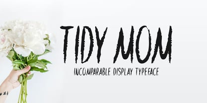 Tidy Mom is a unique display font. This font is a great choice for a wide variety of contexts! It looks stunning on thank you cards, quotes, greeting cards, logos, business cards, and every other design which needs a creative spark.
 - Timework by Seemly Fonts,
$14.00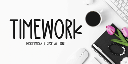 Timework is a unique display font. This font is a great choice for a wide variety of contexts! It looks stunning on thank you cards, quotes, greeting cards, logos, business cards, and every other design which needs a creative spark.
 - Sweet Magolina by Letter Muray,
$15.00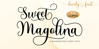 Sweet Magolina Script is a beautiful modern calligraphy typeface. Sweet Magolina is perfect for today’s emerging market design. This font has a stylish, trendy, natural, and soft touch. You can use it for wedding invitations, branding, parties, graduations, birthdays, gatherings, etc.
 - Matteny Angels by Multype Studio,
$16.00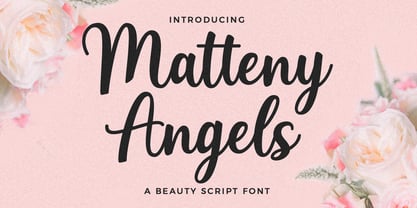 Matteny Angels is a beautiful and flowing script font. It looks stunning on wedding invitations, branding, thank you cards, watermark, fashion, quotes, greeting cards, logos, business cards and every other design which needs a handwritten touch. This font is PUA encoded.
 - Kaligawe by Locomotype,
$19.00 Introducing Kaligawe, the perfect font for designers looking to make a bold statement with their work. This display sans font boasts a unique blend of mediaeval and sans-serif characteristics that will give your designs a distinct edge. With nine weights available, from Thin to Black, you'll have plenty of options to choose from when it comes to creating eye-catching posters, attention-grabbing headlines, captivating movie titles, and stylish packaging. What sets Kaligawe apart from other fonts is its ability to combine old-world charm with modern style. Its mediaeval touches provide a classic, timeless feel, while its strong sans-serif characteristics give it a contemporary edge. The result is a font that can be used for a wide range of design projects, whether you're creating something with a vintage vibe or a more modern look.
 - Robur by Canada Type,
$24.95 It shouldn't be a surprise to anyone that these letter shapes are familiar. They have the unmistakable color and weight of Cooper Black, Oswald Cooper's most famous typeface from 1921. What should be a surprise is that these letters are actually from George Auriol's Robur Noir (or Robur Black), published in France circa 1909 by the Peignot foundry as a bolder, solid counterpart to its popular Auriol typeface (1901). This face precedes Cooper Black by a dozen of years and a whole Great War. Cooper Black has always been a bit of a strange typographical apparition to anyone who tried to explain its original purpose, instant popularity in the 1920s, and major revival in the late 1960s. BB&S and Oswald Cooper PR aside, it is quite evident that the majority of Cooper Black's forms did not evolve from Cooper Old Style, as its originators claimed. And the claim that it collected various Art Nouveau elements is of course too ambiguous to be questioned. But when compared with Robur Noir, the "elements" in question can hardly be debated. The chronology of this "machine age" ad face in metal is amusing and stands as somewhat of a general index of post-Great War global industrial competition: - 1901: Peignot releases Auriol, based on the handwriting of George Auriol (the "quintessential Art Nouveau designer," according to Steven Heller and Louise Fili), and it becomes very popular. - 1909-1912: Peignot releases the Robur family of faces. The eight styles released are Robur Noir and its italic, a condensed version called Robur Noir Allongée (Elongated) and its italic, an outline version called Clair De Lune and its condensed/elongated, a lined/striped version called Robur Tigre, and its condensed/elongated counterpart. - 1914 to 1918: World War One uses up economies on both sides of the Atlantic, claims Georges Peignot with a bullet to the forehead, and non-war industry stalls for 4 years. - 1921: BB&S releases Cooper Black with a lot of hype to hungry publishing, manufacturing and advertising industries. - 1924: Robert Middleton releases Ludlow Black. - 1924: The Stevens Shanks foundry, the British successor to the Figgins legacy, releases its own exact copies of Robur Noir and Robur Noir Allongée, alongside a lined version called Royal Lining. - 1925: Oswald Cooper releases his Cooper Black Condensed, with similar math to Robur Noir Allongée (20% reduction in width and vectical stroke). - 1925: Monotype releases Frederick Goudy's Goudy Heavy, an "answer to Cooper Black". Type historians gravely note it as the "teacher steals from his student" scandal. Goudy Heavy Condensed follows a few years later. - 1928: Linotype releases Chauncey Griffith's Pabst Extra Bold. The condensed counterpart is released in 1931. When type production technologies changed and it was time to retool the old faces for the Typositor age, Cooper Black was a frontrunning candidate, while Robur Noir was all but erased from history. This was mostly due to its commercial revival by flourishing and media-driven music and advertising industries. By the late 1960s variations and spinoffs of Cooper Black were in every typesetting catalog. In the early- to mid-1970s, VGC, wanting to capitalize on the Art Nouveau onslaught, published an uncredited exact copy of Robur Black under the name Skylark. But that also went with the dust of history and PR when digital tech came around, and Cooper Black was once again a prime retooling candidate. The "old fellows stole all of our best ideas" indeed. So almost a hundred years after its initial fizz, Robur is here in digital form, to reclaim its rightful position as the inspiration for, and the best alternative to, Cooper Black. Given that its forms date back to the turn of the century, a time when foundry output had a closer relationship to calligraphic and humanist craft, its shapes are truer to brush strokes and much more idiosyncratic than Cooper Black in their totality's construct. Robur and Robur Italic come in all popular font formats. Language support includes Western, Central and Eastern European character sets, as well as Baltic, Esperanto, Maltese, Turkish, and Celtic/Welsh languages. A range of complementary f-ligatures and a few alternates letters are included within the fonts.
 - Hand Stamp Wood by TypoGraphicDesign,
$9.00 The typeface Hand Stamp Wood is designed from 2020 for the font foundry Typo Graphic Design by Manuel Viergutz. The display font based on original old wood letter, stamps, DIY and is inspired in the past and present. 4 font-styles (Rough, Mix, Circle, CircleMix) with 370 glyphs (Adobe Latin 1) incl. decorative extras like arrows, dingbats, emojis, symbols, geometric shapes, decorative ligatures (type the word #LOVE for ❤ or #SMILE for ☺ as OpenType-Feature dlig) and stylistic alternates (2 stylistic sets). For use in logos, magazines, posters, advertisement plus as webfont for decorative headlines. The font works best for display size. Have fun with this font & use the DEMO-FONT (with reduced glyph-set) FOR FREE! Font Specifications ■ Font Name: Hand Stamp Wood ■ Font Weights: 4 (Rough, Mix, Circle, CircleMix) + DEMO (with reduced glyph-set) ■ Font Category: Display for headline size ■ Font Format:.otf (Mac + Win, for Print) + .woff (for Web) ■ Glyph Set: 370 glyphs (Adobe Latin 1) incl. decorative extras like arrows, dingbats, emojis, symbols ■ Design Date: 2020 ■ Type Designer: Manuel Viergutz
 - Klein Rough Gemein by TypoGraphicDesign,
$19.00 The typeface Klein Rough & Gemein(e) is designed from 2020 for the font foundry Typo Graphic Design by Inga Luft and Manuel Viergutz. The display font based on original old german rubber stamps and is inspired in the past and present. 4 font-styles (Rough, Rougher, Roughest, Rough Mix) + 1 icon-style with 432 glyphs (Adobe Latin 2) incl. 100+ decorative extras like icons, arrows, dingbats, emojis, symbols, geometric shapes, catchwords, decorative ligatures (type the word #LOVE for ❤ or #SMILE for ☺ as OpenType-Feature dlig) and stylistic alternates (7 stylistic sets). For use in logos, magazines, posters, advertisement plus as webfont for decorative headlines. The font works best for display size. Have fun with this font & use the DEMO-FONT (with reduced glyph-set) FOR FREE! ■ Font Name: Klein Rough & Gemein(e) ■ Font Weights: 4 + 1 (Icons) + DEMO (with reduced glyph-set) ■ Font Category: Display for headline size ■ Font Format:.otf (Mac + Win, for Print) + .woff (for Web) ■ Glyph Set: 432 glyphs (Adobe Latin 2) incl. 100+ decorative extras like dingbats ■ Design Date: 2020 ■ Type Designer: Manuel Viergutz und Inga Luft
 - Mosler by Carmel Type Co.,
$19.00 Inspired by the interior of a now defunct Mosler Safe Company bank vault door located inside of what is now an Irish Pub in Stroudsburg, Pennsylvania, Mosler is a typeface that is impenetrability incarnate. This all uppercase, slab-serif brawny beauty comes in four weights - Safe, Strongbox, Vault, and Fortress, and each one is more powerful than the last. Each weight has 450 glyphs included, making for a whopping 1800 glyphs for the full family, complete with small capitals, total support for nearly 80 different languages, decorative word glyphs, and a handful of select alternates. Ranging from the low contrast of the "Safe" weight to the extreme contrast of the "Fortress" weight, Mosler is effective in a wide array of applications but serves best as a titling, headlining, or display face that need to make a mammoth statement. Features Include: 4 Weights Uppercase Only with Small Capitals Numerals, Punctuation & Symbols 450 Characters per Style Stylistic Alternates and Word Glyphs Supports 75+ Latin Languages OTF files Designed and Developed by Jason Carne
 - Tag Banger by Okaycat,
$12.50 TagBanger WADE1 is the first in a short graffiti font series. This series will showcase the hand-styles of various mature street artists that Okaycat is working with. This first release highlights the style of one such graffiti writer, WADE1, who has an eclectic writing style after many years proliferating street art. Long-term graffiti artists develop their own style over their careers, spending as many endless hours honing their letter-forms as any full-time professional typographical artist. Style, individuality, and originality are everything. These attributes are key to the graffiti artist's tao. A writer who copies, or "bites" loses respect -- their work will be painted over or "crossed out" by all other writers. Okaycat's TagBanger series aims to demonstrate just how widely these individual styles can diverge, likely due, at least in part, to the social pressures of a community that ruthlessly punishes copycats. WADE1's tags were transformed into vector format from a generous sampling of their most recent scrawls. Our TagBanger series may not be composed of the most legible or beautiful fonts, but we imagine there are uses for these whenever highly unusual handwriting is needed. TagBanger WADE1 is extended, containing the full West European diacritics & a full set of ligatures, making it suitable for multilingual environments & publications.
 - Echowarp by Luxfont,
$18.00 Introducing Echowarp is an unusual COLORED font family. Main idea of this font is that a colored echo spreads and fades from minimalistic letters to the sides. Distorted letters give the effect of temporary refraction. The originality of this family is primarily suitable for a bold design. And if you add a random distortion in a graphics program to the finished heading written in this font, the inscription will turn into an absolutely unique and inimitable one. Futuristic set has 23 fonts in the family! Do not limit your imagination, because the font opens up a huge space for creative experiments. Check the quality before purchasing and try the FREE DEMO version of the font to make sure your software supports color fonts. Features: Free Demo font to check it works Letters with color echo & distortion 23 OTF SVG color fonts in the family Gradient and hologram fonts Kerning IMPORTANT: - OTF SVG fonts contain vector letters with gradients and transparency. - Multicolor OTF version of this font will show up only in apps that are compatible with color fonts, like Adobe Photoshop CC 2017.0.1 and above, Illustrator CC 2018. Learn more about color fonts & their support in third-party apps on www.colorfonts.wtf - Don't worry about what you can't see the preview of the font in the tab "Individual Styles" - all fonts are working and have passed technical inspection, but not displayed, they just because the website MyFonts is not yet able to show a preview of colored fonts. Then if you have software with support colored fonts - you can be sure that after installing fonts into the system you will be able to use them like every other classic font. Question/answer: How to install a font? The procedure for installing the font in the system has not changed. Install the font as you would install the classic OTF | TTF fonts. How can I change the font color to my color? Adobe Illustrator: Convert text to outline and easily change color to your taste as if you were repainting a simple vector shape. Adobe Photoshop: You can easily repaint text layer with Layer effects and color overlay. ld.luxfont@gmail.com
 - Preto Semi OT Std by DizajnDesign,
$- Preto Semi is an experiment. It is an attempt to create a readable type for text point sizes (other than sans-serif and serif). Preto Semi is not a Sans with added serifs or Serif with serifs removed. The use of the serifs is redefined and used for other purpose(s). The serifs became the extension of the stroke, they help to solve the spacing problem of sans-serif types and they use the primary function of serifs – keeping the eye on the baseline and emphasize the horizontal rhythm of the lines of text. Preto Semi is intended for magazines and editorial design, as other members of Preto family. Preto is an extensive type family, which explores the function of serifs on readability and legibility. Preto consist of three subfamilies: Sans, Semi and Serif. Preto is designed for multilingual typesetting. All of the subfamilies have equal gray value but different texture which can be use to differentiate languages. Preto sub-families have two text weights and two bold styles (Regular -> Bold, Medium -> Black). Every weight has a companion Italic style as well.
 - FF Kaytek Headline by FontFont,
$50.99 Kaytek™ Headline completes the Kaytek typeface family with seven weights optimized for display purposes. Like the Kaytek Sans it is a fresh take on the correspondence typefaces of the 90s - which were originally designed for the demands of office environments. Just like its predecessors, this text typeface is robust and hard-working - meaning it works well in challenging design or printing environments - but it’s not without personality. Look closer at the lowercase g and a, especially in the italic, and you can see some unexpected elements of subversiveness within the design Every style of the typeface takes up exactly the same amount of space, thanks to the careful creation by Radek Lukasiewicz. This means designers can switch between styles without the text being reflowed, making it particularly useful in magazines, where space might be limited, and also on the internet, where hover links appear in a different style Kaytek Headline comes in seven weights, from Thin to ExtraBlack. Kaytek Sans, Kaytek Slab, and Kaytek Rounded, are also available.
 - Preto Semi by DizajnDesign,
$24.00 Preto Semi is an experiment. It is an attempt to create a readable type for text point sizes (other than sans-serif and serif). Preto Semi is not a Sans with added serifs or Serif with serifs removed. The use of the serifs is redefined and used for other purpose(s). The serifs became the extension of the stroke, they help to solve the spacing problem of sans-serif types and they use the primary function of serifs – keeping the eye on the baseline and emphasize the horizontal rhythm of the lines of text. Preto Semi is intended for magazines and editorial design, as other members of Preto family. Preto is an extensive type family, which explores the function of serifs on readability and legibility. Preto consist of three subfamilies: Sans, Semi and Serif. Preto is designed for multilingual typesetting. All of the subfamilies have equal gray value but different texture which can be use to differentiate languages. Preto sub-families have two text weights and two bold styles (Regular -> Bold, Medium -> Black). Every weight has a companion Italic style as well.
 - Diablo by Monotype,
$29.99Jim Parkinson's Diablo typeface is a single weight display design. The look comes from samples found in early 20th century books on hand-lettering books, as well as general poster lettering styles from that same of the period. Diablo has a touch of the Arts and Crafts" movement in its appearance, and it also looks rather heavy. It is a unicase design, in that there is no real "lowercase." Some glyphs on the uppercase keys are alternates to the capital-style forms found on the lowercase keyboard, like A, E, F, H, J, K, M, N, Q, R, V, W, and Z. In fact, the uppercase itself is a bit more decorated and round than the lowercase. Nevertheless, the upper and lowercase letters may be freely interchanged with each other to create the best possible image for the text. The name of the typeface, Diablo, is another term for the devil, or Satan." - Thwaites by Eyad Al-Samman,
$20.00 ‘Thwaites’ typeface is fully dedicated to one of my best Canadian friends who I do cherish and value highly. This great and industrious Canadian friend is ‘James Douglas Thwaites’ who lives along with his good-natured family in British Columbia, Canada. For me, James is like a source of inspiration and I do consider him as an ideal in my life. Our strong friendship has started since 1999 and I hope that it will endure just to the last moment of my life. Sometimes I see him as the writer and poet that I learn a lot from, sometimes I see him as a devoted religious minister that I try to understand more about his teachings, and other times I see him as the educator that I strive to imitate verbatim in my life. When I want to talk more about this Canadian friend, I will not be able to give him his due in full. Thus, I will instead mention some excerpts of his biography that he wrote himself saying that: “James D. Thwaites is a self-accomplished man. Having worked in various fields including restaurant management and cleaning, he has achieved his goals of being a full-time teacher, past-time writer, and volunteer religious minister for the Christian Congregation of Jehovah's Witnesses. His personal and academic pursuits have led him to be published in various magazines, newspapers, self-published books, and websites, including his now defunct ‘poetryofthemonth.com’ website. He continues to learn and augment the craft of writing while working primarily in early literacy and delayed literacy learners, teaching reading and literature to a wide age range of students. He views his religious endeavors as an extension of his academic ones. He teaches others both as a public speaker and in one-on-one situations, teaching about the benefits of submission to God and to His teachings. His future goals include expanding his ministry and continuing his writing.” The name ‘Thwaites’ itself comes from Great Britain and originated from the last Viking raids upon England, being an Anglicized version of a Scandinavian term meaning—depending on the source material—either "a place that is difficult to approach" or "a small thicket of trees." Another recitation mentions that ‘Thwaites’ can be described also as an English surname but one of pre 7th century Norse-Viking origins. It may be either topographical or locational, and is derived from the word "thveit", meaning a clearing or farm. As a locational surname it originates from any one of the various places called "Thwaite", found in several parts of Northern England and East Anglia to the south. The various modern spelling forms include Thwaite, Thwaites, Thwaytes, Thoytes, Twaite, Twatt, Twaites, Tweats and Twite. The name, although often appearing unique to outsiders, can often be found within other famous names like Braithwaite, Goldthwaites, or Misslethwaites. With various spellings, some families not including the ‘e’ or the ‘s’ at the end, Thwaites and its derivations—although not exceedingly common—is a name found worldwide. ‘Thwaites’ typeface is simply a sans-serif streamlined, stylish, and versatile font. It is designed using a combination of thick and thin strokes for its +585 characters. Its character set supports nearly most of the Central, Eastern, and Western European languages using Latin scripts including the Irish language. The typeface is appropriate for any type of typographic and graphic designs in web, print, and other media. It is also absolutely preferable to be used in the wide fields related to publication, press, services, and production industries. It can create a very impressive impact when used in headlines, posters, titles, products’ surfaces, logos, medical packages, product and corporate branding, and also signage. It has also both of lining and old-style numerals which makes it more suitable for any printing or designing purposes. ‘Thwaites’ typeface is really the cannot-miss choice for anyone who wants to possess unique artistic and modern designs produced using this streamlined typeface.
 - Domestica by ArimaType,
$15.00 Domestica is made from a sans humanist design with a modern touch. Domestica is inspired by the strong character of the letters without leaving the aesthetics of the letterform. Every member of the Domestica family is also equipped with useful OpenType features such as Ordinals, Stylistic Alternates, Stylistic Sets, Standard Ligatures, Fractions, and Numerator & Denominator. Comes with 8 weights from Thin to Extra Bold with each matching Tilt. also one outline font Contains several OpenType features: Style Alternatives, Number Variations (fractions, table layers, numerators, denominators), and also includes extensive Latin.
 - ITC Johnston by ITC,
$29.00ITC Johnston is the result of the combined talents of Dave Farey and Richard Dawson, based on the work of Edward Johnston. In developing ITC Johnston, says London type designer Dave Farey, he did “lots of research on not only the face but the man.” Edward Johnston was something of an eccentric, “famous for sitting in a deck chair and carrying toast in his pockets.” (The deck chair was his preferred furniture in his own living room; the toast was so that he’d always have sustenance near at hand.) Johnston was also almost single-handedly responsible, early in this century, for the revival in Britain of the Renaissance calligraphic tradition of the chancery italic. His book Writing & Illuminating, & Lettering (with its peculiar extraneous comma in the title) is a classic on its subject, and his influence on his contemporaries was tremendous. He is perhaps best remembered, however, for the alphabet that he designed in 1916 for the London Underground Railway (now London Transport), which was based on his original “block letter” model. Johnston’s letters were constructed very carefully, based on his study of historical writing techniques at the British Museum. His capital letters took their form from the best classical Roman inscriptions. “He had serious rules for his sans serif style,” says Farey, “particularly the height-to-weight ratio of 1:7 for the construction of line weight, and therefore horizontals and verticals were to be the same thickness. Johnston’s O’s and C’s and G’s and even his S’s were constructions of perfect circles. This was a bit of a problem as far as text sizes were concerned, or in reality sizes smaller than half an inch. It also precluded any other weight but medium ‘ any weight lighter or heavier than his 1:7 relationship.” Johnston was famously slow at any project he undertook, says Farey. “He did eventually, under protest, create a bolder weight, in capitals only ‘ which took twenty years to complete.” Farey and his colleague Richard Dawson have based ITC Johnston on Edward Johnston’s original block letters, expanding them into a three-weight type family. Johnston himself never called his Underground lettering a typeface, according to Farey. It was an alphabet meant for signage and other display purposes, designed to be legible at a glance rather than readable in passages of text. Farey and Dawson’s adaptation retains the sparkling starkness of Johnston’s letters while combining comfortably into text. Johnston’s block letter bears an obvious resemblance to Gill Sans, the highly successful type family developed by Monotype in the 1920s. The young Eric Gill had studied under Johnston at the London College of Printing, worked on the Underground project with him, and followed many of the same principles in developing his own sans serif typeface. The Johnston letters gave a characteristic look to London’s transport system after the First World War, but it was Gill Sans that became the emblematic letter form of British graphic design for decades. (Johnston’s sans serif continued in use in the Underground until the early ‘80s, when a revised and modernized version, with a tighter fit and a larger x-height, was designed by the London design firm Banks and Miles.) Farey and Dawson, working from their studio in London’s Clerkenwell, wanted to create a type family that was neither a museum piece nor a bastardization, and that would “provide an alternative of the same school” to the omnipresent Gill Sans. “These alphabets,” says Farey, referring to the Johnston letters, “have never been developed as contemporary styles.” He and Dawson not only devised three weights of ITC Johnston but gave it a full set of small capitals in each weight ‘ something that neither the original Johnston face nor the Gill faces have ‘ as well as old-style figures and several alternate characters. - Sanseki by Hanoded,
$20.00 The term Sanseki (Japanese for Three [Brush] Traces) is used to describe three famous Heian period calligraphers: Yaseki, Gonseki and Saseki. Not that I would ever dream of comparing my messy brush-work with theirs, but the name stuck and I kind of liked it. I used Chinese ink and a high quality brush (which I got in a sale actually) to create this font. All glyphs were hand painted in one go! Sanseki is a very detailed brush font. Upper and lower case letters mingle and there’s even an alternate for every lower case glyph. Comes with an abundance of diacritics.