10,000 search results
(0.066 seconds)
- Bogue Slab by Melvastype,
$29.00 Bogue is a slab serif type family of 8 weights and matching italics. Bogue Slab comes with a lots of stylistic alternates that makes it very versatile in various uses like logos, editorial design, branding, web design, package design and much more. You can use it to create short powerful phrases and headlines and also use it in longer text like lead paragraphs and body texts. So if you are looking for a versatile slab serif font you have found it! Bogue Slab is a slab serif version of Bogue
 - Altemus Stars by Altemus Creative,
$11.00 Stars contains 174 characters; a variety of solid and dimensional star designs with from three to twelve points, pentagrams, sheriff stars, stars of david, outline stars, burst stars and airforce stars. Stars Two contains 174 characters; a variety of five pointed outline stars with centers, star designs composed from various geometric shapes with from three to eight points, jagged stars, quilt stars, outline stars, starfish, arrow stars, burst stars, drop shadow stars, ragged starbursts, double stars and air force stars. Stars Three is a collection of 174 star designs.
 - Farewell Angelina by Ana's Fonts,
$15.00 Farewell Angelina is an elegant font family with a feminine flair. It includes: - a display font with 3 weights and 2 styles: regular, bold and black in serif and sans, which look great at large sizes; - a text font in 2 styles: regular and italic, which look great at small sizes and in longer texts. Each font includes: - A-Z, a-z, 0-9 - accents - punctuation and symbols - ligatures - stylistic alternates - small caps Farewell Angelina is perfect for magazine layouts, creating logotypes, social media posts, branding and packaging.
 - UXB by astroluxtype,
$30.00 UXB Stencil and its companion UXB Spray contain both the stencil and the sprayed letters in two fonts. The font is a headline display uppercase only character set, which is duplicated in the lowercase keys, identical in form (except for an alternate “Z”). No need to remember to hit the caps lock, the font will work with lowercase key strokes. UXB Spray is also a headline display uppercase only character set but, includes a few “drip” characters (find them in the lowercase key positions) these apply when you have held the spraycan over the stencil too long and made a mess. Use separately or together for a maximum design explosion. The fonts used together with color can create many nice design effects- by offsetting characters and putting one font in front of the other for a second effect. UXB it’s an emergency.
 - Graphique Next by profonts,
$41.99 The original Graphique Pro was designed by the famous Swiss designer Hermann Eidenbenz in 1945 and included one outline shadow style. His idea of a very narrow, very economic headline font became increasingly more popular over the last decades and since the recent trend of layered fonts his idea is more up-to-date than ever. profonts studio now took the idea of the Graphique Pro to its next level: Graphique Pro Next. This layered type family consists of 8 styles which can be combined in plenty of ways to create unique designs. The fonts thereby preserve the outstanding and timeless drawings of the original Graphique Pro font and will add an aesthetic and fresh look to every project. Please have a look at the Graphique Pro Next Type Specimen for more details about the language support and font layer combinations.
 - Gloriz Vintage by Mans Greback,
$59.00 Gloriz Vintage is the bold and distinctive retro serif font that adds a touch of rustic charm to any project. Designed by Mans Greback in 2023, this font features rounded edges and a heavy, printed appearance that will give your work a vintage look. Perfect for headlines and logotypes, Gloriz Vintage is the perfect choice for designers looking to add a touch of personality to their work. Don’t miss out on this one-of-a-kind family! The Gloriz Vintage family consists of six high-quality fonts: The three weights Regular, Light and Bold, are each provided as both Upright and Italic styles. The font is built with advanced OpenType functionality and has a guaranteed top-notch quality, containing stylistic and contextual alternates, ligatures and more features; all to give you full control and customizability. It has extensive language support, covering all Latin-based languages, from Northern Europe to South Africa, from America to South-East Asia. It contains all characters and symbols you’ll ever need, including all punctuation and numbers.
 - Squid Junkie by Mans Greback,
$59.00 Squid Junkie is a bold and vibrant tribute to the funky, hippie-inspired designs of the past. With its playful, cartoonish aesthetic and playful use of line and color, this sans-serif font is the perfect choice for designers looking to inject a touch of retro fun and humor into their projects. With its versatile range of styles, including regular, light, and bold weights, each with its own italic counterpart, this font is designed to meet the needs of designers of all levels. But that's not all - Squid Junkie is also available as an outlined font, giving you even more options for making your designs stand out. The font is built with advanced OpenType functionality and has a guaranteed top-notch quality, containing stylistic and contextual alternates, ligatures and more features; all to give you full control and customizability. It has extensive lingual support, covering all Latin-based languages, from Northern Europe to South Africa, from America to South-East Asia. It contains all characters and symbols you'll ever need, including all punctuation and numbers.
 - Honey Ponds by Yumna Type,
$15.00 It is complicated to find an aesthetically charming font in a professional look. The thing is that a wrong font choice can damage your projects. For that reason, Honey Ponds is here for your needs. Honey Ponds is a simple display font in a plain, yet interesting, professional design. To create a better display and to be legible, the font’s form or geometry is presented in a simple style without many details. Additionally, this font provides you a clipart as a bonus. You can enjoy the available features here as well. Features: Multilingual Supports PUA Encoded Numerals and Punctuations Honey Ponds fits best for various design projects, such as brandings, posters, banners, headings, magazine covers, quotes, invitations, name cards, printed products, merchandise, social media, etc. Find out more ways to use this font by taking a look at the font preview. Thanks for purchasing our fonts. Hopefully, you have a great time using our font. Feel free to contact us anytime for further information or when you have trouble with the font. Thanks a lot and happy designing.
 - Delikaat by Cubo Fonts,
$19.00 Delikaat is made up of thin & thick strokes - a version of Cubo Font's former Delicate. Most cursive fonts intend to create the look and feel of real handwriting: many letters have a specific drawing, following other letters that come before and after, or its position at the beginning or at the end of the word. “Delicate” resolved that problem thanks to the OpenType technology, and offers many discretionary ligatures (group of pre-drawn letters), adapted to numerous combinations. Therefore, it’s not only a decorative and calligraphic writing, but also a fluent and energetically one. In order to make the most of it, please activate your software’s OpenType features.
 - Frambuesa by Sudtipos,
$39.00 Organic versus geometric are two different universes that converges on nature systems and has its reflection on this new sans serif typeface. Frambuesa is a half humanist-half geometric sans that merges decorative curves with straight lines looking for a balance. The result: a solid but somewhat romantic, nostalgic type program that go ahead harmoniously, dancing to the rhythm of a naturally imperfect melody. Frambuesa can’t hide its family genetics. Structure and proportions come from Elisetta, her older sister they so both have a really good text performance. Regular variables and italics feel comfortable in a lot of contexts and are useful for little words or big title compositions. All seven weights are carefully adjusted to achieve soft transitions between one and the other resulting in high readability levels on program combinations and complex uses. This new font family name is a tribute to Lucia’s childhood, a very happy one. Frambuesa honors this sweet intense red fruit that her grandpa’s Coco gave to his grandchildren every Sunday in the summer.
 - Shad by Ingo,
$27.00 The Shad is the almost illegible cousin of the >> Chiq. As the name suggests - it consists of the shadows of the letters. And the bolder the font style, the stronger it is. The “Light” only has a thin shadow, while the “Black” casts a very deep, broad shadow. Shad only consists of the letter shadows, the corresponding letter remains transparent, i.e. without filling. The “metrics”, i.e. the spacing and character widths, correspond to those of Chiq, so that both fonts can be placed congruently on top of each other. When you combine and play with the two fonts, very attractive effects quickly emerge. Shad brings a bit of 3D into typography.
 - Goodbees by ZetDesign,
$15.00 Goodbees is built from a bold base, unique combinations, smooth curves, and sharp edges. Goodbees is best uses for headings, Logo types, quotes, apparel design, invitations, flyers, posters, greeting cards, product packaging, book covers, printed quotes, album covers, movies and more.
 - Candaleya by Ditatype,
$29.00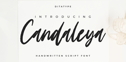 Candaleya is a modern handwritten font. With a classy and natural handwritten style, it brings a classy and chic typeface. Candaleya is best used for weddings, branding, logotype, and quotes. Features: - Beautiful Ligatures - PUA Encoded - Multilingual Support - Numerals and Punctuation
 - Slightwell by Ditatype,
$29.00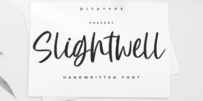 Slightwell is a modern handwritten font. With a classy and natural handwritten style, it brings a classy and chic typeface. Slightwell is best used for weddings, branding, logotype, and quotes. Includes: - Slightwell (OTF) Features: - PUA Encoded - Multilingual Support - Numerals and Punctuation
 - Selenic by Paul Dersidan,
$23.00 Selenic is a solid typeface with a clean look, interesting texture and quick impact. Friendly but also aggressive it is best suited for massive headlines, fashion photography, album covers, logo design or any other typographical work on digital and print.
 - Andaretta by Ditatype,
$29.00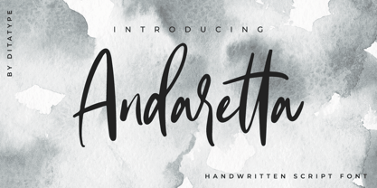 Andaretta is a modern handwritten font. With a classy and natural handwritten style, it brings a classy and chic typeface. Andaretta is best used for weddings, branding, logotype, and quotes. Features: - Beautiful Ligatures - PUA Encoded - Multilingual Support - Numerals and Punctuation
 - Dreadful by Aiyari,
$14.00 Introducing a new layered typeface called Dreadful. Inspired from classic horror movie and vintage comic. Dreadful typeface best uses for headings, Logo type, quotes, apparel design, invitations, flyer, poster, greeting cards, product packaging, book cover, printed quotes, cover album, movie, etc.
 - Veryberry Pro by My Creative Land,
$35.00 Veryberry is a handwritten font with a unique character inspired by latest trends in modern calligraphy and handlettering. Full of open type features, is best used in an OpenType-aware software. Font supports most of European languages including cyrillic ones.
 - Mariolite by Ditatype,
$29.00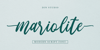 Mariolite is a modern handwritten font. With a classy and natural handwritten style, it brings a classy and chic typeface. Mariolite is best used for weddings, branding, logotype, and quotes. Features: - Beautiful Ligatures - Alternates - PUA Encoded - Multilingual Support - Numerals and Punctuation
 - Mightwell by Ditatype,
$29.00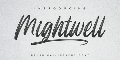 Mightwell is a modern Brush font. With a classy and natural handwritten style, it brings a classy and chic typeface. Mightwell is best used for weddings, branding, logotype, and quotes. Features: - Beautiful Ligatures - PUA Encoded - Multilingual Support - Numerals and Punctuation
 - Areplos by Storm Type Foundry,
$53.00To design a text typeface "at the top with, at the bottom without" serifs was an idea which crossed my mind at the end of the sixties. I started from the fact that what one reads in the Latin alphabet is mainly the upper half of the letters, where good distinguishableness of the individual signs, and therefore, also good legibility, is aided by serifs. The first tests of the design, by which I checked up whether the basic principle could be used also for the then current technology of setting - for double-sign matrices -, were carried out in 1970. During the first half of the seventies I created first the basic design, then also the slanted Roman and the medium types. These drawings were not very successful. My greatest concern during this initial phase was the upper case A. I had to design it in such a way that the basic principle should be adhered to and the new alphabet, at the same time, should not look too complicated. The necessary prerequisite for a design of a new alphabet for double-sign matrices, i.e. to draw each letter of all the three fonts to the same width, did not agree with this typeface. What came to the greatest harm were the two styles used for emphasis: the italics even more than the medium type. That is why I fundamentally remodelled the basic design in 1980. In the course of this work I tried to forget about the previous technological limitations and to respect only the requirements then placed on typefaces intended for photosetting. As a matter of fact, this was not very difficult; this typeface was from the very beginning conceived in such a way as to have a large x-height of lower-case letters and upper serifs that could be joined without any problems in condensed setting. I gave much more thought to the proportional relations of the individual letters, the continuity of their outer and inner silhouettes, than to the requirements of their production. The greatest number of problems arose in the colour balancing of the individual signs, as it was necessary to achieve that the upper half of each letter should have a visual counterbalance in its lower, simpler half. Specifically, this meant to find the correct shape and degree of thickening of the lower parts of the letters. These had to counterbalance the upper parts of the letters emphasized by serifs, yet they should not look too romantic or decorative, for otherwise the typeface might lose its sober character. Also the shape, length and thickness of the upper serifs had to be resolved differently than in the previous design. In the seventies and at the beginning of the eighties a typeface conceived in this way, let alone one intended for setting of common texts in magazines and books, was to all intents and purposes an experiment with an uncertain end. At this time, before typographic postmodernism, it was not the custom to abandon in such typefaces the clear-cut formal categories, let alone to attempt to combine the serif and sans serif principles in a single design. I had already designed the basic, starting, alphabets of lower case and upper case letters with the intention to derive further styles from them, differing in colour and proportions. These fonts were not to serve merely for emphasis in the context of the basic design, but were to function, especially the bold versions, also as independent display alphabets. At this stage of my work it was, for a change, the upper case L that presented the greatest problem. Its lower left part had to counterbalance the symmetrical two-sided serif in the upper half of the letter. The ITC Company submitted this design to text tests, which, in their view, were successful. The director of this company Aaron Burns then invited me to add further styles, in order to create an entire, extensive typeface family. At that time, without the possibility to use a computer and given my other considerable workload, this was a task I could not manage. I tried to come back to this, by then already very large project, several times, but every time some other, at the moment very urgent, work diverted me from it. At the beginning of the nineties several alphabets appeared which were based on the same principle. It seemed to me that to continue working on my semi-finished designs was pointless. They were, therefore, abandoned until the spring of 2005, when František Štorm digitalized the basic design. František gave the typeface the working title Areplos and this name stuck. Then he made me add small capitals and the entire bold type, inducing me at the same time to consider what to do with the italics in order that they might be at least a little italic in character, and not merely slanted Roman alphabets, as was my original intention. In the course of the subsequent summer holidays, when the weather was bad, we met in his little cottage in South Bohemia, between two ponds, and resuscitated this more than twenty-five-years-old typeface. It was like this: We were drinking good tea, František worked on the computer, added accents and some remaining signs, inclined and interpolated, while I was looking over his shoulder. There is hardly any typeface that originated in a more harmonious setting. Solpera, summer 2005 I first encountered this typeface at the exhibition of Contemporary Czech Type Design in 1982. It was there, in the Portheim Summer Palace in Prague, that I, at the age of sixteen, decided to become a typographer. Having no knowledge about the technologies, the rules of construction of an alphabet or about cultural connections, I perceived Jan Solpera's typeface as the acme of excellence. Now, many years after, replete with experience of revitalization of typefaces of both living and deceased Czech type designers, I am able to compare their differing approaches. Jan Solpera put up a fight against the digital technology and exerted creative pressure to counteract my rather loose approach. Jan prepared dozens of fresh pencil drawings on thin sketching paper in which he elaborated in detail all the style-creating elements of the alphabet. I can say with full responsibility that I have never worked on anything as meticulous as the design of the Areplos typeface. I did not invent this name; it is the name of Jan Solpera's miniature publishing house, in which he issued for example an enchanting series of memoirs of a certain shopkeeper of Jindrichuv Hradec. The idea that the publishing house and the typeface might have the same name crossed my mind instinctively as a symbol of the original designation of Areplos - to serve for text setting. What you can see here originated in Trebon and in a cottage outside the village of Domanín - I even wanted to rename my firm to The Trebon Type Foundry. When mists enfold the pond and gloom pervades one's soul, the so-called typographic weather sets in - the time to sit, peer at the monitor and click the mouse, as also our students who were present would attest. Areplos is reminiscent of the essential inspirational period of a whole generation of Czech type designers - of the seventies and eighties, which were, however, at the same time the incubation period of my generation. I believe that this typeface will be received favourably, for it represents the better aspect of the eighties. Today, at the time when the infection by ITC typefaces has not been quite cured yet, it does absolutely no harm to remind ourselves of the high quality and timeless typefaces designed then in this country.In technical terms, this family consists of two times four OpenType designs, with five types of figures, ligatures and small capitals as well as an extensive assortment of both eastern and western diacritics. I can see as a basic text typeface of smaller periodicals and informative job-prints, a typeface usable for posters and programmes of various events, but also for corporate identity. Štorm, summer 2005 - Fresh Lemons by Yumna Type,
$15.00 Your font choice is important because without the right font, you have a higher risk of failure to attract the audience's attention resulting in having a big trouble competing with competitors. A good font shows characters of your projects and makes them more prominent than the others. Therefore, Fresh Lemons is here to be the perfect, eye-catching font option. Fresh Lemons is a visually amazing display font with thin lines suitably applied for a more elegant, modern looking display. In addition, such a font shows professional, high quality nuances on your designs due to the simple forms and consistent proportions to be legible enough. You will receive a clipart as a bonus and you can also enjoy the available features here. Features: Ligatures Multilingual Supports PUA Encoded Numerals and Punctuations Fresh Lemons fits best for various design projects, such as brandings, posters, banners, headings, magazine covers, quotes, invitations, name cards, printed products, merchandise, social media, etc. Find out more ways to use this font by taking a look at the font preview. Thanks for purchasing our fonts. Hopefully, you have a great time using our font. Feel free to contact us anytime for further information or when you have trouble with the font. Thanks a lot and happy designing.
 - Mi Negra by Letritas,
$25.00 Mi negra is a funny and hilarious typography designed especially for children, thought and created by Isabel de Gregorio. It could be described as an original combination between a semi-handwright and semi sans-serif font. Thanks to its structure and nice endings "Mi Negra" is recommended for composing short texts (logotypes, packing, posters, etc.). It may similarly be used for illustrations and comics, as well as in printing press works for children from 6 to 13 years old for instance. Mi Negra has been conceived to be a useful support in all kinds of illustrations works (please note that Isabel, the type designer, considers herself primarily an illustrator). The font designer of Mi Negra tells that every time she needed to provide some text data (i.e. in children infographies) and needed to make them more understandable and suitable for children, she used this typography. The former idea was than to create a font who could be a second option to comic sans, but as the project started to reveal its forms, it was clear that it was revealing another connotation and its own character. In this way, Mi Negra went on modifying its forms and the more it developed, the more it was showing its new characteristics and concepts. The family is composed of three weighs: Light, regular and black. It provides also interesting functional ligatures. It also includes a dingbat with nice doggies. It has 434 characters and can work with 208 languages.
 - Odile by Kontour Type,
$50.00 Odile is a text typeface with bracketed head and bracket-free bottom lower case serifs, a quality that counters rigidness most traditional slab serif typefaces possess. This contemporary design draws inspiration from an experimental typeface named Charter originally designed by the American book and type designer William Addision Dwiggins. It consisted of an informal lowercase alphabet, a narrow seemingly non-inclined vertical letter with script attributes, featuring non-joining letterforms. Dwiggins’ contemplated Charter as the italic companion to Arcadia, Experimental No. 221. The Charter project progressed sporadic stalled during the Second World War and came to a halt in 1955. Charter remained incomplete and was never commercially released. Assessing Charter’s whimsical design, its fragments were rethought and developed into a comprehensive text family. Odile Upright Italic reveals recognizable similarities shared by Dwiggin’s Charter and defines the design approach for the family. The steep calligraphic outstroke and low junctions off the stem as in the upright italic “n” or “r”, for example, are gradually lessened in the italic and moved up for the roman weights. The six optically balanced weights range from the delicate Light to stark Black, accompanied by display variants with feminine flair and ardent Ornaments. Two sorts of Initials, one amplified with interweaving swashes, the other more restrained, both are clearly derived from the Upright Italic. This mid-contrast serif offers a wide range of tools for text and display typographies with a palette of strict to playful. This family shines in magazine, book and display use. The graceful serifed type harmonizes perfectly with Elido, Odile’s sans companion. Sans and serif share the family array and OpenType features in perfect tune. Odile offers an extensive character set, numerous OT features including roman and italic Small Caps, five sets of numerals, alluring ligatures, and many more. OT stylistic variants (with accents) offer a one-story “a” for the roman weights, alternate “g” and “s” designs for the italics, and a variant “s” for the Upright Italic.
 - Namalika by Mans Greback,
$59.00 Namalika is a beautiful calligraphy font. In a feminine and wonderful style, this flowing script will be your favorite logotype and signature lettering. This cursive handwriting is drawn and created by Toni Studio and Mans Greback in 2022, and has an optimistic character and a humble personality. Use underscore _ after any word to make a swash. Example: Namalika_ (Download required.) The Namalika family consists of four handwritten fonts: Regular, Italic, Bold, Bold Italic The font is built with advanced OpenType functionality and has a guaranteed top-notch quality, containing stylistic and contextual alternates, ligatures and more features; all to give you full control and customizability. It has extensive lingual support, covering all Latin-based languages, from Northern Europe to South Africa, from America to South-East Asia. It contains all characters and symbols you'll ever need, including all punctuation and numbers.
 - Gready by Mans Greback,
$59.00 Gready is a swirly brush typeface. With happy swashes and funny curves, this comic lettering has a flowing and soft character and a greedy, optimistic personality. Use it for a fresh, tasty ice cream or food store logo, a cartoon headline or any playful context speaking to the child within us. Drawn and created by Mans Greback, this modern paintbrush font family comes in four styles: Thin, Regular, Bold and the crazy Outline variety. Gready is built with advanced OpenType functionality and has a guaranteed top-notch quality, containing stylistic and contextual alternates, ligatures and more features; all to give you full control and customizability. It has extensive lingual support, covering all Latin-based languages, from North Europe to South Africa, from America to South-East Asia. It contains all characters and symbols you'll ever need, including all punctuation and numbers.
 - Capitaly Script by Mans Greback,
$59.00 Capitaly Script is a bold calligraphic typeface. Created with pride and care, this lettering has the optimal appearance of a classic vintage logo, for a modern setting. The font family consists of the styles Script (Regular) and Top (Upright). Use asterisk * after a letter to make a swash letter. Example: Ber*lin Use _ or # or ¤ after any word to make a swash tail. Example: Cursive¤ Letters_ Use multiple _ # ¤ after any word to make swashes of different length. Example: Decorate______ (Download required.) The font is built with advanced OpenType functionality and has a guaranteed top-notch quality, containing stylistic and contextual alternates, ligatures and more features; all to give you full control and customizability. It has extensive lingual support, covering all Latin-based languages, from Northern Europe to South Africa, from America to South-East Asia. It contains all characters and symbols you'll ever need, including all punctuation and numbers.
 - Rombi Technocrat by Mans Greback,
$39.00 Rombi Technocrat is a geometric, heavy font that features a unique combination of square shapes and slanting angles. Inspired by the dynamics of forward movement and the rigidity of structured design, this italicized font family brings a sense of purpose and direction to your creative projects. The Rombi Technocrat font family includes five weights: Thin, Light, Regular, Bold, and Black, providing a broad range of stylistic options for designs that call for a distinct, angular touch. The font is built with advanced OpenType functionality and has a guaranteed top-notch quality, containing stylistic and contextual alternates, ligatures, and more features; all to give you full control and customizability. It has extensive lingual support, covering all Latin-based languages, from Northern Europe to South Africa, from America to South-East Asia. It contains all characters and symbols you'll ever need, including all punctuation and numbers.
 - Romello by Ardyanatypes,
$13.00 Romello is a pretty typeface that was made to make your designs look more funny and pretty. Romello is also accompanied by Alternative characters that embellish every form of writing, Romello is the perfect choice to use for poster designs, signatures, logos, quotes, album covers, business cards, product designs, and many other design projects. Romello has its own charm when used. We make this font look elegant, classy, easy to read, stylish, easy to remember, and easy to use.
 - Genit by Motokiwo,
$15.00 Genit is a classy, elegant, modern and natural handwritten script font. Genit was made to handle every minimalist design project. Minimalist design is recommended for professional business, just like Leonardo da Vinci said: "Simplicity is the ultimate form of sophistication" With its signature style, Genit is ideal for business cards, magazines, book covers, blogs, branding, posters, headlines, wedding, quotes and also GREAT for logos. You can use this font for various design projects that need an elegant feel.
 - Forever Loved by Joanne Marie,
$19.99 Forever Loved is a delightful new handwriting font which is full of character and suitable for every occasion. It has OpenType features such as alternates (two sets of uppercase alternates), swashes, ligatures, terminal forms in lowercase, and a European language support. This wonderful script font is perfect for wedding stationery, engagements, and baby, family and friends orientated themes. Not only that - it can be used for logos, tattoos, delicious food and drink, mugs, clothing, the list is endless!
 - GUI Design Icons by upirTYPO,
$17.00 GUI Design Icons is pack of about 200 icons for every possible user interface (GUI). What makes this font special is combinations. There are background and foreground objects which you can combine any way you like. Imagine you have an icon of shopping cart. By just adding another symbol, you can make an icon for adding that item to shopping cart, removing the item, showing favorites or any other possible combination. See image example for some fresh ideas!
 - Miometry by HakanPolatovic,
$20.00 GEOMETRICAL PERFECTNESS Every letter of miometry has a ratio to one another SHARPNESS Due it's design,it has a elegant look at first sight RATIONALITY It can even be used in every kind of rational system like patterns etc INSPIRED BY Concepts like futurism,transhumanism,cyberpunk,cyberworld etc
 - Treacherous by Comicraft,
$29.00 Midnight, Pacific Coast Highway. You're driving home alone at night and your battery's dying. Your headlights have dimmed and you can barely see the road or the signpost up ahead. But there's an eerie green light glimmering in your rear view mirror and that strange warning uttered by the pump attendant at the Devil's Elbow gas station has put the frighteners on you. Is that Satan's face glowering at you through the mist, or something far worse? The only way to handle this font is with one foot on the gas pedal and one foot on the brake. Originally designed by John Roshell for GAMBIT titles, this sharp font has appeared on vampire & rock magazine covers, Star Wars & Star Trek merch, and the logo for the INHUMANS comic & TV show!
 - Brilliant Grunge by Java Pep,
$17.00 Introducing stylish modern sans serif font. The font builds with many stylistic alternates for forming beauty stylish sans. The font is called Brilliant Grunge font, every glyph or letter builds with more than 3 alternates sets for access to the alternate font you must use compatible software like Adobe Illustrator, Adobe Photoshop, Corel, Affinity, Procreate, Inkscape 01. or the newest and etc. If you are not using compatible software you can use and Install character maps software you can see the tutorial https://www.youtube.com/watch?v=KV7n5nxmsLs .
 - Chop Chop PB by Pink Broccoli,
$19.00 Inspired by an old matchbook which read: "Chop Suey: Finest Chinese and American Cooking". Chop Chop recreates that matchbook printed feel with soft rounded edges on what one would normally expect to be a sharp and pointy typeface. The typeface has two versions of each capital form, one in the capitals and one in the lowercase positions. The Contextual Alternates feature auto-magically swaps every other character with the alternative version allowing you to easily type you message, while creating a little diversity as well.
 - Plz Print Bold Cond by Outside the Line,
$19.00 A bold, energetic, friendly font with a little bounce to it. A good, casual headline font. Works back well with Plz Print or Plz Script.
 - Hindia by Lafontype,
$14.00 Hindia is a casual handwritten font with a pleasant shape and taste on every glyph. Hindia also supports multiple languages so this font is suitable for any design such as branding, fashion, print templates, quotes, wedding and more.
 - Aery by Daily Studio,
$13.00 Aery is a Typeface designed by Daily Studio. This font is a slim type font. Every letter has its design, so it makes your projects look professional and outstanding. Aery contains full uppercase, lowercase, punctuation, and multilingual letters.
 - Dena by Linecreative,
$16.00 Presenting Dena Font, a forward-thinking typeface that straddles the boundaries of future aesthetics and modern design. Designed for the cutting edge designer, Dena Font is more than simply a letterform—it's a design language, a representation of sophisticated elegance influenced by cyberculture, sci-fi movies, and innovative video games. Dena Font is a tool that gives designers the ability to push the frontiers of creativity and reshape the visual world. Elevate your projects with Dena Font's futuristic appeal, which combines typography with creativity. Every letterform in Dena Font has a vibrant, futuristic feel to it. The deftly drawn characters blend together to create a visual rhythm that mirrors the quick-paced, constantly-changing nature of contemporary design. Modern Futuristic style: With futuristic style, Dena Font is at the vanguard of modern design. It is the perfect option for forward-thinking design projects because every curve and shape is painstakingly created to communicate a sense of innovation and advancement. Ligature-Enhanced Creativity: Dena Font's rich ligature set enables designers to smoothly combine characters to create a flowing and melodic typographic expression. These artistically elegant ligatures provide a touch of refinement to your designs and are ideal for creating distinctive logo types and brand identities. Overcoming linguistic obstacles, Dena Font provides extensive assistance for the Latin Western Europe character set. This makes your creative vision a flexible instrument for international design projects by guaranteeing successful communication across linguistic environments.