10,000 search results
(0.074 seconds)
- Micheliya by IM Studio,
$16.00 Micheliya has a font script that is provided with great tenderness to be presented with a variety of stunning character models. Micheliya combines a new design that features free, warm, modern features. taste. The diversity of weights provides a variety of choices that will help you find the best design colors for your project. Lighter weights are perfect for heavier body text ideal for high impact headers. Alternative styles available provide different characters that give your logo or business card a unique display.
 - Toggle by Thinkdust,
$10.00 Toggle is a welcoming font with a charming and friendly demeanour. An all-caps display set with built-in layers of customisability in the form of two different cuts, regular and stencil, Toggle is happy to go along with whatever suits you best. The quirky corners and upbeat details flirt with tradition without conforming to what has been before, giving you confidence in Toggle’s quality type credentials while simultaneously freeing you to use it in a huge variety of situations.
 - Palo Slab by TypeUnion,
$30.00 Palo Slab is an epic font family made up of 9 weights in four widths, along with italic & oblique options to total a massive 108 styles. Using our 2020 release Palo as the base, the slab version began to take on its own life and personality to become a unique entity in its own right. From super punchy heavy weights to the delicate lighter weights, the Palo Slab super family is a versatile beast that offers you ultimate flexibility. The heavy weights ranging from Compressed Black to Wide Black are built with super tight spacing and love to be big and bold, so perfect for showing off your brand. The Italic styles add curves to the slab feel, providing a beautiful flow, but we've also included an oblique option if you want to use the blockier version. Palo Slab features extensive latin language support as well as OpenType features such as case sensitive punctuation, old style figures, scientific numbers and ligatures, + arrows. You can check out our 2020 release Palo here.
 - Luis Serra by Homelessfonts,
$49.00 Homelessfonts is an initiative by the Arrels foundation to support, raise awareness and bring some dignity to the life of homeless people in Barcelona Spain. Each of the fonts was carefully digitized from the handwriting of different homeless people who agreed to participate in this initiative. Please Note: these fonts include only the latin alphabet; no accented characters, no numbers or punctuation. MyFonts is pleased to donate all revenue from the sales of Homelessfonts to the Arrels foundation in support of their mission to provide the homeless people in Barcelona with a path to independence with accommodations, food, social and health care. Luis Serra was born in Alicante. There he grew up and even started a family His life was there. But at the age of 35 he split up with his wife and decided to go to Barcelona in search of a new life. And it wasn’t easy for him. He had to turn his hand to all kinds of jobs and didn’t manage to find the stability he needed. Luis is a shy, retiring person who takes great pleasure in the little things in life such as walking in the mountains or celebrating the victories of his football team, Barça. After four years living in Barcelona, Luis found himself in a position he’d never imagined. “The street’s much worse now, there’s more trouble, there’s more tension,” says Luís. In the street he had to learn, as he always had, to move fast, to find a place to sleep and something to eat. Luís is one of those people who don’t let circumstances mould him, but adapts to them and always tries to do his best.
 - Juan Carlos by Homelessfonts,
$49.00 Homelessfonts is an initiative by the Arrels foundation to support, raise awareness and bring some dignity to the life of homeless people in Barcelona Spain. Each of the fonts was carefully digitized from the handwriting of different homeless people who agreed to participate in this initiative. A biography/story of each homeless person captures their story, to help raise awareness and bring some dignity to the life of homeless people. Monotype is pleased to donate all revenue from the sales of Homelessfonts to the Arrels foundation in support of their mission to provide the homeless people in Barcelona with a path to independence with accommodations, food, social and health care. Juan Carlos was born in Barcelona, Spain 46 years ago. Since the age of 17 – and during eleven years – he worked double shifts of eight hours every day in a factory. Excessive work and family problems debilitated his health and he lost his job. He then faced a dilemma: to spend unemployment benefits to pay for rent or for food. For a few years, he worked helping in the kitchens of different restaurants while he lived on a pension, until he was definitively left without work and ended up living in the street for 10 years. “In the street I tried to find rest in the ATMs of banks. I preferred to be alone, and if I ran into conflictive people, I looked for somewhere else” he explains. Living in the street he was the victim of an aggression. Since then, with the help of Arrels he moved into a pension. Today, Juan Carlos is a volunteer in the shower service of Arrels, the same showers he used during years. He also collaborates with the maintenance team, helps prepare hygienic and cleaning material, and participates in activities such as the theatre group and the football team.
 - Blobs, Brushstrokes & Balloons by Outside the Line,
$19.00 50 blobs, brush strokes, balloons, ovals, scribbles and a few characters. Outline, color, flip or flop. Reverse type out of brush strokes and or use them to underline type. Best used in large sizes as clip art. An easy and quick way to add a creative and artistic flare to any job. Lots of variation.
 - Smooth Fantasy by Din Studio,
$29.00 Smooth Fantasy is designed with a chic and natural handwritten style, and makes for a beautiful typefaces. Smooth Fantasy is best used for logotype, branding, quotes, and more. Features: - Ligatures - PUA Encoded - Multilingual Support - Numerals and Punctuation I hope your project design would be more beautiful with this Smooth Fantasy. Happy Design :) Thank You!
 - Trakya Sans by Bülent Yüksel,
$19.00 Thrace (/θreɪs/; Greek: Θράκη, Thráki; Bulgarian: Тракия, Trakiya; Turkish: Trakya) is a geographical and historical region in Southeast Europe, now split among Bulgaria, Greece, and Turkey, which is bounded by the Balkan Mountains to the north, the Aegean Sea to the south, and the Black Sea to the east. It comprises southeastern Bulgaria (Northern Thrace), northeastern Greece (Western Thrace), and the European part of Turkey (East Thrace). Trakya Sans is a modern sans serif with a geometric touch. Futura, Avant Garde and the like. It has a modern streak which is the result of a harmonization of width and height especially in the lowercase letters to support legibility. Ideally suited for advertising and packaging, editorial and publishing, logos, branding and creative industries, posters and billboards, small text, way-finding and signage as well as web and screen design. Trakya Sans provides advanced typographical support for Latin-based languages. An extended character set, supporting Central, Western and Eastern European languages, rounds up the family. The designation “Trakya Sans 500 Regular” forms the central point. The first figure of the number describes the stroke thickness: 100 Thin to 900 Bold. "Trakya Sans" comes in 5 weights with matching italics plus "Trakya Sans Alt", also 5 weights and italics so a total of 20 styles. The family contains a set of 630+ characters. Case-Sensitive Forms, Classes and Features, Small Caps from Letter Cases, Fractions, Superior, Inferior, Denominator, Numerator, Old Style Figures just with one easy touch in all graphic programs. Trakya Sans is the perfect font for web use. You can enjoy using it.
 - Schooner Script by Three Islands Press,
$39.00 I happened to mention to the proprietor of an antique barn near here that I'd be interested in any old typewriters she happened to come across. A conversation ensued, the proprietor withdrew into a back room, and she re-emerged with an old handwritten letter, dated 18 Sept. 1825 and spanning nearly three pages. The letter, penned by Samuel Clarke, a Princeton, Mass., pastor, sought donations for the victims of an accident at sea. I thought his script unique, stylistic, and definitely something worth digitizing, so I bought the old letter and took it home. Had to come up with several uppercase characters to round out the set, but the results seem good and proper. Full release has complete character set.
 - Mehdi Mutamathil by Arabetics,
$32.00 The Mehdi Mutamathil type family follows the guidelines of the Mutamathil type style. It has only one glyph for every basic Arabic Unicode character or letter. The Mehdi Mutamathil family includes all required Lam-Alif ligatures and selected marks positioning so it does use limited glyph substitutions or forming. Mehdi Mutamathil employs variable x-height values. Text strings composed using typefaces of this family are non-cursive with stand-alone isolated glyphs. The Mehdi Mutamathil family includes both Arabic and Arabic-Indic numerals, all required diacritic marks, Allah ligature, in addition to all standard English keyboard punctuations and major currency symbols. The fonts in this family support the following scripts: Arabic, Persian, Urdu, Pashtu, Kurdish, Baluchi, Kashmiri, Kazakh, Sindhi, Uyghur, Turkic, and all extended Arabic scripts.
 - Keratine by Zetafonts,
$39.00 The letterforms that we now accept as the historical standard for printing latin alphabets were developed in Italy around the end of 1400. Deriving from Roman capitals and from italic handwriting, they soon replaced the blackletter letterforms that were used a few years before by Gutenberg for his first moveable types. Between these two typographical traditions there's an interesting and obscure middle ground of historical oddballs, like the Pannartz-Sweynheym Subiaco types, cut in Italy in 1462. Keratine is the result of Cosimo Lorenzo Pancini's exploration of that territory. Like our Kitsch by Francesco Canovaro it explores the impossible territory between antiqua and blackletter, not as a mere historical research, but rather as a way to re-discover and empower an unexpected and contemporary dynamism. Using contemporary digital aesthetics to combine the proportions of humanistic type with the gestural energy of Fraktur letterforms, Keratine develops a "digitally carved", quasi-pixelated appearance (clearly stressed in Keratine's italics) that allows an unexpected balance between small-size readability and display-size personality. Keratine also relies heavily on a variable identity as the letterforms change dynamically with weight, developing from a contrasted, text-oriented light range to more expressive and darker display range, for a total of 8 weights with italics. Open type features and glyph alternates further enrich the usage possibility of this typeface that embodies our contemporary swap culture by embracing the contradictory complexity at the crossroads between Gothic and Humanist styles, while playfully empathising with a digital, brutalist spirit.
 - Carbona by Plau,
$30.00 Carbona is our attempt to imagine the future through typography. The perspective of the future is, perhaps, the greatest force of action humans have. Knowing that there will be a tomorrow is the stimulus we depend on to decide how we are going to act today. This idea is also one of the best fuels for creativity. That's why we thought of Carbona as a typeface in sync with everything that appears on our technological future. From the countless births of new digital currencies to the sending of ultra complex algorithms at 5G speed, the future of any habit, choice or task that we will perform will transit through some super computer located somewhere very far away – who knows even on another planet. The family is designed to deal with the situations of the digital world, today and what is yet to come. It is optimized for programming, contains cryptocurrency symbols, advanced features for use in interfaces, and much more.
 - VVDS Big Tickle by Vintage Voyage Design Supply,
$15.00 To the sound of smooth jazz 50's and incendiary Rock'n'Roll dance of 60's Im glad to Introduce you the new product in my Vintage Voyage — The Big Tickle Font Family! Absolute useful collection! Firstly is playful serif. The range of weights can be used to maintain an even colour across different sizes. Use it normally or all caps and play with baseline, give more bounce to composition. Or try to use Caps alternates and get really bouncing letters. Alternates has every uppercase letter. Also, for more variety I add a few versions for decoration: Inner hatched and Offset with Shadow. Okay, folks! The second one is Script. I really love them, they look like was signed with true brush. It can be perfectly used both independently and in tandem with the serifs. And the last one is Retro Graphic! Authentic collection of typical design elements of 50's and 60's style of Poster, Books or Ads. You can create awesome retro patterns or use them individually. 124 graphic elements total. A-Z; a-z; 0-9. Multilingual. Grab this stuff and have a good time with Mid Century Modern Adventure!
 - Fiona Pro by Monday Type,
$15.00 Fiona Pro is the Extra Condensed answer to the beautiful didones of this world with a modern twist. It is made for brave designers who are not afraid to design big attention grabbing designs, whether it be on screen or in print. The recognition value of Fiona Pro is its biggest asset in world of uniformity. Fiona Pro's strong contrast is an homage to the great times of graphic design and makes it so elegant. Equipped with an italic version as well as a back slanted version for every style there is nothing you can't design with this beauty. MondayType can't wait to see the beautiful designs you are going to create with our Fiona Pro.
 - Mr Eaves Modern by Emigre,
$59.00 Mr Eaves is the often requested and finally finished sans-serif companion to Mrs Eaves, one of Emigre’s classic typeface designs. Created by Zuzana Licko, this 2009 addition to the Emigre Type Library expands the versatility of the original Mrs Eaves with two complimentary families: Mr Eaves Sans and Mr Eaves Modern. Mr Eaves was based on the proportions of Mrs Eaves, but Licko took some liberty with its design. One of the main concerns was to avoid creating a typeface that looked like it simply had its serifs cut off. And while it matches Mrs Eaves in weight, color, and armature, Mr Eaves stands as its own typeface with many unique characteristics. The Sans version relates most directly to the original serif version, noticeably in the roman lower case letters a, e, and g, as well as in subtle details such as the angled lead in strokes, the counter forms of the b, d, p, and q, and the flared leg of the capital R, the tail of the Q. The distinctly loose-fitting letter spacing of Mrs Eaves was applied also to the Sans version. This, together with generous built-in line spacing due to a small x-height and extended ascenders and descenders, renders the same kind of lightness and airiness when setting text that is so characteristic of Mrs Eaves. Deviations from the original Mrs Eaves are evident in the overall decrease of contrast, as well as in details such as the flag and tail of the f and j, and the finial of the t, which were shortened to maintain a cleaner, sans serif look. And the lower case c had to be balanced out differently after it lost its top ball terminal. And with the loss of serifs, Mr Eaves set width is slightly narrower. Mr Eaves Italic also carries over many forms from its Mrs Eaves model, most notably the v, w, and z, which are unusually flamboyant for a sans italic design. It also utilizes lead in and terminal tails that are reminiscent of the serif italic. The biggest departure here is the width of the characters. The extra narrow gauge and delicate features seemed more appropriate for the Serif than the Sans. To allow for a comfortable fit, Mr Eaves Italic has a more robust design and wider character width. Meanwhile, the Modern family provides an overall less humanistic look, with simpler and more geometric-looking shapes, most noticeably in the squared-off terminals and symmetric lower case counters. This family has moved furthest from its roots, yet still contains some of Mrs Eaves’ DNA. The Modern Italic is free of tails, and overall the Modern exhibits more repetition of forms, projecting a cleaner look. This provides stronger differentiation from the serif version whenever a more contrasting look is desired. Each version (Sans and Modern) contains its own set of alternates providing unique options for applications such as headlines, word logos, letterheads, pull quotes, and other short text settings. Both the Sans and Modern come in six weights. The simpler forms of a sans-serif provide the opportunity of more weights than do serif letter forms, which are more complex in structure, making it difficult to accommodate additional weight without distortions. Regular and Bold match the original Mrs Eaves weights, while the Heavy provides an additional weight for extra emphasis.
 - Mr Eaves Sans by Emigre,
$59.00 Mr Eaves is the sans-serif companion to Mrs Eaves, one of Emigre’s classic typeface designs. Created by Zuzana Licko, this 2009 addition to the Emigre Type Library expands the versatility of the original Mrs Eaves with two complementary families: Mr Eaves Sans and Mr Eaves Modern. Mr Eaves was based on the proportions of Mrs Eaves, but Licko took some liberty with its design. One of the main concerns was to avoid creating a typeface that looked like it simply had its serifs cut off. And while it matches Mrs Eaves in weight, color, and armature, Mr Eaves stands as its own typeface with many unique characteristics. The Sans version relates most directly to the original serif version, noticeably in the roman lower case letters a, e, and g, as well as in subtle details such as the angled lead in strokes, the counter forms of the b, d, p, and q, and the flared leg of the capital R, the tail of the Q. The distinctly loose-fitting letter spacing of Mrs Eaves was applied also to the Sans version. This, together with generous built-in line spacing due to a small x-height and extended ascenders and descenders, renders the same kind of lightness and airiness when setting text that is so characteristic of Mrs Eaves. Deviations from the original Mrs Eaves are evident in the overall decrease of contrast, as well as in details such as the flag and tail of the f and j, and the finial of the t, which were shortened to maintain a cleaner, sans serif look. And the lower case c had to be balanced out differently after it lost its top ball terminal. And with the loss of serifs, Mr Eaves set width is slightly narrower. Mr Eaves Italic also carries over many forms from its Mrs Eaves model, most notably the v, w, and z, which are unusually flamboyant for a sans italic design. It also utilizes lead in and terminal tails that are reminiscent of the serif italic. The biggest departure here is the width of the characters. The extra narrow gauge and delicate features seemed more appropriate for the Serif than the Sans. To allow for a comfortable fit, Mr Eaves Italic has a more robust design and wider character width. Meanwhile, the Modern family provides an overall less humanistic look, with simpler and more geometric-looking shapes, most noticeably in the squared-off terminals and symmetric lower case counters. This family has moved furthest from its roots, yet still contains some of Mrs Eaves' DNA. The Modern Italic is free of tails, and overall the Modern exhibits more repetition of forms, projecting a cleaner look. This provides stronger differentiation from the serif version whenever a more contrasting look is desired. Each version (Sans and Modern) contains its own set of alternates providing unique options for applications such as headlines, word logos, letterheads, pull quotes, and other short text settings. Both the Sans and Modern come in three weights. The simpler forms of a sans-serif provide the opportunity of more weights than do serif letter forms, which are more complex in structure, making it difficult to accommodate additional weight without distortions. Regular and Bold match the original Mrs Eaves weights, while the Heavy provides an additional weight for extra emphasis.
 - JHC Audemars by Jehoo Creative,
$20.00 Presenting JHC Audemars, an impeccably crafted condensed serif font exuding a resolute and refined character. Distinguished by its unique inverted letter shapes, this font embraces an avant-garde aesthetic. Boasting a comprehensive range of weights from Thin to Black, along with an elegant italic style, JHC Audemars ensures versatile application in various design contexts. Ideal for sophisticated branding and editorial endeavors, this font effortlessly merges strength with sophistication, delivering a commanding and memorable typographic presence.
 - Picturama Founder by Mans Greback,
$59.00 Picturama Founder is a beautiful script font that elegantly bridges the gap between time-honored formality and contemporary innovation. Every curve and connection in this formal calligraphy type speaks of finesse, flowing with an unmatched grace reminiscent of vintage labels or classic vinyl covers. Yet, there's a modern twist that sets it apart: its bold stance and innovative touches redefine what we expect from formal script.
 - Kathira by Awan Senja,
$14.00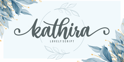 Kathira is a lovely script font. It has a modern and elegant look and is perfect for logos, branding, invitations, photography, wedding stationary, labels, and every other design which needs an unique and luxurious touch. This font is PUA encoded which means you can access all of the cute glyphs and swashes with ease! It also features a wealth of special features including alternate glyphs and ligatures.
 - Alayla by Ghuroba Studio,
$15.00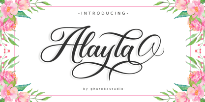 Alayla is modern calligraphy. It's feels both magical and elegant. It looks stunning for your design such as on wedding invitations, thank you cards, quotes, greeting cards, logos, business cards and every other design. This font is PUA encoded which means you can access all of the glyphs and swashes with ease! It features a varying baseline, smooth lines, gorgeous glyphs and stunning alternates.
 - Ajuslly by Stringlabs Creative Studio,
$29.00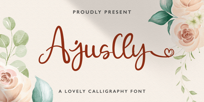 Ajuslly is an incredibly distinct, delicate and timeless handwritten font. It looks stunning on wedding invitations, thank you cards, quotes, greeting cards, logos, business cards and every other design which needs a handwritten touch. This font is PUA encoded which means you can access all of the glyphs and swashes with ease! It features a varying baseline, smooth lines, gorgeous glyphs and stunning alternates.
 - South Sand by Viswell,
$17.00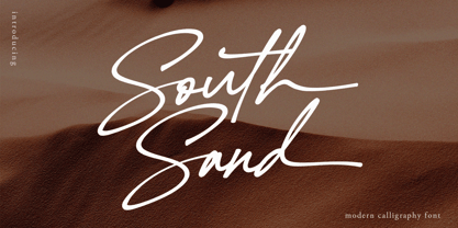 South Sand is a stylish and lovely script font. It looks stunning on wedding invitations, thank you cards, quotes, greeting cards, logos, business cards and every other design which needs a handwritten touch. This font is PUA encoded which means you can access all of the glyphs and swashes with ease! South Sand features : Uppercase & Lowercase Character Numeral & Punctuation Alternate & Ligatures Ending Swash Lowercase Multilingual
 - Cortair by Letterhend,
$15.00 Cortair is an organic font duo with natural vibes! Contain two fonts, Sans and Serif with Rough and Stamp Style. You can use this font for every project. Suitable for branding logo, hand lettering, or apparel design. We hope you enjoy the font, please feel free to comment if you have any thoughts or feedback. Or simply send me a PM or email me at letterhend@gmail.com
 - Victory Speech Lower by Comicraft,
$49.00 Speak quietly but carry a big stick' as President Theodore Roosevelt once said... so, with so much heated rhetoric in the air this -- let's face it, EVERY -- Election season, we felt that it was important to put together a more dignified and sedate lower case edition of our popular Victory Speech font. Bad Hair and Big Sticks not included. See related font: Victory Speech
 - Sterlington by Typeskets,
$18.00 sterlington is an ornamental font, with a hint of Victorian style that can be seen in every form of the letter, this font is also accompanied by additional free ornaments and floral illustrations that you might use to add a more vintage impression and feel of royal romance, very suitable for design such as logotype, headline, label design, coverbook, business card, and many more
 - Amellia by Haksen,
$12.00 Hello Font lovers, I just released my new font with the name "Amellia" "Amellia" is one of beauty script font with many alternate fonts. WHAT YOU GET? - Amellia otf with many alternates. As You can see in the preview. You will make many of version in every letters. Thanks for visited. Happy Designs
 - AT Glanela by Amera Type,
$15.00 The new fonts from Amera Type are designed in the latest styles and with more inspiration from contemporary typographic art. Glanela was created to complement our visual needs in writing titles, music, fashion and product branding Complete with lowercase and uppercase which have alternate and ligatures to complement every need, support 75+ languages
 - Peaches And Cream by Fenotype,
$35.00 Peaches and Cream is a bold brush style script family of three weights, ornament set and an all caps font. Peaches and Cream is equipped with plenty of OpenType features: To activate the alternates click on Swash, Stylistic or Titling Alternates in any OpenType savvy program or manually select the characters from Glyph Palette. Combine Peaches and Cream with Peaches and Cream Ornaments and Peaches and Cream Caps to complete your designs. Peaches and Cream is an effective font for creating ambitious headlines, logos & posters with a custom-made feeling. For the best price purchase the complete Peaches and Cream.
 - Xotor by Typogama,
$19.00 Xotor is a double styled typeface family destined for use in titling and headlines. The main style, the Triline weight, is a modular typeface composed of three strokes and is best used in large sizes. For smaller bodies of text, the second Regular style is based on the same letter construction but in a simple, solid stroke. Both weights can either be used individually or combined to add extra effect to any layout. With an extended Latin language support, Xotor covers most Latin based scripts and equally features a range of Opentype features, from ligatures, alternative letters or different styles of numerals.
 - News Gothic BT by Bitstream,
$29.99 The standard American sanserif of the first two thirds of the twentieth century, prepared for ATF by Morris Fuller Benton in 1908 under the name News Gothic, with a matching lightface known as Lightline Gothic. Linotype’s Trade Gothic follows News Gothic except for its widely-spaced straight-sided boldface based on ATF Alternate Gothic No.3. Linotype matches News Gothic Bold, a boldface version that originated at Intertype, with Trade Gothic Bold No.2. Ludlow Record Gothic follows News Gothic more loosely. News Gothic BT™ font field guide including best practices, font pairings and alternatives.
 - Budare by fragTYPE,
$14.00 Budare is a geometric font family that rebelled to find its own identity within an ocean of other typefaces of the same style. Its design is based on the shape of the wrought iron plate used in Venezuela and other countries to make arepas and other foods. Its appearance is strongly defined by basic geometric shapes such as the circle and its upright style is accompanied by rotated italics "rotalics" that complement its rebellious spirit. Because of its strong display characteristics, its best uses are focused on posters, branding, titles and anything that needs a strong graphic emphasis.
 - Poster Brush by Fenotype,
$18.00Poster Brush is a hand drawn font pair with lots of character. Poster Brush is packed with OpenType features - Contextual Alternates changes prevents identical double letters from being next to each other. With Stylistic Alternates you can manually change the letters. When you turn on Discretionary Ligatures you’ll get interlocking ligatures when typing with caps. Poster Brush Script is equipped with Standard Ligatures and Contextual Alternates to keep the flow smooth. It also has Swash alternates for certain letters. Poster Brush & Poster Brush Script work great together or as themselves. For the best price purchase the whole family. - OTC Eugen by Ograda Type Company SRL,
$29.00 OTC Eugen is a geometric grotesque with industrial socialist aspect. It is a somewhat brute interpretation of the graphic environment and old era typography found around cities or in the country side in Romania. It works best as a display typeface used in big titles, in branding projects for clear wordmarks, or around the house where you can just go wild and make your own mark with the stencil version. Two styles: Display & Stencil. Various stylistic and contextual alternates, and a considerable amount of ligatures, arrows and more. Language support for: Basic Latin, Western, Central & Eastern European languages.
 - KOEEYA by Product Type,
$13.00 Koeeya is a font with a charming Display Graffiti theme. Created to give your projects a touch of freedom and uniqueness, Available in three different variations, Koeeya provides flexibility and the opportunity to express your creativity in limitless ways. You can choose between solid and plain styles, dramatic shadows, or interesting textures. With eccentric designs and beautifully handwritten characters, Koeeya gives each design a different and memorable impression. This font combines the boldness and creativity of graffiti writing with the amazing smoothness and clarity of handwriting. By using Koeeya, you can give a unique and stylish touch to your promotional materials, posters, merchandise designs, and much more. This font exudes energy and freedom, capturing the attention of potential customers in an instant. Now is the time to let your imagination run wild and express yourself through eye-catching designs. Choose Koeeya as your main font and watch how your project becomes unique, interesting, and unforgettable. What’s Included : - File font - All glyphs Iso Latin 1 - Ligature, Alternate - We highly recommend using a program that supports OpenType features and Glyphs panels like many Adobe apps and Corel Draw, so you can see and access all Glyph variations. - PUA Encoded Characters – Fully accessible without additional design software. - Fonts include Multilingual support
 - VLNL Hollandsche Nieuwe by VetteLetters,
$20.00 Raw herring is the Dutch sashimi. Every year at the beginning of the summer a new batch of freshly caught herring arrives at Holland’s quays. Fishing boats actually race each other to be the first boat bringing it home. The fresh herring is called ‘Hollandsche Nieuwe’ (Holland’s new). This typeface, designed by Donald Roos, is based on the typography of Dutch fish shops and stalls. Inspired by lettering from the 30’s and 40’s, infused with some ‘techno’ flavour, Hollandsche Nieuwe is the brand new fresh fishy type flavor on your computer! It is traditionally eaten with sliced onions and pickles. Simply pick up the fish by the tail, open your mouth and take a bite! Enjoy!
 - Jokerman by ITC,
$40.99Jokerman is the work of British designer Andrew Smith. It is a wild and energetic font that is effective when set in all caps, or as mixture of caps and lowercase. Included are a number of alternate letters and funky forms. Jokerman is a fanciful display font that exudes excitement and vitality. - Retrio by Luxfont,
$18.00 Introducing Retrio. Original glyphs with echoed behind. As if the letters were moved, but the kinetic trail remained. Colored, gradient, with transparency or solid - many options in one family for any task and for every taste. The font will emphasize the style of the 20th century in illustration. Discos, electro music, records, nostalgia - these are the associations that this font family evokes, which is very important in design. At the same time, the Retrio font is not outdated, it was created taking into account modern trends in retro themes. A unique family in which there are both color and classic monochrome versions. Great versatility in use is provided by the many fonts in the set. Great for ad designs, posters, headlines and covers. Check the quality before purchasing and try the FREE DEMO version of the font to make sure your software supports color fonts. P.s. Have suggestions for color combinations? Write me an email with the subject "Retrio Color" on: ld.luxfont@gmail.com Features: - Free Demo font to check it works. - Uppercase and lowercase the same size. - With transparency and without. - Mega high-quality gradients in letters. - Kerning. IMPORTANT: - Multicolor version of this font will show up only in apps that are compatible with color fonts, like Adobe Photoshop CC 2017.0.1 and above, Illustrator CC 2018. Learn more about color fonts & their support in third-party apps on www.colorfonts.wtf -Don't worry about what you can't see the preview of the font in the tab "Individual Styles" - all fonts are working and have passed technical inspection, but not displayed, they just because the website MyFonts is not yet able to show a preview of colored fonts. Then if you have software with support colored fonts - you can be sure that after installing fonts into the system you will be able to use them like every other classic font. Question/answer: How to install a font? The procedure for installing the font in the system has not changed. Install the font as you would install the classic fonts. How can I change the font color to my color? · Adobe Illustrator: Convert text to outline and easily change color to your taste as if you were repainting a simple vector shape. · Adobe Photoshop: You can easily repaint text layer with Layer effects and color overlay. ld.luxfont@gmail.com
 - Impulsa by Just Font You,
$16.00 Impulsa is a very impulsive handwritten font. It is finished with digital touch but still keep holding on to the honest of the handwriting feeling. I believe messages with personalized handwriting vibes always deliver deeper feelings to anybody. Impulsa is an all-caps font. You can play with the uppercase and lowercase mix to get the different vibes of every letters so it looks seamlessly handwritten.
 - Diameter by Vishnu Sathyan,
$8.00 The idea of symmetry came to me when I was lookig for a geometric sans font. None of the things that I found did have the mathematically perfect symmetry. So, I went ahead and created one. I have used complex mathematical equations to get the perfect angle in every letter. Diameter comes with two styles square corner and rounded corner, each with regular and bold weights.
 - Turbo Modul by PizzaDude.dk,
$15.00 The future is square! Well, at least according to Turbo Modul! Maybe the future is square, but it is also funky - just like Turbo Modul ... and its pretty unpredictable! Turbo Modul is loaded with alternative letters with arrows pointing in all directions, all made to pimp your designs! I've also added ligatures to substitute double letters, and there's a slight difference from caps and lowercase. Wow! That's a lot of different combinations! I tell you what ... I take a look at the posters I've made, and hopefully it will make you want to try out the font. I had a lot of fun doing the font, and maybe you will have a lot of fun using it! ;)