10,000 search results
(0.056 seconds)
- Daylosta by Authentype,
$20.00 Daylosta Authentic Handwritten Font created by AuthenType. This font features a classic and elegant style, perfect for: The concept of font design for the food, drink and cake industry leads to an energetic and creative youth market processing the taste and color of food. Features Standard glyphs uppercase and lowercase letters Numerals, a large range of punctuation and ligatures. Lowercase letters include ending swashes. Works on PC & Mac. Simple installations, accessible in the Adobe Illustrator, Adobe Photoshop, Adobe InDesign, even work on Microsoft Word. PUA Encoded Characters – Fully accessible without additional design software. Fonts include multilingual support for; ä ö ü Ä Ö Ü ß ¿ ¡ ________________________________________________________________________________________________________________________________________________ Image used : All photographs/pictures/logo/vector used in the preview are not included, they are intended for illustration purpose only. Thank you for your purchase! Hope you enjoy with our font! Designers: Ekayasa.
 - Mehighea by Youngtype,
$15.00 Mehighea Regular and Mehighea Clean are modern font sets featuring an organic, dynamic and energetic style. They can be used for a variety of purposes, such as titles, signatures, logos, correspondence, wedding invitations, letterheads, nameplates, labels, newsletters, posters, badges and much more. To enable the OpenType Stylistic alternative, you need a program that supports OpenType features such as Adobe Illustrator CS, Adobe Indesign & CorelDraw X6-X7, Microsoft Word 2010 or a later version. Thank You:)
 - Chairdrobe by XTOPH,
$25.00 Chairdrobe is minimalistic typeface with a contemporary, urban style. It feels pure, raw and a bit dirty. You can use it as display type as well as in longer text. Try to space it up. It looks super tight with a lot of spacing! Chairdrobe is a sans-serif, condensed typeface. Available in 3 different variations – Normal, Rounded and Grunge. It features upper and lowercase letters and up to 7 Weights and Italics.
 - Bunuelo Clean Pro by Buntype,
$39.00 A contemporary, clear and minimalistic font with a friendly and smooth appearance. Bunuelo™ Clean is based on a squarish form, all edges are slightly rounded and spurs are completely absent. In addition, the endings of terminals follow the curvature. This gives the glyphs a very smooth, friendly and a little bit bubbly look - especially in the bolder styles because the smoothing increases with the weight. Together with the minimalistic and clear letterforms, Bunuelo™ Clean has become a very distinct, strong character. Bunuelo™ Clean ships with 8 upright and 7 real italic styles from an unusually thin Hair to a pretty fat Heavy weight. It provides a bunch of professional typographic features like stylistic alternates, ligatures, Small Capitals, 9 sets of figures, slashed zeros, support for at least 58 languages and much more. Each professional style contains up to than 870 Characters. BunueloClean Specimen PDF
 - Closing Time by Putracetol,
$16.00 Closing Time - Display Retro Font takes you on a nostalgic journey to the charming days of classic design. This font is the epitome of retro and classic aesthetics, with its distinctive features and timeless appeal. The font boasts a perfect blend of retro and classic elements, achieved by slightly curving the font's edges inward. It offers two distinct versions: a clean variant for a polished look and a textured one for added character. Moreover, it provides alternative characters to infuse a touch of uniqueness and creativity into your designs. Closing Time - Display Retro Font is the ideal choice for logos, invitations, packaging, posters, titles, businesses, greeting cards, magazines, and any design projects that seek to capture the essence of retro and classic themes. Embrace the nostalgia and timeless charm of Closing Time - Display Retro Font, and let your designs tell a story of a bygone era.
 - Bright Flicks by Nathatype,
$29.00 Bright Flicks is a delightful script font that embodies a playful and whimsical spirit. With its rounded letterforms and charming swings at the ends of some letters, this typeface adds a joyful and lively touch to your designs. The defining feature of this script lies in its rounded shape, which gives the font a friendly and approachable appearance. The letterforms flow smoothly, creating a sense of fluidity and movement. Each letter flows into the next, creating a harmonious and lively composition. The uppercase letterforms are crafted with precision and creativity, maintaining legibility while embracing the playful nature of the font. Adding to its character are the swings at the ends of select letters, adding a touch of playfulness and spontaneity. Bright Flicks captures the essence of creativity and imagination. The rounded shapes evoke a sense of warmth and friendliness, while the swings at the ends of certain letters add a touch of whimsy and fun. This font brings a sense of joy and positive energy to your designs. You can also enjoy the various features available in this font. Features: Stylistic Sets Ligatures Multilingual Supports PUA Encoded Numerals and Punctuations Bright Flicks fits in logos, branding materials, packaging, and any design project that aims to evoke a sense of cheerfulness and creativity. Whether you're working on invitations, greeting cards, posters, or any project that needs a touch of playfulness, this font will bring a vibrant and lively vibe. Find out more ways to use this font by taking a look at the font preview. Thanks for purchasing our fonts. Hopefully, you have a great time using our font. Feel free to contact us anytime for further information or when you have trouble with the font. Thanks a lot and happy designing.
 - Ongunkan Carpathian Basin Rovas by Runic World Tamgacı,
$60.00 Carpathian Basin Rovas The Carpathian Basin Rovas script, or Kárpát-medencei rovás in Hungarian, was used in the Carpathian Basin between about the 7th and 11th centuries. Most of the inscriptions are in Hungarian, but some were in Onogur, As-Alan, Slavic or Eurasian Avar. Carpathian Basin Rovas is thought to be a descendent of the Proto-Rovas script, which was used to the east of the Aral Sea between about the 1st century AD and 567, when the tribes who were using it, the Avars and Ogurs, started to move into the Carpathian Basin. That process took until about 670 AD, after which the Proto-Rovas script became the Carpathian Basin Rovas and the Khazarian Rovas scripts. The Proto-Rovas script was perhaps a descendent of the Aramaic script. Since 2009 efforts have been made to revive the use of this alphabet. Some letters were added to it to represent sounds in modern Hungarian that weren't used historically.
 - 99 Names of ALLAH Straight by Islamic Calligraphy75,
$12.00 We have transformed the “99 names of ALLAH” into a font. That means each key on your keyboard represents 1 of the 99 names of ALLAH Aaza Wajal. The fonts work with both the English and Arabic Keyboards. We call this Calligraphy "Straight" because of the straight like design. Everything is clear, symmetric and straight. The first "Alef" has a "fatha", this indicates to pronounce the first letter. So instead of saying "R-RAHMAAN" you say "AR-RAHMAN" (in the zip file you will find a pdf file explaining the differences in the "harakat", pronunciation and spelling according to the Holy Quran). We went for the traditional "soukoun" instead of the Quranic "soukoun" & the decorative symbols are at a minimum. Decorative letters used in this calligraphy: "Mim, Aain, Sin, HHe, He & Kaf". Purpose & use: - Writers: Highlight the names in your texts in beautiful Islamic calligraphy. - Editors: Use with kinetic typography templates (AE) & editing software. - Designers: The very small details in the names does not affect the quality. Rest assured it is flawless. The MOST IMPORTANT THING about this list is that all the names are 100% ERROR FREE, and you can USE THEM WITH YOUR EYES CLOSED. All the “Tachkilat” are 100% ERROR FREE, all the "Spelling" is 100% ERROR FREE, and they all have been written in accordance with the Holy Quran. No names are missing and no names are duplicated. The list is complete "99 names +1". The +1 is the name “ALLAH” 'Aza wajal. Another important thing is how we use the decorative letters. In every font you will see small decorative letters, these letters are used only in accordance with their respective letters to indicate pronunciation & we don't include them randomly. That means "mim" on top or below the letter "mim", "sin" on top or below the letter "sin", and so on and so forth. Included: Pdf file telling you which key is associated with which name. In that same file we have included the transliteration and explication of all 99 names. Pdf file explaining the differences in the harakat and pronunciation according to the Holy Quran. Here is a link to all the extra files you will need: https://drive.google.com/drive/folders/1Xj2Q8hhmfKD7stY6RILhKPiPfePpI9U4?usp=sharing
 - Berliana Elemixia by BlackLotus,
$10.00 Berliana Elemixia is a type of display font with nuances of beauty, class, freshness, and softness that best suits your design needs. This font is ideal for headlines and brand identities. Berliana Elemixia also includes a script version, a bold script, and an ExtraBold script. This font is great when you combine your display and script fonts. This font also have interesting alternate features.
 - Backover by Alit Design,
$19.00 Introducing “Backover Typeface” – Unleash the Power of Words with a Heroic Twist! 🔥 Immerse yourself in the epic realm of typography with our latest creation, the “Backover Typeface.” Inspired by the valor of superheroes and the chivalry of knights, this font is a visual journey into the heart of heroic tales. 🗡️ Strike with Power: Channel the strength of legendary warriors as each letter in “Backover Typeface” is meticulously crafted to embody the essence of a hero’s decisive strike. The sharp angles and bold lines evoke the precision of a superhero’s punch or a knight’s swordplay. 🛡️ Defend with Style: The font doesn’t just pack a punch; it defends with flair! Each curve and contour replicate the resilience of a shield, offering a typographic fortress that stands strong against the ordinary. Let your words be the armor that shields your message with distinction. 👤 Unleash Your Inner Hero: “Backover Typeface” isn’t just a font; it’s a transformation. Feel the power surge as you type words that resonate with the bravery of classic heroes. This font empowers your message to become a beacon of courage, ready to take on any adventure. ⚔️ Warrior’s Arsenal: Immerse your audience in the visual feast of classic warrior illustrations included with “Backover Typeface.” Swords clash, shields protect, and helmets gleam with the promise of valor. These meticulously designed elements seamlessly integrate into your typography, allowing you to create a visual narrative that echoes the grandeur of heroism. 🎮** Level Up Your Designs:** Whether you’re working on a superhero movie poster, a knight-themed game interface, or any project that demands a touch of legendary charm, “Backover Typeface” is your ultimate companion. Elevate your designs, captivate your audience, and let the font be the hero of your creative journey. 🌟 Key Features: Heroic Typography Superhero and Knight Theme Sword, Shield, and Helmet Illustrations Perfect for Movie Posters, Game Graphics, and more 🚀 Elevate your design game with “Backover Typeface” – where every word becomes a heroic adventure! Download now and embark on a typographic journey like never before. Unleash the hero within your words! ⚡️
 - Gradl Zierschriften by HiH,
$10.00 Here is another design by jewelry designer Max Joseph Gradl. Zier is a verb, meaning to decorate, adorn or ornament; zierlich means decorative, elegant, fine, neat. Schrift means type. Zierschrift, therefore, means decorative type. Gradl Zierschriften is a decorative type in the Art Nouveau style, rather than the more ornate Victorian style. Very modern, very young, with an elegant simplicity of form. Maria Makela, in her book The Munich Secession (Princeton 1990) suggests that the frequent use of simple, flowing, organic forms that was so characteristic of Art Nouveau was a reaction against the growing complexity and rapid urbanization that resulted from 19th century industrialization. In keeping with that reaction is the hand-drawn quality that intentionally rejects a mechanistic mathematic precision of line rendering. Gradl Zierschriften preserves that hand-drawn quality. Designed with upper case only, this face was obviously intended for short headlines only and is best set at 18 points or larger. However, I don't think you really get to experience the grace of this design until you get to 36 points or more. In the larger sizes, it is simply stunning. Please note that while most of the uppercase letterforms are repeated in the lower case for convenience, the ‘F’,‘L’ and ‘T’ are rendered a little narrower than in the uppercase to provide for visual variety. The font also includes a generous supply of ligatures for just the right fit ... and just for the fun of using them. Three common ways of inserting a ligature, accented letter or other special character are: 1) Key in “ALT”+“0”+[ascii #]; for example ALT+0233 for the e-acute, 2) From within your application program, go to the INSERT menu and look for something like “Insert Symbol,” (this function is NOT available in all application programs) & 3) Cut & Paste from the CHARACTER MAP display that has been supplied by every generation of Windows Operating System that I can recall (All Programs>Accessories>System Tools). Isn't it amazing what you can do? Don't be afraid to experiment. If you back up your work, you have very little to lose and a lot to gain. Not only do you acquire a new tool, but by the very process you have learned how to continually expand your knowledge and skill base.
 - Vengeance Is Mine by Comicraft,
$29.00 VENGEANCE IS MINE, I WILL REPAY, sayeth the Lord. "BUT IF YOUR ENEMY IS HUNGRY, FEED HIM, AND IF HE IS THIRSTY, GIVE HIM A DRINK -- FOR IN SO DOING YOU WILL HEAP BURNING COALS ON HIS HEAD.""AND FURTHERMORE" sayeth the Lord, "WHEN I FINALLY GET AROUND TO EXPRESSING MY VENGEANCE, LO. MY WORD SHALL BE RENDERED IN A FONT WITH THREE RAGGED LAYERS -- VENGEANCE IS MINE!"
 - Sugarless Coffee by Gassstype,
$23.00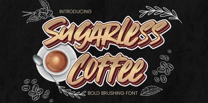 Hello Everyone, introduce our new product Sugarless Coffee - Bold Brushing Font Crafted Display, inspired by the title of the sports poster and We make it very energetically. Sugarless Coffee font with strong and challenging nuances. very suitable for the title, typography, Poster, magazines, brochures, packaging,Websites and much more for your design needs, making your designs more modern and professional. Inspired by Logo style and combination with Cute Craft style. that will fulfill your design needs for quotes,sporty theme, logotype, wordmark, etc. This has many opentype features and support multi language. You can activate Ligature OpenType panel design more interesting.
 - Mixtra Slabserif by T4 Foundry,
$21.00Mixtra is a versatile and complete type family designed by Bo Berndal. The three Mixtra family branches are Roman, Sansserif and Slabserif, each with a full set of weights. The Roman also has a Small Caps font. Combining the three family members is a good starting point for creating a coherent typographical design. Mixtra works well in magazines and all sorts of print in need of a strong visual identity. "Mixtra is a multiface", says Bo Berndal. "With or without serifs, or with powerful slabserifs, you can pick the version that best suits the design and printing technique you have chosen." - Mixtra Sansserif by T4 Foundry,
$21.00Mixtra is a versatile and complete type family designed by Bo Berndal. The three Mixtra family branches are Roman, Sansserif and Slabserif, each with a full set of weights. The Roman also has a Small Caps font. Combining the three family members is a good starting point for creating a coherent typographical design. Mixtra works well in magazines and all sorts of print in need of a strong visual identity. "Mixtra is a multiface", says Bo Berndal. "With or without serifs, or with powerful slabserifs, you can pick the version that best suits the design and printing technique you have chosen." - Stannard by Greater Albion Typefounders,
$12.95 Stannard speaks to us of the happy days of the inter-war period, of enamel advertising 'street-jewelry' as seen on the railways and in all the best shops, of youngsters' train set boxes and toy catalogues, of traditional magazine mastheads, of a simpler, happier and just maybe better era, when summers lasted for ever and all was well with the world. It's a great family of faces for use in nostalic poster design, for nostalgic packaging design or signage or book covers, or even just for making a bold statement anywhere. Four decorative faces are offered.
 - Maggot by Malgorzata Bartosik,
$10.00 Maggot is crazy geometric display typeface. First 36 characters were designed during #36daysoftype 2021. Each letter of the typeface fits into a square composed of 49 modules. Maggot contains 112 letters - Basic Latin, Western, Central and South Eastern European diacritics. Each character that contains a mark has two versions: regular, where the mark is above or below the height of the character and alternate, where character with mark is the same height as characters without marks. Maggot is a display typeface, it works best as short inscriptions, for example on vinyl and book covers, posters, T-shirts, packaging.
 - Mixtra Roman by T4 Foundry,
$21.00Mixtra is a versatile and complete type family designed by Bo Berndal. The three Mixtra family branches are Roman, Sansserif and Slabserif, each with a full set of weights. The Roman also has a Small Caps font. Combining the three family members is a good starting point for creating a coherent typographical design. Mixtra works well in magazines and all sorts of print in need of a strong visual identity. "Mixtra is a multiface", says Bo Berndal. "With or without serifs, or with powerful slabserifs, you can pick the version that best suits the design and printing technique you have chosen." - Decary Sans by Mans Greback,
$49.00 Decary Sans is a new vintage typeface. A sans-serif lettering provided in the styles Light, Regular and Bold, and each weight as Italic. Perfect for a logotype or headline, use this modern retro type to express genuine tradition while keeping the design up-to-date. The font is built with advanced OpenType functionality and has a guaranteed top-notch quality, containing stylistic and contextual alternates, ligatures and more features; all to give you full control and customizability. It has extensive lingual support, covering all Latin-based languages, from Northern Europe to South Africa, from America to South-East Asia. It contains all characters and symbols you'll ever need, including all punctuation and numbers.
 - Wedding Monograms by Kaer,
$19.00 Wedding monograms is a font family in elegant historical style. This family of two character monograms was inspired by “Course of women's needlework” published in 1887. You’ll get the set includes Wide and Narrow capitals, so you can make your own monogram, by combining letters you want. --- Please note, you should use graphic applications such as Adobe Illustrator or Photoshop, but not Microsoft Word. All you need is put Narrow initial on the top of Wide. You can use color fonts in PS CC 2017+, AI CC 2018+, ID CC 2019+, macOS 10.14 Mojave+ Please note that the Canva & Corel & Affinity doesn't support color fonts! --- Please feel free to request any help you need: kaer.pro@gmail.com Best, Roman.
 - Valienta Script by Colllab Studio,
$19.00 "Hi there, thank you for passing by. Colllab Studio is here. We crafted best collection of typefaces in a variety of styles to keep you covered for any project that comes your way! Fonts never fit your designs ? They’re just not flexible enough, not modern enough or too old-fashioned? And you’re too busy to keep looking for a font that fits the bill, right? The market is flooded with all kinds of fonts, but none of them is simple and elegant. Valienta Script is what you’re looking for. It’s an elegant typeface created to make your designs stand out from the crowd, and to add a touch of luxury. A Million Thanks www.colllabstudio.com
 - Good Faster by Mans Greback,
$59.00 Good Faster is a bold script typeface. In a quirky calligraphic style, this flowing font has a rustic look and soft lines. The Good Faster family consists of four styles: Regular, Bold, Italic and Bold Italic, complimenting each other for the greatest design possibilities. The font is built with advanced OpenType functionality and has a guaranteed top-notch quality, containing stylistic and contextual alternates, ligatures and more features; all to give you full control and customizability. It has extensive lingual support, covering all Latin-based languages, from Northern Europe to South Africa, from America to South-East Asia. It contains all characters and symbols you'll ever need, including all punctuation and numbers.
 - PG Gothique Variable by Paulo Goode,
$300.00 IMPORTANT: This is the VARIABLE VERSION of PG Gothique This is my addition to a long line of traditional gothic typefaces. As you can probably tell, PG Gothique Variable is inspired by classics such as Trade Gothic, News Gothic, Franklin Gothic, Alternate Gothic, and Gothic Gothic. Well, maybe not the last one... But Paulo, we have all those already, why would we want to add PG Gothique Variable to our collection? This typeface has many subtle design nuances that differentiates itself from its historical influences. Also, this is possibly the most comprehensive Latin gothic font family released to date. It has 99 default styles that cover pretty much every width and weight you could ever need, while this variable version unlocks options to match your exact style preference – including the angle of italic. PG Gothique Variable is designed to handle a multitude of applications, from branding projects, to titles, body text, user interfaces, and film poster credits. This typeface has a style that will suit the purpose. There are 99 default instances in this family, ranging from Thin to Ultra weights across six widths in both roman and italic. Activate Stylistic Set 1 and you will get the alternate slab-serif-style capital “I” that offers improved legibility when placed adjacent to a lowercase “l”. PG Gothique Variable has an extensive character set that covers every Latin European language. See full details and hi-res examples at https://paulogoode.com/pg-gothique
 - Sticky Melody by Nathatype,
$29.00 Sticky Melody is a charming display font that combines cuteness with a bold and prominent style. With its thick weight, rounded shapes, and distinct contrast, this typeface is designed to capture attention and infuse your designs with a playful and lively energy. The thick weight of Sticky Melody gives each letter a robust and substantial presence, making it stand out effortlessly. The rounded shapes add a touch of softness and friendliness, creating an endearing and approachable feel. The font's unique feature lies in its prominent contrast, which accentuates the curves and contours of each character, elevating the overall visual impact. Let the thick weight, rounded shapes, and prominent contrast of this font bring your creative visions to life, ensuring that your message stands out in the most charming and captivating way possible. You can use it in big text sizes to be greatly legible and enjoy the available features here. Features: Stylistic Sets Ligatures Multilingual Supports PUA Encoded Numerals and Punctuations Sticky Melody fits in children's books, toy packaging, posters, headlines, logos, social media designs, and any design project that require a touch of delightful playfulness. Find out more ways to use this font by taking a look at the font preview. Thanks for purchasing our fonts. Hopefully, you have a great time using our font. Feel free to contact us anytime for further information or when you have trouble with the font. Thanks a lot and happy designing.
 - Concert Series JNL by Jeff Levine,
$29.00 The design of Concert Series JNL is based on hand-lettering for a 1930s-era WPA (Works Progress Administration) poster for the Federal Music Project of New York City’s symphony concerts. Held every Sunday at the Theater of Music [located at 254 West 54th Street], the admission in those Depression-era days was 25 cents and 60 cents, with all seats reserved.
 - Space Armada by Wing's Art Studio,
$10.00 Space Armada - A Science-Fiction Font for Out of this World Designs! Space Armada is inspired by a 1980s interpretation of the future, referencing blockbuster sci-fi action movies of the period, along with the emerging video-game consoles and home computer technologies. It's nine unique fonts are designed to work together in a variety of ways, so you can layer it's different styles on top of each other to retro-futuristic effect!* Here's an example of how it works: Start by placing the Regular font on top of the Bold for a simple base outline. Add contrasting gradients to both fonts for an instant metallic or chrome effect. Take it a step further with one of the readymade Outlines for an embossed look. Overlay the Wireframe font for a glimpse inside the machine! This looks particularly good when you apply a glow effect and reduce it's opacity so the other layers show through. That's just one way to use it. Check out my visuals for more usage ideas! You can also follow my short tutorial! Space Armada is an all-caps font with unique uppercase and lowercase characters, along with a range of alternatives for experimentation with different looks. It also includes punctuation, numerals and language support, plus a selection of underlines and symbols. It's a highly customisable font, perfect for retro designs such as movie titles, posters, games, book covers and more! Every care has been taken to ensure that all fonts align perfectly when layering. Due to the variations in how different software handles text tracking, some minor tweaking may be required for pixel perfect alignment.
 - Touvlo by Monotype,
$49.99 New from the Monotype Studio’s Creative Type Director, Emilios Theofanous, Touvlo – meaning brick in Greek – is an homage to London and the view from his studio window. A zestful, modern interpretation of a classic genre, Touvlo skillfully captures the spirit of early British grotesque typefaces through playful terminals and lively curves. Touvlo offers an array of styles, from clean uprights to characterful Italics, and exuberant Backslants. Its regular upright weights are optimized for long text, with prominent and visible vertical contrast, creating rhythm and texture for comfortable reading. The Italics are designed to be visibly distinct, with narrower proportions and calligraphic shapes, offering brightness and emphasis wherever needed. The Backslants are an unexpected and energetic addition, providing an element of surprise while following similar design choices as the Italics, packing a particular punch. With a total of 24 weights in 3 styles across 3 variable fonts, Touvlo’s variety adds flavor in any use case, and can withstand complex typographic layouts or unexpected and peculiar settings. Touvlo’s weights range from Thin to Black, giving it an expressive edge for headlines. Its lyrical Drop caps are the finishing touch, featuring exquisite birds and creatures inspired from ornaments found in type specimen books. Touvlo’s spirit is radiant; becoming more than a voice; a reimagining of a classic genre and a must have for every designer's typographic palette.
 - Touvlo Variable by Monotype,
$229.99 New from the Monotype Studio’s Creative Type Director, Emilios Theofanous, Touvlo – meaning brick in Greek – is an homage to London and the view from his studio window. A zestful, modern interpretation of a classic genre, Touvlo skillfully captures the spirit of early British grotesque typefaces through playful terminals and lively curves. Touvlo offers an array of styles, from clean uprights to characterful Italics, and exuberant Backslants. Its regular upright weights are optimized for long text, with prominent and visible vertical contrast, creating rhythm and texture for comfortable reading. The Italics are designed to be visibly distinct, with narrower proportions and calligraphic shapes, offering brightness and emphasis wherever needed. The Backslants are an unexpected and energetic addition, providing an element of surprise while following similar design choices as the Italics, packing a particular punch. With a total of 24 weights in 3 styles across 3 variable fonts, Touvlo’s variety adds flavor in any use case, and can withstand complex typographic layouts or unexpected and peculiar settings. Touvlo’s weights range from Thin to Black, giving it an expressive edge for headlines. Its lyrical Drop caps are the finishing touch, featuring exquisite birds and creatures inspired from ornaments found in type specimen books. Touvlo’s spirit is radiant; becoming more than a voice; a reimagining of a classic genre and a must have for every designer's typographic palette.
 - Thinpaw by upirTYPO,
$4.00 Thinpaw is a serif handwritten font perfect for usage in a really big sizes (50 pt+). The stem width is about 0.5 mm (0.019") in 100 pt size. The font comes with central european character set and a set of various glyphs and icons (see preview images). Opentype features: - Standard ligatures - fi, fl, ff - Discretionary Ligatures - ft, fb, fh, fk, fj - Contextual Alternates - a, e, f, g - Stylistic set 01: A Stylistic set 01 changes every dot into the heart shape symbol. It turns every writing into a nice looking love letter! Thinpaw is perfect for wedding proposals, wedding invitations, happy birthday cards or anything personal. For usage on the computer screen, the stem width is about 1 pixel for 50 pt size, and 2 pixel for 100 pt size.
 - Bunday Sans by Buntype,
$22.50 Buntype’s new Bunday™ Sans Font Family consists of four main states with different moods: the crisp and distinctive sans, the cute script styled upright and the matching italics (these upright styles are currently not available). All states of Bunday™ Sans share the same contemporary, clear and open base forms and create a space-saving and homogeneous text colour. Despite the fact that the overall width is space-saving or narrow, Bunday™ Sans offers good legibility. The font was manually hinted and contains extensive handcrafted kerning tables to ensure perfect appearance in all media. Bunday™ Sans ships with 9 standard, 9 upright italic, 16 italic styles from a considerable thin “Hair” to a pretty fat “Heavy” weight. It supports at least 99 languages and provides OpenType® features for ligatures, alternative glyphs, localised forms and more. Please take a look at the other members of the Bunday superfamily: Bunday™ Clean Bunday™ Slab Further information: Bunday Sans Specimen PDF Bunday Sans OpenType® Quickguide Feature Summary: 9 weights: Hair, Light, Thin, SemiLight, Regular, SemiBold, Bold, ExtraBold and Heavy 4 Moods: Sans, Upright, Sans Italic and Upright Italic Overall width: Narrow or Space-Saving Advanced “f” ligature set* “s” and “c” ligatures* Alternates Characters: a, ç, e, f, g, l, t, y and more* Capital German Esszett* Supports at least 99 Languages * Available only in applications with advanced OpenType® support
 - Raqmi by Arabetics,
$45.00 Raqmi was designed as a serif like font with relatively uniform glyph thicknesses, perfect simplified straight lines and curves, and emphasized isolated letters. This font family supports all Arabetic scripts covered by Unicode 6.1, and the latest Arabic Supplement and Extended-A Unicode blocks, including support for Quranic texts. It includes two weights: regular and light, each of which has normal and left-slanted Italic versions. The script design of this font family follows the Arabetics Mutamathil Taqlidi style utilizing varying x-heights. The Mutamathil Taqlidi type style uses one glyph per every basic Arabic Unicode character or letter, as defined by the Unicode Standards, and one additional final form glyph, for each freely-connecting letter of the Arabic cursive text. Raqmi includes the required Lam-Alif ligatures in addition to all vowel diacritic ligatures. Soft-vowel diacritic marks (harakat) are selectively positioned with most of them appearing on similar high and low levels—top left corner—, to clearly distinguish them from the letters. Tatweel is a zero-width glyph.
 - Rhope by Linecreative,
$14.00 Introducing "Rhope," an enigmatic and expressive hand-sketched font that captures the essence of untamed creativity. Crafted with the raw energy of a pencil, this font exudes the captivating charm of scribbled artistry. "Rhope" is not just a font; it's a visual experience that brings a sense of spontaneity and intrigue to your projects. With its distinctive hand-drawn appearance, "Rhope" is uniquely suited for a variety of themes, making it a versatile choice for your creative endeavors. Embrace the dark and mysterious with its inherent horror vibes, or infuse a playful spirit into your designs for a fun and whimsical touch. This font seamlessly transitions between genres, offering a dynamic quality that adapts to your creative vision. Perfectly poised for brand titles, "Rhope" adds an element of authenticity and originality to your visual identity. The irregular lines and organic imperfections create a personalized and human touch, setting your brand apart with a memorable and artistic flair. Whether you're working on chilling horror projects, lighthearted and fun designs, or establishing a brand identity that stands out, "Rhope" is your go-to font. Its versatility and handcrafted nature make it a valuable asset for designers seeking a font that breaks free from the ordinary and injects character into their work.
 - Italiko by Luca Bolognese,
$11.00 Italiko is a calligraphic font. The letters have been hand-drawn individually to extract the common strokes. The strokes have then been re-composed to give the font a more unified appearance. It comes in Black, Bold, Regular, and Thin. The Thin version is different as the extreme contrast in the font makes the thinner lines disappear. It is likely best used as a display font. There are ligatures for the combination of letters that can be written more quickly by using a single stroke and letters that are slightly different from the ‘Italic canon.’ You can select which one to use in your application (i.e., Word) using combinations of italic/bold: No selection -> Regular Bold -> Bold Italic -> Thin Bold Italic -> Black If you end up using the font, get in touch at https://github.com/lucabol/Italiko. Feel free to suggest improvements or let me know if you encounter problems.
 - Hello Fresh by Resistenza,
$29.00 Fresh is best! Say hello to this playful and bouncing font designed by Resistenza. This all-caps have been specially created to add a lively mood to your graphics. You’ll be able to create catchy quotes combining these all-caps fonts or you can use them individually. Including 2 sets of letters on each font (uppercase & lowercase), so you can choose an alternate for each glyph just using your keyboard or the opentype glyphs panel on Indesign, illustrator and other apps with opentype features. Have fun with this friendly font family and give a whimsical touch to your projects. Perfect to create headlines, posters, DIY hand-lettered artwork, books, holiday cards, wrapping paper, invitations, T-shirts, labels, packaging, fashion supplies, food products, artisanal goods, and an endless array of options.
 - Gio by Fenotype,
$20.00 Gio is a wedge serif with robust geometric features and subtle details. Available in two widths and seven styles each, Gio boasts a generous x-height and straight endings, maintaining generally consistent proportions. This creates an elegant ensemble, ideal for captivating display purposes. Gio excels in magazine layouts, headlines, as a logotype, or in any display use, imparting a sophisticated modern feel.
 - ALS SyysScript by Art. Lebedev Studio,
$63.00 Handwriting of a strong Carelian personality revived: It’s autumn time once again, harvesting season, mushroom & berry time – the favourite season of my Karelian aunt Katri. A postcard she sent me more than twenty years ago had inspired me to SyysScript, “Script of Autumn” in Finnish. Katri had a very kind but also energetic personality, and I always thought her handwriting was a mirror of it. By making SyysScript I felt I could revive some of her unforgettable character. My Finnish autumn font has by now become a favourite for many and is branding fine food in both the Eastern and the Western hemisphere – even far beyond the arctic circle. “SyysScript“ is actually a growing family. For enhanced functionality in small sizes I added “SyysScript Eco” a year ago, a style with shortened extensions and simplified letterforms especially suited for packaging. And this autumn, a special one for Finland which is celebrating its 99th birthday, SyysScript grew again: Two long awaited newcomers, “SyysScript FeltTip” and “SyysScript FeltTip Eco” joined the family. They are bolder and softer than the previous styles but keep their positive, lighthearted feel. Use them to make a powerful individual mark on any background. – They are equally well suited for paper, packaging, a screen or even a concrete wall! Language support: Western and Central European, Extended Cyrillic.
 - Wildline by Mans Greback,
$59.00 Wildline is a fast logotype font, created to help you designing logotype or lettering that looks just like a hand-painted brush logo. Use it for designing signs, packaging, headlines, or a cool typographic print. Wildline has characteristics such as strength and confidence, while being dynamic, readable and very energic. Containing extensive lingual support, it covers all Latin European and Asian scripts. The font contains all characters you'll ever need, including all punctuation and numbers.
 - Affair by Sudtipos,
$99.00 Type designers are crazy people. Not crazy in the sense that they think we are Napoleon, but in the sense that the sky can be falling, wars tearing the world apart, disasters splitting the very ground we walk on, plagues circling continents to pick victims randomly, yet we will still perform our ever optimistic task of making some little spot of the world more appealing to the human eye. We ought to be proud of ourselves, I believe. Optimism is hard to come by these days. Regardless of our own personal reasons for doing what we do, the very thing we do is in itself an act of optimism and belief in the inherent beauty that exists within humanity. As recently as ten years ago, I wouldn't have been able to choose the amazing obscure profession I now have, wouldn't have been able to be humbled by the history that falls into my hands and slides in front of my eyes every day, wouldn't have been able to live and work across previously impenetrable cultural lines as I do now, and wouldn't have been able to raise my glass of Malbeck wine to toast every type designer who was before me, is with me, and will be after me. As recently as ten years ago, I wouldn't have been able to mean these words as I wrote them: It’s a small world. Yes, it is a small world, and a wonderfully complex one too. With so much information drowning our senses by the minute, it has become difficult to find clear meaning in almost anything. Something throughout the day is bound to make us feel even smaller in this small world. Most of us find comfort in a routine. Some of us find extended families. But in the end we are all Eleanor Rigbys, lonely on the inside and waiting for a miracle to come. If a miracle can make the world small, another one can perhaps give us meaning. And sometimes a miracle happens for a split second, then gets buried until a crazy type designer finds it. I was on my honeymoon in New York City when I first stumbled upon the letters that eventually started this Affair. A simple, content tourist walking down the streets formerly unknown to me except through pop music and film references. Browsing the shops of the city that made Bob Dylan, Lou Reed, and a thousand other artists. Trying to chase away the tourist mentality, wondering what it would be like to actually live in the city of a billion tiny lights. Tourists don't go to libraries in foreign cities. So I walked into one. Two hours later I wasn't in New York anymore. I wasn't anywhere substantial. I was the crazy type designer at the apex of insanity. La La Land, alphabet heaven, curves and twirls and loops and swashes, ribbons and bows and naked letters. I'm probably not the very first person on this planet to be seduced into starting an Affair while on his honeymoon, but it is something to tease my better half about once in a while. To this day I can't decide if I actually found the worn book, or if the book itself called for me. Its spine was nothing special, sitting on a shelf, tightly flanked by similar spines on either side. Yet it was the only one I picked off that shelf. And I looked at only one page in it before walking to the photocopier and cheating it with an Argentine coin, since I didn't have the American quarter it wanted. That was the beginning. I am now writing this after the Affair is over. And it was an Affair to remember, to pull a phrase. Right now, long after I have drawn and digitized and tested this alphabet, and long after I saw what some of this generation’s type designers saw in it, I have the luxury to speculate on what Affair really is, what made me begin and finish it, what cultural expressions it has, and so on. But in all honesty it wasn't like that. Much like in my Ministry Script experience, I was a driven man, a lover walking the ledge, an infatuated student following the instructions of his teacher while seeing her as a perfect angel. I am not exaggerating when I say that the letters themselves told me how to extend them. I was exploited by an alphabet, and it felt great. Unlike my experience with Ministry Script, where the objective was to push the technology to its limits, this Affair felt like the most natural and casual sequence of processions in the world – my hand following the grid, the grid following what my hand had already done – a circle of creation contained in one square computer cell, then doing it all over again. By contrast, it was the lousiest feeling in the world when I finally reached the conclusion that the Affair was done. What would I do now? Would any commitment I make from now on constitute a betrayal of these past precious months? I'm largely over all that now, of course. I like to think I'm a better man now because of the experience. Affair is an enormous, intricately calligraphic OpenType font based on a 9x9 photocopy of a page from a 1950s lettering book. In any calligraphic font, the global parameters for developing the characters are usually quite volatile and hard to pin down, but in this case it was particularly difficult because the photocopy was too gray and the letters were of different sizes, very intertwined and scan-impossible. So finishing the first few characters in order to establish the global rhythm was quite a long process, after which the work became a unique soothing, numbing routine by which I will always remember this Affair. The result of all the work, at least to the eyes of this crazy designer, is 1950s American lettering with a very Argentine wrapper. My Affair is infused with the spirit of filete, dulce de leche, yerba mate, and Carlos Gardel. Upon finishing the font I was fortunate enough that a few of my colleagues, great type designers and probably much saner than I am, agreed to show me how they envision my Affair in action. The beauty they showed me makes me feel small and yearn for the world to be even smaller now – at least small enough so that my international colleagues and I can meet and exchange stories over a good parrilla. These people, whose kindness is very deserving of my gratitude, and whose beautiful art is very deserving of your appreciation, are in no particular order: Corey Holms, Mariano Lopez Hiriart, Xavier Dupré, Alejandro Ros, Rebecca Alaccari, Laura Meseguer, Neil Summerour, Eduardo Manso, and the Doma group. You can see how they envisioned using Affair in the section of this booklet entitled A Foreign Affair. The rest of this booklet contains all the obligatory technical details that should come with a font this massive. I hope this Affair can bring you as much peace and satisfaction as it brought me, and I hope it can help your imagination soar like mine did when I was doing my duty for beauty.
 - Rigatoni by Sudtipos,
$39.00 Rigatoni is a didone display family with exceptional readability. Based on a German mid-century lettering specimen by Nerdinger, designer Alejandro Paul expanded the face into an extensive family, with 5 weights, italics, and a 2 weights stencil version. Its tall letterforms and sturdy serifs give it a noble bearing when set in all caps; in the lower case its large x-height and spacious counters imbue it with a welcoming tone. A plethora of alternate and swash characters let you create distinctive settings for identities, labels, titles, and headlines. Use the shorter ascender and descender variants for aesthetic effects, or to prevent collisions in tightly stacked text. Since we've imagined Rigatoni being used for restaurants, menus, and food packaging, Sudtipos asked to designer Esteban Diácono to create some 3D visualizations. Ale’s type has never looked saucier!
 - Brava Sans by Rafael Jordan,
$30.00 Brava Sans (the naked & extended version of Brava Slab ) is a family of 8 weights, 2 widths and true italics. Designed for editorial purpose, it has a monolinear appearance with a humanist construction, open counters and a tall “x height” that give it a right personality for use in branding. Also Brava Sans has a lot of helpful features as a wide range cover of Latin languages, a lot of OpenType features, a new condensed width and two bolder and cooler weights that make Brava Sans a useful tool for the graphic designer. A full range of numerals (included old style figures, lining, numerators, denominators, superiors, subs, circled and black circled), small caps, forty ligatures (between standard & discretionary ligatures), a lowercase superior and inferior set and a stylistic set are some of the features that makes Brava Sans a solid choice.