10,000 search results
(0.063 seconds)
- FiveOh by Ingrimayne Type,
$9.95 The FiveOh fonts are caps-only with extreme contrast.. They are decorative or display fonts with a carefree, wobbly look. FiveOh-One and FiveOh-Shadowed contain the same set of letters on upper and lower-case keys. FiveOh-Two, Three, and Stars contain different interior decorations on upper and lower cases. Thus there are eight different sets of letters in the five typefaces. FiveOh-One can serve as a base layer with the other four fonts layered on top of it to give letters with two colors.
 - Viable Logic by Twinletter,
$12.00 Viable Logic font, has a neat and clean character new face sans serif fonts, in response to the need for innovative and new designs, for that this sans serif font family has different characters namely bold, thin and regular. This font is simple yet neat and elegant, the design of this typeface gives it a clean, modern look and a unique style to help give it a captivating look when you use it. This font is perfect for strong text with displays for a wide variety of branding, advertising, posters, banners, packaging, news headlines, magazines, websites, logo design, and more.
 - Double Pineapple by Putracetol,
$25.00 DoublePineapple - Playful Quirky Font. This font is a playful quirky font with a lot of character ligatures, as many as 85 ligatures. With a soft and warm appearance, it is suitable for all ages from children, teenagers and the elderly. This font is perfect for logos, greeting cards, quotes, svg, clothes, posters, logos and more. This font can be installed on MAC OS and Windows OS, it can also be installed in the procreate and cricut applications. Come with lot of ligatures character, its help you to make great lettering, quote, logos and. This font is also support multi language.
 - Thwaites by Eyad Al-Samman,
$20.00 ‘Thwaites’ typeface is fully dedicated to one of my best Canadian friends who I do cherish and value highly. This great and industrious Canadian friend is ‘James Douglas Thwaites’ who lives along with his good-natured family in British Columbia, Canada. For me, James is like a source of inspiration and I do consider him as an ideal in my life. Our strong friendship has started since 1999 and I hope that it will endure just to the last moment of my life. Sometimes I see him as the writer and poet that I learn a lot from, sometimes I see him as a devoted religious minister that I try to understand more about his teachings, and other times I see him as the educator that I strive to imitate verbatim in my life. When I want to talk more about this Canadian friend, I will not be able to give him his due in full. Thus, I will instead mention some excerpts of his biography that he wrote himself saying that: “James D. Thwaites is a self-accomplished man. Having worked in various fields including restaurant management and cleaning, he has achieved his goals of being a full-time teacher, past-time writer, and volunteer religious minister for the Christian Congregation of Jehovah's Witnesses. His personal and academic pursuits have led him to be published in various magazines, newspapers, self-published books, and websites, including his now defunct ‘poetryofthemonth.com’ website. He continues to learn and augment the craft of writing while working primarily in early literacy and delayed literacy learners, teaching reading and literature to a wide age range of students. He views his religious endeavors as an extension of his academic ones. He teaches others both as a public speaker and in one-on-one situations, teaching about the benefits of submission to God and to His teachings. His future goals include expanding his ministry and continuing his writing.” The name ‘Thwaites’ itself comes from Great Britain and originated from the last Viking raids upon England, being an Anglicized version of a Scandinavian term meaning—depending on the source material—either "a place that is difficult to approach" or "a small thicket of trees." Another recitation mentions that ‘Thwaites’ can be described also as an English surname but one of pre 7th century Norse-Viking origins. It may be either topographical or locational, and is derived from the word "thveit", meaning a clearing or farm. As a locational surname it originates from any one of the various places called "Thwaite", found in several parts of Northern England and East Anglia to the south. The various modern spelling forms include Thwaite, Thwaites, Thwaytes, Thoytes, Twaite, Twatt, Twaites, Tweats and Twite. The name, although often appearing unique to outsiders, can often be found within other famous names like Braithwaite, Goldthwaites, or Misslethwaites. With various spellings, some families not including the ‘e’ or the ‘s’ at the end, Thwaites and its derivations—although not exceedingly common—is a name found worldwide. ‘Thwaites’ typeface is simply a sans-serif streamlined, stylish, and versatile font. It is designed using a combination of thick and thin strokes for its +585 characters. Its character set supports nearly most of the Central, Eastern, and Western European languages using Latin scripts including the Irish language. The typeface is appropriate for any type of typographic and graphic designs in web, print, and other media. It is also absolutely preferable to be used in the wide fields related to publication, press, services, and production industries. It can create a very impressive impact when used in headlines, posters, titles, products’ surfaces, logos, medical packages, product and corporate branding, and also signage. It has also both of lining and old-style numerals which makes it more suitable for any printing or designing purposes. ‘Thwaites’ typeface is really the cannot-miss choice for anyone who wants to possess unique artistic and modern designs produced using this streamlined typeface.
 - Copperplate Wide by Wiescher Design,
$39.50 Copperplate Wide is remotely based on the traditional Copperplate typeface that can be seen on many business cards. I have completely redrawn the typeface in a much wider version and without those stubby little serifs. In the place of the lowercase letters I put a very slim version of the font to give you more options. You can either use the wide letters or the narrow ones – or – you can mix both to get something completely new. It works great! Your forever inventive type designer - Gert Wiescher
 - Leather by Canada Type,
$24.95 Over the past few years, every designer has seen the surprising outbreak of blackletter types in marketing campaigns for major sports clothing manufacturers, a few phone companies, soft drink makers, and more recently on entertainment and music products. In such campaigns, blackletter type combined with photos of usual daily activity simply adds a level of strength and mystique to things we see and do on a regular basis. But we couldn't help noticing that the typography was very odd in such campaigns, where the type overpowers all the other design elements. This is because almost all blackletter fonts ever made express too much strength and time-stamp themselves in a definite manner, thereby eliminating themselves as possible type choices for a variety of common contemporary design approaches, such as minimal, geometric, modular, etc. So extending the idea of using blackletter in modern design was a bit of a wild goose chase for us. But we finally found the face that completes the equation no other blackletter could fit into: Leather is a digitization and major expansion of Imre Reiner's forgotten but excellent 1933 Gotika design, which was very much ahead of its time. In its own time this design saw very little use because it caused problems to printers, where the thin serifs and inner bars were too fragile and broke off too easily when used in metal. But now, more than seventy years later, it seems like it was made for current technologies, and it is nothing short of being the perfect candidate for using blackletter in grid-based settings. Leather has three features usually not found in other blackletter fonts: - Grid-based geometric strokes and curves: In the early 1930s, blackletter design had already begun interacting back with the modern sans serif it birthed at the turn of the century. This design is one of the very few manifestations of such interaction. - Fragile, Boboni-like serifs, sprout from mostly expected places in the minuscules, but are sprinkled very aesthetically on some of the majuscules. The overall result is magnificently modern. - The usual complexity of blackletter uppercase's inner bars is rendered simple, geometric and very visually appealing. The contrast between the inner bars and thick outer strokes creates a surprising circuitry-like effect on some of the letters (D, O, Q), wonderfully plays with the idea of fragile balances on some others (M, N and P), and boldly introduces new concepts on others (B, F, K, L, R). Our research seems to suggest that the original numerals used with this design in the 1930s were adopted from a previous Imre Reiner typeface. They didn't really fit with the idea of this font, so we created brand new numerals for Leather. We also expanded the character set to cover all Western Latin-based languages, and scattered plenty of alternates and ligatures throughout the map. The name, Leather, was derived from a humorous attempt at naming a font. Initially we wanted to call it Black Leather (blackletter...blackleather), but the closer we came to finishing it, the more respect we developed for its attempt to introduce a plausible convergence between two entirely different type categories. Sadly for the art, this idea of convergence didn't go much further back then, due to technological limitations and the eventual war a few years later. We're hoping this revival would encourage people to look at blackletter under a new light in these modern times of multiple design influences.
 - Feltro by Ndiscover,
$24.99 Feltro is a Handmade Brush Script full of personality. Because of its fast brush strokes the design looks really fresh and full of identity. It has a total of 9 variants that will give you a lot of customisation options. Outline, Shadow, 4 Textures, and also Textured Outline and Shadow. You can combine the 9 styles in different manners and create colourful typographic expressions. Feltro is loaded with features, like terminal forms, ligatures and contextual alternates, so that you have even more stylistic options. It has a large latin language support across all the 9 styles so you can use it with confidence in all styles. You can use Feltro in advertising, branding, merchandise, web headlines, and more. Make sure you buy the full family and benefit of a massive discount. You can see feltro in action on this short video.
 - Fredericksburg by Nick's Fonts,
$10.00In his book of 100 Wood Type Alphabets, Rob Roy Kelly called this face "Teutonic". This version adds lowercase letters, missing in the original, plus a few woodcut dingbats in the brackets, bar, section and florin positions. Named for a charming town in the Texas Hill Country, founded by German settlers in the mid-1850s. Both versions of the font include 1252 Latin, 1250 CE (with localization for Romanian and Moldovan). - Enge Journal Antiqua by RMU,
$30.00 Hermann Zehnpfundt’s Enge Journal Antiqua, released by the Emil Gursch Foundry, Berlin, in 1910, revived and redesigned. This font contains also a long s, which can be reached by typing option + b, or turning the round s into the long one by using the OT feature historical forms. It is recommended to also use the OT feature discretionary ligatures to get access to all ligatures in this font.
 - Qukiha by Twinletter,
$15.00 Looking for the perfect font for your next gothic project? Do not look elsewhere than QUKIHA! A great place to look for fonts for your most recent logo, label, badge, music video, or movie is the QUKIHA Blackletter font. You can select the ideal word for your project by choosing from the beautiful and harmonious shapes available in the QUKIHA font. The capital letters are impressive, and the letters are slick and fashionable. QUKIHA Blackletter is a necessity if you’re designing labels, posters, or other things. They are also of a professional caliber, making them ideal for any design task.
 - Teapot by Ingrimayne Type,
$9.00 Teapot is a font with letters on teapots. Upper-case letters have the handles on the right and lower-case characters have the handles on the left. The letters on the teapots are from the typeface InsideLetters. A revision in 2018 added some characters that can be used to create multicolored lettering. A pdf file here shows how to use them.
 - Sabon Georgian by Linotype,
$67.99The Sabon® Georgian design translates the original Sabon typeface into Georgian language. Its old style Latin-based design traits and proportions have been carefully and beautifully interpreted as Georgian script characters. In the early 1960s, a group of German master printers wanted a typeface family which would provide them with consistent and predictable results, whether it was used as machine or hand-set composition. They approached one of Germany’s most distinguished type designers, Jan Tschichold, to undertake the design task. The end result of the design commission is a typographic tour de force, and the face that establishes Tschichold’s reputation as a type designer. The completed design, released in 1966, not only solved the imposed design problem of the early 1960s, it is also an exceptionally beautiful and useful digital design. The Sabon® Georgian design further extends the range of this remarkable typeface - Hernandez Bros by Latinotype,
$29.00 Hernández Bros, is a typeface designed by Daniel and Eli Hernández. Born in the year 2021, in the midst of the Covid pandemic, from a collaborative spirit where everything called them to work together as family, in order to obtain better results in such trying times. The Hernández siblings, started a ping pong of drawings based on Bulfinch found in the 1912 ATF catalogue. From this exercise, Hernández Bros was designed, a modern Sans Serif, with 8 weights ranging from Extralight to Black. This is an elegant font, with beautiful and harmonious contrasts, which makes it ideal for titles, brands, editorial design, magazines among others.
 - Black River by Larin Type Co,
$14.00 Black River It is a stunning display font that comes in three styles: Regular, Round and Rough. It also includes many alternatives and ligatures, so make them up to the extent that your design's creativity is enough. This versatile it can be used both in modern projects and in vintage ones, as a main or additional one. This font is easy to use, has OpenType features.
 - Lamiran by RagamKata,
$14.00 Lamiran is a Distorted Wavy Font . You're not going to write a novel with this font, I will tell you that but... if you want something seriously psychedelic thats part art and part font, then this is the font for you. Using it sparingly to mix and match with a clean sans serif or go all out for a good time. Thanks, Have a wonderful Day. Ragamkata
 - Paella by Wilton Foundry,
$29.00I finally designed this simplified brush style script after years of frustration trying to find a font that can fit a need for short descriptors especially for packaging design. While this script does not replace custom script, it comes close - it even includes the underscore as in the sample type. - Lunturan by Differentialtype,
$10.00 Hello this is a Lunturan, display font with a blood theme or something melted. Lunturan can be used for all kinds of scary or melting themed purposes. This font is designed to be a true favourite, it has the potential to take any of your creative ideas to the highest level!
 - Catchy Bellonia by Fargun Studio,
$12.00 Catchy Bellonia is a relaxed and cursive script font. Not too thin and not too thick, balanced and varied, this font was designed to enhance the beauty of your projects. Included Mono-line version. This font is PUA encoded which means you can access all of the glyphs with ease!
 - Meritocracy by Up Up Creative,
$29.00 Introducing Meritocracy, a full-featured handwritten font with tons of alternate characters and OpenType features. My goal with this font was to make you a typeface that will look as much like hand lettering as possible. Using the built-in OpenType pseudo-random contextual alternates and over 300 individually drawn ligatures, you can infuse your typography with personality and variety.** OpenType Features Meritocracy comes with more than 900 glyphs! Specific OpenType features include contextual alternates, stylistic alternates, a second stylistic set for variety, multiple alternate glyphs for many letters (accessed through the glyphs panel), multilingual support (including multiple currency symbols), standard numbers, and seven ampersand styles. It also includes 325+ standard and discretionary ligatures, all of them individually hand-drawn to be different from all other glyphs in the font. These ligatures allow you to give a super-realistic hand-lettered look to your typography. You can write the same word in so many different ways if you combine the default set, stylistic set 01, and standard and discretionary ligatures in different ways. SPECIAL OPENTYPE FEATURE: If you are using OpenType-capable software like Adobe Illustrator, Photoshop, InDesign, or CorelDraw and you have contextual alternates turned on, you can see the letters randomize themselves as you type, mixing from the default character set and stylistic set 01. (You can always turn on contextual alternates after you have already typed your passage and it will randomize all at once, or you can choose to turn off contextual alternates and substitute specific glyphs yourself - I find that if I'm typing a word or two, I prefer to control the individual glyphs myself; if I'm typing a paragraph, I like to use the built-in randomness of the contextual alternates feature). Note that this pseudo-randomization (aka contextual alternate feature) is ON by default in Apple's Pages app and OFF by default in Microsoft Word, but it can be turned on. The OpenType features can be very easily accessed by using OpenType-savvy programs such as Adobe Illustrator and Adobe InDesign. (To access most of these awesome features in Microsoft Word, you'll need to get comfortable with the advanced tab of Word's font menu. If you have questions about this, ask me!) Files included: Meritocracy-Regular.otf Please note: there is only one file for this font. That's the magic of OpenType - all of the alternates, ligatures, etc. are built right into the .otf file! Mail support : julie@upupcreative.com --- Find inspiration (and sneak peeks at my next font-in-progress) on - Instagram: http://instagram.com/julieatupupcreative - Facebook : https://www.facebook.com/upupcreative - Pinterest: https://www.pinterest.com/upupcreative - My website: http://upupcreative.com --- **PLEASE ENJOY! I can't wait to see what you make with Meritocracy! Feel free to use the #upupcreative and #meritocracyfont tags to show me what you've been up to!**
 - Solaris by Ultramarin,
$40.00 Solaris is a sans serif or a grotesque as we still call it where I come from. (it is an old term which means strange compared with Roman which was the normal font) The face is an open sans, which means that the round signs take the air into the form, minuscule d is drawn kind of backwards like in Gill Sans, which sets off on minuskel a. Here is the Regular version, with a slightly difference between stems and hairlines.
 - Gurgle Jock by Bogstav,
$14.00 urgle Jock is actually two fonts in one: The Regular version is a classic handmade sans and the Outline version is…well, an outlined version of the Regular - however, I made it a bit off-grid and hasty scribbled looking. The two versions works well as they are and even greater together!
 - Odd Stencil JNL by Jeff Levine,
$29.00 The sheet music for "Dancing Butterfly" had the title of the 1929 composition hand lettered in what can be only described as an odd hybrid of letters with an Art Nouveau stencil influence. This quirky style became the basis for Odd Stencil JNL, which is available in both regular and oblique versions.
 - Art Materials JNL by Jeff Levine,
$29.00 The cover of the 1930s-era “Catalog of Artists’ Materials” from Ernst H. Friedrichs, Inc. (New York) has the words “Artists’ Materials” hand lettered in a stylized Art Deco sans serif type style. This unique design is now the digital font Art Materials JNL, which is available in both regular and oblique versions.
 - Naroline by Graptail,
$15.00 Naroline is a typefaces with a strong characteristic. The ideas are from Art Nouveau era, explore some of other art era and combining them into strong characteristic Naroline. The final fonts are looks Classic yet Modern, like what we do on the preview above, how the fonts can "stands" within your design.
 - Helvetica by Linotype,
$42.99 With the name Helvetica (Latin for Swiss), this font has the objective and functional style which was associated with Swiss typography in the 1950s and 1960s. It is perfect for international correspondence: no ornament, no emotion, just clear presentation of information. Helvetica is still one of the best selling sans-serif fonts.
 - Bonnington by Greater Albion Typefounders,
$9.95 Bonnington is a Roman display face full of the spirit of the 1920s, developing further the ideas in our Bonning family. Three weights are offered, including a shadowed black form, in a choice of regular and condensed widths. It's the ideal face for signage with a period feel, as well as posters and headings. Combine Bonnington and Bonning together using Bonnington for eye-catching headings and Bonning for other text.
 - Grava by Positype,
$35.00 Grava is Neil Summerour’s injection of warmth within the geometric sans font category. Historically, geometric sans families have been based on primal shapes — triangle, circle, square — and the more closely they held to those rigid rules, the more internal inconsistencies they showed. Angles won’t match up correctly, letters will lean, overshoots complicate clean typesetting, and idealized circles become grotesque and unwieldy in some weights. Because of issues like these, geometric sans fonts have a reputation of being cold, austere, even a bit “off”. Grava was made to hold a T-square and triangle in one hand while giving a welcoming handshake with the other. The Grava font family comes in two styles (a normal and a Display), each with 20 weights (Thin to Ultra) and paired with italics. Its design allowed the three scripts of Latin, Cyrillic, and Greek to emerge seamlessly, ensuring Grava will find its home in multilingual publications. Even better, each character in the three scripts is spaced with every other character for a beautifully matched fit, and it’s a buy-one-get-all-three deal since they are all packaged together. The normal style’s large x-height won’t let you down in paragraphs, headings, and any call-out text. And have you seen the angles on those numerals? Pairing Grava’s numerals on a jersey is sure to catch some eyes, just sayin'. Grava Display is purposefully quirky and sharp, and made for poster sizes, book and album covers, and those websites with a well-defined character — somewhere between playfully self-aware and overtly vintage. Flat edges are abandoned to make way for sharp points and conspicuousness, for geometrical attitude and respectful expressiveness. Corporate reports use Grava Display to take on a professional and current look. The optional ligatures (N–T, L–L, G–A, C–O, almost anywhere an ‘A’ is placed, and more) in both the normal and Display styles invoke a midcentury modernist and high art feel. Now that introductions are done, you can let go of Grava’s hand and put it to work for you.
 - Ride my Bike Serif by Latinotype,
$39.00 Ride my bike Serif is a new version of successful handmade typeface Ride My Bike designed by Coto Mendoza. Inspired by street style and the new culture that moves pedaling around the city. Perfect for use in headlines, brands and fashion photography compose alternative, thanks to its leading characters, terminals, alternate characters and ligatures that you can find in the Pro version. This time with serif. The ‘Ornaments’ font in this family has 121 dingbats, very fun to compliment and accentuate the handmade design. If you do not want to ride so fast, you can find a version without OpenType features - Essential. Come! Get on it and let’s go ride my bike! Photography by Nico Alari.
 - Almoneda by Sudtipos,
$49.00 Almoneda: Sale at public auction of movable goods, generally used. And also: private and voluntary sale of jewelry and junk that is made without the intervention of justice. Formerly, it was nothing more than the market or sale of things and spoils won from the enemy in war. Nowadays, the almoneda is practically associated with spaces where the sale of "old things" takes place and, in Madrid, they are usually concentrated in the area of El Rastro, an open-air market that is set up on Sundays and some holidays in the center of Madrid. There, you can find everything and, if you walk around a lot and look hard enough, great typographic finds. It is there where I find a large number of elements (usually from the late nineteenth and early twentieth century) such as boxes, posters, books, etc.. in which appear uppercase letters with a variety of shapes, letters embedded, rare ligatures ... In addition, many elements extracted from street signs, tiles from bars and commemorative elements of Madrid have been used to complete this font design made with care and patience. Thus was born Almoneda, a modern typeface with a marked axis and great contrast, and an uppercase with several sets of characters to play with and enjoy. It also includes a large number of ligatures and discretionary ligatures. A Variable font is included with the full package license. Almoneda, a typeface that will not leave you indifferent. They take it out of my hands, hey!
 - Snow Atisen by Differentialtype,
$10.00 Snow Atisen is a festive and fun handwritten font. Perfect for adding a touch of holiday magic to Christmas cards, New Year's decorations, winter designs and other fun projects. Comes with 3 styles that you can mix and match. This font has the potential to become your favorite font of choice, whatever the occasion, spread the joy of the season with this unique font.
 - Magalith by Samtype,
$39.95 This hebrew typeface is inspired in prayer books from the beginning of the XX century. Even in this Std version You can apply modern hebrew marks like Kamats Katan, Sheva Na, Dagesh Chazak and Cholam Chaser. It's a classic style with the most modern of a digital font technology and a easy lecture. The Caption versions is ideal for small size of texts and footnotes.
 - TextFace Type by Forme Type,
$9.99 The idea for this font family, derived from SMS text message faces (Emojis) and found photographs of faces collected over the last ten years. The concept for this project was to a create text-face characters using only the glyphes found in a standard version of a Sans Serif typeface. There are 36 different Textfaces. Available in three weights, Regular, Bold and a Stencil version.
 - New Boston NF by Nick's Fonts,
$10.00Another addition to the Whiz-Bang Woodtype series, this offering is patterned after a typeface issued by the old Boston firm of Baker & Greele in 1826. Named after a small town in Texas just a hop, skip and a jump from the Red River and Arkansas. Both versions of this font include the complete Latin 1252 and CE 1250 character sets, with localization for Romanian and Moldovan. - IL Palamede by Notope,
$25.00 IL Palamede is a typeface with just one style, referring by its name to the French chess magazine Le Palamède. Connects with chess here not only the name. Each symbol is built on a 5x5 grid with 3x3 priority. At the same time, the logic here is higher than optical compensation, so you can observe here quite dense, for example "b". Thanks to this solution, the typed text is balanced in width, and it also creates the feeling of a chess cell, where black and white cells alternate. Connects with chess here not only the name. Each symbol is built on a 5x5 grid with 3x3 priority. At the same time, the logic here is higher than optical compensation, so you can observe here quite dense, for example, "s". Thanks to this solution, the typed text is balanced in width, and it also creates the feeling of a chess cell, where black and white cells alternate. Use this font for any purpose that includes winning or enjoying.
 - Barbieri by Re-Type,
$45.00 Barbieri is a casual sans type family, based on a German lettering style from the 1960s. The original hand-drawn alphabet was used in a rather peculiar edition of Der Barbier von Bagdad, an opera composed by Peter Cornelius. Our efforts to identify the cover designer have been, so far, unsuccessful. As fans of informal typography and popular lettering styles, we thought these few thin letters deserved a re-incarnation as a complete type family. Andrés Torresi and Marta Sánchez Marco were in charge of the production work. Now Barbieri has 6 weights suitable for packaging, posters, and music covers. It resembles a certain 'Americana' spirit, though with a Germanic twist.
 - Local Brewery Collection by Cultivated Mind,
$29.00 Local Brewery is back with a new vintage inspired font collection that includes a script, two sans serif fonts, icons and extras. The sans serif fonts and the script include regular, semi-bold and bold weights. The script is monoline with smooth edges. The sans serif fonts have a smooth edge with all caps letters. Local Brewery Script comes with caps and lowercase alternates. These alternates will give your designs an extra flair and uniqueness. The script and sans serif fonts work exceptionally well together. Use Local Brewery for packaging, products, websites, marketing and beer branding.
 - Bunny Flowers by Gilar Studio,
$16.00 Bunny Flower a Handwritten Display Font With 3 Style (Regular,Outline and Shadow) You Can Mix And Match for Your Awesome Project This fonts is ideal for crafting, branding and decorate your any project. This fonts are perfect for wedding invitation or your blog. Also with their help, you can create a logo or beautiful frame for your home. Or just use for your business, book covers, stationery, marketing, magazines and more. FEATURES : Uppercase & Lowercase Number & Punctuation More than 248 of glyphs Multilingual Language PUA Encode 9 Ligatures Alternate 7 OpenType features were detected in the font (aalt dlig frac liga ordn salt sups kern) Support for 67 languages detected The alternative characters were divided into several Open Type features can be accessed by using Open Type savvy programs such as Adobe Illustrator, Adobe InDesign, Adobe Photoshop Corel Draw X version, And Microsoft Word. And this Font has given PUA unicode (specially coded fonts). so that all the alternate characters can easily be accessed in full by a craftsman or designer. If you don't have a program that supports OpenType features such as Adobe Illustrator and CorelDraw X Versions, you can access all the alternate glyphs using Font Book (Mac) or Character Map (Windows). Check my other Font here : https://gilarstudio.com/ Thanks and happy designing :-)
 - Zira by Artcity,
$10.00 Zira is a playful hand-drawn font family designed by Daniel Bak (Artcity). It is available in three handy weights: regular, bold and screaming. It contains international language accent marks and diacriticals, including Greek and Cyrillic. Zira can be considered as smoothed serif version of Cornelius font. Zira as Cornelius as well is a chimpanzee character in the novel and movie series Planet of the Apes. Dr. Zira is a chimpanzee psychologist and veterinarian, who specializes in the study of humans, in the novel and subsequent movie series Planet of the Apes. Zira was played in the first three Apes movies by actress Kim Hunter. Unique among the Apes characters, Zira has blue eyes. Zira is the fiancée (later wife) of Cornelius, and both are ultimately responsible to the Minister of Science, Dr. Zaius. Zira's character and role are essentially the same in both the novel and the movies, though some story details differ. Her work in each involves both working with humans under laboratory conditions (e.g. learning and behavioural experiments), and working on them physically (lobotomy and other brain surgeries, vivisection, physical endurance and tolerance experiments, and subsequent autopsies). Zira is an outspoken liberal by nature, deploring war and militancy (and despising the gorillas, who seem to make both a way of life), and eager to seek and develop intelligence anywhere it can be found. Zira literally stands for her principles - or refuses to stand, as the case may be.
 - Urban Space by Letterhend,
$15.00 Urban Space is a heavy, bold, standout sans serif. This type of font perfectly made to be applied as a headline, logo, title, quotes which is need a standout font, and the other various formal forms such as invitations, labels, logos, magazines, books, greeting / wedding cards, packaging, fashion, make up, stationery, novels, labels or any type of advertising purpose. Features : lowercase and uppercase numbers and punctuation multilingual ligatures PUA encoded We highly recommend using a program that supports OpenType features and Glyphs panels like many of Adobe apps and Corel Draw, so you can see and access all Glyph variations.
 - Saltburg by Letterhend,
$17.00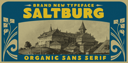 Introducing, Saltburg, an strong and bold sans serif with a touch of vintage look and feel. This type of font perfectly made to be applied especially in logo, headline, signage and the other various formal forms such as invitations, labels, logos, magazines, books, greeting / wedding cards, packaging, fashion, make up, stationery, novels, labels or any type of advertising purpose. Features : uppercase & lowercase numbers and punctuation multilingual alternates swashes and ligatures PUA encoded We highly recommend using a program that supports OpenType features and Glyphs panels like many of Adobe apps and Corel Draw, so you can see and access all Glyph variations.