10,000 search results
(0.059 seconds)
- Dez Yinznat Stencil by Dezcom,
$35.00 Dez Yinznat Stencil is a condensed stencil sans serif inspired by the industrial city of Pittsburgh, PA USA. Stencil type was often used in the steel mills, scrap metal yards, railroads, warehouses, and other industrial institutions of Pittsburgh and is almost a signature for the City. The name comes from combining two colloquial expressions common to Pittsburgh. “Yinz” is used there like "Y'all" is used in Southern States. "n'at" or sometimes "N@" is used to replace “and that” when ending a phrase. This font is dedicated to the hard-working people who made Pittsburgh what it is, N@. High-tech subjects can also find a friend in Dez Yinz'nat.
 - Argusho by Keristyper Studio,
$14.00 Introducing, Argusho font a modern typeface that takes a classic style. Designed to give the impression of elegance and luxury with a classic feel. This font is good for logo design, Social media, Movie Titles, Books Titles, short text even long text letters, and good for your secondary text font with sans or serif. **Featured:** * Standard Uppercase & Lowercase * Numeral & Punctuation * Multilingual : ä ö ü Ä Ö Ü ß ¿ ¡ * Alternate & Ligature * PUA encoded We recommend programs that support the OpenType feature and the Glyphs panel such as Adobe applications or Corel Draw. so you can use all the variations of the glyphs. Hope you enjoy our fonts!
 - Shelottra by Keristyper Studio,
$14.00 Shelottra is an elegant beauty fancy display font with expressive shapes and characteristics to bring magical imagination in your design. This font is good for logo design, Social media, Movie Titles, Books Titles, short text even long text letters, and good for your secondary text font with the script, sans, or serif. Featured: Standard Uppercase & Lowercase Numeral & Punctuation Multilingual : ä ö ü Ä Ö Ü ß ¿ ¡ Alternate & Ligature PUA encoded We recommend programs that support the OpenType feature and the Glyphs panel such as Adobe applications or Corel Draw. so you can use all the variations of the glyphs. Hope you enjoy our fonts!
 - Chilango by Ed Garland,
$28.00 Chilango is a beautiful new typeface based on the gorgeous hand-painted street signs of Mexico City.., It come with 7 weights and a unique Italic family. Throughout Mexico City, from the Centro Historic (Zocalo) through La Condessa, Polanco and Guerrero - from La Roma to San Rafael to Atlampa to Lomas, you can be sure to see the iconic hand painted blue with white lettered street signs wherever you go. It is an exuberant and flourishing font that represents this fabulous flourishing city to its core. It is a historical one, classy and stylish and deeply routed in the curvature and designs of the Spanish heritage.
 - Almirab by Keristyper Studio,
$14.00 Almirab Script is a classic Script font inspired by Arabic classic handwriting that uses a flat pen (or signature pen) and is written in the low height of letterforms. This font is good for logo design, Social media, Movie Titles, Books Titles, short text even long text letters, and good for your secondary text font with sans or serif. Featured: Standard Uppercase & Lowercase Numeral & Punctuation Multilingual : ä ö ü Ä Ö Ü ß ¿ ¡ Alternate & Ligature PUA encoded We recommend programs that support the OpenType feature and the Glyphs panel such as Adobe applications or Corel Draw. so you can use all the variations of the glyphs. Hope you enjoy our fonts!
 - Benhard by Holis.Mjd,
$14.00 BENHARD is a display font with masculine characteristics suitable for old or modern styles, this font can be combined with a sans-serif font suitable for poster fonts, logos, headlines, titles on book covers, films, content and others.
 - Venarotta by Aftertime Studio,
$20.00 Venarotta is a minimal and neat sans serif font. It can easily be matched to an incredibly large set of projects, so add it to your creative ideas and notice how it makes them stand out! Thank you.
 - Vemanem Pro by ffeeaarr,
$11.00 Vemanem is dynamic sans serif display fonts, you can use it for advertising, movie, titles & more.
 - Satigof by holyline design,
$19.00 Satigof by Holyline is a playful sans serif font family, This font very playful and unique comes in nine weight, thin to black . It's very unique, fancy, playful very easy to combine with multiple design style. Satigof perfect for headline, sub headline ,custom logo,packaging, quote, invitations, watermark,social media posts, label, anything for your creativity and Satigof is perfect font if you want something new with your project, and you can pairing this font with the weight, its very satisfy. Happy creating!
 - Resola by Ironbird Creative,
$15.00 Resola is a hand drawn vintage display typeface. This item consist of 12 FONTS in various styles which you can play around with it. This typefaces is perfect for people looking for vintage aesthetic and organic feel. What Will You Get : Resola Vintage Serif (OTF and TTF) Resola Sans Serif (OTF and TTF) We hope you enjoy the font, please feel free to comment if you have any thoughts or feedback. Thanks for purchasing and have fun! Regards, Ironbird Creative
 - Ringtail by Din Studio,
$25.00 Every font designer has their own favorite font type, which you do not need to find as it takes too much time to figure it out for you until you can match it with a perfect font. Ringtail has the best answer to your needs. Ringtail is a font containing two font types to use together or separately: sans serif and script fonts. Sans serif font has firm, modern, simple looking lines without curvy edges. Meanwhile, the script font has curvy lines in water paint or ink textures. The textures are extra lines added to each letter and to the background letter patterns. A textured script font looks more artistic and more detailed than the other ordinary script fonts to show elegant, romantic impressions in your designs. Additionally, script font can be applied for adding extra visual contrasts to designs with sans serif font. Features: Stylistic Sets Ligatures Multilingual Supports PUA Encoded Numerals and Punctuations Ringtail fits best for various design projects, such as brandings, posters, banners, logos, magazine covers, quotes, headings, printed products, invitations, name cards, merchandise, social media, etc. Find out more ways to use this font by taking a look at the font preview. Thanks for purchasing our fonts. Hopefully, you have a great time using our font. Feel free to contact us anytime for further information or when you have trouble with the font. Thanks a lot and happy designing.
 - MBF Inno by Moonbandit,
$17.00 Inno font, is a modern take on the futuristic scifi theme, this typeface is clean, sharp, and have plenty of alternative, you can easily access them through uppercase lowercase. This font is great for headlines, sub titles and many attention grabber projects.
 - Zombie Mummy by Letterara,
$14.00 Zombie Mummy is a bold, quirky, and incredibly spooky display font. Add this font to your favorite Halloween-themed ideas and notice how it makes them come alive! This font is PUA encoded which means you can access all of the glyphs.
 - SK Ilke Mono by Salih Kizilkaya,
$9.99 SK Ilke Mono is a "mono geometric sans" font family. Designed by Salih Kızılkaya in 2021, this font is designed for the needs of designers and software developers. Character ranges and proportions of characters have been specially designed so that you can use it comfortably in any area you want to use mono font. SK Ilke offers full support for the Latin alphabet and includes many typographic elements that you will need in your designs. It contains 22 different fonts and 12,760 glyphs in total. Each font of this font family contains 580 glyphs. In this way, it offers you all the typographic elements you will need in your designs and aims to meet all your design needs.
 - Benar by Twinletter,
$12.00 Benar is our newest san serif, and it has amazing fonts for your projects. This typeface is ideal for branding, advertising, posters, banners, packaging, headlines, magazines, websites, logo designs, banners, social media designs, and many other uses. Light, Regular, Medium, and Thick are the four available weights. It features a clean and beautiful aesthetic that can help your project appear more serene, and unique and grab the attention of the audience. of course, your various design projects will be perfect and extraordinary if you use this font because this font is equipped with a font family, both for titles and subtitles and sentence text, start using our fonts for your extraordinary projects.
 - Miluero by Luxfont,
$18.00 Introducing the stylized Miluero family. Graceful cut, rounded corners combined with austere shapes. Accent fonts with color padding and a classic basic monochrome version in the set. Perfect for logos, headlines and captions. Looks elegant in a minimalist modern design. An assortment of colors will help you get started quickly. This font family is based on the Regular font Pacardo - which means that if necessary you can combine these two families and they will be absolutely stylistically identical and complement each other. Check the quality before purchasing and try the FREE DEMO version of the font to make sure your software supports color fonts. P.s. Have suggestions for color combinations? Write me an email with the subject "Miluero Color" on: ld.luxfont@gmail.com Features: - Free Demo font to check it works. - Uppercase and lowercase the same size but different forms. - Color in letters. - Kerning. IMPORTANT: - Multicolor version of this font will show up only in apps that are compatible with color fonts, like Adobe Photoshop CC 2017.0.1 and above, Illustrator CC 2018. Learn more about color fonts & their support in third-party apps on www.colorfonts.wtf -Don't worry about what you can't see the preview of the font in the tab "Individual Styles" - all fonts are working and have passed technical inspection, but not displayed, they just because the website MyFonts is not yet able to show a preview of colored fonts. Then if you have software with support colored fonts - you can be sure that after installing fonts into the system you will be able to use them like every other classic font. Question/answer: How to install a font? The procedure for installing the font in the system has not changed. Install the font as you would install the classic fonts. How can I change the font color to my color? · Adobe Illustrator: Convert text to outline and easily change color to your taste as if you were repainting a simple vector shape. · Adobe Photoshop: You can easily repaint text layer with Layer effects and color overlay. ld.luxfont@gmail.com
 - Sancoale by insigne,
$22.00 Sancoale is a new sans serif that is simple and geometric. It is a contemporary design that is distinctive and unique, but not too far outside the box. This makes for a typeface family that is very useful for many applications. The design is simplified without stems or spurs in the default character set. The OpenType alternates do include alternates with stems, and there are six weights with true italics. Please see the informative .pdf brochure to see these features in action. OpenType capable applications such as Quark or the Adobe suite can take full advantage of the automatically replacing ligatures and alternates. This family also includes the glyphs to support a wide range of languages. Sancoale is a great choice for a professional designer that wants to achieve a simple but still unique look.
 - Bibliophile Script by Sudtipos,
$79.00 A friend once jokingly told me that what I really do is mine extinct arts for parts to use in modern things, like going to the scrapyard to pick up bumpers, quarter-panels and dashboards off of Datsuns and Ponies to build a shiny new Ferrari. I still kind of grin at that, but I certainly do spend a lot of time looking at old things and imagining ways they would work today. This shiny new Ferrari here is called Bibliophile, and it contains scrap heap parts from various pages by Louis Prang, the Prussian-American printer and publisher who inspired my Prangs fonts. This is my second engagement with the late 19th century man, and it’s quite a bit more intricate than just an italic Didone with a connected lowercase. Bibliophile marries Round Hand calligraphy with Italian capitals, two styles not often relayed in the same alphabet, but work together beautifully when combined well. When you combine them well with a few long-practised tricks of the trade, then mix in a few trusted features from my previous work over the years, you get my usual crazy exuberance, like 17 different shapes for the d, 21 different forms for the y, endings, beginnings, swashes, ornaments, and so on. It’s no secret that I can get carried away when I’m so consumed by an idea. — Bibliophile comes in 2 weights, each of them with over 900 glyphs covering all the latin languages. Bibliophile also comes with a bold weight, something I’m always reluctant to do with something as adventurous and complex as the structure of this historical mashup. But I couldn’t chase away the idea of increasing the contrast while maintaining the hairlines in a lowercase this narrow. Part of it was the curiosity about the outcome, and part was the sheer challenge of it. I think it turned out OK. Words set in either weight will show delicateness and elegance, and the more time you spend inside the font and micro-manage the setting, the more ways you will find to magnify either. Bibliophile can be as muted or luxurious as you want it to be. This is the kind of alphabet that fits well in fashion marketing and high-end packaging, from the very subdued to the super-exquisite. Enjoy the gleaming new vehicle made with freshly polished old parts.
 - Forgotten Dream by Hanoded,
$15.00 I had a really weird dream the other night, but when I woke up, I had forgotten it. I had the feeling it was about something important, but I cannot, for the life of me, recall what I dreamt about! Forgotten Dream is a horror brush font, which I made with a brushy brush and Chinese ink. It looks like something right out of a nightmare, but you can also use it for something important. Like a ‘keep your distance’ poster, or a sign about the importance of washing ones hands. But then again, if you play in a death metal band, then Forgotten Dream font could be exactly what you need for your album cover!
 - Naive by S&C Type,
$8.00 Naïve is a serif handwritten font designed by Fanny Coulez and Julien Saurin in Paris. Our goal was to draw a font with finely irregular lines that give a human and whimsical feeling. The three weights of this subtle Parisian hand-drawn font can be enhanced with two alternates fancy glyphs for each letter, the “Fantaisies”, to improve your designs and bring a more poetic and unusual feeling. We hope you will enjoy our work :) You could follow us on our Instagram: instagram.com/sc.type Merci beaucoup! Note: This font is part of our Naïve superfamily that contains lot of variations: Line, Inline, Serif, Sans Serif, and a special Art Deco one. Just click on our foundry name to see them all!
 - Bandera by AndrijType,
$21.00 This square serif typeface is a real workhorse. It is a modern tool for text design: extremely legible and well shaped. Bandera has six weights with original italics. It catches attention in headlines of posters and magazines or makes reading comfortable in plain texts. Bandera shares main proportions with sans serif Osnova Pro typefamily so ideally can pair it. It has Bandera Text and Bandera Display sister families as well. Please check also Pro version for pan-european support (full Latin-Greek-Cyrillic). Bandera is Spanish for ‘flag’. And Bandera is a symbol of Ukrainian fighting for freedom for many years.
 - Peaceful Island by Invasi Studio,
$16.00 Peaceful Island is a handwritten combo pairing font. It combines script and handwritten sans. This font has a retro feel, playful handwritten sans, and a casual script. This attractive combination with retro vibes is perfect for your Display Design. You can use it for logo designs, title vloggers, brand imagery, quotes, merchandise, social media posts, and more. Features: - Uppercase & Lowercase - Numerals & Punctuation - Alternates and Ligatures - Multilanguage Supports 60+ Latin based languages
 - Andreae by Proportional Lime,
$9.99 Hieronymus Andreae or latter in life Hieronymus Formenschneider as he proudly took a new surname to proclaim his success in the printing industry as the man who introduced the Fraktur script to the world of print. This project was undertaken at the orders of Emperor Maximilian I. One of Fraktur’s first appearances was in a joint venture with the great Albrecht Dürer. This font was based on a later work, Andreae’s magnus opus in the music field, the Coralis Constantini by Henry Isaac. Andreae worked as woodblock cutter and then became a publisher in the city of Nuremberg until his death in 1565. We at PLTF are proud to revive this enormously influential typeface.
 - Aerle by Hackberry Font Foundry,
$24.95 My first font for 2009 was Aerle. It is a new dark sans serif font in my continuing objective of designing book fonts that I can really use. It made a little ripple in the industry, but more than that I found that I loved it with Aramus and Artimas — my latest book font family with the same proportions. In many ways, Aerle is a very different direction for me built on what I have learned on Aramus and other recent developments in my style. The concept came to me while using Bitstream's Mister Earl on a site online—though there is no direct reference. I wanted a more playful heavy sans with a much smaller x-height than I have been using lately, plus taller ascenders. As I was using Aerle, I constantly needed a light and bold version. The new direction I am taking is a result of a decision that my fonts, though I loved the character shapes, produced an even type color that is too dark or a little dense. Aerle was an attempt to get away from that look even though the letterspacing is quite tight. For Aerle Thin I pushed a little further in that direction and increased the letterspacing. The hand-drawn shapes vary a lot, many pushing the boundaries of the normal character. This gives a little looseness and helps the lightness in feel I am looking for. It will be interesting to see where this all goes. Most new type around the world is far too perfect for my taste. While the shapes are exquisite, the feel is not human but digital mechanical. I find myself wanting to draw fonts that feel human — as if a person crafted them. In most ways this is a normal font for me in that it has caps, lowercase, small caps with the appropriate figures for each case. These small caps were very small (x-height as is proper). So Aerle's small caps are a little oversize because they plugged up too bad at x-height size. The bold is halfway between. These size variations seem important and work well in the text. This font has all the OpenType features in the set for 2009. There are several ligatures for your fun and enjoyment: bb gg sh sp st ch ck ff fi fl ffi ffl ffy fj ft tt ty Wh Th and more. Like all of my fonts, there are: caps, lowercase, & small caps; proportional lining figures, proportional oldstyle figures, & small cap figures; plus numerators, denominators, superiors, inferiors, and a complete set of ordinals 1st through infinity. Enjoy!
 - Passenger Train JNL by Jeff Levine,
$29.00 A 1940s travel poster for the Florida East Coast Railway (which then carried passengers but is now a freight line) had the railroad’s name hand lettered in a bold Art Deco sans. This inspired Passenger Train JNL, which is available in both regular and oblique versions.
 - Asbanur by Mightyfire,
$10.00 Hello! Asbanur is here. Asbanur brings modern, clean and neat looks. This font can be used as the logo of your brand, headline title, magazine title or many things. We have two versions: light and regular, but both of the versions is cool! Try them and enjoy!
 - Nouveau Titling JNL by Jeff Levine,
$29.00 Sheet music for 1907's "Just A Little Fond Affection" had the song title hand lettered in a simple sans serif design with influences from the then-current Art Nouveau movement. This is now available as Nouveau Titling JNL; available in both regular and oblique versions.
 - Haenel Antiqua by RMU,
$30.00 This narrow neoclassical revival is based upon a font released by the Haenel Foundry, Berlin, in the 19th century. By typing [alt] + p respectively [alt] + b you have access to a framing element as it can be seen on the posters. By using the OT feature stylistic alternative you can change the normal numbersign into an oldstyle numero sign.
 - Shibui by Artisticandunique,
$38.00 Shibui is a Japanese word that expresses a certain aesthetic of simple, subtle and inconspicuous beauty. Shibui - Sans serif font, character structure is simple alphabet style. It has an elegant appearance with rounded folds. It offers the best solutions in your digital projects with this font which is highly readable in the smallest dimensions. With its modern minimalist stance, this font can meet your needs in all modern or classic creative projects. Absolutely perfect for titles, websites, magazines, books, invitations, logos, packaging design, branding and more! Character Ranges: Basic Latin, Latin-1 Supplement, Latin Extended-A, Latin Extended-B, General Punctuation, Currency Symbols, CJK Symbols And Punctuation, Private Use Area (plane 0), Glyph Count: 463 With this font you can create your unique designs. If you have a question, please contact me. Have a good time.
 - Big Brush by Canada Type,
$20.00Big Brush is the result of me seeing Brush Script everywhere around me. Toronto signage is full of Brush Script. My last two trips to the West Coast showed me mostly Brush Script. Brush Script must be the most widely overused North American script font of all time. Don't we all know at least one restaurant or bar with its sign made in Brush Script? And aren't you just sick of the weird F, Q and T of Brush Script? Well, out with the old and in with the new. Big Brush was made as a replacement for Brush Script, and then some. While Brush Script has only the single familiar letters we all know, Big Brush comes in two fonts, so you can keep the design fresh the neat and keep them guessing at the same time. The next time you want to design something that calls for strong, fast brush calligraphy, do the world's bored eyes a favor and use Big Brush instead. - TA Bankslab by Tural Alisoy,
$33.00 The building of the Northern Bank of St. Petersburg's Baku branch was built in 1903-1905. It was the first Art Nouveau-style building in Baku, Azerbaijan. Later the bank was transformed into the Russian-Asian Bank. After the oil boom in Baku in the 19th century, branches of many banks and new banks were opened in the city. The branch of the Northern Bank of St. Petersburg was among the first banks that was opened in Baku. N.Bayev was the architect of the building for the branch of the Northern Bank of St. Petersburg located at Gorchakovskaya 3 in 1903-1905. The building currently houses the Central Branch of the International Bank of Azerbaijan. My purpose in writing this is not to copy and paste the information from Wikipedia. What attracted me to the building was the word "Банкъ" (Bank) written in Cyrillic letters, which was also used in Azerbaijan during the Soviet era. The exact date of the writing is not known. Every time I pass by this building, I always thought of creating a font of this writing someday. I had taken a photo of the building and saved it on my phone. I did a lot of research on the font and asked a lot of people. However, some did not provide information at all and some said they did not have any information. I was interested in the history of this font but I do not know if this font really existed or it was created by the architect out of nowhere. If there was such a history of this font, I wanted to recreate this font and make it available. If not, I had to create it from scratch in the same way, using only existing letters on the building. Finally, I made up my mind and decided to develop the font with all letters I have got. It was difficult to create a font based on the word, Банкъ. Because in the appearance of the letters, the midline of the letters on A, H, K was very distinct, both in the form of inclination and in more precise degrees. The serif part of the letters, the height of the upper and lower sides, differed from each other. I don't know whether it was done this way when the building was constructed or it happened over time. I prepared and kept the initial version of the font. I took a break for a while. I started digging on the story of the font again. Meanwhile, I was researching and got inspired by similar fonts. Unfortunately, my research on the font's history did not yield any results. I decided to continue finishing up the font. After developing the demo, I created the font by keeping certain parts of these differences in the letters. In addition, I had to consider the development of letters in the Cyrillic, as well as the Latin alphabet, over the past period. Thus, I began to look at the appearance of slab-serif or serif fonts of that time. In general, as I gain more experience in developing fonts, I try to focus on the precision of the design for each font. In recent years, I specifically paid attention to this matter. YouTube channel and articles by Alexandra K.'s of ParaType, as well as, information and samples from TypeType and Fontfabric studios on the Cyrillic alphabet were quite useful. I gathered data regarding the Latin alphabet from various credible sources. I do not know if I could accomplish what I aimed at but I know one thing that I could develop the font. Maybe someday I'll have to revise this font. For now, I share it with you. I created the font in 10 styles. 7 weight from Thin to Extra Black, an Outline, Shadow, and Art Nouveau. The Art Nouveau style was inspired by the texture in the background used for the text on the building. The texture I applied to capital letters adds beauty to the font. If you like the font feel free to use it or simply let me know if your current alphabet doesn't support this font.
 - TA Bankslab Art Nouveau by Tural Alisoy,
$40.00 TA Bankslab graphic presentation at Behance The building of the Northern Bank of St. Petersburg's Baku branch was built in 1903-1905. It was the first Art Nouveau-style building in Baku, Azerbaijan. Later the bank was transformed into the Russian-Asian Bank. After the oil boom in Baku in the 19th century, branches of many banks and new banks were opened in the city. The branch of the Northern Bank of St. Petersburg was among the first banks that was opened in Baku. N.Bayev was the architect of the building for the branch of the Northern Bank of St. Petersburg located at Gorchakovskaya 3 in 1903-1905. The building currently houses the Central Branch of the International Bank of Azerbaijan. My purpose in writing this is not to copy and paste the information from Wikipedia. What attracted me to the building was the word "Банкъ" (Bank) written in Cyrillic letters, which was also used in Azerbaijan during the Soviet era. The exact date of the writing is not known. Every time I pass by this building, I always thought of creating a font of this writing someday. I had taken a photo of the building and saved it on my phone. I did a lot of research on the font and asked a lot of people. However, some did not provide information at all and some said they did not have any information. I was interested in the history of this font but I do not know if this font really existed or it was created by the architect out of nowhere. If there was such a history of this font, I wanted to recreate this font and make it available. If not, I had to create it from scratch in the same way, using only existing letters on the building. Finally, I made up my mind and decided to develop the font with all letters I have got. It was difficult to create a font based on the word, Банкъ. Because in the appearance of the letters, the midline of the letters on A, H, K was very distinct, both in the form of inclination and in more precise degrees. The serif part of the letters, the height of the upper and lower sides, differed from each other. I don't know whether it was done this way when the building was constructed or it happened over time. I prepared and kept the initial version of the font. I took a break for a while. I started digging on the story of the font again. Meanwhile, I was researching and got inspired by similar fonts. Unfortunately, my research on the font's history did not yield any results. I decided to continue finishing up the font. After developing the demo, I created the font by keeping certain parts of these differences in the letters. In addition, I had to consider the development of letters in the Cyrillic, as well as the Latin alphabet, over the past period. Thus, I began to look at the appearance of slab-serif or serif fonts of that time. In general, as I gain more experience in developing fonts, I try to focus on the precision of the design for each font. In recent years, I specifically paid attention to this matter. YouTube channel and articles by Alexandra K.'s of ParaType, as well as, information and samples from TypeType and Fontfabric studios on the Cyrillic alphabet were quite useful. I gathered data regarding the Latin alphabet from various credible sources. I do not know if I could accomplish what I aimed at but I know one thing that I could develop the font. Maybe someday I'll have to revise this font. For now, I share it with you. I created the font in 10 styles. 7 weight from Thin to Extra Black, an Outline, Shadow, and Art Nouveau. The Art Nouveau style was inspired by the texture in the background used for the text on the building. The texture I applied to capital letters adds beauty to the font. If you like the font feel free to use it or simply let me know if your current alphabet doesn't support this font.
 - Kaligawe by Locomotype,
$19.00 Introducing Kaligawe, the perfect font for designers looking to make a bold statement with their work. This display sans font boasts a unique blend of mediaeval and sans-serif characteristics that will give your designs a distinct edge. With nine weights available, from Thin to Black, you'll have plenty of options to choose from when it comes to creating eye-catching posters, attention-grabbing headlines, captivating movie titles, and stylish packaging. What sets Kaligawe apart from other fonts is its ability to combine old-world charm with modern style. Its mediaeval touches provide a classic, timeless feel, while its strong sans-serif characteristics give it a contemporary edge. The result is a font that can be used for a wide range of design projects, whether you're creating something with a vintage vibe or a more modern look.
 - E-Lie by Shaun C. Kennedy,
$99.99E-Lie is based on the logo for the Portland band E-Lie. Jon Lincicum designed the logo, and then the basic shapes of the principal letters and numbers. He then gave these designs to Shaun Kennedy, who expanded the design, adding punctuation, accented letters, and math symbols. Shaun then compiled the designs into an OpenType font, adding kerning and ligature information. The design is a distinctive, stylistic font excellent for use when you need to grab someone's attention. - Jet Jane by Ingrimayne Type,
$7.00 JetJane is a geometric sans-serif family. The family has two widths and each width has nine weights. Each of these 18 fonts comes with an accompanying italics version, giving the family a total of 36 members. JetJane, like other geometric sans faces, is plain, unadorned, and highly legible. It is derived from JetJaneMono, a monospaced sans-serif face. This development is unusual because one expects the monospaced variants to be created after the proportional variant, if a monospaced variant is even produced. This development history results in some distinctive differences between JetJane and two other geometric sans faces from IngrimayneType, AndrewAndreas and Yassitf.
 - Vermost by Putracetol,
$28.00 Vermost is display retro sans serif font. This font is very unique and unlike other fonts, the difference is that the horizontal body is thicker than the vertical. This font also goes into a classic style, with a neat and soft shape. There is a rough/texture version too. I strengthen the vintage/retro impression with the character ligatures, there are 88 ligatures in this font. But if you want to use this font with a neater impression, you can disable this ligature feature. This font is perfect for projects with vintage/retro and classic themes. But this font is also suitable for logos, branding, greeting cards, invitation cards, advertisements, titles, healines, book titles, stickers, packaging, quotes, posters, t-shirts/apparel, billboards and others. This font is also support multi language. To access the alternate glyphs, you need a program that supports OpenType features such as Adobe Illustrator CS, Adobe Photoshop CC, Adobe Indesign and Corel Draw.
 - Pema by Designpiraten,
$65.00 Pema – a contemporary Tibetan sans serif encoded in the Unicode standard. This is the first Tibetan typeface influenced by western sans serif fonts. It was designed especially to match multilingual purposes. The rather calligraphic Tibetan scripts did not match with the design aesthetics of western and Indian fonts and so I came up with the idea to design a “modern” Tibetan sans serif. Pema comes in two weights, Regular and Bold, each equipped with almost 1.300 glyphs.
 - HU Malrang KR by Heummdesign,
$50.00 'HU Malrang KR' is a font that gives a round and soft feel to its tightly packed modules. This font has a variable function, allowing users to fine-tune the thickness they want. (Available only in Adobe programs.) Six basic weights are provided so that they can be used even in programs that do not apply the variable function. This fonts contain Hangul, Korean.
 - FF Dax Compact by FontFont,
$59.99 German type designer Hans Reichel created this sans FontFont in 2004. The family has 6 weights, ranging from Light to Black and is ideally suited for editorial and publishing and small text. FF Dax Compact provides advanced typographical support with features such as ligatures, alternate characters, case-sensitive forms, fractions, super- and subscript characters, and stylistic alternates. It comes with a complete range of figure set options – oldstyle and lining figures, each in tabular and proportional widths. This FontFont is a member of the FF Dax super family, which also includes FF Dax and FF Daxline.
 - Ganiser by Letterhend,
$17.00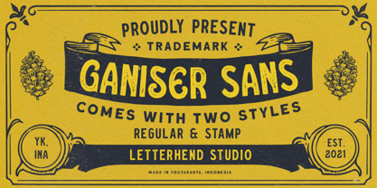 Ganiser Sans is a vintage display typeface with the touch of nostalgic feel. This typeface has unique looks and strong character. This font perfectly made to be applied especially in logo, and the other various formal forms such as invitations, labels, magazines, books, greeting / wedding cards, packaging, fashion, make up, stationery, novels, labels or any type of advertising purpose. Features : Uppercase & lowercase (alternates) Numbers and punctuation Stylistic alternates multilingual PUA encoded We highly recommend using a program that supports OpenType features and Glyphs panels like many of Adobe apps and Corel Draw, so you can see and access all Glyph variations.