10,000 search results
(0.025 seconds)
- Express Christmas by Seemly Fonts,
$14.00 Express Christmas is a simple lettered handwritten font. It can easily be matched to an incredibly large set of projects, so add it to your creative ideas and notice how it makes them stand out!
 - Doodle by WAP Type,
$15.00 Doodle is a cool and friendly display font. It can easily be matched to an incredibly large set of projects, so add it to your creative ideas and notice how it makes them stand out!
 - Anything Skribble by Crumphand,
$15.00 Hello, Introducing the new font "Anything Skribble" the font was very cute. Match for your doodling, Scribble motion and Etc. Good readability, good contour. What's Included ? Uppercase Lowercase Numerals Symbols Multilingual Supports. Thank you, Regards!
 - Nimble Bear by Seemly Fonts,
$14.00 Nimble Bear is a simple lettered handwritten font. It can easily be matched to an incredibly large set of projects, so add it to your creative ideas and notice how it makes them stand out!
 - Boldetton by Rockboys Studio,
$26.00 Boldetton is an elegant and bold script font. Fall in love with its incredibly versatile style and use it to create gorgeous wedding invitations, beautiful stationary art, eye-catching social media posts, and much more!
 - Basely Bagel by RA Studio,
$12.00 He is round. He is funny. He is Bagel font. It is perfect for eye-catching signs, posters, headers, product packaging, book cover, logotype, apparel design and etc. Display font Extended latin & Cyrillic 605 glifs
 - Mangarans by Raditya Type,
$13.00 Mangarans is a Modern Victorian Blackletter, which is combining modern and classic typography. It has a vintage feel, and as a result, it matches a wide variety of designs. Get inspired by its retro feel.
 - Bellarosse by Nissa Nana,
$26.00 Bellarosse is a delicate, elegant and flowing handwritten font. Get inspired by its authentic feel and use it to create gorgeous wedding invitations, beautiful stationary art, eye-catching social media posts, and cute greeting cards.
 - Bottania by Rockboys Studio,
$23.00 Bottania is an elegant and bold script font. Fall in love with its incredibly versatile style and use it to create gorgeous wedding invitations, beautiful stationary art, eye-catching social media posts, and much more!
 - Blocky by Garisman Studio,
$22.00 Blocky combines attractive curves with a fresh urban edge; delivering a stylish script which is guaranteed to add an eye-catching appeal to your logo designs, brand imagery, quotes, product packaging, merchandise & social media posts
 - Hot Sunday by Epiclinez,
$18.00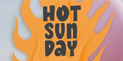 Introducing Hot Sunday, a fresh and playful font ideal for creative headlines. Whether you're designing a logo or crafting an eye-catching poster, this font will energize your designs with its fun personality. Thank You.
 - MGT Vallery Hills by Magetype,
$15.00 When I was surfing the internet, with rock n 'roll music. I accidentally found a picture of a hotel sign with a very unique style, namely: Mid-century Modern (MCM). It looks very pretty and charming to me. And inspired me to create Font Family. And I am proud to present the Vallery Hills Font Family. This font is in the Retro style of the 50s to 60s. Okay, here are the specifications. 1. Vallery Hills Schrift There is one unique thing about this font. Usually, script fonts with Retro style always have an angled anatomical shape, but I made this font upright. The goal is to make a difference with other script fonts I've seen. By the way, this font comes in two styles, namely: Regular and Bouncy. Why do I make it like that? Because I want to make this font into two different functions, namely: If you want to make it a Display Font, which is usually used for Headings, then use the Bouncy style. And if you want to use it as Bodytext, then use Regular. 2. Vallery Hills Sherift This second font is a font that is very synonymous with the Mid-century Modern (MCM) era. A very distinctive form of the serif font of that era. Similar to the first font, this font also has 2 styles, namely: Regular and Bouncy. You can combine this font with the other two fonts in Vallery Hills. It could be Title, or Bodytext. And you can also combine two styles, namely: Regular and Bouncy. Try! 3. Vallery Hills Suns Sherift This last font is Sans Serif. Also has 2 styles like his two brothers, namely: Regular and Bouncy. The goal is actually the same. I am sure you are cooler to create a design that uses this font family. Well, there is one advantage of this font from its two siblings, which is that it has a feature, namely: SMALLCAPS. Which will be an option when you are bored with the mediocre shape or style of Lowercase. Try combining the Smallcaps with Uppercase or Lowercase. Must be cool! : D Oops, almost forgot. This font consists of several font formats, namely: OTF, TTF, and Webfonts. And of course everything is MULTILANGUAGE. OK, friends. That's all I can describe about the Vallery Hills Family. Hopefully it will please all of you. Cheers!
 - Rakesly by Typodermic,
$- Are you looking for a typeface that exudes style and class? Look no further than Rakesly, the zesty compact grotesque headliner that’s sure to add some piquant charm to your message. Rakesly boasts well-balanced, charismatic letterforms that draw inspiration from a variety of late nineteenth-century and early twentieth-century sans-serif metal typefaces. Its upright styles feature tasty, cherry-picked features, while its italics draw upon the unique industrial essence of the Art Deco era. This stunning typeface is available in six weights and italics, including the wispy and delicate Rakesly Ultra-Light. Plus, Rakesly includes OpenType fractions and numeric ordinals, mathematical symbols, and a wide variety of currency symbols. For those who love a bit of texture in their designs, Rakesly also offers four grainy, letterpress texture styles called Rakesly Iron, which are available in Regular, Italic, Bold, and Bold Italic. And if you want to add a little extra spice to your typography, Rakesly even includes OpenType contextual alternates that automatically shuffle three letter/numeral variations for a more convincing effect. And if you’re a typography pro who likes to get hands-on, the Iron styles contain private use (PUA) encoding that lets you manually access alternate characters via a glyph table or character table. So why settle for a boring historical revival when you can add Rakesly’s peppery blend of classical elements to your typographic spice rack? Try Rakesly today and experience the rare flavor that only this typeface can provide. Most Latin-based European writing systems are supported, including the following languages. Afaan Oromo, Afar, Afrikaans, Albanian, Alsatian, Aromanian, Aymara, Bashkir (Latin), Basque, Belarusian (Latin), Bemba, Bikol, Bosnian, Breton, Cape Verdean, Creole, Catalan, Cebuano, Chamorro, Chavacano, Chichewa, Crimean Tatar (Latin), Croatian, Czech, Danish, Dawan, Dholuo, Dutch, English, Estonian, Faroese, Fijian, Filipino, Finnish, French, Frisian, Friulian, Gagauz (Latin), Galician, Ganda, Genoese, German, Greenlandic, Guadeloupean Creole, Haitian Creole, Hawaiian, Hiligaynon, Hungarian, Icelandic, Ilocano, Indonesian, Irish, Italian, Jamaican, Kaqchikel, Karakalpak (Latin), Kashubian, Kikongo, Kinyarwanda, Kirundi, Kurdish (Latin), Latvian, Lithuanian, Lombard, Low Saxon, Luxembourgish, Maasai, Makhuwa, Malay, Maltese, Māori, Moldovan, Montenegrin, Ndebele, Neapolitan, Norwegian, Novial, Occitan, Ossetian (Latin), Papiamento, Piedmontese, Polish, Portuguese, Quechua, Rarotongan, Romanian, Romansh, Sami, Sango, Saramaccan, Sardinian, Scottish Gaelic, Serbian (Latin), Shona, Sicilian, Silesian, Slovak, Slovenian, Somali, Sorbian, Sotho, Spanish, Swahili, Swazi, Swedish, Tagalog, Tahitian, Tetum, Tongan, Tshiluba, Tsonga, Tswana, Tumbuka, Turkish, Turkmen (Latin), Tuvaluan, Uzbek (Latin), Venetian, Vepsian, Võro, Walloon, Waray-Waray, Wayuu, Welsh, Wolof, Xhosa, Yapese, Zapotec Zulu and Zuni.
 - Mastadoni by Eclectotype,
$40.00 Mastadoni is a bold headliner/masthead typeface, with high vertical contrast in a Didone style. That's the starting point at least. There's much more to this font than another modern clone. It is a specialized (only one weight) typeface that comes in five optical grades. Use G1 at very large sizes and G5 at smaller sizes. The grades can be combined so that the thins of type set at different point sizes appear the same thickness - a very useful feature for magazine layouts. Optical grades could also be used in circumstances where a logo needs to be size-specific; the text on your bistro sign can afford to be more delicate than that on your coffee cups. This is a typeface with a big x-height, small cap-height and stubby ascenders and descenders, which contribute to an overall appearance somewhat different from must Didones, and make for some interesting layout possibilities in tight spaces. Mastadoni features a number of useful OpenType features. All fonts include standard ligatures and automatic fractions. In the discretionary ligature feature, you'll find the esoteric "percent off" glyph. Just type '%ff' with dlig engaged and there it is! Case-sensitive forms are available in all the fonts. The contextual alternates feature performs a subtle trick that resolves an optical illusion whereby two ascenders next to each other appear to be different heights. The Roman and Italic styles have a different group of stylistic sets as follows: Roman: SS01 substitutes a less decorative 4; SS02 is a different eszett; SS03 substitues the # with an attractive numero glyph; and SS04 gives an alternate K. Italic: SS01 and SS03 are the same as in the Romans; SS02 gives you more bulbous variants of v, w, and y letters; SS04 is a single storey g; SS05 changes C, G and S to non-ball-terminal varieties; and SS06 changes the swash versions of E, L, N and Q (when the swash feature is engaged). Speaking of the swash feature, the italic fonts feature swash capitals from A to Z, and swash variations for lower case h k m n v w and z. Lastly, the discretionary ligature feature in the italic fonts has vi, wi, KA and RA ligatures. Mastadoni is a typeface that would find itself immediately at home in glossy magazines, while offering a different aesthetic palette from the more standard choices of Didones.
 - Warugaki by Typodermic,
$11.95 Introducing Warugaki: a typeface that defies convention and eschews predictability. With a bold, untamed energy that is deeply rooted in mid-century Japanese style, Warugaki captures the essence of a bygone era while remaining firmly anchored in the present. But don’t be fooled by its seemingly disorganized appearance—this headline typeface is the result of a meticulous subtractive process that imbues each letterform with a sense of organic authenticity. The edge technique used is reminiscent of a handcrafted silk screen or wax dye resist, resulting in compact letterforms that exude a sense of raw, unbridled energy. But Warugaki is more than just a typeface—it’s an experience. With bespoke letter combinations and alternate letters in the lowercase position, each word you create with Warugaki is a unique expression of your own creative vision. No two designs will ever be the same, and that’s exactly the way it should be. So if you’re looking to break free from the constraints of traditional typography and embrace a more spontaneous, expressive approach to design, look no further than Warugaki. This is a typeface that will take your work to new heights, and leave a lasting impression on anyone who sees it. Most Latin-based European, Vietnamese, Greek, and most Cyrillic-based writing systems are supported, including the following languages. Afaan Oromo, Afar, Afrikaans, Albanian, Alsatian, Aromanian, Aymara, Azerbaijani, Bashkir, Bashkir (Latin), Basque, Belarusian, Belarusian (Latin), Bemba, Bikol, Bosnian, Breton, Bulgarian, Buryat, Cape Verdean, Creole, Catalan, Cebuano, Chamorro, Chavacano, Chichewa, Crimean Tatar (Latin), Croatian, Czech, Danish, Dawan, Dholuo, Dungan, Dutch, English, Estonian, Faroese, Fijian, Filipino, Finnish, French, Frisian, Friulian, Gagauz (Latin), Galician, Ganda, Genoese, German, Gikuyu, Greenlandic, Guadeloupean Creole, Haitian Creole, Hawaiian, Hiligaynon, Hungarian, Icelandic, Igbo, Ilocano, Indonesian, Irish, Italian, Jamaican, Kaingang, Khalkha, Kalmyk, Kanuri, Kaqchikel, Karakalpak (Latin), Kashubian, Kazakh, Kikongo, Kinyarwanda, Kirundi, Komi-Permyak, Kurdish, Kurdish (Latin), Kyrgyz, Latvian, Lithuanian, Lombard, Low Saxon, Luxembourgish, Maasai, Macedonian, Makhuwa, Malay, Maltese, Māori, Moldovan, Montenegrin, Nahuatl, Ndebele, Neapolitan, Norwegian, Novial, Occitan, Ossetian, Ossetian (Latin), Papiamento, Piedmontese, Polish, Portuguese, Quechua, Rarotongan, Romanian, Romansh, Russian, Rusyn, Sami, Sango, Saramaccan, Sardinian, Scottish Gaelic, Serbian, Serbian (Latin), Shona, Sicilian, Silesian, Slovak, Slovenian, Somali, Sorbian, Sotho, Spanish, Swahili, Swazi, Swedish, Tagalog, Tahitian, Tajik, Tatar, Tetum, Tongan, Tshiluba, Tsonga, Tswana, Tumbuka, Turkish, Turkmen (Latin), Tuvaluan, Ukrainian, Uzbek, Uzbek (Latin), Venda, Venetian, Vepsian, Vietnamese, Võro, Walloon, Waray-Waray, Wayuu, Welsh, Wolof, Xavante, Xhosa, Yapese, Zapotec, Zarma, Zazaki, Zulu and Zuni.
 - Selfie by Lián Types,
$37.00 ATTENTION CUSTOMERS :) There's a new Selfie available, have a look here; Selfie Neue is better done and more complete in every aspect. However, you can stay here if you still prefer the classic version. -But first, let me take a Selfie!- said that girl of the song and almost all of you at least once this year. While some terms and actions get trendy, some font styles do it too. It wouldn't be crazy to combine these worlds, in fact it happens often. Selfie is a connected sans serif based in vintage signage scripts seen in Galerías of Buenos Aires. These places are, in general, very small shopping centres which pedestrians sometimes use as shortcuts to get to other parts of the city. Their dark corridors take you back in time, and all of a sudden you are surrounded by cassettes, piercings, and old fashioned cloth. For some reason, all these shops use monolined geometric scripts. Surely, neon strings are easier to manipulate when letterforms have simple shapes. My very first aim with Selfie was to make a font that would serve as a company to those self-shot pictures that have become so popular nowadays. However, the font turned into something more interesting: I realised it had enough potential to stand-alone. Selfie proves that geometry itself can be really attractive. In this font, elegance is not achieved with the already-known contrast between thicks and thins of calligraphy, but with the purity of form. Its curves were based in perfectly shaped circles which made the font easy to be used at different angles (some posters show it at a 24.7º angle) without having problems/deformities. In addition to its nice performance when used over photographs, the font can be a good option for packaging and wedding invitations. TIPS Adding some lights/shadows between letters will for sure catch the eye of the viewer: Words will look as if they were made with tape/strings; so trendy nowadays. Try using Selfie at a 24.7º angle so that the slanted strokes become perfectly vertical. Having the decorative ligatures feature (dlig) activated is a good option to see letters dance. TECHNICAL It is absolutely recommended to use this font with the standard ligatures feature (liga) activated. It makes letters ligate perfectly and also improves the space between words.
 - Agmena Paneuropean by Linotype,
$103.99Agmena™ has no historical precursor; it was designed from scratch by Jovica Veljovi? whose aim was to create a new book typeface. Although it generally has certain similarities with the group of Renaissance Antiqua fonts, it is not clearly derived from any of these. Clear and open forms, large counters and a relatively generous x-height ensure that the characters that make up Agmena are readily legible even in small point sizes. The slightly tapering serifs with their curved attachments to letter stems soften the rigidity of the typeface, bringing Agmena to life. This non-formal quality is further enhanced by numerous tiny variations to the letter shapes. For example, there are slight differences to the terminals of the b", the "d" and the "h" and minor dissimilarities in the forms and lengths of serifs of many of the letters. The tittles over the "i" and "j" and those of the German umlauts are almost circular, while the diamond shape that is more characteristic of a calligraphic script is used for the punctuation marks. Although many of these variations are only apparent on closer inspection, they are enough to give Agmena the feeling of a hand-made typeface. It is in the larger point sizes that this feature of Agmena comes particularly into play, and individual characters gain an almost sculptural quality. The italic variants of Agmena are actually real cursives. The narrower and thus markedly dynamically formed lowercase letters have a wider range of contrast in terms of line thickness and have the appearance of having been manually produced with a quill thanks to the variations in their terminals. The lowercase "a" assumes a closed form and the "f" has a descender. The italic capitals, on the other hand, have been consciously conceived to act as a stabilising element, although the way they have been inclined does not produce a simply mechanical effect. This visual convergence with the upright characters actually means that it is possible to use letters from both styles in combination. Agmena is available in four weights: Book, Regular, Semibold and Bold, and each has its matching italic variant. Veljovi? designed Book and Regular not only to provide an optical balance between various point sizes, such as between that used for the text and that used in footnotes, but also to take account of different paper forms: Regular for lined paper and Book for publishing paper. Agmena's range of characters leaves nothing to be desired. All variants include small caps and various numeral sets with oldstyle and lining figures for setting proportional text and table columns. Thanks to its pan-European language support, Agmena can be used to set texts not only in languages that use the Latin alphabet as it also features Cyrillic and Greek characters. The set of standard ligatures has been extended to include special combinations for setting Greek and Serbian. Agmena also has some initial letters, alternative glyphs and ornaments. Agmena is a poetic text font with forms and spacing that have been optimised over years of work to provide a typeface that is ideal for setting books. But its letters also cut a good figure in the larger font sizes thanks to their individual, vibrant and, in some cases, sculptural effects. Its robust forms are not merely suited to a printed environment, but are also at home among the complex conditions on terminal screens. You can thus also use Agmena as a web font when designing your internet page."Agmena has received the Certificate of Excellence in Type Design at the Type Directors Club of New York TDC2 competition in 2013. - Pantera by Lián Types,
$39.00 ROARRR! THE STYLES -Pantera Pro is the most complete style, and although its default look is mono-rhythmic it gets really playful and crazy like the examples of the posters by just activating the Decorative Ligatures button in the Open-type Panel of Adobe Illustrator. However, I recommend using also the Glyphs Panel because there you'll find much more variants per letter. Pantera Pro is in fact, coded in a way the combination of thicknesses will always look fantastic. -Pantera Black Left, and Pantera Black Right are actually “lite” versions of Pantera Pro: They have very little Open-Type code, so what you see here is what you get. Pantera Black Left has its left strokes thick, while Pantera Black Right has its right strokes thick. -Pantera White is a lovely member in this family that looks lighter and airy, hence its name. With the feature Standard Ligatures activated (liga) the font gets very playful. -Pantera Caps is based on sign painters lettering and since it follows the same pointed brush rules as the other styles, it matches perfectly. -Pantera Claws like its name suggests, is a set of icons that were done by our dear panther. THE STORY It is said that typography can never be as expressive as calligraphy, but sometimes it can get close enough. I tend to think that calligraphic trials, in order to work well as potential fonts, need first to go through very strict filters before going digital: While calligraphy is synonym of freedom (once its rules are mastered), type-design, in the other hand, has its battlefield a little tighter and tougher. When I practice pointed brush lettering, there are so many things happening on the paper. And most of them are delicious. The ones who know my work may see that although many of my fonts are very expressive, my handmade brush trials are much more lively than them. With that in mind, this time I tried to go further and rescue more of those things that are lost in the process of thinking type when first sketches are calligraphic. I wondered if I could create something wild, hence its name Panther, by understanding the randomness that sometimes calligraphy conveys and turning it to something systemic: With Pantera, I created an ordered disorder. Like it happens a lot in many kinds of lettering styles, in order to enrich the written word the scribe mixes the thickness of the strokes and the width of the letters. Like one of my favorite mentors say (1), they make thoughtful gestures Some lively strokes go down with a thick, while some do that with a thin. Some letters are very narrow, meaning some of them will need to be very wide to compensate. Why not?. The calligrapher is always thinking on the following letters, and he/she designs in his head the combination of thicks and thins before he/she executes them. He/she knows the playful rhythm the words will have before writing them. It takes time and skill to master this and achieve graceful results. Going back to the font, in Pantera, this combination of varying thicknesses and widths of letters were Open-Type coded so the user will see satisfactory results by just enabling or disabling some buttons on the glyphs panel. I'm very pleased with the result since it’s not very easy to find fonts which play with the words' rhythm like Pantera does, following of course, a strong calligraphic base. I believe that if you were on the prowl for innovative fonts, this is your chance to go wild and get Pantera! NOTES (1) Phrase by Yves Leterme. In fact, it’s the title of a book by him. EPILOGUE Esta fuente está dedicada a mi panterita
 - Obviosa by Letterhend,
$16.00 Obviosa is a serif font that is both chic and modern. Its slim strokes create a sense of elegance that is perfect for upscale design projects. Whether you're creating a wedding invitation or a business presentation, Obviasa will add a touch of refinement and class. Features : Uppercase & lowercase Numbers and punctuation Alternates & Ligatures Multilingual PUA encoded We highly recommend using a program that supports OpenType features and Glyphs panels like many of Adobe apps and Corel Draw, so you can see and access all Glyph variations.
 - Mosaic SS by Sensatype Studio,
$15.00 Mosaic is a Modern Vintage Font A Serif Vintage font that we created special for classy branding needs, with extra ligature in unique and vintage shape add value of your brand. It's so nice to leverage designer or product owner that need solutions to make their design look more stylish and casual. Mosaic Modern Vintage font ready with: Lowercase and Uppercase characters Numbers and Punctuations Preview as a inspirations that you can do with Mosaic font Available for PC and Mac Wish you enjoy our font.
 - Noise Maker by Bogstav,
$15.00 Can noise be a beautiful sound? Well, I guess...because the other day when I was playing the good old Bleach album by Nirvana (which I consider lovely grunge music!) my wife yelled "Could you stop that noise?!" - and I answered "What noise?!" - ha-ha-ha! Anyway, I finished this font while listening to that particular lovely noise, and I knew that this crunchy, grungy, handmade and full of contextual alternates and multilingual font had to be named something with the word "noise" in it!
 - Flank Steak by Mysterylab,
$17.00 This duo of handlettered-style vintage Americana fonts is a versatile package that can not only provide that subtle secret sauce that transports the viewer back 60 or 70 years to the neighborhood grocery store, it's also capable of conjuring up a very forward-looking and relaxed modern vibe. Whether it's the extra bold mid-century signpainter style of the sans serif, or the quick-brush liveliness of the casual script, you'll find this versatile pair is a real go-to for a variety of great looks.
 - Aruna by Sensatype Studio,
$15.00 Aruna is a Modern Display Font A New font that we created special for Unique branding needs, with extra ligature in unique style, ready to add value of your brand. It's so nice to leverage designer or product owner that need solutions to make their design look more unique and casual. Aruna Modern Display font ready with: Lowercase and Uppercase characters Numbers and Punctuations Preview as a inspirations that you can do with Aruna font Available for PC and Mac Wish you enjoy our font.
 - Coconut Punch by Hanoded,
$10.00 Health Warning! Coconuts are not that healthy!! I always thought that coconuts were the new quinoa, but apparently they’re not that good for you. They are furry balls of saturated fat, sugar and calories, so don’t go all out with your coconut eating habits! Of course, eating a bit of coconut now and then will not kill you, so enjoy! Coconut Punch is a handmade didone-ish font. Nice and rounded and full of saturated brush strokes. Comes with all the diacritics you need too!
 - Walpurga by Julia Bausenhardt,
$28.00 Walpurga is a witchy display font that comes in two variants - regular & bold - and with four glyphs for each letter. There is a set of ornaments and the in-built open type features produce a random, natural looking effect when activated through the "contextual alternates" feature. Walpurga was created with stylized brush ends that become visible at larger font sizes. A fresh, versatile font that is usable for a wide range of design applications. Please activate Open Type Features to get the most out of this font.
 - Mesintwa by Ilhamtaro,
$14.00 MESINTWA is a font that is basically a classic serif font then to make it different from other serifs is to give the effect as if it were a letter on a letterpress machine, it will add a vintage impression because remembering that letterpress machines were the beginning of a printing press. To enable the OpenType Stylistic alternates, you need a program that supports OpenType features such as Adobe Illustrator CS, Adobe Indesign & CorelDraw X6-X7. Guides to access all alternates glyphs : http://adobe.ly/1m1fn4Y Cheers!
 - Aimeriga by Ilhamtaro,
$19.00 AIMERIGA is a vintage script font with fat features on its body, a font that is suitable for branding food, fashion or any brand that requires a vintage style. In addition to vintage, this font is also relaxed and casual and easy to process in layouts according to design needs. To enable the OpenType Stylistic alternates, you need a program that supports OpenType features such as Adobe Illustrator CS, Adobe Indesign & CorelDraw X6-X7. Guides to access all alternates glyphs : http://adobe.ly/1m1fn4Y Cheers!
 - XRoomingHouse by Ingrimayne Type,
$9.95 XRoomingHouse is a typeface of pictures that I did many years ago. Most of the pictures are border elements, and within a set they can be combined to make borders or frames. There is no real style consistency in the font—it is an eclectic collection of elements. (Minor corrections and additions were made in 2018 to improve sets that can form frames. For a more ambitious attempt at a font that can form frames, see Framealot). As for the name, boarders stay in a rooming house.
 - Spooky Monsta by Putracetol,
$28.00 Spooky Monsta is a spider web display font. This font is inspired by an old embossed nameplate with cobwebs in it. So I made it a font. This font has an uppercase and lowercase version that doesn't have a cobweb, so you can be more creative. In addition, this font has a ligature feature that makes the cobwebs of each word cooler. Spooky Monsta would be perfect for Logo, title, logotype, cover, headline, apparel, comic, cover books, cards, posters, or anything that requires a horrror or scarylook!
 - Heirley Script by Groen Studio,
$15.00 Heirley Script, it is that the smooth fonts brush that has a different style. This is the perfect choice for personal branding project. Can be used for various purposes.such as headings, logos, wedding invitations, t-shirts, letterhead, lable, news, posters, badges etc. To enable the OpenType Stylistic alternates, you need a program that supports OpenType features such as Adobe Illustrator CS, Adobe Indesign and CorelDraw X6-X7. The Features of this fonts is; Standart ligatures Stylistic Alternates Stylistic sets PUA Unicode (Private Use Areas) THANK YOU
 - Griftone by Neoflix Studio,
$22.00 Griftone is a strong and modernist display typeface designed for use in large size. Inspired by style design that is a currently popular. Griftone have some letters and ligatures with an alternative style to facilitate you in determining the letter that fits your design. Griftone is perfect use for headlines, poster, cover books, t-shirt, logotype and all you needs of every idea that you will pour in this modern era. Griftone was build 520 glyphs with numbers, punctuation, symbol and support +75 languages.
 - Aegiste by Flawlessandco,
$9.00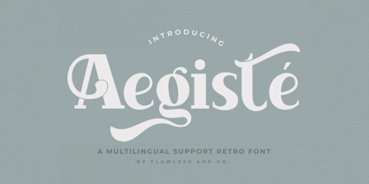 Aegiste is a Serif Retro Font with some font swashes that can add a touch of vintage to each letter. An Original typeface that suitable for any graphic designs such as branding materials, t-shirt, print, business cards, logo, poster, t-shirt, photography, quotes .etc This font support for some multilingual. Modern Serif Retro that contains uppercase A-Z and lowercase a-z, alternate character, numbers 0-9, and some punctuation. If you need help, just write me! Thanks so much for checking out my shop!
 - Deadfrog by Ilhamtaro,
$23.00 DEADFROG is a simple classic font, the base is a super bold serif font that is given a grunge texture effect, resulting in a vintage font, which is suitable for supporting designs related to the world of motorcycle custom. But it can also be used for other designs that require a vintage, bold design style, such as magazine headlines or posters. To enable the OpenType Stylistic alternates, you need a program that supports OpenType features such as Adobe Illustrator CS, Adobe Indesign & CorelDraw X6-X7. Cheers!
 - Javin by Flawlessandco,
$9.00 Javin is a Sweet Script Font with some font swashes that can add a touch of sweetness to each letter. An Original typeface that suitable for any graphic designs such as branding materials, t-shirt, print, business cards, logo, poster, t-shirt, photography, quotes .etc This font support for some multilingual. Modern Script that contains uppercase A-Z and lowercase a-z, alternate character, numbers 0-9, and some punctuation. If you need help, just write me! Thanks so much for checking out my shop!
 - Rossena by Flawlessandco,
$9.00 Rossena is a modern retro serif font that features unique alternate and ligature characters, so it's fitted for some retro project. An Original typeface that suitable for any graphic designs such as branding materials, t-shirt, print, business cards, logo, poster, t-shirt, photography, quotes .etc This font support for some multilingual. Modern Sweet Retro that contains uppercase A-Z and lowercase a-z, alternate character, numbers 0-9, and some punctuation. If you need help, just write me! Thanks so much for checking out my shop!
 - Carly by Flawlessandco,
$9.00 Carly Script is a handcrafted script that made with a modern and girly typeface, this style gives a feel of sweetness. An Original typeface that suitable for any graphic designs such as branding materials, t-shirt, print, business cards, logo, poster, t-shirt, photography, quotes .etc This font support for some multilingual. Modern Sweet Retro that contains uppercase A-Z and lowercase a-z, alternate character, numbers 0-9, and some punctuation. If you need help, just write me! Thanks so much for checking out my shop!
 - Chatarina by Flawlessandco,
$9.00 Chatarina is a Sweet Script Font with some font swashes that can add a touch of sweetness to each letter. An Original typeface that suitable for any graphic designs such as branding materials, t-shirt, print, business cards, logo, poster, t-shirt, photography, quotes .etc This font support for some multilingual. Modern Script that contains uppercase A-Z and lowercase a-z, alternate character, numbers 0-9, and some punctuation. If you need help, just write me! Thanks so much for checking out my shop!
 - Limited Edition by KA Designs,
$10.00 If you are looking for a versatile modern retro font, look no further! Limited Edition was designed to bring together modern design and that popular 1960's retro style that everyone loves. This font includes interlocking letter pairs that are sure to make all of your designs stand out! There are three styles available - Regular, Outline and Shadow. Layer all three to create your own custom design! Limited Edition is perfect for branding, logos, editorial, magazines, signs, print, t-shirt design, stickers and more!
 - Hangbird by Melvastype,
$35.00 Hangbird is a modern brush script with lots of alternate characters, swashes and underlines. It is very versatile and has many options for customization. You can build up words and phrases that suit your specific needs and liking. That makes Hangbird a good choice for logos, titles and lettering pieces. Hangbird has various alternatives for uppercase, several end swashes, connecting and non-connecting lowercase and options for ascenders and descenders. By altering these options you can have an end result that is almost like lettering.
 - Águila by Latinotype,
$29.00 Águila design is based on the combination of straight lines, curves and triangular shapes as well as on Didone typefaces. The font also has semi serifs— a notable characteristic that gives it a singular appearance. Águila was specially designed to be used as a display font for editorial design, packaging, branding, broadcasting purposes and for any project that requires a clean, modern font with a strong character. Águila comes with a set of more than 400 characters that support over 200 Latin-based languages.