10,000 search results
(0.07 seconds)
- Areon Flux by DePlictis Types,
$33.00 The future is right here, today, and Areon Flux comes to point that out. It’s a font family consisting in three weights that makes it a notable choice for designers that have to do with techy, futuristic layouts or printing materials. The lettering design appeal as sharp, powerful, distinctive and kind of modular, remembering the upcoming space exploration opportunities that are ready to enlarge our horizons in the next years. Areon Flux family is designed and published in late ‘20/ early ’21 and has an established discount for more that 30% for all the weights buyed together that makes it a versatile fresh and modern display not to be missed by edgy designers.
 - Minimela Tm by Mustafa Demirel,
$30.00 "It is hard to believe, but they won't be able to give up on us" The story of this font has started with a little suitcase actually. These characters were trying to do something for minimela kitchen which it named.After that, they looked that they was wanting to be that font beautiful writings written with it, belonging to it, special to it and reminding it to everybody. These cute monsters that have shaped themselves were a piece of a whole, of a little whole. They were totally believing to beautiful and long ways that have being waited them. They have given a sincere promise they will continue with little steps on that ways. "It is hard to believe, but they won't be able to give up on us" while telling this, we were totally talking about that
 - Megastina by Aqeela Studio,
$20.00 One of my favorite signature fonts is Megastina. It features a contemporary, natural, and fresh handwritten style that will give your ideal designs a special touch. This typeface is ideal for branding since it has a variety of choices that let you create a logo that is both feminine and masculine. It also includes a few markings that lend stiffness to the signature, emphasizing the organic feel of the handwriting.
 - Flottenheimer by PizzaDude.dk,
$20.00 Flottenheimer was done with a semi dry pen, that leaves the strokes quite rough. Some letters are more rough than other, giving a very realistic overall look to the text. To add more spice to the realistic look, I have added several versions of each letter. That means that there is 5 different versions of each letter that automatically cycles as you type! Packed with loads of accented characters!
 - Vanilla by Device,
$29.00 Two-flavour stripes feature in this geometric font that is reminiscent of the Deco styles that adorn seaside ice-cream parlours and arcades.
 - Ivy Ivy by Daylight Fonts,
$150.00 This is a groundbreaking font that combines Caslon Italic and script. You can achieve an advanced typography that is elegant, delicate and powerful.
 - Campuni by Identity Letters,
$29.00 A charming confidant. Italic, but without the slant. Campuni is a sans-serif typeface that can be described as an “upright italic”: its letters are modeled on the handwritten forms of italics—but without the slant. This gives Campuni a contemporary, charming, and trustworthy character. As with most modern sans-serif typefaces, Campuni’s design is based on low-contrast, almost monolinear strokes with a neat and clear appearance. This is where Campuni’s steep and tapered joints come in: with a bit of contrast, they provide the perfect foundation for a steady rhythm between characters—just like you’d find in meticulous handwriting. Careful spacing ensures that this rhythmic character is preserved on the page and on screen, making for a pleasant reading experience. It’s not just the letterforms that gain from Campuni’s calligraphic heritage, though. This typeface is packed with calligraphy-style swash capitals and end swashes on lowercase letters, as well as discretionary ligatures. These are available via OpenType, allowing you to spice up your logo or headline with a hint of calligraphy in a breeze. Despite its flawless legibility in body text, Campuni is definitely eye-catching in display sizes. (Decrease letterspacing for some additional punch.) Besides logo design, Campuni is a great choice for branding, advertising, packaging, corporate design, or even signage and wayfinding. The range of topics that Campuni excels in varies from food, leisure, retail, e-commerce, music, and travel to games, toys, childcare, and family-themed events. Campuni has got an Extended Latin character set, seven sets of figures, case-sensitive forms, arrows, and a few other advanced typographic features—622 glyphs in total. Its eight weights span from Thin to Black.
 - Neon Street by Ditatype,
$29.00 Neon Street is a captivating display font that takes inspiration from the dazzling glow of neon lights found on vibrant city streets. With its bold uppercase letterforms and neon-style inline elements, this typeface exudes energy and creates a visually stunning experience. Each letter is meticulously crafted with neon-inspired strokes that run through the center, adding a dynamic and luminous effect. This inline style brings a sense of urban excitement and nostalgia, evoking the vibrant atmosphere of neon-lit cityscapes. Inspired by the enchanting allure of neon signs, Neon Street infuses a sense of liveliness and modernity into each character. The font captures the captivating glow of neon lights, casting a radiant and vibrant hue that is both eye-catching and mesmerizing. This neon style adds a touch of urban energy, making the font truly stand out with its electrifying charm. The uppercase letter forms of Neon Street are bold and assertive, commanding attention with their distinctive design. Enjoy the various features available in this font. Features: Alternates Multilingual Supports PUA Encoded Numerals and Punctuations Neon Street is perfect for headlines, signage, logos, and any design that aims to make a bold statement with a touch of neon-inspired flair. This font will also inject your project with a vibrant and captivating element, whether you're creating posters, branding materials, digital artwork, or anything in between. Find out more ways to use this font by taking a look at the font preview. Thanks for purchasing our fonts. Hopefully, you have a great time using our font. Feel free to contact us anytime for further information or when you have trouble with the font. Thanks a lot and happy designing.
 - Misadventures by Typodermic,
$11.95 Are you tired of weak, puny fonts that lack the power and energy to really make a statement? Look no further than Misadventures, the font that’s all brawn and no nonsense. Whether you’re designing a fashion headline or any other type of message that needs to be heard loud and clear, Misadventures is the font for you. It’s action-packed, high-octane, and ready to inject some serious adrenaline into your designs. Don’t settle for weak, feeble fonts that leave your message feeling lackluster and uninspired. With Misadventures, you’ll have the power and energy you need to create designs that are truly unforgettable. Get your hands on Misadventures today and see just how energetic your designs can be! Most Latin-based European writing systems are supported, including the following languages. Afaan Oromo, Afar, Afrikaans, Albanian, Alsatian, Aromanian, Aymara, Bashkir (Latin), Basque, Belarusian (Latin), Bemba, Bikol, Bosnian, Breton, Cape Verdean, Creole, Catalan, Cebuano, Chamorro, Chavacano, Chichewa, Crimean Tatar (Latin), Croatian, Czech, Danish, Dawan, Dholuo, Dutch, English, Estonian, Faroese, Fijian, Filipino, Finnish, French, Frisian, Friulian, Gagauz (Latin), Galician, Ganda, Genoese, German, Greenlandic, Guadeloupean Creole, Haitian Creole, Hawaiian, Hiligaynon, Hungarian, Icelandic, Ilocano, Indonesian, Irish, Italian, Jamaican, Kaqchikel, Karakalpak (Latin), Kashubian, Kikongo, Kinyarwanda, Kirundi, Kurdish (Latin), Latvian, Lithuanian, Lombard, Low Saxon, Luxembourgish, Maasai, Makhuwa, Malay, Maltese, Māori, Moldovan, Montenegrin, Ndebele, Neapolitan, Norwegian, Novial, Occitan, Ossetian (Latin), Papiamento, Piedmontese, Polish, Portuguese, Quechua, Rarotongan, Romanian, Romansh, Sami, Sango, Saramaccan, Sardinian, Scottish Gaelic, Serbian (Latin), Shona, Sicilian, Silesian, Slovak, Slovenian, Somali, Sorbian, Sotho, Spanish, Swahili, Swazi, Swedish, Tagalog, Tahitian, Tetum, Tongan, Tshiluba, Tsonga, Tswana, Tumbuka, Turkish, Turkmen (Latin), Tuvaluan, Uzbek (Latin), Venetian, Vepsian, Võro, Walloon, Waray-Waray, Wayuu, Welsh, Wolof, Xhosa, Yapese, Zapotec Zulu and Zuni.
 - Boxajoy by PizzaDude.dk,
$20.00Boxajoy drawn with an inky pen and scanned at high resolution - that's why it looks good, even at large sizes! - Cheapside by Device,
$29.00 A condensed serif that’s been through the ravages of reproduction but has now been digitized for modern use. Elegantly wasted.
 - Crosshair by Burghal Design,
$29.00Unfortunately, Crosshair was inspired by the youthful craze that's all the rage: on-campus shootings. Put the gun down, Junior. - Casual Lunch JNL by Jeff Levine,
$29.00Casual Lunch JNL is a friendly, relaxed typeface that's perfect for headlines where legibility is important, but formality is optional. - Ameriondela by Maulana Creative,
$21.00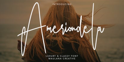 Give your designs an authentic handcrafted feel. "Ameriondela" is perfectly suited to stationery, logos and much more. Thanks for Watching!
 - HiH Firmin Didot by HiH,
$10.00 Before Bodoni, there was Didot. With the publication by Francois Ambroise Didot of Paris in 1784 of his prospectus for Tasso’s La Gerusalemme Liberata, the rococo typographical style of Fournier de Jeune was replaced with a spartan, neo-classical style that John Baskerville pioneered. The typeface Didot used for this work was of Didot’s own creation and is considered by both G. Dowding and P. Meggs to be the first modern face. Three years later, Bodoni of Parma is using a very similar face. Just as Bodoni’s typeface evolved over time, so did that of the Didot family. The eldest son of Francois Ambroise Didot, Pierre, ran the printing office; and Firmin ran the typefoundry. Pierre used the flattened, wove paper, again pioneered by Baskerville, to permit a more accurate impression and allow the use of more delicate letterforms. Firmin took full advantage of the improved paper by further refining the typeface introduced by his father. The printing of Racine’s Oeuvres in 1801 (seen in our gallery image #2) shows the symbiotic results of their efforts, especially in the marked increase in the sharpness of the serifs when compared to their owns works of only six years earlier. It has been suggested that one reason Bodoni achieved greater popularity than Didot is the thinner hairlines of Didot were more fragile when cast in metal type and thus more expensive for printers to use than Bodoni. This ceased to be a problem with the advent of phototypesetting, opening the door for a renewed interest in the work of the Didot family and especially that of Firmin Didot. Although further refinements in the Didot typeface were to come (notably the lower case ‘g’ shown in 1819), we have chosen 1801 as the nominal basis for our presentation of HiH Firmin Didot. We like the thick-thin circumflex that replaced the evenly-stroked version of 1795, possible only with the flatter wove paper. We like the unusual coat-hanger cedilla. We like the organic, leaf-like tail of the ‘Q.’ We like the strange, little number ‘2’ and the wonderfully assertive ‘4.’ And we like the distinctive and delightful awkwardness of the double-v (w). Please note that we have provided alternative versions of the upper and lower case w that are slightly more conventional than the original designs. Personally, I find the moderns (often called Didones) hard on the eyes in extended blocks of text. That does not stop me from enjoying their cold, crisp clarity. They represent the Age of Reason and the power of man’s intellect, while reflecting also its limitations. In the title pages set by Bodoni, Bulmer and Didot, I see the spare beauty of a winter landscape. That appeals to a New Englander like myself. Another aspect that appeals to me is setting a page in HiH Firmin Didot and watching people try to figure out what typeface it is. It looks a lot like Bodoni, but it isn't!
 - FS Olivia Paneuropean by Fontsmith,
$90.00Antwerp On a visit to Belgium and the Netherlands while still an MA student at Reading University, Eleni Beveratou made some important discoveries. First, there was the letter ‘g’ from the Didot family seen at Plantin Moretus Museum in Antwerp, which seemed “almost like a mistake”. Then there were strange details such as the serifs on the “l”, “h”, “k”, “b” and “d” in Egmont Cursive and other typefaces by Sjoerk Hendrik de Roos, found in volumes of poetry she picked up from a chaotic bookshop in Amsterdam. These were characters that stood out from the text but seemed to blend harmoniously with the rest of the letters. “And there it was, the spark. I decided to design a typeface that would capture the details of the process of writing.” A guiding hand Eleni shared her initial thoughts with Phil Garnham and Jason Smith. They liked what they saw in her tentative first sketches, and gave her the chance to develop her ideas further. Phil, in particular, provided valuable input as FS Olivia took shape. Eleni’s main influence – the handwritten – would give the font its character. “When creating a typeface,” says Eleni, “it’s fair to say that it reflects some of the designer’s personality. And that’s certainly the case with FS Olivia. “Although technology is part of my everyday life. I am a great admirer of traditional graphic design where you can touch and feel paper and ink.” Irregular “What I particularly like,” says Eleni, “is that a printed item can develop its own personality sometimes as a result of imperfections in the print. “FS Olivia has some of these characteristics as it’s inspired by handwriting, and yet it also includes some very modern features.” Feminine and fascinating, FS Olivia captures the expressive twists and turns of (the poet’s?) pen on paper, with low junctions, deep top serifs and semi-rounded edges. Round outstrokes contrast with the rough corners of the instroke, while strong diagonals and inclined serifs create a richly textured pattern. Polytonic It’s only fitting that there should be a version of this poetic font for one of the birthplaces of poetry and song. Eleni, who hails from Athens, developed an extensive range of glyphs that could be used for the Greek language, in both modern and ancient texts. For the latter, there is a version of Olivia for displaying polytonic Greek (a system that utilises a range of accents and “breathings”), which brings the 21st century technology of OpenType to the presentation of poetic texts from Ancient Greece. Just think what Homer could have done with that. - FS Olivia by Fontsmith,
$70.00 Antwerp On a visit to Belgium and the Netherlands while still an MA student at Reading University, Eleni Beveratou made some important discoveries. First, there was the letter ‘g’ from the Didot family seen at Plantin Moretus Museum in Antwerp, which seemed “almost like a mistake”. Then there were strange details such as the serifs on the “l”, “h”, “k”, “b” and “d” in Egmont Cursive and other typefaces by Sjoerk Hendrik de Roos, found in volumes of poetry she picked up from a chaotic bookshop in Amsterdam. These were characters that stood out from the text but seemed to blend harmoniously with the rest of the letters. “And there it was, the spark. I decided to design a typeface that would capture the details of the process of writing.” A guiding hand Eleni shared her initial thoughts with Phil Garnham and Jason Smith. They liked what they saw in her tentative first sketches, and gave her the chance to develop her ideas further. Phil, in particular, provided valuable input as FS Olivia took shape. Eleni’s main influence – the handwritten – would give the font its character. “When creating a typeface,” says Eleni, “it’s fair to say that it reflects some of the designer’s personality. And that’s certainly the case with FS Olivia. “Although technology is part of my everyday life. I am a great admirer of traditional graphic design where you can touch and feel paper and ink.” Irregular “What I particularly like,” says Eleni, “is that a printed item can develop its own personality sometimes as a result of imperfections in the print. “FS Olivia has some of these characteristics as it’s inspired by handwriting, and yet it also includes some very modern features.” Feminine and fascinating, FS Olivia captures the expressive twists and turns of (the poet’s?) pen on paper, with low junctions, deep top serifs and semi-rounded edges. Round outstrokes contrast with the rough corners of the instroke, while strong diagonals and inclined serifs create a richly textured pattern. Polytonic It’s only fitting that there should be a version of this poetic font for one of the birthplaces of poetry and song. Eleni, who hails from Athens, developed an extensive range of glyphs that could be used for the Greek language, in both modern and ancient texts. For the latter, there is a version of Olivia for displaying polytonic Greek (a system that utilises a range of accents and “breathings”), which brings the 21st century technology of OpenType to the presentation of poetic texts from Ancient Greece. Just think what Homer could have done with that.
 - Proprietor by Sudtipos,
$59.00 The great value of something crafted thoroughly by hand has been observed for years by Guille Vizzari throughout a wide spectrum of clients and projects developed at «Yani & Guille» —the studio he runs cheek by jowl with Yani Arabena—, and they both noticed that recently it has been taking on a new meaning. From barbers at their shops, to a barista that passionately prepares coffee every morning, or a bartender that deeply enjoys diving towards unknown ingredients, and even Guille’s admiration for sign painters worldwide that keep spreading their passion for the perfectly constructed letter. This wide trades universe, where craftsmanship represents a huge difference, is where «Proprietor» lives, and it’s the reason why it exists. «Proprietor» was born in a Moleskine notebook —just pencil, paper and ink— as a tribute to those crafts, and to regain the art behind Type Design that involves the fusion between tools, materials and the action of the hand. Fed by these principles, every single glyph within the whole «Proprietor» Family has been fully designed and illustrated by hand by its author (including all the ornaments, frames and crafts icons that can be seen along this specimen), showcasing Vizzari’s solid formation in the drawing field. Proprietor can be described as a compact type family system illustrated by hand, intended and designed to be able to create solid —but beautifully ornamented— paragraphs, and elaborate compositions. For this purpose, Proprietor Roman and Open displays a notorious x-height which goes perfectly with plenty of ornaments that unfold along the ascenders and descenders, but always containing its swashes inside the text line. The icing on the cake, Proprietor Script, a copperplate-based font unbelievably flooded with ornamented capitals, flourishes and endings to break through the coarse feeling of the Proprietor non-script sets, with a huge load of delicate and warm letterforms. Proprietor Wide and Wide Open hand a complete font set to complement the family for composing extended words in uppercase, matching in style and adding a striking personality. And as being part of Sudtipos’ catalogue «Proprietor» comes packed with full Open Type support —thanks to Ale Paul, fearless to tame this hand–drawn beast, supported by his vast knowledge in programming and optimization—. 7 imperfectly elegant and completely handmade fonts join the «Proprietor» system, bringing life to designs that are meant to represent the spirit of the genuine and skilled craftsmen, showing respect for their trade, and at the same time being part of it.
 - Sketchbook - Unknown license

- Baby Megista by IM Studio,
$15.00 Baby Megista is a calligraphic script font that comes with beautiful alternate characters. copper calligraphy mix in handlettering style. Designed to convey an elegant style. Baby Megista is attractive because it is subtle, clean, feminine, sensual, glamorous, simple and very easy to read. Its classic style is perfect to apply to all kinds of formal items such as invitations, labels, menus, logos, fashion, make up, stationery, letterpress, romantic novels, magazines, books, greeting/wedding cards, packaging, labels. Baby Megista has 304+ glyphs and 150 alternate characters. including multiple language support. It features OpenType with alternative styles, binders and character swashes, which allows you to mix and match letter pairs to suit your design, as well as a touch of ornamentation to make this font look elegant.
 - Garetra by Letterhend,
$17.00 Garetra Serif s a sophisticated serif with many weight you can choose. It has 4 weight styles which you can play around to match your project, whether for a standout headline, or for a tagline, you name it. Perfect to be applied to the other various formal forms such as invitations, labels, logos, magazines, books, greeting / wedding cards, packaging, fashion, make up, stationery, novels, labels or any type of advertising purpose. Features : uppercase & lowercase numbers and punctuation multilingual alternates & ligatures PUA encoded We highly recommend using a program that supports OpenType features and Glyphs panels like many of Adobe apps and Corel Draw, so you can see and access all Glyph variations. How to access opentype feature : letterhend.com/tutorials/using-opentype-feature-in-any-software/
 - Fargo Tuscan by Greater Albion Typefounders,
$20.00 Fargo Tuscan is the first of seven typefaces exploring the decorative possibilities of the Tuscan letter form, all of which are releasing in 2017. It’s the most European of the seven- it’s a Mid-Victorian inspired display face which would have been (and is) at home on either side of the Atlantic, unlike some of the others in this batch of Tuscan faces which are distinctly ‘trans-Atlantic’ (we know, that depends on your point of view but we are Greater ALBION Typefounders after all) in flavour. Fargo Tuscan is replete with decorative features, including Swash Capitals, alternate numeric forms and stylistic alternates ideal for the beginning and ending of words. Have some mid-Victorian mid-Atlantic fun with your next design project!
 - Carlony by Keristyper Studio,
$14.00 Carlony is a delicate, elegant, and flowing handwritten font. It has beautiful and well-balanced characters and as a result, it matches a wide pool of designs. Fall in love with its incredibly versatile style and use it to create spectacular designs. This font is good for logo design, Social media, Movie Titles, Books Titles, short text even a long text letter, and good for your secondary text font with sans or serif. Featured: Standard Uppercase & Lowercase Numeral & Punctuation Multilingual : ä ö ü Ä Ö Ü ß ¿ ¡ Alternate & Ligature PUA encoded We recommend programs that support the OpenType feature and the Glyphs panel such as Adobe applications or Corel Draw. so you can use all the variations of the glyphs. Hope you enjoy our fonts!
 - Scroll by Canada Type,
$24.95Earlier this year, my eyes fell upon a discarded wedding invitation on the sidewalk. A closer look at it revealed that it had at one point been victimized by rain. Some of the fancy script letters were not quite broken, but sort of melted and run-down, while the rest were still somewhat intact. That's how Scroll was conceived, as an idea for a script where thicks and thins blend to produce a wet appearance. Unlike most available broken scripts, the Scroll script was originally drawn in its own juiced context, and not based on any existing script. This font is great for atmospheric antiquity, deep natural poetry, still life captioning, gothic music posters and collateral, or horror literature and poetry covers. - Hyper Super by Bisou,
$15.00 Made in La Chaux-de-Fonds Switzerland, Hyper Super is born while the hyperdesigner Bisou watches "Blow up", a french film-lover show. This episode about Paul Newman quotes the 1969 movie "Winning". The Italian poster with the title "Indianapolis pista infernale" uses a striking handmade font that inspire Hyper Super, a very fast font. Hyper super is thought from ground up to give a strong impact and an impression of speed. Its retro 70’s car racing movies style makes it best suitable a dog race stadium. It works perfectly with short texts for advertisement like a tuning garage sign or delivery pizza menu. Just use it for your pizza restaurant and see Paul Newman in person apply for a delivery boy job.
 - Couturier Poster by Latinotype,
$29.00 Elegance flows through Couturier Poster soul. The new cousin of early launched Couturier, brings higher contrast and an extended family, perfect for big sizes. Inspired by the didones from the 18th century, its design its heavily influenced by contemporary ideas makes it suitable to use for almost anything you can think of. Equipped with swashes, ligatures, small caps and alternates, this typography is very versatile and allows you to set a big range of compositions with discretion or personality. Couturier Poster comes in six weights and matching true italics, from thin to black. It's a good choice to pair with Couturier for smaller sizes and Couturier Poster for the big titles. It has a set of 1248 characters that cover more than 200 languages derived from latin.
 - Nokia Expanded by Lone Army,
$10.00 Introducing "Nokia Expanded" - a bold and expansive font designed to capture attention. Inspired by the iconic Nokia brand, this typeface embodies a sense of reliability and modernity. With its bold strokes and expanded proportions, Nokia Expanded commands a strong presence in any design. The font's clean lines and geometric forms lend a touch of precision and sophistication, reflecting Nokia's commitment to quality and innovation. Ideal for various applications, including branding, advertising, and display graphics, Nokia Expanded ensures legibility and impact. Its bold and expansive nature makes it suitable for creating attention-grabbing headlines and eye-catching designs. Embrace the essence of Nokia with Nokia Expanded, a font that encapsulates reliability and modernity while adding a distinctive touch to your projects.
 - Misyalli by DonyaDesign,
$12.00 Misyalli is a romantic typeface, a bold, elegant & fun vintage script font. Can be used for various purposes such as logos, wedding invitation, t-shirt, letterhead, signage, news, posters, badges etc. View all glyphs here: http://s28.postimg.org/7osts7ezx/All_Glyphs.jpg To enable the OpenType Stylistic alternates, you need a program that supports OpenType features such as Adobe Illustrator CS, Adobe Indesign & CorelDraw X6-X7. How to get access alternate glyphs from open type fonts: http://youtu.be/iptSFA7feQ0 There are additional ways to access alternates/swashes, using Character Map (Windows), Nexus Font (Windows), Font Book (Mac) or a software program such as PopChar (for Windows and Mac). How to access all alternative characters, using Windows Character Map with Photoshop: https://www.youtube.com/watch?v=Go9vacoYmBw
 - Ollivette by Chank,
$59.00The new distressed typewriter font Ollivette is inspired by a beatnik poet sitting on a beach in Mexico pecking away at his brand new, imported, Italian portable typewriter in 1954. That's where the basic letterforms for this font hearken from. The grungey patina has been added over the years and is now available for you to download in font format. If you prefer the basic TrueType or PostScript versions, you'll enjoy a new standard retro typewriter style. Users of the advanced OpenType features will appreciate stylistic alternates for almost every letter, and contextual alternates for a randomizing organic effect. Support for Western & Central Europe? Yeah! We put that in there, too. So go global, and go vintage, here's a classic new type for you. - LiebeKitty by LiebeFonts,
$19.90 Do you like cats? We love them! Cats do so many crazy things, we thought it was time to design a font for cat lovers and their cat-loving friends. LiebeKitty is just right for greeting cards, birthday invitations and to add pretty details to your photo album. We have spent much time on cat-watching research and included over 50 cats and kittens for a wide range of creative applications. Happy cats, mad cats, bad cats, hungry cats, egyptian walk cats, and more. Plus‚ cats love fish, just like we do. Check out LiebeFish, one of our other popular fonts. And if you're looking for a typeface that perfectly fits the hand-drawn looks of LiebeKitty, check out LiebeErika, #1 Hot New Font in October 2010!
 - Armorel Script by Gatype,
$12.00 Armorel script is a romantic, bold, elegant and fun vintage script font. It can be used for various purposes such as logos, wedding invitation, t-shirt, letterhead, signage, news, posters, badges, and more. To enable the OpenType Stylistic alternates, you need a program that supports OpenType features such as Adobe Illustrator CS, Adobe Indesign & CorelDraw X6-X7. There are additional ways to access alternates/swashes, using Character Map (Windows), Nexus Font (Windows), Font Book (Mac) or a software program such as PopChar (for Windows and Mac). How to access all alternative characters, using Windows Character Map with Photoshop: https://www.youtube.com/watch?v=Go9vacoYmBw Need help? If you need help or advice, please contact me by e-mail "chaidirgata@gmail.com" Thank you for your purchase!
 - CRESTY Eighties by holyline design,
$19.00 Cresty Eighties is a retro condensed serif family with a modern touch. This font inspired by retro magazine and 80s handcrafted lettering.This font comes in 5 weight from regular to extra bold + variable support. Cresty Eighties designed with Stylistic Alternates and Ligature in some characters that allows you to mix and match pairs of letters to fit your design. Cresty Eighties perfect for headline, sub headline ,custom logo,packaging, quote, merchandise, sticker, badges,social media posts, label, album cover and anything for your creativity. Cresty Eightie is perfect font if you want something new with your project, you can play the 5 fonts style, and you can pairing this font with another font you like, its very satisfy. So happy creating!
 - Proda Sans by Nasir Udin,
$24.00 Meet Proda Sans, a humanist typeface with geometric construction inspired by the humanist-style sans serif faces that were popular in the mid 20th-century. Its calligraphic influenced letterforms have been adjusted to have geometric’s low-stroke-contrast for better legibility. The medium x-height give it a warm and delicate appearance, and keep your page bright. It's a family of nine weights plus matching italics. The thin and the black weights are great for display purposes. The light, book and regular weights are well suited for longer paragraphs and smaller texts. Proda Sans is developed for advanced typography needs. The OpenType fonts have an extended character set to support 200+ latin-based languages. For full presentation please visit my Behance post.
 - Bodihel by Sealoung,
$15.00 Bodihel is a cute and chunky charactered display font. Add this colorful and bold display font to each of your creative ideas and notice how it makes them come alive! Get inspired by its authentic feel and use it to create gorgeous wedding invitations, beautiful stationary art, eye-catching social media posts, and cute greeting cards. I highly recommend using a program that supports OpenType features and Glyphs panels such as Adobe Illustrator, Adobe Photoshop CC, Adobe InDesign, or CorelDraw, so you can see and access all Glyph variations. FEATURE: ALL CAPS We hope you enjoy the font, please feel free to comment if you have any thoughts or feedback. Or simply send me a PM or email me. Thank you!
 - Padlock by Letterhend,
$19.00 Padlock has nostalgic feel because of its vintage style, which would match well for projects with a retro or vintage theme. The swashes make this typeface unique so you can use it to create beautiful vintage lettering quickly and easily. Padlock is idea for invitations, labels, logos, magazines, books, greeting/wedding cards, packaging, fashion, make up, stationery, novels, labels or any type of advertising purpose. Features: Uppercase & Lowercase Numbers and Punctuation Multi-Lingual Support Ligatures Alternates Swashes PUA encoded We highly recommend using a program that supports OpenType features and Glyphs panels like many of Adobe apps and Corel Draw, so you can see and access all Glyph variations. Email us at letterhend@gmail.com if you need something! Happy Designing!
 - Credit Extension by Comicraft,
$19.00At Comicraft we're always looking for new ways to help our loyal customers get more bang for their buck. There are times when when the big financial institutions turn their backs on the average working Joe, but that’s why we want to help you restructure your finances, renegotiate your commitment to font purchases... We're here to help you stretch your dollars a little further. With that in mind, our latest release is twice as wide as our usual fare and will help you make it to the end of the month in ways other fonts won't! It’s not so much a bailout or a refi... It’s more of a credit extension. I wonder what we should call it? See the families related to Credit Extension: Credit Crunch. - Without Sans by W Type Foundry,
$30.00 Without Sans is a new geometric sans serif of 10 weights plus matching italics and alt family. It was designed by Felipe Sanzana and Diego Aravena, the founders of “Without Foundry”, in 2014/15. It is inspired by the geometric-style sans serif typefaces that were famous during the 50s. The fonts are based on the geometric forms with a mix of grotesque typefaces. The opentype fonts have an extended character set to support Central and Eastern European as well as Western European languages. It is perfectly suited for highlighting lettering, magazines, web, interaction design, advertising, logotypes, etc. Learn about upcoming releases, work in progress and get to know us better! On Instagram W Foundry On facebook W Foundry wtypefoundry.com
 - Holy Grail by Comicraft,
$29.00 GOOD GOD! You have circumnavigated the globe and chosen wisely...The Grail is FOUND! Oh... no, Zoot set light to our beacon, which I've just remembered is Grail-shaped. But wait, look! There! Carved in the wall... a Legend: "Here may be found the last words of Joseph of Aramathia: He who finds the Grail must face three, maybe four, challenges. First, the path of God; Second, the word of God; Third, the breath of God, and fourth is the Font of God. Only a font that is valiant, pure of spirit and includes international characters, both European AND Cyrillic -- may find the Holy Grail... in the Castle of AARRGGGHHH… That's all it says; the guy carving it must have died before he could finish.
 - Random But Perfect by Aldedesign,
$18.00 Random But Perfect is Nice Bold Script Font - A stylish and quirky new bold script. Random But Perfect font was created to look as close to a readable bold script as possible by including over a lot ligatures, titling, and swash. This font is for those who want to show something strong and modern. You may use this font if you want to attract modern buyers. The font design seems to show that you have a passion in the business and give your love to the products and services you are offered to customers. Because it is an eye-catching bold script font, you can use it for a variety of purposes including design, branding, signature, logo, poster, and many more.
 - Chiefland by Letterhend,
$17.00 Garetra Serif s a sophisticated variable serif font with with many weight you can choose. It has 12 weight styles which you can play around to match your project, whether for a standout headline, or for a tagline, you name it. Perfect to be applied to the other various formal forms such as invitations, labels, logos, magazines, books, greeting / wedding cards, packaging, fashion, make up, stationery, novels, labels or any type of advertising purpose. Features : variable font with 6 weight style regular and slant uppercase & lowercase numbers and punctuation multilingual alternates & ligatures PUA encoded We highly recommend using a program that supports OpenType features and Glyphs panels like many of Adobe apps and Corel Draw, so you can see and access all Glyph variations.
