10,000 search results
(0.124 seconds)
- Synchro by ITC,
$29.99Synchro is the work of British designer Alan Birch. It is a futuristic typeface, which reproduces the look of electronic display systems. Synchro is an excellent choice for situations that require a font with an advanced, high-tech appearance. - Midnight Sun by Hanoded,
$15.00 Midnight Sun, despite its rough look, was carefully painted. I used a very cheap brush with stuck-together bristles to get that ‘eroded’ look. Midnight Sun comes with double letter ligatures and some really cool stylistic alternates as well.
 - Gorthe by Letterena Studios,
$17.00 A serif modern and classic typeface that has its own unique style & modern look. This typeface is perfect for an elegant & luxury logo, book or movie title design, fashion brand, magazine, clothes, lettering, quotes, and so much more. **Uppercase
 - Bradlay by Sabrcreative,
$25.00 Discover the allure of exquisite script typography with the Bradlay Script Font. Infused with timeless sophistication, this typeface effortlessly captures the essence of graceful hand-lettering, making it an exceptional choice for projects that demand a touch of elegance.
 - Yodo by The Northern Block,
$12.80 A geometric typeface that combines elegant curves with precise angles. The contemporary nature of this font will compliment a wide variety of graphic design applications. Details include 3 weights, a full character set, manually edited kerning and Euro symbol.
 - Chisel Tip by m u r,
$15.00The evolution of letters is something obsessed over by graffiti writers and font fanatics alike. This font is authentic and can be used both by other graffiti writers as well as by people looking to create that particular style. - Titanium Motors by Monotype,
$29.99 There is almost no other font that conveys a sense of speed better than the bold but dynamic letters of Titanium Motors™ by Steve Matteson. Use this headline font to create exciting software titles, logos and user interfaces.
 - Giro by Suomi,
$25.00 I saw an old logo for Giro d'Italia on telly, and was just smitten by the truly ugly type: just ruler and compass work, no intakes or optical corrections whatsoever. I just had to turn that into a font.
 - Hi Ho Steverino NF by Nick's Fonts,
$10.00 Here's a hipster face that evokes the Beat era, taking its name from Louis Nye's catchphrase on "The Steve Allen Show." Both versions of this font support the Latin 1252, Central European 1250, Turkish 1254 and Baltic 1257 codepages.
 - Gods Must by Letterena Studios,
$17.00 A serif modern and classic typeface that has its own unique style & modern look. This typeface is perfect for an elegant & luxury logo, book or movie title design, fashion brand, magazine, clothes, lettering, quotes, and so much more. **Uppercase
 - Kiks by David Engelby Foundry,
$25.00 Kiks is the Danish name for biscuit. Just like a biscuit this font throws its crums in every direction with curvy, bold letters. A display font made for headlines and everything else that needs to be visually loud. Enjoy!
 - Slimpick by IbeyDesign,
$15.00 Slimpick Brush Stroke Font results out of a stunning pairing of a brush pen and pencil that makes it look incredibly endearing and authentic. Use this gorgeous and unique this handwritten font to bring any DIY project to life!
 - Gladis by Motokiwo,
$14.00 Gladis is a modern calligraphy font that has thin strokes and wide characters. A super stylish and elegant for branding purpose and also great for romantic projects. Gladis created with passion and designed to be a reflection of beauty.
 - Hair by URW Type Foundry,
$39.99 Hair is another beautiful URW++ FontForum contribution by Wojtek Ruhnau. It is a technically ambitious multi-line script-like type design that should be used carefully and in large sizes only. However, set properly, Hair renders beautifully and charmingly.
 - Roemisch by Linotype,
$29.99The Roemisch type family is a historic hot metal face with left slanted weights that is used for the german cartographic map production. There are also special typefaces required like the Venus type family and Topografische Zahlentafel type family." - Fairy Heart by Namara Creative Studio,
$9.00 Cute and lovely display font that comes with a unique style to make it suitable for any purpose, such as handicrafts, product packaging, quotes, product design, craftsmen, labels or any other projects which need a playful and lovely touch.
 - HU BlueoceanKR by Heummdesign,
$25.00 This is a headline typeface created by imagining the appearance of waves in a square glass tube. It is a typeface that adds a wave shape to the gothic style in a full square module. HU BlueoceanKR includes Korean.
 - Speedblur by Greater Albion Typefounders,
$12.00 Speedblur - the name says it all really! Want a display typeface that suggests speed and motion? Well this is it. Ideal for all those retro-future designs, anything streamlined or the boy (or girl) racer in all of us!
 - MBF Raveny by Moonbandit,
$19.00 Raveny is a high contrast modern display font by moonbandit, This typeface is a unicase font, meaning that the uppercase and lowercase has the same height. Raveny also comes with multilingual support and several alternates for you to explore.
 - Death Demon by Yoga Letter,
$15.00 "Death Demon" is a horror font that is very scary and full of mystery. This font is perfect for Halloween moments, movie titles, book titles, Halloween party invitations, and more. Equipped with uppercase, lowercase, numerals, punctuation, and multilingual support.
 - Single Tyne by Jonahfonts,
$35.00 A single top serif creates a modern look between serifs and a single weight font. SingleTyne contains short ascenders and descenders for tight line spacing designed as a display face that also works well for short sentences and paragraphs.
 - Leshy by ParaType,
$25.00An original volume decorative typeface that imitates broken stones. It was inspired by graffiti letterforms. Solid and inverted styles are available. Designed by Fedor Saveliev and Olga Ryabihina in 2003 and licensed by ParaType. For use in display typography. - Bagias by Letterena Studios,
$9.00 Bagias is a modern and classic sans serif font that features its own unique look. This typeface is perfect for elegant & luxurious logos, book or movie title designs, fashion brands, magazine covers, clothes, lettering, quotes, and so much more.
 - Colmena by ParaType,
$25.00 Colmena (means Beehive in Spanish) features soft viscous shapes and high contrast that resemble bees and honey. The font was entered into TypeArt Contest in 2005 under the name "FD_Harvey". Suitable for display purposes especially in books for children.
 - Delgos by Typebae,
$10.00 Delgos is a display font family. It is very suitable for logos, headlines, posters and various other designs that require an assertive touch. What's Included? 20 Font, 9 Weight Slanted & Outline All Caps, Numbers & Punctuation Multilingual Support PUA Encoded
 - Hawkes by Kimmy Design,
$15.00 Hawkes is an extensive handmade typeface family that comes with a bundle of weights, widths and styles, all designed to work cohesively. Here is a breakdown of the Hawkes family. Hawkes Sans: The primary subfamily is a sans-serif typeface that includes nine fonts: three weights (light, medium and bold) and three widths (narrow, regular and wide). Within this set are an array of stylistic features; including small capitals, character style alternatives, discretionary ligatures and contextual alternatives. See details below for more information on OpenType Features. Hawkes Variable Width Sans: The secondary subfamily is the same base sans-serif fonts but combined in variating widths. Essentially, it takes all three widths of each weight and randomly mixes them together. This creates a funky and creative alternative to the more traditional sans-serif set. The variations are for the uppercase, lowercase, small capitals, ligatures and numbers. Hawkes Script: The last subfamily is the script typeface. It’s a quirky script with variations of its own, including ligatures, swashes and contextual alternatives (again, see below for further details.) The script font works great as a complimentary style to the sans-serif, or on it’s own. FEATURES Alright, let’s get into all the extra goodies this typeface has to offer. Small Capitals: Small caps are short capital letters designed to blend with lowercase text. These aren’t just capital letters just scaled down but designed to fit with the weight of both the lowercase and capitals. With Hawkes, small caps can either sit on the baseline (in line with the base of the capital and lowercase) or to be lifted to match the height of the capital letters by applying the discretionary ligature setting in the OpenType panel. These small capitals have a dot underlining them that sit along the baseline. The feature offers a unique display affect that is great for logos, titles and other headline needs. Discretionary Ligatures: A discretionary ligature is more decorative and unique combination than a standard ligature and can be applied at the users discretion (as the name indicates.) The specific styling for these ligatures varies for different fonts. With Hawkes, they are used as an all capital styling feature, or to lift the small capitals to align with the height of the capitals. In the former setting, both lowercase and uppercase letters are first changed to all capitals, then a specialized set of letter combinations are transitioned so small characters are positioned within a main capital letter. These combinations only happen with main characters that include an applicable stem, such as C F K L R T Y. Some of these combinations include two or three characters. When Small Caps is turned ‘on’, this feature will lift the small caps to the height of the capital letter. For more information, please check out the user guide! Stylistic Alternatives: Stylistic alternates are a secondary form of a character, often used to enhance the look or style of a font. For Hawkes, these alternatives provide a slightly more handmade feel. A - the capital and small capital A will lose its pointed apex and become rounded. Think of it more as an upside-down U than an up-side-down V ;-) Oo, G, Ss, Cc- these characters’ topmost terminal becomes a loop. The O is applied automatically, the G S and C need to be turn on individually. Titling Alternatives: This feature does sort of the opposite of what it intends. Instead of being used for titling purposes, this feature makes the text look better in paragraph text settings. Kk Rr h n m - curved terminals on the are straightened e - the counter stroke also gets straightened from a more looping motion y - the shape of y is changed from a rounded character to a sharper apex (think more like a ‘v’ than ‘u’) Contextual Alternatives: Contextual alternates are glyphs designed to work within context of other adjacent glyphs. With Hawkes Sans, there are three slightly different variations per character. The feature rotates the application of each variation. This helps with organic authenticity, so if you have two e’s next to each other, they won’t look identical (reflecting the natural variations in handwriting and lettering.) With Hawkes Variable width fonts, I have created a contextual pattern that randomizes the widths of each character. So, when the feature is turned ‘on’ in the OpenType panel, the widths would alternate in a pattern such as: Narrow, Wide, Regular, Narrow, Regular Wide, Narrow, etc. It happens automatically so the user doesn’t have to think or worry about getting a random seed. With Hawkes Script, contextual alternates allow strokes to connect properly from one character to the next while maintaining a believable, natural flow. Connecting strokes are present for two letters next to each other but are replaced by a shorter stroke when located at the end of a word or sentence. Some characters have in-strokes when located at the start of a word. When a character is preceded by a capital letter that doesn’t connect, it too needs an in-stroke or altered spacing. This feature is complicated and messy, but luckily you don’t really have to think about it! I’ve done all the coding so all you have to do is turn ‘on’ the feature in the OpenType panel and you are off to the races! I’m just letting you know what’s happening behind the scenes. Swashes: These are just for Hawkes Script and provide tail swashes to the start and ends of letters. There are three different options. You can pick the basic option by turning ‘on’ the swash feature in the OpenType panel, or you can pick using the Glyph panel. Stylistic Sets: This feature work in new versions of Illustrator CC and InDesign CC. You can pick specific styling sets instead of turning on an entire feature. For example, let’s say you want to have a loopy S, but not a loopy C or O, you can just turn on the S in the Style Set. It also helps create the little drop box that pops up when you hover over a character, showing you the alternates associated with that character. This makes it easy to pick and choose specific styles you want in a word or headline. ---------- And there it is folks! That’s all the basic info on Hawkes, I know it’s been a lot and I appreciate you hanging on. If you are like me and need more of a visual reference to accessing all these goodies, I’ve made a user guide to help navigate Hawkes and everything it has to offer. Altogether this extensive family boasts 14 total fonts in a wide array of styles, weights and widths, making it a great addition to any handmade type collection. Enjoy!
 - Mr Eaves Modern by Emigre,
$59.00 Mr Eaves is the often requested and finally finished sans-serif companion to Mrs Eaves, one of Emigre’s classic typeface designs. Created by Zuzana Licko, this 2009 addition to the Emigre Type Library expands the versatility of the original Mrs Eaves with two complimentary families: Mr Eaves Sans and Mr Eaves Modern. Mr Eaves was based on the proportions of Mrs Eaves, but Licko took some liberty with its design. One of the main concerns was to avoid creating a typeface that looked like it simply had its serifs cut off. And while it matches Mrs Eaves in weight, color, and armature, Mr Eaves stands as its own typeface with many unique characteristics. The Sans version relates most directly to the original serif version, noticeably in the roman lower case letters a, e, and g, as well as in subtle details such as the angled lead in strokes, the counter forms of the b, d, p, and q, and the flared leg of the capital R, the tail of the Q. The distinctly loose-fitting letter spacing of Mrs Eaves was applied also to the Sans version. This, together with generous built-in line spacing due to a small x-height and extended ascenders and descenders, renders the same kind of lightness and airiness when setting text that is so characteristic of Mrs Eaves. Deviations from the original Mrs Eaves are evident in the overall decrease of contrast, as well as in details such as the flag and tail of the f and j, and the finial of the t, which were shortened to maintain a cleaner, sans serif look. And the lower case c had to be balanced out differently after it lost its top ball terminal. And with the loss of serifs, Mr Eaves set width is slightly narrower. Mr Eaves Italic also carries over many forms from its Mrs Eaves model, most notably the v, w, and z, which are unusually flamboyant for a sans italic design. It also utilizes lead in and terminal tails that are reminiscent of the serif italic. The biggest departure here is the width of the characters. The extra narrow gauge and delicate features seemed more appropriate for the Serif than the Sans. To allow for a comfortable fit, Mr Eaves Italic has a more robust design and wider character width. Meanwhile, the Modern family provides an overall less humanistic look, with simpler and more geometric-looking shapes, most noticeably in the squared-off terminals and symmetric lower case counters. This family has moved furthest from its roots, yet still contains some of Mrs Eaves’ DNA. The Modern Italic is free of tails, and overall the Modern exhibits more repetition of forms, projecting a cleaner look. This provides stronger differentiation from the serif version whenever a more contrasting look is desired. Each version (Sans and Modern) contains its own set of alternates providing unique options for applications such as headlines, word logos, letterheads, pull quotes, and other short text settings. Both the Sans and Modern come in six weights. The simpler forms of a sans-serif provide the opportunity of more weights than do serif letter forms, which are more complex in structure, making it difficult to accommodate additional weight without distortions. Regular and Bold match the original Mrs Eaves weights, while the Heavy provides an additional weight for extra emphasis.
 - Mr Eaves Sans by Emigre,
$59.00 Mr Eaves is the sans-serif companion to Mrs Eaves, one of Emigre’s classic typeface designs. Created by Zuzana Licko, this 2009 addition to the Emigre Type Library expands the versatility of the original Mrs Eaves with two complementary families: Mr Eaves Sans and Mr Eaves Modern. Mr Eaves was based on the proportions of Mrs Eaves, but Licko took some liberty with its design. One of the main concerns was to avoid creating a typeface that looked like it simply had its serifs cut off. And while it matches Mrs Eaves in weight, color, and armature, Mr Eaves stands as its own typeface with many unique characteristics. The Sans version relates most directly to the original serif version, noticeably in the roman lower case letters a, e, and g, as well as in subtle details such as the angled lead in strokes, the counter forms of the b, d, p, and q, and the flared leg of the capital R, the tail of the Q. The distinctly loose-fitting letter spacing of Mrs Eaves was applied also to the Sans version. This, together with generous built-in line spacing due to a small x-height and extended ascenders and descenders, renders the same kind of lightness and airiness when setting text that is so characteristic of Mrs Eaves. Deviations from the original Mrs Eaves are evident in the overall decrease of contrast, as well as in details such as the flag and tail of the f and j, and the finial of the t, which were shortened to maintain a cleaner, sans serif look. And the lower case c had to be balanced out differently after it lost its top ball terminal. And with the loss of serifs, Mr Eaves set width is slightly narrower. Mr Eaves Italic also carries over many forms from its Mrs Eaves model, most notably the v, w, and z, which are unusually flamboyant for a sans italic design. It also utilizes lead in and terminal tails that are reminiscent of the serif italic. The biggest departure here is the width of the characters. The extra narrow gauge and delicate features seemed more appropriate for the Serif than the Sans. To allow for a comfortable fit, Mr Eaves Italic has a more robust design and wider character width. Meanwhile, the Modern family provides an overall less humanistic look, with simpler and more geometric-looking shapes, most noticeably in the squared-off terminals and symmetric lower case counters. This family has moved furthest from its roots, yet still contains some of Mrs Eaves' DNA. The Modern Italic is free of tails, and overall the Modern exhibits more repetition of forms, projecting a cleaner look. This provides stronger differentiation from the serif version whenever a more contrasting look is desired. Each version (Sans and Modern) contains its own set of alternates providing unique options for applications such as headlines, word logos, letterheads, pull quotes, and other short text settings. Both the Sans and Modern come in three weights. The simpler forms of a sans-serif provide the opportunity of more weights than do serif letter forms, which are more complex in structure, making it difficult to accommodate additional weight without distortions. Regular and Bold match the original Mrs Eaves weights, while the Heavy provides an additional weight for extra emphasis.
 - Feuerfeste - Unknown license

- Farmhouse by Victory Type,
$20.00Farmhouse is a rustic serif typeface that was inspired by the woodcarved store signs on Main Street in a quaint little village nearby. Farmhouse is based upon the shapes of Baskerville but has a unique rustic character all its own. - Shpinoza MF by Masterfont,
$59.00 A practical font family with 5 weights for all your day by day design needs: headlines, body text, signage etc. High legibility at small sizes. An extended sans serif typeface with rounded endings that provides unique softness appearance without losing legibility.
 - Friendly Yellow by PizzaDude.dk,
$16.00 Friendly Yellow is my sketchy/scratchy handmade sans font. I've made several layers for you to play around with, in order to get that feel-good handmade-sketch-font-look! I've also added ligature substitution for the most common double letters
 - Crispy Orange by Bogstav,
$16.00 The other day, I ate an orange - and I absolutely love oranges! This one was perfect - juicy, sweet and crispy in a very delicate way. This font is also juicy, sweet and crispy and on top of that, organic and handmade!
 - Puffball by Open Window,
$- Puffball is a fat face with cartoonish features. It also wouldn't look out of place in an ancient Celtic engraving. What makes Puffball so intriguing to look at is that it seems to walk a thin line of buffoonery and ornamentation.
 - Strash by Sesa Grafika,
$15.00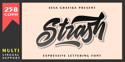 Strash is is designed with a natural expressive handwriting style. This font is perfect for Logo Branding, tshirt design, posters and so much more! Remember that the font is PUA encoded, meaning you can access all delightful glyphs and swashes effortlessly.
 - Akakios by Nantia.co,
$12.00 Akakios uppercase font is an adorable hand-made typeface with a lot of charisma. From “hand-written” quotes to product packaging, merchandise, and branding projects, this font is so versatile that it can cover them all. Greek character set included.
 - Ring Stag by Ochakov,
$14.00 It's important to realize that each of us is unique. I wish Ring Stag will emphasize it. Single but ready for anything. The new Ring Stag is bolder, more dynamic and masculine. New addition to the big family called Ring!
 - Radens by Almarkha Type,
$33.00 Introducing Radens Vintage Bold Script, Inspired by Modern Vintage & Retro style and combination with old american traditional style. that will fulfill your design needs for quotes,sporty theme, logotype, wordmark, etc. This has many opentype features and support multi language.
 - Catchye by MJType,
$25.00 Introducing catchye a captivating serif font that combines timeless elegance with modern flair. Its refined letterforms and balanced proportions make it perfect for logos, editorial designs, and packaging. Embrace Catchye’s allure and elevate your typographic compositions with sophistication and charm.
 - PR Swirlies 08 by PR Fonts,
$10.80 This font is a collection of simple calligraphic ornaments suitable for invitations, gift tags, and anything that can benifit from a "spoonful of sugar" visually. This font includes fewer line fillers, and more "ferns and fans" than our previous swirlies.
