10,000 search results
(0.04 seconds)
- Flirt by Canada Type,
$25.00It's a very happy day when we stumble upon beautiful alphabets that were never digitized. It is even a happier day when the beautiful alphabet finds its way to us through friends and people who like our work. Some two months ago, the forms of this gorgeous font were pointed to us by a friend who saw it in an old Dover Publications specimen book showcasing historical alphabets. It was there under the name Vanessa, with nothing else to go by. We looked and researched for further information but found nothing else. So this gem comes to you like a coal that winked its way out of the ashes because it wanted to shine again. Flirt is very authentic art deco with a noticeable element of artistic pride, swashy delicate majuscules and very aristocratic, fashionable and flirty minuscules. The majuscules can be used as every other capitals usually are, or as initial caps. The minuscules can very nicely stand on their own quite independently from the caps whenever desired. These letters are quite similar to the hand lettering used on of the kind of theater posters, specifically burlesque and opera entertainment, which are now considered very retro-chic and fashionable to see hanging on walls in home or office. The initial specimen we worked from showed a single basic art deco alphabet with numerals which seemed as they belonged to another font. That alphabet became the base Flirt font, the numerals were redrawn to fit much better with the minuscules, and the character set was greatly expanded to include punctuation, accented characters, and many many alternates, especially for the majuscules. Majuscules with a descending right vertical stroke were a common artistic touch in the high days of theater posters, so we thought they would be great additions to the character set. These alternates can be found all over the font. So to maximize the design fun, have a character map or glyphs palette handy when you use Flirt. After the base font was finished, we thought it would be a good idea to give it a bold treatment unlike anything seen out there, and the farthest thing from the mechanical bolds seen everywhere now. This bolding treatment consisted of thickening the lowercase's vertical strokes inwards, but leaving the horizontal stroke weight as is, and thickening only the thicker vertical strokes of the uppercase. The result is quite the visual feat. We encourage you to test both the regular and bold weights and see for yourself. - TF Hustler Blood by Teenage Foundry,
$19.00 TF Hustler Blood Graffiti Font - a unique and exciting design that is sure to add a splash of creativity to your projects! Our font features a monoline style that is complemented by a vibrant splash of paint, giving your designs a unique and eye-catching look. we've also included several alternative that are perfect for supporting the graffiti style. These alternative give you even more flexibility and allow you to create designs that are truly unique and individual. The monoline style gives the font a clean and modern look, while the splash of paint adds a touch of creativity and spontaneity. Features: Uppercase, Lowercase, Numeral, Punctuation & Multilingual. For any questions please contact me 🙂 Thanks!
 - Universal College by Fontscafe,
$39.00 If there is one Fonts Café specially-priced pack that deserves the title "TEAM" it's "Universal College." Together, these two vintage, college-style fonts: the original CLASSIC, and our latest "DRAFT" pick, are the no-sweat, first line players for all your varsity design challenges and goals. Classy enough for every sport, season or celebration, and casual enough for any campus clothing creation. "Universal College" typefaces are also available individually: our original classic version has the handcrafted, retro feel that Fonts Café best-selling typefaces are world famous for. "Draft" has the edge that designers worldwide have come to expect from fontscafe.com and that you can find in many of our other retro and vintage typefaces.
 - Mixa by Fontfabric,
$29.00 Neo-grotesque Sans Serif mixed with the classical handwritten Script in slanted geometric shapes - that’s the way Mixa was born. Those two faces of the new font family makes it as much as unique and recognizable. When you’re using the Capitals only nobody will suspect that there is script hidden in the lowercase. That’s why all eight weights can be combined perfectly with wide list of classical Sans Serif, Slab Serif and Serif typefaces. The font offers wide range of ligatures to ensure smooth readability and beautiful letter combinations. The decorative swashes in some of the Capitals presented as a stylistic sets give unique touch in any design. Mixa has it’s own style and personality, but without lacking of legibility.
 - Moving Message JNL by Jeff Levine,
$29.00 A vintage printer's cut for the masthead of the "Fed-O-Gram" (a monthly publication of the Farm Bureau Federation, Inc.) had its title set in letters that emulated a moving message board. This design formed the basis for what is Moving Message JNL.
 - Ring O Fire by Cool Fonts,
$24.00 Ring O Fire was inspired by a game I used to play where you suspend a coin over a glass with a paper napkin and take turns burning holes in the napkin with a cigarette until the coin drops. Is that weird or what?
 - VAG Rounded Next by Monotype,
$57.99 VAG Rounded Next brings a classic 1970s typeface up to date, keeping all of its easy going, approachable personality but adding some much-needed versatility and language support. Originally commissioned by Volkswagen, VAG Rounded remained in use by the company until the early 90s and has also been used by Apple, Skype and Myspace. Its enduring appeal lies in its appealingly rounded terminals, and its immediate, informal tone of voice. “When you look at the Volkswagen Beetle it has these curves that are timeless and legendary,” says Steve Matteson, who led the creation of VAG Rounded Next. “I think that's what stands out in this design – that friendly aesthetic, and the simple line and circle.” This new version offers 700 glyphs with pan European language support (including Greek and Cyrllic), as well as 10 weights of upright and italic styles. New display weights Shine and Rough – which create “chocolate popsicle” and “rust” effects – are begging to be used in branding, packaging and editorial projects, while the lighter weights are well suited for text. VAG Rounded Next Variables are font files which are featuring one axis and have a preset instance from Thin to Black.
 - FF DIN Round by FontFont,
$93.99 This welcome addition to FontFont’s most popular family brings a softness to FF DIN’s simplicity and industrial sterility. FF DIN Round is more than a “search-and-replace” rounded version of its predecessor. Albert-Jan Pool and his team redrew each letterform to maintain the structure of the original. This ensures FF DIN and FF DIN Round will work well together in logos, slogans, price tags, etc. as compatible parts of advertising campaigns and corporate identities. FF DIN Round is not only a good companion to FF DIN, its smooth and friendly curves make it work on its own for branding strategies for family cars, bikes, household appliances, sportswear, shoes, or medical products. It’s also very legible on screen. This FontFont is a member of the FF DIN super family, which also includes FF DIN.
 - Fifty Holliwing by Attract Studio,
$17.00 Fifty Holliwing is a modern classic serif font inspired by a classy eighties magazine with soft curves and a sharp eye for detail that makes it a must for any project that requires high-end. Fifty Holliwing also comes with an italic version that really helps with your designs as well as lots of unique alternatives and ligatures that are really versatile. Include: Regular & Italic Alternates & Ligatures OpenType support Multilingual PUA Encoded.
 - Art Lesson JNL by Jeff Levine,
$29.00The hand-lettered title of a vintage Walter Foster "how to draw" book inspired the Deco-influenced alphabet of Art Lesson JNL. Bold and retro in nature, this typeface gets the message across in a straightforward way, yet still has a bit of a casual feel to it. - Travel Brochure JNL by Jeff Levine,
$29.00 A vintage booklet from the Japan Tourist Bureau entitled "How to See Matsushima and Environs" had the title hand lettered in the Art Deco style which is the basis for Travel Brochure JNL. For those who prefer a more traditional 'E', it is located on the broken bar keystroke.
 - If This Be Doomsday by Comicraft,
$19.00 THE END IS NIGH! Judgment Day has come and this planet has been CONDEMNED! Do not conspire to hide what remains of your paltry world from my eyes! Know you not that NONE may thwart my will? Of what import are brief, nameless lives -- to DOOMSDAY?? Death is Certain! Apocalypse is UNAVOIDABLE. At last, my cosmic hunger will be sated, if only briefly! This planet shall SUSTAIN me until it has been drained of all elemental life! SO SPEAKS DOOMSDAY! But do not fret. Even if the Domesday Book has been closed on your planet... your utter destruction is being made available in Font form, I call it IF THIS BE DOOMSDAY, and I will deliver it to you via comicbookfonts.com in Regular, (Roach) Chew and Outline weights. Never let it be said that DOOMSDAY is without mercy. Features: Three weights (Regular, Chew & Outline) with small cap characters and Western & Central European international characters.
 - Kahfee by Nathatype,
$29.00 Introducing Kahfee, a mesmerizing display font that invites you into a world where artistry and elegance merge seamlessly. Kahfee takes its inspiration from the captivating aesthetics of Arabic script. In this font, you'll find that every letter is thoughtfully connected, creating a captivating rhythm that mimics the graceful dance of Arabic writing. The strokes and curves are a tribute to the centuries-old tradition of Arabic calligraphy. Kahfee fits in headlines, logos, posters, flyers, branding materials, print media, editorial layouts, and many more designs. Find out more ways to use this font by taking a look at the font preview.
 - Bewitched by Twinletter,
$12.00 BEWITCHED is a handwriting font that has a distinctive feel in its writing, use this font for your designs and make it easy for people to remember at first glance. so that they always remember the message in each of your designs This font is designed with a natural touch of handwriting which is refined to create a portion and composition that suits your needs. So this font is suitable for craft, children's writing, adventure posters, food banner titles, wedding invitations, product packaging logos, quotes, social media page covers, furniture banner headlines, book covers, and much more.
 - Duck Footprint by AaAAaAlena,
$10.00 This font looks like a natural gel pen handwriting. It supports both uppercase and lowercase Cyrillic and Latin alphabets, numeral, punctuation, symbols, currencies. The story of creating is short: I made a font that would support the concept of the website. And then it seemed to me that this font could have more uses, so I decided to share it. You can use it for any creative project, I’m not going to list examples not to limit you. I am sure that with this font you will convey the vibe you want. Just use imagination, and your masterpiece will look perfect)
 - Slimedunk by Mozatype,
$11.00 SLIMEDUNK is a sans serif display font, which contains 4 styles and It features a unique and modern sans serif. This font would be perfect for E-sport Logo, film posters, games, sports, and any project. It’s also perfect for that delicate look that you want in your invitations, poster Use this font for any crafting project that requires a personalized look! What’s Included : - Works on PC & Mac - Easy to use ( Installations ) - Compatibility Windows, Apple, Linux, Cricut, Silhouette, and Other cutting machines Thank you for purchasing this font. Please appreciate, if you like this. ENJOY it :)
 - Staple by Ajeet Mestry,
$50.00 Staple is a Display Font. Each letter and number is made up of a clever arrangement of staples. Together, they retain the simplicity and beauty of a perfectly folded stapler pin. This creates a font that provides very good readability, solid shape and simple elegance that makes it perfect for use as a display font. To add elegance to the font, the letters and numerals are designed to retain the pin identity across all characters. Care has been taken so that the pins do not overlap. Nor are the pins bent or twisted into unnatural shapes to create the characters.
 - Not Found by Gassstype,
$23.00 Hello Everyone, Introduce our new collection Font Not Found This is a Unique Display Font that is written casually and quickly.this a Authentic Style and classy style Inspired by famous logos of Technology and brands that have very strong characteristics, this font is great for your creative projects such as watermark on photography, and perfect for logos & branding, invitation,advertisements,product designs, stationery, wedding designs,label ,product packaging, special events or anything that need handwritting taste. Font Not Found has charming, authentic and relaxed characteristic more natural look to your text with a more natural look to your text.
 - Love Board by Sarid Ezra,
$13.00 Love Board, Handmade font with two weight! Love Board is a handmade font based in sans serif. With carefully crafted, this font have a hand lettering vibes that will make your design more natural and humanist. You can use this font for book cover, your t-shirt design, quotes, or even your letter! With two weight that compliment each other, this font will suitable for many projects. This font also support multilingual! Love, Sarid Ezra
 - Entog by Twinletter,
$12.00 This font offers beautiful abstract typographic harmony for a wide variety of design projects, including natural handwriting in digital form for designs, quote designs, for social media business designs, advertisements, trademarks, promotional banners, posts, posters, signatures, and all. the design requires handwriting or whatever design you want. This font is equipped with uppercase, lowercase, numbers, punctuation marks, swhases and several variations on each character including multi-language. This font is best suited for open type friendly applications. How to get alternative glyphs from open type fonts: http://adobe.ly/1m1fn4Y PUA Character Code - Fully accessible without additional design software. We hope you enjoy this font. Feel free to send whatever message you want to convey. Thank you Regards Twinletter
 - Protagonice by Invasi Studio,
$17.00 Designed by hand-drawn slab serif style font, Protagonice font comes in two varieties of regular and dotted textures. You can enhance your project with a retro-style using Protagonice Font. Ensuring carefully crafted styles result from the use of this font. Its imperfections keep it casual but allow it to still be legible. There is an incredibly wide range of uses for it, so give it a try and see how it inspires your creativity! It's ideal for headlines, flyers, posters, greeting cards, product packaging, book covers, printed quotes, logotype, and album covers, among other applications. Because this font is PUA encoded, you can easily access all of the glyphs and swashes!
 - Kazuwa by Scratch Design,
$9.00 It introduces a cute display font "Kazuwa". This font is complete with all punctuation and multi-languages support. Kazuwa also has a unique casual shape and looks like a natural kid handwritten, so this font will be perfect when applied to the fun concept design. This font will be useful for posters, name cards, books, comics, presentations, or packaging designs. Enjoy this font, it also supports multi-languages. In some features like stylistic alternates, we put some cute illustrations to make your design more cheerful. Features: Stylistic Alternates & Ligatures Numerals & Punctuation Accented characters Multiple Languages Supported HOW TO ACCESS ALTERNATE CHARACTERS Open glyphs panel: In Adobe Photoshop go to Window - glyphs In Adobe Illustrator go to Type - glyphs
 - Alexandra Gistela by Typebae,
$15.00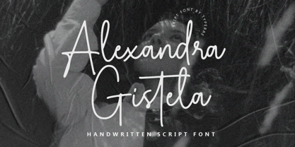 Alexandra Gistela is a stunning handwritten signature script font that exudes beauty and elegance. Alexandra Gistela is perfect for creating luxurious branding materials, wedding invitations, greeting cards, and other projects that demand a touch of refined beauty.
 - Shockproof by Haiku Monkey,
$19.00 Shockproof takes its inspiration from 1940s hand lettering. It's a display font that mixes elegance with a touch of informality. Great for use in identity, signage, posters, and anywhere that tall, cool typographic drink would be refreshing.
 - Aethuisty by Typebae,
$15.00Alexandra Gistela is a stunning handwritten signature script font that exudes beauty and elegance. Alexandra Gistela is perfect for creating luxurious branding materials, wedding invitations, greeting cards, and other projects that demand a touch of refined beauty. - Movest Outline by Jadatype,
$12.00 Movest is a display font that has a bubble style with fun graffiti's vibe. suitable for poster, branding, social media, products, advertisements, and so on. contains standard English letters, numbers, punctuation, and several accents that support multilingualism.
 - BAXAU by Twinletter,
$17.00 Baxau is a superhero-themed display font that brings strength, courage, and modernity to your projects. With a strong, bold, and bold style, this font is the perfect solution for creating an impressive and aggressive look. The Baxau font features letters that combine boldness with a modern twist, creating a fresh and energized look. Each character exudes undeniable power and charisma, delivering compelling and inspiring messages to your audience. With features such as ligature and alternate, Baxau provides unlimited flexibility and creativity. You can combine these font elements to create unique and exciting style variations. Multilingual support also allows you to use Baxau in multiple languages, so your project can reach a global audience. Baxau is the perfect choice if you need a font that is attractive, powerful, modern, and true to the superhero theme. With a strong message and features that give room for creative experimentation, this font will quickly grab the attention of your potential customers and make a memorable impression in no time. What’s Included : File font All glyphs Iso Latin 1 Alternate, Ligature Simple installations We highly recommend using a program that supports OpenType features and Glyphs panels like many Adobe apps and Corel Draw so that you can see and access all Glyph variations. PUA Encoded Characters – Fully accessible without additional design software. Fonts include Multilingual support
 - FS Kim by Fontsmith,
$80.00 Unconventional beauty FS Kim is bold and intriguing – exuberant and unmissable, but playing a supporting role when needed. This typeface shines brightest as a display font, and is perfect for applications across fashion, theatre, cultural projects and pretty much any brand that wants to make a statement. While FS Kim is dramatic, it’s incredibly versatile, too, and works to showcase content in a stylish, striking way. This font makes you look, and makes you curious – perfect for brands and publishers that relish unconventional beauty. A playful text version While FS Kim’s text version is more constrained than the display, the strength and playfulness remain. Modifications for the text version include larger x-heights, longer ascenders and descenders, wider proportions and spacing, longer and more defined serifs and a lower contrast. “The overall idea is that it’s not an optical size,” Radoeva explains. Text and display maintain a strong connection that mean they can be used together. A display with a twist The calligraphic starting point helped to create familiar forms, while a contemporary display feel is achieved through short wedge serifs, with bold touches added through the font’s exaggerated forms and details. FS Kim’s narrow proportions, short ascenders and descenders, and tighter spacing make the font suitably compact for display use. The overall aesthetic feels bold and sharp, but closer inspection reveals that all the corners are softened. Decorative inlines In an unusual twist, FS Kim’s display version was first drawn using a broad-nib pen to create familiar forms and elegance while still breaking from serif traditions and making it all about standout character. There are also two additional styles, based on the Regular and Black with inlines – in uppercase, figures and symbols. The inline brings an extra option for an even stronger, more decorative display use.
 - FS Kim Variable by Fontsmith,
$349.99Unconventional beauty FS Kim is bold and intriguing – exuberant and unmissable, but playing a supporting role when needed. This typeface shines brightest as a display font, and is perfect for applications across fashion, theatre, cultural projects and pretty much any brand that wants to make a statement. While FS Kim is dramatic, it’s incredibly versatile, too, and works to showcase content in a stylish, striking way. This font makes you look, and makes you curious – perfect for brands and publishers that relish unconventional beauty. A playful text version While FS Kim’s text version is more constrained than the display, the strength and playfulness remain. Modifications for the text version include larger x-heights, longer ascenders and descenders, wider proportions and spacing, longer and more defined serifs and a lower contrast. “The overall idea is that it’s not an optical size,” Radoeva explains. Text and display maintain a strong connection that mean they can be used together. A display with a twist The calligraphic starting point helped to create familiar forms, while a contemporary display feel is achieved through short wedge serifs, with bold touches added through the font’s exaggerated forms and details. FS Kim’s narrow proportions, short ascenders and descenders, and tighter spacing make the font suitably compact for display use. The overall aesthetic feels bold and sharp, but closer inspection reveals that all the corners are softened. Decorative inlines In an unusual twist, FS Kim’s display version was first drawn using a broad-nib pen to create familiar forms and elegance while still breaking from serif traditions and making it all about standout character. There are also two additional styles, based on the Regular and Black with inlines – in uppercase, figures and symbols. The inline brings an extra option for an even stronger, more decorative display use. - Nassim Latin by Rosetta,
$60.00 Nassim is a contemporary typeface for multilingual text-setting. With its lively texture and balanced rhythm, Nassim is a proven workhorse for a vast array of applications, from literature to the sciences, scholarly publications to contemporary news. Nassim Latin is stout in colour and resolute in its construction, standing up to the demands of long-form reading. But the heartiness that keeps it going is balanced with lively details: the asymmetric serifs and calligraphic modulation allude just enough to broad-nib flourishes to keep the reader alert and looking for what comes next. Nassim has always been ahead of the curve, bridging the distinct typographic traditions of Arabic and Latin without forcing the typographer into compromise. Nassim Latin offers upright and true italic styles across five weights, supporting more than 110 languages, and designed to pair harmoniously in multi-script settings with Nassim Arabic. Beyond that, it is equipped with smart OpenType features like small caps, case-sensitive punctuation, and a full palette of ranging numerals, fractions, and superior and inferior figures ensure that Nassim Latin is up to any task, be it print publications or delivering late-breaking online news.
 - Hawkes by Kimmy Design,
$15.00 Hawkes is an extensive handmade typeface family that comes with a bundle of weights, widths and styles, all designed to work cohesively. Here is a breakdown of the Hawkes family. Hawkes Sans: The primary subfamily is a sans-serif typeface that includes nine fonts: three weights (light, medium and bold) and three widths (narrow, regular and wide). Within this set are an array of stylistic features; including small capitals, character style alternatives, discretionary ligatures and contextual alternatives. See details below for more information on OpenType Features. Hawkes Variable Width Sans: The secondary subfamily is the same base sans-serif fonts but combined in variating widths. Essentially, it takes all three widths of each weight and randomly mixes them together. This creates a funky and creative alternative to the more traditional sans-serif set. The variations are for the uppercase, lowercase, small capitals, ligatures and numbers. Hawkes Script: The last subfamily is the script typeface. It’s a quirky script with variations of its own, including ligatures, swashes and contextual alternatives (again, see below for further details.) The script font works great as a complimentary style to the sans-serif, or on it’s own. FEATURES Alright, let’s get into all the extra goodies this typeface has to offer. Small Capitals: Small caps are short capital letters designed to blend with lowercase text. These aren’t just capital letters just scaled down but designed to fit with the weight of both the lowercase and capitals. With Hawkes, small caps can either sit on the baseline (in line with the base of the capital and lowercase) or to be lifted to match the height of the capital letters by applying the discretionary ligature setting in the OpenType panel. These small capitals have a dot underlining them that sit along the baseline. The feature offers a unique display affect that is great for logos, titles and other headline needs. Discretionary Ligatures: A discretionary ligature is more decorative and unique combination than a standard ligature and can be applied at the users discretion (as the name indicates.) The specific styling for these ligatures varies for different fonts. With Hawkes, they are used as an all capital styling feature, or to lift the small capitals to align with the height of the capitals. In the former setting, both lowercase and uppercase letters are first changed to all capitals, then a specialized set of letter combinations are transitioned so small characters are positioned within a main capital letter. These combinations only happen with main characters that include an applicable stem, such as C F K L R T Y. Some of these combinations include two or three characters. When Small Caps is turned ‘on’, this feature will lift the small caps to the height of the capital letter. For more information, please check out the user guide! Stylistic Alternatives: Stylistic alternates are a secondary form of a character, often used to enhance the look or style of a font. For Hawkes, these alternatives provide a slightly more handmade feel. A - the capital and small capital A will lose its pointed apex and become rounded. Think of it more as an upside-down U than an up-side-down V ;-) Oo, G, Ss, Cc- these characters’ topmost terminal becomes a loop. The O is applied automatically, the G S and C need to be turn on individually. Titling Alternatives: This feature does sort of the opposite of what it intends. Instead of being used for titling purposes, this feature makes the text look better in paragraph text settings. Kk Rr h n m - curved terminals on the are straightened e - the counter stroke also gets straightened from a more looping motion y - the shape of y is changed from a rounded character to a sharper apex (think more like a ‘v’ than ‘u’) Contextual Alternatives: Contextual alternates are glyphs designed to work within context of other adjacent glyphs. With Hawkes Sans, there are three slightly different variations per character. The feature rotates the application of each variation. This helps with organic authenticity, so if you have two e’s next to each other, they won’t look identical (reflecting the natural variations in handwriting and lettering.) With Hawkes Variable width fonts, I have created a contextual pattern that randomizes the widths of each character. So, when the feature is turned ‘on’ in the OpenType panel, the widths would alternate in a pattern such as: Narrow, Wide, Regular, Narrow, Regular Wide, Narrow, etc. It happens automatically so the user doesn’t have to think or worry about getting a random seed. With Hawkes Script, contextual alternates allow strokes to connect properly from one character to the next while maintaining a believable, natural flow. Connecting strokes are present for two letters next to each other but are replaced by a shorter stroke when located at the end of a word or sentence. Some characters have in-strokes when located at the start of a word. When a character is preceded by a capital letter that doesn’t connect, it too needs an in-stroke or altered spacing. This feature is complicated and messy, but luckily you don’t really have to think about it! I’ve done all the coding so all you have to do is turn ‘on’ the feature in the OpenType panel and you are off to the races! I’m just letting you know what’s happening behind the scenes. Swashes: These are just for Hawkes Script and provide tail swashes to the start and ends of letters. There are three different options. You can pick the basic option by turning ‘on’ the swash feature in the OpenType panel, or you can pick using the Glyph panel. Stylistic Sets: This feature work in new versions of Illustrator CC and InDesign CC. You can pick specific styling sets instead of turning on an entire feature. For example, let’s say you want to have a loopy S, but not a loopy C or O, you can just turn on the S in the Style Set. It also helps create the little drop box that pops up when you hover over a character, showing you the alternates associated with that character. This makes it easy to pick and choose specific styles you want in a word or headline. ---------- And there it is folks! That’s all the basic info on Hawkes, I know it’s been a lot and I appreciate you hanging on. If you are like me and need more of a visual reference to accessing all these goodies, I’ve made a user guide to help navigate Hawkes and everything it has to offer. Altogether this extensive family boasts 14 total fonts in a wide array of styles, weights and widths, making it a great addition to any handmade type collection. Enjoy!
 - Rover Pro by Fontforecast,
$24.00 Rover Pro is a hand painted font family that comes in 5 styles: Regular, Bold, Bold Shadow, Bold Rough and Extra. It was designed with retail in mind, but is also perfectly suited for other uses. The flat brush that was used to hand paint all 424 glyphs creates a nonchalant stroke that adds a personal touch and plenty of pizzaz to your design. Combine Rover Pro Bold Shadow with the Bold and Rough styles for more variety and beautiful designs. For extra fun Rover Pro Extra adds another 85 glyphs to play around with. All in all Rover Pro is a smashing painted font family for virtually every project. Rover Pro is PUA encoded. This means that all Rover Pro's characters are fully accessible via Character Map or Font Book (that come with your PC or Mac).
 - Mitigate by Typodermic,
$11.95 In the fast-paced world of journalism, time is always of the essence. That’s why we need tools that work as quickly as we do. And in the world of typography, Mitigate is the answer. Mitigate is the condensed slab-serif typeface that every designer needs in their arsenal. You see, in a world of broad and regular typewriter fonts, Mitigate stands out with its compact design that makes it perfect for fitting in more text in less space. But that’s not all. Mitigate also features two distressed styles, giving your text that authentic typewriter effect that readers love. And if you’re using OpenType-aware apps, you’ll appreciate the custom ligature combinations that make your text even more unique. So, don’t let your message get lost in a sea of words. Choose Mitigate and make your words stand out. Most Latin-based European writing systems are supported, including the following languages. Afaan Oromo, Afar, Afrikaans, Albanian, Alsatian, Aromanian, Aymara, Bashkir (Latin), Basque, Belarusian (Latin), Bemba, Bikol, Bosnian, Breton, Cape Verdean, Creole, Catalan, Cebuano, Chamorro, Chavacano, Chichewa, Crimean Tatar (Latin), Croatian, Czech, Danish, Dawan, Dholuo, Dutch, English, Estonian, Faroese, Fijian, Filipino, Finnish, French, Frisian, Friulian, Gagauz (Latin), Galician, Ganda, Genoese, German, Greenlandic, Guadeloupean Creole, Haitian Creole, Hawaiian, Hiligaynon, Hungarian, Icelandic, Ilocano, Indonesian, Irish, Italian, Jamaican, Kaqchikel, Karakalpak (Latin), Kashubian, Kikongo, Kinyarwanda, Kirundi, Kurdish (Latin), Latvian, Lithuanian, Lombard, Low Saxon, Luxembourgish, Maasai, Makhuwa, Malay, Maltese, Māori, Moldovan, Montenegrin, Ndebele, Neapolitan, Norwegian, Novial, Occitan, Ossetian (Latin), Papiamento, Piedmontese, Polish, Portuguese, Quechua, Rarotongan, Romanian, Romansh, Sami, Sango, Saramaccan, Sardinian, Scottish Gaelic, Serbian (Latin), Shona, Sicilian, Silesian, Slovak, Slovenian, Somali, Sorbian, Sotho, Spanish, Swahili, Swazi, Swedish, Tagalog, Tahitian, Tetum, Tongan, Tshiluba, Tsonga, Tswana, Tumbuka, Turkish, Turkmen (Latin), Tuvaluan, Uzbek (Latin), Venetian, Vepsian, Võro, Walloon, Waray-Waray, Wayuu, Welsh, Wolof, Xhosa, Yapese, Zapotec Zulu and Zuni.
 - Ewofi by Twinletter,
$12.00 We call this san serif font Ewofi This font is designed with attention to the uniqueness and harmony in its use, has a distinctive character in every word that is written using this font. not only that, but we also complete this font with ligatures and alternates that enhance visuals. This handwritten font is perfect for children’s magazines, drink banners, games, posters, beverage, outdoor events, thumbnails, food banners, cheerful writing, film titles, quotes, titles, logos, and various kinds of projects you need, of course, your various design projects will be perfect and extraordinary if you use this font because this font is equipped with a complimentary font family, both for titles and subtitles and sentence text. start using our fonts for your amazing projects.
 - Cheap Skit by PizzaDude.dk,
$11.00 It doesn’t take long to see that Cheap Skit is a super legible, easy going font. It is intended to be used where text needs to be clear and legible, but have certain amount of handmade energy. I’d say that products that has something to do with children (toys, clothes, games, posters …) or something organic, recipes, bookcovers …
 - Sforzando by PintassilgoPrints,
$19.00 Sforzando is a striking display font available in three variations. Each one is an all caps alphabet that brings two alternatives for each letter, amplifying your design choices. It comes with a small but handy set of alternates that help create that special, unusual touch. Vigorous and versatile, Sforzando is an excellent option for a wide range of applications.
 - Metromedium #2 by Linotype,
$29.00American graphic designer William Addison Dwiggins' (W.A.D. for short) first typefaces were the Metro family, designed from 1927 onward. The project grew out of Dwiggins' dissatisfaction with the new European sans serif typefaces of the day, such as Futura, Erbar, and Kabel, a feeling he expressed in his seminal book Layout in Advertising. Urged by Mergenthaler Linotype to create a solution for the problem, Dwiggins began a professional relationship that would span over the next few decades. The first Metro family typeface to be released was Metroblack, brought to market by Linotype in 1929 (Metroblack #2™ the only one of the two versions that Mergenthaler Linotype eventually put into production which is available in digital form). With more of a humanist quality than the geometric styles popular in Europe at the time, Dwiggins drew what he believed to be the ideal sans serif for headlines and advertising copy. Metroblack has a warmer character than the Modernists' achievements, and the type is full of mannered curves and angled terminals (Metroblack also has an astoundingly beautiful Q). The other weights of the Metro family, Metromedium #2™ and Metrolite #2™, were designed by Mergenthaler Linotype's design office under Dwiggins' supervision. Despite having been created more than three-quarters of a century ago, the Metro family types have aged well, and remain a popular sans serif family. Although spec'd less often than other bestsellers, like Futura, Metro continues to find many diverse uses. The typeface has appeared throughout Europe and the North America for decades in newspapers and magazines, and can even help create a great brand image when used in logos and corporate identity. Dwiggins ranks among the most influential graphic designers and typeface designers of the 20th Century. He has several other quality fonts in the Linotype Originals, including the serif text faces Electra™ and New Caledonia™, as well as Caravan™, a font of typographic ornaments." - Dupont Gothic by Hexagon Foundry,
$19.00 Dupont Gothic is a sleek and contemporary sans-serif font that embodies elegance, clarity, and modernity. With its clean lines, balanced proportions, and distinctive character, Dupont Gothic is a versatile typeface that can be used in many ways. The simplicity of Dupont Gothic lends itself to a wide range of applications. Whether used for headlines, body text, or branding, this font possesses a quality to effortlessly adapt to different design contexts. The font comes in 10 weights with matching oblique characters, 2 widths, and 2 style sets that ensure the endless combinations and possibilities.
 - Selebor by takoliko,
$10.00 Selebor is a slab serif font. Selebor inspired by the 80s and 90s vibe font. The font is perfect for you that want to create a project that have a retro feeling but not to old. it perfect for designing stickers, t-shirt, a food logo and design that used a smiley themed or vintage cartoon on it. Selebor can be used as a fun or a formal kind of project. It support multilingual language. It can easily be matched to your projects, and good for communicating your brands.
 - Hexaplex by Hipfonts,
$17.00 Hexaplex is a geometric and modern font that takes inspiration from the world of architecture and construction. The font is named after its six-sided shapes, which give it a hexagonal motif that is both distinctive and visually engaging. Hexaplex is designed to be versatile, making it an excellent choice for a range of abstract or experimental projects, from logos and branding to headlines and captions. Whether used on its own or paired with other fonts, Hexaplex is a unique and powerful choice for any design project that requires a modern and sophisticated touch.