10,000 search results
(0.027 seconds)
- Morris by HiH,
$10.00 Morris is a four-font family produced by HiH Retrofonts and based on the work of the very English William Morris. William Morris wanted a gothic type drawn from the 14th century blackletter tradition that he admired both stylistically and philosophically. He drew from several sources. His principal inspiration for his lower case was the 1462 Bible by Peter Schoeffer of Mainz; particularly notable for the first appearance of the ‘ear’ on the g. The upper case was Morris’s amalgam of the Italian cursive closed caps popular throughout the 12th through 15th centuries, a modern example of which is Goudy’s Lombardic Capitals. The gothic that Morris designed was first used by his Kelmscott Press for the publication of the Historyes Of Troye in 1892. It was called “Troy Type” and was cut at 18 points by Edward Prince. It was also used for The Tale of Beowulf. The typeface was re-cut in at 12 points and called “Chaucer Type” for use in The Order of Chivalry and The Works of Geoffrey Chaucer. Morris' objective is designing his gothic was not only to preserve the color and presence of his sources, but to create letters that were more readable to the English eye. ATF copied Troy and called it Satanick. Not only was the ATF version popular in the United States; but, interestingly, sold very well in Germany. There was great interest in that country in finding a middle ground between blackletter and roman styles -- one that was comfortable for a wider readership. The Morris design was considered one of the more successful solutions. Our interpretation, which we call Morris Gothic, substantially follows the Petzendorfer model used by other versions we have seen, with the following exceptions: 1) a larger fillet radius on the upper arm of the H, 2) a more typically broadpen stroke in place of the foxtail on the Q, which I do not like, 3) inclusion of the aforementioned ear on the g and 4) a slightly shorter descender on the y. We have included five ornaments, at positions 0135, 0137, 0167, 0172 and 0177. The German ligatures ‘ch’ & ‘ck’ can be accessed using the left and right brace keys (0123 & 0125). Morris Initials One and Morris Initials Two are two of several different styles of decorative initial letters that Morris designed for use with his type. He drew from a variety of 15th century sources, among which were Peter Schoeffer’s 1462 Mainz Bible and the lily-of-the-valley alphabet by Gunther Zainer of Augsburg. Each of the two initial fonts is paired with the Morris Gothic lower case. Morris Ornaments is a collection of both text ornaments and forms from the surrounding page-border decorations.
 - Exelancer Extra by Popskraft,
$9.00 Introducing the cutting-edge Excelancer Extra font, a modern masterpiece born from the rich heritage of classic sci-fi typography. Our inspiration? The boundless allure of outer space. And bestseller — the Excelancer font! https://www.myfonts.com/collections/exelancer-font-popskraft Excelancer Extra font is a harmonious blend of sleek, contemporary design, drawing from the timeless elegance of its predecessor. What sets Excelancer Extra apart is its captivating fusion of bold, ornate uppercase characters with meticulously crafted lowercase letters that maintain exceptional readability, even in extensive text. With Excelancer, you possess an all-encompassing font toolkit, designed to tackle every facet of forward-looking design. But that's not all. This font isn't just for intergalactic tales; it's also a striking choice for anything related to technology, innovation, progress, and even the world of sports. In essence, Excelancer embodies the pure essence of the future—an infusion of dynamism that knows no bounds!
 - Lily Stevan by Epiclinez,
$18.00 You know that feeling when you see something and you're like "Hey, I like this!"? Hopefully, Lily Stevan is that font. With its clean lines and playful design, it's perfect for fun little sayings, logos, and headlines. It's easy to use and will make your designs pop right off the page. Download Lily Stevan today! So what’s included : Basic Latin Uppercase and Lowercase Numbers, symbols, and punctuations Multilingual Support. Accented Characters : ÀÁÂÃÄÅÆÇÈÉÊËÌÍÎÏÑÒÓÔÕÖØŒŠÙÚÛÜŸÝŽàáâãäåæçèéêëìíîïñòóôõöøœšùúûüýÿžß PUA Encoded and fully accessible without additional design software Simple Installations Works on PC & Mac Thank You!
 - Black Scratch by Blankids,
$23.00 Hello, Are you looking for a strong bold font? Do you want of creating Something that stand out and inspire creativity, imagination, and endless fun? Wait no more, we will give you the best choice. Black Scratch a Strong Bold Font Black Scratch a Strong Bold Font, Inspiring from strong bold typography. This font is perfect for a design that makes it more attractive and playful. made with a very good level of aesthetics making this font suitable for book cover, poster, packging, merchandise, logotype and much more.
 - Peanut Square Layer by PizzaDude.dk,
$19.00 This is a font that will fit in the "hard to read section" because it may not be super legible at first sight - that is because of the negative space. But when you combine the two layers (Layer and Box) the letter suddenly appears very legible! Play around with your favourite colour palette while adjusting the transparency in order for the colours to blend, giving a really nice handcrafted look! You have 4 different versions of each letter to play around with and of course there is multilingual support!
 - Thima by Rosario Nocera,
$14.00 Thima is a display font inspired by the liberty style revisited to the present day, hence it is free from the canonical compositional standards that make up the majority of fonts. Its elegant shapes are available in two versions: solid and outline. Thima’s unique features are enhanced by the perfect fusion between irregular and fluid shapes that coexist with right angles. Despite being a display font, the lowercase version is suitable for short and long paragraphs of text, while for large titles the uppercase shows off all its potential.
 - Hip Hopper by Pink Broccoli,
$19.00 An offbeat typeface inspired by the lettering on an art poster by Patrick Owsley for the cartoon character Hoppity Hooper. This typeface goes beyond the basic opentype features you've seen (i.e. extended language character sets, stylistic alternate character variations, etc) and offers not only a ligature feature that automatically alternates between the Capitals & Lowercase (Alt Capitals) sets, but also a unique Contextual Alternates feature that enables an automatic alternating BOUNCING effect. All this piled into a single typeface with loads of personality, just waiting to be played with!
 - Kosumi by Thinkdust,
$10.00 Kosumi is an experimental display typeface. Its juxtaposition of thick and thin catches that gleam in your eye, and leads you by the hand out of your comfort zone with such ease that you'll never look back. Kosumi is comfortable in any of a thousand different places, looking brilliant on posters, and reigning supreme within magazine spreads. All you need to do is let is whisk you away. The eye-catching differences between thick and thin lines serve to capitalise your attention, ensuring your nicely laid out headline is truly the star of the show!
 - Starwall by Blankids,
$18.00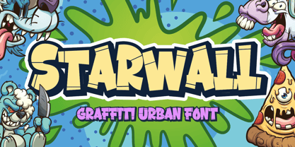 Hello, Are you looking for a graffiti urban font? Do you want of creating Something that stand out and inspire creativity, imagination, and endless fun? Wait no more, we will give you the best choice. Starwall a Graffiti Urban Font Starwall a Graffiti Urban Font, Inspiring from graffiti typography. This font is perfect for a design that makes it more attractive and playful. made with a very good level of aesthetics making this font suitable for book cover, poster, packging, merchandise, logotype and much more. FEATURES : Uppercase Lowercase Number Punctuation Multilingual PUA Encode Opentype
 - Santa Fe Spring by Haksen,
$21.00 Santa Fe Spring is a chic casual modern calligraphy script font. It is perfect for branding, signature, wedding invitation, promotion, product packaging, and other needs. You will get full set of lowercase and uppercase letters, numerals and punctuation, multilingual symbols, lowercase beginning and ending swashes, ligatures and extra swashes that giving realistic hand-lettered style. In order to use the beautiful swashes, you need a program that supports OpenType features such as Adobe Illustrator, Adobe Photoshop, Adobe Indesign and Corel Draw. Thanks and have a wonderful day, Haksen
 - Marviona by Arterfak Project,
$17.00 Brighten your day with Marviona, inspired by cute handwriting and casual-minimalist design. Crafted with monoline brush with the natural flow of the letterforms. This font has a bit bouncy layout that makes it looks more playfully! Marviona has sweet looks with a medium weight that you can apply for many themes and perfect for lovely quotes, headlines, logos, merchandise, books, bottle label, and short body text. Complete with OpenType features. Cheer up with Marviona! Fonts featured : Uppercase Lowercase Numbers Symbol and punctuations Stylistic alternates Ligatures Catchwords Swashes Multilingual Thank you for visiting.
 - Wonderbar 2 by Sharkshock,
$125.00 Wonderbar 2 is wacky, retro, and not to be taken too seriously. The wavy nature throughout the characters ensure that you're in for a wild ride. Alternating between upper and lowercase letters is like shifting gears. Uppercase characters take on a more undulating flow with stems that reach out to tickle you. Because of this slight overlap should be expected. In addition to Latin this childlike display font is equipped with Extended Latin for many European languages as well as Cyrillic. Try it in a children’s book, poster, or birthday invitations.
 - Ryo Text PlusN by Adobe,
$79.00Ryo is a Japanese kana typeface design composed of hiragana, katakana and some punctuation marks. Available in four weights--extra light, light, regular and medium, Ryo Text has been specifically designed for use when producing text settings. Supplied in the cross-platform OpenType format, this special kana font can be used to supplement or replace the existing kana designs in existing Japanese fonts that contain full character sets. Creative professionals using the Japanese version of Adobe InDesign may use that program's Composite Font tool to easily combine Ryo Text with other typefaces. - Japan Wave by Senekaligrafika,
$12.00 "Japan Wave" is a Japanese-style display font inspired by japanese calligraphy.This font is a handwritten font with a authentic japanese look and feel designed as unique as possible to create a beautiful and easy-to-read combination of sentences. This font is also very flexible for you to use in your various projects, ensuring that your project has a fantastic and appealing appearance that will be remembered by all audiences. Logotypes, food banners, branding, brochure, posters, movie titles, book titles, quotes, and more – may all benefit from this font. The owner of endless possibilities!
 - Chellomego by Haksen,
$19.00 Chellomego is a stylish modern handwritten script font with casual chic flair. It is perfect for branding, signature, wedding invitation, promotion, product packaging, and other needs. You will get full set of lowercase and uppercase letters, numerals and punctuation, multilingual symbols, lowercase beginning and ending swashes, ligatures and extra swashes that giving realistic hand-lettered style. In order to use the beautiful swashes, you need a program that supports OpenType features such as Adobe Illustrator, Adobe Photoshop, Adobe Indesign and Corel Draw. Thanks and have a wonderful day, Haksen
 - Goldwyre by Mofr24,
$11.00 Introducing Goldwyre, an extraordinary typeface meticulously crafted to captivate and inspire. With its seamless blend of elements from medieval to modern times, Goldwyre stands out as a truly unique font that embodies the essence of timelessness and elegance. Drawing inspiration from the intricate beauty of Gothic Blackletter and enriched with bold calligraphic strokes, this typeface exudes a mesmerizing charm that effortlessly bridges the gap between the past and the present. What sets Goldwyre apart from other typefaces is its ability to seamlessly combine medieval and modern aesthetics. By skillfully integrating the ornate and elaborate forms of Gothic Blackletter with contemporary design elements, Goldwyre offers a truly captivating typographic experience. This fusion of styles creates a font that is both classic and contemporary, making it an exceptional choice for projects that require a touch of sophistication and versatility. In addition to its captivating design, Goldwyre is available in two weights: regular and bold. The regular weight showcases the delicate intricacies of the typeface, while the bold weight accentuates its bold calligraphic strokes, adding a sense of strength and impact to any design. This versatility allows designers to explore a range of creative possibilities, whether it's designing eye-catching posters, compelling marketing materials, engaging titles, stylish T-shirt designs, or attention-grabbing headlines. Goldwyre is also a highly functional typeface, offering extensive multilingual support to cater to diverse audiences. It features a wide range of characters and diacritical marks, ensuring that it can effectively communicate in various languages and scripts. This broad language coverage expands the possibilities for global projects, making Goldwyre an excellent choice for international brands, publications, and design agencies. When conceptualizing Goldwyre, our design team aimed to create a typeface that harmoniously blends the grandeur of medieval typography with the sleekness of modern design. We wanted to pay homage to the rich history of typography while infusing it with a contemporary twist, resulting in a font that seamlessly integrates into both traditional and modern contexts. The deliberate fusion of styles and the meticulous attention to detail in Goldwyre's creation reflect our passion for typography and our commitment to delivering exceptional design solutions. Goldwyre was born out of a desire to provide designers and creatives with a captivating and stylish typographic solution that effortlessly merges the beauty of the past with the demands of the present. We believe that design is a powerful tool for self-expression, and with Goldwyre, we sought to empower designers to create visually striking and evocative designs that leave a lasting impression. Its timeless appeal and versatile nature make it the perfect choice for those who seek to elevate their projects and make a bold statement. Pairing Goldwyre with related families or other typefaces can further enhance its visual impact. It complements well with minimalist sans-serif fonts, such as Futura or Helvetica, providing a striking contrast between the intricate forms of Goldwyre and the clean lines of the sans-serif typefaces. This combination creates a harmonious balance, allowing designers to play with different aesthetics and create visually dynamic compositions. In conclusion, Goldwyre is more than just a typeface; it's a captivating journey through time. With its seamless blend of medieval and modern elements, extensive multilingual support, and versatile weights, Goldwyre empowers designers to create visually stunning designs across a wide range of applications. Whether you're designing posters, marketing materials, titles, T-shirt designs, or headlines, Goldwyre is the ultimate choice for those seeking to infuse their projects with a touch of timeless elegance and captivating beauty. Experience the magic of Goldwyre and unlock the true potential of your designs.
 - Scrapbooker by Sudtipos,
$29.00 After previously collaborating on the bestselling Distillery Set, Carolina Marando and Alejandro got together once again to create this Scrapbooker Set, a new series of fonts that multiply the possibilities. One reason scrapbookers became a kind of design demographic is the appeal of what they do. They make albums of memories, diaries composed of different elements that converge together to lead the viewer to a special moment in time. A paper, a photo, a letter, an event ticket, or a dry petal — everything ends up being part of a collage that tells a story. Words have a key role in such a collage. They use different shapes and forms and combinations to state what cannot otherwise be expressed. They make the collage stronger by clarifying a concept, defining an image, and solidifying a memory. These words for memory albums are the reason for this Scrapbooker Set, six different fonts with different impressions and different personalities — so each part of the memory can have its own identity. People tell you to write your own history. Now you can do that in style.
 - Endless Sunrise by Wing's Art Studio,
$10.00 A hand-made retro script font duo inspired by 80s action movies! This hand-made, retro styled script font was born from a childhood watching countless 80s action movies. Stories of inspirational heroism and competition, all set against impossibly beautiful Summer sunsets. And no self-respecting 80s movie would be without the coolest title design, setting the stage with a seemingly spontaneous glide of the designer’s brush. Endless Sunrise aims to capture this spirit through it’s loose, hand-drawn design and complimentary sans-serif. It comes with a complete set of alternatives and underlines for true customisation, meaning you’ll never have to repeat an E or an I; the tale-tell signs that give away other script fonts. It also features uppercase and lowercase characters, along with numerals, punctuation and language support. An awesome font that will work equally well across film, sports, music, merch and more! Find more from The Video Store Collection at Wingsart Studio
 - 99 Names of ALLAH Attached by Islamic Calligraphy75,
$12.00 We have transformed the “99 names of ALLAH” into a font. That means each key on your keyboard represents 1 of the 99 names of ALLAH Aaza Wajal. The fonts work with both the English and Arabic Keyboards. We call this Calligraphy "Attached" because the "alef" and "lam" are attached together. The first "Alef" has a "fatha", this indicates to pronounce the first letter. So instead of saying "R-RAHMAAN" you say "AR-RAHMAAN" (in the zip file you will find a pdf file explaining the differences in the "harakat", pronunciation & spelling according to the Holy Quran). You will also notice that the decorative letters in this font are bigger than usual, we also used the traditional "soukoun" instead of the "Quranic soukoun" & we were a little bit more generous than usual with the decorative symbols. Decorative letters used in this calligraphy: "Mim, Aain, Sin, HHe, He, Kaf, Alef, Tah & Saad". Purpose & use: - Writers: Highlight the names in your texts in beautiful Islamic calligraphy. - Editors: Use with kinetic typography templates (AE) & editing software. - Designers: The very small details in the names does not affect the quality. Rest assured it is flawless. The MOST IMPORTANT THING about this list is that all the names are 100% Error Free, and you can use them with your eyes closed. All the “Tachkilat” are 100% Error Free, all the "Spelling" is 100% Error Free, and they all have been written in accordance with the Holy Quran. No names are missing and no names are duplicated. The list is complete "99 names +1". The +1 is the name “ALLAH” 'Aza wajal. Another important thing is how we use the decorative letters. In every font you will see small decorative letters, these letters are used only in accordance with their respective letters to indicate pronunciation & we don't include them randomly. That means "mim" on top or below the letter "mim", "sin" on top or below the letter "sin", and so on and so forth. Included: Pdf file telling you which key is associated with which name. In that same file we have included the transliteration and explication of all 99 names. Pdf file explaining the differences in the harakat and pronunciation according to the Holy Quran. --------------------------------------------------------------------------------------------------------------------------- Here is a link to all the extra files you will need: https://drive.google.com/drive/folders/1Xj2Q8hhmfKD7stY6RILhKPiPfePpI9U4?usp=sharing ---------------------------------------------------------------------------------------------------------------------------
 - DIN 1451 by Linotype,
$40.99 DIN stands for Deutsche Industrienorm, German Industrial Standard. In 1936, the German Standard Committee settled upon DIN 1451 as the standard font for the areas of technology, traffic, administration, and business. The committee chose a sans serif font because of its legibility and easy-to-write forms. This font was not seen in advertisements and other artistically oriented uses, and there were disagreements about its aesthetic qualities. Nevertheless, this font was seen everywhere on German towns and traffic signs and hence made its way into advertisements because of its ease of recognition.
 - Embassy by Bitstream,
$29.99The English roundhand has always occupied the central position in the group of faces appropriate to the social printing handled by engravers, and their contemporary imitators, thermographers. At the end of the nineteenth century when engraving was mechanised by the pantographic engraving machine, the traditional roundhands found their way onto pantographic pattern plates. Embassy is a traditional roundhand of vigorous contrast with straightforward capitals with ball terminals; it was transferred from such an engravers’ pattern plate to the Fotosetter at Intertype about 1955. Alphatype’s Yorktown is similar, but appears to have less contrast. - Founder Christmas by Sealoung,
$15.00 Founder Christmas is an elegant script font, that features a very delicate and classy look. Not too thin and not too thick, balanced and varied, this font was designed to enhance the beauty of your projects.
 - Quick Poster JNL by Jeff Levine,
$29.00 A vintage poster from the British Columbia Forest Service on the subject of forest fire prevention provided the hand lettering that was the design model for Quick Poster JNL; available in both regular and oblique versions.
 - Cold Case JNL by Jeff Levine,
$29.00The unusual type design that comprises Cold Case JNL was modeled from a 1950s set of letter and number stencils manufactured by the Huntington Oil Cured Stencil Company of Huntington, NY (later relocating to South Florida). - Local News JNL by Jeff Levine,
$29.00 The hand lettered title for the 1954 film “Power of the Press” was done in a condensed sans serif type style that is now available digitally in both regular and oblique versions as Local News JNL.
 - Proband by SH Grafikdesign,
$25.00 The goal was to create a typeface that looks reputable and still original. Notably, some uppercase characters indicate this font its unique character. It is ideally suited for both body text and headings, or modern logos.
 - Proband Special by SH Grafikdesign,
$25.00 The goal was to create a typeface that looks reputable and still original. Notably, some uppercase characters indicate this font its unique character. It is ideally suited for both body text and headings, or modern logos.
 - Bodoni Ornamental by FontMesa,
$30.00 New for 2020 Bodoni Ornamental now has two italics to choose from, one basic italic and a second which is more of a true italic with a few uppercase letters that have been stylized. Only one italic can be style linked to the regular upright version so in the second italic we've added Avanti to the name which means forward in Italian. When purchasing the regular upright and Avanti italic together they will install as two separate families. Bodoni Ornamental is a revival of a very old typeface based on the Poster Bodoni letter shape. Giambattista Bodoni passed away in 1813, this decorative version was created in the 1820’s or 1830’s which was the time period when many of these ultra bold decorated type faces began to appear, the original artist is currently unknown. The original version of this ornate classic was only available as a set of uppercase letters, today over one hundred eighty years later this font is now complete with a new lowercase, numbers and accented characters for Eastern, Central and Western European countries. Due to the ornate detail in Bodoni Ornamental when printing itís recommended to use a laser printer 600dpi or greater, a 1200dpi printer will give you the best results rendering the most detail at the smallest possible point size for this font. Small home user Ink Jet printers are not recommended for Bodoni Ornamental unless you set the font to a very large point size. With Ink Jet printers much of the detail in the letters will bleed together as the ink hits the page, commercial Ink Jet printers such as GiclÈe printers may give good results. When using Bodoni Ornamental for digital images including web site graphics it may help to add a one pixel stroke fill around the letters setting color to white or grey, this may help the web site images display better on some computer's. You will need a photo editing application such as Adobe Photoshop to create your image adding the stroke fill and save as a jpg , png or gif file. I hope you enjoy this old font as much as I did making it. Note: When previewing the Bodoni Ornamental font in the Windows font preview you may notice some letters appearing lighter and some darker, this is a problem with the preview window and some ornate fonts, Bodoni Ornamental will print normal and not with mixed light and dark letters.
 - Khimany by Twinletter,
$17.00 Welcoming you to the dynamic and distinctive world of typography! A genuinely distinctive serif display typeface is Khimany. Khimany is the ideal option if you're seeking a bold and distinctive look for your numerous visual design tasks. What sets Khimany apart from other people? has incredible characteristics. Khimany provides you with the versatility to create distinctive and varied letter designs by making ligatures and alternates readily available. This is your chance to give each of your projects a unique touch. Khimany offers various languages since we realize how crucial it is to communicate with a worldwide audience. Your message will reach a global audience in a powerful and clear way with Khimany. So, are you prepared to differentiate your designs? Khimany is prepared to support your success. Get this font right away and see how Khimany can turn any of your projects into unforgettable works of visual art.
 - Hero Sandwich Combos by Comicraft,
$19.00 As comic book readers know all too well, team ups are every super hero’s bread and butter... when the brave and the bold are in a pickle, and super villains are running onion rings around them, here’s how they roll: They Meat! They Team-Up with your taste buds! They Fight Hunger! Yes, some hero combos may get along better than others, but they are always more powerful together. So take a footlong bite out of crime, and make the subways safe again with our mouthwatering HERO SANDWICH! Prepared with plastic gloves on by those awfully nice chaps at the Comicraft deli. If you're an avenging hero on the go, have no fear, we've pre-assembled these eight classic Hero Sandwich Combos! Because choosing your fillings shouldn't get in the way of knocking out a supervillain’s fillings. See these families related to Hero Sandwich Combos: Hero Sandwich Ingredients Hero Sandwich Pro
 - Alright, picture this: Zekton Free, a font that looks like it moonlights as a futuristic secret agent. Designed by the font wizard Ray Larabie, this typeface isn't just another font in the crowd. Oh ...
- billieBoldhand by JOEBOB graphics,
$- BillieBoldhand was written at once with a fat marker. That's all there's to it... Caps only.
 - Gaslon by Canada Type,
$24.95 Gaslon is a slight reinterpretation and major expansion of a 1973 film type called Corvina Black, originally designed for VGC by A. Bihari. While the original typeface was popular in its own right, there were some things in it that were too quirky to work in the display applications it was intended for. Some of the letter combinations just didn't work to their visual optimum. For example the a and o were too similar, ditto the C and G, the E, F and J were too overwhelming to be set properly within certain display uses. Gaslon eliminates these problems by the inclusion of plenty of alternates for the vast majority of the original letters. In fact, the original a is itself now an alternate to a gorgeous new one. The Gaslon Alt font includes tremendous possibilities for both unicase use, and proper use in conjunction with the main font. This is our true homage to a typeface that had great potential more than three decades ago, but was overlooked by digitizers because of a few quirks it had in film type contexts. Full of curves and invitation, Gaslon ranks very high among the friendliest poster faces ever made. It is ideal for friendly store signs, children book covers, and plenty of other applications. In fact, if you're planning on contributing to a few protests around your neighborhood or city, you would probably be better off using Gaslon to help your sign/placard carry words and slogans that are big but friendly. Nothing beats "DOWN WITH GAS PRICES" set in a nice imaginative mix of the many Gaslon letters. The OpenType version of Gaslon is a single font that contains all the alternates and niceties programmed within features accessible by OT-friendly programs.
 - Fairbank by Monotype,
$29.99Monotype Bembo is generally regarded as one of the most handsome revivals of Aldus Manutius' 15th century roman type, but the original had no italic counterpart. The story is told that Stanley Morison commissioned Alfred Fairbank, a renowned calligrapher, to create the first italic for Bembo, which was released as metal fonts in 1929. Alfred Fairbank, however, claimed that he drew the design as an independent project and then sold his drawings to Monotype. According to him, the statement has been made that I was asked to design an italic for the Bembo roman. This is not so. Had the request been made, the italic type produced would have been different." Whichever version you believe, it was obvious that Fairbank's design - while undeniably beautiful - was not harmonious with Bembo roman. A second, more conventional italic was eventually drawn and added to the Bembo family. Fairbank's first design, which was based on the work of sixteenth-century writing master Ludovico degli Arrighi, managed to have a modest life of its own as a standalone font of metal type. It never made the leap into phototype fonts, however, and the face could have been lost, were it not for Robin Nicholas, Monotype Imaging's Head of Typography in the United Kingdom, and Carl Crossgrove, a senior designer for Monotype Imaging in the US. Nicholas and Crossgrove used the original drawings for Fairbank as the starting point for a new digital design, but this was only the beginning. They improved spacing, added subtle kerning and optimized the design for digital imaging. In addition, Nicholas created an alternative set of lowercase letters, fancy and swash capitals and enough alternate characters to personalize virtually any design project. By the time his work was complete, Nicholas and Crossgrove had created a small type family that included Fairbank, a revived version of the earlier metal font, and Fairbank Chancery, a more calligraphic rendition of the design. An additional suite of ornate caps, elegant ligatures, and beginning and ending letters accompanies both fonts, as does a full complement of lowercase swash characters. Now, instead of a failed Bembo italic, Fairbank emerges in its true glory: a sumptuous, elegant design that will lend a note of grace to holiday greetings, invitations, and any application where its Italianate beauty is called for." - Copperplate Alt by Wiescher Design,
$39.50 Copperplate Alt is the sister font to Copperplate Wide. The »Alt« version stands for alternative and has lowercase letters that are slightly smaller than the uppercase. It gives you another possibility to use this elegant typeface. Your forever inventive type designer - Gert Wiescher
 - Baroque Grotesk by SilverStag,
$19.00 Introducing Baroque Grotesk, a font that seamlessly weaves the grace of baroque aesthetics into the structural simplicity of geometric shapes. It's a typeface that's as comfortable on the grandest stages as it is in contemporary digital spaces, embodying the essence of timeless design.
 - Penwrite JNL by Jeff Levine,
$29.00 The same 1935 piece of sheet music ("Along Tobacco Road") that yielded the multi-line lettering design for Deco Triline JNL has also provided lettering examples inspired by the writers' credits for what is now Penwrite JNL, in both regular and oblique versions.
 - Jesus Saves by Breauhare,
$13.94 Jesus Saves is a font based on the familiar old logo that has “JESUS” hidden within a maze-like set of multi-branched vertical bars. The characters appear to be an alien, cryptic language at first sight, perhaps even a Japanese, Chinese, or Korean language, thanks to the unusual figures created by the combinations of various letters. It is a teaser for the eyes, as well as a visual feast of De Stijl-type art. It is an attention-getting font that is cool to look at, an eye puzzle that is enticing to decipher. It’s a great font to use for striking logos (see Gallery Images) by the judicious use of ligatures, where in word settings ligatures may be used at the beginnings of words, the middle or the endings of words. Jesus Heals is the missing spaces from the Jesus Saves font, sort of like a doughnut hole font! If you use this font to fill in the spaces in the Jesus Saves font, it becomes whole, or healed, thus the name. Jesus Lives is a raised block/3D or three dimensional version of Jesus Heals. For color combinations in apps that support layering, Jesus Lives synchs and has perfect kerning register with Jesus Heals, as Jesus Heals has with Jesus Saves. The digitization was done by fontmeister John Bomparte.
 - Arturo by Hackberry Font Foundry,
$24.95 Arturo is a brand new font family drawn from the original inspiration of an old alphabet in one of Dan Solo 's Dover Clip Art books. It has moved far away from those raw roots, however. Every character has been redrawn. For example, I had a light version that I never could get working. Arturo is based on that light style and called Arturo Book. The name comes from a good friend of mine in El Paso. He was the guinea pig upon whom I foisted off the beginnings of this style so many years ago. I did several marketing pieces for him using the raw drawings. I figured that he deserved to have the family named after him, at the very least. This is a normal font family for me in that it has caps, lowercase, small caps with the appropriate figures for each case. This font has all the OpenType features in the set for 2009. There are several ligatures for your fun and enjoyment: bb gg ff fi fl ffi ffl ffy fj ft tt ty Wh Th and more. Like all of my fonts, there are: caps, lowercase, small caps, proportional lining figures, proportional oldstyle figures, & small cap figures, plus numerators, denominators, superiors, inferiors, and a complete set of ordinals 1st through infinity. Enjoy!
 - Marchioness by MKGD,
$13.00 Marchioness is a typeface that was built on the same basic structure as Lady Edith. I considered making it a subset of Lady Edith but felt that its overall appearance projected a uniqueness that allowed it to stand on its own. Although still maintaining a definite Art Deco form, it differentiates itself from its parent font by possessing a more opulent, if not regal, construction. The bones may be that of Lady Edith, but the typeface itself is most certainly Marchioness. There is no lower case for Marchioness as it is a decorative font. The Upper case version serves both the upper and lower case keys. Marchioness has a glyph count of 389 and supports the following languages; Supported Languages: Afrikaans, Albanian, Asu, Basque, Bemba, Bena, Bosnian, Catalan, Chiga, Colognian, Cornish, Croatian, Czech, Danish, Embu, English, Esperanto, Estonian, Faroese, Filipino, Finnish, French, Friulian, Galician, German, Gusii, Hungarian, Icelandic, Indonesian, Irish, Italian, Kabuverdianu, Kalaallisut, Kalenjin, Kamba, Kikuyu, Kinyarwanda, Latvian, Lithuanian, Low German, Lower Sorbian, Luo, Luxembourgish, Luyia, Machame, Makhuwa-Meetto, Makonde, Malagasy, Malay, Maltese, Manx, Meru, Morisyen, North Ndebele, Norwegian Bokmål, Norwegian Nynorsk, Nyankole, Oromo, Polish, Portuguese, Romanian, Romansh, Rombo, Rundi, Rwa, Samburu, Sango, Sangu, Scottish Gaelic, Sena, Shambala, Shona, Slovak, Slovenian, Soga, Somali, Spanish, Swahili, Swedish, Swiss German, Taita, Teso, Turkmen, Upper Sorbian, Vunjo, Walser, Zulu