10,000 search results
(0.026 seconds)
- Only You Icons by LeType,
$19.90 Only You Icons, with more than 300 options between icons, ribbons and frames that will make your project very attractive and romantic. Only You Icons is brilliant. Also available Only you Pro.
 - Moonthy by Skiiller Studio,
$20.00 Moonthy is a beautiful and elegant script font. It features more than 150 alternates that are PUA encoded. This gorgeous script is widely suitable for graphic designs and any other creative projects!
 - Kellvin by AEN Creative Studio,
$14.00 Kellvin is a fun and friendly display font, that can easily stand out. Simple but with a strong visual effect, this font will instantly make your creation more appealing than any others.
 - Katsudon by Hanoded,
$15.00 Katsudon is a Japanese crumbed and deep fried pork cutlet, typically served on rice with egg drizzled over it. There is also a chicken variety. I have been to Japan numerous times (it is my favourite country) and each time I revelled in the great variety of foods being served in street stalls and hole-in-the-wall eateries. I especially love the grandma-and-grandpa eateries that are tucked away in alleys behind the major shopping streets. They never speak English and my Japanese is shaky (to say the least), but the food is always good and we always seem to understand each other. This year, I couldn’t travel to Japan, because of the Covid outbreak, but I can tell you that I miss Japan a lot! Katsudon is a crumbed and deep fried font. It comes with a splash of authenticity, a sprinkling of cheekiness and a generous dose of oomph. Oh, yeah, and double letter ligatures, plus a few alternates as well.
 - Seminary by Solotype,
$19.95This began life as a European font that was copied in the United States by Bruce's Type Foundry in 1885. It was caps only and had a fine line "three-D" shadow. We scrapped the shadow, added a lower case, and voila! - Superstar by ITC,
$40.99Superstar was designed by Colin Brignall, who was inspired by American sportswear graphics during the process. The font is an inline sans serif that incorporates wedge-like cutouts instead of curves. Superstar is an excellent choice for design work related to sports activities. - Trustee by Look Minus Today,
$14.00 Trustee Modern Retro Bold Serif . That has a unique style & luxurious look. is great for logos, editorial, web design, craft projects, shirts, decoration, wedding invitations, packaging, stickers, social media, quotes, magazines and more!. The unique sharp serifs mixed with thin strokes give off a bold mid century architectural vibe. Trustee features: · Alternates And Ligatures · Uppercase And Lowercase · Numerals & Punctuation · Accented characters · Format File: OTF,TTF,WOFF,WOFF2 · Multilingual Support · Unicode PUA Encoded While using this product, if you encounter any problem or spot something we may have missed, please don't hesitate to drop us a message. We'd love to hear your feedbacks in order to further fine-tune our products. Thanks and have a wonderful day
 - Concrete Thick by Sohel Studio,
$16.00 Concrete Thick Modern Retro Bold Serif . That has a unique style & luxurious look. is great for logos, editorial, web design, craft projects, shirts, decor, wedding invitations, packaging, stickers, social media, quotes, magazines and more!. The unique sharp serifs mixed with thin strokes give off a bold mid century architectural vibe. Concrete Thick features: · 4 Weights font (Regular,Oblique,Bold,Thin) · Uppercase And Lowercase · Numerals & Punctuation · Accented characters · Multilingual Support · Unicode PUA Encoded While using this product, if you encounter any problem or spot something we may have missed, please don't hesitate to drop us a message. We'd love to hear your feedbacks in order to further fine-tune our products. Thanks and have a wonderful day
 - Menor by Twinletter,
$15.00 Menor is a graffiti font with a distinctive and appealing abstract shape that has a unique shape in each character, making this font appropriate for your outstanding project. This font also contains an alternation of enormous letters to beautify your project, so don’t wait. Use this typeface once more to create a lovely and stylish project. This graffiti font is great for product logos, poster titles, headlines, packaging, film titles, logotypes, gorgeous writing, and trendy graffiti designs, among other things. Of course, if you utilize this font in your numerous creative projects, they will be perfect and outstanding. Use this typeface right away for your one-of-a-kind and remarkable projects.
 - CoolKids by SevenType,
$29.99 CoolKids was inspired by the song “Signs of Life” by Arcade Fire. Since the lyrics talk about some cool kids we wondered what a typeface with the name cool kids would look like. We immediately knew it had to be laid back yet bold and to stand out from the crowd. After designing the bold script we decided to include a light, regular and medium weight to offer you more options for your designs. It comes with initial and final alternates, that show up automatically, to make it feel more natural and similar to handwriting. Every character was carefully drawn and connections are real smooth. This casual font-family speaks most Latin languages, both in their basic and alternate forms. CoolKids is great for creating logos, packaging, posters and much more. More important than to create a font is to use it… so now it’s up to you to create something awesome with it. Feel free to share your designs with us via email to hi@seventype.com We would love to see and share them with the world!
 - Potato by ŁUBUDU,
$20.00 The Potato font was made using a technique everyone probably knows from childhood - the letters were cut out from a potato which was used as a stamp. It was designed for my cook book. One of its best features is OpenType Contextual Alternates that will automatically replace each glyph with it alternate characters.
 - Architype Van Doesburg by The Foundry,
$99.00 Architype Konstrukt is a collection of avant-garde typefaces deriving mainly from the work of artists/designers of the inter-war years, whose ideals have helped to shape the design philosophies of the modernist movement in Europe. Due to their experimental nature character sets may be limited. Architype Van Doesburg derives from the 1919 experimental geometric alphabet by Theo van Doesburg, whose work was heavily influenced by De Stijl theories, specifically rectangularity. The typeface has been constructed on the same 5 x 5 grid, and is limited by his ‘single alphabet’ theory.
 - Architype Schwitters by The Foundry,
$99.00 Architype Konstrukt is a collection of avant-garde typefaces deriving mainly from the work of artists/designers of the inter-war years, whose ideals have helped to shape the design philosophies of the modernist movement in Europe. Due to their experimental nature character sets may be limited. Architype Schwitters was developed from the phonetic experiments made by Kurt Schwitters with his 1927 universal alphabet, where he attempted to link sound and shape. He ‘played with’ using heavier, wider, rounded forms to convey the vowels, creating a unique visual speech texture.
 - Maya Tiles by Aga Silva,
$25.00 Maya Tiles was designed as a set of 62 seamless, endless patterns accompanied by font map(s) and “Idea Book” to get you started on designing your own wallpapers, textiles, stained/etched/privacy glass window films, or even wooden fancy trellises - the choice is yours :) The font features simple, fancy, intricate patterns in three variants (Fill, Outlines and Stencil). - Outlines were designed with an idea of serving as an unobtrusive pattern on its own, or as a playful addition to the Fill pattern. - Fill pattern was designed to give more statement to Outlines, which in some cases may be too subtle for the job you have to be done. - Stencil has the most robust shapes. I have thrown this one in just in case you might want to do some DIY stencils. You may also use this file as a starting point for some CNC cut fancy trellis, however please do match pattern to the cutting method (ie. CNC, bolt cutter etc) and the material you intend to cut. -By overlaying Outlines & Fill (or Stencil & Fill) and manipulating those two layers you may get “more flat” or “more 3D” look. Have fun! Note: Please be aware that you may need to prepare those patterns in order to work with them in CAD-CAM or if you intend them for bolt cutter etc.
 - Ivy Tiles by Aga Silva,
$9.50 Ivy Tiles was designed as a set of 62 seamless, endless patterns accompanied by font map(s). They well might be a base for designing your own wallpapers, textiles, glass wall opaque foil privacy screens or even wooden fancy trellises - the choice is yours :) The font features simple, fancy, intricate patterns in three variants (Fill, Outlines and Stencil). - Outlines were designed with an idea of serving as an unobtrusive pattern on its own, or as a playful addition to the Fill pattern. - Fill pattern was designed to give more statement to Outlines, which in some cases may be too subtle for the job you have to be done. - Stencil has the most robust shapes. I have thrown this one in just in case you might want to do some DIY stencils. You may also use this file as a starting point for some CNC cut fancy trellis, however please do match pattern to the cutting method (ie. CNC, bolt cutter etc.) to the pattern and the material you intend to cut. -By overlaying Outlines & Fill (or Stencil & Fill) and manipulating those two layers you may get “more flat” or “more 3D” look. Have fun! Note: Please be aware that you may need to prepare those patterns in order to work with them in CAD-CAM or if you intend them for bolt cutter etc.
 - 112 Hours by Device,
$9.00 Rian Hughes’ 15th collection of fonts, “112 Hours”, is entirely dedicated to numbers. Culled from a myriad of sources – clock faces, tickets, watches house numbers – it is an eclectic and wide-ranging set. Each font contains only numerals and related punctuation – no letters. A new book has been designed by Hughes to show the collection, and includes sample settings, complete character sets, source material and an introduction. This is available print-to-order on Blurb in paperback and hardback: http://www.blurb.com/b/5539073-112-hours-hardback http://www.blurb.com/b/5539045-112-hours-paperback From the introduction: The idea for this, the fifteenth Device Fonts collection, began when I came across an online auction site dedicated to antique clocks. I was mesmerized by the inventive and bizarre numerals on their faces. Shorn of the need to extend the internal logic of a typeface through the entire alphabet, the designers of these treasures were free to explore interesting forms and shapes that would otherwise be denied them. Given this horological starting point, I decided to produce 12 fonts, each featuring just the numbers from 1 to 12 and, where appropriate, a small set of supporting characters — in most cases, the international currency symbols, a colon, full stop, hyphen, slash and the number sign. 10, 11 and 12 I opted to place in the capital A, B and C slots. Each font is shown in its entirety here. I soon passed 12, so the next logical finish line was 24. Like a typographic Jack Bauer, I soon passed that too -— the more I researched, the more I came across interesting and unique examples that insisted on digitization, or that inspired me to explore some new design direction. The sources broadened to include tickets, numbering machines, ecclesiastical brass plates and more. Though not derived from clock faces, I opted to keep the 1-12 conceit for consistency, which allowed me to design what are effectively numerical ligatures. I finally concluded one hundred fonts over my original estimate at 112. Even though it’s not strictly divisible by 12, the number has a certain symmetry, I reasoned, and was as good a place as any to round off the project. An overview reveals a broad range that nonetheless fall into several loose categories. There are fairly faithful revivals, only diverging from their source material to even out inconsistencies and regularize weighting or shape to make them more functional in a modern context; designs taken directly from the source material, preserving all the inky grit and character of the original; designs that are loosely based on a couple of numbers from the source material but diverge dramatically for reasons of improved aesthetics or mere whim; and entirely new designs with no historical precedent. As projects like this evolve (and, to be frank, get out of hand), they can take you in directions and to places you didn’t envisage when you first set out. Along the way, I corresponded with experts in railway livery, and now know about the history of cab side and smokebox plates; I travelled to the Musée de l’imprimerie in Nantes, France, to examine their numbering machines; I photographed house numbers in Paris, Florence, Venice, Amsterdam and here in the UK; I delved into my collection of tickets, passes and printed ephemera; I visited the Science Museum in London, the Royal Signals Museum in Dorset, and the Museum of London to source early adding machines, war-time telegraphs and post-war ration books. I photographed watches at Worthing Museum, weighing scales large enough to stand on in a Brick Lane pub, and digital station clocks at Baker Street tube station. I went to the London Under-ground archive at Acton Depot, where you can see all manner of vintage enamel signs and woodblock type; I photographed grocer’s stalls in East End street markets; I dug out old clocks I recalled from childhood at my parents’ place, examined old manual typewriters and cash tills, and crouched down with a torch to look at my electricity meter. I found out that Jane Fonda kicked a policeman, and unusually for someone with a lifelong aversion to sport, picked up some horse-racing jargon. I share some of that research here. In many cases I have not been slavish about staying close to the source material if I didn’t think it warranted it, so a close comparison will reveal differences. These changes could be made for aesthetic reasons, functional reasons (the originals didn’t need to be set in any combination, for example), or just reasons of personal taste. Where reference for the additional characters were not available — which was always the case with fonts derived from clock faces — I have endeavored to design them in a sympathetic style. I may even extend some of these to the full alphabet in the future. If I do, these number-only fonts could be considered as experimental design exercises: forays into form to probe interesting new graphic possibilities.
 - Jambo by Hanoded,
$15.00 Jambo ('hello' in Swahili) is a cute and bouncy typeface. I guess you can say that it is didone-ish in nature, but comic would also be an apt description. Jambo has generous curves, swirls and curls and comes with a jumbo amount of diacritics.
 - RM Tubes by Ray Meadows,
$19.00 This is an unusual family of 3D designs that will add impact to your design. Due to the modular nature of this design there may be a very slight lack of smoothness to the curves at extremely large point sizes (around 100 pt and above).
 - Fat Albert BT by Bitstream,
$50.99 Ray Cruz releases another typeface family, this time inspired by 1970's pop culture. Fat Albert Regular, Outline and Shadow are bold poster types that evoke the fun and funk of an era gone by. Go on bro, get Fat Albert and get down.
 - Gothic Herbarium by 2D Typo,
$32.00 Ornamental font based on the Gothic Revival ornaments developed by Augustus Pugin (1812-1852). This is a collection of ornamental plants and flowers arranged in a convenient font file that may be always at hand. Decorate your projects with high quality and interesting ornaments!
 - HARBER by bb-bureau,
$60.00 The name ‘HARBER’ comes from the first letters drawn. It is a sans serif family designed of dots on a grid, that gives it this round and rhythmic aesthetic. Only dots grow, approaching or moving away, changing the aspect of letters but keeping its characteristics.
 - Lead Paint by Fonthead Design,
$19.00Lead Paint is a font designed by Ethan Dunham that is very rough and grungy looking. It was created using ink and a piece of shredded wood. - Hellena by Motokiwo,
$17.00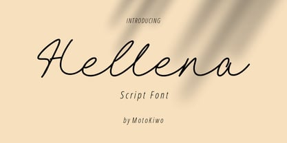 Hellena, an elegant script font that great for fashion, quote, and many more. This font was designed with uppercase, lowercase, ligature, numbers, punctuation, and also multilingual support.
 - RefSpecialty by Microsoft Corporation,
$29.00RefSpecialty is a unique font that was originally developed for inclusion in a Microsoft product. The RefSpecialty font is available in TrueType with a custom character set. - Elen Sans by Hurufatfont,
$19.00 The first design of Elensans consisted of 4 styles that are including two weights and their italics which I designed in my student years in 2002. It was designed with a little Art Nouveau style touch with inspired by classical geometric based fonts such as Friz Quadrata and Eras. It was updated with according to the orientations of the day in 2012 and eventually it took its final form with actual touches in 2020. The family has 18 weights, ranging from Thin to Black in normal styles and including their italics. It is ideally suited for advertising and packaging, editorial and publishing, logo, branding and creative industries, poster and billboards, small text, wayfinding and signage as well as web and screen design.
 - Feverish by Veil of Perception,
$66.00 “Feverish” was a font borne out of perceived need in the marketplace. Hallmark retired font designer and master letter designer Myron McVay first approached Bill LaFever to collaborate on a project to design a semiformal calligraphic script that could be set as text copy with a large variety of swash and alternative characters and small caps. Bill penned the initial forms and Myron did the digital conversions and initial technical work. After Myron passed away, Terry Lee, a protégé of Myron’s at Hallmark, also retired, took over and the project was completed. “Feverish” is a semi-formal italic which can be used in a wide variety of commercial and advertising applications. The font family is large which can accommodate a variety of unique applications.
 - Bombelli Light Hand by Wiescher Design,
$39.50 Bombelli is a font that looks like it has been handwritten by a meticulous architect in one of those hand-drawn blueprints of the old days. I chose the name to honor one of my ex-bosses -- a graphic designer-architect who taught me a lot of things when I was young and needed the money. One of the things he taught me – and probably the most important one – was to always be on time in the morning. He never said a word about me being late, but it worked. He taught me about being meticulous in detail and many other things I only appreciated much later. This clear and straightforward font deserves bearing his name. Your grateful type designer Gert Wiescher
 - Qonihy by Twinletter,
$17.00 Qonihy is a modern serif typeface that is ideal for projects that require a classic yet contemporary look. Its characteristics allow you to express your creativity. Every character in Qonihy is meticulously designed, with precise and elegant lines that give the impression of luxury and professionalism. This font is appropriate for a wide range of design demands, including book designs, logos, and product packaging. Qonihy’s combination of narrow and bold serifs creates a strong and dominant impression while remaining easy to read. With the available character alternatives, you can easily customize the appearance of your text and make your projects more creative and unique. Qonihy’s multilingual support allows you to easily reach a worldwide audience and deliver your content in many languages. So, if you want to create visually appealing and elegant projects, Qonihy is the way to go. What’s Included : - File font - All glyphs Iso Latin 1 - Alternate, Ligature - Simple installations - We highly recommend using a program that supports OpenType features and Glyphs panels like many Adobe apps and Corel Draw so that you can see and access all Glyph variations. - PUA Encoded Characters – Fully accessible without additional design software. - Fonts include Multilingual support
 - Westville by Nathatype,
$29.00 Are you ready to make your branding stand out? Do you dream of creating headings that stand out and inspire creativity, imagination, modernity, and endless fun? Looking for an elegant and stylish font? We've got what you want. Westville- A Blackletter Font Westville is an incredibly unique and distinct blackletter font. The style was influenced by many fonts and extra touch of urban street attitude. This is a timeless font that suits and fit perfectly in any timeframe or style you want. Well suited for you who needs for headline, logotype, apparel, branding, packaging, advertising, and many more. Our font always includes Multilingual Support to make your branding reach a global audience. Features: PUA Encoded Numerals and Punctuation Thank you for downloading premium fonts from Natha Studio
 - Cosmic Turtle by Hanoded,
$10.00 Cosmic Turtle is the belief that the world is supported by a giant turtle. It is mostly found in Hindu and Chinese mythology and the mythologies of the indigenous peoples of the Americas. I had to think of this, as the idea of the Cosmic Turtle is referenced to in the 1982 book ‘A Wild Sheep Chase’ by Haruki Murakami - my favourite author. Cosmic Turtle is a font that I made using a broken chop stick and Chinese ink. I was actually trying to create something scary for Halloween, but this is what came out and I quite like it. Cosmic Turtle is a fat display font with rough edges, wobbly glyphs and a set of double letter ligatures for you to play with.
 - Isla by Sudtipos,
$39.00 Eugene Grasset, the popular 19th-century Swiss graphic designer, dabbled in a multitude of disciplines such as ceramics, furniture, tapestry, jewelry and stamp design. Known mostly for his commercial posters and illustrations, he left a legacy of design that still fascinates scholars and professionals alike. One of the rarely mentioned Grasset treasures is the italic he designed in 1898 for use in two of his posters. Grasset's italic has an irregular quality that makes it seem much older than it is. It can be a very meaningful face in many contexts, such as map-related design or historical publications. Isla was digitized by Alfredo Graziani and completed by Alejandro Paul, maintaining the utmost respect for its historical flavor. The typeface includes a wealth of ligatures and alternates.
 - Prototype by Barnbrook Fonts,
$30.00 Prototype is a typeface with a very contemporary identity crisis—is it old or new? uppercase or lowercase? serif or sans-serif? Prototype tries to be all things to all people. There have been many attempts at creating a universal typeface, one that rationalises the alphabet and removes the inconsistencies of upper and lower case, applying an unreasonable logic to something that has grown organically ...and is already perfectly usable! Prototype was the same experiment carried out at a time when design was experiencing an identity crisis of its own—letterforms that try to be all things to all people but end up being something else entirely.
 - Cusp by Typeco,
$29.00 Cusp is a display font that was initially inspired by austere Art Deco lettering. After the capitals were refined, then the lowercase was designed with a bit of techno flair. From these basic letterforms a variety of styles were created, ranging from the rigid DeStijl to the whimsical Loose. The result is a versatile display font family that allows the user to mix, match, and overlay the letters for a dynamic effect. In-fact 2 overlay fonts were designed specifically so that one can create graffiti-like multi-layered effects. Cusp is a super-kawaii display family of 16 fonts plus 2 overlay fonts.
 - Hipster Script Pro by Sudtipos,
$79.00 Hipster Script is another of my habitual attempts at trying to reduce the divide between manual and digital. In this case, I try to articulate brush lettering, try to get the computer to emulate continuous painting. The process wasn't that different from my work with Feel Script's shot at computerized commercial lettering, though here we have a more casual contrast, rather than the high seriousness of the Copperplate script. Swashes, alternates, ligatures — too many of them, all trying to make the interplay between the tool’s two extreme widths remain faithful to hand movement subtleties. I also toyed with ligatures containing apostrophes, something I've never seen before. With this typeface I think I've become more balanced in uniting the spontaneity of post-war ad lettering with the current trends in illustration and design. Hipster Script received a Judge’s choice Certificate of Excellence at the Type Directors of New York and was selected to be part of the Bienal Tipos Latinos 2012.
 - Hobo Symbols Mod by SymbolMinded,
$29.99 During the period of the Great American Depression, “hobos” created a system of symbols to communicate and assist fellow travelers. These symbols would mark a home, farm, fence or other structure to indicate what to expect in the area. They would tip off travelers on how to find food, stay safe and what to avoid and more. In some areas of the USA, these symbols are still visible and have also become part of the American popular culture. These 96 symbols are accompanied by the what the symbol was used to indicate. The meanings and symbols are by no means the complete list andther may be additional or alternative meanings. These are for casual use and not historical or anthropologically completely accurate
 - Hobo Symbols Chaulk by SymbolMinded,
$29.99 During the period of the Great American Depression, “hobos” created a system of symbols to communicate and assist fellow travelers. These symbols would mark a home, farm, fence or other structure to indicate what to expect in the area. They would tip off travelers on how to find food, stay safe and what to avoid and more. In some areas of the USA, these symbols are still visible and have also become part of the American popular culture. These 96 symbols are accompanied by a pdf describing what the symbol was used to indicate. The meanings and symbols are by no means the complete list and there may be additional or alternative meanings. These are for casual use and not historical or anthropologically completely accurate.
 - Five Star Final by Solotype,
$19.95Introduced by the American Type Founders Co. at the time of the Spanish American War and advertised as suitable for "War Scare Headlines"! Used by many papers for years after because the narrow type was suitable for narrow single column heads. - Oceanwide Pro by California Type Foundry,
$47.00 A font perfect for not just one, but many projects! Introducing Oceanwide Pro, a sans that loves to be used in just about any situation! Designed with ultra clean lines and versatility in mind, Oceanwide wants to be your new favorite sans! Oceanwide’s ultra clean letters work anywhere you want to communicate orderliness and competence, and designed to build trust and rapport with your audience. Its wide proportions make it ideal for display and logo use. Oceanwide especially shines for white/bright letters on black/dark backgrounds! That’s because the inside shapes are nearly perfect circles in many weights. Here's a quick video tour of Oceanwide Pro by Dave Lawrence, including all the great things Oceanwide can be used for! We've tested Oceanwide for these industries, with stunning results!: Tech Arts Fashion & Style Business & Branding Corporations Logistics Architecture Food and many more... Oceanwide can be used for: Headers Subheadlines Logos Even body text, if tracked. Print & Screen The styles it can take are also many. It's great for: Modern/minimalist design Flat design Cut out design User Interface (UI) Technical designs In combination with text effects, even for grunge and other situations. And many others... DESIGN FEATURES Simplicity Tall x-height Hand-sloped obliques (italics) Narrow spacing Semi-wide proportions Expert kerning Well proportioned, usable lights & extra lights Large caps Great ALL CAPS MODE Uppercase punctuation Uppercase spacing with California Type Foundry’s Smart Tracking™ Advanced fraction support Proportional lining figures Thick joins Smooth curves Sturdy—great for textures and effects Variable font available Latin Pro character set for Central European languages. That's the writing for over 782 languages and transliterations worldwide! DESIGN STORY—THE FORGOTTEN SANS by Dave Lawrence, Lead Designer, California Type Foundry Adrian Frutiger was the 20th century master of sans, but I didn't realize he had made—not one—but TWO geometric sans! It wasn't until I had purchased the book “Adrian Frutiger: Typefaces”. I had hoped to someday meet Adrian Frutiger, but he passed away that very same year. Here is the story of Frutiger's forgotten sans. Back in 1968, Frutiger was approached by Pentagram to make a design for British Petroleum. They wanted a "new version of Futura". However, they wanted him to make a couple adjustments. First, they felt that Futura was "too fiddly." By this, they meant that it narrowed too much at the joins. (Joins are for example where the round and straight parts of the 'd' meet.) This is something that is necessary for small print text (to prevent ink clogging), but is not necessary at large sizes. Second, they wanted it to be entirely geometric, using the circular shape with minimal optical corrections. Unfortunately this font was not even used very consistently in the BP brand. A haphazard mix of Futura and Frutiger's BP font ensued. It was then replaced by another font design very soon after. My design is different in several ways. First, the commas and quotes are a more modern style. I tried his original commas, but these just didn’t work to 21st century eyes. Second, in his drawings, Frutiger went for a more standard u with a downstroke on the right. However, Oceanwide has a simpler u. Third, I made more optical adjustments. At the direction of his employer, Frutiger reluctantly put no font optical corrections into the letters. So I think my optical adjustments are similar to what Frutiger would have wanted. Fourth, I extended the weight into the light and extra light ranges. Fifth, the rest of the font I created according to the principles of Adrian Frutiger, but with no sources for inspiration. Here is Frutiger’s design philosophy, in his own words: “If you remember the shape of your spoon at lunch, it has to be the wrong shape. The spoon and the letter are tools; one to take food from the bowl, the other to take information off the page... When it is a good design, the reader has to feel comfortable because the letter is both banal and beautiful.” The words about the spoon were the ones I kept in my mind as I tried to make the curves ultra smooth, and the shapes ultra simple. Hopefully this font is a worthy successor to the font that inspired it. Released on the 93rd birthday of Adrian Frutiger, to celebrate the life and achievements of this amazing designer. ——————— Simplicity. Versatility. Oceanwide.
 - CourtGesture by Ingrimayne Type,
$5.00 The CourtGesture family fonts are zany, absurd, whimsical typefaces that were inspired by nineteenth century faces that have one style on the top and another on the bottom. They are rather crudely drawn. The CourtGestureInside style was designed to be layered over letters of CourtGesture to fill in the tops with color.
 - Scrivano by Outras Fontes,
$19.95 The Scrivano family was designed by Ricardo Esteves Gomes, inspired by some handwritings from the Middle Ages and Renaissance period. There are four elegant organic font styles (Regular, Italic, Bold & Bold Italic) that can be very useful to compose long or short texts in graphic standards that need some 'old style' feeling.