10,000 search results
(0.047 seconds)
- Elfen Fraktur by FDI,
$25.00 Elfen-Fraktur is monolinear blackletter typeface, that was originally designed by M. Beck and published in 1919. This revival comes in two extended versions with a complete Latin 1 character set: Elfen-Fraktur A uses the original blackletter skeletons and is suitable for setting texts with traditional German typesetting and orthography rules. Elfen-Fraktur B includes modernized letter designs for a broader and more legible use in various languages. A free bonus is the set of 22 border elements called Elfen-Schmuck. Check out the type specimen PDF for more details and instructions.
 - Odin by ITC,
$29.00The extravagant Odin was designed by Bob Newman in 1972. Its figures display constructed basic forms and when set into words, the typeface builds closely set lines. The strong serifs catch the reader's eye and draws it horizontally across the page. The forms of the capital letters are particularly distinctive. In the upper third, the stroke beginnings seem to form a roof over the body of the letter, fragmented by a fine white line that lends them independence and dominance. Odin is best used for headlines in display point sizes. - Sebastian Goen by Gian Studio,
$12.00 Sebastian Goen is my new elegant serif font that will give your projects a touch of luxury and style. It's perfect for logotypes, branding, monograms and wedding invitations, blog headlines, and more. Browse through all the previews and get as inspired as I was when creating this font. Important information: To access the alternatives, you must have access to an older version of Photoshop to copy/paste the glyphs from the included PSD, OR the Glyphs Panel, which can be found in Photoshop CC or any Version of Adobe Illustrator. Thanks.
 - Nurom by The Northern Block,
$25.80 Nurom is a contemporary sans-serif typeface influenced by the early grotesque style which is neutral and legible in purpose with a fresh personality. The goal wasn't about historic revival; it was to make a new Grotesk that could compete in an overcrowded market while offering strength, clarity and function across a vast array of applications. Details include six weights (bold free), a regular italic, and over 400 characters per style. Opentype features include decimal figures, fractions, case sensitive punctuation and language support for Western, South, and Central Europe.
 - Bold Loop by Kaer,
$19.00 Here is my new font family Bold Loop. The symbols are made of overlapping lines in a childish style. Ideal for colorful applications, children's design, bright advertising, mosaic packaging, multimedia identity. --- *You can use color fonts in PS CC 2017+, AI CC 2018+, ID CC 2019+, macOS 10.14 Mojave+ * *Please note that the Canva & Corel doesn't support color fonts!* *Please download this test file with only ABC letters ( https://www.dropbox.com/s/vvxws9jffocet5t/BoldLoop-Test.otf?dl=0 ) to check your app & system.* --- If you have any questions or issues, please contact me: kaer.pro@gmail.com Best, Roman.
 - South Island by Rook Supply,
$14.00 The goal with South Island was to make a font that looked authentically handwritten. Each character had to perfectly flow into the next and maintain a nice balance between variation and legibility. The typeface retains all the texture and grit of the original handwritten characters, making it especially powerful when used for large headers. South Island comes in a regular version, and a second version which contains alternate versions of each letter A-Z (both upper and lowercase). Try pairing it up with a more traditional serif or sans serif font for endless possibilities.
 - Insignia by Linotype,
$40.99 Brody’s fonts borrow elements from both Art Deco and non-Western styles. His designs received international recognition for their innovative, computer-oriented style, reaching almost cult status. Four original Brody fonts are available from Linotype Library GmbH: Insignia, Industria-Solid, Industria Inline and Arcadia. For your convenience, we have gathered all four into one package. Insignia has the basic forms of constructed grotesque fonts and was influenced by the New Typography of the Bauhaus during the 1930s. Its image reflects the Zeitgeist of that age, suggesting technology and progress.
 - Silent by Justi,
$20.00 Silent is a semi-serif typeface that combines readability with fluidity in a discreet and clean design. It works great on short texts such as captions, charts and graphs. The soft curves offer a calm rhythm. The design is smooth and bring silence and concentration while reading. Silent Alternates was born from the deconstruction of Silent Light, resulting in a most impressive typeface. Ideal for use in large sizes, such as posters and titles, it is an alternative to italics. It can be used to highlight some words in conjunction with Silent Light.
 - Eckhardt Dualine JNL by Jeff Levine,
$29.00 While searching online for vintage type inspirations, an image was spotted of an old letterhead for a steel manufacturing company. The hand lettering of the word 'Ludlum' only offered D,L,M and E as visual examples, but from this Jeff Levine has designed Eckhardt Dualine JNL - a Deco-flavored dual-line type font. As with a number of other releases that emulate hand-lettering or sign painting, Jeff has named this font in honor of his good friend, the late Albert Eckhardt, Jr.; who ran Allied Signs in Miami from 1959 until his passing.
 - Leuthikline by Lettertype Studio,
$23.00 Leuthikline Script is a beautiful monoline font, perfect for logo design, branding, clothing design, signage, posters, wedding invitations and so much more! My goal in creating this font was to be an easy-to-read script font that would serve a variety of purposes and help your project to be more perfect and beautiful. Do not miss! Don't Miss Out! Leuthikline Script comes with: Lowercase and Uppercase Stylistic Alternates Numerals & Punctuation Accented characters Format File: OTF Multiple Languages Supported I Hope You Enjoy! Diki Pradipta Tri Atmojo ^ Pradipta Creative & Lettertype Studio
 - Staylight by Ardian Nuvianto,
$18.00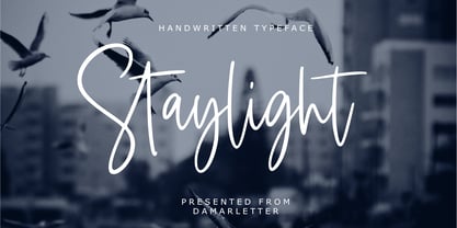 Staylight is a chic, refined script font. Its stylish ligatures make this font the perfect match for any project. Staylight is consisting of a fashionable style script make looks classy and touch of stylish. This font was created to look as close to a natural handwritten script as possible. Staylight is perfect for branding projects, logos, wedding designs, social media posts, advertisements, product packaging, product designs, label, photography, watermark, invitation, stationery and anything that you want. This font is PUA encoded which means you can access all of the amazing glyphs and ligatures with ease!
 - Greenaway Mignonettes by Wiescher Design,
$29.50 Kate Greenaway was a very famous British (1846-1901) author and illustrator of childrens books. Her books were an outstanding success in English publishing during the Victorian period. Recently I found these sweet Mignonettes in an old foundry specimen book. Mignonettes is derived from the French word "mignon" which stands for lovely, charming, sweet, delightful, pleasant and that does exactly describe these little drawings. I already published a Kate Greenaway's Alphabet a couple of years ago. So here is my second installment. Yours, Kate Greenaway fan Gert Wiescher
 - Frio by Lamatas un Slazdi,
$28.00 Frio is a geometric monoline sans-serif typeface consisting of 15 styles: 5 weights and 3 widths plus italics. Clean, neutral and technical, Frio was inspired by the form of super ellipse and Eurostile by Aldo Novarese. The font contains stylistic and contextual alternates, ligatures, discretional ligatures for use in German, ornaments and other OpenType features. It supports all the European languages using Latin alphabets. The main thing that sets it apart from the other typefaces is a possibility of using simple typing combined with stylistic sets to add colored backgrounds to numerals.
 - Stockhand by Aminmario Studio,
$20.00 Introducing Stockholm font is charming and elegant handwritten with a quick stroke pen effect. This font was created to look as close to a natural handwritten script, as possible by including lowercase alternates, ligature and underlines. Perfect for any awesome projects that need hand writing taste. Comes with regular and italic. With built in Opentype features, this script comes to life as if you were writing it yourself. What's included: Stockholm (ttf.otf.web) Stockholm Italic (ttf.otf.web) Don't hesitate if you have any questions. Thanks for checking out this font. I hope you enjoy it! AminMario
 - Cochin by Linotype,
$29.99 Georges Peignot designed Cochin based on copper engravings of the 18th century and Charles Malin cut the typeface in 1912 for the Paris foundry Deberny & Peignot. The font is named after the French engraver Charles Nicolas Cochin (1715–1790) although its style had little to do with that of the copper artist’s. The font displays a curious mix of style elements and could be placed as a part of the typographical Neorenaissance movement. Cochin is especially large and wide and was very popular at the beginning of the 20th century.
 - P22 Goudy Aries by P22 Type Foundry,
$24.95 Frederic W. Goudy (1865-1947) created over 100 typefaces during his lifetime. Like most type designers, he is known principally to most people only through his eponymously titled faces such as Goudy Modern, Goudy Old Style etc. This set includes one of Goudy's rarest Arts & Crafts styled faces, a font known as Aries. The font was originally created by Goudy for a private press in Eden, New York in 1926. Also included in this set are two decorative fonts: one font of 52 decorative Ornaments & one font that contains 52 Ampersands.
 - F2F Al Retto by Linotype,
$29.99The Techno sound of the 1990s, a personal computer, a font creation software and some inspiration had been the sources to the F2F (Face2Face) font series. Alessio Leonardi and his friends had the demand to create new unusual faces that should be used in the leading german techno magazine "Frontpage". Even typeset in 6 point to nearly unreadability it was a pleasure for the kids to read and decrypt the messages. About Al Retto: "Al" means "Alessio Leonardi" and Retto "straight", but if you read it as an italian world means "in the a**". - Sola by Khaito Gengo,
$25.00 Sola is a simplistic, stylish, and modern san serif type font with the unique addition of rounded corners. When creating this font, Bank Gothic originally influenced me, however when I made the square shapes lower case the font didn't retain its sophistication, so it was designed narrower. The result is this warm and soft looking font that works for all types of design, from posters and fliers to logos and business cards. Sola also features standard ligature, stylistic alternates, titling characters with extended width, and a set of standard pictograms.
 - Ye Paradigma by Yinon Ezra,
$30.00 Sans-serif, with clean and fresh Character. "Ye Paradigma" has been established in order to keep its forms as simple as possible - without losing the unique character of each letter, and without simplifying too much. The process was gradual, like the ripening of a sauce that leaves it to be reduced to strengthen flavors, so the letters ripened while reducing unnecessary details, until the taste became more concentrated and uniform. The result is a clean, fresh, remarkably useful 24 fonts typeface, with a clear and stable graphic language.
 - Agency Gothic CT by CastleType,
$59.00 Originally designed by American type designer Morris Fuller Benton in 1933, Agency Gothic is a wonderful, narrow, squarish art deco typeface. I was commissioned by Publish magazine to create digital versions of Agency Gothic Open and Agency Gothic Condensed for a redesign in 1990. Since then, I have added four other styles. Agency Gothic CT is uppercase only and supports most European languages that use the Latin or Cyrillic alphabets. The Agency Gothic CT family is available in six weights/styles: Light, Medium, Bold, Condensed, Inline, and Open.
 - Antiquarian Scribe by Three Islands Press,
$39.00 Henri Abraham Chatelain was a cartographer and publisher of the famous Atlas Historique, ou Nouvelle Introduction a L'Histoire, a world atlas released between 1705 and 1732 in Amsterdam. A few years ago, at an antique book shop in London, I bought a page from Chatelain's atlas—a page covering the Near East, India, the Indian Ocean—that had a particularly alluring, oblique handlettering style. The text is in French, which gave me plenty of samples of diacritics and accented characters. The overall effect is neat and legible, with a distinctly historical flair.
 - Federico by Olga Umpeleva,
$30.00 Federico is a typeface based on the handwriting of Federico Garcia Lorca, the eminent Spanish poet and playwright (1898-1936). Original version was designed for a book about Lorca. The face has two styles. One looks like an original poets writing, the second looks like if Lorca would write with a ball pen. Federico includes many alternative glyphs and ligatures, which make it look like a real writing of an emotional, negligent, creative man. Despite the fact that Garcia Lorca has written in spanish, the font has western and eastern european, cyrillic, turkish letters.
 - Cadora Woods by Hanoded,
$15.00 Last year I walked half of Offa’s Dyke path, a long distance trail on the Welsh/English border. Walking the trail, I came across a beautiful stretch of forest with a lovely name: Cadora Woods. Cadora Woods font was made with a Japanese brush pen. It sort of looks medieval and a friend of mine suggested it would be the font of choice for maps of ‘The Shire’. I guess that is true, but I am convinced you can come up with some innovative uses for this font!
 - HWT Catchwords by Hamilton Wood Type Collection,
$24.95 Catchwords have always been offered alongside standard alphabets in wood type catalogs and so often appear on posters as a decorative punch that they have become part of the wood type vernacular. Words like 'The', 'And', 'To', 'For', and less common abbreviations could be inserted into a design along with decorative ornaments or stars when space was tight or to add variety in the design. HWT Catchwords features over 80 words based directly on designs offered by Hamilton and other wood type manufacturers of the 19th and early 20th Century.
 - Nacho Script Pro by Vástago Studio,
$19.99 Nacho Script is a classic and casual typeface ideal for give to your design a confortable touch of traditional feeling, casual style and luxury looks. Is a script system of glyphs with a subtle modulations in it strokes, because it's inspired on the classic advertising from the golden age of ads in 1950; promptly in 1957. Was so amazing design it and create it for multiple uses like ads for food, drinks, traveling, commercial products, and personal things, and thats it. Enjoy it like we enjoy it creating it. Thanks for your buy.
 - Aphasia BT by Bitstream,
$50.99A meeting of Byzantine and Art Deco forms, Aphasia began as a series of handwritten captions to accompany drawings in the early 1990s. The drawings were abandoned to allow the lettering to become the real composition. Playfully set in blocks of verse with each line shaped through free-association, the only visual rule was that all the lines of capitals be of equal length. The challenge of the game required extensive abbreviations, ligatures, small caps, and superiors. With the advent of Letraset’s FontStudio program, the project moved into the typographic realm. - Proza Display by Bureau Roffa,
$39.00 Proza Display is the eye-catching counterpart of Proza, consisting of 12 styles (6 weights + italics). Together, Proza and Proza Display form a large family of 24 styles, which are all equipped with plenty of language support and opentype features. Proza Display was made to function especially well at large sizes, drawing the reader's attention with its beautiful and slightly eccentric shapes. Its large character set (support for 200+ languages) and opentype features make sure that Proza Display doesn't let you down, while its classy design helps you to make a visual impact.
 - Play Vehicle by Din Studio,
$29.00 Are you looking for an attractive font for your customers? We have what you need. Play Vehicle is a racing-themed display font to provide you a stylish, brave, modern design which is visually eye-catching because of its variations of thick and thin letters. Through its developed legibility, it is possible to use the font in titles or text contents. The font features you can enjoy are as follows. Features: Stylistic Sets Ligatures Swashes Multilingual Supports PUA Encoded Numerals and Punctuations Play Vehicle fits best for various designs, such as posters, banners, logos, book covers, headings, printed products, merchandise, social media, and more. Find out more ways to use this font by taking a look at the font preview. Enjoy your experience with this font and feel free to contact us for further product information or trouble complaints. Happy designing.
 - Cowboy Wanted by Shakira Studio,
$19.00 Introducing "Cowboy Wanted" - The Ultimate Western Retro Serif Font! Saddle up and embrace the wild, wild west with Cowboy Wanted, the font that's taking the design world by storm. This font embodies the perfect blend of old-school ruggedness and contemporary flair, making it the hottest ticket in town for all your Western-inspired design needs. Each character in Cowboy Wanted is meticulously crafted to capture the essence of the Old West, from the sweeping serifs to the rugged lines. Whether you're working on a saloon-inspired logo, a rustic poster, or a themed event invitation, Cowboy Wanted adds that authentic Western touch that's so in demand right now. Don't miss your chance to lasso the trendiest Western retro serif font of the moment. With Cowboy Wanted, you'll be the sheriff of style in your design projects, standing out in the crowded frontier of design. Saddle up and make a bold statement with Cowboy Wanted today! Here's what you get: Cowboy Wanted Regular All Multilingual symbol Opentype features ( ligature, alternate ) Accessible in the Adobe Illustrator, Adobe Photoshop, Adobe InDesign, even work on Microsoft Word. PUA Encoded Characters - Fully accessible without additional design software. Multilingual character supports : (Afrikaans, Albanian, Catalan, Croatian, Czech, Danish, Dutch, English, Estonian, Finnish, French, German, Hungarian, Icelandic, Italian, Lithuanian, Maltese, Norwegian, Polish, Portuguese, Slovenian, Spanish, Swedish, Turkish, Zulu) Follow my shop for upcoming updates, and for more of my work, Thank you!
 - LTC Italian Old Style by Lanston Type Co.,
$39.95LTC Italian Old Style is not to be confused with the English Monotype font also called Italian Old Style, which is an earlier design from 1911 based on William Morris’s Golden Type that is based on Nicholas Jenson’s Roman face. Goudy went back to Jenson’s original Roman and other Renaissance Roman faces for his inspiration and the result is what many consider to be the best Renaissance face adapted for modern use. Bruce Rogers was one of the biggest admirers of Italian Old Style and designed the original specimen book for Italian Old Style in 1924 using his trademark ornament arrangement. These ornaments are now contained in the pro versions of the Roman styles—Regular Pro and Light Pro. With most digitizations of old metal typefaces, one source size is often used as reference (as was Goudy’s method for his own cuttings of his Village foundry types) so that all sizes refer to one set of original artwork. The original hot metal fonts made by Lanston Monotype (from Goudy’s drawings) and other manufacturers used two or three masters for different size ranges to have optimal relative weights—smaller type sizes would need proportionally thicker lines to not appear thin and larger sizes would require thinner lines to not appear to bulky. The variations in size ranges can also be affected by the size of the cutter head in making the master patterns. The light weights of LTC Italian Old Style were digitized from larger display sizes (14, 18, 24, 30, 36 pt) and the regular weights were digitized from smaller composition sizes (8,10,12 pt). The fitting for the regular weights is noticeably looser to allow for better setting at small sizes. Very few font revivals take this approach. Italian Old Style, originally designed by Frederic Goudy in 1924, was digitized by Paul Hunt in 2007. In 2013, it has been updated by James Grieshaber and is now offered as a Pro font. The newly expanded Pro font includes all of the original ligatures, plus small caps and expanded language coverage in all 4 Pro styles. - Bree by TypeTogether,
$37.50 The Bree font family is a spry sans serif by Veronika Burian and José Scaglione that delivers a spirited look and feel for branding and headline usage. As an upright italic, Bree shows a pleasant mix of rather unobtrusive capitals with more vivid lowercase letters, giving text a lively appearance. Bree is clearly influenced by handwriting. As such, some of its most characteristic features are the single-story ‘a’, the cursive ‘e’, the outstroke curves of ‘v’ and ‘w’, the flourished ‘Q’, and the fluid shapes of ‘g’, ‘y’, and ‘z’. Alternates of these letters are available when a more neutral look is desired. Bree has a touch of cheekiness, a wide stance for each character, and an extra-large x-height. All this adds up to a big personality, so even when set in small text there is no skimming past the words Bree voices. In 2019, the Bree font family got a huge update. A few shapes were updated or added (the ‘k’ and German capital ‘ß’), two entirely new weights were added (Book and Book Italic), and spacing was perfected. More than that, Vietnamese support was added to Bree Latin, and the Bree Greek and Bree Cyrillic scripts were designed from scratch to parallel the Latin’s tone. Additionally, Bree was designed in variable font format for those who want complete control over the font’s appearance while simultaneously saving digital weight in the form of kilobytes and megabytes. Bree is in the perfect position for the next digital revolution. The complete Bree font family, along with our entire catalogue, has been optimised for today’s varied screen uses. Bree has been chosen for such wide-ranging uses as Breast Cancer Awareness Month in the US, the branding for the country of Peru, and numerous layouts including mobile apps, magazines, newspapers, and books. Awards – Tipos Latinos exhibition 2008 – Several best-of-the-year typeface lists of 2008 MyFonts Top 10 Fonts of 2008 Smashing Magazine: 60 Brilliant Typefaces For Corporate Design https://www.smashingmagazine.com/2008/03/60-brilliant-typefaces-for-corporate-design/ Die besten Schriften 2008 http://www.fontwerk.com/619/die-besten-schriften-2008/ – Selected for Typographica’s Best Typefaces of 2008 – Won Bronze for Original Typeface in the 2009 European Design Awards
 - David Hadash Sans by Monotype,
$50.99Monotype Imaging is pleased to present David Hadash (New" David), the full family of typefaces by Ismar David, in its intended authentic form. The Estate of Ismar David has sought to revive this jewel of Twentieth-Century design by granting an exclusive license to Monotype Imaging to implement it in industry-standard format. Never before has the typeface in its full set of sub-styles been made available to the design community. David Hadash consists of three style families, Formal, Script, and Sans. Each of these appears in three weigths: regular, medium, and bold. Originally devised as a companion to the upright Formal style, the Script style has a beauty and grace all its own that allows it to be used for full-page settings also. While it is forward-leaning and dynamic, it does not match any of the existing cursive styles of Hebrew script. Ismar David created an eminently readable hybrid style which is like no other by inclining the forms of the upright while blending in some features of Rashi style softened with gentle curves. One can say that the Script style is the first truly italic, not just oblique, typeface for Hebrew script. Although the proportions of the Sans style are very similar to those of the Formal style, its visual impression is stunningly different. If the Formal style is believably written with a broad-point pen, the Sans is chiseled in stone. Rounded angles turn angular and stark. The end result is an informal style that evokes both ancient and contemporary impressions. David Hadash (Modern) supports the writing conventions of Modern Hebrew (including fully vocalized text) in addition to Yiddish and Ladino. David Hadash Biblical is a version of the Formal style that supports all the complexities of Biblical Hebrew, including vocalization and cantillation marks. " - Expline Variable by Formatype Foundry,
$140.00 Expline typeface finds its roots in modernist design but subtly pays homage to early Modern Industrial Grotesks. This fusion creates a font that encapsulates the essence of tradition while embracing the contemporary. The font incorporates sharp details in select characters and curves, imparting a delicate sweetness while preserving the robust character associated with Grotesk fonts. This unique blend allows Expline to strike a perfect balance between display and text usage, making it a versatile choice for a variety of design projects. Expline's flexibility shines through its extensive weight options. The font family offers eight distinct weights, each thoughtfully crafted to establish a clear typographic hierarchy. Designers can easily choose the right weight to suit the specific needs of their projects, whether it's a bold headline or a refined body text. This variety ensures that your typography will always make the right visual impact. Expline typeface doesn't stop at weights. It provides expansive character sets across each weight, encompassing all Western European diacritics, Punctuation, Mathematics, and Numerics. This ensures that your typography will seamlessly support various languages and punctuation marks, making it a global choice. In addition, the font boasts OpenType features, granting the flexibility to explore multiple subsets. This includes alternate capital letterforms, tabular and lining numerals (both proportional and old-style), enabling endless typographic possibilities. Whether you're designing for print or web, these features allow you to fine-tune your typography for a perfect fit. Expline is a font that bridges the gap between modernist design principles and early industrial influences, resulting in a Neo-Grotesk font with a contemporary twist. Its comprehensive weight options, expansive character sets, and OpenType features make it a versatile choice for any medium between print and screen.
 - Expline by Formatype Foundry,
$39.00 Expline typeface finds its roots in modernist design but subtly pays homage to early Modern Industrial Grotesks. This fusion creates a font that encapsulates the essence of tradition while embracing the contemporary. The font incorporates sharp details in select characters and curves, imparting a delicate sweetness while preserving the robust character associated with grotesk fonts. This unique blend allows Expline to strike a perfect balance between display and text usage, making it a versatile choice for a variety of design projects. Expline's flexibility shines through its extensive weight options. The font family offers eight distinct weights, each thoughtfully crafted to establish a clear typographic hierarchy. Designers can easily choose the right weight to suit the specific needs of their projects, whether it's a bold headline or a refined body text. This variety ensures that your typography will always make the right visual impact. Expline typeface doesn't stop at weights. It provides expansive character sets across each weight, encompassing all Western European diacritics, Punctuation, Mathematics, and Numerics. This ensures that your typography will seamlessly support various languages and punctuation marks, making it a global choice. In addition, the font boasts OpenType features, granting the flexibility to explore multiple subsets. This includes alternate capital letterforms, tabular and lining numerals (both proportional and old-style), enabling endless typographic possibilities. Whether you're designing for print or web, these features allow you to fine-tune your typography for a perfect fit. Expline is a font that bridges the gap between modernist design principles and early industrial influences, resulting in a Neo-Grotesk font with a contemporary twist. Its comprehensive weight options, expansive character sets, and OpenType features make it a versatile choice for any medium between print and screen.
 - David Hadash Script by Monotype,
$50.99Monotype Imaging is pleased to present David Hadash (New" David), the full family of typefaces by Ismar David, in its intended authentic form. The Estate of Ismar David has sought to revive this jewel of Twentieth-Century design by granting an exclusive license to Monotype Imaging to implement it in industry-standard format. Never before has the typeface in its full set of sub-styles been made available to the design community. David Hadash consists of three style families, Formal, Script, and Sans. Each of these appears in three weigths: regular, medium, and bold. Originally devised as a companion to the upright Formal style, the Script style has a beauty and grace all its own that allows it to be used for full-page settings also. While it is forward-leaning and dynamic, it does not match any of the existing cursive styles of Hebrew script. Ismar David created an eminently readable hybrid style which is like no other by inclining the forms of the upright while blending in some features of Rashi style softened with gentle curves. One can say that the Script style is the first truly italic, not just oblique, typeface for Hebrew script. Although the proportions of the Sans style are very similar to those of the Formal style, its visual impression is stunningly different. If the Formal style is believably written with a broad-point pen, the Sans is chiseled in stone. Rounded angles turn angular and stark. The end result is an informal style that evokes both ancient and contemporary impressions. David Hadash (Modern) supports the writing conventions of Modern Hebrew (including fully vocalized text) in addition to Yiddish and Ladino. David Hadash Biblical is a version of the Formal style that supports all the complexities of Biblical Hebrew, including vocalization and cantillation marks. " - Terfens Gothic by insigne,
$29.00 Terfens Gothic is the perfect choice for your next project! With its medium contrast and approachable design, this calligraphic sans serif has a classic feel that will never go out of style. Terfens Gothic is the perfect typeface for anyone looking to add a touch of uniqueness to their designs. With its generous x-height and rounded terminals, it's perfect for creating one-of-a-kind designs that are sure to impress. Its large x-height gives it a welcoming, but not too casual vibe. With forty-eight different typefaces, it has the versatility and aesthetic options you need to make your project stand out. Choose from regular, condensed, and extended styles, each with nine different weights and italics. Terfens Gothic has the look you need to make a powerful impression. Terfens is the ideal typeface for any project that has to stand out, thanks to its towering verticality. Terfens may be utilized for a variety of purposes because of its adaptable design. Terfens is a sans unlike any other- it starts with a beautiful calligraphic chancery script and then adds movement and personality. This sans is guaranteed to make your next project more exciting! The Terfens Type System's third typeface, Terfens Gothic, is an amazing addition to any type collection. The Terfens Type System's adaptability is unrivaled, with its vast choice of styles, widths, and weights. This font family has everything you need to create unique, customized designs that will suit your individual needs. Whether you need a narrow or wide font, or a hairline or bold weight, the Terfens Type System has you covered! And, with its Opentype features, the Terfens Type System is perfect for anyone who wants to add a personal touch to their projects.
 - David Hadash Biblical by Monotype,
$50.99Monotype Imaging is pleased to present David Hadash (New" David), the full family of typefaces by Ismar David, in its intended authentic form. The Estate of Ismar David has sought to revive this jewel of Twentieth-Century design by granting an exclusive license to Monotype Imaging to implement it in industry-standard format. Never before has the typeface in its full set of sub-styles been made available to the design community. David Hadash consists of three style families, Formal, Script, and Sans. Each of these appears in three weigths: regular, medium, and bold. Originally devised as a companion to the upright Formal style, the Script style has a beauty and grace all its own that allows it to be used for full-page settings also. While it is forward-leaning and dynamic, it does not match any of the existing cursive styles of Hebrew script. Ismar David created an eminently readable hybrid style which is like no other by inclining the forms of the upright while blending in some features of Rashi style softened with gentle curves. One can say that the Script style is the first truly italic, not just oblique, typeface for Hebrew script. Although the proportions of the Sans style are very similar to those of the Formal style, its visual impression is stunningly different. If the Formal style is believably written with a broad-point pen, the Sans is chiseled in stone. Rounded angles turn angular and stark. The end result is an informal style that evokes both ancient and contemporary impressions. David Hadash (Modern) supports the writing conventions of Modern Hebrew (including fully vocalized text) in addition to Yiddish and Ladino. David Hadash Biblical is a version of the Formal style that supports all the complexities of Biblical Hebrew, including vocalization and cantillation marks. " - David Hadash Formal by Monotype,
$50.99Monotype Imaging is pleased to present David Hadash (New" David), the full family of typefaces by Ismar David, in its intended authentic form. The Estate of Ismar David has sought to revive this jewel of Twentieth-Century design by granting an exclusive license to Monotype Imaging to implement it in industry-standard format. Never before has the typeface in its full set of sub-styles been made available to the design community. David Hadash consists of three style families, Formal, Script, and Sans. Each of these appears in three weigths: regular, medium, and bold. Originally devised as a companion to the upright Formal style, the Script style has a beauty and grace all its own that allows it to be used for full-page settings also. While it is forward-leaning and dynamic, it does not match any of the existing cursive styles of Hebrew script. Ismar David created an eminently readable hybrid style which is like no other by inclining the forms of the upright while blending in some features of Rashi style softened with gentle curves. One can say that the Script style is the first truly italic, not just oblique, typeface for Hebrew script. Although the proportions of the Sans style are very similar to those of the Formal style, its visual impression is stunningly different. If the Formal style is believably written with a broad-point pen, the Sans is chiseled in stone. Rounded angles turn angular and stark. The end result is an informal style that evokes both ancient and contemporary impressions. David Hadash (Modern) supports the writing conventions of Modern Hebrew (including fully vocalized text) in addition to Yiddish and Ladino. David Hadash Biblical is a version of the Formal style that supports all the complexities of Biblical Hebrew, including vocalization and cantillation marks. " - Fledgling by Typodermic,
$11.95 Introducing Fledgling, the sans-serif typeface that exudes svelte elegance and refined sophistication. With a high waist and a low x-height, Fledgling boasts a unique silhouette that will set your message apart from the crowd. Its delicate curves and sophisticated contours were designed with a fashion-forward mindset, making it the perfect choice for any project that requires a touch of class. Whether you’re creating a logo, branding materials, or a fashion editorial, Fledgling will lend your message a one-of-a-kind voice that speaks volumes. And that’s not all. Fledgling is equipped with OpenType capabilities that include numeric ordinals, fractions, and old-style numerals, allowing you to effortlessly convey any numerical information with grace and style. Available in eight weights and obliques, Fledgling gives you the flexibility to experiment with different styles and weights to create a look that perfectly matches your vision. So why settle for ordinary when you can elevate your message with Fledgling? Most Latin-based European, Vietnamese, Greek, and most Cyrillic-based writing systems are supported, including the following languages. Afaan Oromo, Afar, Afrikaans, Albanian, Alsatian, Aromanian, Aymara, Azerbaijani, Bashkir, Bashkir (Latin), Basque, Belarusian, Belarusian (Latin), Bemba, Bikol, Bosnian, Breton, Bulgarian, Buryat, Cape Verdean, Creole, Catalan, Cebuano, Chamorro, Chavacano, Chichewa, Crimean Tatar (Latin), Croatian, Czech, Danish, Dawan, Dholuo, Dungan, Dutch, English, Estonian, Faroese, Fijian, Filipino, Finnish, French, Frisian, Friulian, Gagauz (Latin), Galician, Ganda, Genoese, German, Gikuyu, Greenlandic, Guadeloupean Creole, Haitian Creole, Hawaiian, Hiligaynon, Hungarian, Icelandic, Igbo, Ilocano, Indonesian, Irish, Italian, Jamaican, Kaingang, Khalkha, Kalmyk, Kanuri, Kaqchikel, Karakalpak (Latin), Kashubian, Kazakh, Kikongo, Kinyarwanda, Kirundi, Komi-Permyak, Kurdish, Kurdish (Latin), Kyrgyz, Latvian, Lithuanian, Lombard, Low Saxon, Luxembourgish, Maasai, Macedonian, Makhuwa, Malay, Maltese, Māori, Moldovan, Montenegrin, Nahuatl, Ndebele, Neapolitan, Norwegian, Novial, Occitan, Ossetian, Ossetian (Latin), Papiamento, Piedmontese, Polish, Portuguese, Quechua, Rarotongan, Romanian, Romansh, Russian, Rusyn, Sami, Sango, Saramaccan, Sardinian, Scottish Gaelic, Serbian, Serbian (Latin), Shona, Sicilian, Silesian, Slovak, Slovenian, Somali, Sorbian, Sotho, Spanish, Swahili, Swazi, Swedish, Tagalog, Tahitian, Tajik, Tatar, Tetum, Tongan, Tshiluba, Tsonga, Tswana, Tumbuka, Turkish, Turkmen (Latin), Tuvaluan, Ukrainian, Uzbek, Uzbek (Latin), Venda, Venetian, Vepsian, Vietnamese, Võro, Walloon, Waray-Waray, Wayuu, Welsh, Wolof, Xavante, Xhosa, Yapese, Zapotec, Zarma, Zazaki, Zulu and Zuni.
 - Chinese Rocks by Typodermic,
$11.95 In the bustling world of rough, grungy typography, there’s one typeface that stands out among the rest—Chinese Rocks. This iconic typeface draws inspiration from the hand-cut rubber-stamp writing found on Chinese export crates from the twentieth century. It’s a typeface that captures the raw, unpolished energy of the streets and infuses it into your messaging. What sets Chinese Rocks apart is its artisanal, handcrafted quality. Each letter is carefully carved to give your words a unique, personal touch that cannot be replicated by any other font. With Chinese Rocks, your text takes on a casual, laid-back vibe that speaks to the rawness and authenticity of modern culture. This versatile font comes in sixteen different styles, including Fat, Condensed, and Shaded. Each variation offers a different take on the classic Chinese Rocks style, allowing you to tailor your messaging to fit any occasion or application. Whether you’re looking to make a bold statement or add a touch of personality to your branding, Chinese Rocks has you covered. So why settle for a generic font that doesn’t capture your essence? Chinese Rocks is the typeface that captures your personality and turns your words into art. Try it out today and discover the power of authentic, handcrafted typography. Most Latin-based European writing systems are supported, including the following languages. Afaan Oromo, Afar, Afrikaans, Albanian, Alsatian, Aromanian, Aymara, Bashkir (Latin), Basque, Belarusian (Latin), Bemba, Bikol, Bosnian, Breton, Cape Verdean, Creole, Catalan, Cebuano, Chamorro, Chavacano, Chichewa, Crimean Tatar (Latin), Croatian, Czech, Danish, Dawan, Dholuo, Dutch, English, Estonian, Faroese, Fijian, Filipino, Finnish, French, Frisian, Friulian, Gagauz (Latin), Galician, Ganda, Genoese, German, Greenlandic, Guadeloupean Creole, Haitian Creole, Hawaiian, Hiligaynon, Hungarian, Icelandic, Ilocano, Indonesian, Irish, Italian, Jamaican, Kaqchikel, Karakalpak (Latin), Kashubian, Kikongo, Kinyarwanda, Kirundi, Kurdish (Latin), Latvian, Lithuanian, Lombard, Low Saxon, Luxembourgish, Maasai, Makhuwa, Malay, Maltese, Māori, Moldovan, Montenegrin, Ndebele, Neapolitan, Norwegian, Novial, Occitan, Ossetian (Latin), Papiamento, Piedmontese, Polish, Portuguese, Quechua, Rarotongan, Romanian, Romansh, Sami, Sango, Saramaccan, Sardinian, Scottish Gaelic, Serbian (Latin), Shona, Sicilian, Silesian, Slovak, Slovenian, Somali, Sorbian, Sotho, Spanish, Swahili, Swazi, Swedish, Tagalog, Tahitian, Tetum, Tongan, Tshiluba, Tsonga, Tswana, Tumbuka, Turkish, Turkmen (Latin), Tuvaluan, Uzbek (Latin), Venetian, Vepsian, Võro, Walloon, Waray-Waray, Wayuu, Welsh, Wolof, Xhosa, Yapese, Zapotec Zulu and Zuni.