10,000 search results
(0.062 seconds)
- Unicorn by DavidMatos,
$15.00 Unicorn is a super-condensed Display font with a subtle dramatic flair that works especially well in titles, headers and editorial design. It was firstly inspired by a lowercase set seen on a furniture ad in Domus (the architecture magazine) #192, from 1943. For maximum drama, use with a bright & smart colour palette. Appointed by the Unicorn. Of course.
 - P22 Pop Art by P22 Type Foundry,
$24.95 This font set was developed for the Albright-Knox Art Gallery and is inspired by their collection of Pop Art. Artists such as Warhol, Lichtenstein, and Rauchenberg sought to blur the lines between high and low art as well as the boundaries between art and everyday life. The alphabets and extras in this set reflect that spirit.
 - Mercato VF by Borutta Group,
$79.00 MERCATO is a headline family of typefaces inspired by hand-painted price tags. The idea for this family was born a few years ago in South America. I wanted to create a typeface that is written, expressive and organic on the one hand, and thrown into a geometric frame on the other. Co-designers: Karol Mularczyk & Małgorzata Bartosik.
 - Halliday JNL by Jeff Levine,
$29.00 Halliday JNL was redrawn from impressions made by a rubber stamp sign printing set, thus providing the slight imperfection of line widths that gives a hand-made approach to the typeface. The lettering style is based on Beton Open Condensed, a clean and popular slab serif used for decades in print display titling and rubber stamp manufacture.
 - Old Songs JNL by Jeff Levine,
$29.00 Hand lettering of the song title on the 1914 sheet music for “Dear Old Girl” was the working model for Old Songs JNL. A condensed Roman typeface available in both regular and oblique versions, this titling font exhibits a casual, nonconformist design that isn’t quite traditional, nor is it part of the Art Nouveau movement popular at the time.
 - Jimi by Canada Type,
$24.95Jimi is a tribute to classic rock posters of the sixties and seventies. It was inspired by and modeled after a 1969 sheet of dry transfer letters. Named after the famous American rock and blues guitarist Jimi Hendrix. Ideal for any design that intends to invoke or parody the era of classic rock, free love and mysticism. - Mogathe by Invasi Studio,
$16.00 Mogathe was inspired by the west life era. Mogathe is a slab serif font with a vintage western look and feel. Four varieties are available: Regular, Stamp, Spurs, and Spurs Stamp. The use of this font results in carefully-crafted styles. Mogathe font is ideal for branding projects or packaging that need a vintage western feel.
 - Vaelor by nasirbaradari,
$20.00 The coolest royal font is here. This font was designed with the goal of exotic and rich looking, every single letter and every single character itself is a logo in this typeface. You can use it for any purpose that you want and this font will make your design stand out. Certain characters are designed to look unique.
 - Hugolers Stylish Modern by Typetemp Studio,
$15.00 HUGOLERS is a modern-style serif font with alternatives and ligatures that create stunning logos, quotes, posts, blog posts. branding projects, magazine imagery, wedding invitations, and much more. FEATURES Stylistic Alternates & Ligatures Numerals & Punctuation Accented characters Illustration Floral Ai/Eps Multiple Languages Supported Contact me with an inbox message If you have any question. Thank you! Happy Creating.
 - Attention Seeker by Hanoded,
$15.00 Attention Seeker does seek attention: it looks like a stencil font, and it sort of is, but it wasn’t made with stencils. It was made with a brush and ink on paper - just like that! Use Attention Seeker for your revolutionary posters, your books, your products or your posters, I am sure the end result will make heads turn.
 - Cuadrifonte by PintassilgoPrints,
$20.00 Cuadrifonte was freely inspired by the lettering from a 1917 poster – the only recorded poster designed by the architect and furniture designer Gerrit Rietveld. It is a hand-drawn bold and boxy typeface, available in 3 handcrafted styles. The family also comes with a very nice picture font, loaded with illustrations that match the typeface look and feel.
 - Delivery Note by Hanoded,
$15.00 I like fonts that look like scribbled notes… so I made one! Delivery note was made with a sharpie pen on paper. I didn’t ‘clean’ the glyphs too much, as I wanted it to look like a genuine note script. It comes with double letter ligatures for the lower case glyphs and a fun doodle pack!
 - LTC Cloister by Lanston Type Co.,
$24.95Designed by Morris Fuller Benton 1913-15, this Oldstyle family was digitized by Jim Rimmer in the early 2000's. It is a roman face closely styled to that of Nicholas Jensen's with a companion italic in the style of Aldus Manutius. Benton considered Cloister the ideal typeface and it does indeed lend itself to many uses. - Luckangle by Balpirick,
$15.00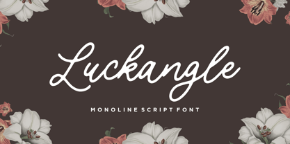 Luckangle is a Monoline Script Font. Luckangle is a lovely and delicate script font that exudes elegance and class. This font was particularly crafted for those who need a beautiful and refreshing look to their designs. Luckangle also multilingual support. Enjoy the font, feel free to comment or feedback, send me PM or email. Thank you!
 - DBL Cheque by Letterhead Studio-VG,
$15.00 This is an experimental type, something of retro-futurism and modern robotics in one package, with letters of unexpected proportions and forms. It was inspired by the glorious imagination of the past, but it holds in itself themes that are bound with the future. The DBL Cheque family consists of incredible 22 styles, filling every need for demanding designers.
 - PSZ Alpha by Patrick Siegfried Zimmer,
$45.00 PSZ Alpha was designed by Patrick Siegfried Zimmer in 2023. It is a modern typeface designed in a sans serif-grotesque structure and it has been created by taking inspiration from the leading Grotesk fonts that have been designed at the beginning of the 20th century. PSZ Alpha is designed to give results in both screens and editorial designs.
 - Gordis by John Moore Type Foundry,
$25.00 Gordis is a letter to display ideal for situations humorous and tender, based on rounded shapes that weigh about their weight. It comes in three versions combined Open Type, which can be used in layers for special effects. Gordis was awarded at the third biennial TL08 Tipos Latinos. Put an end to those boring headlines, use Gordis!
 - Blackbone by Balpirick,
$15.00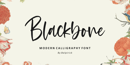 Blackbone is a Modern Calligraphy Font. Blackbone is a lovely and delicate script font that exudes elegance and class. This font was particularly crafted for those who need a beautiful and refreshing look to their designs. Blackbone also multilingual support. Enjoy the font, feel free to comment or feedback, send me PM or email. Thank you!
 - Freak by Cool Fonts,
$24.00 This is a funky hand lettered font that just begs to be used for coffeehouse promo. It is best when used in sizes above 16 points and is even better when used for posters where it can be printed in giant sizes. It was hand drawn in Fractal Designs Painter with lots of little Doo-Dads.
 - Hisyan by Zeenesia Studio,
$15.00 INTRODUCING HISYAM. Hisyam is a Bold style sans serif font with strong character and soft features. modern and classic sans serif font with a clear and bold look. It’s a very versatile font that works great in large. Hisyam was built with open Type features, many stylistic alternate and Ligature makes your project will be awesome
 - Neue Aachen by ITC,
$40.99 Impressed by the quality of the Aachen typeface that was originally designed for Letraset in 1969 and extended to include Aachen Medium in 1977, Jim Wasco of Monotype Imaging has extended this robust display design to create an entire family. Derived from the serif-accented Egyptienne fonts dating to the early 20th century, Aachen has serifs that are very solid but considerably shorter than those of its precursor. The incorporated geometrical elements, such as right angles and straight lines, provide the slender letters of Aachen with a slightly technological, stencil-like quality. Despite this, the effect of Aachen is by no means static; its dynamism means that this typeface, originally designed for use in headlines, has come to be used with particular frequency in sport- and fitness-related contexts. Jim Wasco, for many years a type designer at Monotype Imaging, recognized the potential of Aachen and decided to extend the typeface to create an entire typeface family. He appropriated the existing Aachen Bold in unchanged form and first created the less heavy cuts, Thin and Regular. Wasco admits that he found designing the forms for Thin a particular challenge. It took him several attempts before he was able to achieve consistency within the glyphs for Thin and, at the same time, retain sufficient affinity with the original Aachen Bold. But he finally managed to adapt the short serifs and the condensed and slightly geometrical quality of the letters to the needs of Thin. The weights Light, Book, Medium and Semibold were generated by means of interpolation. Supplemented by Extralight and Extrabold, the new Neue Aachen can now boast a total of nine different weights. Wasco initially relied on his predilection for genuine cursives in his designs for the Italic cuts. But it became apparent with these first trial runs that the soft curves of cursives did not suit Aachen and led to the loss of too much of its original character. Wasco thus decided to compromise by using both inclined and cursive letters. Neue Aachen Italic is somewhat narrower than its upright counterparts; the lower case 'a' has a closed form while the 'f' has been given a descender, but the letters have otherwise not been given additional adornments. The range of glyphs available for Neue Aachen has been significantly extended, so that the typeface can now be used to set texts not only in Western but also Central European languages. Wasco has also added a double-counter lowercase 'g' while relying on the availability of alternative letters in the format sets for the enhancement of the legibility of Neue Aachen when used to set texts. The seven new weights and completely new Italic variants have enormously increased the potential applications of Aachen and the range of creative options for the designer. While the Bold weights have proved their worth as display fonts, the new Book and Regular cuts are ideal for setting text. And the subtlety of Ultra Light will provide your projects with a quite unique flair. The new possibilities and opportunities in terms of design and applications that Neue Aachen offers you are not restricted to print production; you can also create internet pages thanks to its availability as a web font.
 - WildWords Lower by Comicraft,
$49.00 WILD WORDS! WILD WORDS! Buh-Buh-Buh-DUH-DUH! WILD WORDS! Wild Words never lose it! Wild Words never chose this way… Wild Words never close their eyes… Wild Words always sh-- I'm sorry? WILD WORDS is NOT a song by Duran Duran? Really? But I got myself the Simon Le Bon ’80s haircut and my MAD MAX outfit and everything… It’s a font from Comicraft? Now available in lower case? Well that’s good too, right? Comicraft fonts are created BY comic book letterers FOR lettering comic books. Accept no substitutes! See the family related to WildWords Lower: Wild Words
 - Runtage by Riasyletter_Studio,
$16.00 Runtage font is a stylish and modern hand letter script font but can also be used for vintage projects. This font will look awesome and amazing in many ways to your latest project. perfect for various projects such as logos and branding, hand lettering, merchandise, advertisements, invitations, social media posts etc What's Included : More than 280 of glyphs (include Uppercase, Lowercase, Numerals & Punctuations, Ligature, Stylistic, Swashes) Support multilingual support Works on PC & Mac Simple installations Accessible in the Adobe Illustrator, Adobe Photoshop, Adobe InDesign, even work on Microsoft Word. PUA Encoded Characters (fully accessible without additional design software)
 - Bobbi Bee by Baseline Fonts,
$39.00 Bobbi Bee won't stop popping her bubblegum, even though that's not very ladylike. Bobbi Bee is very proud of all of her 361 numbers, letters and alternates - all of which are chock full of summer sunshine and life. The font comes in a single weight (because she's perfect just the way she is.) She's cut out for a very special book title, logotype, or love letter. Keep Bobbi's hand firmly in yours in shopping malls, as she tends to get distracted and wander, and though it's hard, always remember to tell her how smart she is, as well as how beautiful.
 - Scribbler by Hanoded,
$15.00 Scribbler, like Double Quick (another one of my fonts), is a handwritten typeface, designed to look like a quick grocery list, a hasty 'I Love You' note penned down on a Post-it or a home improvement to-do list. Scribbler is a little messier than Double Quick, but this may be just your style!
 - Fast Racer Italic by Sipanji21,
$16.00 Fast Racer is a sport display Font. The font is ready to be used for your racing sports or automotive related projects . Built to be perfect for headlines, jerseys, logos, branding, posters, packaging, advertising, and much more. If you Find some trouble with this font please chat me. thanks and have a nice day
 - Klute by Alias Collection,
$60.00 Klute references stylised forms of writing; historic Germanic, blackletter letterforms and graffiti and tagging. Its references are based on a personal idea of lettering - the action of writing is more personal and human than the craft of calligraphy or the mechanics of typing. These references suggest the idea of saying something particular and personal.
 - Valina by Khoir,
$15.00 Valina - Modern serif has an elegant impression and displays a unique shape in each letter but does not leave the readability of the font itself so this font is good for logos, quotes, posters, covers and many more. Valina Uppercase Lowercase 75+ Language Alternates Font So what are you waiting for? Thank you for seeing
 - Hello Freeday by Nathatype,
$29.00 Hello Freeday is a striking display font that combines a bold and clean font weight with playful swinging endings. With its uniform letter proportions and unique character details, this typeface effortlessly balances sophistication and a touch of whimsy. The bold and clean font weight of this font commands attention and adds a sense of strength and impact to your designs. Each letter is meticulously designed with precise geometric forms, resulting in a polished and professional appearance. The consistent proportions of the letters contribute to the font's overall coherence, ensuring a harmonious and balanced visual experience. What sets this display apart is the charming swinging endings found in select letters. These decorative details add a hint of playfulness and movement to the font, injecting a touch of personality and delight into your designs. The swinging endings give the letters a sense of rhythm and flow, making Hello Freeday an excellent choice for projects that require a dynamic and captivating visual presence. The font's bold and clean aesthetic ensures legibility and readability, even at smaller sizes. Enjoy the available features here. Features: Stylistic Sets Ligatures Multilingual Supports PUA Encoded Numerals and Punctuations Hello Freeday fits in headlines, logos, attention-grabbing titles, product packaging, greeting cards, branding materials, editorial layouts and website headers. Find out more ways to use this font by taking a look at the font preview. Thanks for purchasing our fonts. Hopefully, you have a great time using our font. Feel free to contact us anytime for further information or when you have trouble with the font. Thanks a lot and happy designing.
 - Biro Script Plus by Ingo,
$50.00 An authentic script from the tip of the ball point pen. This hasn’t been seen yet: A typeface which truly looks as if it were handwritten. Calligraphy is, actually, the art of fine writing. And actually, written scripts as typeface for the computer are 100% nonsense. And yet, an obvious thought: Create a typeface which truly derives from everyday handwriting. And since we, if we write at all, utilize practically only a ball point pen anymore, then a modern cursive writing form must look like just that. As a counterpart to the artistic ”handwritings“ which have long been available as typeface, the thought of digitalizing a truly ”ugly“ handwriting is appealing. After all, time and again there is the need for a text to look ”handwritten“. Biró Script is written freehand with a ball point pen. Finally a truly individual script! Biró Script includes more than 300 authentic ligatures in addition to the customary alphabet. By the way, the most convincing effect is obtained with a font size of about 18 to 22 points, at which the thickness of the stroke is now about the same as that of a real ball point pen. There's a difference between the anglo-american forms of some characters (esp. the numerals 1 and 7, but also capitals I and F) and how it's written in the rest of the world. For those of us who aren’t used to the world-wide usual forms, Biró Script includes a US version with the appropriate characters.
 - SK Yok Deve by Salih Kizilkaya,
$9.00 SK Yok Deve is a handwritten font. It is designed for use in cartoons, comics or illustrations. Special kerning settings have been made for easy reading in small areas such as speech bubbles. It offers full support for the Latin alphabet and contains many typographic elements. In this way, you can easily use it in your designs. This font family includes 8 fonts and 2656 glyphs. In this way, it contains many typographic materials you will need.
 - Friends by W Type Foundry,
$25.00 Friends is a complete and contemporary language system for postmodern graphics. Inspired by the idea of making new art and graphic design keeping in mind new ways of visual language like emojis as a formal way of communication and contemporary graphic arts. Friends is perfect for web design, postmodern arts, book design, posters, editorial design, branding, advertising, headlines, and short texts. Friends includes 14 style typeface plus italics, icons, emojis, arrows, ligatures, fractions, special numbers, etc.
 - Wittenberger Fraktur by Monotype,
$29.99One of the earliest Monotype faces, issued about 1906 in two weights, normal and semibold. Based on Schelter & Giesecke's School Fraktur which was in turn based on type favored by early 16th century printers in Wittenberg. It was the door of the Schlosskirche in Wittenberg on which Luther nailed his 95 theses. For this reason, types similar to Wittenberger Fraktur are particularly associated with Lutheran theology. There are two s versions in the DFR-layout. They enable you to typeset the old way, where the long s with the form like an f is used in the beginning and middle of a syllable or word and the typical round s, also called final s, is used at the end of syllable and end of words. - Syndra by Typodermic,
$11.95 Introducing Syndra, a typeface that’s as timeless as it is modern. With its unique Y2K style, this typeface boasts letterforms that seem to have come straight from a machine. You can almost feel the hum of technology when you look at it. But don’t let its cold, emotionless shapes fool you. Syndra’s tireless character set works hard to make your message sound authoritative and technical. With OpenType fractions, numeric ordinals, and plenty of currency symbols included, you’ll have everything you need to create a professional and polished look. It’s the perfect font for anything related to plastics, medications, technology, and renewable energy. And with seven weights to choose from—Thin, Extra-Light, Light, Regular, Semi-Bold, Bold, and Extra-Bold—you’ll have the flexibility to create the look and feel you want. So if you’re looking for a typeface that’s both unusual and tech-savvy, look no further than Syndra. It’s a font that’s sure to turn heads and make your message stand out in all the right ways. Most Latin-based European, Vietnamese, Greek, and most Cyrillic-based writing systems are supported, including the following languages. Afaan Oromo, Afar, Afrikaans, Albanian, Alsatian, Aromanian, Aymara, Azerbaijani, Bashkir, Bashkir (Latin), Basque, Belarusian, Belarusian (Latin), Bemba, Bikol, Bosnian, Breton, Bulgarian, Buryat, Cape Verdean, Creole, Catalan, Cebuano, Chamorro, Chavacano, Chichewa, Crimean Tatar (Latin), Croatian, Czech, Danish, Dawan, Dholuo, Dungan, Dutch, English, Estonian, Faroese, Fijian, Filipino, Finnish, French, Frisian, Friulian, Gagauz (Latin), Galician, Ganda, Genoese, German, Gikuyu, Greenlandic, Guadeloupean Creole, Haitian Creole, Hawaiian, Hiligaynon, Hungarian, Icelandic, Igbo, Ilocano, Indonesian, Irish, Italian, Jamaican, Kaingang, Khalkha, Kalmyk, Kanuri, Kaqchikel, Karakalpak (Latin), Kashubian, Kazakh, Kikongo, Kinyarwanda, Kirundi, Komi-Permyak, Kurdish, Kurdish (Latin), Kyrgyz, Latvian, Lithuanian, Lombard, Low Saxon, Luxembourgish, Maasai, Macedonian, Makhuwa, Malay, Maltese, Māori, Moldovan, Montenegrin, Nahuatl, Ndebele, Neapolitan, Norwegian, Novial, Occitan, Ossetian, Ossetian (Latin), Papiamento, Piedmontese, Polish, Portuguese, Quechua, Rarotongan, Romanian, Romansh, Russian, Rusyn, Sami, Sango, Saramaccan, Sardinian, Scottish Gaelic, Serbian, Serbian (Latin), Shona, Sicilian, Silesian, Slovak, Slovenian, Somali, Sorbian, Sotho, Spanish, Swahili, Swazi, Swedish, Tagalog, Tahitian, Tajik, Tatar, Tetum, Tongan, Tshiluba, Tsonga, Tswana, Tumbuka, Turkish, Turkmen (Latin), Tuvaluan, Ukrainian, Uzbek, Uzbek (Latin), Venda, Venetian, Vepsian, Vietnamese, Võro, Walloon, Waray-Waray, Wayuu, Welsh, Wolof, Xavante, Xhosa, Yapese, Zapotec, Zarma, Zazaki, Zulu and Zuni.
 - Monotype Goudy by Monotype,
$40.99Over the course of 50 years, the charismatic and enterprising Frederic W. Goudy designed more than 100 typefaces; he was the American master of type design in the first half of the twentieth century. Goudy Old Style, designed for American Type Founders in 1915-1916, is the best known of his designs, and forms the basis for a large family of variants. Goudy said he was initially inspired by the cap lettering on a Renaissance painting, but most of the flavor of this design reflects Goudy's own individualistic style. Recognizable Goudy-isms include the upward pointing ear of the g, the diamond-shaped dots over the i and j, and the roundish upward swelling of the horizontal strokes at the base of the E and L. The italic was completed by Goudy in 1918, and is notable for its minimal slope. Goudy Bold (1916-1919) and Goudy Extra Bold (1927) were drawn not by Goudy, but by Morris Fuller Benton, who was ATF's skillful in-house designer. Goudy Catalogue was drawn by Benton in 1919-1921 and was meant to be a medium weight of Goudy Old Style. Goudy Heavyface was designed by Goudy for Monotype in 1925, and was intended to be a rival to the successful Cooper Black. Goudy Modern was designed by Goudy in 1918; its small x-height, tall ascenders and shorter caps impart a spacious and elegant feeling. Benton designed Goudy Handtooled, the shaded version that has just a hairline of white through its bold strokes. The Goudy faces, especially the bolder weights, have long been popular for display and advertising design. They continue to pop up all over the world, and still look reassuring to our modern eyes." - Goudy Ornate MT by Monotype,
$29.99Over the course of 50 years, the charismatic and enterprising Frederic W. Goudy designed more than 100 typefaces; he was the American master of type design in the first half of the twentieth century. Goudy Old Style, designed for American Type Founders in 1915-1916, is the best known of his designs, and forms the basis for a large family of variants. Goudy said he was initially inspired by the cap lettering on a Renaissance painting, but most of the flavor of this design reflects Goudy's own individualistic style. Recognizable Goudy-isms include the upward pointing ear of the g, the diamond-shaped dots over the i and j, and the roundish upward swelling of the horizontal strokes at the base of the E and L. The italic was completed by Goudy in 1918, and is notable for its minimal slope. Goudy Bold (1916-1919) and Goudy Extra Bold (1927) were drawn not by Goudy, but by Morris Fuller Benton, who was ATF's skillful in-house designer. Goudy Catalogue was drawn by Benton in 1919-1921 and was meant to be a medium weight of Goudy Old Style. Goudy Heavyface was designed by Goudy for Monotype in 1925, and was intended to be a rival to the successful Cooper Black. Goudy Modern was designed by Goudy in 1918; its small x-height, tall ascenders and shorter caps impart a spacious and elegant feeling. Benton designed Goudy Handtooled, the shaded version that has just a hairline of white through its bold strokes. The Goudy faces, especially the bolder weights, have long been popular for display and advertising design. They continue to pop up all over the world, and still look reassuring to our modern eyes." - Goudy Handtooled by Monotype,
$40.99Over the course of 50 years, the charismatic and enterprising Frederic W. Goudy designed more than 100 typefaces; he was the American master of type design in the first half of the twentieth century. Goudy Old Style, designed for American Type Founders in 1915-1916, is the best known of his designs, and forms the basis for a large family of variants. Goudy said he was initially inspired by the cap lettering on a Renaissance painting, but most of the flavor of this design reflects Goudy's own individualistic style. Recognizable Goudy-isms include the upward pointing ear of the g, the diamond-shaped dots over the i and j, and the roundish upward swelling of the horizontal strokes at the base of the E and L. The italic was completed by Goudy in 1918, and is notable for its minimal slope. Goudy Bold (1916-1919) and Goudy Extra Bold (1927) were drawn not by Goudy, but by Morris Fuller Benton, who was ATF's skillful in-house designer. Goudy Catalogue was drawn by Benton in 1919-1921 and was meant to be a medium weight of Goudy Old Style. Goudy Heavyface was designed by Goudy for Monotype in 1925, and was intended to be a rival to the successful Cooper Black. Goudy Modern was designed by Goudy in 1918; its small x-height, tall ascenders and shorter caps impart a spacious and elegant feeling. Benton designed Goudy Handtooled, the shaded version that has just a hairline of white through its bold strokes. The Goudy faces, especially the bolder weights, have long been popular for display and advertising design. They continue to pop up all over the world, and still look reassuring to our modern eyes." - Goudy by Linotype,
$39.00Over the course of 50 years, the charismatic and enterprising Frederic W. Goudy designed more than 100 typefaces; he was the American master of type design in the first half of the twentieth century. Goudy Old Style, designed for American Type Founders in 1915-1916, is the best known of his designs, and forms the basis for a large family of variants. Goudy said he was initially inspired by the cap lettering on a Renaissance painting, but most of the flavor of this design reflects Goudy's own individualistic style. Recognizable Goudy-isms include the upward pointing ear of the g, the diamond-shaped dots over the i and j, and the roundish upward swelling of the horizontal strokes at the base of the E and L. The italic was completed by Goudy in 1918, and is notable for its minimal slope. Goudy Bold (1916-1919) and Goudy Extra Bold (1927) were drawn not by Goudy, but by Morris Fuller Benton, who was ATF's skillful in-house designer. Goudy Catalogue was drawn by Benton in 1919-1921 and was meant to be a medium weight of Goudy Old Style. Goudy Heavyface was designed by Goudy for Monotype in 1925, and was intended to be a rival to the successful Cooper Black. Goudy Modern was designed by Goudy in 1918; its small x-height, tall ascenders and shorter caps impart a spacious and elegant feeling. Benton designed Goudy Handtooled, the shaded version that has just a hairline of white through its bold strokes. The Goudy faces, especially the bolder weights, have long been popular for display and advertising design. They continue to pop up all over the world, and still look reassuring to our modern eyes." - Ongunkan Irk Bitig Viking by Runic World Tamgacı,
$99.00 This is the Viking font that I developed based on the letters in the Irk Bitig book, which is written with the brush line of the old Turkish runic alphabet, the information below. It was interesting work. Irk Bitig or Irq Bitig (Old Turkic: 𐰃𐰺𐰴 𐰋𐰃𐱅𐰃𐰏), known as the Book of Omens or Book of Divination in English, is a 9th-century manuscript book on divination that was discovered in the "Library Cave" of the Mogao Caves in Dunhuang, China, by Aurel Stein in 1907, and is now in the collection of the British Library in London, England. The book is written in Old Turkic using the Old Turkic script (also known as "Orkhon" or "Turkic runes"); it is the only known complete manuscript text written in the Old Turkic script. It is also an important source for early Turkic mythology.
 - CA Spotnik by Cape Arcona Type Foundry,
$40.00 The initial inspiration for CA Spotnik was the opening title of an early Andrei Tarkovsky movie. There was this very unconventional hand drawn “s” which drew my attention. Despite its strange shape, it felt totally natural in that context. So we made a few screenshots and started to sketch some more letters in order to catch the spirit that attracted us so much. The result is a grotesque typeface with a slight contrast, the proportions are rather wide with a large x-height. The bolder the weight, the wider it gets. In case you find the swirly “s” uncomfortable, there is a standard s included as well. The general atmosphere of the typeface, which could be described as “nerdy but friendly” doesn’t depend on this detail. It’s rather the sum of details derived from the original inspiration.