10,000 search results
(0.013 seconds)
- ITC Oldbook by ITC,
$29.99For some time, Eric de Berranger had wanted to create a distressed typeface design - one that gave the appearance of antique printing and showed signs of wear, yet was still highly readable. He was busy designing a new face called Maxime, when an idea struck: I realized that I could use these lettershapes as the basis for my antique typeface," he says. The two faces ended up being designed in tandem. While ITC Oldbook clearly captures the flavor of aged, uneven and imperfect printing, it also meets de Berranger's goal of being exceptionally readable in text sizes. Beginning with well-drawn characters was the key, and these were carefully modeled into the distressed forms. "The process was more difficult than I originally thought," says de Berranger. "The antique letters had to be tested and modified several times to work correctly." ITC Oldbook elegantly simulates antique printing in both text and display sizes. And while stroke weights are uneven and curves are irregular, the design has remarkably even color when set in blocks of text copy. Add to this the design's inherent legibility, and ITC Oldbook acquires a range far beyond replication of things old; it's suitable for any project that calls for warm and weathered typography. ITC Oldbook is available in roman and bold weights with complementary italic designs. Small caps, old style figures and a suite of alternate characters and ornaments provide additional flexibility and personality to the design." - LiebeRuth by LiebeFonts,
$29.90 LiebeRuth is your 100 percent hand-made organic type. She absolutely loves to be typeset in large *and* small sizes, because Legibility is her middle name. (Yes, we know it’s not a typical girl’s name.) She is friendly and polite, but she also has a few quirks. Her friends are impressed with how natural she manages to look every day. Her four weights ensure that Ruth has the right boldness for any context: birthday invitation, personal correspondence, photo album, or billboard ad. During the creation of this font, her designer ate plenty of healthy, organic foods. We think this is the reason why Ruth looks so fresh and lively. And of course Ruth has been designed with lots of Liebe (which is German for “love”—and she speaks many other languages, too). One more thing Ruth is marvelous at: showing off her curly-swirly swashed alternative letterforms that can be activated via OpenType. (Please make sure your software supports OpenType if you wish to use the advanced features.) Each style contains more than 560 gluten-free glyphs—now that is great value! If you like this font, you may want to look at LiebeRuth’s bolder sister LiebeDoni and our best-sellers LiebeErika and LiebeKlara. Or add in some LiebeOrnaments to prepare a curly-licious feast. By the way: LiebeRuth also gets along great with our wide range of illustrative fonts, including LiebeCook, LiebeFish, and LiebeTweet.
 - Lincoln Electric by Canada Type,
$30.00 Lincoln Electric started its life as an in-house experimental film type Thomas Lincoln drew shortly after concluding his work as part of Herb Lubalin’s famed crew in the late 1960s,. The master alphabet was drawn on illustration boards using pen and ink and press-type lines. The typeface was initially made for use in the branding and promotional material of Lincoln’s new design outfit. This alphabet’s forms are a spin on Bifur, the all-cap deco face designed by Adolphe Mouron (known as Cassandre) in 1929, and published by the Deberny & Peignot foundry in France. Lincoln Electric evolves Cassandre’s idea further by constructing new shapes more in line with minimalist principles rather than art deco geometry — something clearly evident in Lincoln’s minuscules, which exhibit a clear connection to Bauhaus ideas More than 50 years after the typeface’s design, Thomas Lincoln found the original film alphabet tucked away in his archives and brought it over to Canada Type for digital retooling. The result is a modern and thoroughly elaborate set of fonts that belonging prominently in a 21st century designer’s toolbox. The following features are included in Lincoln Electric: • Three fonts for chromatic layering. • More than 1900 glyphs in each font. • Expanded Latin and Cyrillic character sets. • Small caps and Caps-to-small-caps. • Six different sets of stylistic alternates. • Ordinals and case-sensitive forms. For a showing of the stylistic set variations and a sample of demonstration of chromatic layering, please consult this PDF.
 - Cherry Blossoms by Positype,
$15.00 It’s spring and the Cherry Blossoms are in bloom… and so is the new typeface by Neil Summerour and Positype. Cherry Blossoms is the new relaxed script family in the same vein as Good Karma. Produced from hand and sumi brush of Neil Summerour, Cherry Blossoms is a natural brush textured font family. Cherry Blossoms is blooming with personality, reliable and genuine movements, and a wide range of letter options to befit any project needing an honest hand-lettered look. Each typeface comes with an expansive set of stylistic alternates (upper AND lowercase), that harmonize wonderfully when you have the Opentype Ligature feature active. Additionally, special double-letter smart ligatures have been produced for specific combinations in need of more expressive flair, as well as a few swashes that work with the economical strokes originally produced from the sumi brush. To further expand the usefulnesss of this bright script, a separate Caps/Lowercase font has been added that provides the simple contrast needed to bring the script fonts forward. Rather than limit the personality of this script, various styles have been produced to compliment the original Regular… Wide and Tight as well as the afforementioned Simple’ fonts are included in hopes of helping you find the perfect variation needed for your composition. Cherry Blossoms is the second release of the Positype Relaxed Script Collection of typefaces—all focused on fluid, effortless script fonts for simple use.
 - Dena by Linecreative,
$16.00 Presenting Dena Font, a forward-thinking typeface that straddles the boundaries of future aesthetics and modern design. Designed for the cutting edge designer, Dena Font is more than simply a letterform—it's a design language, a representation of sophisticated elegance influenced by cyberculture, sci-fi movies, and innovative video games. Dena Font is a tool that gives designers the ability to push the frontiers of creativity and reshape the visual world. Elevate your projects with Dena Font's futuristic appeal, which combines typography with creativity. Every letterform in Dena Font has a vibrant, futuristic feel to it. The deftly drawn characters blend together to create a visual rhythm that mirrors the quick-paced, constantly-changing nature of contemporary design. Modern Futuristic style: With futuristic style, Dena Font is at the vanguard of modern design. It is the perfect option for forward-thinking design projects because every curve and shape is painstakingly created to communicate a sense of innovation and advancement. Ligature-Enhanced Creativity: Dena Font's rich ligature set enables designers to smoothly combine characters to create a flowing and melodic typographic expression. These artistically elegant ligatures provide a touch of refinement to your designs and are ideal for creating distinctive logo types and brand identities. Overcoming linguistic obstacles, Dena Font provides extensive assistance for the Latin Western Europe character set. This makes your creative vision a flexible instrument for international design projects by guaranteeing successful communication across linguistic environments.
 - Confitería by Sudtipos,
$39.00 Confitería is the Spanish word for a shop where sweets and chocolates are made and sold, which sometimes has a tea room. And now Confitería is also a font that brings to mind lettering piped on delicate cakes ... sweet but never sickly. This font captures something of that simple and innocent beauty of traditional confiterías, where good manners will never go out of fashion, menus are elegant and time comes to a standstill to make way for life’s little pleasures. A confitería is a perfect place to share sweet tidbits with a friend or date, eavesdrop on the conversation at the next table, read a book, or just people-watch from the window. I celebrated my last birthday at one. There is one iconic confitería in Buenos Aires that I love more than the rest because, some 60 years ago, it put up its marvellous sign and never took it down. Walking by it is sure to bring a smile to your face. It’s big. Very big. And the lettering in its name is written in a timelessly beautiful vertical script – the most attractive I have ever seen. I joined forces with Sol Matas – who worked with me to update the Montserrat font –to design this geometrical connected font with pleasant, even strokes. It is elegant and saccharine-free. And to top it off, it comes in several flavors. Welcome! What can we get you?
 - Mi Negra by Letritas,
$25.00 Mi negra is a funny and hilarious typography designed especially for children, thought and created by Isabel de Gregorio. It could be described as an original combination between a semi-handwright and semi sans-serif font. Thanks to its structure and nice endings "Mi Negra" is recommended for composing short texts (logotypes, packing, posters, etc.). It may similarly be used for illustrations and comics, as well as in printing press works for children from 6 to 13 years old for instance. Mi Negra has been conceived to be a useful support in all kinds of illustrations works (please note that Isabel, the type designer, considers herself primarily an illustrator). The font designer of Mi Negra tells that every time she needed to provide some text data (i.e. in children infographies) and needed to make them more understandable and suitable for children, she used this typography. The former idea was than to create a font who could be a second option to comic sans, but as the project started to reveal its forms, it was clear that it was revealing another connotation and its own character. In this way, Mi Negra went on modifying its forms and the more it developed, the more it was showing its new characteristics and concepts. The family is composed of three weighs: Light, regular and black. It provides also interesting functional ligatures. It also includes a dingbat with nice doggies. It has 434 characters and can work with 208 languages.
 - FS Lucas by Fontsmith,
$80.00 Pure and not-so-simple Maybe it’s the air of purity, openness and transparency that they transmit, but geometric typefaces are more popular than ever among leading brands. Based on near-perfect circles, triangles and squares, geometric letterforms look uncomplicated, even though making them readable is anything but – something the designers of the first wave of geometric fonts discovered nearly a century ago. Many of the world’s most recognisable brands in technology, retail, travel, food, manufacturing and other industries continue to be drawn to the straightforward, honest character that geometric fonts convey. Fontsmith set out in 2015 to develop a typeface in the same tradition, but optimised for the demands of modern brands – online and offline usage, readability and accessibility. And, of course, with the all-important Fontsmith x-factor built in. FS Lucas is the bold and deceptively simple result. Handle with care The letterforms of FS Lucas are round and generous, along the lines of Trajan Column lettering stripped of its serifs. But beware their thorns. Their designer, Stuart de Rozario, who also crafted the award-winning FS Millbank, wanted a contrast between spiky and soft, giving sharp apexes to the more angular letterforms, such as A, M, N, v, w and z. Among his inspirations were the colourful, geometric compositions of Frank Stella, the 1920s art deco poster designs of AM Cassandre, and the triangular cosmic element symbol, which led him to tackle the capital A first, instead of the usual H. The proportions and angles of the triangular form would set the template for many of the other characters. It was this form, and the light-scattering effects of triangular prisms, that lit the path to a name for the typeface: Lucas is derived from lux, the Latin word for light. Recommended reading Early geometric typefaces were accused of putting mathematical integrity before readability. FS Lucas achieves the trick of appearing geometric, while taking the edge off elements that make reading difficult. Perfectly circlular shapes don’t read well. The way around that is to slightly thicken the vertical strokes, and pull out the curves at the corners to compensate; the O and o of FS Lucas are optical illusions. Pointed apexes aren’t as sharp as they look; the flattened tips are an essential design feature. And distinctive details such as the open terminals of the c, e, f, g, j, r and s, and the x-height bar on the i and j, aid legibility, especially on-screen. These and many other features, the product of sketching the letterforms in the first instance by hand rather than mapping them out mechanically by computer, give FS Lucas the built-in humanity and character that make it a better, easier read all-round. Marks of distinction Unlike some of its more buttoned-up geometric bedfellows, FS Lucas can’t contain its natural personality and quirks: the flick of the foot of the l, for example, and the flattish tail on the g and j. The unusual bar on the J improves character recognition, and the G is circular, without a straight stem. There’s a touch of Fontsmith about the t, too, with the curve across the left cross section in the lighter weights, and the ampersand is one of a kind. There’s a lot to like about Lucas. With its 9 weights, perfect proportions and soft but spiky take on the classic geometric font, it’s a typeface that could light up any brand.
 - FS Lucas Paneureopean by Fontsmith,
$90.00Pure and not-so-simple Maybe it’s the air of purity, openness and transparency that they transmit, but geometric typefaces are more popular than ever among leading brands. Based on near-perfect circles, triangles and squares, geometric letterforms look uncomplicated, even though making them readable is anything but – something the designers of the first wave of geometric fonts discovered nearly a century ago. Many of the world’s most recognisable brands in technology, retail, travel, food, manufacturing and other industries continue to be drawn to the straightforward, honest character that geometric fonts convey. Fontsmith set out in 2015 to develop a typeface in the same tradition, but optimised for the demands of modern brands – online and offline usage, readability and accessibility. And, of course, with the all-important Fontsmith x-factor built in. FS Lucas is the bold and deceptively simple result. Handle with care The letterforms of FS Lucas are round and generous, along the lines of Trajan Column lettering stripped of its serifs. But beware their thorns. Their designer, Stuart de Rozario, who also crafted the award-winning FS Millbank, wanted a contrast between spiky and soft, giving sharp apexes to the more angular letterforms, such as A, M, N, v, w and z. Among his inspirations were the colourful, geometric compositions of Frank Stella, the 1920s art deco poster designs of AM Cassandre, and the triangular cosmic element symbol, which led him to tackle the capital A first, instead of the usual H. The proportions and angles of the triangular form would set the template for many of the other characters. It was this form, and the light-scattering effects of triangular prisms, that lit the path to a name for the typeface: Lucas is derived from lux, the Latin word for light. Recommended reading Early geometric typefaces were accused of putting mathematical integrity before readability. FS Lucas achieves the trick of appearing geometric, while taking the edge off elements that make reading difficult. Perfectly circlular shapes don’t read well. The way around that is to slightly thicken the vertical strokes, and pull out the curves at the corners to compensate; the O and o of FS Lucas are optical illusions. Pointed apexes aren’t as sharp as they look; the flattened tips are an essential design feature. And distinctive details such as the open terminals of the c, e, f, g, j, r and s, and the x-height bar on the i and j, aid legibility, especially on-screen. These and many other features, the product of sketching the letterforms in the first instance by hand rather than mapping them out mechanically by computer, give FS Lucas the built-in humanity and character that make it a better, easier read all-round. Marks of distinction Unlike some of its more buttoned-up geometric bedfellows, FS Lucas can’t contain its natural personality and quirks: the flick of the foot of the l, for example, and the flattish tail on the g and j. The unusual bar on the J improves character recognition, and the G is circular, without a straight stem. There’s a touch of Fontsmith about the t, too, with the curve across the left cross section in the lighter weights, and the ampersand is one of a kind. There’s a lot to like about Lucas. With its 9 weights, perfect proportions and soft but spiky take on the classic geometric font, it’s a typeface that could light up any brand. - Fave by Aerotype,
$48.00 The hand-brushed Fave™ Set has ten informal scripts and other handwritten fonts made up of two subfamilies: Fave and the even-more informal Fave Casual, each have a primary script with a bold version and three other handwritten faces for a total of ten typefaces spanning the casual spectrum. All are optimized for large type use too so they look as good up close as they do set at smaller sizes. OpenType features The Fave family has a few features that happen largely in the background. All of the fonts use the OpenType Standard Ligature feature to automatically differentiate consecutive lowercase letters and numbers (using separate glyphs) and like our previous release Turbinado, they also automatically differentiate like characters that are separated by another letter. Alternate characters The script fonts have alternate uppercase and lowercase characters including multiple t (and double t) crossbar alternates that can be selected from the OpenType glyph table. Enable Contextual Alternates feature to automatically insert a bigger crossbar as the surrounding letters allow throughout a text box or document. You can also make your own custom lowercase t and crossbar to fit any situation–all of the lowercase t ascenders and crossbars are available separately in the OpenType glyph table, and can be combined and moved around manually. Stylistic sets and other goodies Fave Script and its bold counterpart have two Stylistic Sets. When enabled, one automatically substitutes non-connecting alternate characters at the ends of words, the other substitutes even bigger t crossbars than the Standard Ligature feature does. Smart apostrophes and ligatures Other subtle but hopefully helpful features include smart apostrophes, which insert themselves between two script characters in common situations without breaking their connection, and a few ligatures that also make character connections more seamless.
 - Rangarang by Si47ash Fonts,
$24.00 "At last, something beautiful you can truly own!" This is the first Persian Arabic & Latin COLOR font ever designed! Chromatic or Color fonts are fairly new. And Persian Arabic color fonts are extremely rare. Here, you get a font that supports both Arabic and Latin! Rangarang [means colorful] font comes in with a wonderful color set and variety in forms. Every single glyph has a unique palette of colors. If you look closely at the glyphs, you'll see complex paths and connections in every single one of them. Each glyph could be seen as a typographic artwork! Rangarang font is great for entertainment design, posters, business cards, website titles, magazine illustrations, logotypes, book covers, banners, billboards,... There are countless options! Notes: - SVG fonts contain vector letters with gradients and transparency. - These fonts will show up in apps that are compatible with color fonts, like Adobe Photoshop CC 2017.0.1 and above, Illustrator CC 2018. Learn more about color fonts and their support in third-party apps on: www.colorfonts.wtf - Don't worry about what you see here in the preview section in your browser. You may see the glyphs in black here, but this font is working EXACTLY how you can see it in the font pictures I put here. So if you use it in apps that support colored fonts, you can be sure that after installing the font on the system you will be able to use it like every other font. Shahab Siavash, the designer has done more than 30 fonts and got featured on Behance, Microsoft, McGill University research website, Hackernoon, Fontself, FontsInUse,... Astaneh and Hezareh text and headline fonts, Yaddasht and Yadgar handwriting fonts,... already got professional typographers, lay-out and book designers' attention as well as some of the most recognizable publications in Persian Arabic communities.
 - Guaruja Neue by Tipogra Fio,
$- Get in touch with Tipogra Fio and get inspired by Guaruja Neue specimens. Guaruja Neue is a neo-grotesque typeface with additional industrial traits to it, such as open corners in diagonal glyphs and short curves. The semi-cursive italics shapes, more than an orthographic matter, give sea waves for the headlines and copies that Guaruja Neue will compose, since it is named after a city on the coast of São Paulo, Brazil. Stylistic alternates, ligatures, ordinals, arrows and emojis give extra personality for texts that cross millennial and modernist concepts, going from a comprehensive Latin script, including Vietnamese support, until a basic Cyrillic set. Brazilian music tells the graphic story of Guaruja Neue specimens, songs that speak about beaches and the city of Guarujá, as well as the inspiration of 50’s and 60’s modernist design and the music movement of Bossa Nova. This family is also an evolution of Guaruja Grotesk (2021), a typeface with four fonts —Regular, Italic, Bold and Bold Italic— developed as part of a design school project, that now in Neue gains professionalism, refinement and knowledge. Guaruja Grotesk took 18 months to make, and Neue took additional 12 months of redrawing and rethinking, as design as processes. Part of the project got feedback from the typeface designer Ulrike Raush, under the Alphabettes mentorship program. Overview and features: 8 weights and 8 italics; 2 free fonts: Guaruja Neue Regular and Guaruja Neue Italic; Extended Latin and basic Cyrillic; 800+ glyphs; Numbers: proportional, tabular, superscripts, subscripts, denominators, numerators and fractions; Greek for math; Case-Sensitive forms; Arrows; Standard and discretionary ligatures; SS01: one story a and SS02: two story g; Emojis and SS03: negative alternate emojis; Ligatures for English ordinals;
 - Circe Rounded by ParaType,
$40.00 Circe Rounded is an extension for a popular Circe typeface, with rounded terminals. Bold and ExtraBold faces have two variants with different radius of the roundings. Circe Rounded is even more friendly than the original Circe. The typeface is designed by Alexandra Korolkova and Alexander Lubovenko and released by ParaType in 2015. It is known that the Circe typeface is distinguished by mild and humanist nature being formally a geometric sans-serif. However, as an experiment we decided to make it even softer: Circe now has a version with rounded terminals — Circe Rounded. Rounding is generally regarded as a mechanical operation, but in this case a lot of manual adjustment was needed because of the humanist nature and peculiarities of type design. Moreover, the two bold styles now have two options: a basic one is slightly rounded and an alternate one is fully rounded. In Circe Rounded we decided to dismiss characters with swashes that are rather inappropriate in such a rounded font, but the stylistic sets and alternate characters are remaining. Rounded terminals make an open and friendly typeface even more childish. For example, in quite large point sizes (because the x-height is still not big) it can be used as a body type in infant books. Circe Rounded, similar to Circe, has alternative forms of lowercase characters, which are called “infant” and are used in publications for children’s reading. However, a humanist basis is preserved alongside with its softness and it does not allow it to be as “plasticine” as many other rounded fonts. Two of the most obvious areas of possible application of Circe Rounded are everything for children and everything edible, especially all that is sweet and puff. However, we believe that there are other options.
 - Hellfire Flames by Ferry Ardana Putra,
$99.00 Are you ready to bring some dark and edgy vibes to your designs? Look no further than the Hellfire Flames | death metal font! With its black fire-inspired design and brutal form, this font is perfect for adding a touch of darkness to your work. Hellfire Flames is a death metal font that embodies the essence of infernal power and brutal energy. The font's letters take the shape of black flames, with a raw and aggressive design that will leave a lasting impression. The font includes both uppercase and lowercase letters, as well as a range of symbols, numerals, and foreign language support, making it a versatile tool for any project. Hellfire Flames also offers an array of extraordinary and unique death metal ornaments. These intricate designs are perfect for adding a touch of dark ambiance to your project, and are sure to impress any fans of the genre. Hellfire Flames is perfect for anyone looking to add a touch of darkness and aggression to their design projects. It's especially well-suited for projects related to death metal, black metal, gothic, horror, and other genres of heavy music. This font is also great for creating logos, album covers, merchandise, and other graphics that need a raw and intense look. Its unique death metal ornaments make it a great choice for adding an extra level of detail and flair to your designs. So why settle for boring fonts when you can unleash the power of darkness with the Hellfire Flames? Get ready to create designs that are truly unforgettable and take your work to the next level! ——— Hellfire Flames features: A full set of uppercase and lowercase Numbers and punctuation Multilingual language support PUA Encoded Characters OpenType Features +238 Total Glyphs +50 Death Metal Ornaments and Splatter included! ———
 - Wasleyton by Uncurve,
$30.00 Introducing "Wasleyton," a vintage ephemera font that weaves the elegance of a bygone era into your modern design projects. Drawing inspiration from the timeless charm of elegant signage, gold leaf craftsmanship, and the artistry of old label products, Wasleyton is more than just a font—it's a journey into the aesthetics of the past. Unleash the power of nostalgia as Wasleyton offers a plethora of alternate characters, ensuring your designs are not just eye-catching but also uniquely authentic. The versatility of this font makes it a perfect choice for a range of applications, from authentic logos and elegant headings to the artistry of sign painting and captivating posters. Infuse your projects with a touch of vintage sophistication as Wasleyton lends its charm to letterheads, branding materials, magazines, album covers, and book covers. Watch as your designs come alive in movies, apparel, flyers, and label designs, each one telling a story of craftsmanship and timeless style. Combine Wasleyton with other fonts, be it a script for a touch of fluid elegance, a serif for classic appeal, or a sans serif for a modern twist. Add a few effects, and suddenly, your project transforms into a masterpiece—classic yet contemporary, elegant yet bold. Elevate your design game with Wasleyton's ability to transport your audience to a different era. Whether you're working on product packaging that demands attention or creating an atmosphere on a movie poster, Wasleyton brings that touch of vintage authenticity that turns your project from ordinary to extraordinary. In summary, Wasleyton isn't just a font; it's a time machine to the aesthetics of yesteryears. Perfect for logos, signage, posters, branding, magazines, album covers, and much more, Wasleyton is your key to infusing a timeless vintage charm into the modern design landscape. Add it to your toolkit, and let your creativity unfold in a tapestry of nostalgia and elegance.
 - Gaslon by Canada Type,
$24.95 Gaslon is a slight reinterpretation and major expansion of a 1973 film type called Corvina Black, originally designed for VGC by A. Bihari. While the original typeface was popular in its own right, there were some things in it that were too quirky to work in the display applications it was intended for. Some of the letter combinations just didn't work to their visual optimum. For example the a and o were too similar, ditto the C and G, the E, F and J were too overwhelming to be set properly within certain display uses. Gaslon eliminates these problems by the inclusion of plenty of alternates for the vast majority of the original letters. In fact, the original a is itself now an alternate to a gorgeous new one. The Gaslon Alt font includes tremendous possibilities for both unicase use, and proper use in conjunction with the main font. This is our true homage to a typeface that had great potential more than three decades ago, but was overlooked by digitizers because of a few quirks it had in film type contexts. Full of curves and invitation, Gaslon ranks very high among the friendliest poster faces ever made. It is ideal for friendly store signs, children book covers, and plenty of other applications. In fact, if you're planning on contributing to a few protests around your neighborhood or city, you would probably be better off using Gaslon to help your sign/placard carry words and slogans that are big but friendly. Nothing beats "DOWN WITH GAS PRICES" set in a nice imaginative mix of the many Gaslon letters. The OpenType version of Gaslon is a single font that contains all the alternates and niceties programmed within features accessible by OT-friendly programs.
 - Kake by Eclectotype,
$30.00 Kake’s upper case letters are inspired by a hand-painted sign outside a temple in Ubud, Bali. The rest of the font is made to fit the style. The hand-made aesthetic is increased by the implementation of contextual alternates, which automatically swap glyphs to alternate forms to avoid the monotony of repeating letters. The amount of variations for each glyph is dependent on letter frequency in English; there are more a’s and e’s than q’s and j’s. Even with only two variations of some glyphs, the programming makes sure that no two matching glyphs are ever next to eachother, and for the most part they will rarely be even two letters apart. This all makes for type that looks like it isn't type. The glyphs bounce and subtly change weight with willful abandon. Some of the letters on that original sign are somewhat quirky. If you're not a fan you can engage stylistic alternates or stylistic sets to change the C, G, S, Y, c, s and y glyphs to a less idiosyncratic form. These variations still have variations themselves, so with contextual alternates on, they will look as random as all the rest. Case sensitive forms and automatic fractions are included, as are 98 ornaments, ranging from the useful to the (let’s just say) esoteric. These can be accessed from the glyph palette. I know you've probably never realized you need an anchor, a fuel pump, skull and crossbones and chess symbols in the same font before, but that doesn't mean you don't! Kake is full on display typography. It’s legible for small blocks of copy but don't go setting essays in it. Unless you really want to... in which case, go for it.
 - Solo Beats by PizzaDude.dk,
$17.00 It's clear, fat and juicy - it's my Solo Beats font! It has got that organic feeling of something handmade...and that is exactly what it is. Even though I digitally removed some inkblobs here and there, the handmade look is quite clear!
 - Bipolar Decorative by VersusTwin,
$45.00 A bolder condensed version of the Bipolar family of fonts, Bipolar Decorative has a level of ornamental sophistication and balancing that is surprising for its narrow spiny appearance. It's a neo-blackletter typeface that screams for experimental as well as serious use.
 - Monico by Eotype,
$14.00 Monico is a new condense font that is elegance and versatility. This unique font is perfect for creating beautiful logotypes, stunning magazine designs and more. This font can be your solution in completing projects that are equipped with various alternate and ligature collections.
 - Blandford Woodland NF by Nick's Fonts,
$10.00The chapbook Pen & Brush Lettering and Practical Alphabets, published by Blandford Press, Ltd., London, in 1929 averred that these letterforms suggested a lightface version of Neuland. And so they do, with the added bonus that this typeface, unlike its inspiration, includes lowercase characters. - Gersang by Linecreative,
$16.00 Gersang is a retro groovy font with rounded corners that is perfect for designing with a retro style. With bold style and unique shapes, Gersang is the perfect choice for those seeking a retro font that will create eye-catching and memorable designs.
 - Wolfpack by Arendxstudio,
$15.00 Wolfpack is a handwritten font with a personal charm, and has a challenging concept that is stated and also has random properties that make it very interesting to use for each of your design project needs and the needs of all of you.
 - Shakilla by Zamjump,
$17.00 Pleased to introduce you to Shakilla new handwritten kid's fun font! This is a cute kids handwritten font that would be perfect for Comic, books, greeting cards, toys, posters, picture books, branding, logo or anything that requires a fun and happiness look!
 - Starslang Halo by MyAnvil,
$20.00 The "Starslang Halo" font is derived from the original Starslang Phat font. This typeface design features a halo that encompasses the glyph characters that creates a positive warm urban feel. It probably best suited to liven up parties, and makes reading more fun!
 - De Gozaru by Bejeletter,
$14.00 De Gozaru, is a classic calligraphy font with a beautiful arch. This font is available in several modern swirls that can make your work look elegant, sweet and perfect. This font also has several alternatives that can allow you to improvise your writing.
 - Rational Mood by Pixel Colours,
$18.00 Rational Mood is a handwritten font trio that includes an uppercase font that combines perfect with a script font and is loaded with tons of cute extra illustrations. This is a perfect font to create quotes or texts with a handwritten, natural style.
 - Skinnytoon by Majestype,
$19.00 Handwriting style will always be fun. Skinnytoon comes with that purpose. Equipped with 200+ Glyphs that will give the impression of a good handwriting. Perfect for tittle, magazine headers, comic, cartoon or simply as a stylish text overlay to any background image.
 - Natural Blues by PizzaDude.dk,
$17.00 Natural Blues is my laid back handwriting font, and it is also the name of a song by Moby. Maybe I was inspired by that song … I can’t tell. But what I can tell is that having the blues is a natural thing!
 - Rigaster by Iwm Design,
$10.00 Rigaster is a font that encompasses four distinct styles, skillfully blending elements from classic serif fonts with those from modern typography. This fusion results in dynamic characteristics that lend themselves perfectly to contemporary designs as well as those with a retro aesthetic.
 - Mariska by Typehand Studio,
$16.00 Mariska is a display font that we made with Japanese Taste. Mariska can be used for design japanese restaurant, clothing brand, japanese arts, business purpose relate with japanese culture and a perfect companion for your creative project that has an japanese taste.
 - Heathtop by Warnetype,
$6.00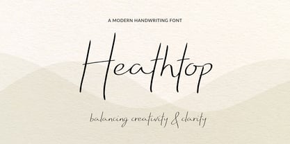 A modern handwritten script font that balances creativity with clear legibility that contains upper & lowercase characters, all punctuation and numerals. Designed so the text reflects stylish natural handwriting, with ligatures and carefully kerned characters mixed with unjoined letters for a contemporary feel.
 - Tough Cookie by Hanoded,
$15.00 Tough Cookie is a handmade font that looks like it has been cut out. It comes in three varieties that work together really well. Use it for your book covers and product packaging, or (if you’re a tough cookie) for your christmas cards…
 - Garlic Embrace by PizzaDude.dk,
$15.00 Ever wanted to be embraced by garlic? Probably not! But this font could surely embrace your designs that need an authentic brush look! Comes with 7 contextual alternates that automatically cycles as you type! Also, Garlic Embrace is FULL of accented letters! :)
 - Harder by Doehantz Studio,
$20.00 Fresh and New, Harder. Harder is an elegant script font. Made from vectorized hand strokes so that it will look neat on each side of the character. He has several character alternatives that will offer interesting options for any of your design projects
 - Brossard by Greater Albion Typefounders,
$13.95 Brossard is a slab serif face redolent of French atmosphere and the design ethos of the 1920s. Use it for headines and posters that need that distinctive élan or where a Continental feel is called for. Regular and outline faces are offered.
 - Gloucester by Monotype,
$29.00 Gloucester is a smart, chipper, and studious typeface that evokes British literature and historic books. It's highly legible and great for kids books. Use this font for a pub sign, a book about British history, or anything else that needs a sophisticated look.
 - Kato by Autographis,
$39.50 Kato is a handwritten mostly-joining script with long, but not overly long ascenders and descenders, that make it a very elegant font. Scanned and finished carefully by hand on screen, with that little bit of extra effort to keep the "rough" touch.
 - HK Requisite by Hanken Design Co.,
$- HK Requisite™ is a sans serif typeface inspired by the compactness of Neue Haas Grotesk and the strong character of Akzidenz Grotesk. The name came from the fact that fonts are elements that are necessary for the achievement of a specified end.
 - Rugged Rock by Comicraft,
$19.00 Around the rugged rock the ragged rascal ran, Foregoing fancy fonts, the Fontographer fawned and fell! Alliteratively allowing for assonant aspects as well, He spoke of several sentences that some should never spell! This classic title font will deliver tall tales that tell!